
Project 11 — Day 25 of 30 days of Data Analytics with Projects Series
Welcome back peep. Hope all’s well. This is Day 25 of 30 days of data analytics where we will be implementing a project covering —
Summary Functions
Indexing
Grouping
Sorting
Data Profiling
Categorical and Numerical Features
Missing Value Analysis
Unique Value Analysis
Data Visualization
Correlation Coefficients
Let’s cover the most important concepts in brief —
- Summary functions, such as mean and standard deviation, provide a quick overview of the distribution of a dataset’s numerical features.
- Indexing allows for easy access and manipulation of specific rows or columns in a dataset.
- Grouping separates a dataset into smaller groups based on one or more features, allowing for analysis of subgroups within the larger dataset.
- Sorting rearranges the rows of a dataset in a specific order, such as by a certain feature’s values.
- Data profiling is the process of examining the properties and characteristics of a dataset, including missing values, unique values, and the data types of each feature.
- Categorical and numerical features are two types of data, where categorical features are non-numerical and numerical features are numerical.
- Missing value analysis examines and deals with missing or null values in a dataset, such as through imputation or removal.
- Unique value analysis examines the number and values of unique entries in a feature.
- Data visualization is the process of creating graphical representations of data, such as charts and plots, to make it easier to understand and interpret.
- Correlation coefficients are statistical measures that indicate the strength and direction of a linear relationship between two variables.
- Pearson’s r measures the linear correlation between two variables.
- Spearman’s ρ and Kendall’s τ are non-parametric measures of rank correlation.
- Cramer’s V (φc) is a measure of association for categorical variables.
- Phik (φk) is a measure of association for categorical variables for k categories.
Example Code Implementation —
import pandas as pd
import numpy as np
import seaborn as sns

# Create a sample dataset
data = pd.DataFrame({
    'Feature1': [1, 2, 3, 4, np.nan, 6, 7, 8, 9, 10],
    'Feature2': ['A', 'B', 'C', 'D', 'E', 'F', 'G', 'H', 'I', 'J'],
    'Feature3': [10, 20, 30, 40, 50, 60, 70, 80, 90, 100]
})

# Summary functions
mean = data['Feature1'].mean()
std_dev = data['Feature1'].std()

# Indexing
subset = data.loc[3:7, ['Feature2', 'Feature3']]

# Grouping
grouped_data = data.groupby('Feature2').mean()

# Sorting
sorted_data = data.sort_values('Feature1')

# Data profiling
missing_values = data.isnull().sum()
unique_values = data.nunique()
data_types = data.dtypes

# Categorical and numerical features
categorical_features = data.select_dtypes(include=['object'])
numerical_features = data.select_dtypes(include=['int', 'float'])

# Missing value analysis
data_without_missing = data.dropna()
imputed_data = data.fillna(data.mean())

# Unique value analysis
unique_entries = data['Feature2'].unique()

# Data visualization
sns.histplot(data['Feature1'])
sns.scatterplot(x='Feature1', y='Feature3', data=data)

# Correlation coefficients
pearson_corr = data['Feature1'].corr(data['Feature3'], method='pearson')
spearman_corr = data['Feature1'].corr(data['Feature3'], method='spearman')
kendall_corr = data['Feature1'].corr(data['Feature3'], method='kendall')
cramer_v = pd.crosstab(data['Feature2'], data['Feature3']).apply(lambda x: x/sum(x)).sum().sum()

print("Mean:", mean)
print("Standard Deviation:", std_dev)
print("\nSubset of Data:\n", subset)
print("\nGrouped Data:\n", grouped_data)
print("\nSorted Data:\n", sorted_data)
print("\nMissing Values:\n", missing_values)
print("\nUnique Values:\n", unique_values)
print("\nData Types:\n", data_types)
print("\nCategorical Features:\n", categorical_features)
print("\nNumerical Features:\n", numerical_features)
print("\nData without Missing Values:\n", data_without_missing)
print("\nImputed Data:\n", imputed_data)
print("\nUnique Entries:\n", unique_entries)
print("\nPearson Correlation:", pearson_corr)
print("Spearman Correlation:", spearman_corr)
print("Kendall Correlation:", kendall_corr)
print("Cramer's V:", cramer_v)
Snippet —
What’s covered in 30 days of Data Analytics Series till now —
Day 1 : Data Analytics basics and kickstart of Data analytics with projects series
Day 3 : Data Analytics Ecosystem — Data Life Cycle, Data Analysis complete process ( most important things)
Day 5 : Statistics
Day 6 : Basic and Advanced SQL
Day 8 : Pandas and Numpy
Day 9 : Data Manipulation
Day 10 : Data Visualization — Part 1
Day 11 : Project 1 : Data Visualization — Part 2
Day 12 : Data Visualization — Part 3
Day 13: Tableau — Part 1
Day 14: Tableau — Part 2
Day 15: Tableau — Part 3
Day 16 : Data Analysis Project 2
Day 17 : Data Analysis Project 3
Day 18: Data Analysis Project 4
Day 20 : Data Analysis Project 6
Day 21 : Data Analysis Project 7
Take Complete Hands On Tableau Course : Link
Projects Videos —
All the projects, data structures, SQL, algorithms, system design, Data Science and ML , Data Analytics, Data Engineering, , Implemented Data Science and ML projects, Implemented Data Engineering Projects, Implemented Deep Learning Projects, Implemented Machine Learning Ops Projects, Implemented Time Series Analysis and Forecasting Projects, Implemented Applied Machine Learning Projects, Implemented Tensorflow and Keras Projects, Implemented PyTorch Projects, Implemented Scikit Learn Projects, Implemented Big Data Projects, Implemented Cloud Machine Learning Projects, Implemented Neural Networks Projects, Implemented OpenCV Projects,Complete ML Research Papers Summarized, Implemented Data Analytics projects, Implemented Data Visualization Projects, Implemented Data Mining Projects, Implemented Natural Leaning Processing Projects, MLOps and Deep Learning, Applied Machine Learning with Projects Series, PyTorch with Projects Series, Tensorflow and Keras with Projects Series, Scikit Learn Series with Projects, Time Series Analysis and Forecasting with Projects Series, ML System Design Case Studies Series videos will be published on our youtube channel ( just launched).
Subscribe today!
Tech Newsletter —
If you are interested, you can join my newsletter through which I send tech interview tips, techniques, patterns, hacks — Software Development, ML, Data Science, Startups and Technology projects to more than 30K readers. You can subscribe to Tech Brew :
In the last post we covered Data Visualization and in this post we will cover a project.
Pre-requisite —
Before starting, go through this post to understand charts/plots and which chart to use and when.
(Note : Zoom all the images)
Import Necessary Libraries
import numpy as np # linear algebra
import pandas as pd # data processing, CSV file I/O (e.g. pd.read_csv)
import seaborn as sns
import pandas_profiling
from matplotlib import pyplot as plt

from matplotlib.colors import rgb2hex
import matplotlib.cm as cm
import matplotlib.colors
from collections import Counter
cmap2 = cm.get_cmap('twilight',13)
colors1= []
for i in range(cmap2.N):
    rgb= cmap2(i)[:4]
    colors1.append(rgb2hex(rgb))


# Set style
sns.set(style='whitegrid')
Load data and get information
#Load the data
df= pd.read_csv('/Path to file/dataset.csv', low_memory = False)
#Get information about your data
df.info()Output —
<class 'pandas.core.frame.DataFrame'>
Int64Index: 129971 entries, 0 to 129970
Data columns (total 13 columns):
 #   Column                 Non-Null Count   Dtype
---  ------                 --------------   -----
 0   country                129908 non-null  object
 1   description            129971 non-null  object
 2   designation            92506 non-null   object
 3   points                 129971 non-null  int64
 4   price                  120975 non-null  float64
 5   province               129908 non-null  object
 6   region_1               108724 non-null  object
 7   region_2               50511 non-null   object
 8   taster_name            103727 non-null  object
 9   taster_twitter_handle  98758 non-null   object
 10  title                  129971 non-null  object
 11  variety                129970 non-null  object
 12  winery                 129971 non-null  object
dtypes: float64(1), int64(1), object(11)
memory usage: 13.9+ MB
# Get Columns information
df.columnsOutput —
Index(['country', 'description', 'designation', 'points', 'price', 'province',
       'region_1', 'region_2', 'taster_name', 'taster_twitter_handle', 'title',
       'variety', 'winery'],
      dtype='object')
Data Description
- country : The country that the wine is from
- designation :The vineyard within the winery where the grapes that made the wine are from
- points : The number of points WineEnthusiast rated the wine on a scale of 1–100
- price : The cost for a bottle of the wine
- province : The province or state that the wine is from
- region_1 : The wine growing area in a province or state
- region_2 : More specific regions specified within a wine growing area
Statistical Summary of the data
df.describe()Categorical and Numerical Features
Categorical features are those values that be sorted into groups or categories.
Numerical Features are those values that can be measures (can be places in ascending or descending order)
For this, lets get the Categorical and Numerical Features —
df.info()Output —
<class 'pandas.core.frame.DataFrame'>
Int64Index: 129971 entries, 0 to 129970
Data columns (total 13 columns):
 #   Column                 Non-Null Count   Dtype
---  ------                 --------------   -----
 0   country                129908 non-null  object
 1   description            129971 non-null  object
 2   designation            92506 non-null   object
 3   points                 129971 non-null  int64
 4   price                  120975 non-null  float64
 5   province               129908 non-null  object
 6   region_1               108724 non-null  object
 7   region_2               50511 non-null   object
 8   taster_name            103727 non-null  object
 9   taster_twitter_handle  98758 non-null   object
 10  title                  129971 non-null  object
 11  variety                129970 non-null  object
 12  winery                 129971 non-null  object
dtypes: float64(1), int64(1), object(11)
memory usage: 13.9+ MB
You can see , in our dataset —
Categorical Features are Country, Description, Designation, Province, Region_1, Region_2, Taster Name, Taster Twitter Handle, Title, variety, Winery
Numerical Variable are Points, Price
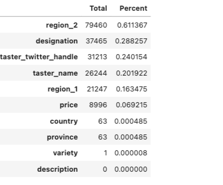
Missing Value Analysis
In this we figure out the missing values in the
df.isnull().sum()Output —
country                     63
description                  0
designation              37465
points                       0
price                     8996
province                    63
region_1                 21247
region_2                 79460
taster_name              26244
taster_twitter_handle    31213
title                        0
variety                      1
winery                       0
dtype: int64
One can also calculate the percentage of missing values out of the total.
p = (df.isnull().sum()/df.isnull().count()).sort_values(ascending=False)
t = df.isnull().sum().sort_values(ascending=False)
m_data = pd.concat([t, p], axis=1, keys=['Total', 'Percent'])
m_data.head(10)Output —
Unique Value Analysis
One can get the count of the unique values for each column in your data —
for i in list(df.columns):
    print("{} -> {}".format(i, df[i].value_counts().shape[0]))
Output —
country -> 43
description -> 119955
designation -> 37979
points -> 21
price -> 390
province -> 425
region_1 -> 1229
region_2 -> 17
taster_name -> 19
taster_twitter_handle -> 15
title -> 118840
variety -> 707
winery -> 16757
Summary Functions
In layman terms, Summary functions help you summarize the data.
- sum() : To compute the sum of a specific Column.
- min() : To compute minimum value of each Column
- max() : To compute maximum value of each Column
- std() : To compute Standard Deviation of each column
- var() : To Compute variance of each column
- describe() : To compute statistical summary
- count() : To count elements by elements.
- value_count() : To count value in column
- mean() : To Compute Mean of each column
- median() : Compute Median of each column
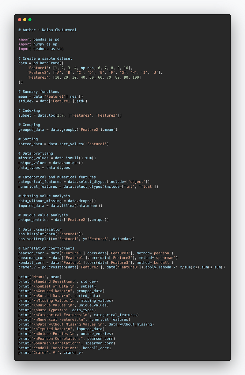
Implementation —
df.points.describe()Output —
count    129971.000000
mean         88.447138
std           3.039730
min          80.000000
25%          86.000000
50%          88.000000
75%          91.000000
max         100.000000
Name: points, dtype: float64df.taster_name.describe()Output —
count         103727
unique            19
top       Roger Voss
freq           25514
Name: taster_name, dtype: objectdf.taster_name.unique()Output —
array(['Kerin O’Keefe', 'Roger Voss', 'Paul Gregutt',
       'Alexander Peartree', 'Michael Schachner', 'Anna Lee C. Iijima',
       'Virginie Boone', 'Matt Kettmann', nan, 'Sean P. Sullivan',
       'Jim Gordon', 'Joe Czerwinski', 'Anne Krebiehl\xa0MW',
       'Lauren Buzzeo', 'Mike DeSimone', 'Jeff Jenssen',
       'Susan Kostrzewa', 'Carrie Dykes', 'Fiona Adams',
'Christina Pickard'], dtype=object)df.taster_name.value_counts()Output —
Roger Voss            25514
Michael Schachner     15134
Kerin O’Keefe         10776
Virginie Boone         9537
Paul Gregutt           9532
Matt Kettmann          6332
Joe Czerwinski         5147
Sean P. Sullivan       4966
Anna Lee C. Iijima     4415
Jim Gordon             4177
Anne Krebiehl MW       3685
Lauren Buzzeo          1835
Susan Kostrzewa        1085
Mike DeSimone           514
Jeff Jenssen            491
Alexander Peartree      415
Carrie Dykes            139
Fiona Adams              27
Christina Pickard         6
Name: taster_name, dtype: int64
Indexing
# Set Index

df.set_index("title")
Output —
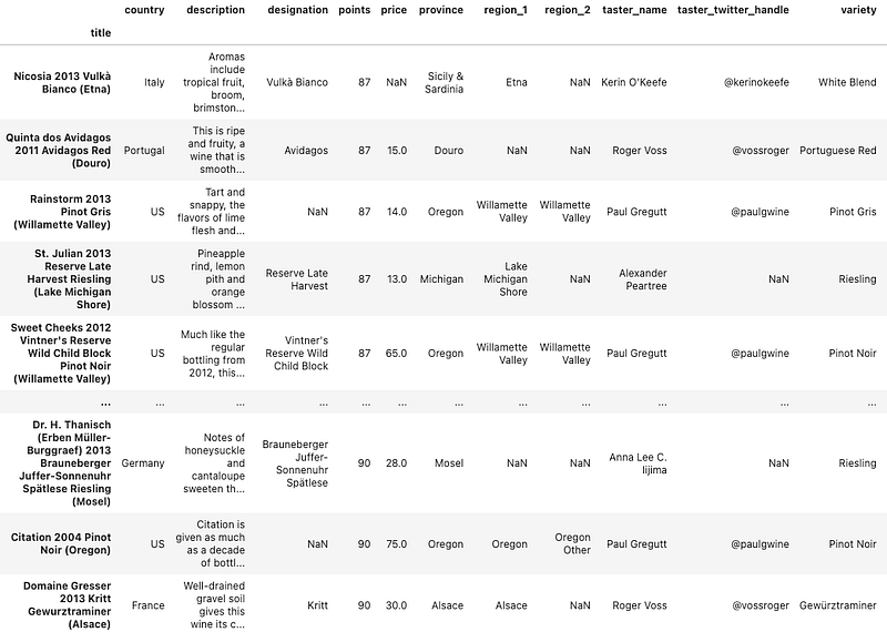
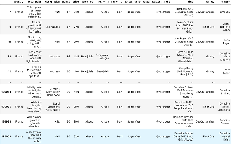
df.loc[(df.country == 'France') & (df.points >= 70)]Output —
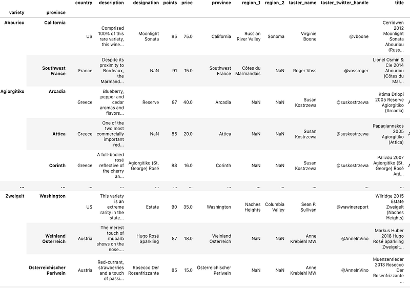
Group by and Sorting
- Split Object
- Applying group by Function
Using Group by you can group by the different features/columns and simultaneously sort the values in ascending and descending order.
df.groupby(['variety', 'province']).apply(lambda df: df.loc[df.points.idxmax()])Output —
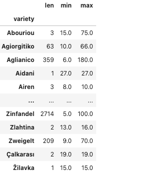
df.groupby(['variety']).price.agg([len, min, max])Output —
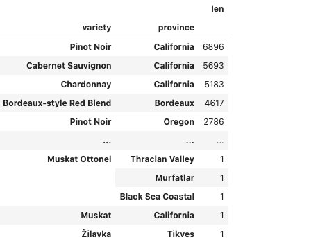
variety_p = df.groupby(['variety', 'province']).description.agg([len])
variety_p
Output —
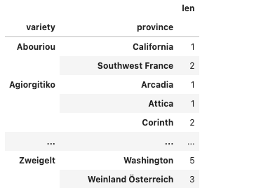
variety_p.sort_values(by='len', ascending=False)Output —
Data Viz
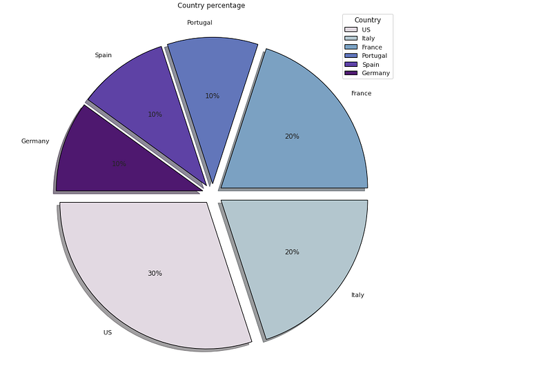
# Country Percentage

df['cntry'] = df['country'].head(10)

plt.figure(figsize=(25,12))
p_r = df['cntry'].value_counts().head(10)
plt.pie(x=p_r,labels=p_r.index,colors=colors1,autopct='%.0f%%',explode=[0.07 for i in p_r.index],startangle=180,wedgeprops={'linewidth':1,'edgecolor':'black'},shadow=True)
plt.title('Country percentage ')
plt.legend(loc='upper right',title='Country')


plt.show()
Output —
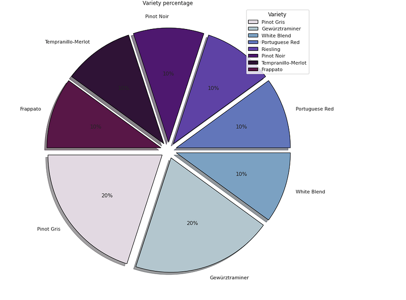
# Variety Percentage

df['vtr'] = df['variety'].head(10)

plt.figure(figsize=(25,12))
p_r = df['vtr'].value_counts().head(10)
plt.pie(x=p_r,labels=p_r.index,colors=colors1,autopct='%.0f%%',explode=[0.07 for i in p_r.index],startangle=180,wedgeprops={'linewidth':1,'edgecolor':'black'},shadow=True)
plt.title('Variety percentage ')
plt.legend(loc='upper right',title='Variety')


plt.show()
Output —
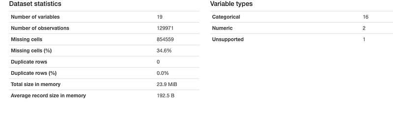
Data Profiling
It is used to generate profile reports from the input data.
The statistics include
Descriptive Statistics and Quantile Statistics.
Descriptive stats — Standard deviation, Kurtosis, mean, skewness, variance etc
Quantile Statistics — Min-max, percentiles, median, IQR etc
df.profile_report()Output —
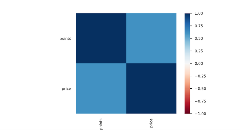
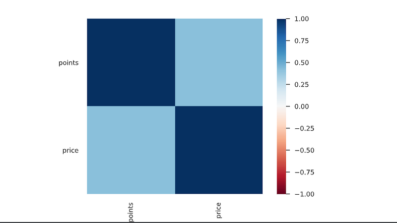
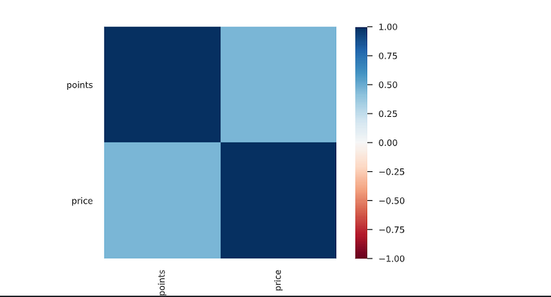
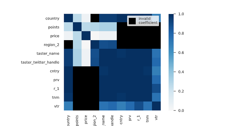
Correlation Coefficients
It’s the measure of the strength of the relationship between two variables.
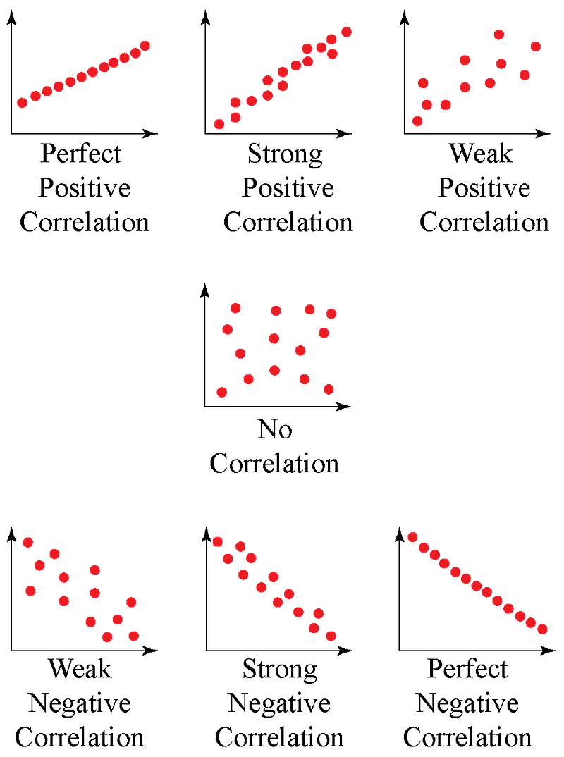
Spearman’s ρ
The Spearman’s rank correlation coefficient (ρ) is a measure of monotonic correlation between two variables, and is therefore better in catching nonlinear monotonic correlations than Pearson’s r. It’s value lies between -1 and +1, -1 indicating total negative monotonic correlation, 0 indicating no monotonic correlation and 1 indicating total positive monotonic correlation.
To calculate ρ for two variables X and Y, one divides the covariance of the rank variables of X and Y by the product of their standard deviations.
Pearson’s r
The Pearson’s correlation coefficient (r) is a measure of linear correlation between two variables. It’s value lies between -1 and +1, -1 indicating total negative linear correlation, 0 indicating no linear correlation and 1 indicating total positive linear correlation. Furthermore, r is invariant under separate changes in location and scale of the two variables, implying that for a linear function the angle to the x-axis does not affect r.
To calculate r for two variables X and Y, one divides the covariance of X and Y by the product of their standard deviations.
Kendall’s τ
Similarly to Spearman’s rank correlation coefficient, the Kendall rank correlation coefficient (τ) measures ordinal association between two variables. It’s value lies between -1 and +1, -1 indicating total negative correlation, 0 indicating no correlation and 1 indicating total positive correlation.
To calculate τ for two variables X and Y, one determines the number of concordant and discordant pairs of observations. τ is given by the number of concordant pairs minus the discordant pairs divided by the total number of pairs.
Cramér’s V (φc)
Cramér’s V is an association measure for nominal random variables. The coefficient ranges from 0 to 1, with 0 indicating independence and 1 indicating perfect association. The empirical estimators used for Cramér’s V have been proved to be biased, even for large samples.
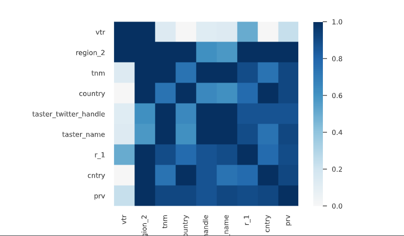
Phik (φk)
Phik (φk) is a new and practical correlation coefficient that works consistently between categorical, ordinal and interval variables, captures non-linear dependency and reverts to the Pearson correlation coefficient in case of a bivariate normal input distribution.
That’s it for now. Day 26 coming soon: Power BI.
Let me know if you have questions in the comment section below. Subscribe/ Follow, Like/Clap as it would encourage me to write more in my free time
Stay Tuned!!
Read More —
11 most important System Design Base Concepts
6. Networking, How Browsers work, Content Network Delivery ( CDN)
13. System Design Template — How to solve any System Design Question
System Design Case Studies — In Depth
Complete Data Structures and Algorithm Series
Some of the other best Series —
30 days of Data Structures and Algorithms and System Design Simplified
Data Science and Machine Learning Research ( papers) Simplified **
100 days : Your Data Science and Machine Learning Degree Series with projects
Complete Data Visualization and Pre-processing Series with projects
Exceptional Github Repos — Part 1
Exceptional Github Repos — Part 2
Tech Newsletter —
If you are interested, you can join my newsletter through which I send tech interview tips, techniques, patterns, hacks — Software Development, ML, Data Science, Startups and Technology projects to more than 30K readers. You can subscribe to Tech Brew :
For Python Projects —
For complete 60 days of Data Science and ML : Day 1 — Day 60 : Quick Recap of 60 days of Data Science and ML
Follow for more updates. Stay tuned and keep coding!
For other projects, tune to —
Build Machine Learning Pipelines( With Code)
Recurrent Neural Network with Keras
Clustering Geolocation Data in Python using DBSCAN and K-Means
Facial Expression Recognition using Keras
Hyperparameter Tuning with Keras Tuner
Custom Layers in Keras


