
Project 6 — Day 20 of 30 days of Data Analytics with Projects Series
Welcome back peep. Just came back from Thanksgiving holidays. Enjoyed so much! Hope you too enjoyed yours.
Anyways, this is Day 20 of 30 days of data analytics where we will be implementing a project — Part 1 covering —
1. Categorical and Numerical Features
2. Missing Value Analysis
3. Fill the missing Values
4. Unique Value Analysis
5. Univariate Analysis
6. Bivariate Analysis
7. Multivariate Analysis
8. Correlation Analysis
Let’s cover some of the concepts we would be using -
- Categorical and Numerical Features: In a dataset, there are two types of features, Categorical and Numerical. Categorical features are those which have a finite set of values, for example, Gender (Male, Female) and Nationality (India, USA, UK, etc). Numerical features are those which have continuous values, for example, Age and Salary.
- Missing Value Analysis: Missing values are the values that are not present in the dataset. Missing value analysis is the process of identifying and analyzing the missing values in the dataset. This helps in understanding the pattern of missing values and the percentage of missing values in each feature.
- Fill the Missing Values: After identifying the missing values, the next step is to fill them. There are several techniques to fill the missing values such as mean imputation, median imputation, and mode imputation. It is important to choose the right method based on the feature and the pattern of missing values.
- Unique Value Analysis: Unique value analysis is the process of identifying and analyzing the unique values in each feature. This helps in understanding the distribution of unique values in each feature and identifying any outliers.
- Univariate Analysis: Univariate analysis is the process of analyzing each feature individually. This helps in understanding the distribution of values in each feature and identifying any outliers. It also helps in identifying the skewness and the kurtosis of the distribution.
- Bivariate Analysis: Bivariate analysis is the process of analyzing the relationship between two features. This helps in understanding the relationship between the two features and identifying any patterns or trends.
- Multivariate Analysis: Multivariate analysis is the process of analyzing the relationship between three or more features. This helps in understanding the relationship between multiple features and identifying any patterns or trends.
- Correlation Analysis: Correlation analysis is the process of identifying the correlation between two or more features. This helps in understanding the relationship between the features and identifying any highly correlated features which can be removed to avoid multicollinearity.
- Outlier detection: is a way to identify and exclude extreme values, or outliers, from a dataset. This is important because outliers can have a significant impact on the results of statistical analyses and machine learning models.
- Standardization: is a technique used to scale data so that it has a mean of zero and a standard deviation of one. This is often done to make it easier to compare data from different sources or to improve the performance of machine learning models.
- Regression analysis: is a statistical technique used to examine the relationship between one or more independent variables and a dependent variable. It can be used to predict the value of the dependent variable based on the values of the independent variables.
- Feature engineering: is the process of creating new features from existing data to improve the performance of a model. This can include combining existing features, creating new features based on mathematical transformations of existing data, or using domain knowledge to create new features.
- Modeling: is the process of using statistical or machine learning techniques to create a model that can make predictions or decisions based on data. This can include training a model on historical data and using it to make predictions on new data, or using the model to classify new data into different categories.
Example Code Implementation —
import pandas as pd
import numpy as np
import seaborn as sns
import matplotlib.pyplot as plt
from sklearn.impute import SimpleImputer
from sklearn.preprocessing import StandardScaler
from sklearn.linear_model import LinearRegression
from sklearn.model_selection import train_test_split
from sklearn.metrics import r2_score

# Categorical and Numerical Features
data = pd.DataFrame({'Gender': ['Male', 'Female', 'Male', 'Female'],
                     'Nationality': ['India', 'USA', 'UK', 'India'],
                     'Age': [25, 30, 35, 40],
                     'Salary': [50000, 60000, np.nan, 80000]})
categorical_features = ['Gender', 'Nationality']
numerical_features = ['Age', 'Salary']

# Missing Value Analysis
missing_values_count = data.isnull().sum()
missing_values_percentage = (missing_values_count / len(data)) * 100
print("Missing Values Count:")
print(missing_values_count)
print("Missing Values Percentage:")
print(missing_values_percentage)

# Fill the Missing Values
imputer = SimpleImputer(strategy='mean')
data['Salary'] = imputer.fit_transform(data[['Salary']])

# Unique Value Analysis
unique_values_count = data.nunique()
print("Unique Values Count:")
print(unique_values_count)

# Univariate Analysis
sns.histplot(data['Age'])
plt.title('Distribution of Age')
plt.show()

# Bivariate Analysis
sns.boxplot(x='Gender', y='Salary', data=data)
plt.title('Salary by Gender')
plt.show()

# Multivariate Analysis
sns.scatterplot(x='Age', y='Salary', hue='Nationality', data=data)
plt.title('Age vs Salary by Nationality')
plt.show()

# Correlation Analysis
correlation_matrix = data[numerical_features].corr()
sns.heatmap(correlation_matrix, annot=True, cmap='coolwarm')
plt.title('Correlation Matrix')
plt.show()

# Outlier detection
sns.boxplot(x=data['Salary'])
plt.title('Outlier Detection for Salary')
plt.show()

# Standardization
scaler = StandardScaler()
data[numerical_features] = scaler.fit_transform(data[numerical_features])

# Regression Analysis
X = data[['Age']]
y = data['Salary']
X_train, X_test, y_train, y_test = train_test_split(X, y, test_size=0.2, random_state=42)
linear_model = LinearRegression()
linear_model.fit(X_train, y_train)
y_pred = linear_model.predict(X_test)
r2 = r2_score(y_test, y_pred)
print("R-squared Score:")
print(r2)

# Feature Engineering
data['Age_Squared'] = data['Age']**2
data['Age_Salary_Ratio'] = data['Age'] / data['Salary']

# Modeling
X = data[['Age', 'Age_Squared']]
y = data['Salary']
X_train, X_test, y_train, y_test = train_test_split(X, y, test_size=0.2, random_state=42)
linear_model = LinearRegression()
linear_model.fit(X_train, y_train)
y_pred = linear_model.predict(X_test)
r2 = r2_score(y_test, y_pred)
print("R-squared Score after Feature Engineering:")
print(r2)
In the Part 2, we will cover —
Outlier Detection
Standardization
Regression Analysis
Feature Engineering
Modeling
What’s covered in 30 days of Data Analytics Series till now —
Day 1 : Data Analytics basics and kickstart of Data analytics with projects series
Day 3 : Data Analytics Ecosystem — Data Life Cycle, Data Analysis complete process ( most important things)
Day 5 : Statistics
Day 6 : Basic and Advanced SQL
Day 8 : Pandas and Numpy
Day 9 : Data Manipulation
Day 10 : Data Visualization — Part 1
Day 11 : Project 1 : Data Visualization — Part 2
Day 12 : Data Visualization — Part 3
Day 13: Tableau — Part 1
Day 14: Tableau — Part 2
Day 15: Tableau — Part 3
Day 16 : Data Analysis Project 2
Day 17 : Data Analysis Project 3
Day 18: Data Analysis Project 4
Day 20 : Data Analysis Project 6 — Part 1
Take Complete Hands On Tableau Course : Link
Projects Videos —
All the projects, data structures, SQL, algorithms, system design, Data Science and ML , Data Analytics, Data Engineering, , Implemented Data Science and ML projects, Implemented Data Engineering Projects, Implemented Deep Learning Projects, Implemented Machine Learning Ops Projects, Implemented Time Series Analysis and Forecasting Projects, Implemented Applied Machine Learning Projects, Implemented Tensorflow and Keras Projects, Implemented PyTorch Projects, Implemented Scikit Learn Projects, Implemented Big Data Projects, Implemented Cloud Machine Learning Projects, Implemented Neural Networks Projects, Implemented OpenCV Projects,Complete ML Research Papers Summarized, Implemented Data Analytics projects, Implemented Data Visualization Projects, Implemented Data Mining Projects, Implemented Natural Leaning Processing Projects, MLOps and Deep Learning, Applied Machine Learning with Projects Series, PyTorch with Projects Series, Tensorflow and Keras with Projects Series, Scikit Learn Series with Projects, Time Series Analysis and Forecasting with Projects Series, ML System Design Case Studies Series videos will be published on our youtube channel ( just launched).
Subscribe today!
Tech Newsletter —
If you are interested, you can join my newsletter through which I send tech interview tips, techniques, patterns, hacks — Software Development, ML, Data Science, Startups and Technology projects to more than 30K readers. You can subscribe to Tech Brew :
In the last post we covered Data Visualization and in this post we will cover a project.
Before starting, go through this post to understand which chart to use and when.
(Note : Zoom all the images)
Import Necessary Libraries
import numpy as np # linear algebra
import pandas as pd # data processing, CSV file I/O (e.g. pd.read_csv)
import seaborn as sns
from matplotlib import pyplot as plt
import numpy as np
from matplotlib.colors import rgb2hex
import matplotlib.cm as cm
import plotly.express as px
import plotly.graph_objects as go
import squarify
from plotly.offline import init_notebook_mode,iplot

import matplotlib.colors
from collections import Counter
cmap2 = cm.get_cmap('twilight',13)
colors1= []
for i in range(cmap2.N):
    rgb= cmap2(i)[:4]
    colors1.append(rgb2hex(rgb))

# Set style
sns.set(style='whitegrid')
Load the data
df_train= pd.read_csv('/Path to File/train.csv', low_memory = False)Get information about your data
df_train.info()Output —
<class 'pandas.core.frame.DataFrame'>
RangeIndex: 891 entries, 0 to 890
Data columns (total 12 columns):
 #   Column       Non-Null Count  Dtype
---  ------       --------------  -----
 0   PassengerId  891 non-null    int64
 1   Survived     891 non-null    int64
 2   Pclass       891 non-null    int64
 3   Name         891 non-null    object
 4   Sex          891 non-null    object
 5   Age          714 non-null    float64
 6   SibSp        891 non-null    int64
 7   Parch        891 non-null    int64
 8   Ticket       891 non-null    object
 9   Fare         891 non-null    float64
 10  Cabin        204 non-null    object
 11  Embarked     889 non-null    object
dtypes: float64(2), int64(5), object(5)
memory usage: 83.7+ KB
# Get Columns information
df_train.columnsOutput —
Index(['PassengerId', 'Survived', 'Pclass', 'Name', 'Sex', 'Age', 'SibSp',
       'Parch', 'Ticket', 'Fare', 'Cabin', 'Embarked'],
      dtype='object')
Data Description
PassengerId: Unique id number for each passenger
Pclass: Class of the Passenger
Name: Name of the Passenger
Sex: Gender of the Passenger
Ticket: Ticket number
Fare: Ticket Price
Cabin: Cabin category
Survived: Passenger survive(1) or Died(0)
Embarked: Port from where the passenger embarked (C = Cherbourg, Q = Queenstown, S = Southampton)
Age: Age of the Passenger
SibSp: No of siblings/spouses
Parch: No of parents/children
Statistical Summary of the data
df_train.describe()Categorical and Numerical Features
Categorical features are those values that be sorted into groups or categories.
Numerical Features are those values taht can be measures (can be places in ascending or descending order)
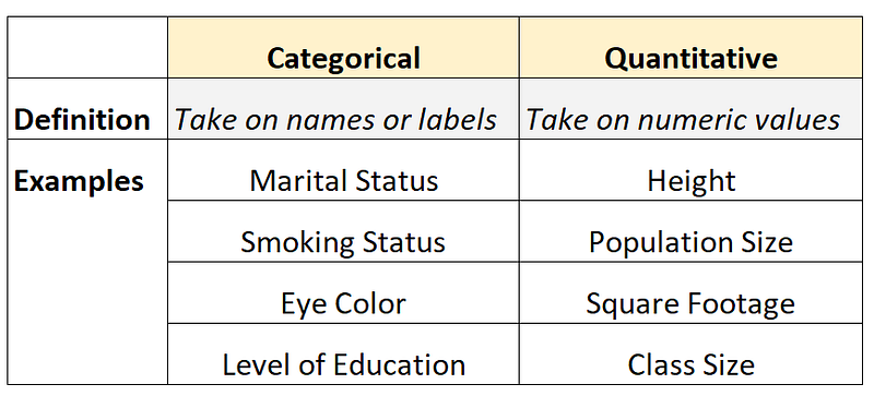
For this, lets get the Categorical and Numerical Features —
df_train.info()Output —
<class 'pandas.core.frame.DataFrame'>
RangeIndex: 891 entries, 0 to 890
Data columns (total 12 columns):
 #   Column       Non-Null Count  Dtype
---  ------       --------------  -----
 0   PassengerId  891 non-null    int64
 1   Survived     891 non-null    int64
 2   Pclass       891 non-null    int64
 3   Name         891 non-null    object
 4   Sex          891 non-null    object
 5   Age          714 non-null    float64
 6   SibSp        891 non-null    int64
 7   Parch        891 non-null    int64
 8   Ticket       891 non-null    object
 9   Fare         891 non-null    float64
 10  Cabin        204 non-null    object
 11  Embarked     889 non-null    object
dtypes: float64(2), int64(5), object(5)
memory usage: 83.7+ KB
You can see , in our dataset—
Categorical Features are Name, Ticket, Sibsp, Parch,Survived, Sex, Pclass, Embarked, Cabin
Numerical Variable are Fare, Age and passengerId
Missing Value Analysis
In this we figure out the missing values in the
df_train.isnull().sum()Output —
PassengerId 0
Survived 0
Pclass 0
Name 0
Sex 0
Age 177
SibSp 0
Parch 0
Ticket 0
Fare 0
Cabin 687
Embarked 2
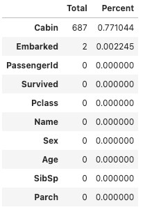
dtype: int64So Age, Cabin and Embarked has missing values.
One can also calculate the percentage of missing values out of the total.
p = (df_train.isnull().sum()/df_train.isnull().count()).sort_values(ascending=False)
t = df_train.isnull().sum().sort_values(ascending=False)

m_data = pd.concat([t, p], keys=['Total', 'Percent'],axis=1 )
m_data.head(10)
Output —
Fill the missing Values
Once the missing values in the data are identified, we can fill those missing values using mead, std etc
df_train['Age'] = df_train['Age'].fillna(np.mean(df_train['Age']))
df_train.isnull().sum()
Output —
PassengerId      0
Survived         0
Pclass           0
Name             0
Sex              0
Age              0
SibSp            0
Parch            0
Ticket           0
Fare             0
Cabin          687
Embarked         2
dtype: int64
Unique Value Analysis
One can get the count of the unique values for each column in your data —
for i in list(df_train.columns):
    print("{} -> {}".format(i, df_train[i].value_counts().shape[0]))
Output —
PassengerId -> 891
Survived -> 2
Pclass -> 3
Name -> 891
Sex -> 2
Age -> 89
SibSp -> 7
Parch -> 7
Ticket -> 681
Fare -> 248
Cabin -> 147
Embarked -> 3
Univariate Analysis
In Univariate Analysis, single variable/feature is analyzed at a time.
First we will start with Categorical Features in our data and then Numerical Features.
Categorical Features Univariate Analysis
# Survived Passengers Count

plt.figure(figsize=(10,8))
sns.countplot(x='Survived',data=df_train,palette='mako',order = df_train['Survived'].value_counts().index)
plt.xlabel('Survived Passengers')
plt.xticks(rotation = 60)
plt.ylabel('Count')
plt.legend()
#plt.title('Survived Passengers')

plt.show()
Output —
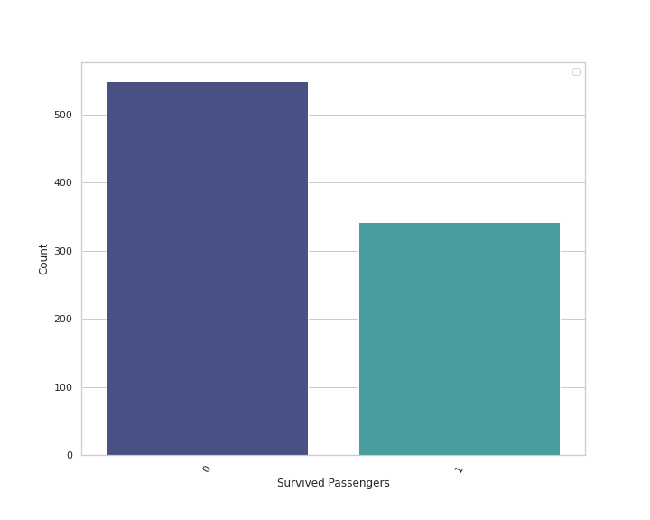
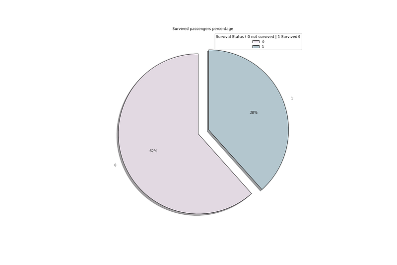
df_train.Survived.value_counts()Output —
0    549
1    342
Name: Survived, dtype: int64
# Sex of the passengers
plt.figure(figsize=(10,8))
sns.countplot(x='Sex',data=df_train,palette='mako',order = df_train['Sex'].value_counts().index)
plt.xlabel('Sex of the Passengers')
plt.xticks(rotation = 60)
plt.ylabel('Count')
plt.legend()
plt.show()Output —
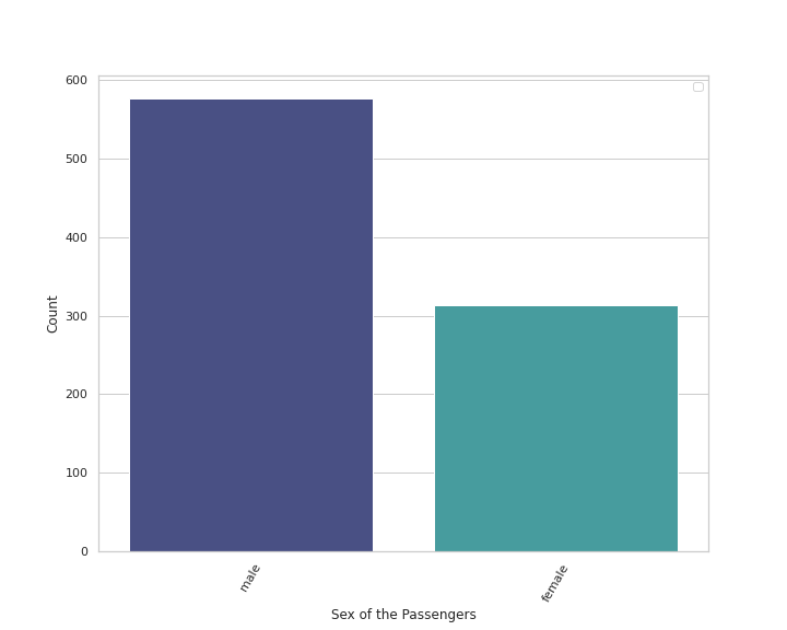
df_train.Sex.value_counts()Output —
male      577
female    314
Name: Sex, dtype: int64
# Passenger Class Count
plt.figure(figsize=(10,8))
sns.countplot(x='Pclass',data=df_train,palette='mako',order = df_train['Pclass'].value_counts().index)
plt.xlabel('Passenger Class')
plt.xticks(rotation = 60)
plt.ylabel('Count')
plt.legend()
plt.show()Output —
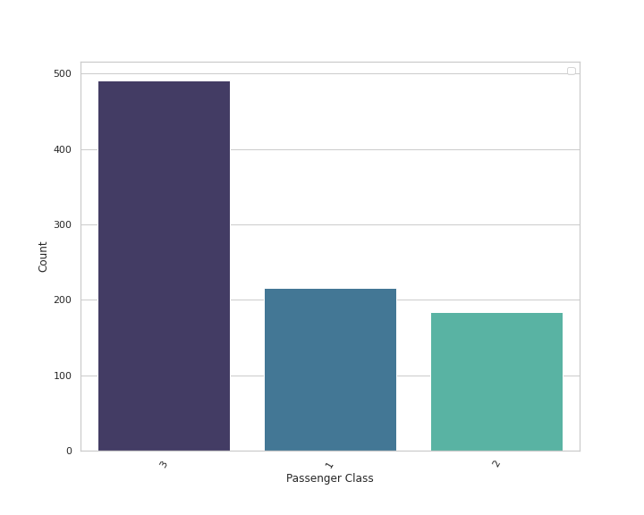
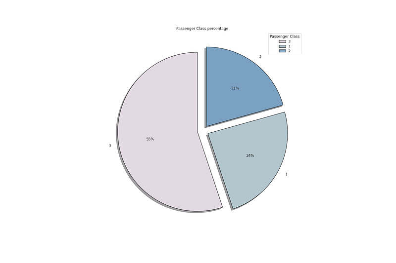
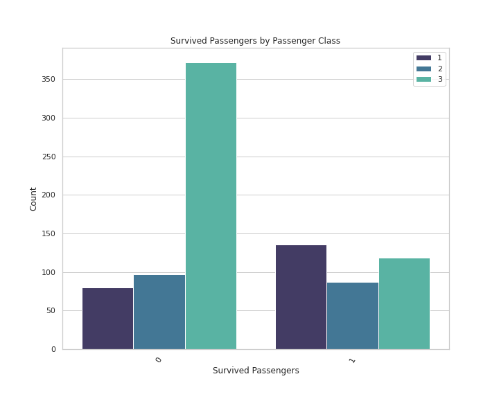
df_train.Pclass.value_counts()Output —
3    491
1    216
2    184
Name: Pclass, dtype: int64
# Embarked passenger port
plt.figure(figsize=(10,8))
sns.countplot(x='Embarked',data=df_train,palette='mako',order = df_train['Embarked'].value_counts().index)
plt.xlabel('Embarked passenger Count')
plt.xticks(rotation = 60)
plt.ylabel('Count')
plt.legend()
plt.show()Output —
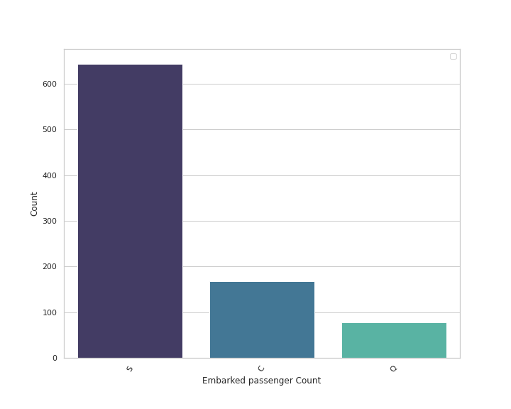
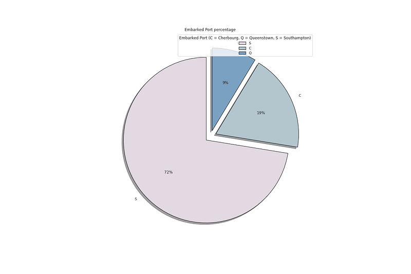
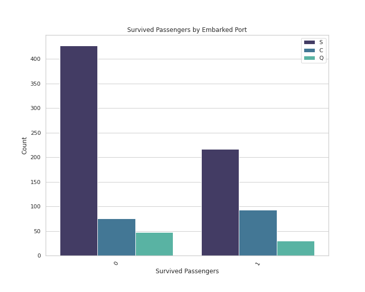
df_train.Embarked.value_counts()Output —
S    644
C    168
Q     77
Name: Embarked, dtype: int64
# Siblings/Spouses Count
plt.figure(figsize=(10,8))
sns.countplot(x='SibSp',data=df_train,palette='mako',order = df_train['SibSp'].value_counts().index)
plt.xlabel('Siblings/Spouses')
plt.xticks(rotation = 60)
plt.ylabel('Count')
plt.legend()
plt.show()Output —
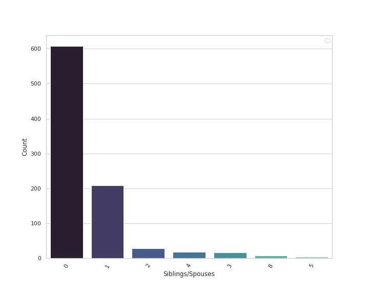
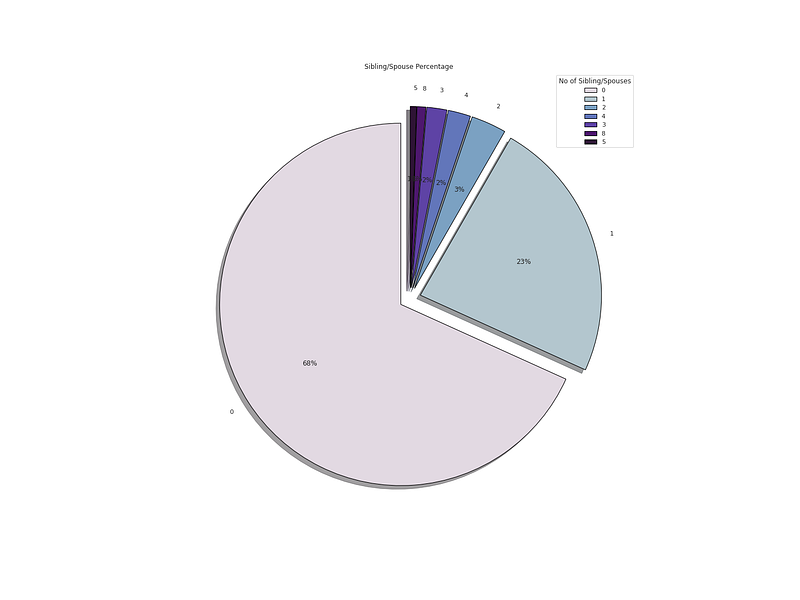
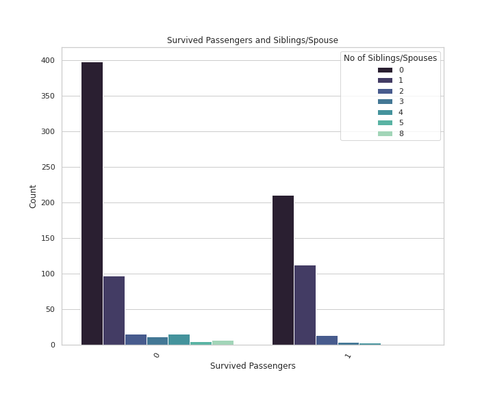
df_train.SibSp.value_counts()Output —
0    608
1    209
2     28
4     18
3     16
8      7
5      5
Name: SibSp, dtype: int64
# No of Parents/Children
plt.figure(figsize=(10,8))
sns.countplot(x='Parch',data=df_train,palette='mako',order = df_train['Parch'].value_counts().index)
plt.xlabel('Parents/Children')
plt.xticks(rotation = 60)
plt.ylabel('Count')
plt.legend()
plt.show()Output —
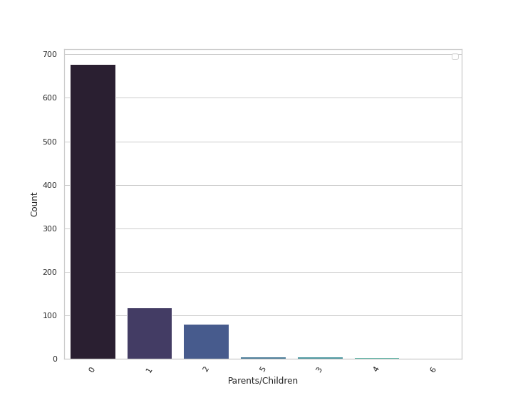
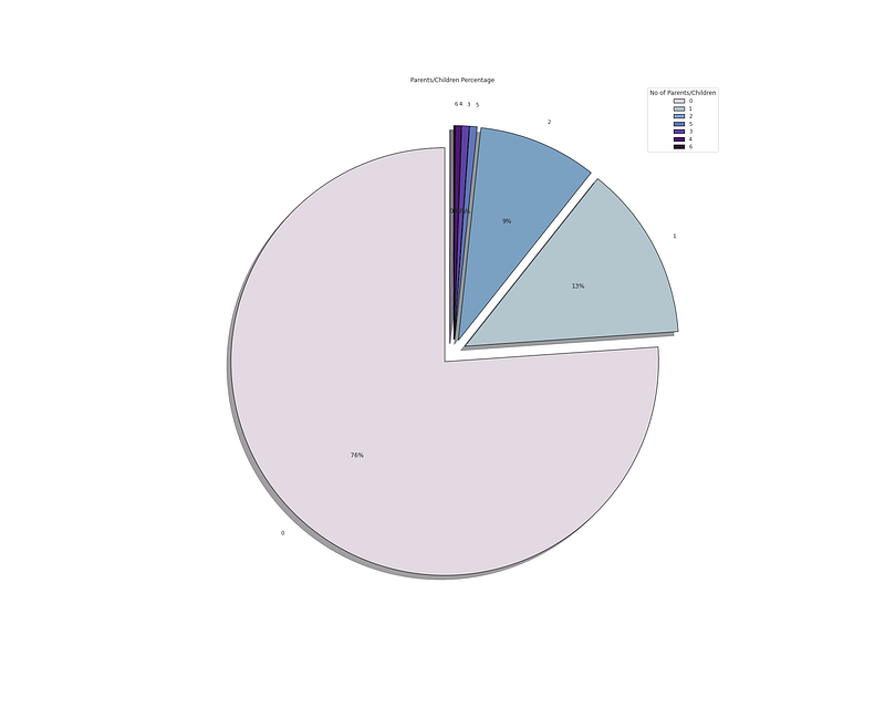
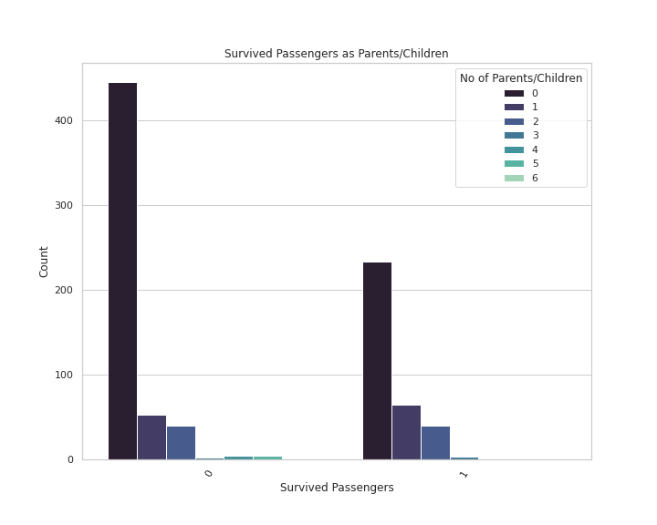
df_train.Parch.value_counts()Output —
0    678
1    118
2     80
5      5
3      5
4      4
6      1
Name: Parch, dtype: int64
# Survived Passengers Percentage
plt.figure(figsize=(18,12))
p_r = df_train['Survived'].value_counts().head(10)
plt.pie(x=p_r,labels=p_r.index,colors=colors1,autopct='%.0f%%',explode=[0.07 for i in p_r.index],startangle=90,wedgeprops={'linewidth':1,'edgecolor':'black'},shadow=True)
plt.title('Survived passengers percentage ')
plt.legend(loc='upper right',title='Survival Status ( 0 not survived | 1 Survived))')
plt.show(Output —
# Embarked Port Percentage

plt.figure(figsize=(18,12))
p_r = df_train['Embarked'].value_counts().head(10)
plt.pie(x=p_r,labels=p_r.index,colors=colors1,autopct='%.0f%%',explode=[0.07 for i in p_r.index],startangle=90,wedgeprops={'linewidth':1,'edgecolor':'black'},shadow=True)
plt.title('Embarked Port percentage ')
plt.legend(loc='upper right',title='Embarked Port (C = Cherbourg, Q = Queenstown, S = Southampton)')


plt.show()
Output —
# Passenger Class Percentage

plt.figure(figsize=(18,12))
p_r = df_train['Pclass'].value_counts().head(10)
plt.pie(x=p_r,labels=p_r.index,colors=colors1,autopct='%.0f%%',explode=[0.07 for i in p_r.index],startangle=90,wedgeprops={'linewidth':1,'edgecolor':'black'},shadow=True)
plt.title('Passenger Class percentage ')
plt.legend(loc='upper right',title='Passenger Class')


plt.show()
Output —
# Sibling/Spouse Percentage

plt.figure(figsize=(20,15))
p_r = df_train['SibSp'].value_counts().head(10)
plt.pie(x=p_r,labels=p_r.index,colors=colors1,autopct='%.0f%%',explode=[0.06 for i in p_r.index],startangle=90,wedgeprops={'linewidth':1,'edgecolor':'black'},shadow=True)
plt.title('Sibling/Spouse Percentage ')
plt.legend(loc='upper right',title='No of Sibling/Spouses')


plt.show()
Output —
# Parents/Children Percentage

plt.figure(figsize=(25,20))
p_r = df_train['Parch'].value_counts().head(10)
plt.pie(x=p_r,labels=p_r.index,colors=colors1,autopct='%.0f%%',explode=[0.06 for i in p_r.index],startangle=90,wedgeprops={'linewidth':1,'edgecolor':'black'},shadow=True)
plt.title('Parents/Children Percentage ')
plt.legend(loc='upper right',title='No of Parents/Children')


plt.show()
Output —
Numerical Variable: Fare, age and passengerId
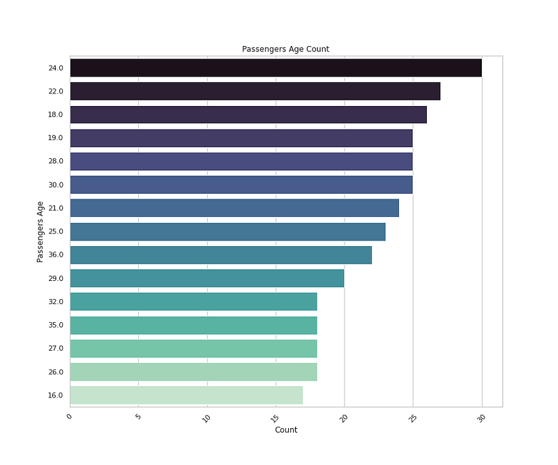
# Passengers Age Count
plt.figure(figsize=(12,10))
sns.countplot(y='Age',data=df_train,palette='mako',order=df_train['Age'].value_counts().index[0:15],orient= 'h')
plt.title('Passengers Age Count')
plt.xlabel('Count')
plt.ylabel('Passengers Age')
plt.xticks(rotation=45)


plt.show()
Output —
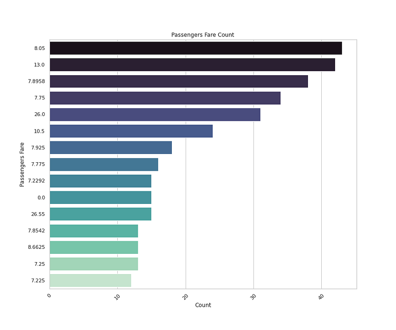
# Passengers Fare Count

plt.figure(figsize=(12,10))
sns.countplot(y='Fare',data=df_train,palette='mako',order=df_train['Fare'].value_counts().index[0:15],orient= 'h')
plt.title('Passengers Fare Count')
plt.xlabel('Count')
plt.ylabel('Passengers Fare')
plt.xticks(rotation=45)


plt.show()
Output —
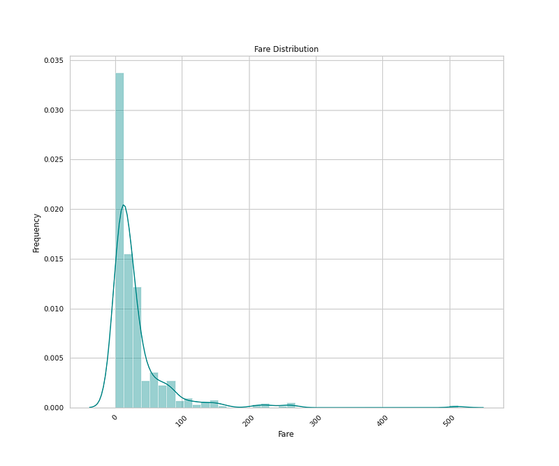
#Fare Distribution

plt.figure(figsize=(12,10))
sns.distplot(x=df_train['Fare'],bins=40,color='darkcyan',kde=True,hist=True)
plt.title('Fare Distribution')
plt.xlabel('Fare')
plt.ylabel('Frequency')
plt.xticks(rotation=45)


plt.show()
Output —
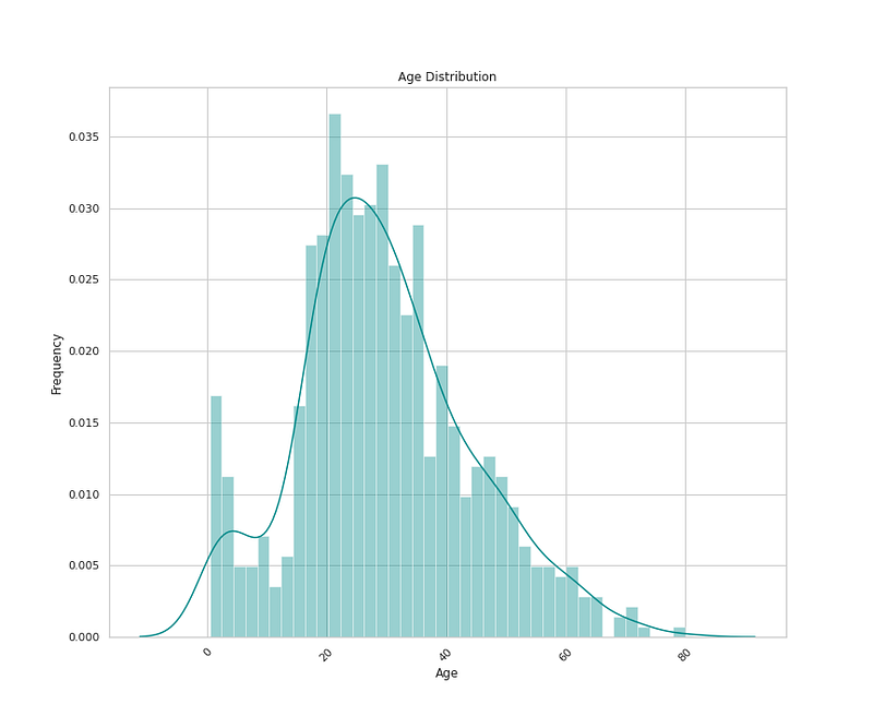
#Age Distribution


plt.figure(figsize=(12,10))
sns.distplot(x=df_train['Age'],bins=40,color='darkcyan',hist=True,kde=True)
plt.title('Age Distribution')
plt.xlabel('Age')
plt.ylabel('Frequency')
plt.xticks(rotation=45)


plt.show()
Output —
Bivariate Analysis
In Bivariate Analysis, two variables/features are analyzed together and the relationship/association between them is studied.
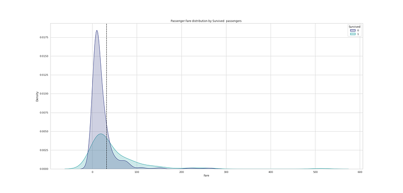
# Passenger Fare distribution by Survived  passengers

plt.figure(figsize=(25,12))
sns.kdeplot(df_train["Fare"], hue=df_train["Survived"], fill=True, linewidth=1.5, palette='mako')
plt.axvline(df_train['Fare'].mean(), c='black',ls='--')
plt.title("Passenger Fare distribution by Survived  passengers ")

plt.show()
Output —
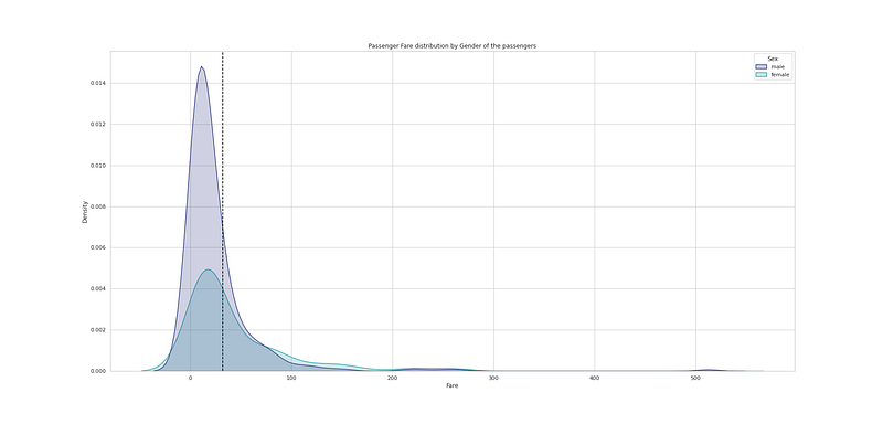
# Passenger Fare distribution by Gender of the passengers

plt.figure(figsize=(25,12))
sns.kdeplot(df_train["Fare"], hue=df_train["Sex"], fill=True, linewidth=1.5, palette='mako')
plt.axvline(df_train['Fare'].mean(), c='black',ls='--')
plt.title("Passenger Fare distribution by Gender of the passengers")

plt.show()
Output —
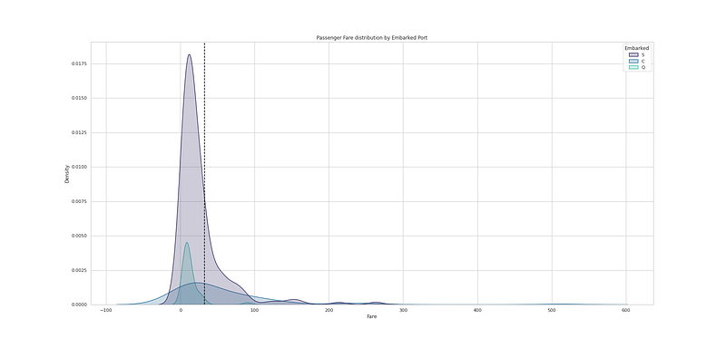
# Passenger Fare distribution by Embarked Port

plt.figure(figsize=(25,12))
sns.kdeplot(df_train["Fare"], hue=df_train["Embarked"], fill=True, linewidth=1.5, palette='mako')
plt.axvline(df_train['Fare'].mean(), c='black',ls='--')
plt.title("Passenger Fare distribution by Embarked Port")

plt.show()
Output —
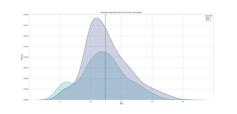
# Passenger Age distribution by Survived  passengers

plt.figure(figsize=(25,12))
sns.kdeplot(df_train["Age"], hue=df_train["Survived"], fill=True, linewidth=1.5, palette='mako')
plt.axvline(df_train['Age'].mean(), c='black',ls='--')
plt.title("Passenger Age distribution by Survived  passengers ")

plt.show()
Output —
# Passenger Age distribution by Sex of the passengers

plt.figure(figsize=(25,12))
sns.kdeplot(df_train["Age"], hue=df_train["Sex"], fill=True, linewidth=1.5, palette='mako')
plt.axvline(df_train['Age'].mean(), c='black',ls='--')
plt.title("Passenger Age distribution by Sex of the passengers ")

plt.show()
Output —

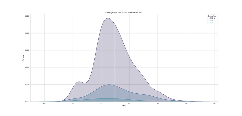
# Passenger Age distribution by Embarked Port

plt.figure(figsize=(25,12))
sns.kdeplot(df_train["Age"], hue=df_train["Embarked"], fill=True, linewidth=1.5, palette='mako')
plt.axvline(df_train['Age'].mean(), c='black',ls='--')
plt.title("Passenger Age distribution by Embarked Port ")

plt.show()
Output —
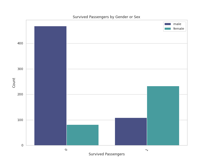
# Survived Passengers by Gender or Sex

plt.figure(figsize=(10,8))
sns.countplot(x='Survived',data=df_train,palette='mako',order = df_train['Survived'].value_counts().index, hue = 'Sex')
plt.xlabel('Survived Passengers')
plt.xticks(rotation = 60)
plt.ylabel('Count')
plt.legend()
plt.title('Survived Passengers by Gender or Sex')

plt.show()
Output —
# Survived Passengers by Embarked Port

plt.figure(figsize=(10,8))
sns.countplot(x='Survived',data=df_train,palette='mako',order = df_train['Survived'].value_counts().index, hue = 'Embarked')
plt.xlabel('Survived Passengers')
plt.xticks(rotation = 60)
plt.ylabel('Count')
plt.legend()
plt.title('Survived Passengers by Embarked Port')

plt.show()
Output —
# Survived Passengers by Passenger Class

plt.figure(figsize=(10,8))
sns.countplot(x='Survived',data=df_train,palette='mako',order = df_train['Survived'].value_counts().index, hue = 'Pclass')
plt.xlabel('Survived Passengers')
plt.xticks(rotation = 60)
plt.ylabel('Count')
plt.legend()
plt.title('Survived Passengers by Passenger Class')


plt.show()
Output —
# Survived Passengers and Siblings/Spouse

plt.figure(figsize=(10,8))
sns.countplot(x='Survived',data=df_train,palette='mako',order = df_train['Survived'].value_counts().index, hue = 'SibSp')
plt.xlabel('Survived Passengers')
plt.xticks(rotation = 60)
plt.ylabel('Count')
plt.legend(loc="upper right",title="No of Siblings/Spouses")
plt.title('Survived Passengers and Siblings/Spouse')


plt.show()
Output —
# Survived Passengers as Parents/Children

plt.figure(figsize=(10,8))
sns.countplot(x='Survived',data=df_train,palette='mako',order = df_train['Survived'].value_counts().index, hue = 'Parch')
plt.xlabel('Survived Passengers')
plt.xticks(rotation = 60)
plt.ylabel('Count')
plt.legend(loc="upper right",title="No of Parents/Children")
plt.title('Survived Passengers as Parents/Children')


plt.show()
Output —
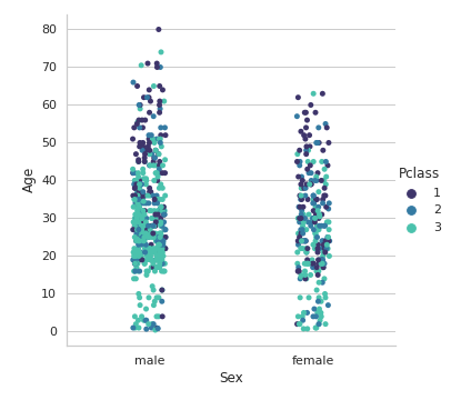
#Passengers Age by Sex and Passenger Class

plt.figure(figsize=(20,10))
sns.catplot(x = "Sex", y = "Age", hue = "Pclass",data = df_train,palette='mako',orient='v')


plt.show()
Output —
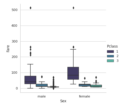
#Passengers Fare by Sex and Pclass

plt.figure(figsize=(20,10))
sns.catplot(x = "Sex", y = "Fare", hue = "Pclass",data = df_train,palette='mako',orient='v',kind='box')


plt.show()
Output —
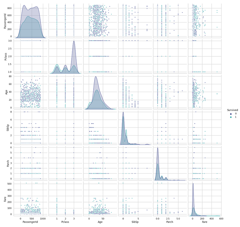
Multivariate Analysis
In Multivariate Analysis, more than two variables/features are analyzed together and the relationship/association between them is studied.
plt.figure(figsize=(25,20))
sns.pairplot(df_train, diag_kind = "kde",palette='mako',hue="Survived",markers='*')


plt.show()
Output —
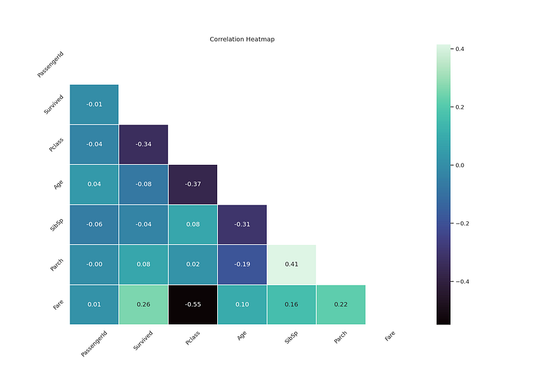
Correlation Analysis
In order to measure the strength of the linear association/relation between two variable, Correlation Analysis is used.
# heatmap correlation

corrmat = df_train.corr()
f, ax = plt.subplots(figsize=(15, 10))
sns.heatmap(corrmat, vmax=.8, square=True,annot=True,fmt=".2f",cmap='mako')


plt.show()
Output —
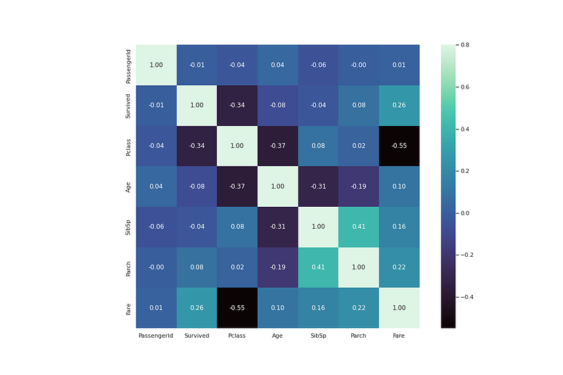
#np.triue : It gives the upper triangle of the array

plt.figure(dpi = 150,figsize= (15,10))
mask = np.triu(np.ones_like(df_train.corr(),dtype = bool))
sns.heatmap(df_train.corr(),mask = mask, fmt = ".2f",annot=True,lw=1,cmap = 'mako')
plt.yticks(rotation = 45)
plt.xticks(rotation = 45)

plt.title('Correlation Heatmap')

plt.show()
Output —
That’s it for now. Day 21 coming soon: Data Analysis : Project 6 — Part 2.
Let me know if you have questions in the comment section below. Subscribe/ Follow, Like/Clap as it would encourage me to write more in my free time
Stay Tuned!!
Read More —
11 most important System Design Base Concepts
6. Networking, How Browsers work, Content Network Delivery ( CDN)
13. System Design Template — How to solve any System Design Question
System Design Case Studies — In Depth
Complete Data Structures and Algorithm Series
Some of the other best Series —
30 days of Data Structures and Algorithms and System Design Simplified
Data Science and Machine Learning Research ( papers) Simplified **
100 days : Your Data Science and Machine Learning Degree Series with projects
Complete Data Visualization and Pre-processing Series with projects
Exceptional Github Repos — Part 1
Exceptional Github Repos — Part 2
Tech Newsletter —
If you are interested, you can join my newsletter through which I send tech interview tips, techniques, patterns, hacks — Software Development, ML, Data Science, Startups and Technology projects to more than 30K readers. You can subscribe to Tech Brew :
For Python Projects —
For complete 60 days of Data Science and ML : Day 1 — Day 60 : Quick Recap of 60 days of Data Science and ML
Follow for more updates. Stay tuned and keep coding!
For other projects, tune to —
Build Machine Learning Pipelines( With Code)
Recurrent Neural Network with Keras
Clustering Geolocation Data in Python using DBSCAN and K-Means
Facial Expression Recognition using Keras
Hyperparameter Tuning with Keras Tuner
Custom Layers in Keras


