
Day 11 of 30 days of Data Analytics with Projects Series
Welcome back peeps. This is Day 11 of 30 days of data analytics.
What’s covered in the Data Analytics Series till now —
Day 1 : Data Analytics basics and kickstart of Data analytics with projects series
Day 3 : Data Analytics Ecosystem — Data Life Cycle, Data Analysis complete process ( most important things)
Day 5 : Statistics
Day 6 : Basic and Advanced SQL
Day 8 : Pandas and Numpy
Day 9 : Data Manipulation
Day 10 : Data Visualization — Part 1
Day 11 : Data Visualization — Part 2
In the last post we covered —
Data Visualization — Part 1
In this post we will cover data visualization — part 2 as follows —
Data Visualization — Part 2
Data Visualization using Matplotlib and Seaborn with project
Data Visualization — Part 3
Data Visualization using Plotly
Data Visualization using Bokeh
Projects Videos —
All the projects, data structures, SQL, algorithms, system design, Data Science and ML , Data Analytics, Data Engineering, , Implemented Data Science and ML projects, Implemented Data Engineering Projects, Implemented Deep Learning Projects, Implemented Machine Learning Ops Projects, Implemented Time Series Analysis and Forecasting Projects, Implemented Applied Machine Learning Projects, Implemented Tensorflow and Keras Projects, Implemented PyTorch Projects, Implemented Scikit Learn Projects, Implemented Big Data Projects, Implemented Cloud Machine Learning Projects, Implemented Neural Networks Projects, Implemented OpenCV Projects,Complete ML Research Papers Summarized, Implemented Data Analytics projects, Implemented Data Visualization Projects, Implemented Data Mining Projects, Implemented Natural Leaning Processing Projects, MLOps and Deep Learning, Applied Machine Learning with Projects Series, PyTorch with Projects Series, Tensorflow and Keras with Projects Series, Scikit Learn Series with Projects, Time Series Analysis and Forecasting with Projects Series, ML System Design Case Studies Series videos will be published on our youtube channel ( just launched).
Subscribe today!
Data Visualization using Matplotlib and Seaborn
Seaborn is a data visualization which is based on matplotlib. It provides high level interfaces to visualize data.
To import matplotlib and seaborn —
import matplotlib.pyplot as ply
import seaborn as sns
To create plots
Load the dataset
Define some plots aesthetics
Plot with seaborn
Customize — give title, name, axis etc
To load car dataset using seaborn —
df = sns.load_dataset("car")Code Example for different charts —
import numpy as np
import pandas as pd
import matplotlib.pyplot as plt
import seaborn as sns

# Create sample data
data = {
    'Category': ['A', 'B', 'C', 'D', 'E'],
    'Value': [10, 15, 7, 12, 8]
}
df = pd.DataFrame(data)

# Line Chart
plt.figure(figsize=(8, 6))
plt.plot(df['Category'], df['Value'])
plt.title('Line Chart')
plt.xlabel('Category')
plt.ylabel('Value')
plt.show()

# Column Chart
plt.figure(figsize=(8, 6))
plt.bar(df['Category'], df['Value'])
plt.title('Column Chart')
plt.xlabel('Category')
plt.ylabel('Value')
plt.show()

# Histogram
plt.figure(figsize=(8, 6))
plt.hist(df['Value'], bins=10)
plt.title('Histogram')
plt.xlabel('Value')
plt.ylabel('Frequency')
plt.show()

# Bar Chart
plt.figure(figsize=(8, 6))
plt.barh(df['Category'], df['Value'])
plt.title('Bar Chart')
plt.xlabel('Value')
plt.ylabel('Category')
plt.show()

# Stacked Column Chart
data = {
    'Category': ['A', 'B', 'C', 'D', 'E'],
    'Value1': [10, 15, 7, 12, 8],
    'Value2': [5, 8, 10, 6, 12]
}
df_stacked = pd.DataFrame(data)

plt.figure(figsize=(8, 6))
plt.bar(df_stacked['Category'], df_stacked['Value1'])
plt.bar(df_stacked['Category'], df_stacked['Value2'], bottom=df_stacked['Value1'])
plt.title('Stacked Column Chart')
plt.xlabel('Category')
plt.ylabel('Value')
plt.legend(['Value1', 'Value2'])
plt.show()

# Pie Chart
plt.figure(figsize=(8, 6))
plt.pie(df['Value'], labels=df['Category'], autopct='%1.1f%%')
plt.title('Pie Chart')
plt.show()

# Donut Chart
plt.figure(figsize=(8, 6))
plt.pie(df['Value'], labels=df['Category'], autopct='%1.1f%%', wedgeprops={'edgecolor': 'white'})
plt.title('Donut Chart')
plt.show()

# Area Chart
x = np.linspace(0, 10, 100)
y = np.sin(x)

plt.figure(figsize=(8, 6))
plt.fill_between(x, y, alpha=0.3)
plt.title('Area Chart')
plt.xlabel('X')
plt.ylabel('Y')
plt.show()

# Scatter Plot
x = np.random.randn(100)
y = np.random.randn(100)

plt.figure(figsize=(8, 6))
plt.scatter(x, y)
plt.title('Scatter Plot')
plt.xlabel('X')
plt.ylabel('Y')
plt.show()

# Box Plot
data = [np.random.normal(0, std, 100) for std in range(1, 4)]

plt.figure(figsize=(8, 6))
plt.boxplot(data)
plt.title('Box Plot')
plt.xlabel('Data')
plt.ylabel('Values')
plt.show()

# KDE Chart
data = np.random.randn(1000)

plt.figure(figsize=(8, 6))
sns.histplot(data, kde=True)
plt.title('KDE Chart')
plt.xlabel('Data')
plt.ylabel('Values')
plt.show()
In this we will cover —
Categorical Plots
Regressin Plots
Distribution Plots
Heatmaps
To plot categorical plot —
- Bar plot
sns.barplot(x,y,data,palette)- Scatterplot
sns.swarmplot(x,y,data)- Countplot
sns.countplot(x,data,palette)- Pointplot
sns.pointplot(s,y,data,palette,hue)- Boxplot
sns.boxplot(x,y,data)- Violinplot
sns.violinplot(x,y,data)For Regression plot —
It is used to showa linear regression model fit over the plotted data.
sns.regplot(x,y,data,axis)For Distribution Plots —
It is used to plot univariate distribution
sns.distplot(data,y,kde)For heatmap—
sns.heatmap(uniform_data,vmin,vmax)Project
We will do a project ( using Netflix data) —
Let’s get started!
Import Necessary Libraries
# Import necessary libraries
import seaborn as sns
from matplotlib import pyplot as plt
import numpy as np
from matplotlib.colors import rgb2hex
import matplotlib.cm as cm

from wordcloud import WordCloud
from PIL import Image
from sklearn.preprocessing import MultiLabelBinarizer
import matplotlib.colorsfrom collections import Counter
cmap2 = cm.get_cmap('twilight',13)
colors1= []
for i in range(cmap2.N):
    rgb= cmap2(i)[:4]
    colors1.append(rgb2hex(rgb))
# Set style
sns.set(style='whitegrid')
Load the Data
# Read data from the CSV using pandas read_csv
df= pd.read_csv('/Path to the File/netflix_titles.csv', low_memory = False)
#show data
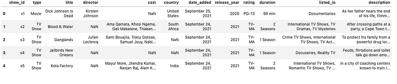
df.head()Output —
# Get more information about your data
df.info()
Output —
<class 'pandas.core.frame.DataFrame'>
RangeIndex: 8807 entries, 0 to 8806
Data columns (total 12 columns):
 #   Column        Non-Null Count  Dtype
---  ------        --------------  -----
 0   show_id       8807 non-null   object
 1   type          8807 non-null   object
 2   title         8807 non-null   object
 3   director      6173 non-null   object
 4   cast          7982 non-null   object
 5   country       7976 non-null   object
 6   date_added    8797 non-null   object
 7   release_year  8807 non-null   int64
 8   rating        8803 non-null   object
 9   duration      8804 non-null   object
 10  listed_in     8807 non-null   object
 11  description   8807 non-null   object
dtypes: int64(1), object(11)
memory usage: 825.8+ KB
#Missing Values in each column
df.isna().sum()Output —
show_id            0
type               0
title              0
director        2634
cast             825
country          831
date_added        10
release_year       0
rating             4
duration           3
listed_in          0
description        0
dtype: int64
#Count of data records in each columndf.count()Output —
show_id         8807
type            8807
title           8807
director        6173
cast            7982
country         7976
date_added      8797
release_year    8807
rating          8803
duration        8804
listed_in       8807
description     8807
dtype: int64
# Unique Values for the type of shows on netflixdf['type'].unique()Output —
array(['Movie', 'TV Show'], dtype=object)# Unique values for the rating
df.rating.unique()Output —
array(['PG-13', 'TV-MA', 'PG', 'TV-14', 'TV-PG', 'TV-Y', 'TV-Y7', 'R','TV-G', 'G', 'NC-17', '74 min', '84 min', '66 min', 'NR', nan,
       'TV-Y7-FV', 'UR'], dtype=object)
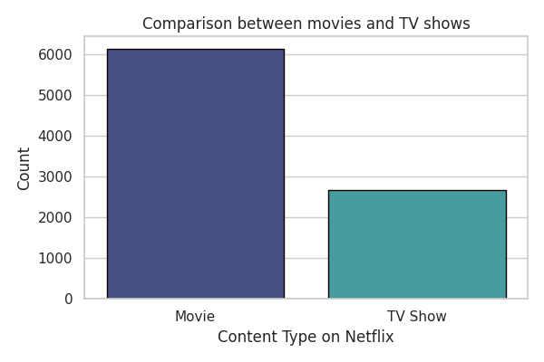
# Comparison between movies and Tv Showsn_shows = df[df['type']=='TV Show']
n_movies = df[df['type']=='Movie']# plot
plt.figure(figsize=(6,4),dpi=100)ax=sns.countplot(x='type',data=df,palette='mako',linewidth=1,edgecolor='black')
plt.xlabel("Content Type on Netflix")
plt.ylabel('Count')
plt.title('Comparison between movies and TV shows')
plt.tight_layout()
plt.show()Output —
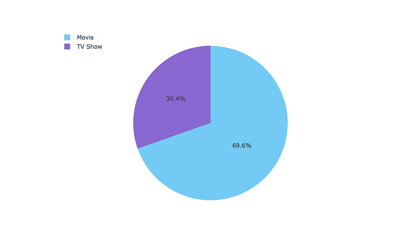
#Percent Distribution
ng_type = df['type'].value_counts().reset_index()
ng_type = ng_type.rename(columns = {'type': 'count','index':'type'})
t = go.Pie(values=ng_type['count'],labels=ng_type['type'],marker=dict(colors=['LightSkyBlue','MediumPurple']))
layout = go.Layout(height=500,legend=dict(x=0.1,y=1.1))fig = go.Figure(data=[t],layout=layout)
iplot(fig)Output —
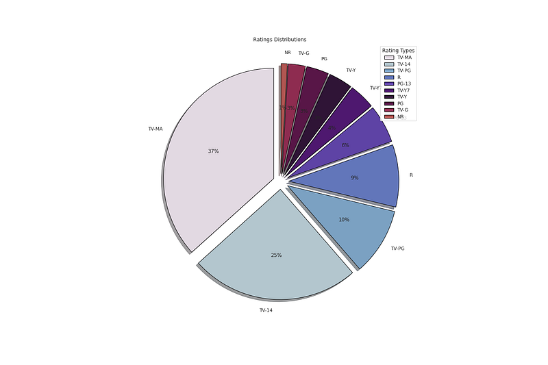
# Distribution of Ratingsplt.figure(figsize=(18,12))
p_ratings = df['rating'].value_counts().head(10)
plt.pie(x=p_ratings,labels=p_ratings.index,colors=colors1,autopct='%.0f%%',explode=[0.07 for i in p_ratings.index],startangle=90,wedgeprops={'linewidth':1,'edgecolor':'black'},shadow=True)
plt.title('Ratings Distributions ')
plt.legend(loc='upper right',title='Rating Types')plt.show()Output —
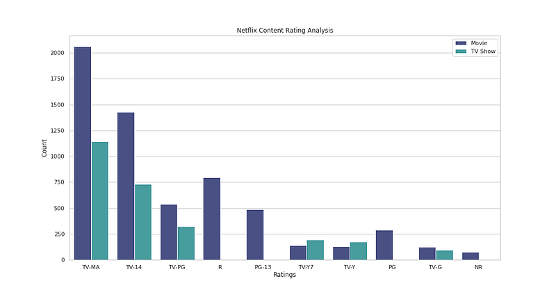
# Ratings Analysisplt.figure(figsize=(15,8))
sns.countplot(x='rating',data=df,palette='mako',hue ='type',order=df['rating'].value_counts().index[0:10])
plt.xlabel('Ratings')
plt.ylabel('Count')
plt.legend()
plt.title('Netflix Content Rating Analysis')plt.show()Output —
# Movies Ratings Analysisplt.figure(figsize=(15,8))
sns.countplot(x='rating',data=n_movies,palette='mako',order=n_movies['rating'].value_counts().index[0:10],edgecolor='black')
plt.xlabel('Movie Ratings')
plt.ylabel('Count')
plt.xticks(rotation=45)
plt.title("Movie Ratings Analysis")plt.show()Output —

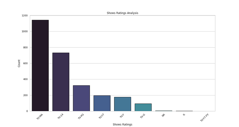
# Show Ratings Analysisplt.figure(figsize=(15,8))
sns.countplot(x='rating',data=n_shows,palette='mako',order=n_shows['rating'].value_counts().index[0:10],edgecolor='black')
plt.xlabel('Shows Ratings')
plt.ylabel('Count')
plt.xticks(rotation=45)
plt.title("Shows Ratings Analysis")plt.show()Output —
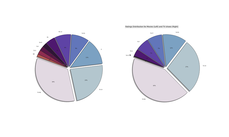
# Movies vs TV showsfig,(ax0,ax1)=plt.subplots(1,2,figsize=(30,18))
np_movies = n_movies['rating'].value_counts().head(10)
np_shows = n_shows['rating'].value_counts().head(10)ax0.pie(x=np_movies,labels=np_movies.index,colors=colors1,autopct='%.0f%%',explode=[0.05 for i in np_movies.index],startangle=160,wedgeprops={'linewidth':1,'edgecolor':'black'},shadow=True)
plt.title('Ratings Distribution for Movies (Left) and TV shows (Right)',bbox={'facecolor':'0.9','pad':5},loc='left',fontsize=17)ax1.pie(x=np_shows,labels=np_shows.index,colors=colors1,autopct='%.0f%%',explode=[0.05 for i in np_shows.index],startangle=160,wedgeprops={'linewidth':1,'edgecolor':'black'},shadow=True)plt.show()Output —
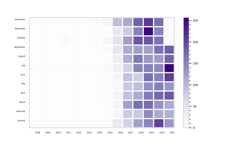
# Month when content can be released
n_date=df[['date_added']].dropna()
n_date['year']= n_date['date_added'].apply(lambda x: x.split(', ')[-1])
n_date['month'] = n_date['date_added'].apply(lambda x:x.split(' ')[0])
month_list = ['January','February','March','April','May','June','July','August','September','October','November','December']g_df= n_date.groupby('year')['month'].value_counts().unstack().fillna(0)[month_list].T# plotplt.figure(figsize=(8,5),dpi=250)
plt.pcolor(g_df,cmap='Purples',edgecolors='white',linewidths=3)
plt.xticks(np.arange(0.8,len(g_df.columns),1),g_df.columns,fontsize=5)
plt.yticks(np.arange(0.8,len(g_df.index),1),g_df.index,fontsize=5)
cbar=plt.colorbar()cbar.ax.tick_params(labelsize=7)
cbar.ax.minorticks_on()plt.show()Output —
# Top 10 countriesdf['country'] = df.country.dropna()
n_countries = df.country.value_counts().head(10)# plot
plt.figure(figsize=(18,10))
plt.pie(x=n_countries,labels=n_countries.index,colors=colors1,autopct='%.0f%%',explode=[0.05 for i in n_countries.index],startangle=160,wedgeprops={'linewidth':1,'edgecolor':'black'},shadow=True)plt.show()Output —
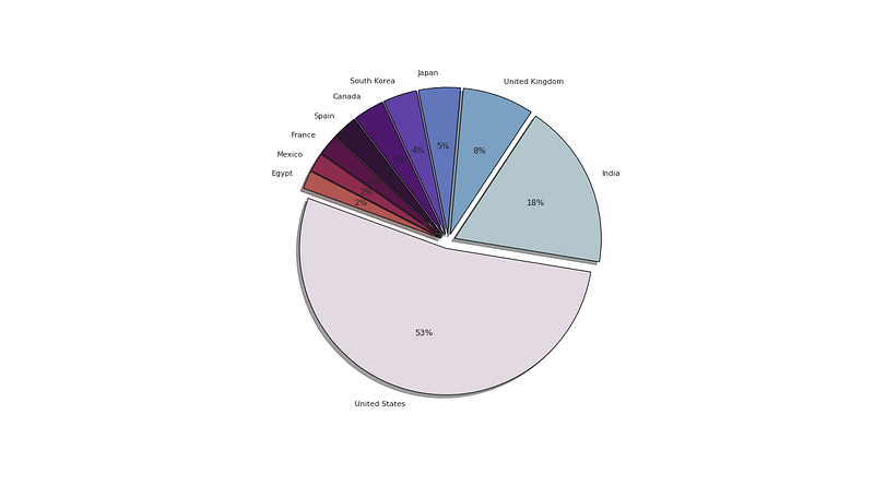
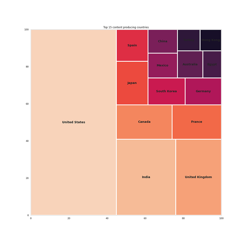
# Which Country produces the most contentn_country = df['country'].dropna()
nc_country = pd.Series(dict(Counter(','.join(n_country).replace(' ,',',').replace(', ',',').split(',')))).sort_values(ascending=False)#get top 15 countries
nc_country[:15]Output —
United States     3690
India             1046
United Kingdom     806
Canada             445
France             393
Japan              318
Spain              232
South Korea        231
Germany            226
Mexico             169
China              162
Australia          160
Egypt              117
Turkey             113
Hong Kong          105
dtype: int64
# Plot the top 15 countriesfig = plt.figure(figsize=(16,16))t = nc_country[:15]
squarify.plot(sizes=t.values,label=t.index,color=sns.color_palette("rocket_r", n_colors=15),linewidth=4,text_kwargs={'fontsize':14,'fontweight':'bold'})
plt.title('Top 15 content producing countries')plt.show()Output —
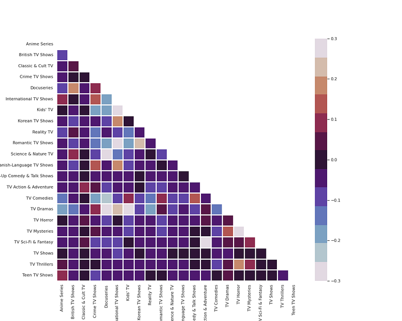
# Movies and Shows Genresdef g_heatmap(df, title):
df['genre'] = df['listed_in'].apply(lambda x : x.replace(' ,',',').replace(', ',',').split(','))
Types = []
for i in df['genre']: Types += i
Types = set(Types)
print("There are {} types".format(len(Types),title))
test = df['genre']
mlb = MultiLabelBinarizer()
res = pd.DataFrame(mlb.fit_transform(test), columns=mlb.classes_, index=test.index)
corr = res.corr()
mask = np.zeros_like(corr, dtype=np.bool)
mask[np.triu_indices_from(mask)] = True
fig, ax = plt.subplots(figsize=(15, 12))
pl = sns.heatmap(corr, mask=mask, cmap=colors1, vmax=.3, vmin=-.3, center=0, square=True, linewidths=2.5)
plt.show()g_heatmap(n_movies, 'Movie')
g_heatmap(n_shows,'Shows')Output —
# Word Cloud of Titlest = str(list(df['title'])).replace(',', '').replace('[', '').replace("'", '').replace(']', '').replace('.', '')wc = WordCloud(background_color = 'white', width = 500, height = 200,colormap='icefire', max_words = 150).generate(t)plt.figure( figsize=(10,10))
plt.imshow(wc, interpolation = 'bilinear')
plt.axis('off')
plt.tight_layout(pad=0)
plt.title('Word Cloud of Titles on Netflix')plt.show()Output —

# Word Cloud for Castc_df['cast'] = df['cast'].dropna()
t = str(list(c_df['cast'])).replace(',', '').replace('[', '').replace("'", '').replace(']', '').replace('.', '')wc = WordCloud(background_color = 'white', width = 500, height = 200,colormap='icefire', max_words = 150).generate(t)plt.figure( figsize=(10,10))
plt.imshow(wc, interpolation = 'bilinear')
plt.axis('off')
plt.tight_layout(pad=0)
plt.title('Word Cloud of Cast on Netflix')plt.show()Output —

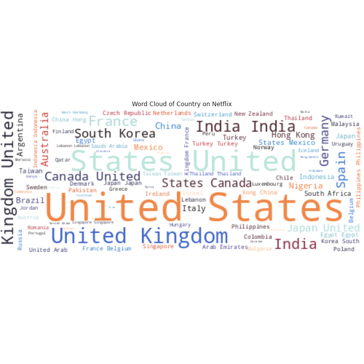
# Word Cloud for Countryc_df['country'] = df['country'].dropna()
t = str(list(c_df['country'])).replace(',', '').replace('[', '').replace("'", '').replace(']', '').replace('.', '')wc = WordCloud(background_color = 'white', width = 500, height = 200,colormap='icefire', max_words = 150).generate(t)plt.figure( figsize=(10,10))
plt.imshow(wc, interpolation = 'bilinear')
plt.axis('off')
plt.tight_layout(pad=0)
plt.title('Word Cloud of Country on Netflix')plt.show()Output —
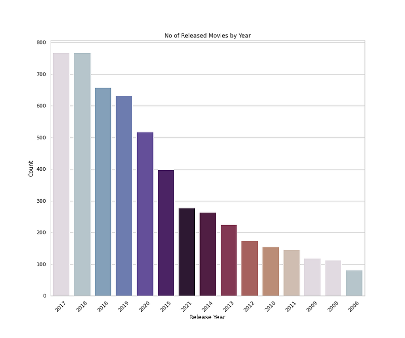
# Number of Released Movies by Yearplt.figure(figsize=(12,10))
sns.countplot(x='release_year',data=n_movies,palette=colors1,order=n_movies['release_year'].value_counts().index[0:15])
plt.title('No of Released Movies by Year')
plt.xlabel('Release Year')
plt.ylabel('Count')
plt.xticks(rotation=45)plt.show()Output —
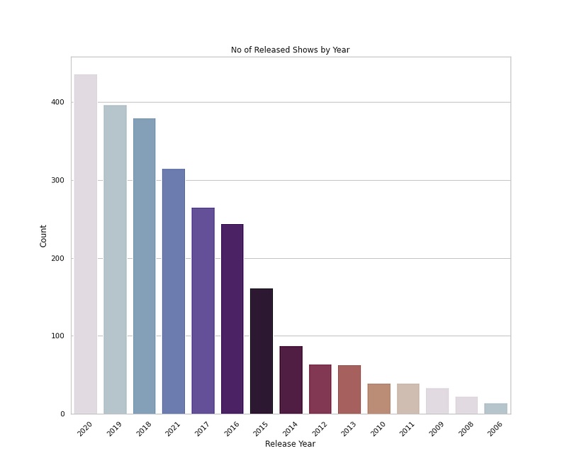
# Number of Released Shows by Yearplt.figure(figsize=(12,10))
sns.countplot(x='release_year',data=n_shows,palette=colors1,order=n_shows['release_year'].value_counts().index[0:15])
plt.title('No of Released Shows by Year')
plt.xlabel('Release Year')
plt.ylabel('Count')
plt.xticks(rotation=45)plt.show()Output —
That’s it for now. Day 12 : Data Visualization — Part 3!
Let me know if you have questions in the comment section below. Subscribe/ Follow, Like/Clap as it would encourage me to write more in my free time
Stay Tuned!!
Read More —
11 most important System Design Base Concepts
6. Networking, How Browsers work, Content Network Delivery ( CDN)
13. System Design Template — How to solve any System Design Question
System Design Case Studies — In Depth
Complete Data Structures and Algorithm Series
Some of the other best Series —
30 days of Data Structures and Algorithms and System Design Simplified
Data Science and Machine Learning Research ( papers) Simplified **
100 days : Your Data Science and Machine Learning Degree Series with projects
Complete Data Visualization and Pre-processing Series with projects
Exceptional Github Repos — Part 1
Exceptional Github Repos — Part 2
Tech Newsletter —
If you are interested, you can join my newsletter through which I send tech interview tips, techniques, patterns, hacks — Software Development, ML, Data Science, Startups and Technology projects to more than 30K readers. You can subscribe to Tech Brew :
For Python Projects —
For complete 60 days of Data Science and ML : Day 1 — Day 60 : Quick Recap of 60 days of Data Science and ML
Follow for more updates. Stay tuned and keep coding!
For other projects, tune to —
Build Machine Learning Pipelines( With Code)
Recurrent Neural Network with Keras
Clustering Geolocation Data in Python using DBSCAN and K-Means
Facial Expression Recognition using Keras
Hyperparameter Tuning with Keras Tuner
Custom Layers in Keras


