
Day 13 of 30 days of Data Analytics with Projects Series
Welcome back peeps. This is Day 13 of 30 days of data analytics.
What’s covered in 30 days of Data Analytics Series till now —
Day 1 : Data Analytics basics and kickstart of Data analytics with projects series
Day 3 : Data Analytics Ecosystem — Data Life Cycle, Data Analysis complete process ( most important things)
Day 5 : Statistics
Day 6 : Basic and Advanced SQL
Day 8 : Pandas and Numpy
Day 9 : Data Manipulation
Day 10 : Data Visualization — Part 1
Day 11 : Data Visualization — Part 2
Day 12 : Data Visualization — Part 3
Day 13: Tableau — Part 1
Day 14: Tableau — Part 2
Day 15: Tableau — Part 3
Take Complete Hands On Tableau Course : Link
All the projects, data structures, algorithms, system design, Data Science and ML, Data Engineering, MLOps and Deep Learning videos will be published on our youtube channel ( just launched).
Subscribe today!
Tech Newsletter —
If you are interested, you can join my newsletter through which I send tech interview tips, techniques, patterns, hacks — Software Development, ML, Data Science, Startups and Technology projects to more than 30K readers. You can subscribe to Tech Brew :
In the last post we covered Data Visualization. In this post we will cover Tableau as follows —
Take Complete Hands On Tableau Course : Link
Tableau Basics
Create trend lines and understand the relevant statistical metrics such as p-value and R-squared
Create forecasts, Barcharts, Area Charts, Box and Whisker
Create Histogram, Bullet Chart, Bubbles Chart, Funnel Charts, Advanced Charts
Create Scatterplots , Piecharts, Treemaps
Create Maps — Detailed Maps, Symbol Maps, Density Maps
Create Advanced Maps
Create Interactive Dashboards
Create Storylines
Work with Data Blending in Tableau
Create Table Calculations
Create Dual Axis Charts
Create Calculated Fields
Create Visualizations using Calculated Fields
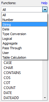
Tableau String Functions
Tableau Date Functions
Tableau Type Conversion
Tableau Reporting
Implement Aggregation, Granularity, and Level of Detail
Create and use Groups
Create and add Filters and Quick Filters
Create Reference Lines with Parameters
Implement Clustering
Implement Filters, including the context filter
Implement Grouping & Sets
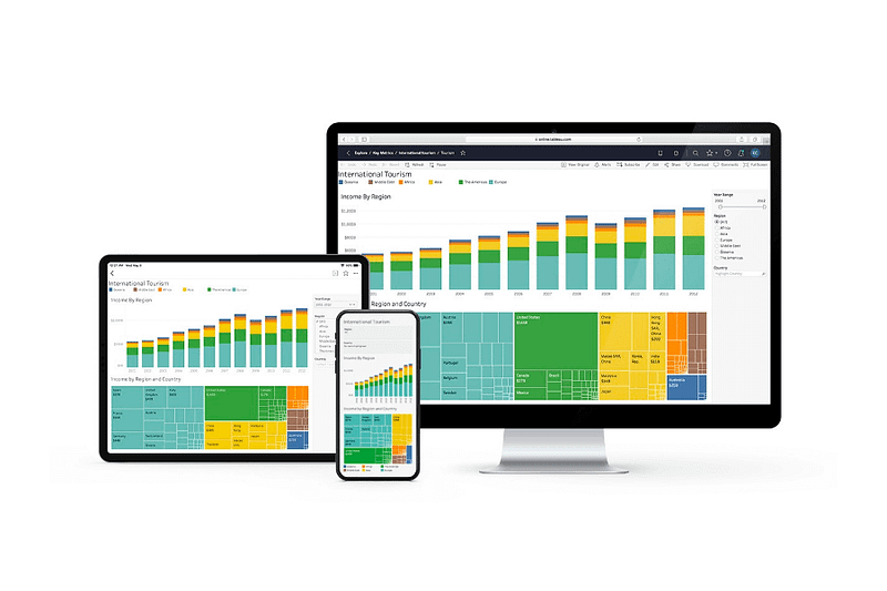
Tableau is a powerful data visualization tool that allows you to create interactive visualizations and dashboards from a wide variety of data sources.
- To create trend lines in Tableau, you can use the trend line option in the Analysis menu. You can also understand the relevant statistical metrics such as p-value and R-squared by using the Show Me option.
- You can create forecasts, bar charts, area charts, box and whisker plots, histograms, bullet charts, bubbles charts, funnel charts, scatterplots, pie charts, treemaps, and advanced charts in Tableau by using the appropriate chart type in the Show Me option or by dragging the relevant dimensions and measures onto the Rows and Columns shelves.
- To create maps in Tableau, you can use the Map option in the Show Me option or by dragging a dimension that contains geographical data onto the Rows or Columns shelves. You can create detailed maps, symbol maps, density maps, and advanced maps in Tableau.
- Tableau also allows you to create interactive dashboards by combining multiple visualizations on a single worksheet and linking them together. You can also create storylines to guide the user through the dashboard.
- Tableau also provides features such as data blending, table calculations, dual axis charts, calculated fields, and visualizations using calculated fields. It also provides string, date and type conversion functions, reporting features like aggregation, granularity and level of detail, creating and using groups, filters and quick filters, reference lines with parameters, clustering, grouping and sets.
Let’s get started with Tableau — Part 1.
Tableau is a business intelligence tool for visually analyzing the data used to create and distribute interactive and shareable dashboards, which depict the trends, variations, and density of the data in the form of graphs and charts.
- It’s used for complex visualization and simplification of complex data
- It is a highly scalable easily deployable and efficient business framework which allows data blending and real-time collaboration
Advantages of Tableau -
Speed
Beautiful and Interactive Dashboard
Ease of use
Tableau Data Types
There are primarily seven data types used in Tableau —
String values : Char string type and Varchar string type
Number (Integer) values : integer type or floating type
Date values : dd-mm-yy, dd-mm-yyyy or mm-dd-yyyy, etc
Boolean values : True or False
Geographic values : Values such as country name, state name, city, region, postal codes, etc
Cluster values : cluster group values or mixed data values
Date & Time values : a date value or a time value
Tableau automatically detects the data types of various fields as soon as new data gets uploaded from source to Tableau and assigns it to the fields.
Once the data is successfully uploaded, we can also change the data type of a field.
Tableau String Functions
Tableau provides various string Functions such as LEN, LTRIM, RTRIM, TRIM, CONTAINS, MID, REPLACE, etc to format or alter string data.
- LEN(string)
- ASCII(string)
- CHAR(number)
- CONTAINS(string, substring)
- ENDSWITH(string, substring)
- STARTSWITH(string, substring)
- FIND(string, substring, [start])
- ISDATE(string)
- LEFT(string, num_chars)
- MAX(a, b)
- MIN(a, b)
- REPLACE(string, substring, replacement)
- TRIM(string)
- UPPER(string)
Tableau Operators
It tells the compiler to perform specific mathematical or relational, logical manipulations
- There are 3 basic operators in tableau:
Arithmetic Tableau Operators
Relational Tableau Operators
Logical Tableau Operators
- Arithmetic Tableau Operators are —
Addition +, Subtraction — , Multiply *, Divide /, Modulation %, Power ^
- Relational Tableau Operators
Equality Operator: =
Not Equality Operator: < >, !=, ^=
Greater Than Operator: >
Less Than Operator: <
Greater Than Equal to Operator: >=
Less Than Equal to Operator: <=
- Logical Tableau Operators
AND, OR, NOT
Tableau Date Functions
Date fields are important in any data set and in the analysis as without date values like a year, month, week, quarter, etc the analysis/visualization are incomplete.
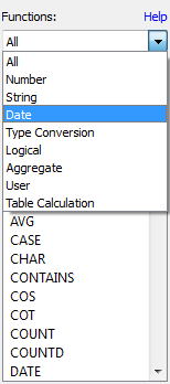
Tableau provides various Date Functions such as Year, Month, Day, makedate, maketime, datediff, datepart, dateadd, datename, datetrunc, now, today, etc
- DATEDD(date_part, interval, date)
- DATEDIFF(date_part, date1, date2, [start_of_week])
- DATENAME(date_part, date, [start_of_week])
- DATEPARSE(date_format, [date_string])
- DATEPART(date_part, date, [start_of_week])
- DATETRUNC(date_part, date, [start_of_week])
- ISDATE(string)
- MAKEDATE(year, month, day)
- MAKETIME(hour, minute, second)
- NOW ( )
- MONTH(date)
- TODAY( )
- WEEK( )
- YEAR(date)
Tableau Aggregate Functions
Aggregate functions allow you to summarize your data i.e the values of multiple lines are grouped together to form a single summative value.
SUM(Expression): sum of values
AVG(Expression): average of values
MIN(Expression): minimum of values
MAX(Expression): maximum of values
VAR(Expression): variance of sample data
VARP(Expression): variance of entire data
STDEV(Expression): standard deviation of sample data
STDEVP(Expression): standard deviation of entire data
COUNT(Expression): count of values
Take Complete Hands On Tableau Course : Link
More implementation coverage —
Create trend lines and understand relevant statistical metrics:
Drag the desired measure and dimension fields onto the view.
Right-click on the plotted data points and select “Trend Lines.”
You can customize the type of trend line and display statistical metrics like R-squared and p-value by clicking on the trend line and selecting “Analyze” in the top menu.
Create forecasts:
Drag the desired measure and dimension fields onto the view.
In the top menu, select “Analysis” and choose “Forecast.”
Adjust the forecast settings as needed, such as the forecast period and confidence level.
Create Bar charts:
Drag a dimension field to the Columns shelf and a measure field to the Rows shelf.
Tableau will automatically create a bar chart based on the selected fields.
Create Area charts:
Follow the same steps as creating a bar chart, but choose “Area” as the mark type.
Create Box and Whisker plots:
Drag a dimension field to the Columns shelf and a measure field to the Rows shelf.
Change the mark type to “Boxplot” by selecting it from the “Show Me” panel on the right.
Create Histograms:
Drag a measure field to the Columns or Rows shelf.
Right-click on the axis and select “Show Me” and choose “Histogram.”
Create Bullet charts, Bubble charts, Funnel charts, and Advanced charts:
These types of visualizations require specific data structures and configurations. You can explore the available chart types and their requirements in the Tableau documentation and follow the provided guidelines to create them.
Create Scatter plots:
Drag two measure fields to the Columns and Rows shelf.
Tableau will automatically create a scatter plot based on the selected fields.
Create Pie charts:
Drag a dimension field to the Color or Label shelf and a measure field to the Angle shelf.
Change the mark type to “Pie” by selecting it from the “Show Me” panel.
Create Treemaps:
Drag a dimension field to the Color or Label shelf and a measure field to the Size shelf.
Change the mark type to “Treemap” by selecting it from the “Show Me” panel.
Create Maps:
Drag a geographic dimension field to the view.
Tableau will automatically create a map visualization based on the available geographic data.
Create Interactive Dashboards and Storylines:
Use the Dashboard and Story tabs in Tableau to build interactive dashboards and storylines by combining different visualizations and adding interactivity.
Work with Data Blending:
Connect to multiple data sources and blend them using common dimensions or keys.
Use the Data menu to manage data blending and define relationships between different data sources.
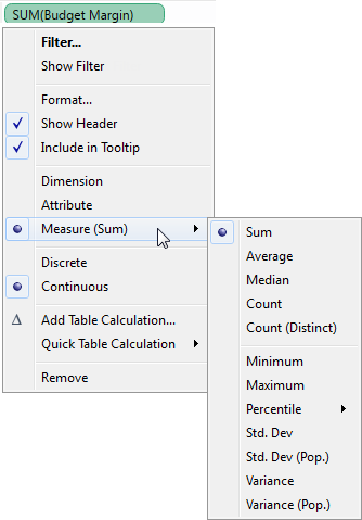
Create Table Calculations:
Right-click on a measure field and select “Quick Table Calculation” to choose from a variety of built-in calculations or create custom calculations.
Create Dual Axis charts:
Drag multiple measure fields to the Rows or Columns shelf.
Right-click on one of the measure axes and select “Dual Axis” to combine the measures on a single chart.
Create Calculated Fields:
Use the Calculated Field editor to define custom calculations using Tableau’s formula syntax.
Create Visualizations using Calculated Fields:
Use the Calculated Field editor to create new fields based on formulas and calculations.
Combine fields, apply mathematical operations, conditional statements, and more to create calculated fields.
Drag the calculated field onto the view to use it in visualizations.
Tableau String Functions:
Tableau provides various string functions such as LEN, LEFT, RIGHT, MID, UPPER, LOWER, REPLACE, CONCATENATE, and more.
These functions allow you to manipulate and analyze string data within Tableau.
Tableau Date Functions:
Tableau offers a range of date functions such as YEAR, MONTH, DAY, DATEPART, DATETRUNC, DATEADD, DATEDIFF, and more.
These functions enable you to extract specific date components, perform date calculations, and format dates in Tableau.
Tableau Type Conversion:
Tableau automatically assigns data types to fields based on their source.
To convert data types, right-click on a field and select “Convert to” to choose the desired data type.
Tableau Reporting:
Tableau provides various reporting features to summarize and present data effectively.
Use filters, sorting, grouping, and aggregations to create insightful reports.
Customize the report layout, formatting, and labels to meet your reporting needs.
Implement Aggregation, Granularity, and Level of Detail:
Tableau allows you to aggregate data at different levels of granularity.
Use the aggregation functions like SUM, AVG, COUNT, etc., to aggregate data.
Adjust the level of detail by adding or removing dimensions from the view.
Create and use Groups:
Select multiple data points and right-click to create a group.
Grouping allows you to combine related data points into a single category for analysis and visualization.
Create and add Filters and Quick Filters:
Use filters to limit the data displayed in a visualization based on specified conditions.
Quick filters provide interactive options to filter data dynamically within a visualization.
Create Reference Lines with Parameters:
Add reference lines to visualizations to highlight specific values or benchmarks.
Parameters allow you to create dynamic reference lines that can be adjusted by end-users.
Implement Clustering:
Use the clustering feature in Tableau to identify patterns and groupings within data.
Apply clustering algorithms to automatically group similar data points together.
Implement Filters, including the context filter:
Tableau offers various filtering options to refine data displayed in visualizations.
Context filters allow you to isolate specific data subsets for analysis and comparison.
Implement Grouping & Sets:
Create groups and sets to organize and analyze data in specific ways.
Groups combine data points into predefined categories, while sets create custom subsets based on specified conditions.
That’s it for now. Day 14: Tableau-Part 2!
Let me know if you have questions in the comment section below. Subscribe/ Follow, Like/Clap as it would encourage me to write more in my free time
Stay Tuned!!
Read More —
11 most important System Design Base Concepts
6. Networking, How Browsers work, Content Network Delivery ( CDN)
13. System Design Template — How to solve any System Design Question
System Design Case Studies — In Depth
Complete Data Structures and Algorithm Series
Some of the other best Series —
30 days of Data Structures and Algorithms and System Design Simplified
Data Science and Machine Learning Research ( papers) Simplified **
100 days : Your Data Science and Machine Learning Degree Series with projects
Complete Data Visualization and Pre-processing Series with projects
Exceptional Github Repos — Part 1
Exceptional Github Repos — Part 2
Tech Newsletter —
If you are interested, you can join my newsletter through which I send tech interview tips, techniques, patterns, hacks — Software Development, ML, Data Science, Startups and Technology projects to more than 30K readers. You can subscribe to Tech Brew :
For Python Projects —
For complete 60 days of Data Science and ML : Day 1 — Day 60 : Quick Recap of 60 days of Data Science and ML
Follow for more updates. Stay tuned and keep coding!
For other projects, tune to —
Build Machine Learning Pipelines( With Code)
Recurrent Neural Network with Keras
Clustering Geolocation Data in Python using DBSCAN and K-Means
Facial Expression Recognition using Keras
Hyperparameter Tuning with Keras Tuner
Custom Layers in Keras


