
Project 7 — Day 21 of 30 days of Data Analytics with Projects Series
Welcome back peep. Hope all’s well. This is Day 21 of 30 days of data analytics where we will be implementing a project covering —
1. Data Profiling
2. Feature Engineering
3. GroupBy Features
4. Categorical and Numerical Features
5. Missing Value Analysis
6. Fill the missing Values
7. Unique Value Analysis
8. Univariate Analysis
9. Bivariate Analysis
10. Multivariate Analysis
11. Correlation Analysis
12. Correlation Coefficients
Let’s cover the most important concepts in brief —
- Data Profiling: Data profiling is the process of examining the data in a dataset to understand its characteristics and quality. It involves analyzing different aspects of the data such as data types, distribution, completeness, consistency, and uniqueness.
- Feature Engineering: Feature engineering is the process of creating new features or transforming existing features to improve the performance of a machine learning model. This can include creating new features by combining existing ones, encoding categorical variables, and scaling numerical variables.
- GroupBy Features: Groupby features refers to the process of grouping similar data based on a specific feature. This is typically used in data analysis to understand the distribution of data within different groups.
- Categorical and Numerical Features: Categorical features are variables that can take on a limited number of values, such as gender or color. Numerical features are variables that can take on a continuous range of values, such as age or height.
- Missing Value Analysis: Missing value analysis is the process of identifying and analyzing missing values in a dataset. It helps to understand the pattern of missing data and decide how to handle it.
- Fill the Missing Values: After identifying missing values, one can use different techniques like mean, median, mode, or using predictions from other models to fill the missing values.
- Unique Value Analysis: Unique value analysis is the process of identifying unique values in a dataset. It helps to understand the pattern of unique data and decide how to handle it.
- Univariate Analysis: Univariate analysis is the simplest form of statistical analysis. It involves the analysis of one variable at a time.
- Bivariate Analysis: Bivariate analysis is the analysis of the relationship between two variables. It helps to understand the relationship between two variables and how they are related.
- Multivariate Analysis: Multivariate analysis is the analysis of more than two variables. It helps to understand the relationship between multiple variables and how they are related.
- Correlation Analysis: Correlation analysis is the process of examining the relationship between two or more variables. It helps to understand how variables are related and the strength of that relationship.
- Correlation Coefficients: Correlation coefficients are used to measure the strength and direction of a linear relationship between two variables. Some common correlation coefficients are:
- Spearman’s ρ: non-parametric test that is used to measure the rank-based correlation between two variables.
- Pearson’s r: measures the linear correlation between two variables.
- Kendall’s τ: non-parametric test that is used to measure the ordinal correlation between two variables.
- Cramér’s V (φc): measures the association between two categorical variables.
- Phik (φk): measures the association between two categorical variables with k categories.
Example Code Implementation —
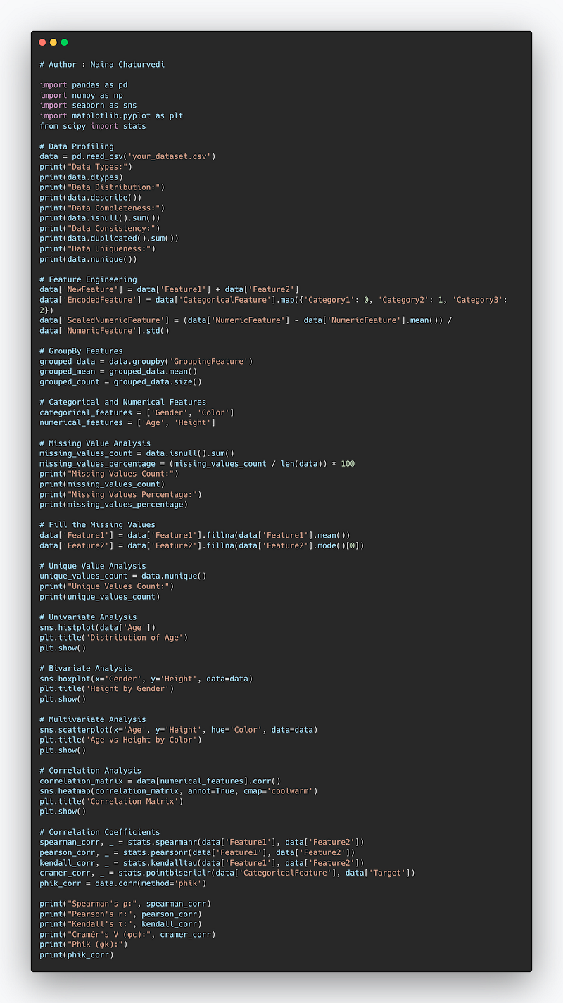
import pandas as pd
import numpy as np
import seaborn as sns
import matplotlib.pyplot as plt
from scipy import stats

# Data Profiling
data = pd.read_csv('your_dataset.csv')
print("Data Types:")
print(data.dtypes)
print("Data Distribution:")
print(data.describe())
print("Data Completeness:")
print(data.isnull().sum())
print("Data Consistency:")
print(data.duplicated().sum())
print("Data Uniqueness:")
print(data.nunique())

# Feature Engineering
data['NewFeature'] = data['Feature1'] + data['Feature2']
data['EncodedFeature'] = data['CategoricalFeature'].map({'Category1': 0, 'Category2': 1, 'Category3': 2})
data['ScaledNumericFeature'] = (data['NumericFeature'] - data['NumericFeature'].mean()) / data['NumericFeature'].std()

# GroupBy Features
grouped_data = data.groupby('GroupingFeature')
grouped_mean = grouped_data.mean()
grouped_count = grouped_data.size()

# Categorical and Numerical Features
categorical_features = ['Gender', 'Color']
numerical_features = ['Age', 'Height']

# Missing Value Analysis
missing_values_count = data.isnull().sum()
missing_values_percentage = (missing_values_count / len(data)) * 100
print("Missing Values Count:")
print(missing_values_count)
print("Missing Values Percentage:")
print(missing_values_percentage)

# Fill the Missing Values
data['Feature1'] = data['Feature1'].fillna(data['Feature1'].mean())
data['Feature2'] = data['Feature2'].fillna(data['Feature2'].mode()[0])

# Unique Value Analysis
unique_values_count = data.nunique()
print("Unique Values Count:")
print(unique_values_count)

# Univariate Analysis
sns.histplot(data['Age'])
plt.title('Distribution of Age')
plt.show()

# Bivariate Analysis
sns.boxplot(x='Gender', y='Height', data=data)
plt.title('Height by Gender')
plt.show()

# Multivariate Analysis
sns.scatterplot(x='Age', y='Height', hue='Color', data=data)
plt.title('Age vs Height by Color')
plt.show()

# Correlation Analysis
correlation_matrix = data[numerical_features].corr()
sns.heatmap(correlation_matrix, annot=True, cmap='coolwarm')
plt.title('Correlation Matrix')
plt.show()

# Correlation Coefficients
spearman_corr, _ = stats.spearmanr(data['Feature1'], data['Feature2'])
pearson_corr, _ = stats.pearsonr(data['Feature1'], data['Feature2'])
kendall_corr, _ = stats.kendalltau(data['Feature1'], data['Feature2'])
cramer_corr, _ = stats.pointbiserialr(data['CategoricalFeature'], data['Target'])
phik_corr = data.corr(method='phik')

print("Spearman's ρ:", spearman_corr)
print("Pearson's r:", pearson_corr)
print("Kendall's τ:", kendall_corr)
print("Cramér's V (φc):", cramer_corr)
print("Phik (φk):")
print(phik_corr)
Snippet —
What’s covered in 30 days of Data Analytics Series till now —
Day 1 : Data Analytics basics and kickstart of Data analytics with projects series
Day 3 : Data Analytics Ecosystem — Data Life Cycle, Data Analysis complete process ( most important things)
Day 5 : Statistics
Day 6 : Basic and Advanced SQL
Day 8 : Pandas and Numpy
Day 9 : Data Manipulation
Day 10 : Data Visualization — Part 1
Day 11 : Project 1 : Data Visualization — Part 2
Day 12 : Data Visualization — Part 3
Day 13: Tableau — Part 1
Day 14: Tableau — Part 2
Day 15: Tableau — Part 3
Day 16 : Data Analysis Project 2
Day 17 : Data Analysis Project 3
Day 18: Data Analysis Project 4
Day 20 : Data Analysis Project 6
Day 21 : Data Analysis Project 7
Take Complete Hands On Tableau Course : Link
Projects Videos —
All the projects, data structures, SQL, algorithms, system design, Data Science and ML , Data Analytics, Data Engineering, , Implemented Data Science and ML projects, Implemented Data Engineering Projects, Implemented Deep Learning Projects, Implemented Machine Learning Ops Projects, Implemented Time Series Analysis and Forecasting Projects, Implemented Applied Machine Learning Projects, Implemented Tensorflow and Keras Projects, Implemented PyTorch Projects, Implemented Scikit Learn Projects, Implemented Big Data Projects, Implemented Cloud Machine Learning Projects, Implemented Neural Networks Projects, Implemented OpenCV Projects,Complete ML Research Papers Summarized, Implemented Data Analytics projects, Implemented Data Visualization Projects, Implemented Data Mining Projects, Implemented Natural Leaning Processing Projects, MLOps and Deep Learning, Applied Machine Learning with Projects Series, PyTorch with Projects Series, Tensorflow and Keras with Projects Series, Scikit Learn Series with Projects, Time Series Analysis and Forecasting with Projects Series, ML System Design Case Studies Series videos will be published on our youtube channel ( just launched).
Subscribe today!
Tech Newsletter —
If you are interested, you can join my newsletter through which I send tech interview tips, techniques, patterns, hacks — Software Development, ML, Data Science, Startups and Technology projects to more than 30K readers. You can subscribe to Tech Brew :
In the last post we covered Data Visualization and in this post we will cover a project.
Before starting, go through this post to understand which chart to use and when.
(Note : Zoom all the images)
Import Necessary Libraries
import numpy as np # linear algebra
import pandas as pd # data processing, CSV file I/O (e.g. pd.read_csv)
import seaborn as sns
from matplotlib import pyplot as plt
import numpy as np
from matplotlib.colors import rgb2hex
import matplotlib.cm as cm
import plotly.express as px
import plotly.graph_objects as go
import squarify
from plotly.offline import init_notebook_mode,iplot

import matplotlib.colors
from collections import Counter
cmap2 = cm.get_cmap('twilight',13)
colors1= []
for i in range(cmap2.N):
    rgb= cmap2(i)[:4]
    colors1.append(rgb2hex(rgb))

# Set style
sns.set(style='whitegrid')
Load data
df= pd.read_csv('/Path to file/marvel-wikia-data.csv', low_memory = False)#Get information about your data
df.info()Output —
<class 'pandas.core.frame.DataFrame'>
RangeIndex: 16376 entries, 0 to 16375
Data columns (total 13 columns):
 #   Column            Non-Null Count  Dtype
---  ------            --------------  -----
 0   page_id           16376 non-null  int64
 1   name              16376 non-null  object
 2   urlslug           16376 non-null  object
 3   ID                12606 non-null  object
 4   ALIGN             13564 non-null  object
 5   EYE               6609 non-null   object
 6   HAIR              12112 non-null  object
 7   SEX               15522 non-null  object
 8   GSM               90 non-null     object
 9   ALIVE             16373 non-null  object
 10  APPEARANCES       15280 non-null  float64
 11  FIRST APPEARANCE  15561 non-null  object
 12  Year              15561 non-null  float64
dtypes: float64(2), int64(1), object(10)
memory usage: 1.6+ MB
# Get Columns informationdf.columnsOutput —
Index(['page_id', 'name', 'urlslug', 'ID', 'ALIGN', 'EYE', 'HAIR', 'SEX',
       'GSM', 'ALIVE', 'APPEARANCES', 'FIRST APPEARANCE', 'Year', 'Title',
       'Name'],
      dtype='object')
Data Description
nameThe name of the character
page_idThe unique identifier for the characters page
urlslugThe unique url within the wikia that takes you to the character
IDThe identity status of the character
ALIGNIf the character is Good, Bad or Neutral
EYEEye color of the character
HAIRHair color of the character
SEXSex of the character (e.g. Male, Female, etc.)
GSMIf the character is a gender or sexual minority (e.g. Homosexual characters, bisexual characters)
ALIVEIf the character is alive or deceasedAPPEARANCES
FIRST APPEARANCEThe month and year of the character's first appearance in a comic book, if availableYEARThe year of the character's first appearance in a comic book, if available.
Statistical Summary of the data
df.describe()Categorical and Numerical Features
Categorical features are those values that be sorted into groups or categories.
Numerical Features are those values that can be measures (can be places in ascending or descending order)
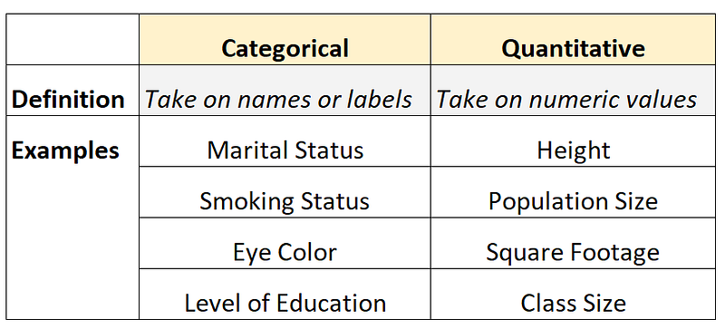
For this, lets get the Categorical and Numerical Features —
df.info()Output —
<class 'pandas.core.frame.DataFrame'>
RangeIndex: 16376 entries, 0 to 16375
Data columns (total 13 columns):
 #   Column            Non-Null Count  Dtype
---  ------            --------------  -----
 0   page_id           16376 non-null  int64
 1   name              16376 non-null  object
 2   urlslug           16376 non-null  object
 3   ID                12606 non-null  object
 4   ALIGN             13564 non-null  object
 5   EYE               6609 non-null   object
 6   HAIR              12112 non-null  object
 7   SEX               15522 non-null  object
 8   GSM               90 non-null     object
 9   ALIVE             16373 non-null  object
 10  APPEARANCES       15280 non-null  float64
 11  FIRST APPEARANCE  15561 non-null  object
 12  Year              15561 non-null  float64
dtypes: float64(2), int64(1), object(10)
memory usage: 1.6+ MB
You can see , in our dataset —
Categorical Features are name, urlslug, ID, ALIGN, Eye, Hair, Sex,GSM, Alive, First Appearance
Numerical Variable are page_id, Appearances, Year
Missing Value Analysis
In this we figure out the missing values in the
df.isnull().sum()Output —
page_id                 0
name                    0
urlslug                 0
ID                   3770
ALIGN                2812
EYE                  9767
HAIR                 4264
SEX                   854
GSM                 16286
ALIVE                   3
APPEARANCES          1096
FIRST APPEARANCE      815
Year                  815
dtype: int64
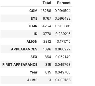
One can also calculate the percentage of missing values out of the total.
p = (df.isnull().sum()/df.isnull().count()).sort_values(ascending=False)
t = df.isnull().sum().sort_values(ascending=False)

m_data = pd.concat([t, p], axis=1, keys=['Total', 'Percent'])
m_data.head(10)
Output —
Fill the missing Values
Once the missing values in the data are identified, we can fill those missing values using mead, std etc
df['APPEARANCES'] = df['APPEARANCES'].fillna(np.mean(df['APPEARANCES']))

#Check if the missing value has been filled or not
df.isnull().sum()
Output —
page_id                 0
name                    0
urlslug                 0
ID                   3770
ALIGN                2812
EYE                  9767
HAIR                 4264
SEX                   854
GSM                 16286
ALIVE                   3
APPEARANCES             0
FIRST APPEARANCE      815
Year                  815
dtype: int64
Unique Value Analysis
One can get the count of the unique values for each column in your data —
for i in list(df.columns):
    print("{} -> {}".format(i, df[i].value_counts().shape[0]))
Output —
page_id -> 16376
name -> 16376
urlslug -> 16376
ID -> 4
ALIGN -> 3
EYE -> 24
HAIR -> 25
SEX -> 4
GSM -> 6
ALIVE -> 2
APPEARANCES -> 359
FIRST APPEARANCE -> 832
Year -> 75
Univariate Analysis
In Univariate Analysis, single variable/feature is analyzed at a time.
First we will start with Categorical Features in our data and then Numerical Features.
Categorical Features are name, urlslug, ID, ALIGN, Eye, Hair, Sex,GSM, Alive, First Appearance
Numerical Variable are page_id, Appearances, Year
Categorical Features Univariate Analysis
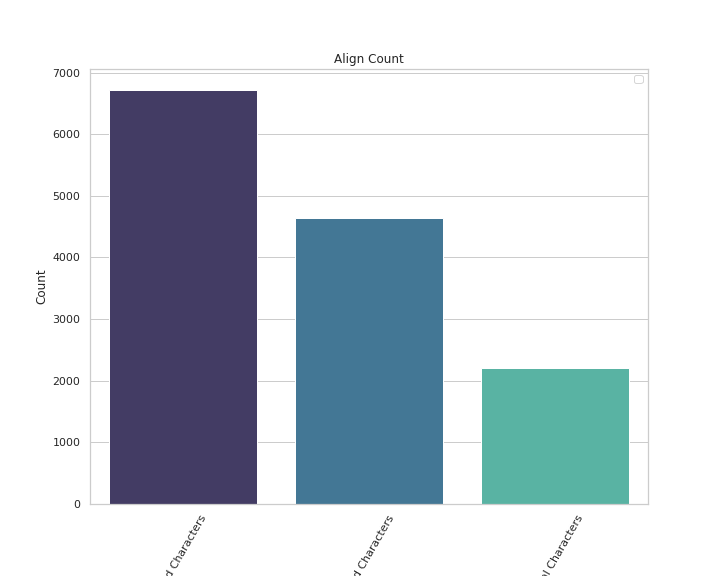
# Align Count

plt.figure(figsize=(10,8))
sns.countplot(x='ALIGN',data=df,palette='mako',order = df['ALIGN'].value_counts().index)
plt.xlabel('ALIGN')
plt.xticks(rotation = 60)
plt.ylabel('Count')
plt.legend()
plt.title('Align Count')


plt.show()
Output —
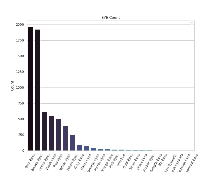
# Eye Count

plt.figure(figsize=(10,8))
sns.countplot(x='EYE',data=df,palette='mako',order = df['EYE'].value_counts().index)
plt.xlabel('EYE')
plt.xticks(rotation = 60)
plt.ylabel('Count')
plt.legend()
plt.title('EYE Count')


plt.show()
Output —
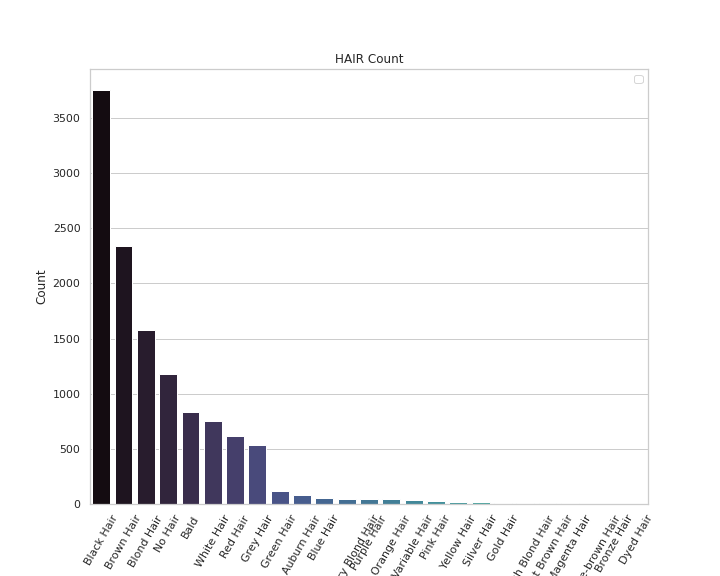
# Hair Count

plt.figure(figsize=(10,8))
sns.countplot(x='HAIR',data=df,palette='mako',order = df['HAIR'].value_counts().index)
plt.xlabel('HAIR')
plt.xticks(rotation = 60)
plt.ylabel('Count')
plt.legend()
plt.title('HAIR Count')


plt.show()
Output —
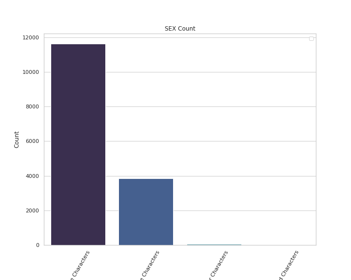
# SEX Count

plt.figure(figsize=(10,8))
sns.countplot(x='SEX',data=df,palette='mako',order = df['SEX'].value_counts().index)
plt.xlabel('SEX')
plt.xticks(rotation = 60)
plt.ylabel('Count')
plt.legend()
plt.title('SEX Count')


plt.show()
Output —
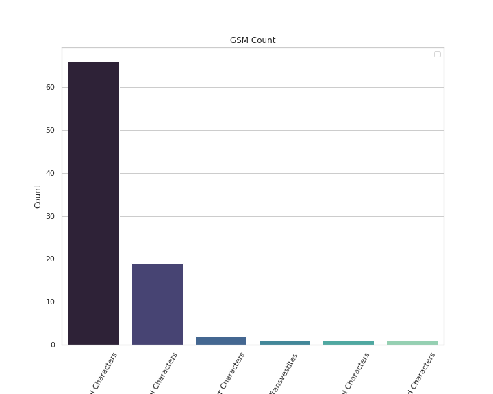
# GSM Count

plt.figure(figsize=(10,8))
sns.countplot(x='GSM',data=df,palette='mako',order = df['GSM'].value_counts().index)
plt.xlabel('GSM')
plt.xticks(rotation = 60)
plt.ylabel('Count')
plt.legend()
plt.title('GSM Count')


plt.show()
Output —
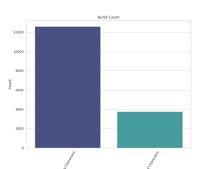
# Alive Count

plt.figure(figsize=(10,8))
sns.countplot(x='ALIVE',data=df,palette='mako',order = df['ALIVE'].value_counts().index)
plt.xlabel('ALIVE')
plt.xticks(rotation = 60)
plt.ylabel('Count')
plt.legend()
plt.title('ALIVE Count')


plt.show()
Output —
Univariate Analysis Numerical Features —
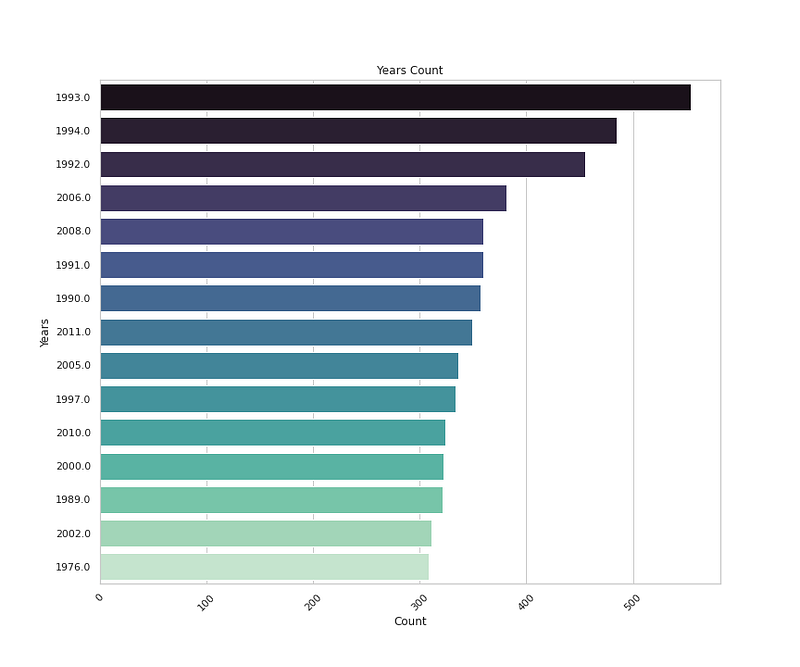
# Years Count

plt.figure(figsize=(12,10))
sns.countplot(y='Year',data=df,palette='mako',order=df['Year'].value_counts().index[0:15],orient= 'h')
plt.title('Years Count')
plt.xlabel('Count')
plt.ylabel('Years')
plt.xticks(rotation=45)


plt.show()
Output —
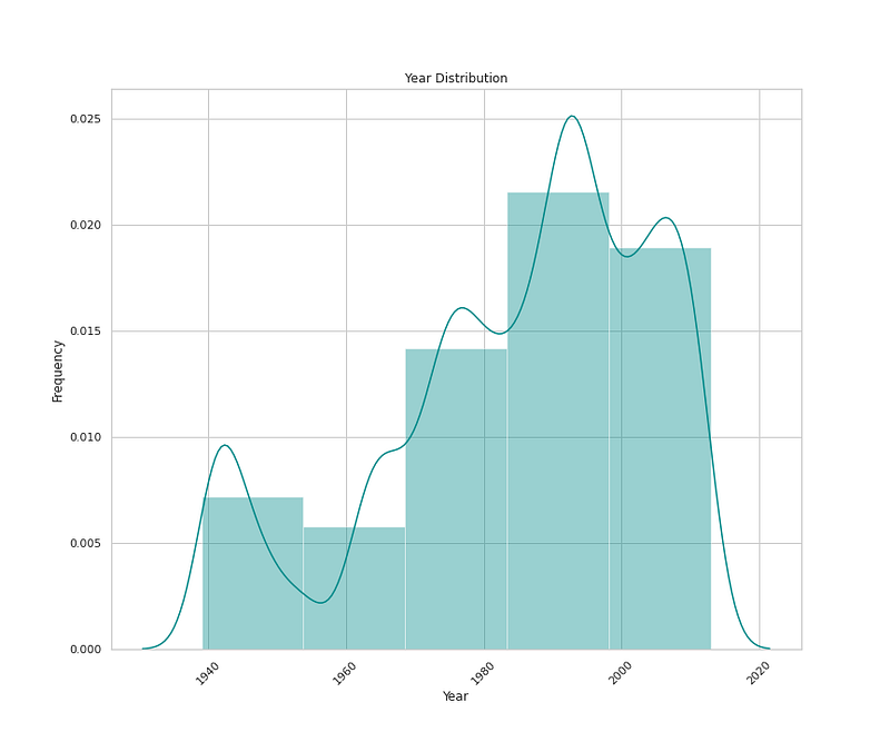
# Year Distribution


plt.figure(figsize=(12,10))
sns.distplot(x=df['Year'],bins=5,color='darkcyan',kde=True,hist=True)
plt.title('Year Distribution')
plt.xlabel('Year')
plt.ylabel('Frequency')
plt.xticks(rotation=45)


plt.show()
Output —
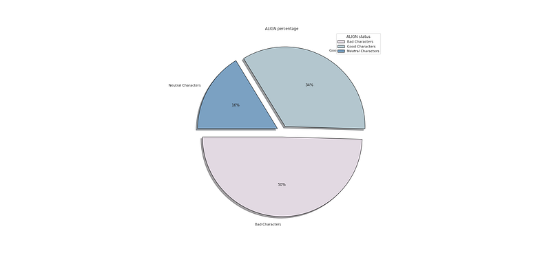
#   ALign Percentage

plt.figure(figsize=(25,12))
p_r = df['ALIGN'].value_counts().head(10)
plt.pie(x=p_r,labels=p_r.index,colors=colors1,autopct='%.0f%%',explode=[0.07 for i in p_r.index],startangle=180,wedgeprops={'linewidth':1,'edgecolor':'black'},shadow=True)
plt.title('ALIGN percentage ')
plt.legend(loc='upper right',title='ALIGN status')


plt.show()
Output —
#   Eye Percentage

plt.figure(figsize=(25,12))
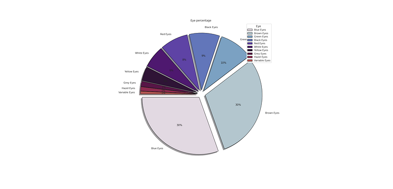
p_r = df['EYE'].value_counts().head(10)
plt.pie(x=p_r,labels=p_r.index,colors=colors1,autopct='%.0f%%',explode=[0.07 for i in p_r.index],startangle=180,wedgeprops={'linewidth':1,'edgecolor':'black'},shadow=True)
plt.title('Eye percentage ')
plt.legend(loc='upper right',title='Eye ')


plt.show()
Output —
#   Hair Percentage

plt.figure(figsize=(25,12))
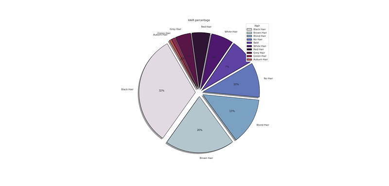
p_r = df['HAIR'].value_counts().head(10)
plt.pie(x=p_r,labels=p_r.index,colors=colors1,autopct='%.0f%%',explode=[0.07 for i in p_r.index],startangle=120,wedgeprops={'linewidth':1,'edgecolor':'black'},shadow=True)
plt.title('HAIR percentage ')
plt.legend(loc='upper right',title='Hair')


plt.show()
Output —
#   First Appearance Percentage

plt.figure(figsize=(25,12))
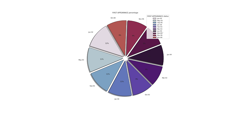
p_r = df['FIRST APPEARANCE'].value_counts().head(10)
plt.pie(x=p_r,labels=p_r.index,colors=colors1,autopct='%.0f%%',explode=[0.07 for i in p_r.index],startangle=120,wedgeprops={'linewidth':1,'edgecolor':'black'},shadow=True)
plt.title('FIRST APPEARANCE percentage ')
plt.legend(loc='upper right',title='FIRST APPEARANCE status')


plt.show()
Output —
Bivariate Analysis
In Bivariate Analysis, two variables/features are analyzed together and the relationship/association between them is studied.
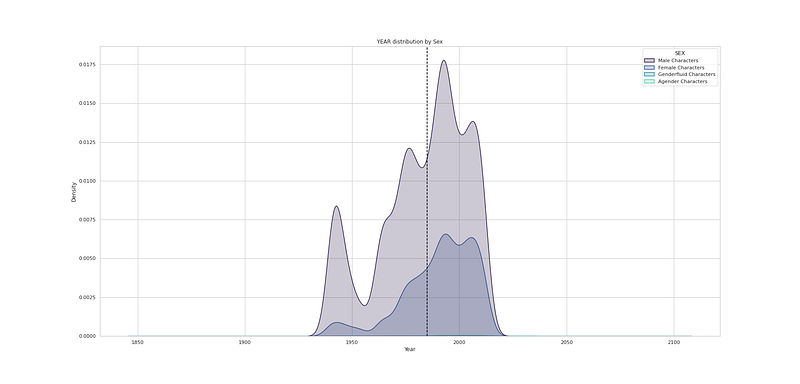
# YEAR distribution by Sex

plt.figure(figsize=(25,12))
sns.kdeplot(df["Year"], hue=df["SEX"], fill=True, linewidth=1.5, palette='mako')
plt.axvline(df['Year'].mean(), c='black',ls='--')
plt.title("YEAR distribution by Sex")


plt.show()
Output —
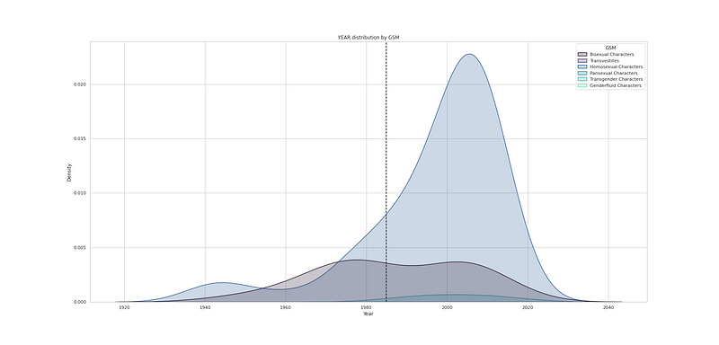
# YEAR distribution by GSM

plt.figure(figsize=(25,12))
sns.kdeplot(df["Year"], hue=df["GSM"], fill=True, linewidth=1.5, palette='mako')
plt.axvline(df['Year'].mean(), c='black',ls='--')
plt.title("YEAR distribution by GSM")


plt.show()
Output —
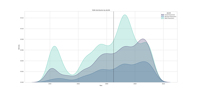
# YEAR distribution by Align

plt.figure(figsize=(25,12))
sns.kdeplot(df["Year"], hue=df["ALIGN"], fill=True, linewidth=1.5, palette='mako')
plt.axvline(df['Year'].mean(), c='black',ls='--')
plt.title("YEAR distribution by ALIGN")


plt.show()
Output —
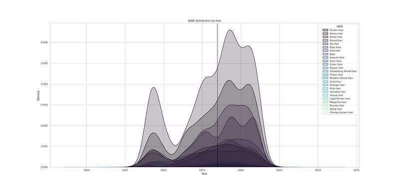
# YEAR distribution by Hair

plt.figure(figsize=(25,12))
sns.kdeplot(df["Year"], hue=df["HAIR"], fill=True, linewidth=1.5, palette='mako')
plt.axvline(df['Year'].mean(), c='black',ls='--')
plt.title("YEAR distribution by Hair")


plt.show()
Output —
# YEAR distribution by EYE

plt.figure(figsize=(25,12))
sns.kdeplot(df["Year"], hue=df["EYE"], fill=True, linewidth=1.5, palette='mako')
plt.axvline(df['Year'].mean(), c='black',ls='--')
plt.title("YEAR distribution by EYE")


plt.show()
Output —

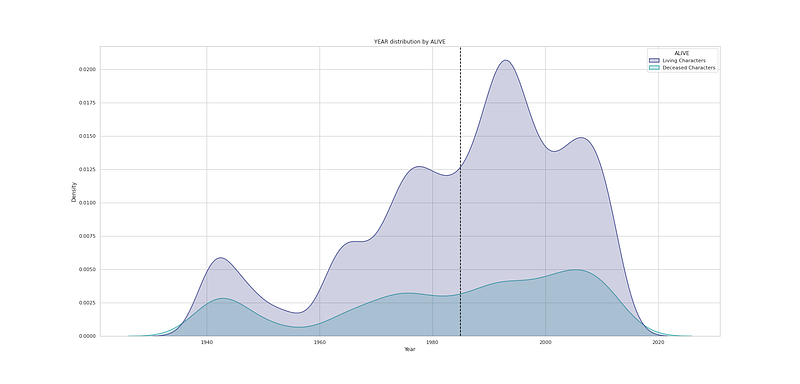
# YEAR distribution by ALIVE

plt.figure(figsize=(25,12))
sns.kdeplot(df["Year"], hue=df["ALIVE"], fill=True, linewidth=1.5, palette='mako')
plt.axvline(df['Year'].mean(), c='black',ls='--')
plt.title("YEAR distribution by ALIVE")


plt.show()
Output —
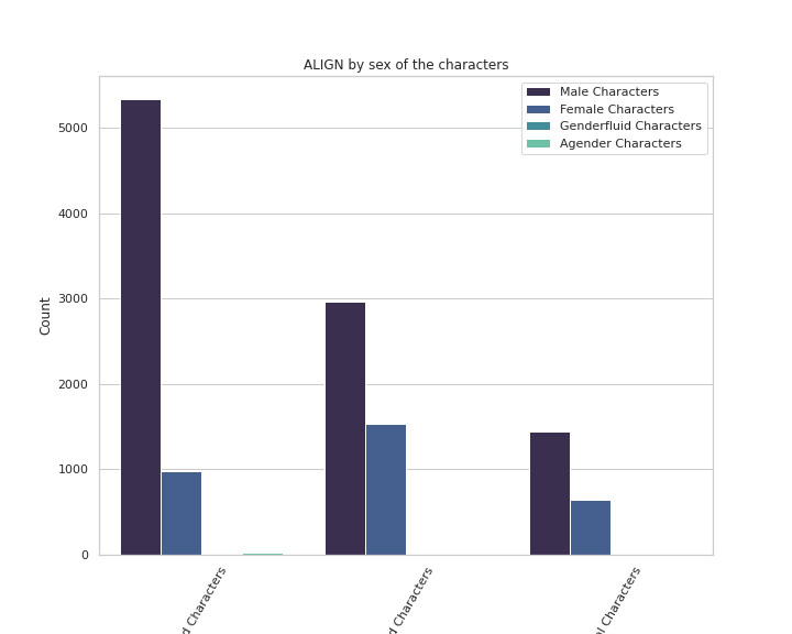
# ALIGN by sex of the characters

plt.figure(figsize=(10,8))
sns.countplot(x='ALIGN',data=df,palette='mako',order = df['ALIGN'].value_counts().index, hue = 'SEX')
plt.xlabel('Align')
plt.xticks(rotation = 60)
plt.ylabel('Count')
plt.legend()
plt.title('ALIGN by sex of the characters')


plt.show()
Output —
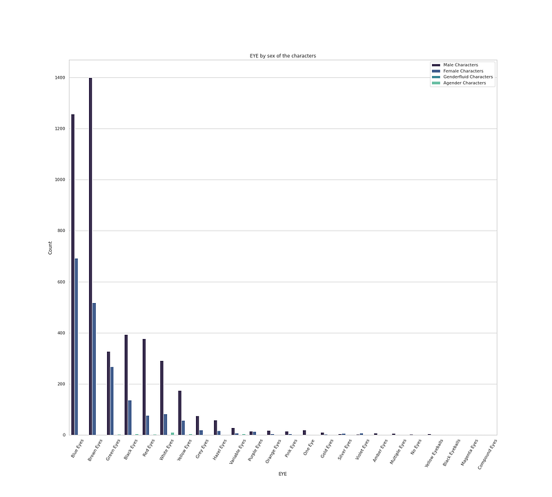
# EYE by sex of the characters

plt.figure(figsize=(20,18))
sns.countplot(x='EYE',data=df,palette='mako',order = df['EYE'].value_counts().index, hue = 'SEX')
plt.xlabel('EYE')
plt.xticks(rotation = 60)
plt.ylabel('Count')
plt.legend(loc='upper right')
plt.title('EYE by sex of the characters')


plt.show()
Output —
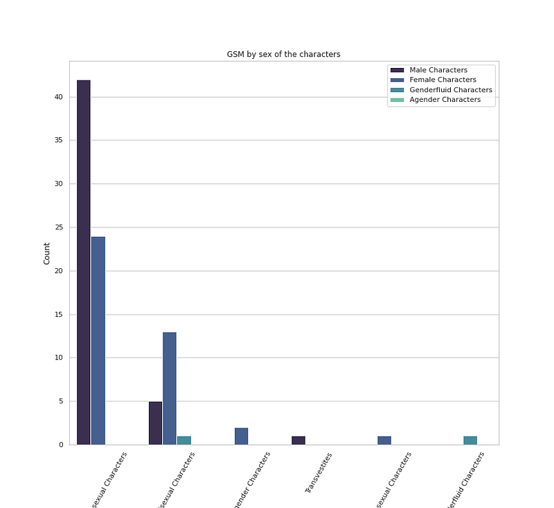
# GSM by sex of the characters

plt.figure(figsize=(12,11))
sns.countplot(x='GSM',data=df,palette='mako',order = df['GSM'].value_counts().index, hue = 'SEX')
plt.xlabel('GSM')
plt.xticks(rotation = 60)
plt.ylabel('Count')
plt.legend(loc='upper right')
plt.title('GSM by sex of the characters')


plt.show()
Output —
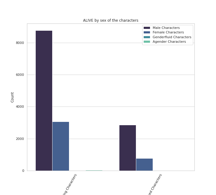
# Alive by Sex of the characters

plt.figure(figsize=(10,9))
sns.countplot(x='ALIVE',data=df,palette='mako',order = df['ALIVE'].value_counts().index, hue = 'SEX')
plt.xlabel('ALIVE')
plt.xticks(rotation = 60)
plt.ylabel('Count')
plt.legend(loc='upper right')
plt.title('ALIVE by sex of the characters')


plt.show()
Output —
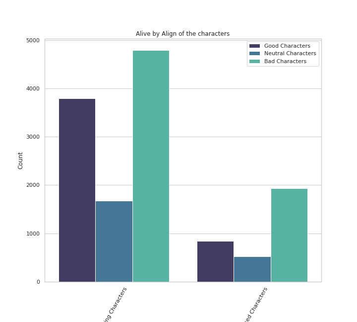
# Alive by Align of the characters

plt.figure(figsize=(10,9))
sns.countplot(x='ALIVE',data=df,palette='mako',order = df['ALIVE'].value_counts().index, hue = 'ALIGN')
plt.xlabel('ALIVE')
plt.xticks(rotation = 60)
plt.ylabel('Count')
plt.legend(loc='upper right')
plt.title('Alive by Align of the characters')


plt.show()
Output —
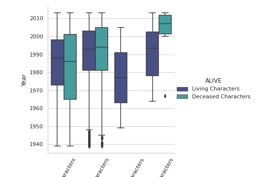
#Year by Sex and Alive status

plt.figure(figsize=(20,10))
sns.catplot(x = "SEX", y = "Year", hue = "ALIVE",data = df,palette='mako',orient='v',kind='box')

plt.xticks(rotation = 60)

plt.show()
Output —
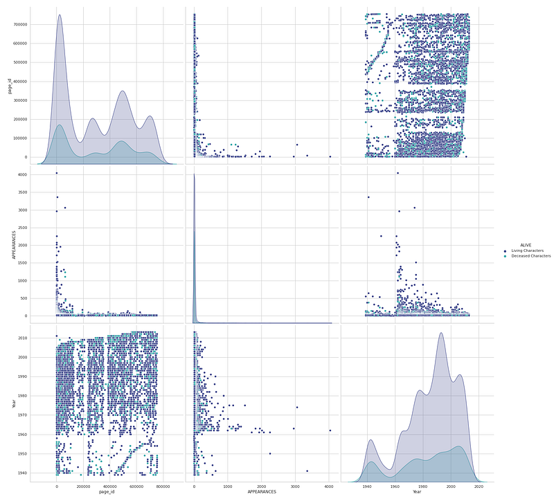
Multivariate Analysis
In Multivariate Analysis, more than two variables/features are analyzed together and the relationship/association between them is studied.
plt.figure(figsize=(40,30))
sns.pairplot(data=df,diag_kind = "kde",palette='mako',markers='o',size=7,hue = 'ALIVE')


plt.show()
Output —
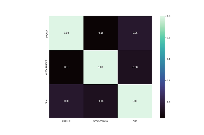
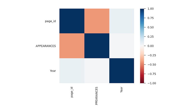
Correlation Analysis
In order to measure the strength of the linear association/relation between two variable, Correlation Analysis is used.
# heatmap correlation

corrmat = df.corr()
f, ax = plt.subplots(figsize=(15, 10))
sns.heatmap(corrmat, vmax=.8, square=True,annot=True,fmt=".2f",cmap='mako')


plt.show()
Output —
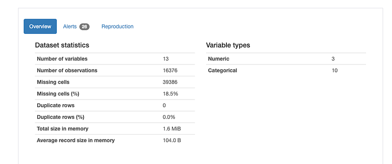
Data Profiling
It is used to generate profile reports from the input data.
The statistics include
Descriptive Statistics and Quantile Statistics.
Descriptive stats — Standard deviation, Kurtosis, mean, skewness, variance etc
Quantile Statistics — Min-max, percentiles, median, IQR etc
df.profile_report()Output —
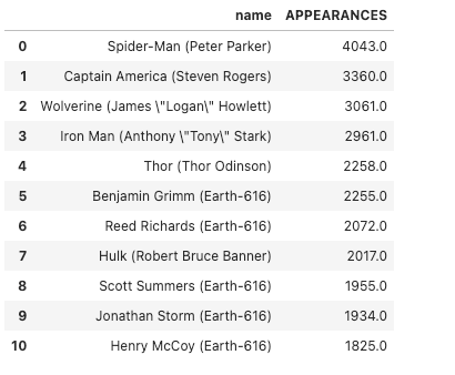
Sort Values
df_dc = df.sort_values(by='APPEARANCES',ascending=False)[:11][['name','APPEARANCES']]
df_dc
Feature Engineering
name = df["name"]
df["Name"] = [i.split(" ")[0].split(",")[-1].strip() for i in name]
df['Name']
Output —
0        Spider-Man
1           Captain
2         Wolverine
3              Iron
4              Thor
            ...
16371        Ru'ach
16372         Thane
16373      Tinkerer
16374         TK421
16375     Yologarch
Name: Name, Length: 16376, dtype: object
# Character Name Percentage
plt.figure(figsize=(25,12))
p_r = df['Name'].value_counts().head(10)
plt.pie(x=p_r,labels=p_r.index,colors=colors1,autopct='%.0f%%',explode=[0.07 for i in p_r.index],startangle=120,wedgeprops={'linewidth':1,'edgecolor':'black'},shadow=True)
plt.title('Character Name Percentage ')
plt.legend(loc='upper right',title='Character Name')
plt.show()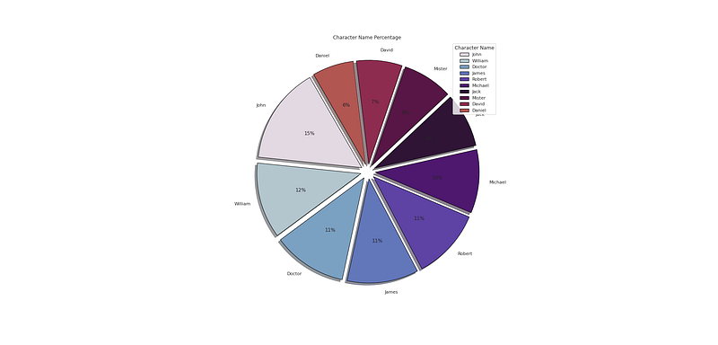
Correlation Coefficients
Spearman’s ρ
The Spearman’s rank correlation coefficient (ρ) is a measure of monotonic correlation between two variables, and is therefore better in catching nonlinear monotonic correlations than Pearson’s r. It’s value lies between -1 and +1, -1 indicating total negative monotonic correlation, 0 indicating no monotonic correlation and 1 indicating total positive monotonic correlation.
To calculate ρ for two variables X and Y, one divides the covariance of the rank variables of X and Y by the product of their standard deviations.
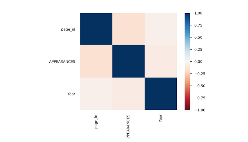
Pearson’s r
The Pearson’s correlation coefficient (r) is a measure of linear correlation between two variables. It’s value lies between -1 and +1, -1 indicating total negative linear correlation, 0 indicating no linear correlation and 1 indicating total positive linear correlation. Furthermore, r is invariant under separate changes in location and scale of the two variables, implying that for a linear function the angle to the x-axis does not affect r.
To calculate r for two variables X and Y, one divides the covariance of X and Y by the product of their standard deviations.
Kendall’s τ
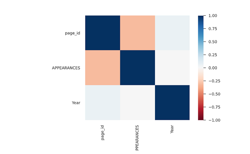
Similarly to Spearman’s rank correlation coefficient, the Kendall rank correlation coefficient (τ) measures ordinal association between two variables. It’s value lies between -1 and +1, -1 indicating total negative correlation, 0 indicating no correlation and 1 indicating total positive correlation.
To calculate τ for two variables X and Y, one determines the number of concordant and discordant pairs of observations. τ is given by the number of concordant pairs minus the discordant pairs divided by the total number of pairs.
Cramér’s V (φc)
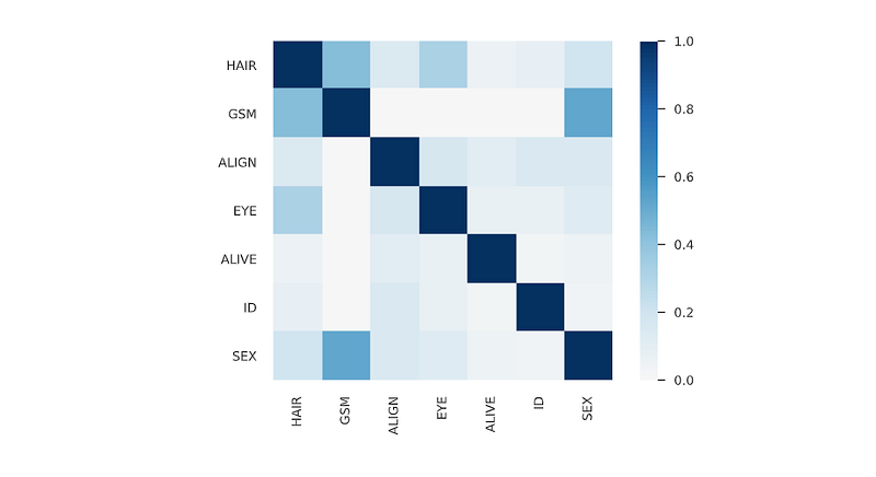
Cramér’s V is an association measure for nominal random variables. The coefficient ranges from 0 to 1, with 0 indicating independence and 1 indicating perfect association. The empirical estimators used for Cramér’s V have been proved to be biased, even for large samples.
Phik (φk)
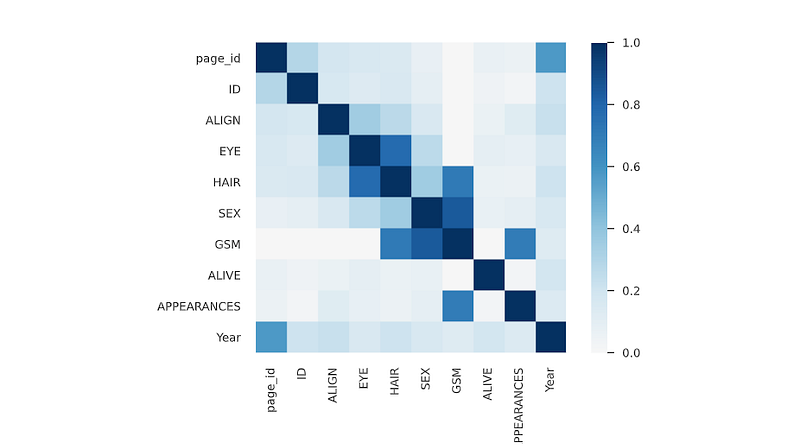
Phik (φk) is a new and practical correlation coefficient that works consistently between categorical, ordinal and interval variables, captures non-linear dependency and reverts to the Pearson correlation coefficient in case of a bivariate normal input distribution.
That’s it for now. Day 22 coming soon: Data Analysis : Project 8.
Let me know if you have questions in the comment section below. Subscribe/ Follow, Like/Clap as it would encourage me to write more in my free time
Stay Tuned!!
Read More —
11 most important System Design Base Concepts
6. Networking, How Browsers work, Content Network Delivery ( CDN)
13. System Design Template — How to solve any System Design Question
System Design Case Studies — In Depth
Complete Data Structures and Algorithm Series
Some of the other best Series —
30 days of Data Structures and Algorithms and System Design Simplified
Data Science and Machine Learning Research ( papers) Simplified **
100 days : Your Data Science and Machine Learning Degree Series with projects
Complete Data Visualization and Pre-processing Series with projects
Exceptional Github Repos — Part 1
Exceptional Github Repos — Part 2
Tech Newsletter —
If you are interested, you can join my newsletter through which I send tech interview tips, techniques, patterns, hacks — Software Development, ML, Data Science, Startups and Technology projects to more than 30K readers. You can subscribe to Tech Brew :
For Python Projects —
For complete 60 days of Data Science and ML : Day 1 — Day 60 : Quick Recap of 60 days of Data Science and ML
Follow for more updates. Stay tuned and keep coding!
For other projects, tune to —
Build Machine Learning Pipelines( With Code)
Recurrent Neural Network with Keras
Clustering Geolocation Data in Python using DBSCAN and K-Means
Facial Expression Recognition using Keras
Hyperparameter Tuning with Keras Tuner
Custom Layers in Keras


