
Project 5— Day 19 of 30 days of Data Analytics with Projects Series
Welcome back peeps. This is Day 19 of 30 days of data analytics where we will be implementing a project .
What’s covered in 30 days of Data Analytics Series till now —
Day 1 : Data Analytics basics and kickstart of Data analytics with projects series
Day 3 : Data Analytics Ecosystem — Data Life Cycle, Data Analysis complete process ( most important things)
Day 5 : Statistics
Day 6 : Basic and Advanced SQL
Day 8 : Pandas and Numpy
Day 9 : Data Manipulation
Day 10 : Data Visualization — Part 1
Day 11 : Project 1 : Data Visualization — Part 2
Day 12 : Data Visualization — Part 3
Day 13: Tableau — Part 1
Day 14: Tableau — Part 2
Day 15: Tableau — Part 3
Day 16 : Data Analysis Project 2
Day 17 : Data Analysis Project 3
Day 18: Data Analysis Project 4
Take Complete Hands On Tableau Course : Link
Projects Videos —
All the projects, data structures, SQL, algorithms, system design, Data Science and ML , Data Analytics, Data Engineering, , Implemented Data Science and ML projects, Implemented Data Engineering Projects, Implemented Deep Learning Projects, Implemented Machine Learning Ops Projects, Implemented Time Series Analysis and Forecasting Projects, Implemented Applied Machine Learning Projects, Implemented Tensorflow and Keras Projects, Implemented PyTorch Projects, Implemented Scikit Learn Projects, Implemented Big Data Projects, Implemented Cloud Machine Learning Projects, Implemented Neural Networks Projects, Implemented OpenCV Projects,Complete ML Research Papers Summarized, Implemented Data Analytics projects, Implemented Data Visualization Projects, Implemented Data Mining Projects, Implemented Natural Leaning Processing Projects, MLOps and Deep Learning, Applied Machine Learning with Projects Series, PyTorch with Projects Series, Tensorflow and Keras with Projects Series, Scikit Learn Series with Projects, Time Series Analysis and Forecasting with Projects Series, ML System Design Case Studies Series videos will be published on our youtube channel ( just launched).
Subscribe today!
Tech Newsletter —
If you are interested, you can join my newsletter through which I send tech interview tips, techniques, patterns, hacks — Software Development, ML, Data Science, Startups and Technology projects to more than 30K readers. You can subscribe to Tech Brew :
In the last post we covered Data Visualization and in this post we will cover a project.
(Note : Zoom all the images)
Import Necessary Libraries
import numpy as np # linear algebra
import pandas as pd # data processing, CSV file I/O (e.g. pd.read_csv)
import seaborn as sns
from matplotlib import pyplot as plt
import numpy as np
from matplotlib.colors import rgb2hex
import matplotlib.cm as cm
import plotly.express as px
import plotly.graph_objects as go
import squarify
from plotly.offline import init_notebook_mode,iplot

import matplotlib.colors
from collections import Counter
cmap2 = cm.get_cmap('twilight',13)
colors1= []
for i in range(cmap2.N):
    rgb= cmap2(i)[:4]
    colors1.append(rgb2hex(rgb))

# Set style
sns.set(style='whitegrid')
Load the Data
#Load the data
df_h21= pd.read_csv('/Path to file/world-happiness-report-2021.csv', low_memory = False)
Get information about the data —
# Get info

df_h21.info()<class 'pandas.core.frame.DataFrame'>
RangeIndex: 149 entries, 0 to 148
Data columns (total 20 columns):
# Column Non-Null Count Dtype
--- ------ -------------- -----
0 Country name 149 non-null object
1 Regional indicator 149 non-null object
2 Ladder score 149 non-null float64
3 Standard error of ladder score 149 non-null float64
4 upperwhisker 149 non-null float64
5 lowerwhisker 149 non-null float64
6 Logged GDP per capita 149 non-null float64
7 Social support 149 non-null float64
8 Healthy life expectancy 149 non-null float64
9 Freedom to make life choices 149 non-null float64
10 Generosity 149 non-null float64
11 Perceptions of corruption 149 non-null float64
12 Ladder score in Dystopia 149 non-null float64
13 Explained by: Log GDP per capita 149 non-null float64
14 Explained by: Social support 149 non-null float64
15 Explained by: Healthy life expectancy 149 non-null float64
16 Explained by: Freedom to make life choices 149 non-null float64
17 Explained by: Generosity 149 non-null float64
18 Explained by: Perceptions of corruption 149 non-null float64
19 Dystopia + residual 149 non-null float64
dtypes: float64(18), object(2)
memory usage: 23.4+ KB
#Get Missing Values in each column
df_h21.isna().sum()
Output —
Country name                                  0
Regional indicator                            0
Ladder score                                  0
Standard error of ladder score                0
upperwhisker                                  0
lowerwhisker                                  0
Logged GDP per capita                         0
Social support                                0
Healthy life expectancy                       0
Freedom to make life choices                  0
Generosity                                    0
Perceptions of corruption                     0
Ladder score in Dystopia                      0
Explained by: Log GDP per capita              0
Explained by: Social support                  0
Explained by: Healthy life expectancy         0
Explained by: Freedom to make life choices    0
Explained by: Generosity                      0
Explained by: Perceptions of corruption       0
Dystopia + residual                           0
dtype: int64
#Count of data records in each column
df_h21.count()Output —
Country name                                  149
Regional indicator                            149
Ladder score                                  149
Standard error of ladder score                149
upperwhisker                                  149
lowerwhisker                                  149
Logged GDP per capita                         149
Social support                                149
Healthy life expectancy                       149
Freedom to make life choices                  149
Generosity                                    149
Perceptions of corruption                     149
Ladder score in Dystopia                      149
Explained by: Log GDP per capita              149
Explained by: Social support                  149
Explained by: Healthy life expectancy         149
Explained by: Freedom to make life choices    149
Explained by: Generosity                      149
Explained by: Perceptions of corruption       149
Dystopia + residual                           149
dtype: int64
# Unique Countries
df_h21['Country name'].unique()array(['Finland', 'Denmark', 'Switzerland', 'Iceland', 'Netherlands',
'Norway', 'Sweden', 'Luxembourg', 'New Zealand', 'Austria',
'Australia', 'Israel', 'Germany', 'Canada', 'Ireland',
'Costa Rica', 'United Kingdom', 'Czech Republic', 'United States',
'Belgium', 'France', 'Bahrain', 'Malta',
'Taiwan Province of China', 'United Arab Emirates', 'Saudi Arabia',
'Spain', 'Italy', 'Slovenia', 'Guatemala', 'Uruguay', 'Singapore',
'Kosovo', 'Slovakia', 'Brazil', 'Mexico', 'Jamaica', 'Lithuania',
'Cyprus', 'Estonia', 'Panama', 'Uzbekistan', 'Chile', 'Poland',
'Kazakhstan', 'Romania', 'Kuwait', 'Serbia', 'El Salvador',
'Mauritius', 'Latvia', 'Colombia', 'Hungary', 'Thailand',
'Nicaragua', 'Japan', 'Argentina', 'Portugal', 'Honduras',
'Croatia', 'Philippines', 'South Korea', 'Peru',
'Bosnia and Herzegovina', 'Moldova', 'Ecuador', 'Kyrgyzstan',
'Greece', 'Bolivia', 'Mongolia', 'Paraguay', 'Montenegro',
'Dominican Republic', 'North Cyprus', 'Belarus', 'Russia',
'Hong Kong S.A.R. of China', 'Tajikistan', 'Vietnam', 'Libya',
'Malaysia', 'Indonesia', 'Congo (Brazzaville)', 'China',
'Ivory Coast', 'Armenia', 'Nepal', 'Bulgaria', 'Maldives',
'Azerbaijan', 'Cameroon', 'Senegal', 'Albania', 'North Macedonia',
'Ghana', 'Niger', 'Turkmenistan', 'Gambia', 'Benin', 'Laos',
'Bangladesh', 'Guinea', 'South Africa', 'Turkey', 'Pakistan',
'Morocco', 'Venezuela', 'Georgia', 'Algeria', 'Ukraine', 'Iraq',
'Gabon', 'Burkina Faso', 'Cambodia', 'Mozambique', 'Nigeria',
'Mali', 'Iran', 'Uganda', 'Liberia', 'Kenya', 'Tunisia', 'Lebanon',
'Namibia', 'Palestinian Territories', 'Myanmar', 'Jordan', 'Chad',
'Sri Lanka', 'Swaziland', 'Comoros', 'Egypt', 'Ethiopia',
'Mauritania', 'Madagascar', 'Togo', 'Zambia', 'Sierra Leone',
'India', 'Burundi', 'Yemen', 'Tanzania', 'Haiti', 'Malawi',
'Lesotho', 'Botswana', 'Rwanda', 'Zimbabwe', 'Afghanistan'],
dtype=object)Exploratory Data Analysis —
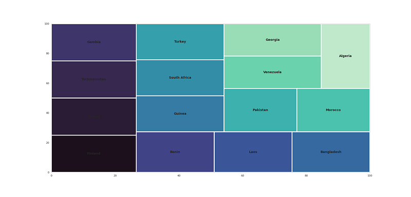
nc_country = df_h21['Country name'].dropna()
nc_country = pd.Series(dict(Counter(','.join(nc_country).replace(' ,',',').replace(', ',',').split(',')))).sort_values(ascending=False)
#Top countries
plt.figure(figsize=(25,12))
t = nc_country[:15]
squarify.plot(sizes=t.values,label=t.index,color=sns.color_palette("mako", n_colors=15),linewidth=4,text_kwargs={'fontsize':14,'fontweight':'bold'})
plt.savefig('sqplot.png')
plt.show()Output —
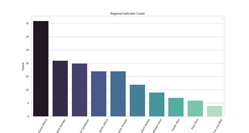
# Regional Indicator Analysis

plt.figure(figsize=(15,8))
sns.countplot(x='Regional indicator',data=df_h21,palette='mako',order = df_h21['Regional indicator'].value_counts().index)
plt.xlabel('Region Names')
plt.xticks(rotation = 60)
plt.ylabel('Count')
plt.legend()
plt.title('Regional Indicator Count')
plt.savefig('RIC.png')
plt.show()
Output —
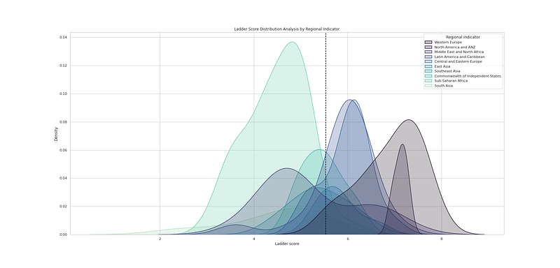
# Ladder Score Distribution Analysis by Regional Indicator

plt.figure(figsize=(25,12))
sns.kdeplot(df_h21["Ladder score"], hue=df_h21["Regional indicator"], fill=True, linewidth=1.5, palette='mako')
plt.axvline(df_h21['Ladder score'].mean(), c='black',ls='--')
plt.title("Ladder Score Distribution Analysis by Regional Indicator")
plt.savefig('LSD.png')
plt.show()
Output —
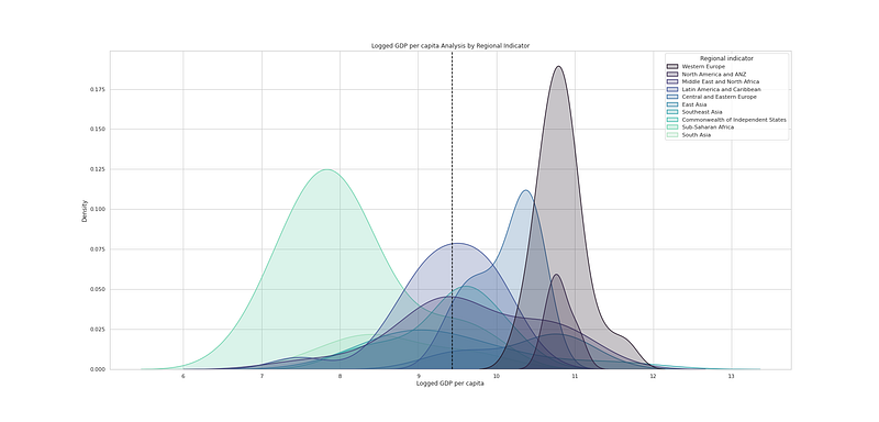
# Logged GDP per capita Analysis by Regional Indicator

plt.figure(figsize=(25,12))
sns.kdeplot(df_h21["Logged GDP per capita"], hue=df_h21["Regional indicator"], fill=True, linewidth=1.5, palette='mako')
plt.axvline(df_h21['Logged GDP per capita'].mean(), c='black',ls='--')
plt.title("Logged GDP per capita Analysis by Regional Indicator")
plt.savefig('LGPC.png')
plt.show()
Output —
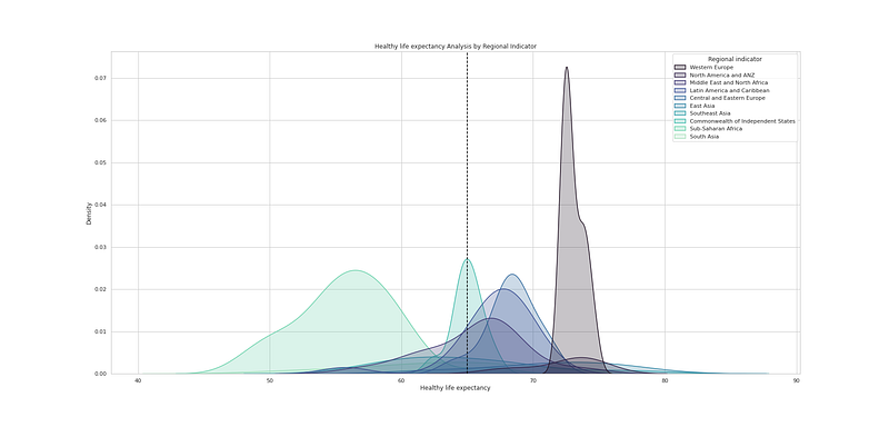
# Healthy life expectancy Analysis by Regional Indicator

plt.figure(figsize=(25,12))
sns.kdeplot(df_h21["Healthy life expectancy"], hue=df_h21["Regional indicator"], fill=True, linewidth=1.5, palette='mako')
plt.axvline(df_h21['Healthy life expectancy'].mean(), c='black',ls='--')
plt.title("Healthy life expectancy Analysis by Regional Indicator")
plt.savefig('HIE.png')
plt.show()
Output —
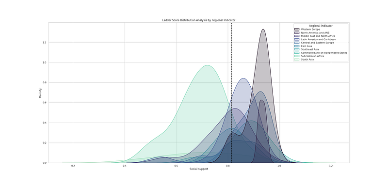
# Social Support Analysis by Regional Indicator

plt.figure(figsize=(25,12))
sns.kdeplot(df_h21["Social support"], hue=df_h21["Regional indicator"], fill=True, linewidth=1.5, palette='mako')
plt.axvline(df_h21['Social support'].mean(), c='black',ls='--')
plt.title("Ladder Score Distribution Analysis by Regional Indicator")
plt.savefig('SS.png')
plt.show()
Output —
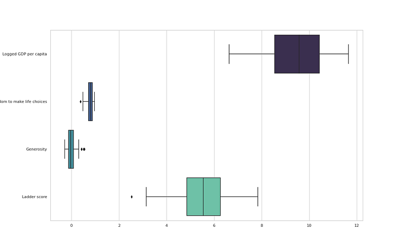
# Features affecting happiness

plt.figure(figsize=(16,10))
ft = ["Logged GDP per capita", "Freedom to make life choices", "Generosity","Ladder score"]
sns.boxplot(data = df_h21.loc[:, ft], orient = "h", palette = "mako")
plt.savefig('LFG.png')
plt.show()
Output —
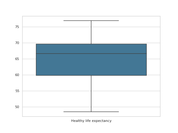
#Health Life Expectancy

plt.figure(figsize=(8,6))
ft_o = ["Healthy life expectancy"]
sns.boxplot(data = df_h21.loc[:,ft_o], orient = "v", palette = "mako")
plt.savefig('HIEX.png')
plt.show()
Output —
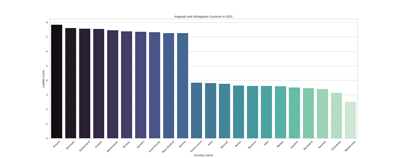
#Unhappiest and happiest countries

plt.figure(figsize=(25,10))
df_h21hu = df_h21[(df_h21.loc[:, "Ladder score"] > 7.2) | (df_h21.loc[:, "Ladder score"] < 4)]
sns.barplot(y = "Ladder score", x = "Country name", data=df_h21hu, palette = "mako",orient='v')
plt.title("Happiest and Unhappiest Countries in 2021")
plt.xticks(rotation=45)
plt.savefig('UH.png')
plt.show()
Output —
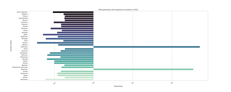
df_h21['Generosity'].max()
df_h21['Generosity'].min()
#Most generaous and ungenerous countries
plt.figure(figsize=(25,10))
df_h21gu = df_h21[(df_h21.loc[:, "Generosity"] > 0.47) | (df_h21.loc[:, "Generosity"] < -0.14)]
sns.barplot(x = "Generosity", y = "Country name", data=df_h21gu, palette = "mako",orient='h')
plt.title("Most generaous and ungenerous countries in 2021")
plt.xticks(rotation=45)
plt.savefig('GU.png')
plt.show()Output —
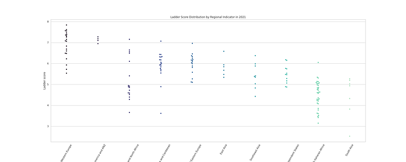
#Ladder Score distribution by Regional Indicator

plt.figure(figsize=(25,10))
sns.swarmplot(x = "Regional indicator", y = "Ladder score", data = df_h21,palette= 'mako')

plt.title("Ladder Score Distribution by Regional Indicator in 2021")
plt.xticks(rotation = 60)
plt.savefig('LSDRI.png')
plt.show()
Output —
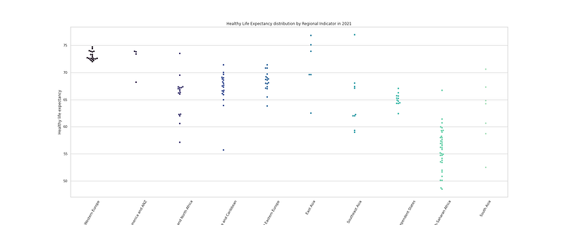
# Healthy Life Expectancy distribution by Regional Indicator

plt.figure(figsize=(25,10))
sns.swarmplot(x = "Regional indicator", y = "Healthy life expectancy", data = df_h21,palette= 'mako')

plt.title("Healthy Life Expectancy distribution by Regional Indicator in 2021")
plt.xticks(rotation = 60)
plt.savefig('HLED.png')
plt.show()
Output —
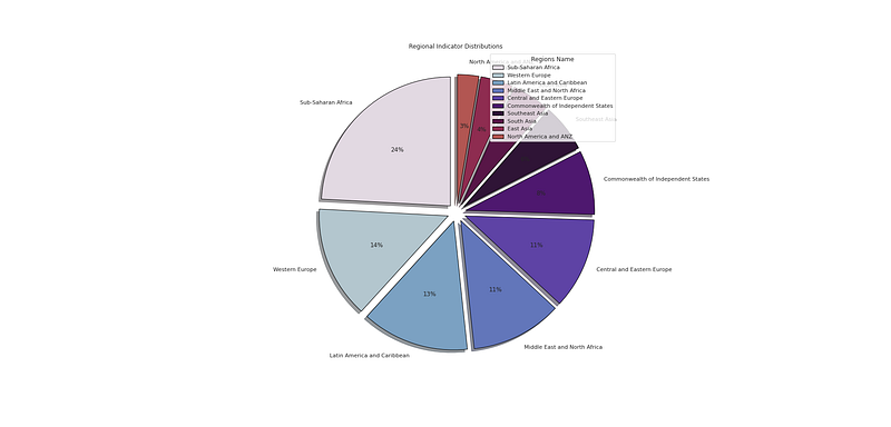
#Regional Indicator Distribution

plt.figure(figsize=(25,12))
p_region = df_h21['Regional indicator'].value_counts().head(10)
plt.pie(x=p_region,labels=p_region.index,colors=colors1,autopct='%.0f%%',explode=[0.07 for i in p_region.index],startangle=90,wedgeprops={'linewidth':1,'edgecolor':'black'},shadow=True)
plt.title('Regional Indicator Distributions ')
plt.legend(loc='upper right',title='Regions Name')

plt.savefig('RIDP.png')
plt.show()
Output —
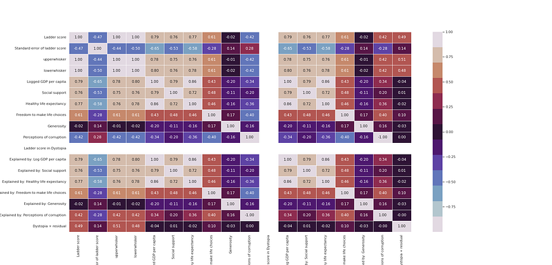
#heatmap

plt.figure(figsize=(25,12))
sns.heatmap(df_h21.corr(), annot = True, fmt = ".2f", linewidth = .7,cmap=colors1)
plt.savefig('heatmap.png')
plt.show()
Output —
That’s it for now. Day 20 coming soon: Data Analysis : Project 6.
Let me know if you have questions in the comment section below. Subscribe/ Follow, Like/Clap as it would encourage me to write more in my free time
Stay Tuned!!
Read More —
11 most important System Design Base Concepts
6. Networking, How Browsers work, Content Network Delivery ( CDN)
13. System Design Template — How to solve any System Design Question
System Design Case Studies — In Depth
Complete Data Structures and Algorithm Series
Some of the other best Series —
30 days of Data Structures and Algorithms and System Design Simplified
Data Science and Machine Learning Research ( papers) Simplified **
100 days : Your Data Science and Machine Learning Degree Series with projects
Complete Data Visualization and Pre-processing Series with projects
Exceptional Github Repos — Part 1
Exceptional Github Repos — Part 2
Tech Newsletter —
If you are interested, you can join my newsletter through which I send tech interview tips, techniques, patterns, hacks — Software Development, ML, Data Science, Startups and Technology projects to more than 30K readers. You can subscribe to Tech Brew :
For Python Projects —
For complete 60 days of Data Science and ML : Day 1 — Day 60 : Quick Recap of 60 days of Data Science and ML
Follow for more updates. Stay tuned and keep coding!
For other projects, tune to —
Build Machine Learning Pipelines( With Code)
Recurrent Neural Network with Keras
Clustering Geolocation Data in Python using DBSCAN and K-Means
Facial Expression Recognition using Keras
Hyperparameter Tuning with Keras Tuner
Custom Layers in Keras


