
Project 3— Day 17 of 30 days of Data Analytics with Projects Series
Welcome back peeps. This is Day 17 of 30 days of data analytics where we will be implementing a project.
What’s covered in 30 days of Data Analytics Series till now —
Day 1 : Data Analytics basics and kickstart of Data analytics with projects series
Day 3 : Data Analytics Ecosystem — Data Life Cycle, Data Analysis complete process ( most important things)
Day 5 : Statistics
Day 6 : Basic and Advanced SQL
Day 8 : Pandas and Numpy
Day 9 : Data Manipulation
Day 10 : Data Visualization — Part 1
Day 11 : Project 1 : Data Visualization — Part 2
Day 12 : Data Visualization — Part 3
Day 13: Tableau — Part 1
Day 14: Tableau — Part 2
Day 15: Tableau — Part 3
Day 16 : Data Analysis Project 2
Day 17 : Data Analysis Project 3
Take Complete Hands On Tableau Course : Link
Projects Videos —
All the projects, data structures, SQL, algorithms, system design, Data Science and ML , Data Analytics, Data Engineering, , Implemented Data Science and ML projects, Implemented Data Engineering Projects, Implemented Deep Learning Projects, Implemented Machine Learning Ops Projects, Implemented Time Series Analysis and Forecasting Projects, Implemented Applied Machine Learning Projects, Implemented Tensorflow and Keras Projects, Implemented PyTorch Projects, Implemented Scikit Learn Projects, Implemented Big Data Projects, Implemented Cloud Machine Learning Projects, Implemented Neural Networks Projects, Implemented OpenCV Projects,Complete ML Research Papers Summarized, Implemented Data Analytics projects, Implemented Data Visualization Projects, Implemented Data Mining Projects, Implemented Natural Leaning Processing Projects, MLOps and Deep Learning, Applied Machine Learning with Projects Series, PyTorch with Projects Series, Tensorflow and Keras with Projects Series, Scikit Learn Series with Projects, Time Series Analysis and Forecasting with Projects Series, ML System Design Case Studies Series videos will be published on our youtube channel ( just launched).
Subscribe today!
Tech Newsletter —
If you are interested, you can join my newsletter through which I send tech interview tips, techniques, patterns, hacks — Software Development, ML, Data Science, Startups and Technology projects to more than 30K readers. You can subscribe to Tech Brew :
In the last post we covered Data Visualization and in this post we will cover a project.
(Note : Zoom all the images)
Import necessary libraries
import numpy as np # linear algebra
import pandas as pd # data processing, CSV file I/O (e.g. pd.read_csv)
import seaborn as sns
from matplotlib import pyplot as plt
Load the Data
df_one = pd.read_csv('/path to the file/kaggle_survey_responses.csv',low_memory = False)
df_one
Set the color palette for your EDA
from matplotlib.colors import rgb2hex
import matplotlib.cm as cmcmap1 = cm.get_cmap('Blues',13)
colors= []
for i in range(cmap1.N):
    rgb= cmap1(i)[:4]
    colors.append(rgb2hex(rgb))
    #print(rgb2hex(rgb))from matplotlib.colors import rgb2hex
import matplotlib.cm as cmcmap2 = cm.get_cmap('twilight',13)
colors1= []
for i in range(cmap2.N):
    rgb= cmap2(i)[:4]
    colors1.append(rgb2hex(rgb))
    #print(rgb2hex(rgb))
Analyze your data ( EDA) —
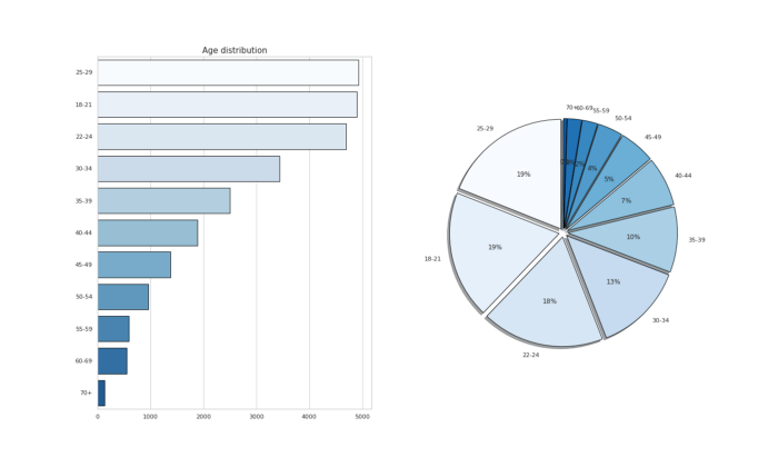
# Age Distribution of survey Participantsfig,ax1 = plt.subplots(1,2,figsize=(20,12))
c_age = df_one['Q1'].value_counts().head(11)sns.barplot(x=c_age.values,y=c_age.index,palette =colors,edgecolor='black',ax=ax1[0])
ax1[0].set_title('Age distribution',fontsize=15)ax1[1].pie(x=c_age,labels=c_age.index,autopct='%.0f%%',colors=colors,explode=[0.04 for i in c_age.index],shadow=True,startangle = 90,
wedgeprops = {'linewidth' : 1, 'edgecolor' : "black"})plt.show()Output —
Observations —
About 19% of survey participants are aged 18–29 and 18% aged 22–24 followed by 30–34 yrs old.
# Age Distribution by Genderdict1 = {}
for g in df_one['Q2'].value_counts().index:
    dict1[g]= df_one[df_one['Q2']==g]['Q1'].value_counts()gender_df=pd.DataFrame(dict1)# plotfigure,ax01=plt.subplots(1,1,figsize=(20,15))ax01.bar(gender_df.index,gender_df['Man'],color='#2c9184',label='Man')
ax01.bar(gender_df.index,gender_df['Woman'],color='#64ADDE',label='Woman')for i in gender_df.index:
    ax01.annotate(gender_df['Man'].loc[i],xy=(i,gender_df['Man'].loc[i]+50),ha='center',va='center',fontsize=15)
    ax01.annotate(gender_df['Woman'].loc[i],xy=(i,gender_df['Woman'].loc[i]-50),ha='center',va='center',fontsize=15)plt.xlabel('Age',fontsize=15)
plt.ylabel('Count',fontsize=15)
plt.title('Age Distribution by Gender',fontsize=20)
plt.legend(fontsize=20, loc='right')plt.show()Output —
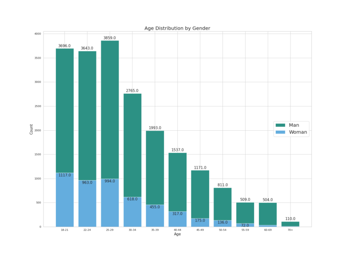
Observation —
Some 3800+ men aged 25–29 years and 1100+ woman aged 18–21 years have participated in the Kaggle Annual survey. Young population on the roll!
# Percentage of Man and Womanfigure(figsize=(20,15),dpi=100)data = df_one[df_one["Q2"].isin(["Man","Woman"])]ax02 = sns.countplot(x="Q1", data=data, hue='Q2',palette=colors1)
plt.title('Gender Distribution', fontsize=15)
for p in ax02.patches:
    percentage = '{:.1f}%'.format(100 * p.get_height()/float(data.shape[0]))
    x = p.get_x() + p.get_width()
    y = p.get_height()
    ax02.annotate(percentage, (x, y),ha='center',va='center')
plt.xlabel("Gender distribution",fontsize=15)
plt.ylabel("Count",fontsize=15)plt.show()Output —
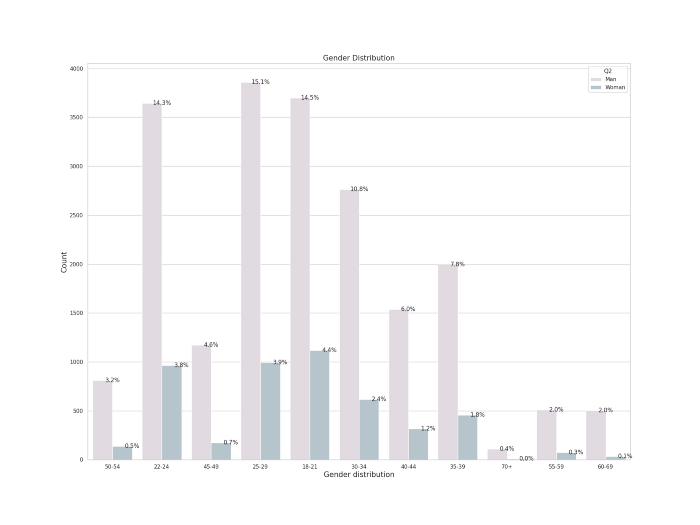
Observation —
More than 15% of man aged 25–29 years and 14% of woman aged 22–24 years participated in the Kaggle Annual Survey which confirms over previous premise.
figure(figsize=(20,15),dpi=100)data = df_one[df_one["Q2"]=="Woman"]ax03 = sns.countplot(x="Q2", data=data, hue='Q1',palette=colors1)
plt.title('Woman and Age group', fontsize=15)
for p in ax03.patches:
    percentage = '{:.1f}%'.format(100 * p.get_height()/float(data.shape[0]))
    x = p.get_x() + p.get_width()
    y = p.get_height()
    ax03.annotate(percentage, (x, y),ha='center',va='center')
plt.xlabel("Woman Survey participants",fontsize=15)
plt.ylabel("Count",fontsize=15)plt.show()Output —
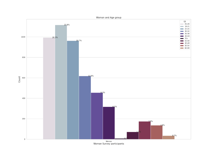
Observation —
More younger women aged 18–21 and 25–29 years participated in the Kaggle Annual Survey.
# Education of the survey Participants

df_one['Q4_one'] = ["Uni" if i == 'Some college/university study without earning a bachelor’s degree' else i for i in df_one['Q4']]

fig,ax2 = plt.subplots(1,2,figsize=(20,10))
c_ed = df_one['Q4_one'].value_counts().head()sns.barplot(x=c_ed.index,y=c_ed.values,palette=colors1,edgecolor='black',linewidth=0.2,ax=ax2[0])
ax2[0].set_title('Education Distribution',fontsize=15)ax2[1].pie(x=c_ed,labels=c_ed.index,colors=colors,autopct='%.0f%%',explode=[0.02 for i in c_ed.index],shadow=True,startangle = 90,
wedgeprops = {'linewidth' : 1, 'edgecolor' : "black"})plt.show()Output —
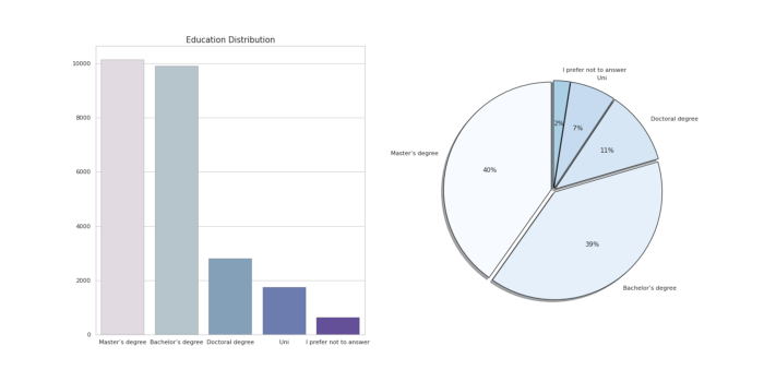
Observation —
About 40 % of the total survey participants are Masters degree holders followed by Bachelors degree.
# Formal education level and Programming Experiencefigure,ax8=plt.subplots(2,1,figsize=(20,15))sns.countplot(x='Q4_one',hue='Q6',ec='black',data=df_ans,ax=ax8[0],palette=colors1)
ax8[0].set_title("Formal Education level and Programming Experience of Survey Participants",fontsize=15)h2= df_ans.pivot_table(index='Q4_one',columns='Q6',values='Q1',aggfunc='count')
sns.heatmap(h2.T,cmap='Purples',ax=ax8[1])
plt.xlabel('Education Level', fontsize = 12)
plt.ylabel('Years of Experience', fontsize = 12)plt.show()Output —

# Education and Title of the survey Participantsfig, ax7 = plt.subplots(2,1,figsize=(20,15))sns.countplot(x='Q4_one',hue='Q5',ec='black',data=df_ans,ax=ax7[0],palette=colors)
ax7[0].set_title("Education and Title of the survey Participants",fontsize=15)h1= df_ans.pivot_table(index='Q4_one',columns='Q5',values='Q1',aggfunc='count')
sns.heatmap(h1.T,cmap='Purples',ax=ax7[1])
plt.xlabel('Education Level', fontsize = 12)
plt.ylabel('Title of Survey Participants', fontsize = 12)
plt.savefig('ETP.png')
plt.show()
Output —
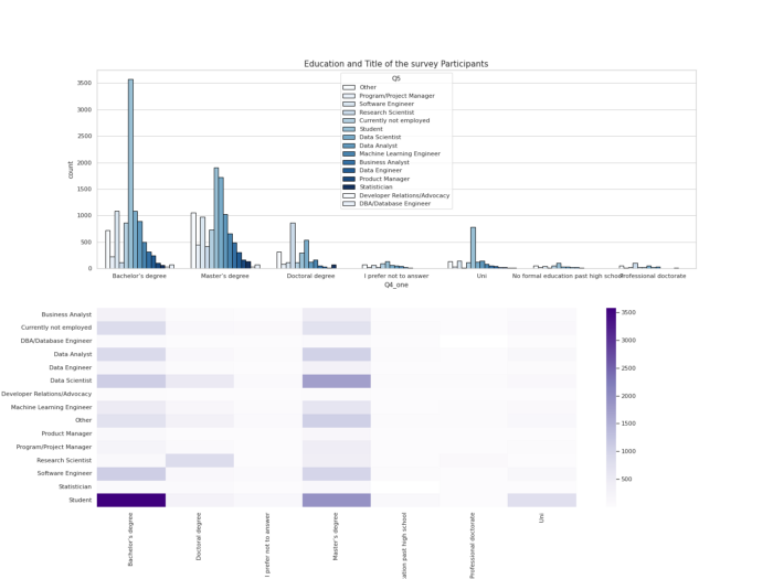
Observation —
Most of the student survey participants are bachelors degree holders followed by Data Scientists holding Masters Degree.
#Country of Survey Participantsdf_one['Q3_one'] = ['USA' if i =='United States of America' else i for i in df_one['Q3']]fig,ax3= plt.subplots(1,2,figsize=(20,8))c_cntry = df_one['Q3_one'].value_counts().head()
sns.barplot(x=c_cntry.values, y = c_cntry.index,palette=colors1,edgecolor='black',ax=ax3[0])
ax3[0].set_title('Country Distribution',fontsize=15)
ax3[1].pie(x=c_cntry,labels=c_cntry.index,colors=colors1,autopct='%.0f%%',explode=[0.03 for i in c_cntry.index],shadow=True,startangle = 90,wedgeprops = {'linewidth' : 1, 'edgecolor' : "black"})plt.show()Output —
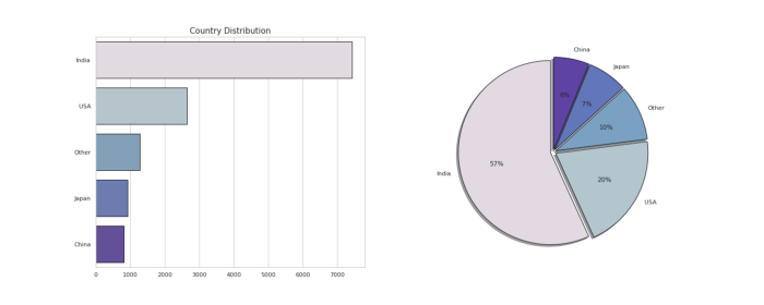
Observation —
Most of the survey participants ( 57%) are from India followed by USA ( 20%)
# Experience in Programmingfigure,ax4=plt.subplots(1,2,figsize=(20,8))c_prg = df_one['Q6'].value_counts().head()
sns.barplot(x=c_prg.index,y=c_prg.values,palette=colors1,edgecolor='black',ax=ax4[0])
ax4[0].set_title('Programming Experience',fontsize=15)
ax4[1].pie(x=c_prg,labels=c_prg.index,colors=colors1,autopct='%.0f%%',shadow=True,explode=[0.02 for i in c_prg.index],startangle = 90,
wedgeprops = {'linewidth' : 1, 'edgecolor' : "black"})plt.show()Output —
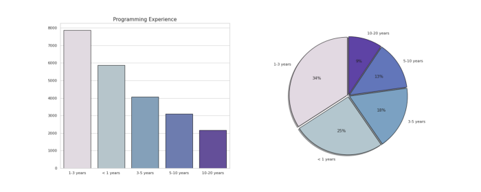
Observation —
More than 30% of survey participants have atleast 1–3 years of programming experience while some of them are just newbies( less than 1 year old)
# Programming Experience and Job Title
figure(figsize=(20,15),dpi=100)sns.catplot(data=df_ans, x='Q8', kind='count', hue='Q5', height=5, aspect=3, palette= colors1 )
plt.xlabel('Programming language')
plt.title('Programming Experience and Job title of Survey Participants')plt.show()Output —
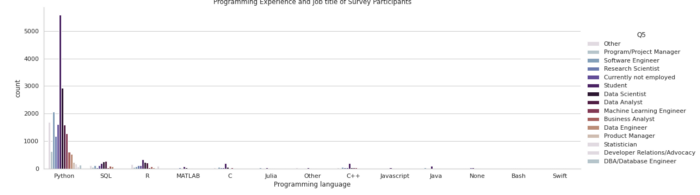
Observation —
Most of the survey participants who are holding titles as students, data scientist, Data Analyst, ML Engineer use Python for Data Science.
# Title of the Survey Participantsfigure,ax5 = plt.subplots(1,2,figsize=(20,8))
c_title = df_one['Q5'].value_counts().head()sns.barplot(x=c_title.values,y=c_title.index,palette = colors1[::-1], edgecolor='black',ax=ax5[0])
ax5[0].set_title('Title of Survey Participants')
ax5[1].pie(x=c_title,labels=c_title.index,colors=colors1[::-1],autopct='%.0f%%',shadow=True,explode=[0.02 for i in c_title.index],startangle = 90, wedgeprops = {'linewidth' : 1, 'edgecolor' : "black"})plt.show()
Output —
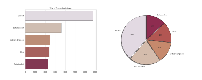
Observation —
More than 39% of total survey participants are Students followed by Data Scientists and software engineer.
# Years of Programming Exp by Title of the Survey Participantssns.catplot(data=df_ans,
            x='Q6', hue='Q5',
            kind='count',
            log=False,
            height=7, aspect=3,palette=colors1)
plt.xlabel('Years of Programming Experience',fontsize=15)
plt.title('Years of Programming Exp by Title of the Survey Participants',fontsize=15)plt.show()
Output —
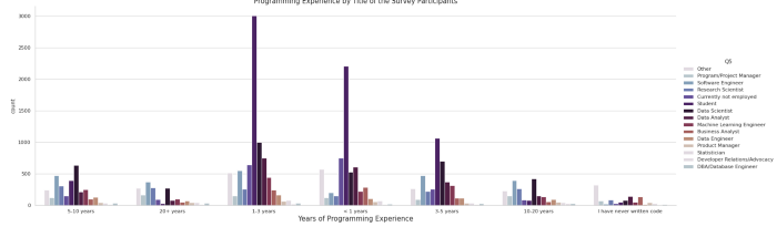
Observation —
Most of the students followed by Data Scientists and Data Analysts have atleast 1–3 years of programming experience.
# age of survey participants ( wrt education)fig,ax6 = plt.subplots(2,1,figsize=(20,15))
df_ans= df_one[1:]sns.countplot(x='Q1',hue="Q4_one",ec='black',data=df_ans,ax=ax6[0],palette= colors1)
ax6[0].set_title("Age and Education of the survey participants")h = df_ans.pivot_table(index='Q1',columns='Q4_one',values='Q5',aggfunc='count')
sns.heatmap(h.T,cmap="Purples",ax=ax6[1])
plt.ylabel('Education Level', fontsize = 12)
plt.xlabel('Age of Survey Participants', fontsize = 12)
plt.show()
Output —
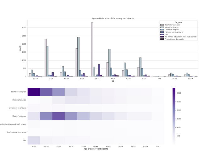
Observation —
Most of the survey participants are bachelors degree holders and aged 18–21 years old followed by Masters Degree holders and aged 25–29 years old.
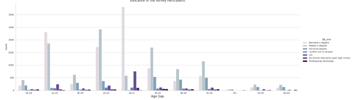
# Age by Education of the Survey Participantssns.catplot(data=df_ans,
            x='Q1', hue='Q4_one',
            kind='count',
            log=False,
            height=7, aspect=3,palette=colors1)
plt.xlabel('Age Gap',fontsize=15)
plt.title('Education of the Survey Participants',fontsize=15)plt.show()Output —
That’s it for now. Day 18 : Data Analysis : Project 4.
Let me know if you have questions in the comment section below. Subscribe/ Follow, Like/Clap as it would encourage me to write more in my free time
Stay Tuned!!
Read More —
11 most important System Design Base Concepts
6. Networking, How Browsers work, Content Network Delivery ( CDN)
13. System Design Template — How to solve any System Design Question
System Design Case Studies — In Depth
Complete Data Structures and Algorithm Series
Some of the other best Series —
30 days of Data Structures and Algorithms and System Design Simplified
Data Science and Machine Learning Research ( papers) Simplified **
100 days : Your Data Science and Machine Learning Degree Series with projects
Complete Data Visualization and Pre-processing Series with projects
Exceptional Github Repos — Part 1
Exceptional Github Repos — Part 2
Tech Newsletter —
If you are interested, you can join my newsletter through which I send tech interview tips, techniques, patterns, hacks — Software Development, ML, Data Science, Startups and Technology projects to more than 30K readers. You can subscribe to Tech Brew :
For Python Projects —
For complete 60 days of Data Science and ML : Day 1 — Day 60 : Quick Recap of 60 days of Data Science and ML
Follow for more updates. Stay tuned and keep coding!
For other projects, tune to —
Build Machine Learning Pipelines( With Code)
Recurrent Neural Network with Keras
Clustering Geolocation Data in Python using DBSCAN and K-Means
Facial Expression Recognition using Keras
Hyperparameter Tuning with Keras Tuner
Custom Layers in Keras


