
Day 18 of 30 days of Data Engineering Series with Projects
Welcome back peeps to Day 18 of Data Engineering Series with Projects!
In this we will cover —
Data Visualization using Plotly and Bokeh
Categorical and Numerical Features
Pre-requisite to Day 18 is to complete Day 1–17( link below):
Day 3 : Complete Advanced Python for Data Engineering — Part 2
Day 18 : Data Visualization basics, Data Visualization Projects, Data Visualization using Plotly and Bokeh, Data Profiling, Summary Functions, Indexing, Grouping, Linear Regression, Multi Linear Regression, Polynomial Regression, Regression, Support Vector Regression, Decision Tree Regression, Random Forest Regression, Feature Engineering, GroupBy Features, Categorical and Numerical Features, Missing Value Analysis, Fill the missing Values, Unique Value Analysis, Univariate Analysis, Bivariate Analysis, Multivariate Analysis, Correlation Analysis, Spearman’s ρ, Pearson’s r, Kendall’s τ, Cramér’s V (φc), Phik (φk)
Projects Videos —
All the projects, data structures, SQL, algorithms, system design, Data Science and ML , Data Analytics, Data Engineering, , Implemented Data Science and ML projects, Implemented Data Engineering Projects, Implemented Deep Learning Projects, Implemented Machine Learning Ops Projects, Implemented Time Series Analysis and Forecasting Projects, Implemented Applied Machine Learning Projects, Implemented Tensorflow and Keras Projects, Implemented PyTorch Projects, Implemented Scikit Learn Projects, Implemented Big Data Projects, Implemented Cloud Machine Learning Projects, Implemented Neural Networks Projects, Implemented OpenCV Projects,Complete ML Research Papers Summarized, Implemented Data Analytics projects, Implemented Data Visualization Projects, Implemented Data Mining Projects, Implemented Natural Leaning Processing Projects, MLOps and Deep Learning, Applied Machine Learning with Projects Series, PyTorch with Projects Series, Tensorflow and Keras with Projects Series, Scikit Learn Series with Projects, Time Series Analysis and Forecasting with Projects Series, ML System Design Case Studies Series videos will be published on our youtube channel ( just launched).
Subscribe today!
Tech Newsletter —
If you are interested, you can join my newsletter through which I send tech interview tips, techniques, patterns, hacks — Software Development, ML, Data Science, Startups and Technology projects to more than 30K readers. You can subscribe to Ignito:
System Design Case Studies — In Depth
Design Instagram
Design Netflix
Design Reddit
Design Amazon
Design Messenger App
Design Twitter
Design URL Shortener
Design Dropbox
Design Youtube
Design API Rate Limiter
Design Web Crawler
Design Amazon Prime Video
Design Facebook’s Newsfeed
Design Yelp
Design Uber
Design Tinder
Design Tiktok
Design Whatsapp
Most Popular System Design Questions
Mega Compilation : Solved System Design Case studies
Let’s get started!
Data Visualization is an incredibly important step as it helps to understand how the data is distributed wrt time, lets you visualize your hypothesis about the data, conveys important information through different charts to let leaders take important business decisions, lets you examine the missing values/outliers in the data.
How To Choose Right Data Visualization Charts For Your Data/best represent your data?
To answer this question, first you need to understand your data i.e what sort of data you are dealing with?
To present your data, there are four basic presentation types :
Composition : To show part-to-whole relationship of the data variables
Distribution : To show the spread of the data values
Relationship : To establish relationship between the different data variables
Comparison : To compare one value with the other ( i.e two or more data variables)
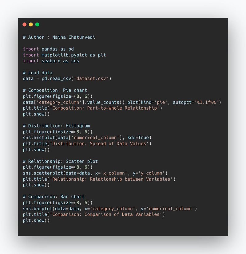
Code Implementation —
import pandas as pd
import matplotlib.pyplot as plt
import seaborn as sns

# Load data
data = pd.read_csv('dataset.csv')

# Composition: Pie chart
plt.figure(figsize=(8, 6))
data['category_column'].value_counts().plot(kind='pie', autopct='%1.1f%%')
plt.title('Composition: Part-to-Whole Relationship')
plt.show()

# Distribution: Histogram
plt.figure(figsize=(8, 6))
sns.histplot(data['numerical_column'], kde=True)
plt.title('Distribution: Spread of Data Values')
plt.show()

# Relationship: Scatter plot
plt.figure(figsize=(8, 6))
sns.scatterplot(data=data, x='x_column', y='y_column')
plt.title('Relationship: Relationship between Variables')
plt.show()

# Comparison: Bar chart
plt.figure(figsize=(8, 6))
sns.barplot(data=data, x='category_column', y='numerical_column')
plt.title('Comparison: Comparison of Data Variables')
plt.show()
Snippet —
The post below covers the different types of charts and most importantly which chart to use when and how?
I have covered Data visualization step by step as —
Categorical and Numerical Features
Complete Code Implementation —
import pandas as pd
import numpy as np
import seaborn as sns
from scipy.stats import spearmanr, pearsonr, kendalltau
from sklearn.linear_model import LinearRegression
from sklearn.ensemble import RandomForestRegressor
from sklearn.svm import SVR
from sklearn.tree import DecisionTreeRegressor
from sklearn.preprocessing import PolynomialFeatures
from sklearn.metrics import mean_squared_error

# Data Profiling

# Summary Functions
def summary_statistics(data):
    summary = data.describe()
    return summary

# Indexing
def index_data(data, column):
    indexed_data = data.set_index(column)
    return indexed_data

# Grouping
def group_data(data, column):
    grouped_data = data.groupby(column)
    return grouped_data

# Regression

# Linear Regression
def linear_regression(X, y):
    model = LinearRegression()
    model.fit(X, y)
    return model

# Multi Linear Regression
def multilinear_regression(X, y):
    model = LinearRegression()
    model.fit(X, y)
    return model

# Polynomial Regression
def polynomial_regression(X, y, degree):
    poly_features = PolynomialFeatures(degree=degree)
    X_poly = poly_features.fit_transform(X)
    model = LinearRegression()
    model.fit(X_poly, y)
    return model

# Support Vector Regression
def support_vector_regression(X, y):
    model = SVR()
    model.fit(X, y)
    return model

# Decision Tree Regression
def decision_tree_regression(X, y):
    model = DecisionTreeRegressor()
    model.fit(X, y)
    return model

# Random Forest Regression
def random_forest_regression(X, y):
    model = RandomForestRegressor()
    model.fit(X, y)
    return model

# Feature Engineering

# GroupBy Features
def groupby_features(data, group_column, agg_column):
    grouped_data = data.groupby(group_column)[agg_column].transform('mean')
    return grouped_data

# Categorical and Numerical Features
def identify_categorical_numerical_features(data):
    categorical_features = data.select_dtypes(include=['object', 'category']).columns.tolist()
    numerical_features = data.select_dtypes(include=['int', 'float']).columns.tolist()
    return categorical_features, numerical_features

# Missing Value Analysis

# Fill the missing Values
def fill_missing_values(data, method='mean'):
    if method == 'mean':
        filled_data = data.fillna(data.mean())
    elif method == 'median':
        filled_data = data.fillna(data.median())
    elif method == 'mode':
        filled_data = data.fillna(data.mode().iloc[0])
    else:
        filled_data = data.fillna(method=method)
    return filled_data

# Unique Value Analysis
def unique_value_analysis(data):
    unique_values = data.nunique()
    return unique_values

# Univariate Analysis
def univariate_analysis(data, column):
    sns.histplot(data[column])
    sns.boxplot(data[column])

# Bivariate Analysis
def bivariate_analysis(data, x_column, y_column):
    sns.scatterplot(data=data, x=x_column, y=y_column)
    sns.boxplot(data=data, x=x_column, y=y_column)

# Multivariate Analysis
def multivariate_analysis(data, columns):
    sns.pairplot(data[columns])

# Correlation Analysis

# Spearman's ρ
def spearman_correlation(data, x_column, y_column):
    correlation, _ = spearmanr(data[x_column], data[y_column])
    return correlation


# Pearson's r
def pearson_correlation(data, x_column, y_column):
    correlation, _ = pearsonr(data[x_column], data[y_column])
    return correlation

# Kendall's τ
def kendall_correlation(data, x_column, y_column):
    correlation, _ = kendalltau(data[x_column], data[y_column])
    return correlation

# Cramér's V (φc)
def cramers_v(data, x_column, y_column):
    confusion_matrix = pd.crosstab(data[x_column], data[y_column])
    chi2 = chi2_contingency(confusion_matrix)[0]
    n = np.sum(confusion_matrix)
    phi_c = np.sqrt(chi2 / (n * (min(confusion_matrix.shape) - 1)))
    return phi_c

# Phik (φk)
def phik(data, x_column, y_column):
    phik_matrix = phik_matrix(data[[x_column, y_column]])
    phik_value = phik_matrix.loc[x_column, y_column]
    return phik_value

# Example usage
data = pd.read_csv('dataset.csv')
correlation = pearson_correlation(data, 'column1', 'column2')
print('Pearson correlation:', correlation)

kendall_corr = kendall_correlation(data, 'column1', 'column2')
print('Kendall correlation:', kendall_corr)

cramers_v_value = cramers_v(data, 'column1', 'column2')
print("Cramér's V:", cramers_v_value)

phik_value = phik(data, 'column1', 'column2')
print('Phik:', phik_value)
Snippet —
Here are the data visualization projects ( end to end) that you can build to hone your data visualization skills.
Apart from this, once you are done with the projects, read below -
Data Visualization — Part 2
Data Visualization using Matplotlib and Seaborn with project
Data Visualization — Part 3
Complete Code Implementation —
import pandas as pd
import matplotlib.pyplot as plt
import seaborn as sns
import plotly.express as px
from bokeh.plotting import figure, show
from bokeh.io import output_notebook

# Data Visualization - Part 2: Matplotlib and Seaborn

# Basic Functions

# Line plot
def line_plot(x, y, title):
    plt.plot(x, y)
    plt.title(title)
    plt.xlabel('X-axis')
    plt.ylabel('Y-axis')
    plt.show()

# Bar plot
def bar_plot(x, y, title):
    plt.bar(x, y)
    plt.title(title)
    plt.xlabel('X-axis')
    plt.ylabel('Y-axis')
    plt.show()

# Scatter plot
def scatter_plot(x, y, title):
    plt.scatter(x, y)
    plt.title(title)
    plt.xlabel('X-axis')
    plt.ylabel('Y-axis')
    plt.show()

# Advanced Functions

# Heatmap
def heatmap(data, title):
    sns.heatmap(data)
    plt.title(title)
    plt.show()

# Pairplot
def pairplot(data):
    sns.pairplot(data)
    plt.show()

# Data Visualization - Part 3: Plotly

# Line plot with Plotly
def plotly_line_plot(data, x, y, title):
    fig = px.line(data, x=x, y=y, title=title)
    fig.show()

# Scatter plot with Plotly
def plotly_scatter_plot(data, x, y, color, title):
    fig = px.scatter(data, x=x, y=y, color=color, title=title)
    fig.show()

# Data Visualization using Bokeh

# Line plot with Bokeh
def bokeh_line_plot(data, x, y, title):
    output_notebook()
    p = figure(title=title, x_axis_label='X-axis', y_axis_label='Y-axis')
    p.line(data[x], data[y])
    show(p)

# Scatter plot with Bokeh
def bokeh_scatter_plot(data, x, y, title):
    output_notebook()
    p = figure(title=title, x_axis_label='X-axis', y_axis_label='Y-axis')
    p.circle(data[x], data[y])
    show(p)

# Example usage

# Load data
data = pd.read_csv('dataset.csv')

# Line plot
line_plot(data['x'], data['y'], 'Line Plot')

# Bar plot
bar_plot(data['category'], data['count'], 'Bar Plot')

# Scatter plot
scatter_plot(data['x'], data['y'], 'Scatter Plot')

# Heatmap
heatmap(data.corr(), 'Correlation Heatmap')

# Pairplot
pairplot(data)

# Plotly line plot
plotly_line_plot(data, 'x', 'y', 'Line Plot (Plotly)')

# Plotly scatter plot
plotly_scatter_plot(data, 'x', 'y', 'category', 'Scatter Plot (Plotly)')

# Bokeh line plot
bokeh_line_plot(data, 'x', 'y', 'Line Plot (Bokeh)')

# Bokeh scatter plot
bokeh_scatter_plot(data, 'x', 'y', 'Scatter Plot (Bokeh)')
Snippet —
That’s it for now.
Find Day 19 Below-
Let me know if you have questions in the comment section below. Subscribe/ Follow, Like/Clap as it would encourage me to write more in my free time
Stay Tuned!!
Read more —
All the Complete System Design Series Parts —
6. Networking, How Browsers work, Content Network Delivery ( CDN)
Github —
For Python Projects —
For complete 60 days of Data Science and ML : Day 1 — Day 60 : Quick Recap of 60 days of Data Science and ML
Follow for more updates. Stay tuned and keep coding! Disclosure: Some of the links are affiliates.
For other projects, tune to —
Build Machine Learning Pipelines( With Code)
Recurrent Neural Network with Keras
Clustering Geolocation Data in Python using DBSCAN and K-Means
Facial Expression Recognition using Keras
Hyperparameter Tuning with Keras Tuner
Custom Layers in Keras


