
Day 10 of 30 days of Data Analytics with Projects Series
Welcome back peeps. This is Day 10 of 30 days of data analytics.
What’s covered in the Data Analytics Series till now —
Day 1 : Data Analytics basics and kickstart of Data analytics with projects series
Day 3 : Data Analytics Ecosystem — Data Life Cycle, Data Analysis complete process ( most important things)
Day 5 : Statistics
Day 6 : Basic and Advanced SQL
Day 8 : Pandas and Numpy
Day 9 : Data Manipulation
Day 10 : Data Visualization — Part 1
Day 11 : Data Visualization — Part 2
In this post we will cover data visualization — part 1 as follows —
Data Visualization — Part 1
Data Visualization basics
Which chart to choose and when?
Data Visualization — Part 2
Data Visualization using Matplotlib and Seaborn
Data Visualization using Plotly and Folium
Data Visualization using Bokeh
Let’s get started with Data Visualization — Part 1.
- Choosing the right chart for your data depends on the type of data you have and the message you want to convey.
- For example, a bar chart is good for comparing different categories, a line chart is good for showing trends over time, and a scatter plot is good for showing the relationship between two variables.
- Matplotlib and Seaborn are both popular libraries for creating static data visualizations in Python. Matplotlib is a low-level library for creating plots, while Seaborn is built on top of Matplotlib and is designed to make it easier to create more complex visualizations.
- Plotly and Folium are both libraries that can be used to create interactive data visualizations. Plotly is a library for creating interactive plots, while Folium is a library for creating interactive maps.
- Bokeh is another popular library for creating interactive data visualizations in Python. It is similar to Plotly, but it is focused more on creating visualizations for the web, and has a more complex architecture.
Projects Videos —
All the projects, data structures, SQL, algorithms, system design, Data Science and ML , Data Analytics, Data Engineering, , Implemented Data Science and ML projects, Implemented Data Engineering Projects, Implemented Deep Learning Projects, Implemented Machine Learning Ops Projects, Implemented Time Series Analysis and Forecasting Projects, Implemented Applied Machine Learning Projects, Implemented Tensorflow and Keras Projects, Implemented PyTorch Projects, Implemented Scikit Learn Projects, Implemented Big Data Projects, Implemented Cloud Machine Learning Projects, Implemented Neural Networks Projects, Implemented OpenCV Projects,Complete ML Research Papers Summarized, Implemented Data Analytics projects, Implemented Data Visualization Projects, Implemented Data Mining Projects, Implemented Natural Leaning Processing Projects, MLOps and Deep Learning, Applied Machine Learning with Projects Series, PyTorch with Projects Series, Tensorflow and Keras with Projects Series, Scikit Learn Series with Projects, Time Series Analysis and Forecasting with Projects Series, ML System Design Case Studies Series videos will be published on our youtube channel ( just launched).
Subscribe today!
In this post we will first cover the different ( important) charts in the visualization libraries stack —
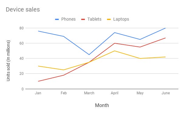
Line Chart —
Line chart are used to show trends over the period time or categories i.e to show changes in one variable value relative to another..
Example :
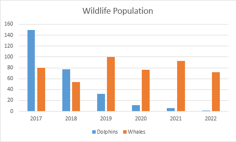
Column Chart —
Column charts are used to show to show comparison between different variables or multiple categories over time. It’s plotted using vertical bars.
Example :
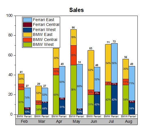
Stacked Column Chart —
Stacked Column Chart is used to show relative percentage of multiple data categories or variables in stacked columns. It’s plotted using vertical bars.
Example :
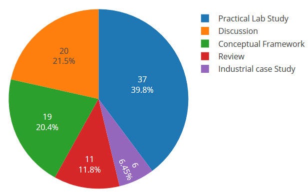
Pie Chart —
Pie charts are used to show data as a percentage of a whole i.e to let user compare the relationship between different categories/dimension in some context.
Example :
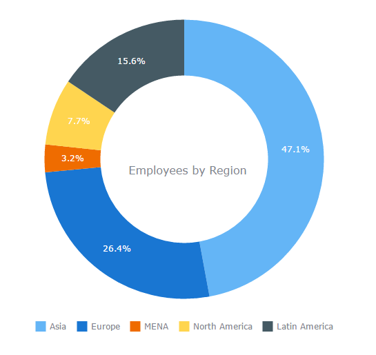
Donut Chart —
Just like pie chart but with a hole in the centre; donut chart is used to visualize the categories as arcs.
Example :
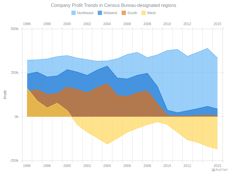
Area Chart —
Area Charts are used to present the accumulative value changes over time and draw attention to the total value across a trend.
Example :
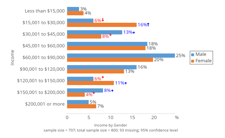
Bar Chart —
Bar charts are used to show to show values across different data variables/categories where values are represented on the x-axis and categories on the y-axis.
Example :
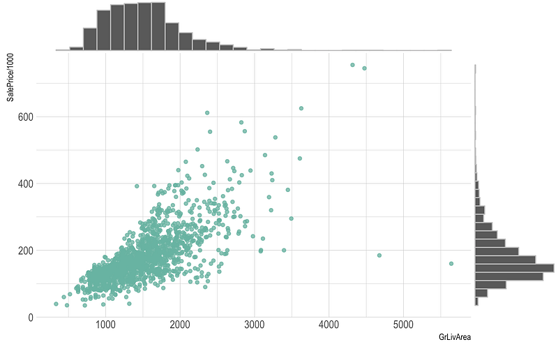
Scatter Plot —
Scatter plot are used to show distribution, correlation analysis and clustering trends.
Example :
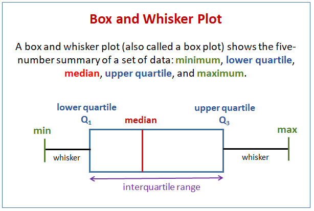
Box plot —
Box plots are used to show data using the median (middle value) of the data and the quartiles, or 25% divisions of the data as shown in the image below.These charts are powerful to spot the outliers and the overall distribution of the data.
The middle line is nothing but the median value of the data.
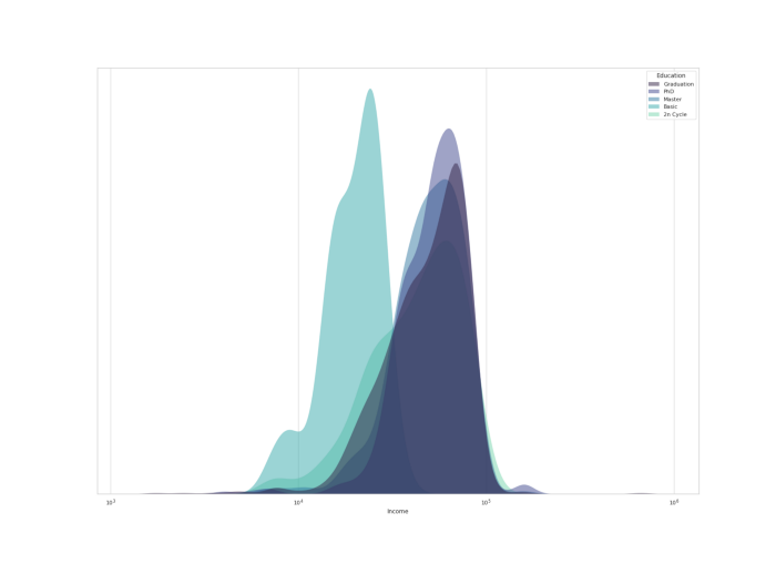
KDE Chart —
Kernel Density Estimation ( KDE) chart is used to show the the distribution of data points/values i.e. project the probability density of a continuous variable in more interpretable format.
Example :
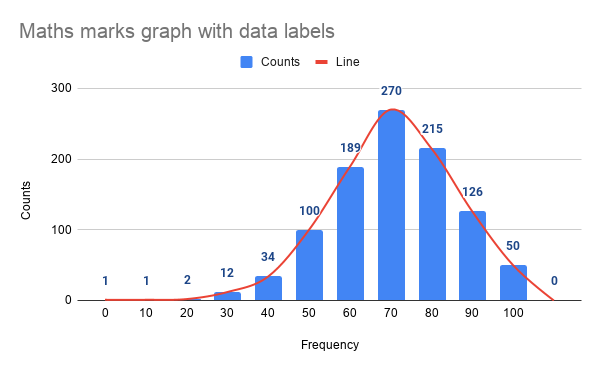
Histograms —
Histogram is one of the most important chart which is largely used to represent analytics and projections. It is used to show frequency over a distribution.
Example :
Code Implementation —
import numpy as np
import matplotlib.pyplot as plt

# Line Chart
x = np.linspace(0, 10, 100)
y = np.sin(x)
plt.plot(x, y)
plt.title('Line Chart')
plt.xlabel('X')
plt.ylabel('Y')
plt.show()

# Column Chart
x = ['A', 'B', 'C', 'D']
y = [10, 15, 7, 12]
plt.bar(x, y)
plt.title('Column Chart')
plt.xlabel('Categories')
plt.ylabel('Values')
plt.show()

# Histogram
data = np.random.randn(1000)
plt.hist(data, bins=30)
plt.title('Histogram')
plt.xlabel('Values')
plt.ylabel('Frequency')
plt.show()

# Bar Chart
x = ['A', 'B', 'C', 'D']
y = [10, 15, 7, 12]
plt.barh(x, y)
plt.title('Bar Chart')
plt.xlabel('Values')
plt.ylabel('Categories')
plt.show()

# Stacked Column Chart
x = ['A', 'B', 'C', 'D']
y1 = [10, 15, 7, 12]
y2 = [5, 8, 10, 6]
plt.bar(x, y1)
plt.bar(x, y2, bottom=y1)
plt.title('Stacked Column Chart')
plt.xlabel('Categories')
plt.ylabel('Values')
plt.legend(['Y1', 'Y2'])
plt.show()

# Pie Chart
labels = ['A', 'B', 'C', 'D']
sizes = [30, 25, 15, 30]
plt.pie(sizes, labels=labels, autopct='%1.1f%%')
plt.title('Pie Chart')
plt.show()

# Donut Chart
sizes = [30, 25, 15, 30]
plt.pie(sizes, labels=labels, autopct='%1.1f%%', wedgeprops={'edgecolor': 'white'})
plt.title('Donut Chart')
plt.show()

# Area Chart
x = np.linspace(0, 10, 100)
y = np.sin(x)
plt.fill_between(x, y, alpha=0.3)
plt.title('Area Chart')
plt.xlabel('X')
plt.ylabel('Y')
plt.show()

# Scatter Plot
x = np.random.randn(100)
y = np.random.randn(100)
plt.scatter(x, y)
plt.title('Scatter Plot')
plt.xlabel('X')
plt.ylabel('Y')
plt.show()

# Box Plot
data = [np.random.normal(0, std, 100) for std in range(1, 4)]
plt.boxplot(data)
plt.title('Box Plot')
plt.xlabel('Data')
plt.ylabel('Values')
plt.show()

# KDE Chart
data = np.random.randn(1000)
plt.hist(data, bins=30, density=True)
plt.title('Histogram with KDE')
plt.xlabel('Values')
plt.ylabel('Density')

# KDE
kde = scipy.stats.gaussian_kde(data)
x = np.linspace(data.min(), data.max(), 100)
plt.plot(x, kde(x))
plt.legend(['KDE'])
plt.show()
To summarize —
- When you want to show distribution , then use -
- For single variable with few data points — Use column histogram
- For Single Variable with many data points — Use Histogram
- For two variable s— Use Scatter Chart
- For three variables — 3 D Area Chart
2. When you want to show composition, then use —
- For static composition, to show share of total — Use pie chart
- For static composition, to show accumulation or total over a period of time — Use waterfall
- For dynamic composition, to show many periods — Use Stacked Area Chart
- For Dynamic composition, to show only few periods — Use Stacked Column Chart
3. When you want to show relationship, then use —
- When you want to show relationship between two variables — Use scatter chart
- When you want to show relationship between three variables — Use Bubble Chart
4. When you want to show Comparison, then use —
- When you want to show comparison, and have many items for few categories — Use bar chart
- When you want to show comparison, and have few items for few categories — Use Column Chart
- When you want to show comparison, and have many periods over time for cynical data — Use Area Chart
- When you want to show comparison, and have many periods over time for non- cynical data — Use Line Chart
Tips and Tricks —
- When you want to show the main point of the entire data over time — Use Tables
- When you want to show color intensity and changes — Use heatmap
- When you want to show categorical Data — Use bar charts
- When you want to show two baselines for comparisons — Use stacked horizontal bar charts
- When you want to show the proportions of the population in different age and gender categories — Use Population Pyramid
- When you want to show multiple data for different categories — Use divided bar chart
That’s it for now. Day 11: Data Visualization — Part 2 !
Let me know if you have questions in the comment section below. Subscribe/ Follow, Like/Clap as it would encourage me to write more in my free time
Stay Tuned!!
Read More —
11 most important System Design Base Concepts
6. Networking, How Browsers work, Content Network Delivery ( CDN)
13. System Design Template — How to solve any System Design Question
System Design Case Studies — In Depth
Complete Data Structures and Algorithm Series
Some of the other best Series —
30 days of Data Structures and Algorithms and System Design Simplified
Data Science and Machine Learning Research ( papers) Simplified **
100 days : Your Data Science and Machine Learning Degree Series with projects
Complete Data Visualization and Pre-processing Series with projects
Exceptional Github Repos — Part 1
Exceptional Github Repos — Part 2
Tech Newsletter —
If you are interested, you can join my newsletter through which I send tech interview tips, techniques, patterns, hacks — Software Development, ML, Data Science, Startups and Technology projects to more than 30K readers. You can subscribe to Tech Brew :
For Python Projects —
For complete 60 days of Data Science and ML : Day 1 — Day 60 : Quick Recap of 60 days of Data Science and ML
Follow for more updates. Stay tuned and keep coding!
For other projects, tune to —
Build Machine Learning Pipelines( With Code)
Recurrent Neural Network with Keras
Clustering Geolocation Data in Python using DBSCAN and K-Means
Facial Expression Recognition using Keras
Hyperparameter Tuning with Keras Tuner
Custom Layers in Keras


