
Day 27 of 30 days of Data Engineering Series with Projects
Welcome back peeps to Day 27 of Data Engineering Series with Projects!
In this we will cover —
Power BI
Which chart to use and When?
Power BI — Data Analysis Expressions
Joins
Data Profiling
Pre-requisite to Day 27 is to complete Day 1–26( link below):
Day 3 : Complete Advanced Python for Data Engineering — Part 2
Day 18 : Data Visualization basics, Data Visualization Projects, Data Visualization using Plotly and Bokeh, Data Profiling, Summary Functions, Indexing, Grouping, Linear Regression, Multi Linear Regression, Polynomial Regression, Regression, Support Vector Regression, Decision Tree Regression, Random Forest Regression, Feature Engineering, GroupBy Features, Categorical and Numerical Features, Missing Value Analysis, Fill the missing Values, Unique Value Analysis, Univariate Analysis, Bivariate Analysis, Multivariate Analysis, Correlation Analysis, Spearman’s ρ, Pearson’s r, Kendall’s τ, Cramér’s V (φc), Phik (φk)
Day 20 : ETL ( Extract, Tranform and Load) basics, Why ETL is important?, How ETL works, ETL Tools
Day 21 : Structured Data, Semi Structured Data, Unstructured Data, Data Warehouse, Data Mart, Data Lake
Day 25: Docker, Docker vs Virtual Machines, Most important Docker commands, Kubernetes, Snowflake
Day 26 : Data Pipelines, Transformation, Processing, Workflow, Monitoring, Airflow, DAG
Projects Videos —
All the projects, data structures, SQL, algorithms, system design, Data Science and ML , Data Analytics, Data Engineering, , Implemented Data Science and ML projects, Implemented Data Engineering Projects, Implemented Deep Learning Projects, Implemented Machine Learning Ops Projects, Implemented Time Series Analysis and Forecasting Projects, Implemented Applied Machine Learning Projects, Implemented Tensorflow and Keras Projects, Implemented PyTorch Projects, Implemented Scikit Learn Projects, Implemented Big Data Projects, Implemented Cloud Machine Learning Projects, Implemented Neural Networks Projects, Implemented OpenCV Projects,Complete ML Research Papers Summarized, Implemented Data Analytics projects, Implemented Data Visualization Projects, Implemented Data Mining Projects, Implemented Natural Leaning Processing Projects, MLOps and Deep Learning, Applied Machine Learning with Projects Series, PyTorch with Projects Series, Tensorflow and Keras with Projects Series, Scikit Learn Series with Projects, Time Series Analysis and Forecasting with Projects Series, ML System Design Case Studies Series videos will be published on our youtube channel ( just launched).
Subscribe today!
Tech Newsletter —
If you are interested, you can join my newsletter through which I send tech interview tips, techniques, patterns, hacks — Software Development, ML, Data Science, Startups and Technology projects to more than 30K readers. You can subscribe to Ignito:
System Design Case Studies — In Depth
Design Instagram
Design Netflix
Design Reddit
Design Amazon
Design Messenger App
Design Twitter
Design URL Shortener
Design Dropbox
Design Youtube
Design API Rate Limiter
Design Web Crawler
Design Amazon Prime Video
Design Facebook’s Newsfeed
Design Yelp
Design Uber
Design Tinder
Design Tiktok
Design Whatsapp
Most Popular System Design Questions
Mega Compilation : Solved System Design Case studies
Let’s get started!
- Data Analysis Expressions (DAX): DAX is a formula language used in Power BI to create custom calculations and aggregations. It is used to create calculated tables and columns, and can also be used to define custom aggregations and filters.
- Joins: Power BI allows you to join data from multiple tables, which can be done in the Query Editor. The most common types of joins include inner join, left join, right join, and full outer join. The choice of join type depends on the specific needs of the analysis and the relationships between the tables.
- Data Profiling: Data profiling is the process of analyzing the data to understand its structure, quality, and content. Power BI offers a Data Profiling feature, which provides a quick way to understand the data by displaying statistics such as the number of rows, columns, null values, and data types. It also allows you to identify outliers and anomalies in the data, which can be used to improve the quality of the data.
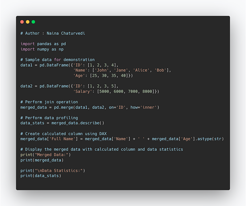
Code Implementation —
import pandas as pd
import numpy as np

# Sample data for demonstration
data1 = pd.DataFrame({'ID': [1, 2, 3, 4],
                      'Name': ['John', 'Jane', 'Alice', 'Bob'],
                      'Age': [25, 30, 35, 40]})

data2 = pd.DataFrame({'ID': [1, 2, 3, 5],
                      'Salary': [5000, 6000, 7000, 8000]})

# Perform join operation
merged_data = pd.merge(data1, data2, on='ID', how='inner')

# Perform data profiling
data_stats = merged_data.describe()

# Create calculated column using DAX
merged_data['Full Name'] = merged_data['Name'] + ' ' + merged_data['Age'].astype(str)

# Display the merged data with calculated column and data statistics
print("Merged Data:")
print(merged_data)

print("\nData Statistics:")
print(data_stats)
Snippet —
Pre-requisite —
Before starting, go through this post to understand charts/plots and which chart to use and when.
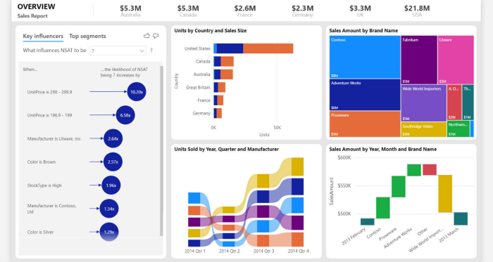
Power BI is a tool for data and analytics reporting which lets users create report insights using different visualizations and dashboards.

Power BI is a UI based tool which allows to integrate with any data source and lets you work with large amount of data.
There are three main views in Power BI —
Data View — datasets associated with the reports are examined.
Model View — lets you establish relationship between different data.
Report View — lets you visualize data and create the reports and dashboards
Upload the data in the Power BI —
Once the data is uploaded, understand which chart best represents your data.
To present your data, there are four basic presentation types :
Composition : To show part-to-whole relationship of the data variables
Distribution : To show the spread of the data values
Relationship : To establish relationship between the different data variables
Comparison : To compare one value with the other ( i.e two or more data variables)
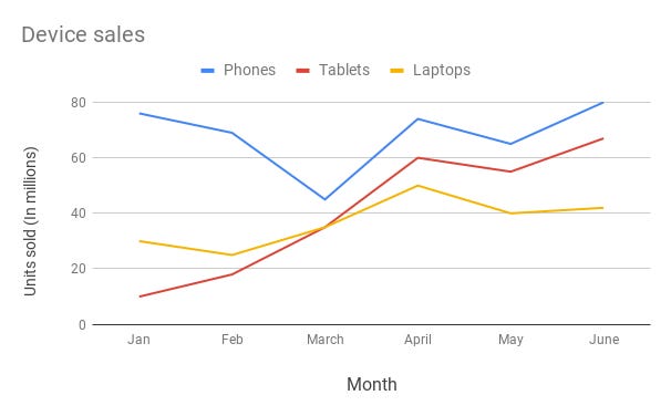
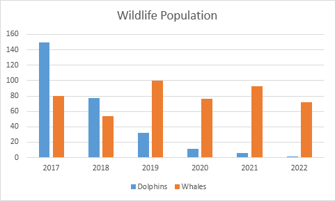
Line Chart —
Line chart are used to show trends over the period time or categories i.e to show changes in one variable value relative to another..
Example :
Column Chart —
Column charts are used to show to show comparison between different variables or multiple categories over time. It’s plotted using vertical bars.
Example :
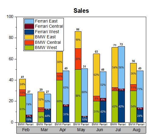
Stacked Column Chart —
Stacked Column Chart is used to show relative percentage of multiple data categories or variables in stacked columns. It’s plotted using vertical bars.
Example :
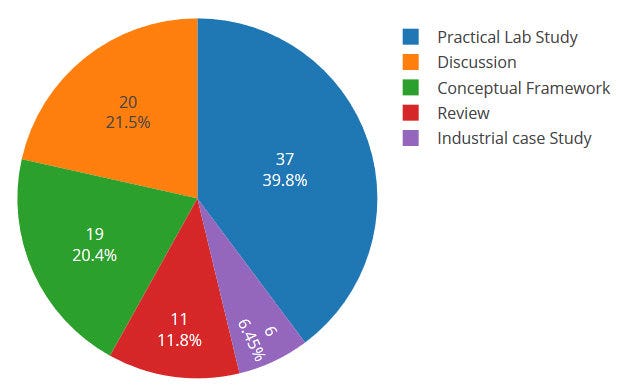
Pie Chart —
Pie charts are used to show data as a percentage of a whole i.e to let user compare the relationship between different categories/dimension in some context.
Example :
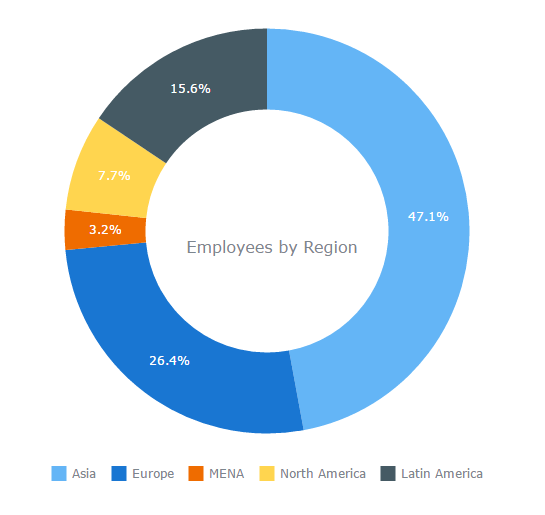
Donut Chart —
Just like pie chart but with a hole in the centre; donut chart is used to visualize the categories as arcs.
Example :
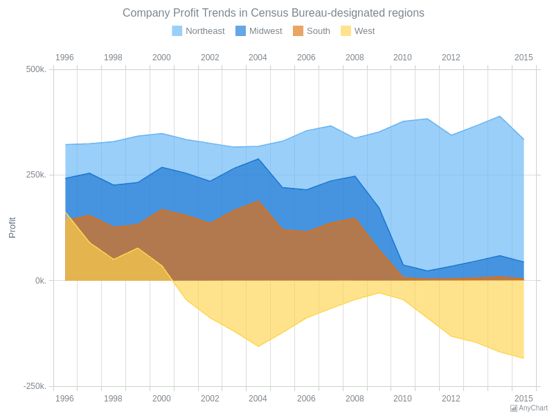
Area Chart —
Area Charts are used to present the accumulative value changes over time and draw attention to the total value across a trend.
Example :
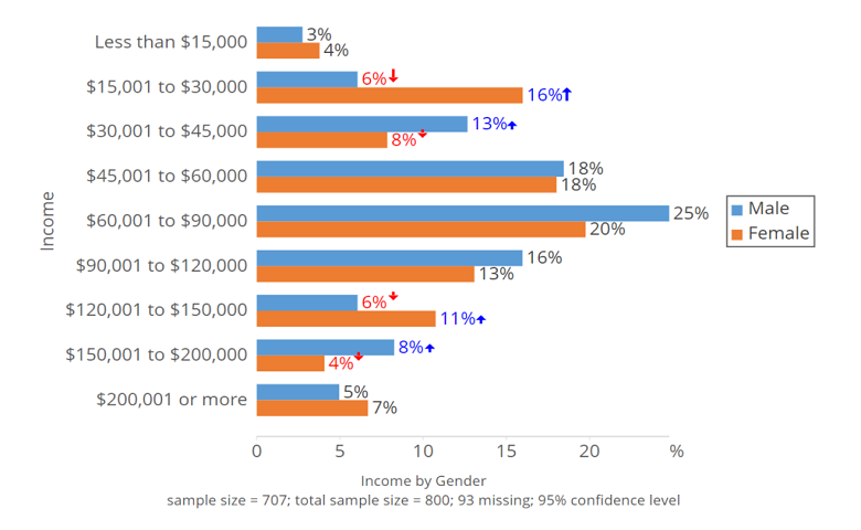
Bar Chart —
Bar charts are used to show to show values across different data variables/categories where values are represented on the x-axis and categories on the y-axis.
Example :
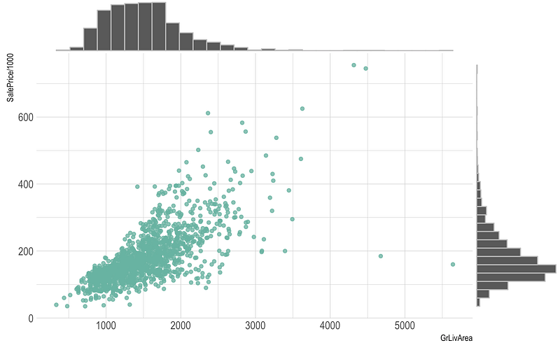
Scatter Plot —
Scatter plot are used to show distribution, correlation analysis and clustering trends.
Example :
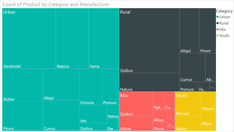
TreeMap —
It is used to visualize the categories with the colored rectangles which have size wrt to their values.
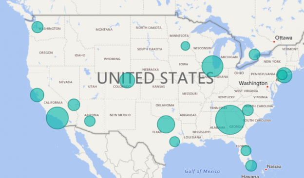
Maps —
It is used to map quantitative and categorical information for the different locations.
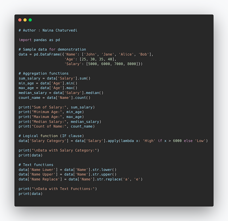
Data Analysis Expressions ( DAX)
It’s a language in Power BI which lets you create queries/calculations and do data analysis.
For aggregations, it uses below functions —
- sum(
) : To compute the sum of a specific Column. - min(
) : To compute minimum value of each Column - max(
) : To compute maximum value of each Column - median(
) : To compute median of each column - count(
) : To count elements by elements.
For logical functions it uses IF clause.
For text Functions, it uses —
LOWER() : to convert text into lowercase
UPPER() : to convert text into uppercase
REPLACE(): To replace the old text with new text
Code Implementation —
import pandas as pd

# Sample data for demonstration
data = pd.DataFrame({'Name': ['John', 'Jane', 'Alice', 'Bob'],
                     'Age': [25, 30, 35, 40],
                     'Salary': [5000, 6000, 7000, 8000]})

# Aggregation functions
sum_salary = data['Salary'].sum()
min_age = data['Age'].min()
max_age = data['Age'].max()
median_salary = data['Salary'].median()
count_name = data['Name'].count()

print("Sum of Salary:", sum_salary)
print("Minimum Age:", min_age)
print("Maximum Age:", max_age)
print("Median Salary:", median_salary)
print("Count of Name:", count_name)

# Logical function (IF clause)
data['Salary Category'] = data['Salary'].apply(lambda x: 'High' if x > 6000 else 'Low')

print("\nData with Salary Category:")
print(data)

# Text functions
data['Name Lower'] = data['Name'].str.lower()
data['Name Upper'] = data['Name'].str.upper()
data['Name Replace'] = data['Name'].str.replace('a', 'e')

print("\nData with Text Functions:")
print(data)
Snippet —
JOINS
Before we start with joins, one must understand the points explained below —
Primary Keys : These are fields/keys in a table which uniquely identifies each record. These are used to join tables.
Foreign Keys : These are fields/keys in a table which the references the primary key of the other table.
Relationships : Relations between the tables can be one to one, one to many and many to many. In one to one relationships, a record in one table is uniquely related to exactly one record in the other table. On the other side, One to many relationships, a record in one table can be related to one or more records in the other table. Lastly, in many to many one or more records in one table are related to one or more records in the other table.
What is a Join?
A join is nothing but a construct used to combine rows from two or more tables based on a related/common column between them. It matches the related columns values in two or more tables.
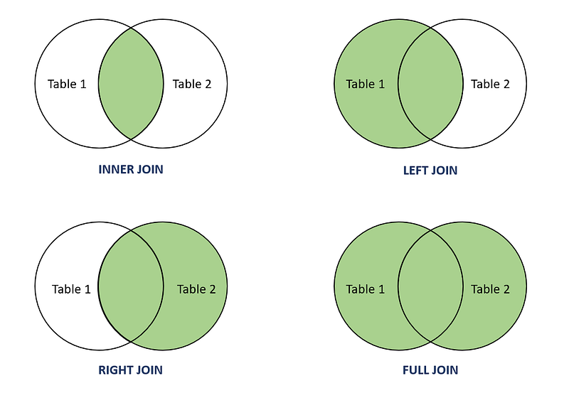
INNER JOIN: Select records that have matching values in both tables.
LEFT JOIN: Select records from the first (left-most) table with matching right table records.
RIGHT JOIN: Select records from the second (right-most) table with matching left table records.
CROSS JOIN : Select records in the first table multiplied by the records in the second table.
FULL JOIN: Selects all records that match either left or right table records.
Format —
SELECT column_names
FROM table1 JOIN table2
ON column_name1 = column_name2
WHERE condition
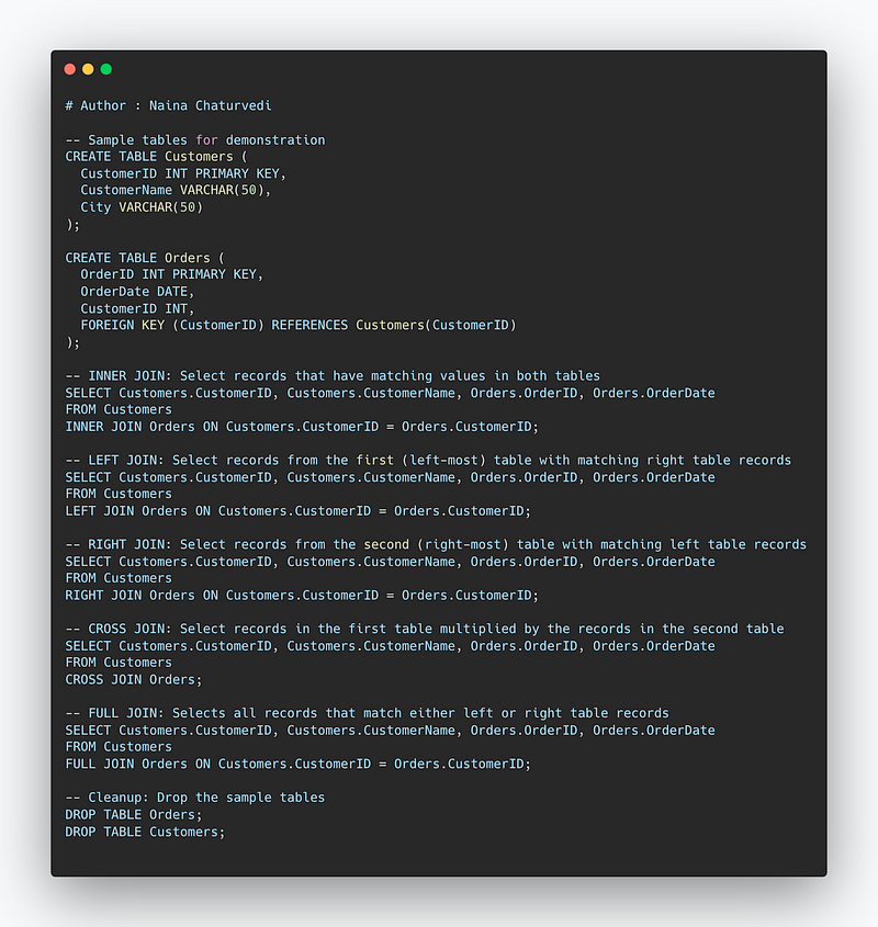
Code Implementation —
-- Sample tables for demonstration
CREATE TABLE Customers (
  CustomerID INT PRIMARY KEY,
  CustomerName VARCHAR(50),
  City VARCHAR(50)
);

CREATE TABLE Orders (
  OrderID INT PRIMARY KEY,
  OrderDate DATE,
  CustomerID INT,
  FOREIGN KEY (CustomerID) REFERENCES Customers(CustomerID)
);

-- INNER JOIN: Select records that have matching values in both tables
SELECT Customers.CustomerID, Customers.CustomerName, Orders.OrderID, Orders.OrderDate
FROM Customers
INNER JOIN Orders ON Customers.CustomerID = Orders.CustomerID;

-- LEFT JOIN: Select records from the first (left-most) table with matching right table records
SELECT Customers.CustomerID, Customers.CustomerName, Orders.OrderID, Orders.OrderDate
FROM Customers
LEFT JOIN Orders ON Customers.CustomerID = Orders.CustomerID;

-- RIGHT JOIN: Select records from the second (right-most) table with matching left table records
SELECT Customers.CustomerID, Customers.CustomerName, Orders.OrderID, Orders.OrderDate
FROM Customers
RIGHT JOIN Orders ON Customers.CustomerID = Orders.CustomerID;

-- CROSS JOIN: Select records in the first table multiplied by the records in the second table
SELECT Customers.CustomerID, Customers.CustomerName, Orders.OrderID, Orders.OrderDate
FROM Customers
CROSS JOIN Orders;

-- FULL JOIN: Selects all records that match either left or right table records
SELECT Customers.CustomerID, Customers.CustomerName, Orders.OrderID, Orders.OrderDate
FROM Customers
FULL JOIN Orders ON Customers.CustomerID = Orders.CustomerID;

-- Cleanup: Drop the sample tables
DROP TABLE Orders;
DROP TABLE Customers;
Snippet —
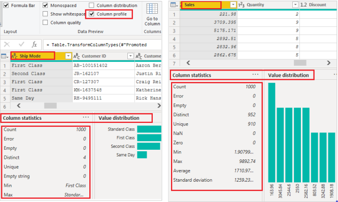
Data Profiling
You can also profile your data in order to get information about your data in Power BI.
Check the Column distribution and profile to see summary statistics of the data.
Some of the most important PowerBI commands —
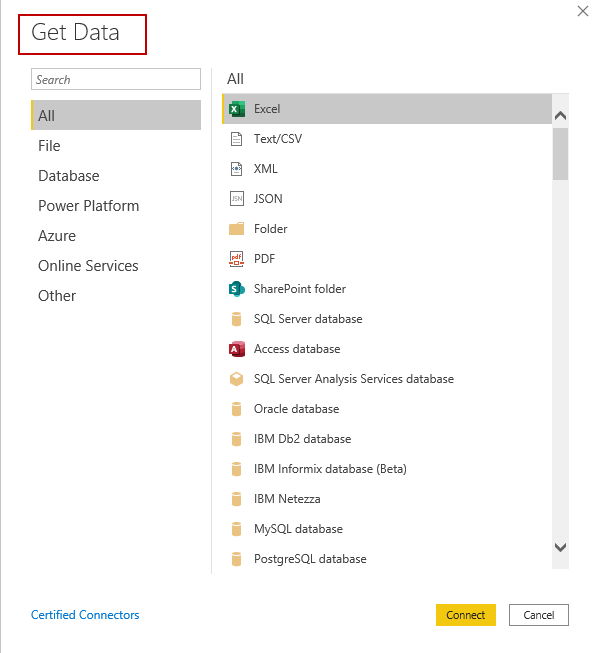
- The “Get Data” command: This command is used to import data into Power BI from various sources such as Excel, CSV, SQL Server, and more.
- The “Transform Data” command: This command, also known as the Query Editor, allows you to clean and transform your data before it is used in your Power BI report. This includes tasks such as filtering, pivoting, splitting columns, and changing data types.
- The “Visualizations” command: This command allows you to create and customize various types of charts and visuals such as bar charts, line charts, pie charts, and more.
- The “Measures” command: This command is used to create calculations and aggregations using DAX (Data Analysis Expressions) formulas. These measures can be used in visuals and tables to show the summarized data.
- The “Format” command: This command allows you to customize the look and feel of your visuals, including things like color, font size, and axis labels.
- The “Page layout” command: This command allows you to arrange and organize your visuals on a Power BI report page.
- The “Publish” command: This command allows you to publish your Power BI report to the Power BI service, where it can be shared and accessed by others.
- “Data Modeling” command : This command allows you to create and manage relationships between tables, create calculated columns and tables, and create hierarchies.
- “Analyze” command : This command allows you to perform advanced analytics tasks such as forecasting, clustering, and key drivers analysis.
- “Dashboard” command : This command allows you to create, manage, and share interactive dashboards that display multiple visuals and reports on a single screen.
A project video covering Power BI, Power BI — Data Analysis Expressions, Joins, Data Profiling coming soon ( subscribe today) —
That’s it for now.
Find Day 28 Below :
Let me know if you have questions in the comment section below. Subscribe/ Follow, Like/Clap as it would encourage me to write more in my free time
Stay Tuned!!
Read more —
All the Complete System Design Series Parts —
6. Networking, How Browsers work, Content Network Delivery ( CDN)
Github —
For Python Projects —
For complete 60 days of Data Science and ML : Day 1 — Day 60 : Quick Recap of 60 days of Data Science and ML
Follow for more updates. Stay tuned and keep coding!
For other projects, tune to —
Build Machine Learning Pipelines( With Code)
Recurrent Neural Network with Keras
Clustering Geolocation Data in Python using DBSCAN and K-Means
Facial Expression Recognition using Keras
Hyperparameter Tuning with Keras Tuner
Custom Layers in Keras


