Principal Graph and Structure Learning (PGSL) for Anomaly Detection
A carefully generated, thoroughly engineered resource for Data Scientists.
Chapter 10 from the Guide to Machine Learning for Anomaly Detection
Warning! Before you continue reading this article and all the articles that compose this guide, you must understand this was in part generated using OpenAI’s GPT 4 model. It started as a self learning project and I soon enough realized this could be really valuable to fellow data scientists. Because of this, I will release the entire guide for free alongside every chapter so you can directly go read the guide from the document so you don’t even need to give me reading time if you don’t want to.

Guide Index
0: About the generation of this guide 1: Introduction to Anomaly Detection 2: Statistical Techniques for Anomaly Detection (Part 1) 2: Statistical Techniques for Anomaly Detection (Part 2) 3: Introduction to M. Learning for Anomaly Detection (Part 1) 3: Introduction to M. Learning for Anomaly Detection (Part 2) 4: Dealing with Imbalanced Classes in Supervised Learning 5: K-Means Clustering for Anomaly detection 6: DBSCAN for Anomaly detection 7: Isolation Forest for Anomaly Detection 8: One-Class SVM for Anomaly Detection 9: K-Nearest Neighbors (KNN) for Anomaly Detection >>>>> 10: Principal Graph and Structure Learning (PGSL) <<<<< 11: Dimensionality Reduction Techniques for Anomaly Detection 12: Singular Value Decomposition (SVD) for Anomaly Detection 13: Advanced Matrix Factorization Techniques for Anomaly Detection 14: Nystrom Method for Anomaly Detection 15: Kernel Methods for Anomaly Detection 16: Advanced Algorithms for Anomaly Detection 17: Feature Selection and Engineering for Anomaly Detection 18: Semi-Supervised Learning for Anomaly Detection 19: Deep Learning for Anomaly Detection 20: Ensemble Methods for Anomaly Detection 21: Evaluation Metrics for Anomaly Detection 22: Case Studies and Industry Applications 23: Conclusion and Future Directions in Anomaly Detection
As we delve deeper into the fascinating world of anomaly detection, we encounter more sophisticated and powerful techniques that leverage the full power of machine learning and artificial intelligence. Among these advanced techniques is Principal Graph and Structure Learning (PGSL), an approach that shines particularly bright when dealing with complex, high-dimensional data.
PGSL lies in the realm of manifold learning, a subset of machine learning that focuses on the discovery and characterization of a lower-dimensional structure or “manifold” within high-dimensional datasets.
It is predicated on the assumption that high-dimensional data often lies on or near a low-dimensional manifold, and if we can uncover this manifold, we can better understand, visualize, and work with the data.
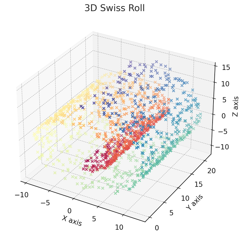
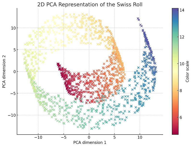
The concept of Principal Graphs introduces the notion of a graphical representation of this lower-dimensional structure.
Just as Principal Component Analysis (PCA) identifies the direction (or directions) in a dataset which explain the most variance, PGSL aims to identify the manifold that best represents the ‘principal curve’ or ‘principal surface’ within the data.
The structure of this principal graph, once learned, can then provide a basis for more sophisticated analyses, including anomaly detection.
In the context of anomaly detection, PGSL becomes a compelling technique.
The underlying premise is that normal data will follow the structure of the principal graph, while anomalies or outliers will deviate from it.
By learning the structure of a dataset using PGSL, we can thus identify anomalies as points that lie far from the graph.
But why are we bringing this advanced technique to the table? The answer lies in the inherent complexity and high dimensionality of today’s data. Simple distance-based or density-based measures may fail to capture the intricacies present in such datasets. However, by using PGSL, we can learn the essential structure of the data, enabling more accurate and nuanced anomaly detection.
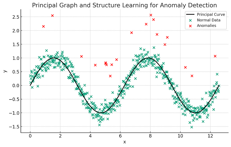
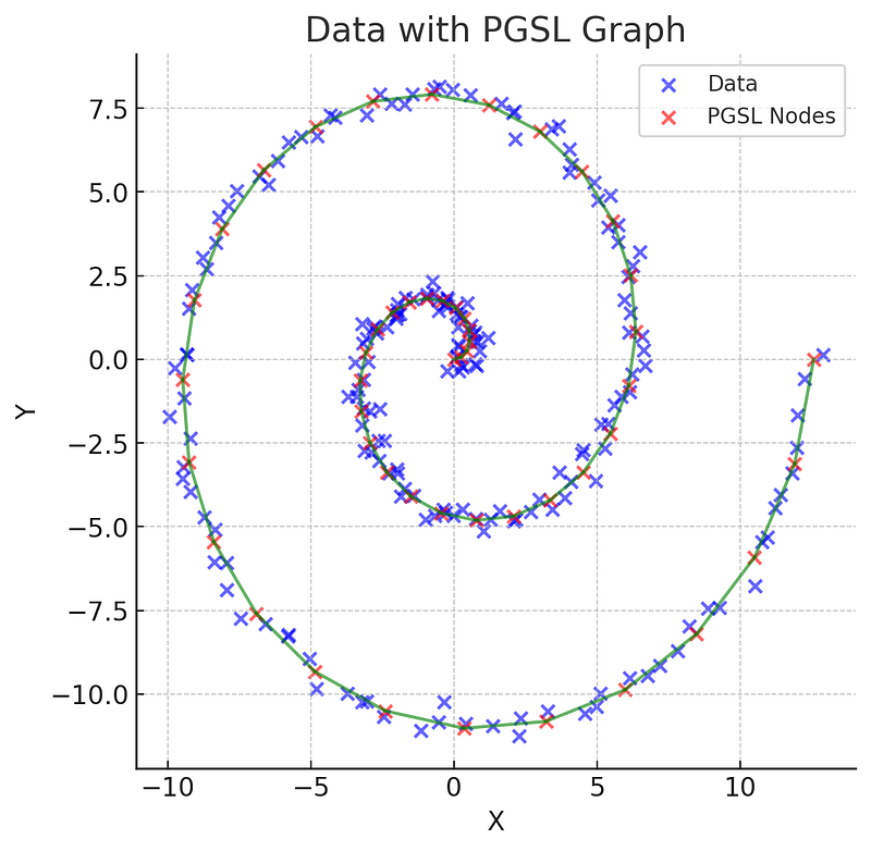
The above plot illustrates the concept of Principal Graph and Structure Learning (PGSL) for anomaly detection in a simplified 2D setting.
- The green points represent “normal” data, which exhibit a certain structure — in this case, a sine wave pattern.
- The black line represents the “principal curve”, learned through a hypothetical PGSL process. This curve captures the primary structure in the “normal” data.
- The red points are anomalies, which do not follow the main structure of the data and thus deviate from the principal curve.
Remember, this is a simplified 2D illustration. In real-world applications, PGSL often operates in high-dimensional spaces where the power of this technique becomes more apparent. The principal graph in such cases could represent a complex, lower-dimensional structure within the high-dimensional data. Normal data points are expected to lie close to this structure, while anomalies are expected to deviate from it.
As we embark on this journey through PGSL for anomaly detection, we will delve into the theoretical underpinnings of this technique, its practical application, and its strengths and limitations. This exploration will further equip us with the knowledge and skills to tackle the ever-growing challenges in anomaly detection. Let’s get started.
PGSL Overview
The Principal Graph and Structure Learning (PGSL) method is a non-linear generalization of PCA, which means it captures more complex data structures than linear methods like PCA.
Instead of finding a linear subspace that best represents the data, PGSL attempts to find a non-linear graph (composed of nodes and edges) that captures the underlying structure of the data.
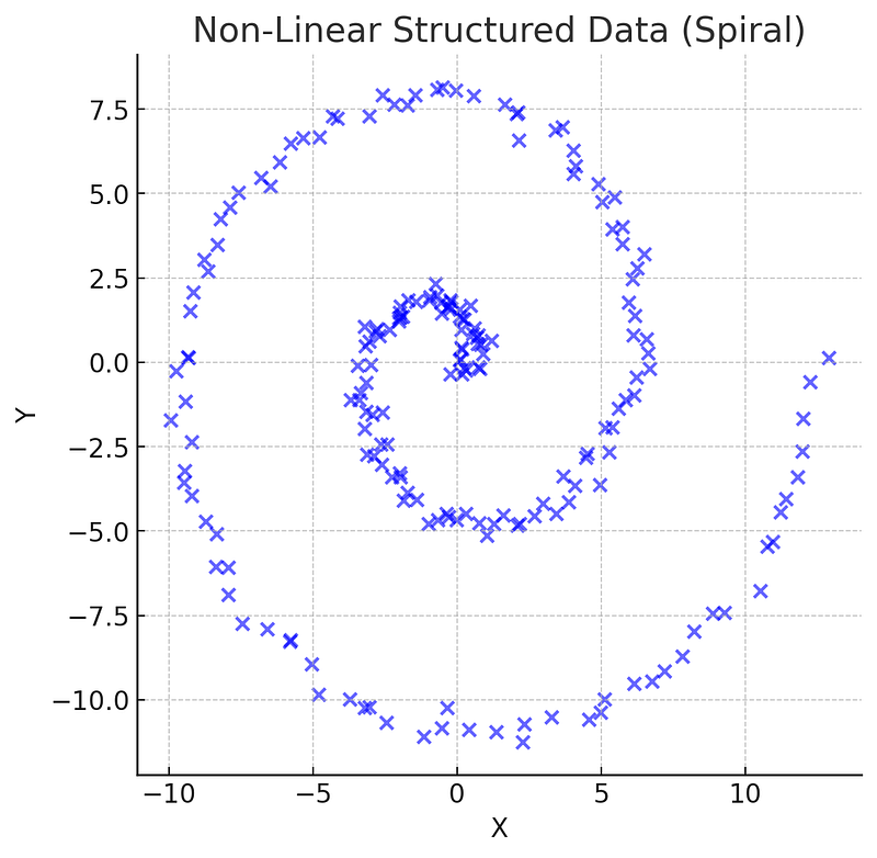
To understand this, let’s revisit the concept of manifolds.
A manifold is a space that locally resembles Euclidean space.
For instance, if we take a small enough part of a sphere, it will look like a flat plane, hence, a sphere is a 2D manifold embedded in 3D space.
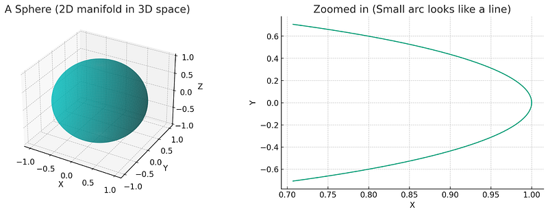
Similarly, high-dimensional data often lies on or near a lower-dimensional manifold, and by learning this manifold’s structure, we can get valuable insights about the data.
So, how does PGSL find this manifold?
The method starts by initializing a graph (e.g., a single node, a random structure, or a structure guided by prior knowledge). Then, it iteratively refines this initial graph to better fit the data. Each iteration consists of two main steps:
- Expectation (E-step): Here, each data point is assigned to the nearest node on the graph.
- Maximization (M-step): The graph’s structure is updated based on these assignments, such that the sum of the distances from the data points to their assigned nodes is minimized. This is usually achieved by updating the positions of the nodes and the topology of the graph.
The iterative process stops when the graph structure stabilizes, or after a set number of iterations. The resulting graph is a representation of the main structure or manifold in the data.
Let’s illustrate the process:
- Initialization: We’ll start with a random graph initialized on our data.
- E-Step: We’ll assign each data point to its nearest node.
- M-Step: We’ll adjust the nodes’ positions to minimize the total distance from the nodes to their assigned data points.
- Iteration: We’ll repeat the E-step and M-step until the graph structure stabilizes.
Let’s start by creating the synthetic dataset and initializing a random graph.
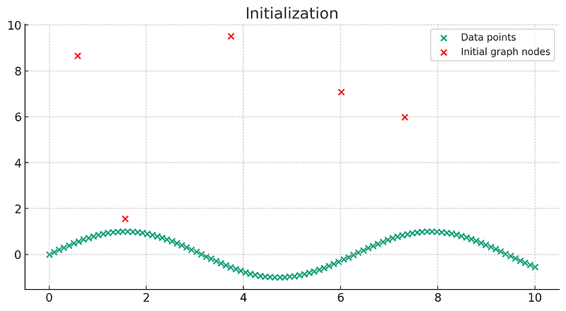
The plot above shows our synthetic dataset (green points), which follows a sine wave pattern, and our initial graph (red points), which consists of 5 randomly placed nodes.
Now let’s move on to the Expectation (E-step). We’ll assign each data point to its nearest node. Let’s visualize this process.
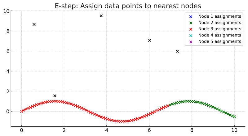
In this plot, each color represents the data points assigned to the nearest node (black dots). This step is known as the Expectation step or E-step, where we assign each data point to the nearest node.
Now let’s proceed to the Maximization (M-step). In this step, we’ll adjust the positions of the nodes based on the assigned data points. We’ll do this by computing the centroid (mean position) of each set of assigned data points. Then we’ll update the node positions to these new centroid positions. Let’s visualize this process as well.
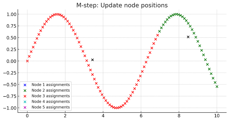
In this plot, the black dots represent the new node positions, which are the centroids of the data points assigned to each node. This is the Maximization step (M-step), where we update the node positions to minimize the total distance from the nodes to their assigned data points.
You may notice that some of the nodes have disappeared. This occurred because no data points were assigned to them during the E-step, causing an error when trying to compute its new position. This can occur in real PGSL algorithms as well, and handling such situations would depend on the specific implementation of the algorithm.
These two steps (E-step and M-step) would be repeated in an iterative process until the graph structure stabilizes or after a set number of iterations.
Please note that this is a simplified demonstration of the PGSL algorithm. In actual practice, the algorithm might be more complex and could involve probabilistic models, optimization algorithms, and the consideration of more complex graph structures. The data could also exist in a high-dimensional space.
Now, how does this help with anomaly detection?
Once we’ve obtained the principal graph, we can use it to identify anomalies in the data.
The underlying premise is that “normal” data will follow the structure of the principal graph, while anomalies or outliers will deviate from it. Thus, data points that lie far from the graph are considered anomalies.
In the following section, we will delve deeper into the application of PGSL for anomaly detection, including how to tune the model, the choice of distance metrics, dealing with high-dimensional data, and more.
Application of PGSL for Anomaly Detection
The application of PGSL for anomaly detection can be split into two phases: the training phase, where the principal graph is learned from the data, and the prediction phase, where the learned graph is used to detect anomalies. Let’s discuss these phases in detail:
1. Training Phase:
In the training phase, PGSL learns the principal graph from a given dataset. This dataset is assumed to predominantly consist of normal data with anomalies being rare or absent during the training phase. As mentioned earlier, the algorithm iteratively refines the graph through E and M steps until the graph structure stabilizes.
It’s important to note that PGSL can be computationally intensive, especially with large datasets or datasets with high dimensions.
Therefore, various techniques may be employed to make the computation feasible, such as dimensionality reduction (like PCA), subsampling, or distributed computing.
Additionally, the initial structure of the graph and the number of iterations can greatly affect the resulting graph and, hence, the performance of the anomaly detection. Therefore, these parameters may need to be tuned based on the specific dataset and use case.
2. Prediction Phase:
Once the principal graph is learned from the data, it can be used to identify anomalies in new or unseen data. Each new data point is assigned to its nearest node on the graph.
If the distance from a data point to its nearest node is above a certain threshold, that data point is flagged as an anomaly.
We can illustrate this process:
1. We start by representing the training phase where a graph is learned from a given dataset.
2. Then we show the prediction phase where this learned graph is used to detect anomalies in new or unseen data.
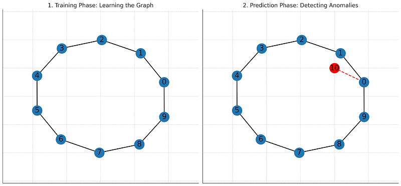
Determining the appropriate distance threshold is a crucial step. If the threshold is too low, it may result in many false positives (normal instances classified as anomalies). Conversely, if the threshold is too high, it may result in many false negatives (anomalies classified as normal). This threshold may be set based on domain knowledge, or it may be learned from the data using methods like cross-validation.
It’s also important to highlight that the choice of distance metric can influence the performance of PGSL. Common choices include Euclidean distance or cosine similarity, but other domain-specific measures could be used depending on the nature of the data.
In the next section, we will walk through a coding example of using PGSL for anomaly detection. We will use a synthetic dataset to train the PGSL model and then use the learned principal graph to detect anomalies in the data.
Coding Time: Applying PGSL for Anomaly Detection
In this section, we’re going to walk you through the process of applying PGSL to a dataset. However, it’s important to mention here that, as of the time of generation of this guide, there isn’t a well-established Python library for PGSL. The most comprehensive library available for this technique is ElPiGraph.R, which is implemented in R. So, if you’re comfortable with R and wish to experiment with PGSL, we highly recommend checking out that library.
Given the circumstances, we will present a high-level overview of how you could implement PGSL in pseudocode. For readers familiar with R, we’ll provide an example using the ElPiGraph.R library.
Pseudocode
1. Initialize: Define the initial set of nodes and edges.
2. Optimize Node Positions: Adjust the node positions to minimize the sum of the squared distances from each point to the nearest node.
3. Add Nodes: Add nodes to the graph to better capture the structure of the data.
4. Remove and Split Edges: Remove any unnecessary edges and split long edges to improve the fit of the graph.
5. Repeat Steps 2–4: Continue iterating on steps 2 through 4 until the graph’s structure sufficiently captures the data structure.
R Code using ElPiGraph.R
If you are comfortable with R and want to experiment with PGSL for anomaly detection, you can use the ElPiGraph.R library. Here is a simple example of how to use it:
# Install the library
install.packages("devtools")
devtools::install_github("Albluca/ElPiGraph.R")

# Load the library
library(ElPiGraph.R)

# Assume 'data' is your dataset
# Compute a Principal Graph with 2 initial nodes
res = computeElasticPrincipalGraph(data, numNodes = 2)

# Perform the bootstrap procedure to estimate the structure
bootres = bootStrap(res, nReps = 100, TrimmedMean = TRUE)

# Plot the final graph structure
plot(res$Gr)
Remember, the principal graph constructed with this process can then be used to identify anomalies.
Data points that lie far from the graph’s structure, as measured by their geodesic distance to the nearest node, can be considered anomalies.
Please note that PGSL is a relatively new field of research, and there are ongoing efforts to develop Python packages for this method. So, keep an eye out for future developments in this space!
See you in Chapter 11!


