
COVID-19 visualizations with Stata Part 10: Stream graphs
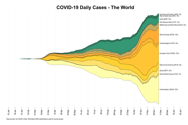
In this Stata guide, learn how to create the following Stream graph using publicly available COVID-19 information on daily cases and deaths from the Our World in Data (OWID) database:
Stream graphs are a follow-up of the Stacked-area graphs guide. It is recommended that you go through the earlier guide before using this one since the essential building blocks are the same, and the earlier guide explains the steps carefully. The additional things we will learn in this guide are preserving and labels before reshaping and applying them after reshaping (also introduced in Guide 9 on Bar graphs), automating area graphs, colors, and labels.
This visualization is inspired by Financial Times’ COVID-19 tracker which currently displays the a stream graph on COVID-19 deaths on their website.
Preamble
Like all previous guides, this guide assumes a basic knowledge of Stata. This guide deals with advanced usage of locals, loops, and code structures that require some experience and familiarity with Stata programming. If you are using this guide for the first time, and are new to Stata, then Guide 1 and Guide 2 are highly recommended, followed by the next set of guides which are in increasing order of difficulty.
This guide uses the following folder structure for the work-flow management:
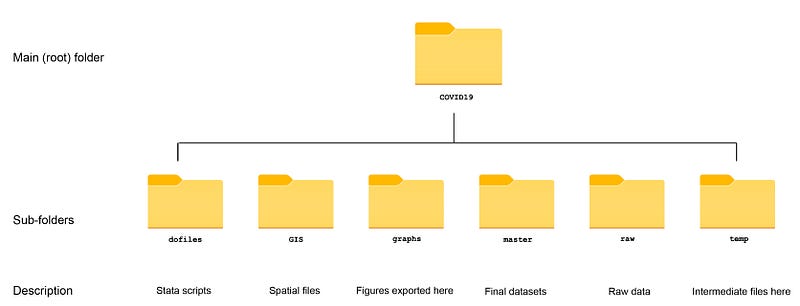
Within the graphs folder, I also create an additional sub-folder called guide10, to store the figures generated here. For details on how to organize your files, please see Guide 1.
In order to make the graphs exactly as they are shown here, several additional item are required:
- In order to make the graphs exactly as they are shown here, install the schemepack suite (more info in the Scheme guide and on GitHub):
ssc install schemepack, replaceand set the scheme to White Tableau:
set scheme white_tableau- Install Ben Jann’s colorpalette package (more on colors in Guide 2 and in the Color guide)
ssc install palettes, replace- Set default graph font to Arial Narrow (see the Font guide on customizing fonts)
graph set window fontface "Arial Narrow"This guide has been written in version 16.1 and should work with version 14 and onwards. Earlier versions might need some modification for implementing custom colors.
Get the data in order
We pull the data from the Our World in Data’s COVID-19 webpage as follows:
************************
***  COVID 19 data   ***
************************
insheet using "https://covid.ourworldindata.org/data/owid-covid-data.csv", clear
save ./raw/full_data_raw.dta, replacegen date2 = date(date, "YMD")
format date2 %tdDD-Mon-yy
drop date
ren date2 dateren location country
replace country = "Slovak Republic" if country == "Slovakia"drop if date < 21915 // 1st Jan 2020save "./master/OWID_data.dta", replaceAll observations before 1st Jan 2020 are dropped in the dataset.
Since OWID uses very broad classifications for continents (five continents in total), we will use the World Bank 2020 classifications for country groupings which provides a very large set of regions.
The Excel file can be downloaded from the page linked above. I have already cleaned the file and uploaded it on my GitHub page in Stata format. It can be directly pulled into Stata and saved in the master folder as follows:
**********************************
***  Country classifications   ***
**********************************

copy "https://github.com/asjadnaqvi/COVID19-Stata-Tutorials/blob/master/data/country_codes.dta?raw=true" "./master/country_codes.dta", replace
Next we merge the two files together and drop anything that does not match:
use "./master/OWID_data.dta", clear
merge m:1 country using "./master/country_codes.dta"
drop if _m!=3
keep country date new_cases new_deaths group*summ date
drop if date>=r(max)We also only keep the variables we need and drop the last date observation to avoid missing values for some countries. This might not be necessary and it all depends on when the data is pulled from the OWID website. In the past, not all countries were updated at the same time.
If everything works well, the dataset should look something like this:
Each group variable corresponds to the classification defined by the World Bank.
Setup for stream graphs
Since we now have World Bank country groupings, we can split the data in as many groups as we want. For now, I am defining the following 12 regions:
gen region = .replace region = 1 if group29==1 & country=="United States"
replace region = 2 if group29==1 & country!="United States"
replace region = 3 if group20==1 & country=="Brazil"
replace region = 4 if group20==1 & country!="Brazil"
replace region = 5 if group10==1
replace region = 6 if group8==1 & group10!=1 & country=="United Kingdom"
replace region = 7 if group8==1 & group10!=1 & country!="United Kingdom"
replace region = 8 if group26==1
replace region = 9 if group37==1
replace region = 10 if group35==1 & country=="India"
replace region = 11 if group35==1 & country!="India"
replace region = 12 if group6==1This of course can be increased or decreased based on the level of detail required. We can also label the values of this variable:
lab de region 1 "United States" 2 "Rest of North America" 3 "Brazil" 4 "Rest of Latin America" 5 "European Union" 6 "United Kingdom" 7 "Rest of Europe" 8 "Middle East and North Africa" 9 "Sub-Saharan Africa" 10 "India" 11 "Rest of South Asia" 12 "East Asia and Pacific"lab val region regionIn the next step, we collapse the data and sum up the daily cases and deaths by date and region combination.
collapse (sum) new_cases new_deaths, by(date region)format date %tdDD-Mon-yy
format new_cases %9.0fc*** minor cleaning of negative cases
replace new_cases = 0 if new_cases < 0
replace new_deaths = 0 if new_deaths < 0Note that all variables that are not defined in the collapse command are automatically dropped from the dataset. We also clean up date format and the variables.
Now we declare the data to be a panel dataset using the xtset command. We can use the panel structure to generate a 7-day moving average to smooth out the series:
xtset region date
tssmooth ma new_cases_ma7 = new_cases , w(6 1 0)
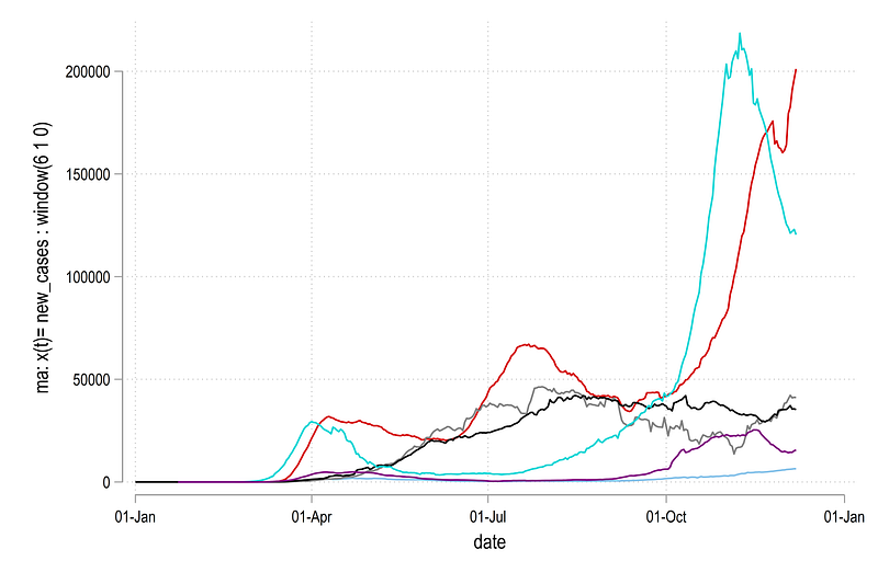
tssmooth ma new_deaths_ma7 = new_deaths , w(6 1 0) and we can plot the series for the first few regions to see what it looks like:
twoway ///
 (line new_cases_ma7 date if region==1) ///
 (line new_cases_ma7 date if region==2) ///
 (line new_cases_ma7 date if region==3) ///
 (line new_cases_ma7 date if region==4) ///
 (line new_cases_ma7 date if region==5) ///
 (line new_cases_ma7 date if region==6), ///
  legend(off)
which gives us this graph:
Next we use the logic introduced in Guide 5 on Stacked area graphs and generate a new set of variables which provides cumulative graphs by stacking values on top of each other:
******** new we stack these upgen stack_cases = .
gen stack_deaths = .sort date regionlevelsof date, local(dates)foreach y of local dates {
summ region*** cases
replace stack_cases = new_cases_ma7 if date==`y' & region==`r(min)' replace stack_cases = new_cases_ma7 + stack_cases[_n-1] if date==`y' & region!=`r(min)' *** deaths replace stack_deaths = new_deaths_ma7 if date==`y' & region==`r(min)' replace stack_deaths = new_deaths_ma7 + stack_deaths[_n-1] if date==`y' & region!=`r(min)' }
Essentially, we are taking the first region observation as it is, and for the subsequent regions iteratively adding up the values. We can also plot the new variables:
twoway ///
 (line stack_cases date if region==1) ///
 (line stack_cases date if region==2) ///
 (line stack_cases date if region==3) ///
 (line stack_cases date if region==4) ///
 (line stack_cases date if region==5) ///
 (line stack_cases date if region==6), ///
  legend(off)
where we get this graph:
Here the difference between the two lines are the daily cases for each region. This figure is also easier to look at relative to the earlier graph.
If you look at the help of the twoway rarea command:
help twoway_rareahere you will see that the syntax is:
twoway rarea y1var y2var xvar [if] [in] [, options]This implies that in Stata, if we need to make area graphs, then each region needs to be its own variable. This essentially means we need to reshape the data and make it wide.
Before we reshape, we keep the variables we need and rename the new stack_* variable for convivence:
keep region date new_cases stack_cases new_deaths stack_deaths// rename just to keep life easy
ren stack_cases cases
ren stack_deaths deathsAs discussed in Guide 9, reshaping losses the information on value labels. We can use this three-step process to (a) preserve the labels in locals before reshaping, (b) reshape the data, and, (c) apply the labels after the reshape:
*** preserve the labelslevelsof region, local(idlabels) // store the id levels
foreach x of local idlabels {
local idlab_`x' : label region `x'
}*** reshape the datareshape wide cases new_cases deaths new_deaths, i(date) j(region)
order date cases* new_cases* deaths**** and apply the labels backforeach x of local idlabels { lab var cases`x' "`idlab_`x''"
lab var new_cases`x' "`idlab_`x''"
lab var deaths`x' "`idlab_`x''"
lab var new_deaths`x' "`idlab_`x''"
}Since there are locals involved, the above code has to run in one go. If the code runs fine, we should get something like this where each variable is given a label based on the corresponding number in the variable name:
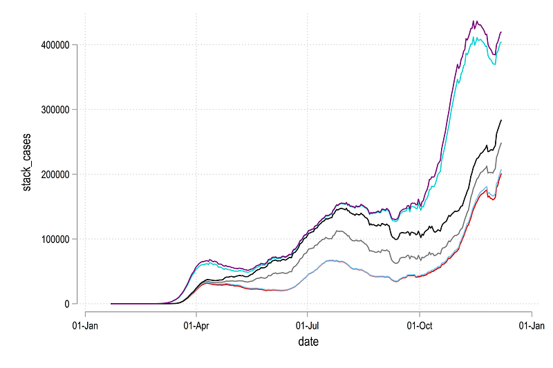
We can now redraw the line graph shown earlier but now we just do it using variable names rather than if conditions:
twoway ///
 (line cases1 date) ///
 (line cases2 date) ///
 (line cases3 date) ///
 (line cases4 date) ///
 (line cases5 date) ///
 (line cases6 date) ///
 (line cases12 date) ///
  , legend(off)
Note that here I am using the last variable cases12 just to show the extent of the data:
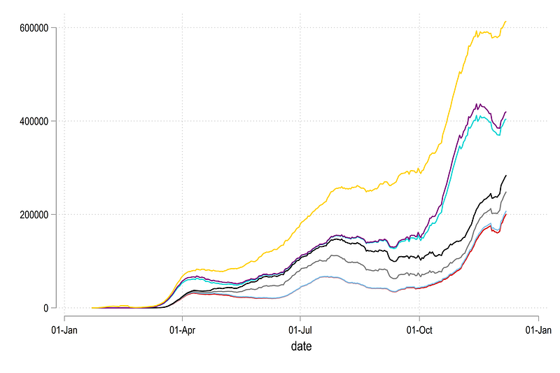
Since we want areas to stack up, we also need to define a dummy 0 variable for the first country:
gen cases0 = 0
gen deaths0 = 0
twoway ///
(line cases0 date) ///
(line cases1 date) ///
(line cases2 date) ///
(line cases3 date) ///
(line cases4 date) ///
(line cases5 date) ///
(line cases6 date) ///
(line cases12 date) ///
, legend(off)Which just gives us this figure:
The importance of having a zero line will become obvious below.
Now we have all the data in place, we can re-center the graph around zero on the y-axis. For this we need to take the maximum value of each date, divide it by two, and subtract each region’s observation by it.
In order to re-center the graph, we take the highest value, or the value of the last variable and divided it by two:
ds cases*
local items : word count `r(varlist)'
local items = `items' - 1
display `items'
gen meanval_cases = cases`items' / 2
gen meanval_deaths = deaths`items' / 2foreach x of varlist cases* {
gen `x'_norm = `x' - meanval_cases
}foreach x of varlist deaths* {
gen `x'_norm = `x' - meanval_deaths
}drop meanval*The first three lines automate to process of counting the number of variables in the dataset. Note, that we do local items = `items' — 1 to account for the additional cases0 variable we generated earlier, so that the total number of variables in our example are 12, and not 13, for the loop to run properly.
The automation helps if regions are added or subtracted, or the graph is looped over multiple regions, for example, generating a stream graph for each continent with all the countries.
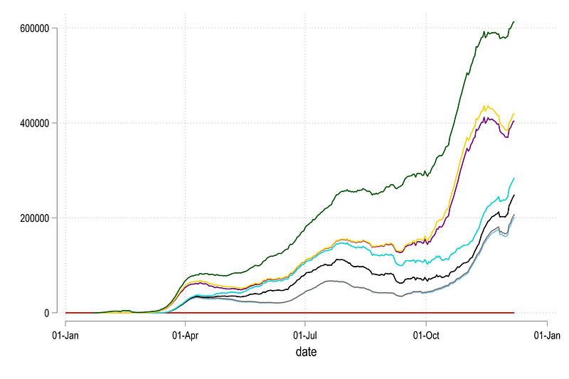
We can now plot the normalized variable given with the suffix *_norm as follows:
twoway ///
 (line cases0_norm date) ///
 (line cases1_norm date) ///
 (line cases2_norm date) ///
 (line cases3_norm date) ///
 (line cases4_norm date) ///
 (line cases5_norm date) ///
 (line cases6_norm date) ///
 (line cases12_norm date) ///
  , legend(off)
which gives us the core skeleton structure we need for stream graphs:
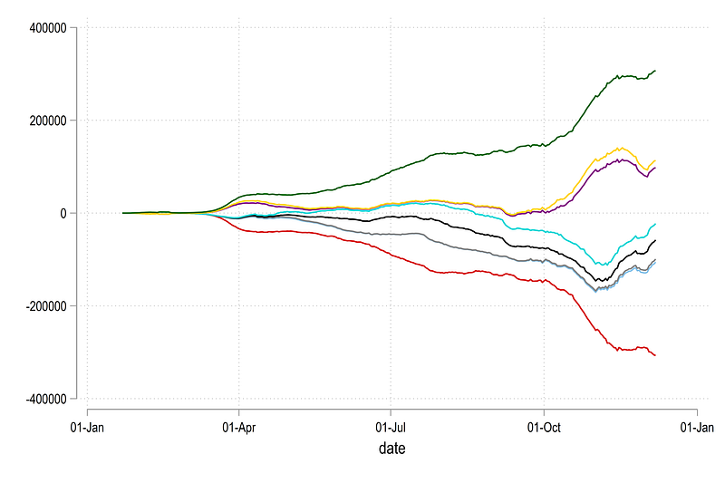
Here we can see the y=0 line has also been re-centered. We can now convert the above figure into an area graph as follows:
twoway ///
 (rarea cases0_norm  cases1_norm date) ///
 (rarea cases1_norm  cases2_norm date) ///
 (rarea cases2_norm  cases3_norm date) ///
 (rarea cases3_norm  cases4_norm date) ///
 (rarea cases4_norm  cases5_norm date) ///
 (rarea cases5_norm  cases6_norm date) ///
 (rarea cases6_norm cases12_norm date) ///
  , legend(off)
which gives us this figure:
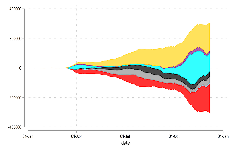
Notice also the y-axis which is now showing zero in the center and everything is distributed around it. Also note the pattern for generating the rarea graph where two y-variables have a difference of one in the name.
Labels
We can also automate the labels in three steps.
Step 1: generate the mid points of the last data observation:
*** this part is for the mid pointssumm date
gen last = 1 if date==r(max)ds cases*norm
local items : word count `r(varlist)'
local items = `items' - 2
display `items'forval i = 0/`items' {
local i0 = `i'
local i1 = `i' + 1gen ycases`i1' = (cases`i0'_norm + cases`i1'_norm) / 2 if last==1
gen ydeaths`i1' = (deaths`i0'_norm + deaths`i1'_norm) / 2 if last==1}
Here note the use of the locals and the word count again to automate the whole process. The mid point has to be calculated as starting value + ending value / 2. Since we are counting from zero, we update the items local by reducing it’s value by 2. Within the loop, we define two locals, i0 and i1, as indices for variable names, which can then be dynamically used in generating the mid points.
Step 2: Next we generate a variable for the share of cases and deaths for the last observation. This is just to indicate how much each region is contributing to the total of the last data point.
This is achieved using a fairly straightforward loop:
*** this part is for the sharesegen lastsum_cases = rowtotal(new_cases*) if last==1
egen lastsum_deaths = rowtotal(new_deaths*) if last==1foreach x of varlist new_cases* {
gen `x'_share = (`x' / lastsum_cases) * 100
}foreach x of varlist new_deaths* {
gen `x'_share = (`x' / lastsum_deaths) * 100
}drop lastsum*Note here that I am not using the smoothed variable but the actual data for the accurate value of the share of cases. This is also the reason, we carry this variable forward throughout the collapse and reshaping process.
Step 3: generate the variables containing the label for the graphs. Here we again use a mix of several locals to automate the label generation process:
**** here we generate the labelsds cases*norm
local items : word count `r(varlist)'
local items = `items' - 1foreach x of numlist 1/`items' {
local t : var lab cases`x'
*** cases
gen label`x'_cases  = "`t'" + " (" + string( new_cases`x', "%9.0f") + ", " + string( new_cases`x'_share, "%9.0fc") + "%)" if last==1
*** deaths
gen label`x'_deaths = "`t'" + " (" + string(new_deaths`x', "%9.0f") + ", " + string(new_deaths`x'_share, "%9.0fc") + "%)" if last==1
}In the code above, ds and word count and item define the number for the loop. The local t picks the variable label, and the gen command puts all this information together. Since the data is in a wide form after the reshape, a new variable is generated for each region.
We can also plot this manually for the same regions shown earlier:
twoway ///
 (rarea cases0_norm  cases1_norm date) ///
 (rarea cases1_norm  cases2_norm date) ///
 (rarea cases2_norm  cases3_norm date) ///
 (rarea cases3_norm  cases4_norm date) ///
 (rarea cases4_norm  cases5_norm date) ///
 (rarea cases5_norm  cases6_norm date) ///
 (rarea cases6_norm cases12_norm date) ///
  (scatter ycases1 date if last==1, ms(smcircle) msize(0.2) mlabel(label1_cases) mcolor(black%20) mlabsize(tiny) mlabcolor(black)) ///
  (scatter ycases2 date if last==1, ms(smcircle) msize(0.2) mlabel(label2_cases) mcolor(black%20) mlabsize(tiny) mlabcolor(black)) ///
  (scatter ycases3 date if last==1, ms(smcircle) msize(0.2) mlabel(label3_cases) mcolor(black%20) mlabsize(tiny) mlabcolor(black)) ///
  (scatter ycases4 date if last==1, ms(smcircle) msize(0.2) mlabel(label4_cases) mcolor(black%20) mlabsize(tiny) mlabcolor(black)) ///
  (scatter ycases5 date if last==1, ms(smcircle) msize(0.2) mlabel(label5_cases) mcolor(black%20) mlabsize(tiny) mlabcolor(black)) ///
  (scatter ycases6 date if last==1, ms(smcircle) msize(0.2) mlabel(label6_cases) mcolor(black%20) mlabsize(tiny) mlabcolor(black)) ///
  , legend(off)
Which gives us this graph:
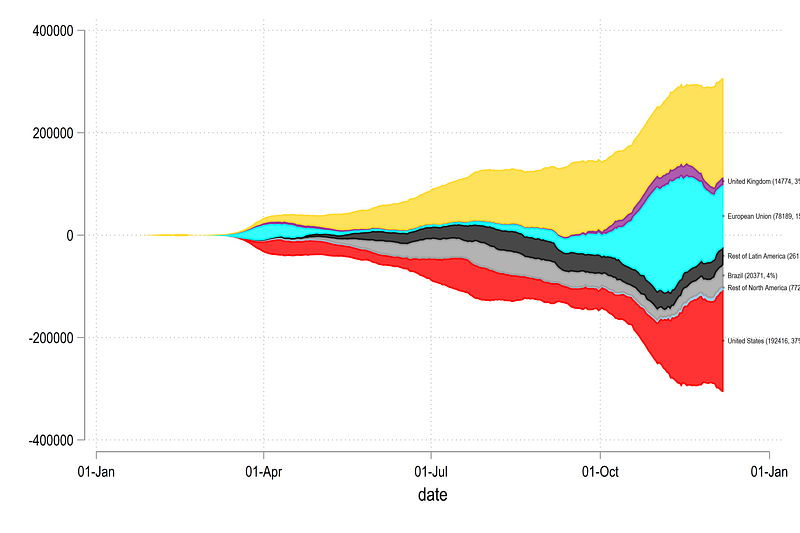
We have now achieved the core structure required to automate the final figure.
Automate
In the code below, we use a combination of loops and locals to also define the colors and labels for each region segment of the graph:
*** automate the areas, colors, labelsds cases*norm
local items : word count `r(varlist)'
local items = `items' - 2
display `items'forval x = 0/`items' {
colorpalette ///
 "253 253 150" ///
 "255 197   1" ///
 "255 152   1" ///
 "  3 125  80" ///
 "  2  75  48" ///
, n(13) nographlocal x0 = `x'
local x1 = `x' + 1
local areagraph `areagraph' rarea cases`x0'_norm cases`x1'_norm date, fcolor("`r(p`x1')'") lcolor(black) lwidth(*0.15) || (scatter ycases`x1' date if last==1, ms(smcircle) msize(0.2) mlabel(label`x1'_cases) mcolor(black%20) mlabsize(tiny) mlabcolor(black)) ||
}*** get the date ranges in ordersumm date
local x1 = `r(min)'
local x2 = `r(max)' + 50*** generate the graphgraph twoway `areagraph' ///
, ///
legend(off) ///
ytitle("", size(small)) ///
ylabel(-300000(100000)300000) ///
yscale(noline) ///
ylabel(, nolabels noticks nogrid) ///
xscale(noline) ///
xtitle("") ///
xlabel(`x1'(15)`x2', labsize(*0.6) angle(vertical) glwidth(vvthin) glpattern(solid)) ///
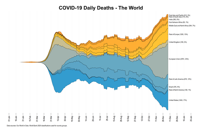
title("{fontface Arial Bold: COVID-19 Daily Cases - The World}") ///
note("Data sources: Our World in Data. World Bank 2020 classifications used for country groups.", size(tiny))The code above have a lot of parts that fit together. The total number of values that need to be picked are stored in the local items. A custom color palette that has been discussed in the Color guide and applied in the Guide 9 on bar graphs, is also being used here. This can be replaced with any other color scheme. The core body of the figure is stored in the local areagraph which contains two parts; one part for the area graph and one part for the labels including all the customizations of the lines, colors, widths, sizes etc. The color information is also dynamically applied from the values stored in locals after the colorpalette command.
The date range is stored in the two locals x1 and x2. The graph command call the areagraph local, and the date locals. Y-axis is turned off completely including the line which show the values centered around zero. The title is also customized using the fontface argument (see the Font Guide for details).
From the code above, we get the following final figure:
The stream graph above provides a neat representation of how the cases evolve and which region is contributing to the daily cases. It also helps immediately convey the relative scale of the epidemic and how different regions evolve over time. For example, the United States and Europe are major contributors at the time of writing this article. This graph can also be generated per-capita to normalize the regions for more accurate comparisons.
Exercise
Generate the graph for daily deaths shown below:
This graph uses the custom color palette:
colorpalette ///
"253 253 150" ///
"255 197 1" ///
"255 152 1" ///
" 3 125 80" ///
" 2 75 48" ///Don’t forget to clear the locals if you generate the stream graph for daily deaths right after the daily cases graph. Locals can be simply reset as follows:
local areagraphHope you enjoyed this guide!
Other Stata guides
Part 1: An introduction to data setup and customized graphs
Part 2: Customizing colors schemes
Part 8: Ridge-line plots (Joy plots)
If you enjoy these guides and find them useful, then please like and follow The Stata Guide. Also, please share your visualizations if you use these guides!
About the author
I am an economist by profession and I have been using Stata since 2003. I am currently based in Vienna, Austria where I work at the Vienna University of Economics and Business (WU) and at the International Institute for Applied Systems Analysis (IIASA). You can find my research work on ResearchGate and Google Scholar, and Stata code repository on GitHub. You can follow my COVID-19 related Stata visualizations on my Twitter. I am also featured on the Stata COVID-19 webpage in the visualization and graphics section.
You can connect with me via Medium, Twitter, LinkedIn or simply via email: [email protected].
My Medium blog for Stata stuff here: The Stata Guide where new awesome content is released regularly. Clap, and/or follow if you like these guides!


