
COVID-19 visualizations with Stata Part 7: Doubling time graphs
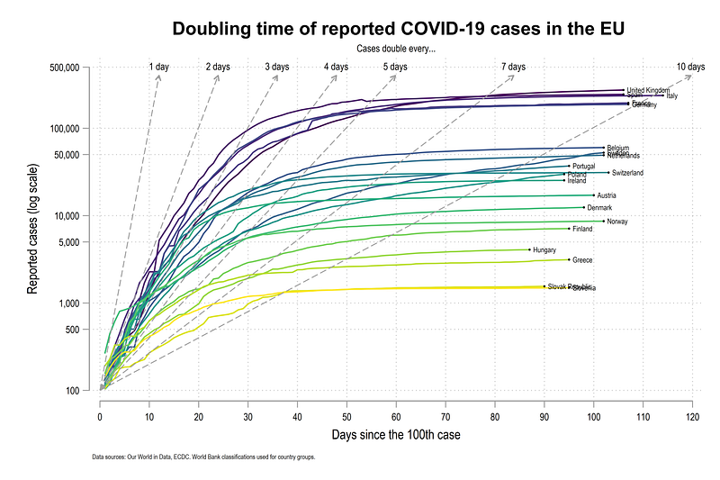
In this guide we will learn how to make the following doubling time graph in Stata:
Doubling time graphs were popular in the beginning of the COVID-19 pandemic with John Murdoch from the Financial Times (FT), and also a first mover in data visualizations on the virus spread. The figures were promoted daily on Twitter. The graph is no longer available on the FT COVID-19 webpage but is discussed here and here.
The graph was also not without controversy. There was significant debate around the use of log-scales, which are not easy to interpret, and the use of absolute cases instead of per capita cases. The graph also shows the doubling time relative to the 10th or 100th case, which sort of loses it value as we move ahead in time. This is also different from a rolling doubling time numbers based on the last 10 or 14 days which make more sense later in the pandemic. Rolling doubling times will be discussed in a follow-up guide.
Regardless, the graph has interesting elements in terms of programming in Stata which will also be covered in this guide: First, we will learn to use log scales and customize them. Second, the mathematics behind the doubling time lines and how to to draw them will be discussed. We will also make use of the custom colors (introduced in Guide 2 and explained in detail in the Stata Color Guide). In this guide, we also introduce another Stata graph element, custom fonts. More on fonts can be found in the Stata Font Guide.
As a side note, this guide is not an introduction to the concept and derivation of doubling time, on which several online resources exist.
Getting started
A basic knowledge of Stata is assumed. If you are using this guide for the first time, and are new to Stata, then Guide 1 and Guide 2 are highly recommended.
Like previous guides, the standard introduction applies here as well, where we start with the following folder structure for the work-flow management:
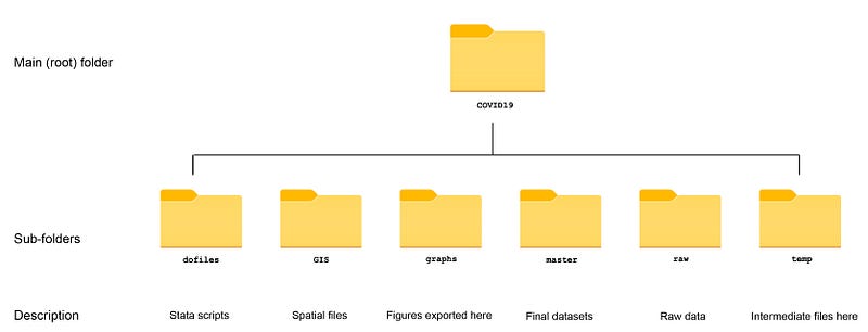
Within the graphs folder, I also create an additional sub-folder called guide7, to store the figures generated here. For details on how to organize your files, please see Guide 1.
In order to make the graphs exactly as they are shown here, several additional item are required:
- Install the cleanplots theme for a clean look for your figures (more on themes in Guide 2):
net install cleanplots, from("https://tdmize.github.io/data/cleanplots")set scheme cleanplots, perm- Install Ben Jann’s colorpalette package (more on colors in Guide 2 and in the Color guide)
net install palettes, replace from("https://raw.githubusercontent.com/benjann/palettes/master/")
net install colrspace, replace from("https://raw.githubusercontent.com/benjann/colrspace/master/")- Set default graph font to Arial Narrow (see the Font guide on customizing fonts)
graph set window fontface "Arial Narrow"This guide has been written in version 16.1 and should work with version 14 and onwards. Earlier versions might need some modification for implementing custom colors.
Setup the data
We download the data from Our World in Data’s (OWID) COVID-19 page (see Guide 1 on how to get data from online repositories):
************************
***  COVID 19 data   ***
************************
insheet using "https://covid.ourworldindata.org/data/owid-covid-data.csv", clear
save ./raw/full_data_raw.dta, replacegen date2 = date(date, "YMD")
format date2 %tdDD-Mon-yy
drop date
ren date2 dateren location country
replace country = "Slovak Republic" if country == "Slovakia"drop if date < 21915 // 1st Januarycompress
save "./master/OWID_data.dta", replaceFor this guide we keep a handful of European countries. Note that we keep the same group of countries across the guides. Any set of countries can be used here:
use ./master/OWID_data.dta, cleargen group = .replace group = 1 if ///
country == "Austria" | ///
country == "Belgium" | ///
country == "Czech Republic" | ///
country == "Denmark" | ///
country == "Finland" | ///
country == "France" | ///
country == "Germany" | ///
country == "Greece" | ///
country == "Hungary" | ///
country == "Italy" | ///
country == "Ireland" | ///
country == "Netherlands" | ///
country == "Norway" | ///
country == "Poland" | ///
country == "Portugal" | ///
country == "Slovenia" | ///
country == "Slovak Republic" | ///
country == "Spain" | ///
country == "Sweden" | ///
country == "Switzerland" | ///
country == "United Kingdom"keep if group==1keep date country total_cases
encode country, gen(id)
order id country datextset id date
sort country dateSince the data series is fairly long, and doubling time graph shown above is mostly useful in the start of the pandemic, we restrict the sample till 15th June 2020, and we also drop the missing data rows:
*** restrict the observations
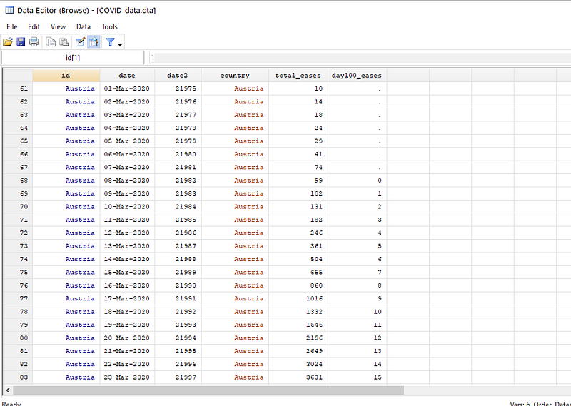
drop if date > 22081 // 15th Junedrop if total_cases==.Note that in order to see what is the number associated with each date, just generate date2=date. This will give the unformatted date variable which you can check in the browser window br.
Now we need to generate a variable that counts the days from the 100th case. This is done as follows:
*** days since 100th casegen day100_cases = .
levelsof country, local(cntr)
foreach x of local cntr {
 summ date if total_cases <= 100  & country=="`x'"
 replace day100_cases = date - `r(max)' if date >= `r(max)' & country=="`x'"
 }
Where for each country, we store the last date where the total_cases variable is less than or equal to 100. Based on this information, we generate a new variable day100_cases as the difference between today’s date and the date when the cases crossed 100. Missing or zero observations are also dropped.
If we browse the data (br ), we can see that this variable starts with 1 where the first observation is above 100.
Here we drop the extra observations:
*** drop extra informationdrop if day100_cases==0
drop if day100_cases==.
lab var day100_cases "Days since the 100th case"Note that while working with actual files, one should not drop unwanted observations but control them using if and and conditions. These steps are done here just to simplify the process. It is also good to browse the data after each step and check the new variables.
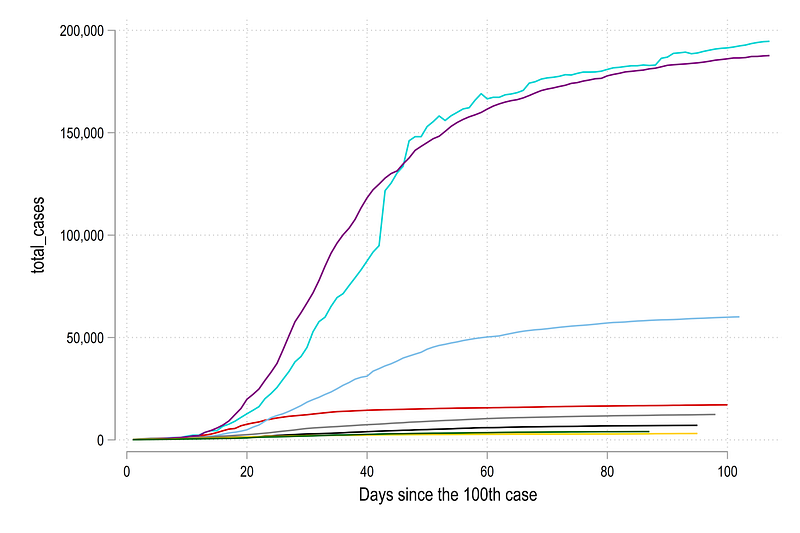
We can now do a first plot. Here I just take the first eight countries based on the id variable.
twoway ///
 (line total_cases day100_cases if id==1) ///
 (line total_cases day100_cases if id==2) ///
 (line total_cases day100_cases if id==3) ///
 (line total_cases day100_cases if id==4) ///
 (line total_cases day100_cases if id==5) ///
 (line total_cases day100_cases if id==6) ///
 (line total_cases day100_cases if id==7) ///
 (line total_cases day100_cases if id==8) ///
 , legend(off)
which gives us a standard line graph:
Note that this graph was exported using the command graph export ./graphs/guide7/graph1.png, replace wid(5000). This command will only work if you are using the folder structure described earlier.
This graph above is not so easy to read. The countries with yellow, purple, and light blue lines have a lot of COVID-19 cases (probably they are larger as well), while the rest are clustered together at the bottom. If we add more countries, the lines will become even more confusing.
We can repeat the code above and just add one more line to make the y-axis log scale yscale(log):
twoway /// (line total_cases day100_cases if id==1) ///
 (line total_cases day100_cases if id==2) ///
 (line total_cases day100_cases if id==3) ///
 (line total_cases day100_cases if id==4) ///
 (line total_cases day100_cases if id==5) ///
 (line total_cases day100_cases if id==6) ///
 (line total_cases day100_cases if id==7) ///
 (line total_cases day100_cases if id==8) ///
 , yscale(log) legend(off)
Which gives us this figure:
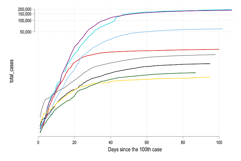
Note how the log scale has completely changed the figure. Here the reader has to be careful with the interpretation of the distances between the line. The true distance are show in the previous figure while the figure here accentuates trends with low values and make them stand out more. The distance is also not even between the lines as the y-axis ticks show. The distance between 50,000 to 100,000 is roughly the same as 100,000 to 200,000.
This has also been a subject to much debate since log-lines, while make data more clear, are not so easy to comprehend, if one is not used to log scales.
Next we label the graph with country names. This is done by generating a variable called last which marks the last data entry for each country and gives it a value of one.
gen last = .levelsof country, local(cntr)
foreach x of local cntr {
summ day100_cases if country=="`x'"
replace last = 1 if day100_cases==`r(max)' & country=="`x'"
}We can now add a simple scatter and label it as follows:
twoway ///
(line total_cases day100_cases if id==1) ///
(line total_cases day100_cases if id==2) ///
(line total_cases day100_cases if id==3) ///
(line total_cases day100_cases if id==4) ///
(line total_cases day100_cases if id==5) ///
(line total_cases day100_cases if id==6) ///
(line total_cases day100_cases if id==7) ///
(line total_cases day100_cases if id==8) ///
(scatter total_cases day100_cases if last==1 & id <= 8, ms(circle) mcolor(black) msize(*0.1) mlabel(country) mlabsize(*0.7) mlabcolor(black)) ///
if total_cases >= 100, ///
ytitle("Reported cases (log scale)") ///
yscale(log range(100 200000)) ///
ylabel(100 200 500 1000 200 5000 10000 50000 100000 200000, labsize(small)) ///
xlabel(0(20)120, labsize(small)) ///
xtitle("Days since the 100th case") ///
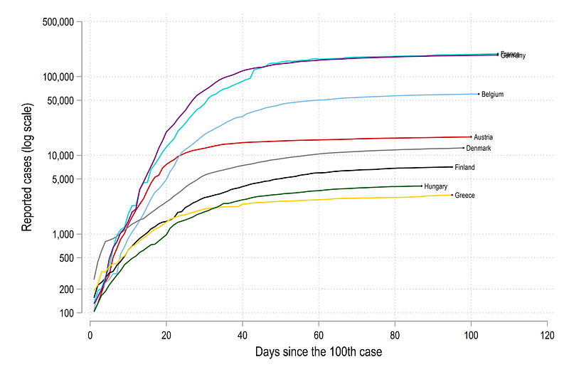
legend(off) Here yscale(log range(100 200000)) gives us control on the axis range. This is an under utilized trick to always prevent the axis starting from 0. The next line ylabel(100 200 500 1000 200 5000 10000 50000 100000 200000, labsize(small)) allows us to use custom ticks on the y-axis. Here we use a pattern of 1,2,5,10 and its multiples. These values roughly give equal distances between the lines. The code above gives us this figure:
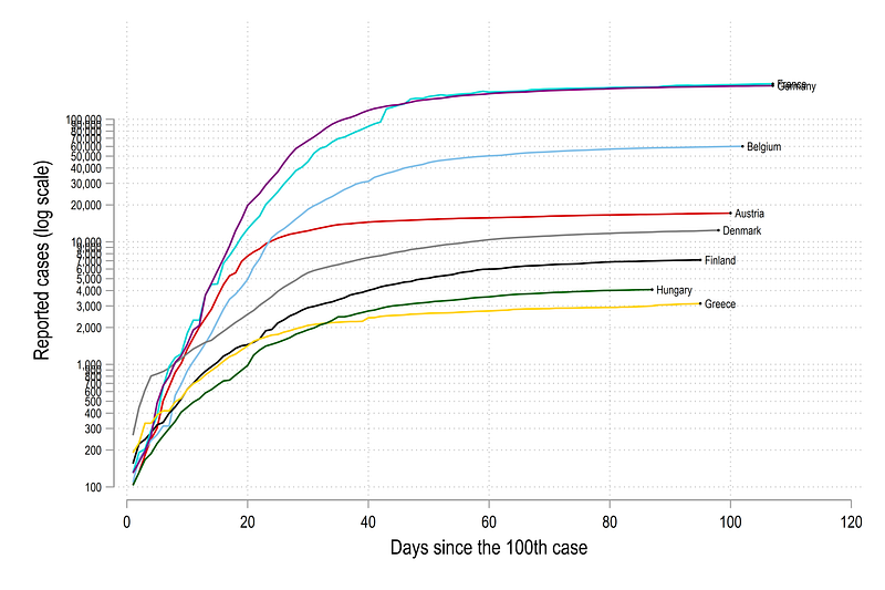
If you want to use more standard log scales, this can be replaced with ylabel(100(100)1000 1000(1000)10000 10000(10000)100000, labsize(vsmall)) which would give us ticks which look like this:
In the graphs above, we can see that Germany has seen the highest rise in cases since the 100th case, followed by France. Since Germany and France are large countries, and the cases are reported in absolute numbers, this result is not surprising. The lines that go farther right also hit the 100th case mark earlier and are trailing ahead. For example, Germany, on 1st June (our data cut-off) was over 90 days since the 100th case, while Greece was only 80 days. Out of all the countries above, Denmark grew the fastest in the beginning.
Doubling time lines
Now we need to add lines that show the rate of doubling. Here we make use of some mathematics:
If we start with the following pair x0 = 0, y0 = 100, where x is days and y are cases, then a doubling time of one day would imply that x1 = 1, y1 = 200 . We can continue this series:
x0 = 0, y0 = 100
x1 = 1, y1 = 200
x2 = 2, y2 = 400
x3 = 3, y3 = 800
x4 = 4, y4 = 1600
...
and so one. This shows that cases doubling from the previous day. From this we can derive the following generic form for yt for a given value of xt as:
yt = 2^xt * y0where t>0 is the time index. We already know y0 (y0 = 100 in our case), so one of the other two variables yt or xt have to be fixed. Since we have total cases exploding on the log scale on the y-axis, we can chose some arbitrary number above the last set of cases as the value of yt . For example, the highest cases we have are around 200,000. So we can keep, lets say yt=40000. If yt is fixed, we can inverse the formula to make xt the subject, from which we get:
xt = 1/log2 * log(yt/y0) // maths homework ;)For a doubling time of n days, we can derive the generic formula as:
xt_n = n * 1/log2 * log(yt/y0) // doubling time of n daysIn Stata, we generate the variables which are used to draw the doubling time lines. Note that this is not the most efficient way, but it helps with following the code, if you see the values in the data browser screen:
**** doubling time lines

** define the limits of the y-axis
local upper = 400000
local lower = 100
gen x0 = 0 in 1 // starting x value
gen y0 = `lower' in 1 // starting y value
gen y1 = `upper' in 1 // ending y value (we fix y)*** and generate the x value gen x1 = (1/log(2)) * log(y1/y0) * 1 in 1 // every 1 days
gen x2 = (1/log(2)) * log(y1/y0) * 2 in 1 // every 2 days
gen x3 = (1/log(2)) * log(y1/y0) * 3 in 1 // every 3 days
gen x4 = (1/log(2)) * log(y1/y0) * 4 in 1 // every 4 days
gen x5 = (1/log(2)) * log(y1/y0) * 5 in 1 // every 5 days
gen x6 = (1/log(2)) * log(y1/y0) * 7 in 1 // every 7 days
gen x7 = (1/log(2)) * log(y1/y0) * 10 in 1 // every 10 daysgen label1 = "1 day" in 1
gen label2 = "2 days" in 1
gen label3 = "3 days" in 1
gen label4 = "4 days" in 1
gen label5 = "5 days" in 1
gen label6 = "7 days" in 1
gen label7 = "10 days" in 1sort country dateIf we browse the data, we can see the values of x1-x7 representing doubling times mentioned above with y1=40000 as the upper y-axis value:
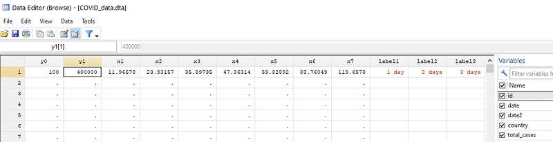
We can now add these lines as twoway spikes using the pcarrow command which takes 2 coordinate pairs (x0,y0) and (xt,yt) to draw a line. These are highlighted in the code below:
twoway ///
 (line total_cases day100_cases if id==1) ///
 (line total_cases day100_cases if id==2) ///
 (line total_cases day100_cases if id==3) ///
 (line total_cases day100_cases if id==4) ///
 (line total_cases day100_cases if id==5) ///
 (line total_cases day100_cases if id==6) ///
 (line total_cases day100_cases if id==7) ///
 (line total_cases day100_cases if id==8) ///
  (scatter total_cases day100_cases if last==1 & id <= 8, ms(circle) mcolor(black) msize(*0.1) mlabel(country) mlabsize(*0.7) mlabcolor(black)) ///
  (pcarrow y0 x0 y1 x1, lc(gs8) lw(thin) lp(-) mc(gs10) msize(small) mlab(label1) mlabsize(vsmall) mlabc(black) mlabposition(12) headlabel) ///
  (pcarrow y0 x0 y1 x2, lc(gs8) lw(thin) lp(-) mc(gs10) msize(small) mlab(label2) mlabsize(vsmall) mlabc(black) mlabposition(12) headlabel) ///
  (pcarrow y0 x0 y1 x3, lc(gs8) lw(thin) lp(-) mc(gs10) msize(small) mlab(label3) mlabsize(vsmall) mlabc(black) mlabposition(12) headlabel) ///
  (pcarrow y0 x0 y1 x4, lc(gs8) lw(thin) lp(-) mc(gs10) msize(small) mlab(label4) mlabsize(vsmall) mlabc(black) mlabposition(12) headlabel) ///
  (pcarrow y0 x0 y1 x5, lc(gs8) lw(thin) lp(-) mc(gs10) msize(small) mlab(label5) mlabsize(vsmall) mlabc(black) mlabposition(12) headlabel) ///
  (pcarrow y0 x0 y1 x6, lc(gs8) lw(thin) lp(-) mc(gs10) msize(small) mlab(label6) mlabsize(vsmall) mlabc(black) mlabposition(12) headlabel) ///
  (pcarrow y0 x0 y1 x7, lc(gs8) lw(thin) lp(-) mc(gs10) msize(small) mlab(label7) mlabsize(vsmall) mlabc(black) mlabposition(12) headlabel) ///
    if total_cases >= 100, ///
    ytitle("Reported cases (log scale)") ///
    yscale(log range(100 400000)) ///
    ylabel(100 200 500 1000 2000 5000 10000 20000 50000 100000 200000, labsize(small) glwidth(vvvthin) glpattern(solid)) ///
    xlabel(0(10)120, labsize(small) glwidth(vvvthin) glpattern(solid)) ///
     xtitle("Days since the 100th case") ///
     legend(off)
From the code above, we end up with this figure:
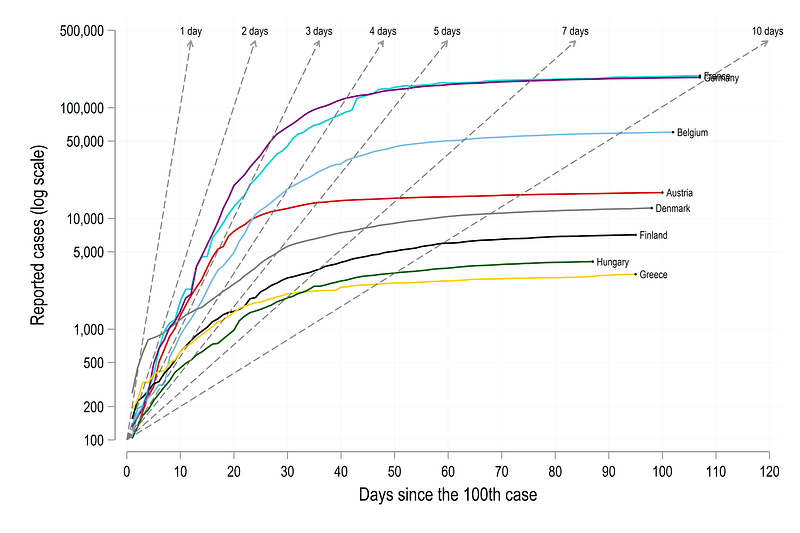
Here the lines mark the rate of doubling time relative to the 100th case. For example, for Germany, the doubling of cases was 3 days , which started slowing down after a month or so from the 100th case. At 1st of June (our cut-off for dropping the dates), Germany’s cases were still doubling at a rate of 8–9 days. For Denmark cases were doubling every day in the beginning, but they managed to rapidly slow it down in 10 days or so after the 100th case.
Fine-tune the colors
Here we can now customize the colors. Like in Guide 2, we will using a sorting method to color the lines and give them a nice gradient. We use the last variable to generate a ranking based on highest to lowest value.
egen rank = rank(total_cases) if last==1, f
sort date rank
**** assign the same rank to the older observations as welllevelsof country, local(lvls)
foreach x of local lvls {
qui summ rank if country=="`x'"
cap replace rank = `r(max)' if country=="`x'" & rank==.
}The next code block has to be run in one go since we are using locals (locals, as opposed to globals, disappear from memory if the run instance changes):
levelsof rank, local(lvls)   // loop over all the ranks
local items = r(r)           // store how many items there are
foreach x of local lvls {colorpalette viridis, n(`items') nograph // change this as neededlocal customline `customline' (line total_cases day100_cases if rank == `x', lc("`r(p`x')'") lw(medium) lp(solid)) ||
}
**** same code as above with slight modifications
twoway ///
`customline' ///
(pcarrow y0 x0 y1 x1, lc(gs10) lw(thin) lp(--.) mc(gs10) msize(small) mlab(label1) mlabsize(vsmall) mlabc(black) mlabposition(12) headlabel) ///
(pcarrow y0 x0 y1 x2, lc(gs10) lw(thin) lp(--.) mc(gs10) msize(small) mlab(label2) mlabsize(vsmall) mlabc(black) mlabposition(12) headlabel) ///
(pcarrow y0 x0 y1 x3, lc(gs10) lw(thin) lp(--.) mc(gs10) msize(small) mlab(label3) mlabsize(vsmall) mlabc(black) mlabposition(12) headlabel) ///
(pcarrow y0 x0 y1 x4, lc(gs10) lw(thin) lp(--.) mc(gs10) msize(small) mlab(label4) mlabsize(vsmall) mlabc(black) mlabposition(12) headlabel) ///
(pcarrow y0 x0 y1 x5, lc(gs10) lw(thin) lp(--.) mc(gs10) msize(small) mlab(label5) mlabsize(vsmall) mlabc(black) mlabposition(12) headlabel) ///
(pcarrow y0 x0 y1 x6, lc(gs10) lw(thin) lp(--.) mc(gs10) msize(small) mlab(label6) mlabsize(vsmall) mlabc(black) mlabposition(12) headlabel) ///
(pcarrow y0 x0 y1 x7, lc(gs10) lw(thin) lp(--.) mc(gs10) msize(small) mlab(label7) mlabsize(vsmall) mlabc(black) mlabposition(12) headlabel) ///
(scatter total_cases day100_cases if last==1, ms(circle) mcolor(black) msize(*0.1) mlabel(country) mlabsize(*0.55) mlabcolor(black)) ///
if total_cases >= 100, ///
ytitle("Reported cases (log scale)", size(small)) ///
yscale(log range(100 200000)) ///
ylabel(100 500 1000 5000 10000 50000 100000 200000, labsize(vsmall) ) /// // glwidth(vvvthin) glpattern(solid)
xlabel(0(10)120, labsize(vsmall) ) /// // glwidth(vvvthin) glpattern(solid)
xtitle("Days since the 100th case", size(small)) ///
legend(off) ///
title("{fontface Arial Bold: Doubling time of reported COVID-19 cases in the EU}") ///
subtitle(Cases double every..., size(vsmall) ) ///
note("Data sources: Our World in Data, ECDC. World Bank classifications used for country groups.", size(tiny))And here we get the final graph:
Note the use of custom fonts in the title: title("{fontface Arial Bold: Doubling time of reported COVID-19 cases in the EU}"). This trick can be used to change any font for any element anywhere. See the Stata Font Guide on how to change the fonts in graphs.
Exercise
Try and generate the same graph for another region. Try generating it from the 500th case, or 500th death. Change the color scheme as well, and play around with the line widths, patterns etc. Try using other fonts in the graphs.
Other Stata guides
Part 1: An introduction to data setup and customized graphs
Part 2: Customizing colors schemes
Part 7: Doubling time graphs I
Part 8: Ridge-line plots (Joy plots)
If you enjoy these guides and find them useful, then please like and follow The Stata Guide. Also, please share your visualizations if you use these guides!
About the author
I am an economist by profession and I have been using Stata since 2003. I am currently based in Vienna, Austria where I work at the Vienna University of Economics and Business (WU) and at the International Institute for Applied Systems Analysis (IIASA). You can find my research work on ResearchGate and Google Scholar, and Stata code repository on GitHub. You can follow my COVID-19 related Stata visualizations on my Twitter. I am also featured on the Stata COVID-19 webpage in the visualization and graphics section.
You can connect with me via Medium, Twitter, LinkedIn or simply via email: [email protected].
My Medium blog for Stata stuff here: The Stata Guide where new awesome content is released regularly. Clap, and/or follow if you like these guides!