
Stata graphs: Get those fonts right
In the world of data visualizations an enormous amount of thinking has gone into defining what constitutes good infographics. At the end of the day, visualizations need to communicate a story in an aesthetically pleasing way and in order to achieve this, various elements like colors and fonts need to fit together neatly.
In the world of Stata graphs, fonts are often an overlooked feature, even though the software provides the functionality to fully customize and utilize them.
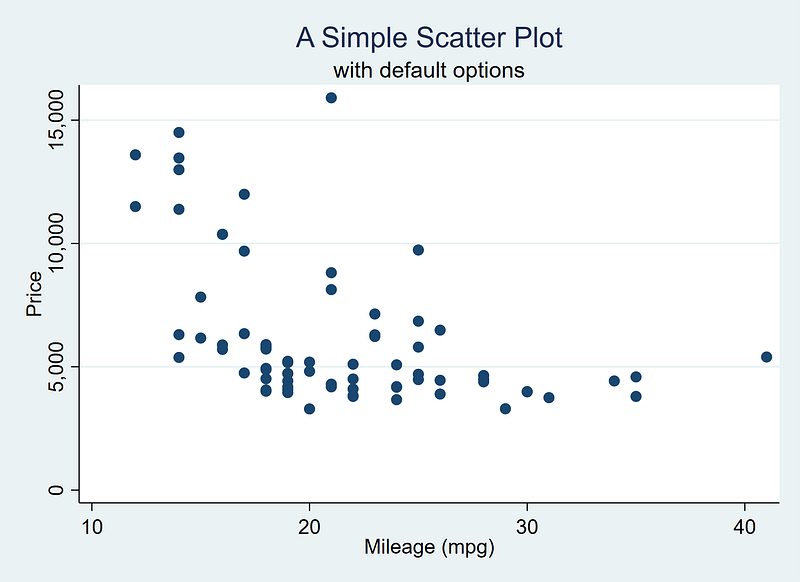
This guide aims to introduce the basics of fonts usage in Stata and provides a step-by-step guide on how to incorporate them in your graphs. Here, we will learn how to go from this default graph:
to this figure below:
Background
Font are an essential part of data visualizations, and several online guides discuss them in detail. For a quick background, this Medium post provides a good introduction:
Visualizations usually utilize Serif fonts. Serifs are a font class that add strokes to letters and make them stand out more. For example, this guide is written in a Serif font. In contrast, Sans-Serif fonts, are fonts without the extra strokes, for example Arial, or the font used for the sub-headings in this post. Sans-serifs are also highly preferred for graphs because of their high readability especially in very small font sizes.
Data visualizations typically use the following combinations:
- Sans-Serif header/Sans-Serif body: in various configurations. For example, (a) using the same font for both header and body, (b) header in bold and body in normal, (c) different Sans-Serif fonts for header and body with a preference for a bold font for the header.
- Serif header/Sans-serif body: is a classic (and safest) combination. Serifs are visually “heavier” fonts than Sans-Serifs and work well as headers.
- Sans-Serif header/Serif body: like this version of Medium blogs with Sans-serif sub-headers and a Serif body.
- Serif header/Serif body: think of the classic Microsoft Word where Times New Roman was the default font for a very long time.
Where to get the fonts?
Fonts can be downloaded anywhere, but a good place to start is the Google fonts repository that is specifically designed for websites, WordPress themes, blogs, infographics etc.:
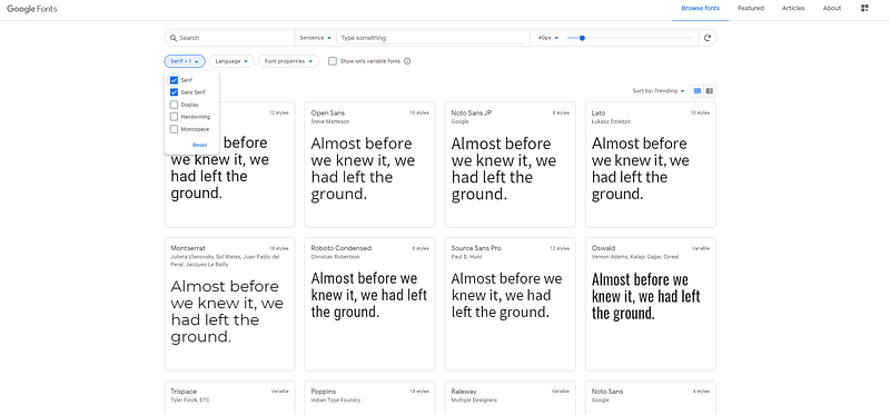
The website also allows one to filter by font type. Here we can filter by Serif and Sans Serif fonts.
Let’s choose two fonts and install them.
For Serif fonts, my current personal favorite is Merriweather, that can also be previewed in various styles online:
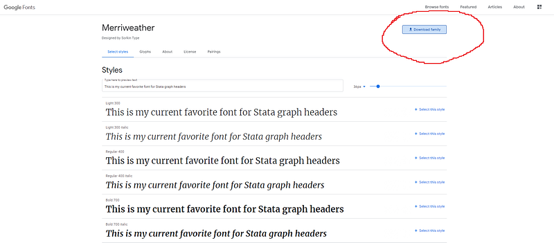
On the webpage, click on the Download Font icon, and a zipped file will be saved in the browser’s download directory. Unzip the files:
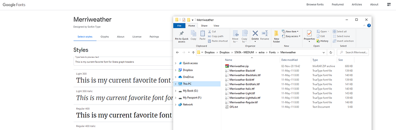
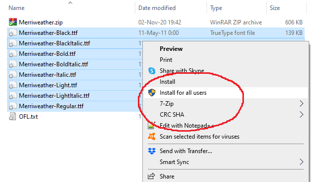
Then select the .ttf files, right-click and install them. For Windows, this should look like this:
Once the fonts are installed, they can be used in any other application like the Microsoft Word, Photoshop, etc. If you usually edit the text in Latex, then several packages can be loaded that already come with a nice selection of Serif, Sans-Serif, and Math fonts.
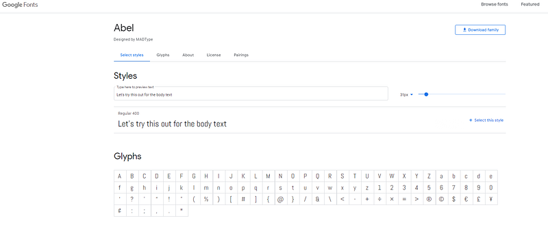
For a Sans-Serif font, I almost always use Arial Narrow since it is already installed on Windows. But for the sake of this guide, we will install an additional font from the Google website. For example, Abel is a close match to the Arial Narrow font:
I prefer these narrow fonts since I use a lot of text for labels in graphs. These horizontally squished fonts minimize the space used up. Once the fonts are installed, we can now start with Stata.
Stata
First we load a default Stata dataset:
clear
sysuse auto   // use a default Stata dataset
Next try these commands:
graph set
help graph set
Typing graph set will give this output:
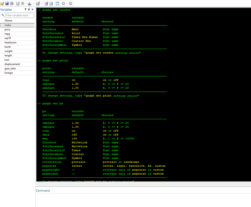
These are essentially the core features of graph windows and how figures are printed and exported. Notice the extent of options available. All of this can be completely customized. One probably does not see these options discussed on forums, blog posts etc. but they are extremely powerful for customizing outputs.
Let’s set the default graph options:
set scheme s2color
graph set window fontface default
And we draw a basic scatter plot:
twoway ///
 (scatter price mpg), ///
 title(A Simple Scatter Plot) ///
 subtitle(with default options)
which gives us the standard Stata layout that everyone is familiar with:
Let’s clean up the figure by using another scheme. Here I prefer using my favorite one, Cleanplots, which I have also covered in previous guides:
net install cleanplots, from("https://tdmize.github.io/data/cleanplots")set scheme cleanplots, permThe last command sets the scheme permanently.
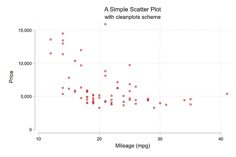
We draw the graph again:
twoway ///
 (scatter price mpg), ///
 title(A Simple Scatter Plot) ///
 subtitle(with cleanplots scheme)
From the code above, we get this minimalistic figure:
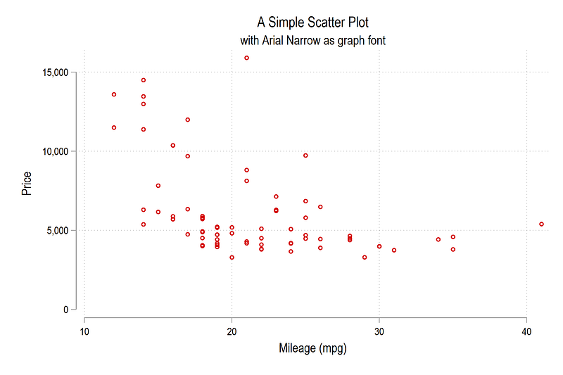
We can now change the overall graph font:
graph set window fontface "Arial Narrow"twoway ///
(scatter price mpg), ///
title(A Simple Scatter Plot) ///
subtitle(with Arial Narrow as graph font)and here we see the graph with the Arial Narrow font:
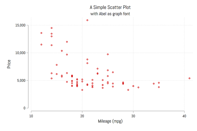
We can also test the Abel font that we installed earlier:
graph set window fontface "Abel"twoway ///
(scatter price mpg), ///
title(A Simple Scatter Plot) ///
subtitle(with Abel as graph font)which also looks nice:
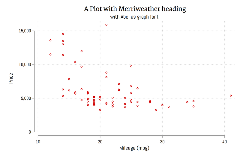
We can also individually customize the font of a specific element in a graph. For example, we can change the title to use the Merriweather font :
twoway ///
 (scatter price mpg), ///
 title({fontface Merriweather: A Plot with Merriweather heading}) ///
 subtitle(with Abel as graph font)
Note the use of the syntax {fontface fontname: text} . From the code above, we get this figure below:
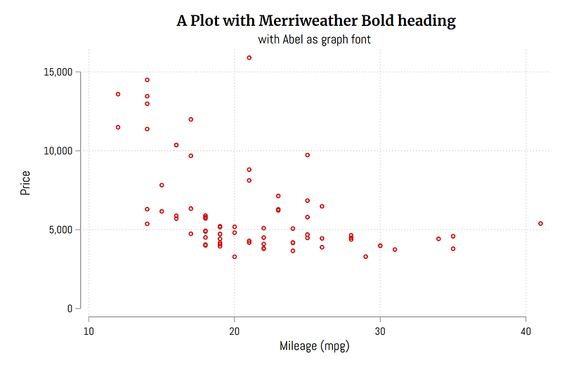
We can also try the bold variant of Merriweather:
twoway ///
 (scatter price mpg), ///
 title({fontface Merriweather Bold: A Plot with Merriweather Bold heading}) ///
 subtitle(with Abel as graph font)
which gives us this figure where the title really stands out:
Note that the variants are usually given in different font files that were unzipped from the website. One can copy the name of the font file without the hyphens used in the file name. If you want to preview some fonts, or figure out their system name, previewing them in MS Word or any other text editor also helps. One can also open the .ttf file directly.
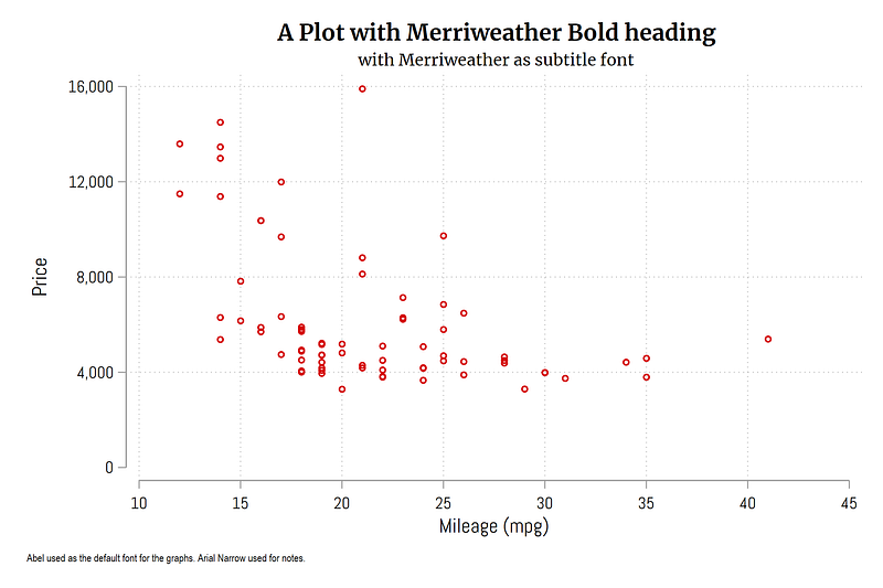
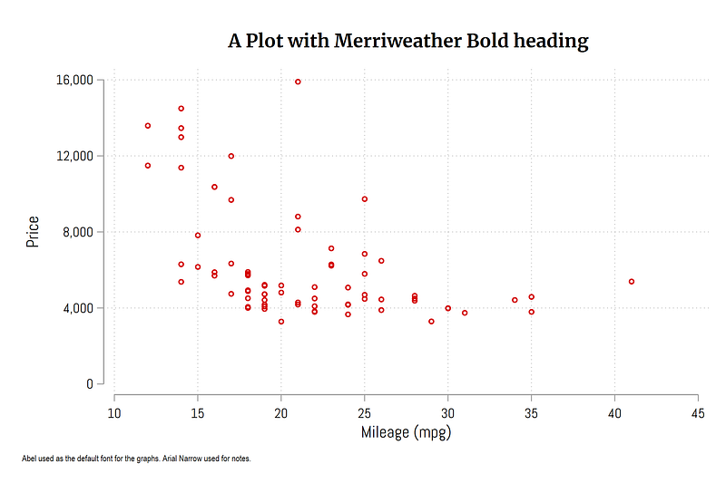
We can also use two different fonts in the same graph. In the graph below, the title is Merriweather Bold, while the subtitle is Merriweather. We also add a note to the figure, using Arial Narrow as the third font:
twoway ///
 (scatter price mpg), ///
 title({fontface Merriweather Bold: A Plot with Merriweather Bold heading}) ///
 subtitle({fontface Merriweather: with Merriweather as subtitle font}, size(small)) ///
 note({fontface Arial Narrow: Abel used as the default font for the graphs. Arial Narrow used for notes.}, span size(*0.65)) ///
 ylabel(0(4000)16000) ///
 xlabel(10(5)45)
Here one can also play around with font weights and sizes to get the best look:
We can also draw the graph without the subtitle and add some margin between the title and the graph:
twoway ///
 (scatter price mpg), ///
 title({fontface Merriweather Bold: A Plot with Merriweather Bold heading}, margin(medium)) ///
 note({fontface Arial Narrow: Abel used as the default font for the graphs. Arial Narrow used for notes.}, span size(*0.65)) ///
 ylabel(0(4000)16000) ///
 xlabel(10(5)45)
This graph looks slightly neater than the earlier version:
Here is another variation of a Stata graph, where the title is left-aligned. One frequently comes across left-aligned headers in graphs, but this option is hardly used for Stata graphs:
twoway ///
 (scatter price mpg), ///
 title({fontface Merriweather Bold: A Plot with Merriweather Bold heading}, margin(medium) position(11) span) ///
 note({fontface Arial Narrow: Abel used as the default font for the graphs. Arial Narrow used for notes.}, span size(*0.65)) ///
 ylabel(0(4000)16000) ///
 xlabel(10(5)45)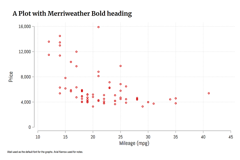
Note that the options used above might not work for all graphs. Customizing graphs require experimentation with these different elements. This is worth the effort since once you have a graph layout that you like, then it can easily be copy-pasted and replicated. In another guide we will cover to to generate your own themes once you have a graph “template” in place.
Exercise
Try using other font combinations for your graphs. Also play around with elements like changing the fonts of tick labels. One good exercise is to take a graph from well-know newspapers like the Financial Times, the Economist, New York Times and try and replicating them. Usually they provide the information on the fonts used.
And that’s it! Hope you like this guide. Let me know if you use these elements in your figure and share them here or on social media.
About the author
I am an economist by profession and I have been using Stata since 2003. I am currently based in Vienna, Austria where I work at the Vienna University of Economics and Business (WU) and at the International Institute for Applied Systems Analysis (IIASA). You can find my research work on ResearchGate and Google Scholar, and Stata code repository on GitHub. You can follow my COVID-19 related Stata visualizations on my Twitter. I am also featured on the Stata COVID-19 webpage in the visualization and graphics section.
You can connect with me via Medium, Twitter, LinkedIn or simply via email: [email protected].
My Medium blog for Stata stuff here: The Stata Guide where new awesome content is released regularly. Clap, and/or follow if you like these guides!


