
COVID-19 visualizations with Stata Part 2: Customizing colors schemes
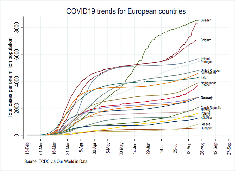
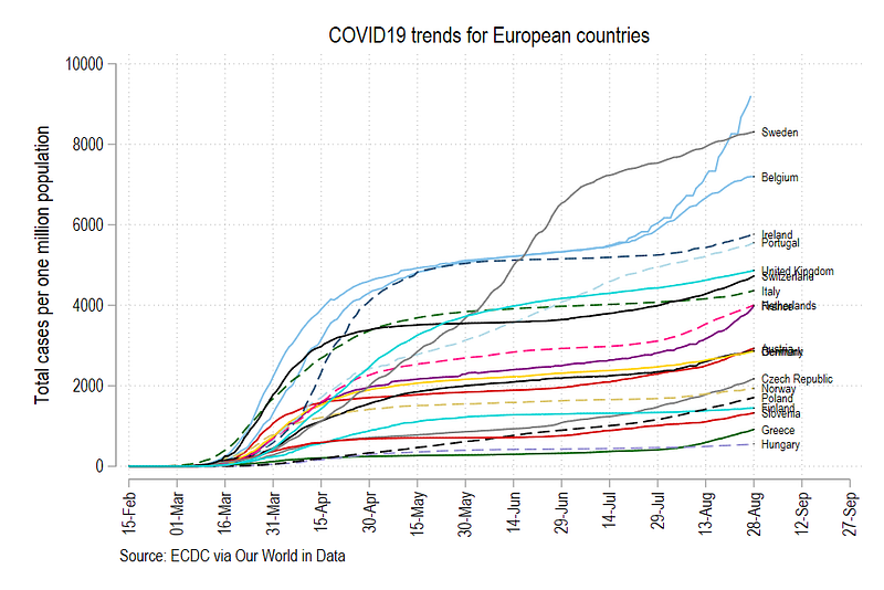
This guide will cover an important, yet, under-explored part of Stata: the use of custom color schemes. In summary, we will learn how to go from this graph:
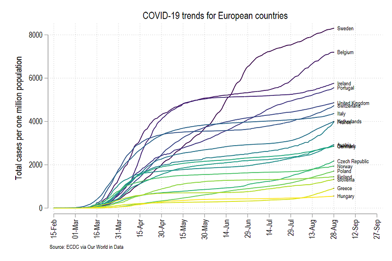
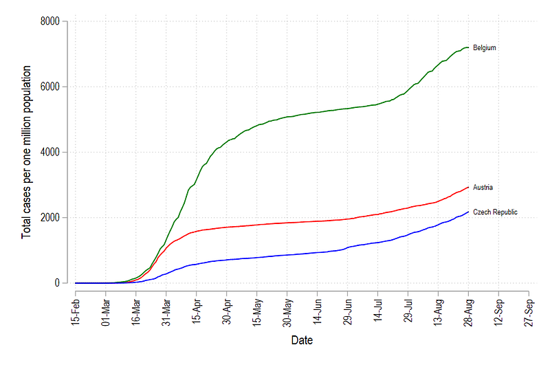
to this graph which implements a matplotlib color scheme, typically used in R and Python graphs, in Stata:
This guide also touches upon advanced use of locals and loops which are essential for automation of tasks in Stata. Therefore, the guide assumes a basic knowledge of Stata commands. Understanding the underlying underlying logic here can also be applied to various Stata routines beyond generating graphs.
This guide build on the first article where data management, folder structures, and an introduction to automation of tasks are discussed in detail. While it is highly recommended to follow the first guide to set up the data and the folders, for the sake of completeness, some basic information is repeated here.
The guide follows a specific folder structure, in order to track changes in files. This folder structure and code used in the first guide can be downloaded from Github.
In case you are starting from scratch, create a main folder and the following five sub-folders within the root folder:
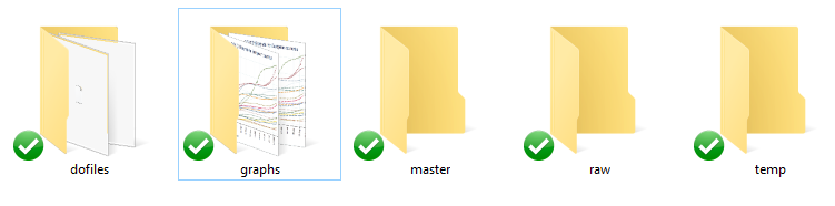
This will allow you to use the code, that makes use of relative paths, given in this guide.
The guide is split into five steps:
- Step 1: provides a quick summary on setting up the COVID-19 dataset from Our World in Data.
- Step 2: discusses custom graph schemes for cleaning up the layout
- Step 3: introduces line graphs and their various elements
- Step 4: introduces color palettes and how to integrate them into line graphs
- Step 5: shows how the whole process of generating graphs with custom color schemes can be automated using loops and locals
Step 1: A refresher on the data
In case you are starting from scratch, start a new dofile, and set up the data using the following commands:
clear
cd <your main directory here with sub-folders shown above>***********************************
**** our worldindata ECDC dataset
***********************************insheet using "https://covid.ourworldindata.org/data/ecdc/full_data.csv", clear
save ./raw/full_data_raw.dta, replacegen year = substr(date,1,4)
gen month = substr(date,6,2)
gen day = substr(date,9,2)destring year month day, replace
drop date
gen date = mdy(month,day,year)
format date %tdDD-Mon-yyyy
drop year month day
gen date2 = date
order date date2drop if date2 < 21915gen group = .replace group = 1 if ///
location == "Austria" | ///
location == "Belgium" | ///
location == "Czech Republic" | ///
location == "Denmark" | ///
location == "Finland" | ///
location == "France" | ///
location == "Germany" | ///
location == "Greece" | ///
location == "Hungary" | ///
location == "Italy" | ///
location == "Ireland" | ///
location == "Netherlands" | ///
location == "Norway" | ///
location == "Poland" | ///
location == "Portugal" | ///
location == "Slovenia" | ///
location == "Slovak Republic" | ///
location == "Spain" | ///
location == "Sweden" | ///
location == "Switzerland" | ///
location == "United Kingdom"keep if group==1ren location country
tab country
compress
save "./temp/OWID_data.dta", replace**** adding the population datainsheet using "https://covid.ourworldindata.org/data/ecdc/locations.csv", clear
drop countriesandterritories population_year
ren location country
compress
save "./temp/OWID_pop.dta", replace**** merging the two datasetsuse ./temp/OWID_data, clear
merge m:1 country using ./temp/OWID_popdrop if _m!=3
drop _m***** generating population normalized variablesgen total_cases_pop = (total_cases / population) * 1000000
gen total_deaths_pop = (total_deaths / population) * 1000000***** clean up the datedrop if date < 21960
format date %tdDD-Mon
summ date***** identify the last date
summ date
gen tick = 1 if date == `r(max)'***** save the file
compress
save ./master/COVID_data.dta, replaceStep 2: Custom graph schemes
In the first guide, we learnt how to make line graphs using the Stata’s xtline command. This was done by declaring the data to be a panel dataset. To summarize, we use the following commands to generate a panel data line graph:
summ date
local start = `r(min)'
local end   = `r(max)' + 30
xtline total_cases_pop ///
, overlay ///
addplot((scatter total_cases_pop date if tick==1, mcolor(black) msymbol(point) mlabel(country) mlabsize(vsmall) mlabcolor(black))) ///
ttitle("") ///
tlabel(`start'(15)`end', labsize(small) angle(vertical) grid) ///
title(COVID19 trends for European countries) ///
note(Source: ECDC via Our World in Data) ///
legend(off) ///
graphregion(fcolor(white)) ///
scheme(s2color)
graph export ./graphs/medium2_graph1.png, replace wid(1000)which gives us this figure:
This figure uses the default color s2 color scheme in Stata where we manually adjusted the background colors, axes, labels, and headings. The font is set to Arial Narrow. In the code above, we add an additional feature to the graph code, scheme(s2color) to manually define which scheme we want to use.
Rather than customizing minor elements of graphs ourselves, we can also rely on several user-written graph schemes. Stata does not have a central repository of these files, hence the files are scattered all over the internet. Here are are codes for accessing some clean colors schemes:
net install scheme-modern, from("https://raw.githubusercontent.com/mdroste/stata-scheme-modern/master/")


summ date
local start = `r(min)'
local end   = `r(max)' + 30
xtline total_cases_pop ///
, overlay ///
addplot((scatter total_cases_pop date if tick==1, mcolor(black) msymbol(point) mlabel(country) mlabsize(vsmall) mlabcolor(black))) ///
ttitle("") ///
tlabel(`start'(15)`end', labsize(small) angle(vertical)) ///
title(COVID19 trends for European countries) ///
note(Source: ECDC via Our World in Data) ///
legend(off) ///
scheme(modern)graph export ./graphs/medium2_graph2.png, replace wid(1000)The modern scheme cleans up the background and the grids. So we do not have to add additional command lines like graphregion(fcolor(white)) and grid in the tlabel command since they are defined within the scheme.
Tip: One can generate their own color schemes by following the official guide here.
The code above gives, us the following graph:
Another popular scheme is cleanplots:
net install cleanplots, from("https://tdmize.github.io/data/cleanplots")summ date
local start = `r(min)'
local end = `r(max)' + 30xtline total_cases_pop ///
, overlay ///
addplot((scatter total_cases_pop date if tick==1, mcolor(black) msymbol(point) mlabel(country) mlabsize(vsmall) mlabcolor(black))) ///
ttitle("") ///
tlabel(`start'(15)`end', labsize(small) angle(vertical) grid) ///
title(COVID19 trends for European countries) ///
note(Source: ECDC via Our World in Data) ///
legend(off) ///
scheme(cleanplots)
graph export ./graphs/medium2_graph3.png, replace wid(1000)Which modifies the line colors and the axis lines as well:
This is the default scheme I use myself personally for all Stata graphs. One can also set the scheme permanently by typing the following command:
set scheme cleanplots, permThis tells Stata to replace the default s2 color scheme with cleanplots permanently.
Step 3: Going back to the basic line graphs
In this section, we will drop the xtline, panel graph command and go back to the very basic line graphs. The line graphs provide us with the building blocks to start customizing figures.
The default line graph menu can be accessed from the interface as follows:
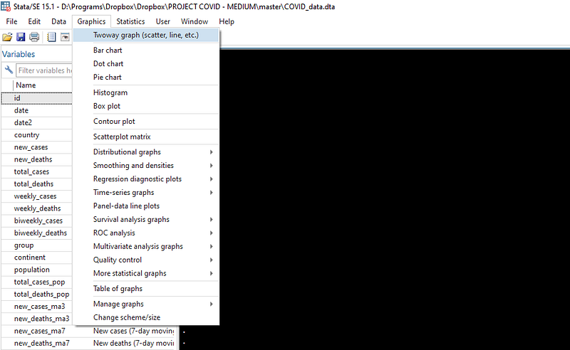
and just click on the very first option:
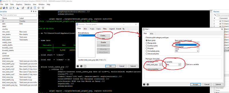
and in the if tab, set the line graph to only show the country with id = 1 (Note the use of double == sign in the command).
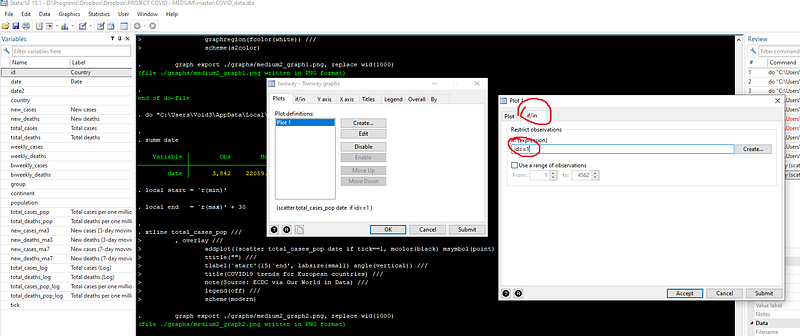
If you press submit, you will get the following syntax and graph:
twoway ///
(line total_cases_pop date if id==1) ///
, legend(off)
graph export ./graphs/medium2_graph5.png, replace wid(1000)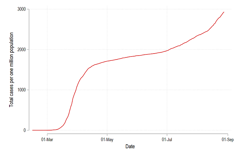
Which gives us just one line in the cleanplots color scheme for the country with id = 1. We can modify this line by changing the color and the line pattern simply by typing:
twoway ///
(line total_cases_pop date if id==1, lcolor(green) lpattern(dash)) ///
, legend(off)graph export ./graphs/medium2_graph6.png, replace wid(1000)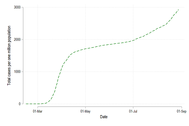
or we can abbreviate the syntax a bit (where lc = line color, and lp = line pattern, and lw = line width):
twoway ///
(line total_cases_pop date if id==1, lc(green) lp(solid)) ///
, legend(off)
graph export ./graphs/medium2_graph7.png, replace wid(1000)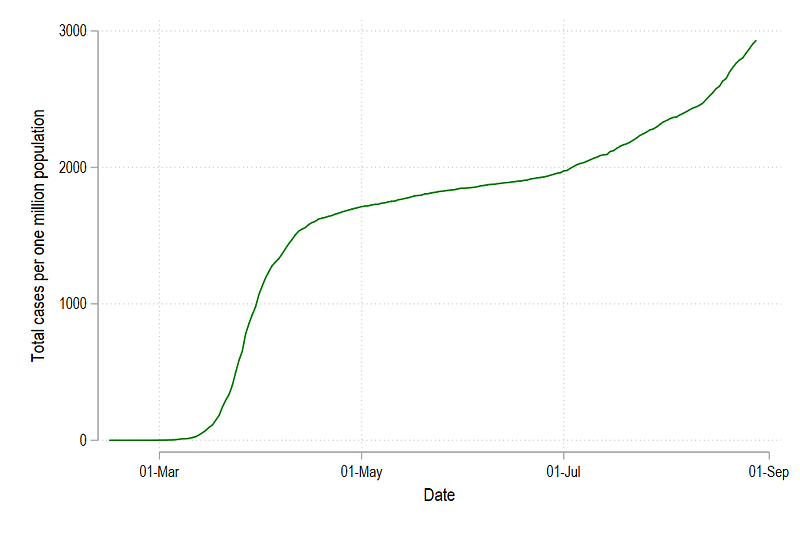
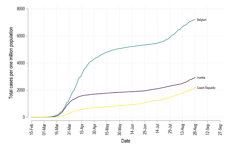
We can add more lines as well by modifying the code above and give the new lines green, blue, and red colors:
twoway ///
(line total_cases_pop date if id==1, lc(green) lp(solid)) ///
(line total_cases_pop date if id==2, lc(blue) lp(solid)) ///
(line total_cases_pop date if id==3, lc(red) lp(solid)) ///
, legend(off)
graph export ./graphs/medium2_graph8.png, replace wid(1000)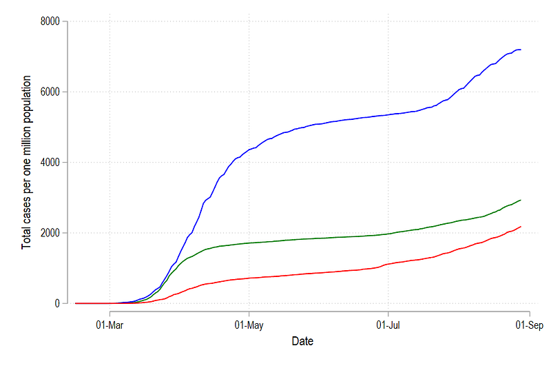
And we can add additional elements to neatly label this graph:
summ date
local start = `r(min)'
local end = `r(max)' + 30twoway ///
(line total_cases_pop date if id==1, lc(green) lp(solid)) ///
(line total_cases_pop date if id==2, lc(blue) lp(solid)) ///
(line total_cases_pop date if id==3, lc(red) lp(solid)) ///
(scatter total_cases_pop date if tick==1 & id <= 3, mcolor(black) msymbol(point) mlabel(country) mlabsize(vsmall) mlabcolor(black)) ///
, ///
xlabel(`start'(15)`end', labsize(small) angle(vertical)) ///
legend(off)
graph export ./graphs/medium2_graph9.png, replace wid(1000)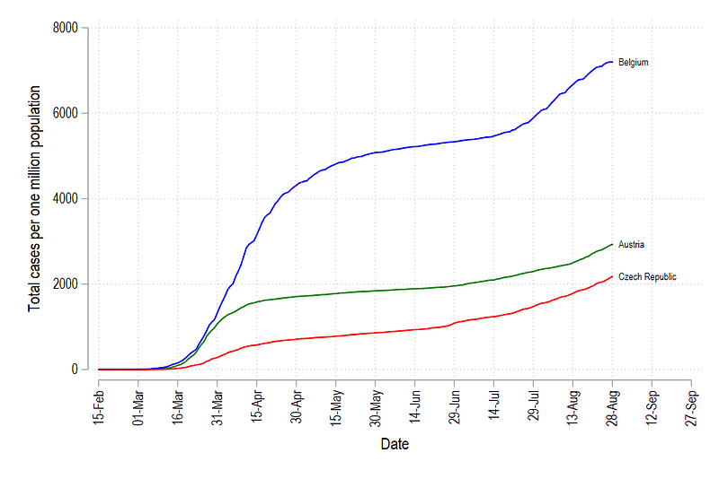
In Stata colors can also be defined using RGB values. So for the graph above, the corresponding RGB values for the three graphs:
Red = “255 0 0”
Green = “0 128 0”
Blue = “0 0 255”
summ date
local start = `r(min)'
local end   = `r(max)' + 30
twoway ///
(line total_cases_pop date if id==1, lc("255 0 0") lp(solid)) ///
(line total_cases_pop date if id==2, lc("0 128 0") lp(solid)) ///
(line total_cases_pop date if id==3, lc("0 0 255") lp(solid)) ///
(scatter total_cases_pop date if tick==1 & id <= 3, mcolor(black) msymbol(point) mlabel(country) mlabsize(vsmall) mlabcolor(black)) ///
, ///
xlabel(`start'(15)`end', labsize(small) angle(vertical)) ///
legend(off)
graph export ./graphs/medium2_graph10.png, replace wid(1000)which gives us exactly the same graph as above:
We can keep adding new lines and new colors as well, but this quickly becomes inefficient especially if we have a lot of countries. Manually defining a color for each line requires a lot of copy pasting and defining colors for each line.
In order to proceed further, we will work on two new elements:
- Using color palettes to replace colors for individual lines
- Generating loops to generate lines for all countries
Step 4: Using color palettes
Here we install two packages written by Benn Jann called palettes and colrspace:
ssc install palettes, replace    // for color palettes
ssc install colrspace, replace   // for expanding the color base
One can also directly install from Github to make sure we have the very latest update:
net install palettes, replace from("https://raw.githubusercontent.com/benjann/palettes/master/")
net install colrspace, replace from("https://raw.githubusercontent.com/benjann/colrspace/master/")
The documentation of these packages can be checked here and one can also explore them by typing:
help colorpalette
help colrspace
Here we will not go into detail of the color theory, or the use of colors since this requires a whole guide on its own. But we will make use of the set of color schemes that come bundled with these packages. For example, colorpalette introduces the popular matplotlib color scheme typically used in R and Python graphs:
colorpalette plasma
colorpalette inferno
colorpalette cividis
colorpalette viridis
The viridis color scheme can be easily recognized since it is one of the most used schemes in Python and R (e.g. in ggplots2). We can also generate different color ranges:
colorpalette viridis, n(10)
colorpalette: viridis, n(5) / viridis, n(10) / viridis, n(15)
where the last command gives us:
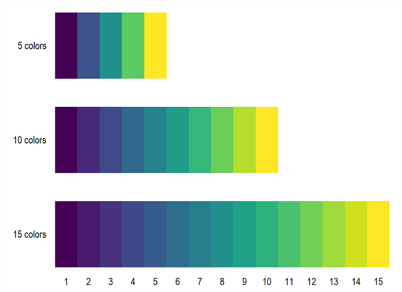
Here we can give whatever value of n to generate a linearly interpolated colors. In the next step, we incorporate the viridis color scheme in the 3 line graph we generate above:
colorpalette viridis, n(3) nograph    // 3 colors and no graph
return list                          // return the locals stored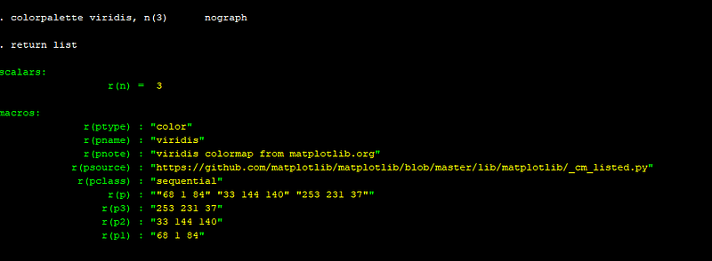
The Stata window will show the following output. The key locals for us are r(p1), r(p2), r(p3), which contains the RGB code for the three colors we need to modify the graph. Now rather than copy pasting the RGB code, we can simply store this information in a set of locals:
colorpalette viridis, n(3) nograph
return list
local color1 = r(p1)
local color2 = r(p2)
local color3 = r(p3)summ date
local start = r(min)
local end = r(max) + 30twoway ///
(line total_cases_pop date if id==1, lc("`color1'") lp(solid)) ///
(line total_cases_pop date if id==2, lc("`color2'") lp(solid)) ///
(line total_cases_pop date if id==3, lc("`color3'") lp(solid)) ///
(scatter total_cases_pop date if tick==1 & id <= 3, mcolor(black) msymbol(point) mlabel(country) mlabsize(vsmall) mlabcolor(black)) ///
, ///
xlabel(`start'(15)`end', labsize(small) angle(vertical)) ///
legend(off)
graph export ./graphs/medium2_graph11.png, replace wid(1000)which gives us this graph:
and if we are using five countries:
colorpalette viridis, n(5) nograph
return list
local color1 = r(p1)
local color2 = r(p2)
local color3 = r(p3)
local color4 = r(p4)
local color5 = r(p5)summ date
local start = r(min)
local end = r(max) + 30twoway ///
(line total_cases_pop date if id==1, lc("`color1'") lp(solid)) ///
(line total_cases_pop date if id==2, lc("`color2'") lp(solid)) ///
(line total_cases_pop date if id==3, lc("`color3'") lp(solid)) ///
(line total_cases_pop date if id==4, lc("`color4'") lp(solid)) ///
(line total_cases_pop date if id==5, lc("`color5'") lp(solid)) ///
(scatter total_cases_pop date if tick==1 & id <= 5, mcolor(black) msymbol(point) mlabel(country) mlabsize(vsmall) mlabcolor(black)) ///
, ///
xlabel(`start'(15)`end', labsize(small) angle(vertical)) ///
legend(off)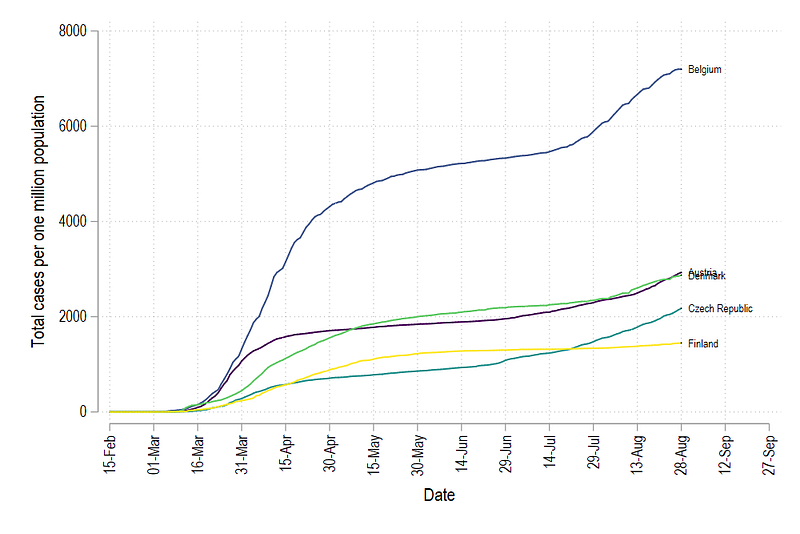
But here we see one problem: the color order is messed up. In order to fix the color graduation, we need to create a rank of countries from lowest to highest values (or vice versa) on the last date (which we have also marked with the variable tick). This can be done in Stata using the egen command:
egen rank = rank(total_cases_pop) if tick==1, fTip: See help egen for a complete list of very useful commands. Also check egenmore which extends the functionality of egen.
We can see that the correct order has been identified by typing:
sort date rank
br country date total_cases_pop rank if tick==1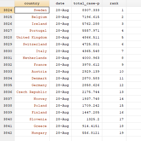
Here we can see that Sweden has the highest cumulative cases per million population and is ranked 1, while Hungary has the lowest cumulative cases per mission population and has a rank of 19.
Now to get the correct colors, this ranking has to be applied to ALL the past observations as well. Here we introduce a level loop:
levelsof country, local(lvls)
foreach x of local lvls {
display "`x'"
qui summ rank if country=="`x'" // summarize the rank of country x
cap replace rank = `r(max)' if country=="`x'" & rank==.
}Tip: Levels of individual unique elements within a variable. The levelsof command help automating looping over all unique values without having to manually define them.
The first command levelsof, stores all the unique values of countries in the local lvls. foreach loops over each lvl (see help forheach). The command display shows the country we are currently looping. qui stands for quietly, and it hides displaying the summarize (summ) command in the Stata output window. This is strictly not necessary. replace replaces the rank variable with the max value returned from the summarize command above for each country and for all empty observations. The capture command (cap), effectively skips the execution of this command if an error occurs. This is a powerful command that allows us to bypass code errors. Errors stop the executing of the code and display an error. capture should only be used if you know exactly what you are doing. The reason we use it here, is because one country (Spain) does not have an observation for the last date. Hence the summarize command returns nothing and therefore there is nothing to be replaced. We can fine tune this code, but this requires adding additional elements not necessary for this guide. We will leave it for other guides in the future.
Once the ranks are defined, we now generate the graph again, BUT, this time we do not plot on the variable id, but on the variable rank:
colorpalette viridis, n(5) nograph
return list
local color1 = r(p1)
local color2 = r(p2)
local color3 = r(p3)
local color4 = r(p4)
local color5 = r(p5)
summ date
local start = r(min)
local end = r(max) + 30twoway ///
(line total_cases_pop date if rank==1, lc("`color1'") lp(solid)) ///
(line total_cases_pop date if rank==2, lc("`color2'") lp(solid)) ///
(line total_cases_pop date if rank==3, lc("`color3'") lp(solid)) ///
(line total_cases_pop date if rank==4, lc("`color4'") lp(solid)) ///
(line total_cases_pop date if rank==5, lc("`color5'") lp(solid)) ///
(scatter total_cases_pop date if tick==1 & rank <= 5, mcolor(black) msymbol(point) mlabel(country) mlabsize(vsmall) mlabcolor(black)) ///
, ///
xlabel(`start'(15)`end', labsize(small) angle(vertical)) ///
legend(off)
graph export ./graphs/medium2_graph13.png, replace wid(1000)which gives us:
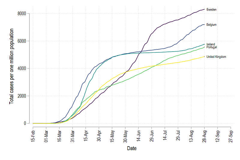
Since the variables id and rank are not the same, we get a different set of countries. But the main thing here is that all lines are colored in the correct order.
Step 5: Full automation
Now we come to trickiest part of the code: adding all the countries and generating their corresponding colors. Here the code will get fairly complex, but we will go over the logic step-by-step.
First, lines cannot be added manually for each country. Especially if we are using different country groupings with different number of countries. Stata, by default, has no option of batch modifying lines in graphs. This is probably only possible in the panel data, xtline command but it also has limited functionality when it comes to modifying the elements of each line. In order to bypass this limitation, what we can do is generate the graph command using locals and loops. If we look at the graph commands above, there is a pattern to how the lines are generated:
(line total_cases_pop date if rank==1, lc("`color1'") lp(solid)) ///
(line total_cases_pop date if rank==2, lc("`color2'") lp(solid)) ///First line says rank = 1 and lc(..color1..), second line says rank=2 and color2 etc. Thus the numbers define both the rank and the color value. Hence, if we know the total number of countries, we can loop over them and sequentially generate code for each line.
Since this is a non-standard Stata graph procedure, I will give the code for looping over the total observations and generating these lines:
levelsof rank, local(lvls)   // loop over all the levels
local items = r(r)           // pick the total items
foreach x of local lvls {
colorpalette viridis, n(`items') nograph local customline `customline' (line total_cases_pop date if rank == `x', lc("`r(p`x')'") lp(solid)) ||
}and discuss it here:
levelsof generates the unique values of rank, which also equals the number of countries (each country has a unique rank). local items store the total number of unique rank values for use later. foreach loops over all the rank levels. For each level, a colorpalette for the viridis color scheme is generated for the number of countries defined in the local items.
The next command stores the information for each rank in local called customline. Every time the loop goes on to the next rank value, the information of the new line graph is appended to the existing line. Each line is given a color value r(px), where x is the rank order and r(px) is the corresponding color value from the colorpalette for that specific rank.
Note that this type of programming is fairly common in softwares like Matlab, Mathematica, and R as well which mostly work with lists and matrices.
The double pipe command (||), is Stata’s internal command for splitting line graphs. Essentially the local customline contains information on all the lines for all the countries. This can be used as follows:
levelsof rank, local(lvls)   // loop over all the levels
local items = r(r)
foreach x of local lvls {
colorpalette viridis, n(`items') nographlocal customline `customline' (line total_cases_pop date if rank == `x', lc("`r(p`x')'") lp(solid)) ||
}summ date
local start = r(min)
local end = r(max) + 30twoway `customline' ///
(scatter total_cases_pop date if tick==1 & rank <= `items', mcolor(black) msymbol(point) mlabel(country) mlabsize(vsmall) mlabcolor(black)) ///
, ///
xlabel(`start'(15)`end', labsize(small) angle(vertical)) ///
xtitle("") ///
title("COVID-19 trends for European countries") ///
note("Source: ECDC via Our World in Data", size(vsmall)) ///
legend(off)
graph export ./graphs/medium2_graph_final.png, replace wid(1000)Which gives us this neat looking graph:
The code above can be used with any number of lines to auto color and label the line graphs. This logic of loop and automation of code can also be used for any complex operation involving different groups and different level sizes.
Exercise
Try generating the graph with different a country grouping and another color scheme.
Other Stata guides
Part 1: An introduction to data setup and customized graphs
Part 2: Customizing colors schemes
Part 7: Doubling time graphs I
Part 8: Ridge-line plots (Joy plots)
If you enjoy these guides and find them useful, then please like and follow The Stata Guide. Also, please share your visualizations if you use these guides!
About the author
I am an economist by profession and I have been using Stata since 2003. I am currently based in Vienna, Austria where I work at the Vienna University of Economics and Business (WU) and at the International Institute for Applied Systems Analysis (IIASA). You can find my research work on ResearchGate and Google Scholar, and Stata code repository on GitHub. You can follow my COVID-19 related Stata visualizations on my Twitter. I am also featured on the Stata COVID-19 webpage in the visualization and graphics section.
You can connect with me via Medium, Twitter, LinkedIn or simply via email: [email protected].
My Medium blog for Stata stuff here: The Stata Guide where new awesome content is released regularly. Clap, and/or follow if you like these guides!


