
Maps in Stata I
Maps are a powerful visualization tool for displaying the spatial distribution of data. In Stata, the ability to make maps was first introduced in 2004 by Maurizio Pisati, as the tmap command, which was upgraded in 2014 to the shp2dta and spmap commands. Stata 15 formally integrated both of these commands as spshape2dta and grmaps respectively in 2017 as part of its support for spatial analysis.
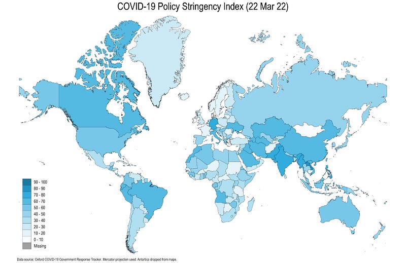
In this guide, will be learn how to create the following COVID-19 Policy Stringency Index map:
In order to follow this guide, a basic knowledge of Stata is assumed including a familiarity with the Stata interface, dofiles, and code syntax. The guide here will introduce shapefiles, map projections, merging datasets from different sources, followed by the commands to generate customized maps, customized color schemes, and the use of locals for code automation.
Understanding shapefiles
Spatial data comes in different formats. The most common version of map data are called shapefiles that was developed by ESRI, the makers of ArcGIS, which is also the standard industrial software for mapping and spatial analysis. ESRI has also developed the now well-known dashboard used by John Hopkin’s University (JHU) and several other countries to showcase COVID-19 maps and trends. Given the rise and popularity of maps, shapefiles are usually easily accessible for most countries including different layers of administrative boundaries. Shapefiles are basically a set of multiple files, of which, the following three core files are required to generate a map:
- .shp: contains the coordinates of shapes which can be polygons, lines, or points
- .dbf: contains the attributes of the shapes
- .shx: has the index of spatial objects
Several other optional files are usually bundled with the above three, but an important one here is the projections file:
- .prj: contains the projection or spatial reference system of the shape
While we won’t go too much into the details of projection systems, it is still essential to understand the core concept behind them. When we see maps, they are usually drawn on a flat two-dimensional surface to represent shape of the earth, a three-dimensional object. This 3-D to 2-D mapping can be done in multiple ways. Different projections are needed to calculate the correct distances or areas. But since we are just plotting data on a map, we will use Google’s Web Mercator projection, which distorts both distance and area, for making countries easier to read. Some countries also release their own projection systems to make maps as accurately as possible. An easy to relate to example given here, shows how a face can be drawn on a flat surface using different projections.
Task 1: Get the folders in order
In line with the previous guides, we use the following folder structure to keep track of the files:
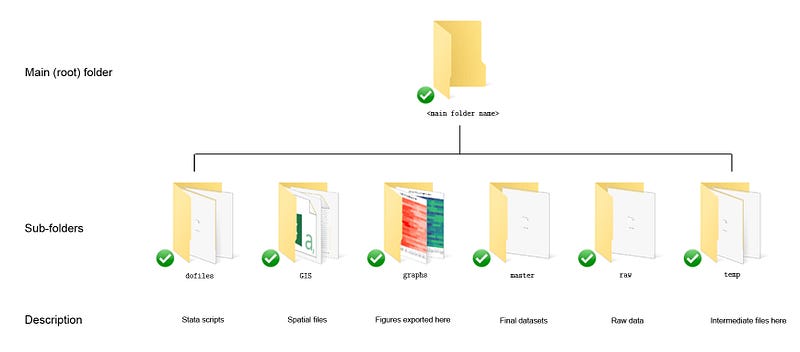
Those, who have read and followed earlier guides, can see that here we add an additional folder, called GIS, to keep all the spatial files. If you are reading this guide for the first time, then just create a root folder, and within it, the following six subfolders shown above. The description of each folder is given in the figure.
Task 2: Get the map files
The generic map files for the world can be downloaded from different places on the internet. For this guide, we will use the ArcGIS 2020 world country boundaries file given at the link here: https://hub.arcgis.com/datasets/UIA::uia-world-countries-boundaries
(Note: Maps get updated regularly so please free to use a latest layer at the time of using this guide.)
The page looks like the image below. Since there are different versions of the files, make sure that the date of the file is somewhere in 2020. If not, then one can scroll down the page and select more recent versions of the same dataset.
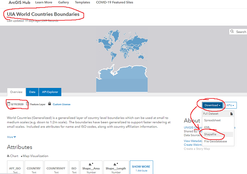
On this page, just click on the Download drop-down menu and then click on the Shapefile, which will download a zipped file. Extract the contents of the zipped file in the GIS folder:
Here we get five files from the compressed zip file. In general, shapefiles can be directly easily viewed in softwares like ArcGIS (needs a license), QGIS (free) and GeoDa (free) just by opening the .shp file.
Task 3: Prepare the data
For the maps, we will use the Oxford COVID-19 Government Response Tracker (OxCGRT), that we also used in Guide 3. Guide 3, also included a detailed description on how to extract data from a Github repository. For the sake of completeness, the code required to set up the data set is repeated below:
clear
*** import the data from Github
import delim using "https://raw.githubusercontent.com/OxCGRT/covid-policy-tracker/master/data/OxCGRT_latest.csv", clear
*** new data has been added for USA and UK for regions so we drop the regions:
drop if regionname!=""*** keep only the variables we need
keep date countryname stringencyindexfordisplayren stringencyindexfordisplay Index
ren countryname country*** fix the datetostring date, gen(date2) // string the date variablegen year = substr(date2,1,4) // extract the date components
gen month = substr(date2,5,2)
gen day = substr(date2,7,2)destring year month day, replace
drop date date2gen date = mdy(month,day,year)
format date %tdDD-Mon-CCyydrop month day year
order country date
sort country datedrop if date < 21915 // 21915 = 1st January** save the files
compress
save ./master/COVID_policies.dta, replaceIn the code above, we keep the overall policy stringency index, country name, and the date variables. The date variable is fixed in the middle part of the code above and, in the last step, we save the cleaned data in the master subfolder with the name COVID_policies.dta.
Task 4: Using Shapefiles in Stata
In order to use the shapefiles, we need to install the following Stata packages:
*** install the core packagesssc install spmap // for the maps package
ssc install shp2dta // shapefiles to dta. For versions < v15.
ssc install geo2xy // for fixing the coordinate systemFor Stata 15 or higher, the custom spmap can also be replaced with the Stata’s official grmap command. Since grmap is a wrapper for spmap, I will stick to the original command. Both can be used interchangeably after minor tweaks to the syntax. An official Stata guide on importing JHU COVID-19 data, and setting it up using the grmap is given here.
shp2dta is only necessary if you are using Stata 14 or earlier versions. shp2dta should work with most of the shapefiles but there is a chance it might not read all shapefiles correctly and give an error. For Stata 15 or higher, the built-in command spshape2dta can be used. geo2xy is used for changing the map projections in Stata.
In the first step, we read the shapefile in Stata and covert it to Stata format:
********* get the shapefiles in order in ordercd GIS // switch to the GIS folder
spshape2dta "World_Countries__Generalized_.shp", replace saving(world)This will show the following screen output:
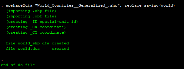
Here we can see that two datasets are created: world.dta, which contains the attributes of the shapes (or countries in our case), and world_shp.dta which contains the outlines of the shapes.
For Stata 14 and earlier versions, the following shp2dta can be used:
*** For Stata 14 or earlier versions ONLY:shp2dta using World_Countries__Generalized_.shp, database(world) coordinates(world_shp) genid(_ID) gencentroids(c) replaceWe can also explore the world.dta and the world_shp.dta files:
*** explore the outline fileuse world_shp, clear
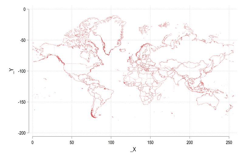
scatter _Y _X, msize(tiny) msymbol(point)In the file above, each countries are defined by the variable _ID and are stored as a series of points. This is a standard structure of map files (spatial JSON files also have a similar concept of connecting dots to form a shape). From the command above, we get the following scatter:
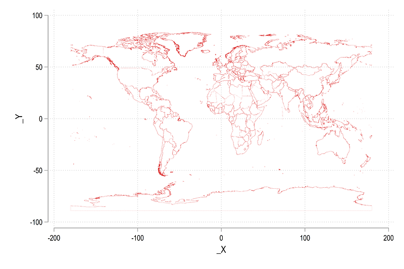
In the map above, Antartica sticks out prominently at the bottom but has no known reported cases. Therefore, we can drop it to make some space for other countries. In order to drop regions or countries, we need to get their names. Since names exists in the attributes data file world.dta, we can merge and drop as follows:
*** merge with attributes file to get the namesmerge m:1 _ID using world drop if COUNTRY=="Antarctica" // drop the polar regions
drop rec_header- _merge // drop all additional variablesscatter _Y _X, msize(tiny) msymbol(point)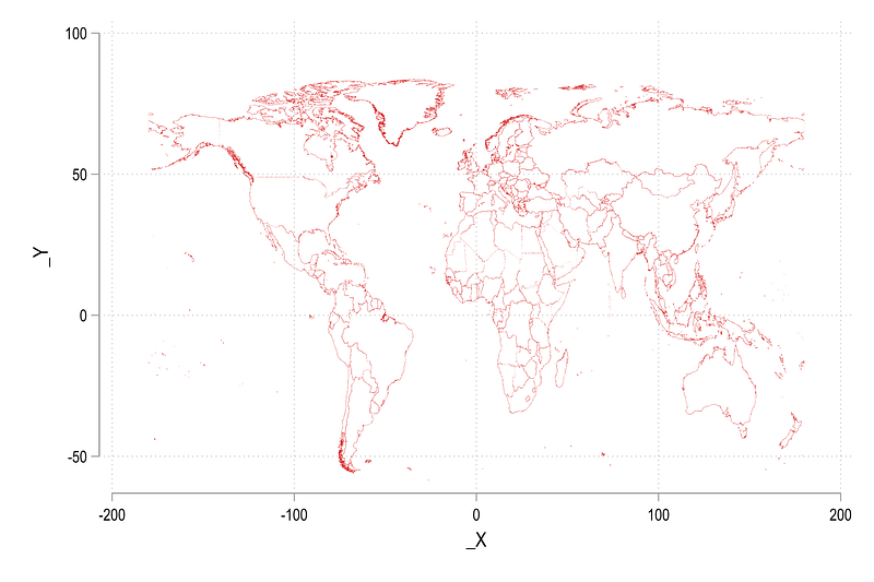
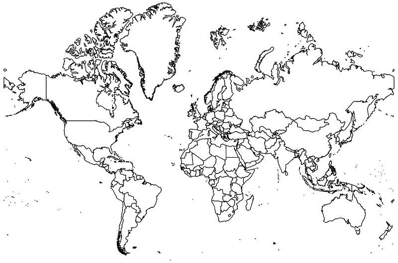
This makes the map a bit more readable. In order to improve the map further, we change the default map projection to Google’s Web Mercator projection:
geo2xy _Y _X, proj (web_mercator) replace
scatter _Y _X, msize(tiny) msymbol(point)
Which gives us:
Here you can see that the scale of the axes has changed and the countries are squeezed in the middle and stretched a bit more on the top and the bottom. This (sort of misleading) projection makes European countries a bit more prominent by making them larger and also makes their data easier to read. We can now save the modified world_shp.dta boundary file with the updated information:
sort _ID
save, replace
As an additional step, we also generate a file which contains the names of the countries for labeling. This step is strictly not necessary for this guide, but this information is useful in general. Since names and center points of country shapes exist in the attribute world.dta file, we use the following code to generate a labels file:
*** generate a file for labelsuse world, clear
ren COUNTRY country
drop if country=="Antarctica"
keep _CX _CY country
geo2xy _CY _CX, proj(web_mercator) replace // fix the projection
compress
save world_label.dta, replaceHere we just keep the X and Y coordinates of the center points and the country names. We also need to change the projection of the coordinates so they can be correctly overlaid with the boundaries.
Note: for labels we can also just use the original world.dta file, but the advantage of the additional file is that it allows us to custom label some selected group of countries and regions. This will be used and discussed in later guides.
We are now ready to make some proper maps. Here we start by loading the attribute file and map it using the spmap command:
use world, clear
 ren COUNTRY country
 drop if country=="Antarctica"
*** the first map
spmap using world_shp, id(_ID)which gives us the following figure:
Note the use of relative paths here. Since we are in the GIS directory (we typed cd GIS earlier to process shapefiles), the two dots .. imply that we first go up one directory, and then go back down in the graphs folder where we save the map1.png file.
We can also generate the same map above with country labels:
** second map with labelsspmap using world_shp, ///
id(_ID) ocolor(gs4 ..) osize(vvthin ..) ///
label(data("world_label.dta") x(_CX) y(_CY) label(country) size(*0.45 ..) length(25))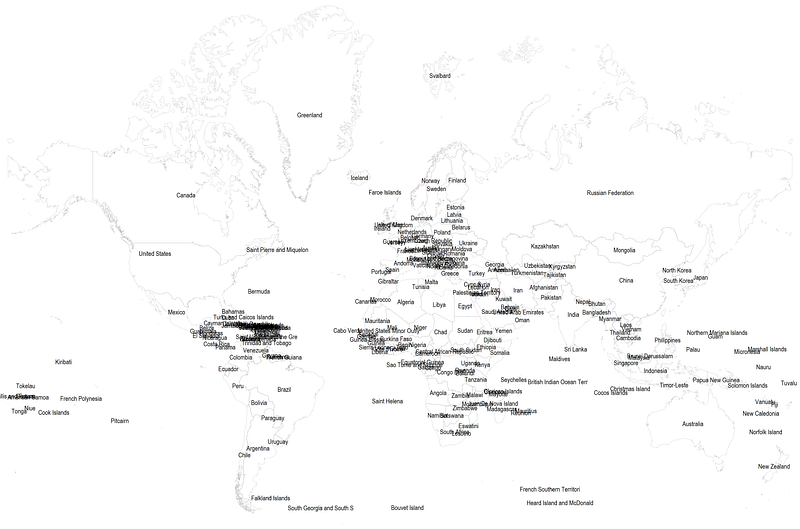
The graph above is a bit messy with the country name clusters but it is to just showcase how this can be done.
A random note: The north-most label shows the Svelbard region, which belongs to Norway (also known as Spitzbergen in German). Svelbard lies just below the Arctic circle and it is one of the coldest and the north-most inhabited regions in the world. It also has no known COVID-19 cases.
Task 5: Putting it all together
We can now merge the world.dta attribute dataset with the COVID19 policy database we saved earlier. The two datasets can be combined on the country name variable.
Note: Merging on names, in general, is sub-optimal since names and spellings can vary. Ideally, the datasets should contain unique identifiers for each region. For example, countries like France have territories all over the world. Sometimes, these territories are labeled by their actual names and sometimes just as France. Similar issues exist with small island territories, regions with contested boundaries etc. While typically, such regions tend to get dropped (or even overlooked), accuracy in data management requires these need be correctly identified across multiple datasets.
Since we are merging datasets from different databases, and names vary across datasets, not all names will merge perfectly. Here, I will just show some examples of basic (and manual) name cleaning we can do before the merge (there are other countries that need to be cleaned up as well):
*** clean some country namesreplace country="Cote d'Ivoire" if country=="Côte d'Ivoire"
replace country="Kyrgyz Republic" if country=="Kyrgyzstan"
replace country="Slovak Republic" if country=="Slovakia"
replace country="Democratic Republic of Congo" if country=="Congo DRC"
replace country="Russia" if country=="Russian Federation"
replace country="Palestine" if country=="Palestinian Territory"We can now do a one-to-many 1:m merge since we are combining countries in world.dta with countries plus dates in COVID19_policies.dta:
merge 1:m country using ../master/COVID_policiestab country if _m==1 // show the unmerged countries in world.dta
tab country if _m==2 // show the unmerged countries in COVID data*** see exactly how many countries merged
egen tag = tag(country) // tag=1 for each country observation
tab _m if tag==1 // 178 countries merge perfectly.drop if _m==2 // drop the unmerged countries from the policy dataWe can now make the first map of policy stringency:
***
summ date
spmap Index using world_shp if date==`r(max)', ///
id(_ID) cln(11) fcolor(Heat)
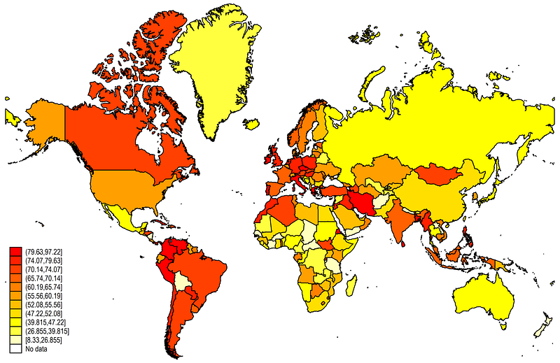
This is the default Stata map layout. It contains eleven endogenously generated cut-offs cln(11) and use the Heat color scheme fcolor(Heat). See help spmap to show the other color schemes available.
We can refine the above map further:
summ date spmap Index using world_shp if date==`r(max)', ///
id(_ID) ocolor(black ..) osize(vvthin ..) ///
clmethod(custom) clbreaks(0(10)100) fcolor(Heat) ///
legend(pos(7) size(*1)) legstyle(2) ///
title("COVID-19 Policy Stringency Index", size(medium)) ///
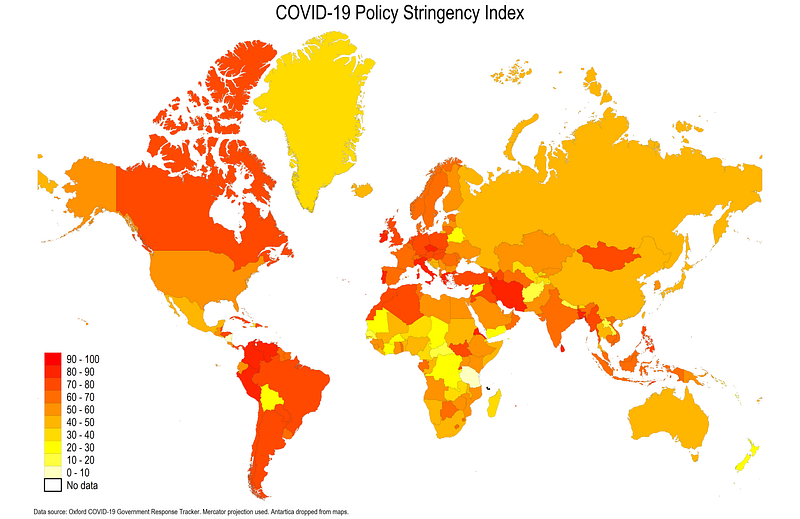
note("Data source: Oxford COVID-19 Government Response Tracker. Mercator projection used. Antartica dropped from maps." , size(tiny))Here we make the outline osize(vvthin ..) very very thin. We also defined a custom legend cut-off clmethod(custom) clbreaks(0(10)100). We also modify the legend position, size and marker separators legstyle(2) and add a title and notes.
This already looks neater but we can some more useful additional information and tone-down the colors a bit.
In the last step, we can add a custom color using the colorpalette package (discussed at length in Guide 2 and Guide 3), and the date when the map was created:
*** get the color scheme packages if not installed
ssc install palettes, replace    // for color palettes
ssc install colrspace, replace   // for expanding the color base
*** generate a local for today's date
local date: display %tdd_m_y date(c(current_date), "DMY")
*** generate a local for the w3 color scheme
colorpalette w3 light-blue, n(10) nograph
local colors `r(p)'summ date spmap Index using world_shp if date==`r(max)', ///
id(_ID) ///
clmethod(custom) clbreaks(0(10)100) ///
ocolor(black ..) fcolor("`colors'") osize(0.04 ..) ///
ndocolor(black ..) ndfcolor(gs10 ..) ndsize(0.04 ..) ndlabel("Missing") ///
legend(pos(7) size(*0.8)) legstyle(2) ///
title("COVID-19 Policy Stringency Index (`date')", size(medium)) ///
note("Data source: Oxford COVID-19 Government Response Tracker. Mercator projection used. Antartica dropped from maps." , size(tiny))Here we customize the line width using the osize(0.04 ..) option. We also add information for how to deal with no data (abbreviated nd). The no data colors follow the same logic ndocolor() is outline color, ndfcolor() is fill color, ndsize() is line width and ndlabel() modifies the legend name. The local date is used to add date information to the title.
From the code above, we get the following final map:
The locals help us with the automation process of the code. Automation in codes is essential to expedite tasks and avoid human errors. These points are discussed at length in Guide 1 and Guide 2 and will be used throughout the various Stata guides. Here we use the w3 CSS amber color scheme pre-defined in colorpalette and colrspace packages which uses very soft gradients.
Hope you find this guide useful! Try making a map using different indicators and other color schemes available in the colorpalette package.
About the author
I am an economist by profession and I have been using Stata since 2003. I am currently based in Vienna, Austria where I work at the Vienna University of Economics and Business (WU) and the International Institute for Applied Systems Analysis (IIASA). You can see my profile, research, and projects on GitHub or my website. You can connect with me via Medium, Twitter, LinkedIn, or simply via email: [email protected]. If you have questions regarding the Guide or Stata in general post them on The Code Block Discord server. We can also collaborate via UpWork.
The Stata Guide releases awesome new content regularly. Subscribe, Clap, and/or Follow the guide if you like the content!


