
COVID-19 visualizations with Stata Part 1: An introduction to data setup and customized graphs
This guide introduces data visualization of publicly available COVID-19 datasets in Stata. Stata, a standard software used in the field of economics for statistical analysis, is usually not the first option when one thinks of data science and data visualizations. Therefore, the aim of this guide is to allow Stata users to go beyond the default graph schemes and start making visualizations that are more appealing and comparable to graphs produced in other, and data science-oriented languages like R, Python, Java etc. While Stata does not have the full flexibility that these languages provide, recent advances in user-written programs have considerably improved the options to produce highly customized graphs, maps, color schemes, and other formatting options, which can make graphs pop-out more.
This post is the first part of a Stata COVID-19 data visualization series where different graphs, maps, animations, will be introduced using publicly available datasets from the internet. To kick-off this series, this post also discusses at length the importance of data management with an introduction to automation of tasks to make scripts more dynamic. Since multiple files are imported, several different scripts are written, datasets are generated, and figures are produced, a structured folder system allows for easy tracking of files as they start multiplying over time. Therefore, the first part of the series is dedicated to file and data organization, which also forms the foundation for subsequent posts. More advanced users, who are aware of these practices, can easily skip to the last part of the guide (Task 4) where customization of time trend graphs is discussed.
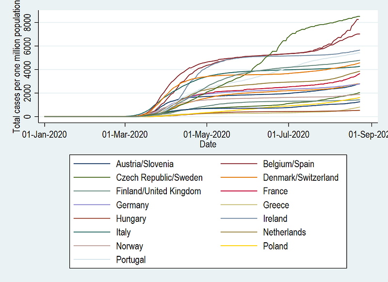
In this guide specifically, we will learn how to go from this default Stata graph scheme:
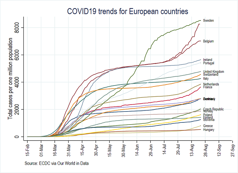
to a more visually appealing figure here:
This guide is not aimed at introducing Stata, but rather assumes that readers have some basic knowledge of the software, including a familiarity with the interface, dofiles, Stata language, and the user interface including drop-down menus. Despite this, some parts are discussed in detail to fine tune the use of Stata.
This post will also introduce the use of “locals”, that are essential in the automating of tasks within Stata scripts. Understanding the use and application of locals is crucial for future guides, where we will expanded to more complex data visualizations including fully customized color schemes.
Given the ubiquity of COVID-19 data visualizations, the graphs generated here can be easily checked and compared against figures that exist on websites, newspapers, social media, or other platforms like Our World in Data’s COVID-19 page. The code for this guide is also available on Github for replication.
Background to COVID-19 and data science
COVID-19 has been the center of focus since its initial outbreak in Wuhan, China in December 2019. This virus, at the time of writing this article, has impacted all countries of the world resulting in various forms of lockdowns, movement restrictions, school and work closures, all of which have caused massive economic disruptions.
A unique feature of this outbreak is a consolidated global effort to collect and standardize data on a daily basis for almost all countries of the world. This is unprecedented in the history of similar events in the past. A handful of websites, like the Center for Systems Science and Engineering (CSSE) at Johns Hopkins University (JHU), European Centre for Disease Prevention and Control (ECDC), Our World in Data (OWID), and Worldometers, collect, clean, and curate data, and present infographics on a daily basis. Data from these websites is also freely available for anyone to use.
In this sea of information, meaningful visualizations are key to getting the message across. Majority of the visualizations are done in R, Python, Java or other comparable languages that are more oriented towards data science. Data science has also seen a massive boom in the last decade due to the ever increasing demand for online visualizations and as a result programming languages have also rapidly evolved as well. This is also evident from the fact that countless data science guides are written daily on platforms like Medium. Within the pool of these powerful visualization languages, Stata, a standard software in economics, is usually not even considered even though within economics, Stata tops the list for the most-used software by a decent margin, especially for reproducible research.
While Stata has pushed the boundaries of cutting-edge advanced statistical analysis, it has not focused so much on the development on the visualization side (this is also not the main aim of Stata). Despite this, a lot of independent developers have expanded the scripts dealing with visualizations considerably in the past few years. These user-written packages are slowly being incorporated into Stata. For example, the user-written command to create spatial maps (spmap) was recently integrated into Stata (tmap). But as of now, data visualization applications are limited, and there is also a lack of good visualization guides and reproducible codes.
Neat visuals can be achieved in Stata but require a good understanding of the options available, the ability to creatively manipulate standard commands, and maybe even go under-the-hood to rewire the original programs. This allows us to fully customize everything in graphs making them comparable to fancier looking visualizations we typically see online. Given the current state of Stata, all of this is achievable and we will go over this step-by-step over the course of several guides. In this specific guide, we will go over four tasks listed below:
Task 1: Preparing the folders and Stata
Task 2: Getting the raw data in order
Task 3: Generating the variables we need
Task 4: Generating and customizing trend graphs
Tasks 1–3 are there to ensure that all readers (and users) of this guide understand the importance of good data management, which will become more evident as folders start populating with files. These practices can be applied to other data management tasks as well. Task 4 deals specifically with creating and customizing trend graphs and if you are advanced Stata user, you can skip directly to this Task.
Task 1: Prepare the folders and Stata
Before we start importing the data, we first need create a folder structure to organize our files. Data handling (or data wrangling) in any software typically deals with four different file types:
Raw data files (csv, txt, xls, etc.) which are processed via software scripts (.do in Stata, .R in R, .m in Matlab, .py in Python, etc.), and saved in the language-specific data formats (dta in Stata, .rda in R, etc.), from which figures and graphs are generated as images files (jpg, png, pdf, tiff etc.).
To maintain the above workflow, folder structures help in sorting and organizing the different files types. For this, we do the following two steps:
Step 1: Create a main (or root) folder on your computer and give it a name, for example, COVID19. This folder can also be kept on some cloud service like Dropbox or One Drive. The advantage of this is that one can access the files from any computer and smartphones. I am currently working across different computers and laptops so I personally find cloud syncing on Dropbox very useful as I can access the files from anywhere and pick up where I last left off.
Step 2: Within this folder, create five subfolders as shown in the figure below:
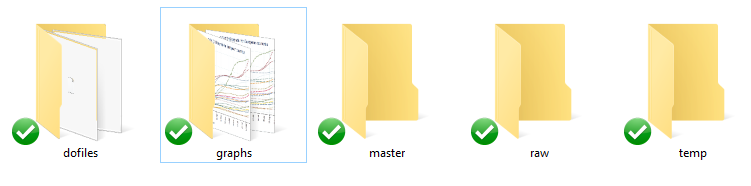
These folders are described as follows:
raw: contains the raw data you will get from the internet. These are mostly commonly readable data files usually in .csv, .txt, .xls formats.
dofiles: contains the Stata scripts, called dofiles, which are used for importing, cleaning and analyzing the data.
temp: is where we will keep all the intermediate Stata files. Since we will be pulling different data sets from different sources online, we will save each cleaned data file in the temp folder, before merging it all together.
master: contains the final version of the cleaned data sets that can be used for generating graphs and tables.
graphs: as the names suggest, contains the graphs that are generated.
Setting up Stata
The assumption of writing this guide is some familiarity with Stata. Hence I will only briefly mention some basics here before diving into the code. Additional points or codes are labeled as Tip. These are generic code snippets, and other tricks that can make life easier in Stata. Here is a first tip:
Tip: A general rule, and a good practice, is that you NEVER modify the raw data by hand. Unless you are an absolute beginner, this is a no-go for working with data sets.
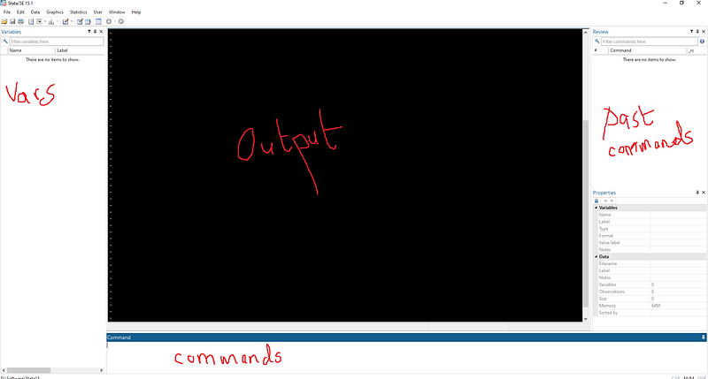
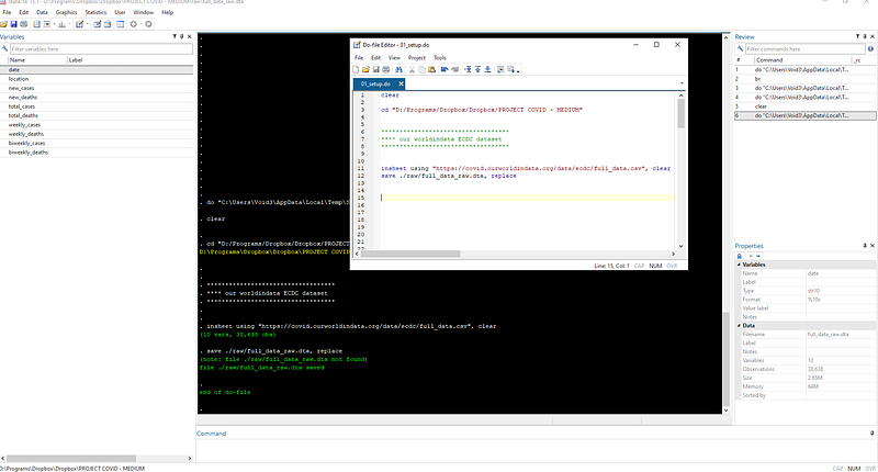
My Stata version 15.1 (the latest is Stata 16) interface is shown above which I am using on a PC. Here I am using the classic color scheme, which I find easy on the eyes especially if you are staring at the screen for hours. You can right click in the main Stata window and change the theme from preferences. My variables list window pane is on the left-hand side (I have swapped the default Variables and the Review windows) since I like to see the complete list of variables on one side. The Review window shows the history of commands we have used. One can reorganize the Stata window panes by dragging and docking them around the center output window.
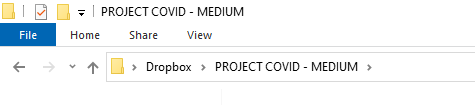
For the purpose of this guide, I have a created a folder on Dropbox called “PROJECT COVID — MEDIUM” (since I already have a dozen COVID-19 folders) but feel free to use any name.
In Stata we start off with an empty dofile.
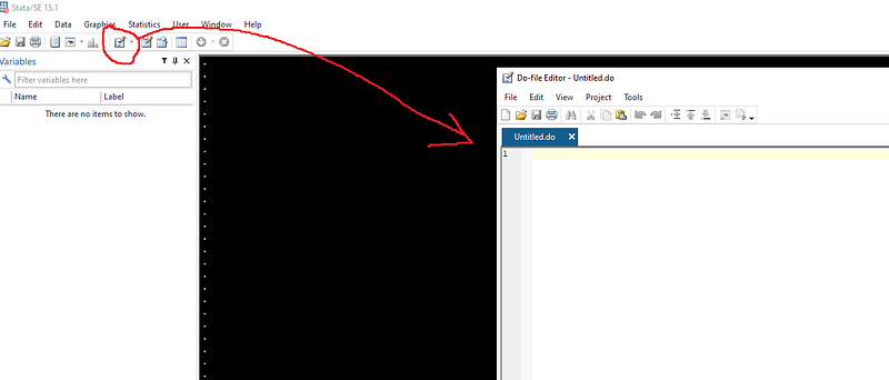
We start the dofile with the following syntax:
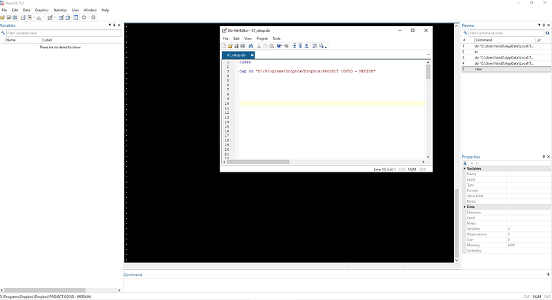
clear
cd "D:/Programs/Dropbox/Dropbox/PROJECT COVID - MEDIUM"
The first line clears everything from the memory, while the second line set’s the path for the folder we just created. Since my folder contains spaces I set the directory using double quotations (“ ”).
You can find the path of your directory by clicking on the address window on the top of the your folder screen in Windows 10:
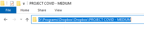
Note that in the dofile I have also manually replaced back slashes (\) with forward slashes (/). This does not really matter for this Stata version, but using forward slashes is generally considered good practice when dealing with directories.
Finding paths to the directory might also vary across different Window versions and Macs. The main idea is to set the path of Stata to access the right COVID19 folder. If the path is correctly written, the directory will show in the bottom left corner of Stata. Once the path is set, we can simply navigate subfolders via relative paths.
Tip: Using relative paths is essential when working with files, especially if they are saved on a cloud service. For example, Dropbox might be installed in different directories in different computers, but as long as the root folder is correctly defined, the use of relative paths will allow the code to run without interruptions.
Task 2: Getting the data in order
Once the folders are set up, it is now time to get the data.
As mentioned earlier several data sets exist that curate information for public use. For the purpose of this guide, we will rely on Our World in Data (OWID)’s online COVID-19 repository, which takes the ECDC dataset for its own visualizations. One can also pull the data directly from the ECDC website, but OWID also has additional variables that we will later use.
We write the following commands in the dofile to get the data:
clear
cd "D:/Programs/Dropbox/Dropbox/PROJECT COVID - MEDIUM"***********************************
**** our worldindata ECDC dataset
***********************************insheet using "https://covid.ourworldindata.org/data/ecdc/full_data.csv", clear
save ./raw/full_data_raw.dta, replaceNote that I am using “insheet” which is an old command that has now been superseded by “import delimited”. Either are fine.
If the script runs successfully, the data will be loaded and saved in the raw directory. I am saving the raw data at this point, mostly out of habit. Raw files have disappeared in the past from the internet so it is good to backup the data as soon as possible. Also notice that we no longer need to specify the whole path for saving but just the path relative (./raw/) where (.) refers to the root folder we defined earlier.
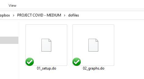
We also save the dofile in the dofile folder and label it neatly as well:
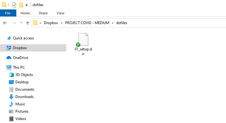
I usually have dofiles numbered in the sequence I execute them. I sometimes also use version controls like 01_setup_v1.do or 01_setup_
One can have a quick look at the data by typing out the br command in the command window at the bottom of Stata.
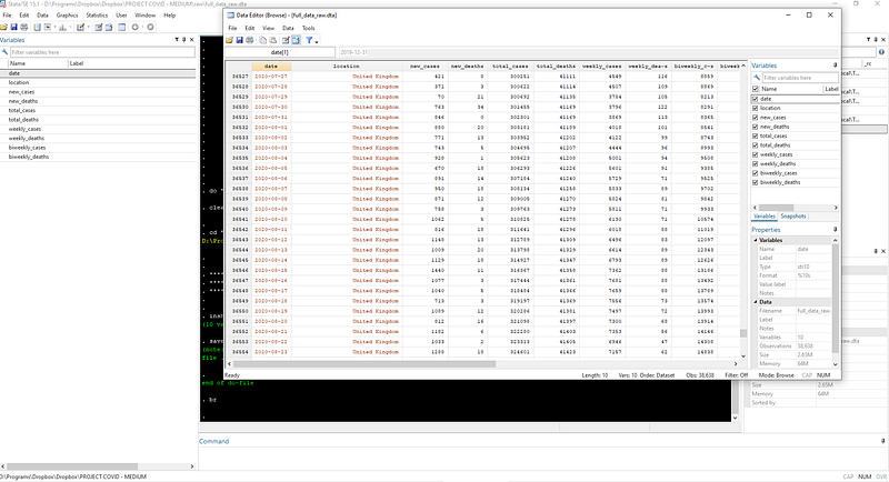
Tip: In the browser window, strings are always labeled red, numerical variables are black, numerical variables with labels (e.g. 0 = No and 1 = Yes) are in blue. So if a number variable is in red, there is a problem somewhere. Running into such problems is not unusual, but since the quality of this dataset is extremely high, all variables are loaded correctly. You can try some commands to explore the data:
* use asterisk for commenting on individual lines count // use two forward slashes to comment after a code
d // to describe the data
br // to browse the data
tab location // tabulate the data on countriesIn the next step, we clean up the date variable which is given as a string and covert it to Stata datetime format. We do this by recovering the year, month, and day values from the date variable:
gen year  = substr(date,1,4)    // see help substr
gen month = substr(date,6,2)
gen day   = substr(date,9,2)
destring year month day, replace // convert to numericdrop date // drop the original variable
gen date = mdy(month,day,year) // generate date
format date %tdDD-Mon-yyyy // make it look neater
drop year month day // we don't need these anymore
gen date2 = date // unformatted date variable
order date date2
drop if date2 < 21915 // drop everything before 1 Jan 2020Here we are using a combination of string extraction substr, converting string to numeric destring, generating a date format gen date = mdy( ), dropping the variables we no longer need drop, and fixing the format of the date format date. The variables “date” and “date2” are exactly the same. The latter gives the date in the default Stata numerical date format. You can check this by typing in the command window:
br date date2We also drop all observations before 1st Jan 2020 since there were no known reported cases at that point in time outside of China.
I like to keep both date and date2 to make data manipulation easy. For example, Stata will not understand commands like “drop if date < 01-Jan-2020” but we need this formatted “date” variable for labeling graphs. There will be other uses of these two later, for example, masking values when date formats no longer work in certain graphs.
Tip: If you are not familiar with a command, the best option is to look at the help and read the guides which are fairly extensive:
help format
help destring
In order to avoid trying to fit all countries of the world on one graph, we will keep only a handful for our exercise. Since the data quality is very good for European countries and it was also at the center of the outbreak right after China, we will keep a sample of European countries:
gen group = .replace group = 1 if ///
location == "Austria" | ///
location == "Belgium" | ///
location == "Czech Republic" | ///
location == "Denmark" | ///
location == "Finland" | ///
location == "France" | ///
location == "Germany" | ///
location == "Greece" | ///
location == "Hungary" | ///
location == "Italy" | ///
location == "Ireland" | ///
location == "Netherlands" | ///
location == "Norway" | ///
location == "Poland" | ///
location == "Portugal" | ///
location == "Slovenia" | ///
location == "Slovak Republic" | ///
location == "Spain" | ///
location == "Sweden" | ///
location == "Switzerland" | ///
location == "United Kingdom"keep if group==1Rather than just keeping the locations we want in one step, we first generate a variable called “group” and then drop the rest of the locations in the next step. This helps if one is creating several groups. For example, group1 can be European countries, group2 can be Asian countries, group3 can be Latin American, group4 can be rich countries etc. This will allow us to loop over different groups later on.
Tip: You can break the Stata code using three forward slashes (///). This makes the code a bit neater and also one can copy paste lines faster especially if doing a lot of this manual variable generation. The pipe symbol (|) means or while (&) symbol stands for and. Also note the use of single equal = for generating a variable and double equal == for defining an exact condition.
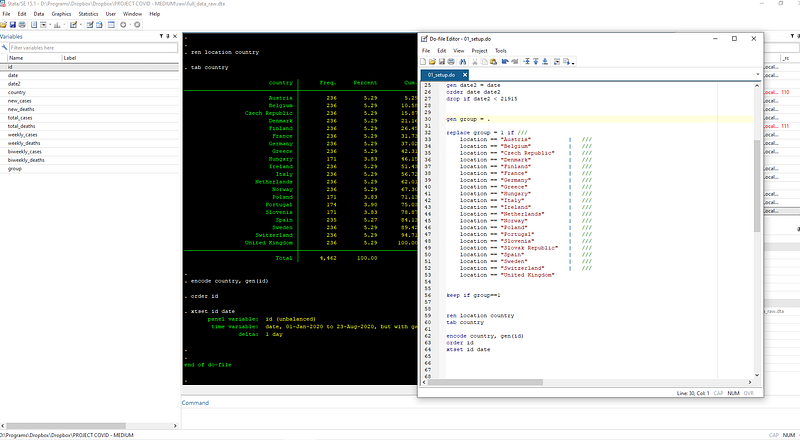
We now do some small cleaning up by renaming “location” variable to “country”.
ren location country  // rename variable location to country
tab country           // look at the frequency of the data
The tabulate tab command gives us a summary of the countries, and their observations. Note that not all countries have data for all the dates.
We save this file in the temp folder:
compress
save ./temp/OWID_data.dta, replace
We can now download the population file for normalizing the cases and deaths. Population normalization indicators are used for comparing countries with each other.
The population file can also be downloaded from OWID and cleaned as follows:
**** adding the population datainsheet using "https://covid.ourworldindata.org/data/ecdc/locations.csv", cleardrop countriesandterritories population_year
ren location countrycompress
save "./temp/OWID_pop.dta", replaceNow that we have both the files in the temp folder, we can merge the two datasets as follows:
**** merging the two datasetsuse ./temp/OWID_data, clear
merge m:1 country using ./temp/OWID_pop // do a many-to-one mergedrop if _m!=3 // drop the observations that don't match
drop _m // drop the _merge variableWe do a many -to-one match because the first dataset (OWID_data) has observations by countries and date, while the population data (OWID_pop) has only observation per country. Thus population data will multiply for the number of country-date combinations. Here we also only keep perfect matches _m==3.
TIP: check commands for combining datasets help merge, help append, help joinby to understand different ways of combining datasets.
Task 3: Getting the variables in order
Now we start fixing the data by generating the variables we need for graphs. We generate population normalized variables calculated as infection and death rates per one million population. The command for this is:
***** generating population normalized variablesgen total_cases_pop = (total_cases / population) * 1000000
gen total_deaths_pop = (total_deaths / population) * 1000000We can also generate some additional variables like moving averages over time. In order to do this efficiently, we can declare the data to be a panel dataset since each country and date combination is unique. You can check this through the duplicates command:
duplicates list country date // should be zero duplicatesIn order to declare a panel panel, we need two numerical variables: a panel id variable (country in our case), and a time variable (date in our date). Since country is string, we can use the encode command to just convert it into numbers where the first country is 1, second is 2, and so on:
encode country, gen(id)   // convert string to numeric
order id                  // reorder the variable columns
xtset id date // declare the data as a panelxtdes // describe panel data
xtsum // summarize panel datathe xtset command declares the data to be a panel Stata now recognizes the panel variable (“id”) and the time variable (“date”). The country names become labels for the “id” variable. Test these commands:
label list   // list of labels
tab id       // tabulate id
tab id, nolabel   // tabulate id without labels
br id        // value labeled variables show up in blue
The advantage of declaring a data to be a panel is that it allows us to generate time series variables like 3-day or 7-day moving averages that we often see being used in online graphs especially for daily cases and deaths which tend to be very spiky:
*** generate 3-day smoothing averages of new cases/deathstssmooth ma new_cases_ma3 = new_cases , w(2 1 0)
tssmooth ma new_deaths_ma3 = new_deaths, w(2 1 0)// try help tssmoothThe commands above simply say that generate a 3-day moving average based on today and the past two observations. If the data was NOT declared a panel, a moving average can be obtained manually as follows:
sort country date
bysort country: gen new_cases_ma3_2 = (new_cases + new_cases[_n-1] + new_cases[_n-2]) / 3
This can quickly become messy if one, for example, needs to generate, a 7-day moving average. One can compare the two variables as well:
br new_cases_ma3 new_cases_ma3_2
compare new_cases_ma3 new_cases_ma3_2
There will be very minor issues with zeros and missing values but this level of fine tuning is not relevant at this stage.
We can now go ahead and generate some more variables for the population-normalized cases and deaths and also their log variables. Log trends were frequently presented in the beginning of the pandemic, but as of writing this article, they have gone out of fashion. Still, we will use these variables later to generate information like doubling times and how to deal with log scales in graphs.
*** generate 7-day smoothing averages of new cases/deaths
tssmooth ma new_cases_ma7  = new_cases , w(6 1 0)
tssmooth ma new_deaths_ma7 = new_deaths, w(6 1 0)
*** generating logs of variables
gen total_cases_log = log(total_cases)
gen total_deaths_log = log(total_deaths)gen total_cases_pop_log = log(total_cases_pop)
gen total_deaths_pop_log = log(total_deaths_pop)Logs of zeros and missing values are undefined and are set to missing which is represented by a dot .. Here we can also label the variables for completeness:
**** label the variables for completenesslab var id "Country"
lab var date "Date"lab var total_cases "Total cases"
lab var total_deaths "Total deaths"
lab var total_cases_pop "Total cases per one million population"
lab var total_deaths_pop "Total deaths per one million population"
lab var new_cases "New cases"
lab var new_deaths "New deaths"lab var new_cases_ma3 "New cases (3-day moving average)"
lab var new_deaths_ma3 "New deaths (3-day moving average)"
lab var new_cases_ma7 "New cases (7-day moving average)"
lab var new_deaths_ma7 "New deaths (7-day moving average)"lab var total_cases_log "Total cases (Log)"
lab var total_deaths_log "Total deaths (Log)"
lab var total_cases_pop_log "Total cases per one million population (Log)"
lab var total_deaths_pop_log "Total deaths per one million population (Log)"Variable labels are automatically used in graphs by default. Since now we have all the core data in place, we can go ahead and save this file in the master folder:
compress
save ./master/COVID_data.dta, replace
Task 4: Graphs
At this stage, we have the data to create basic time series graphs. Rather than populating the existing setup dofile, we start with a fresh dofile for graphs. This allows us to separate the data management from the graph management. Therefore, once the scripts are written, each file can be run independently to update the data and the graphs.
We save this new dofile as 02_graphs.do in the dofiles folder.
and we start this dofile with the following commands:
clear
cd "D:/Programs/Dropbox/Dropbox/PROJECT COVID - MEDIUM"
use ./master/COVID_data.dta // load the master dataSince the data is already set up in a panel format, we can also use the panel graph options to generate trends for the panel variable (countries in our case) in the dataset. This can be accessed from the Graphics > Panel data line-plots option:
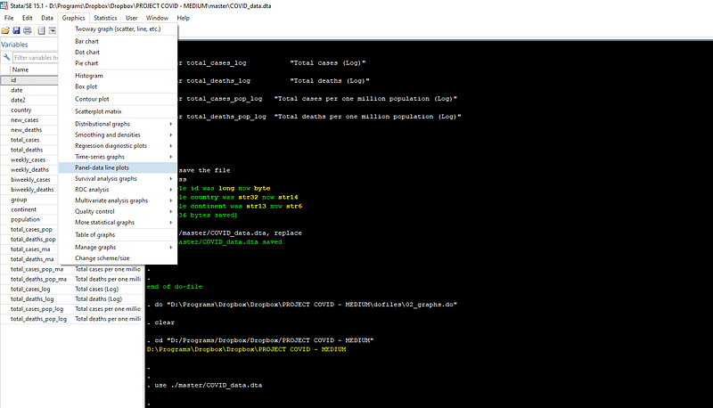
Such drop-down menus are usually referred to as Graphical User Interfaces, or GUIs, where windows pop-up that graphically allow us to execute a task. We can use GUIs to also generate basic code syntax for our dofiles. Here we will use the “Panel data line plots” to set up the base figure, and recover the syntax.
Once the window pops up, check “Overlay each panel on the same graph”, and select one of the variables of interest, like total_cases_pop, and press submit.
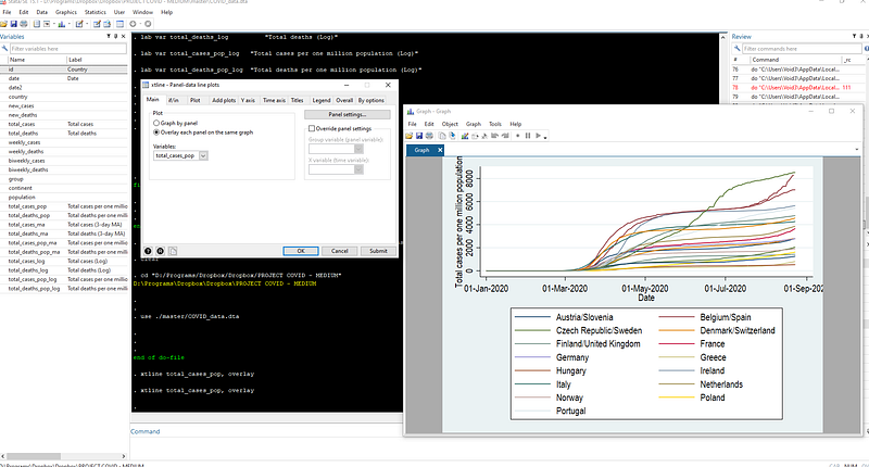
A graph like the one showed at the beginning of this article should pop up. This graph uses the default Stata s2 color scheme. Here I am also using Arial Narrow as my default font. Fonts and schemes can be changed after right clicking on the graph window and clicking on properties.
Each time a graph is generated using the GUI, its syntax also appears at the bottom of the Stata output window. This syntax can also be recovered by clicking on the relevant row in the “Review” pane.
Tip: In Windows, page-up and page-down in the command pane also allows us to cycle through commands used in the past.
Here we can copy the panel graph syntax in the dofile and export the graph as a png image file:
**** export a basic graphxtline total_cases_pop, overlay
graph export ./graphs/total_cases_pop_1.png, replace wid(1000)The png file with a width of 1000 pixels is saved in the “graphs” folder we created in Step 1 above and is shown here:
Tip: type help graph export for all the export formats.
Let us dissect this graph: It shows the correct labels on the axes since we defined them earlier. The lines show the correct patterns by countries over time. The date intervals (or ticks) are a bit too large (2 months) and can be reduced. We can also get rid of the year showing up in the dates on the x-axis. The colors are hard to differentiate and also challenging to match with the legend labels. Additionally, the same colors are being used for different countries: Austria/Slovenia, Belgium/Spain, etc. This is a limitation of the default color scheme which only allows 15 colors.
Given that we have the data and the graph in place, we can now start cleaning up the figure. First, we drop all data before 15 February, since nothing is happening before this date. Here we can make use of the “date2” column to see the date value in Stata format. Just type br and scroll down till you see the 15 Feb and pick its corresponding date2 value:
**** drop dates before 15 February
drop if date < 21960
Next we improve the labels for x-axis by changing its format and increasing the number of ticks. For this, we need to look at the range of the date variable:
format date %tdDD-Mon   // just show date and month
summ date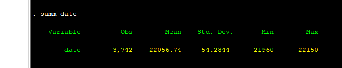
Here we can see the minimum and maximum value of the date variable. These we will use directly in the time axis tab in the xtline GUI:
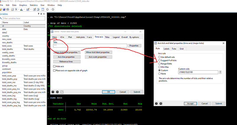
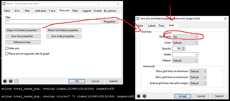
Here we also get rid of the time axis title by adding empty quotes (since dates are formatted, we can save some space here), and use custom rules to defined the x-axis ticks. Custom option is defined as follows: starting value(size of gap)end value. Note that I added 30 extra days to the custom x-axis or time-axis range. This is to give us some space to add country labels at the end the trend lines. But before that, we also need to rotate the x-axis ticks so that they don’t overlap, which can happen if the gap is small:
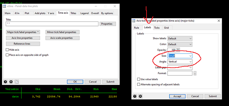
Press submit and get the syntax for the graph. Add this syntax to the dofile:
**** graph 2
xtline total_cases_pop, overlay ttitle("") tlabel(21960(15)22180, labsize(small) angle(vertical)) legend(off)
graph export ./graphs/total_cases_pop_2.png, replace wid(1000)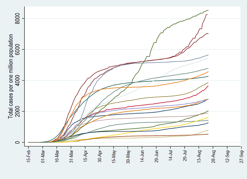
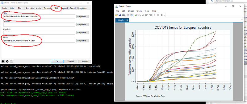
The above graph now has the information we need. Here we add a title, a note, and add grids for dates ticks on the x-axis (or time-axis in panel data plots).
We also recover and save this syntax in the do-file:
*** graph 3
xtline total_cases_pop ///
, overlay ///
ttitle("") ///
tlabel(21960(15)22180, labsize(small) angle(vertical) grid) ///
title(COVID19 trends for European countries) ///
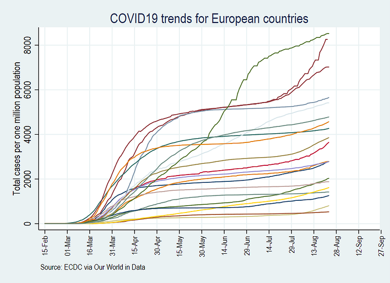
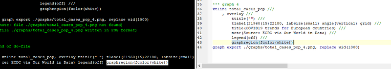
note(Source: ECDC via Our World in Data) legend(off)graph export ./graphs/total_cases_pop_3.png, replace wid(1000)Note that I have now started breaking down the graph syntax into various lines using three forward slashes ///. This makes the code more readable, plus each line in the code represents a different element of the graph. The graph now looks like this:
We also get rid of the blue background:
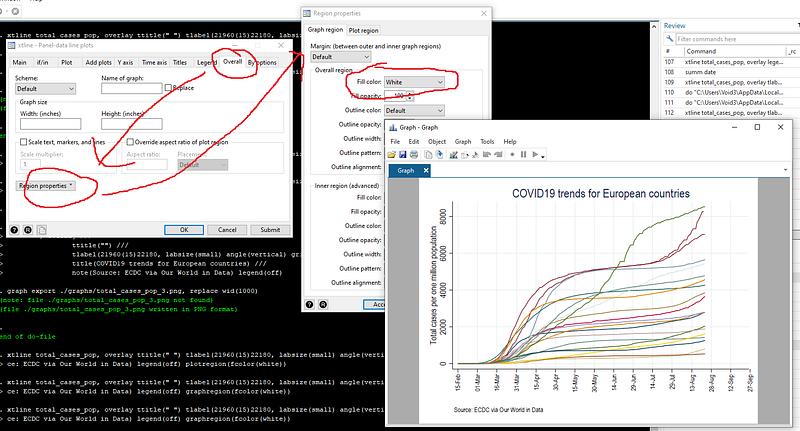
Here we don’t need to copy the whole graphs syntax, but we can simply add the new piece of code to the existing dofile from the last run command:
*** graph 4xtline total_cases_pop ///
, overlay ///
ttitle("") ///
tlabel(21960(15)22180, labsize(small) angle(vertical) grid) ///
title(COVID19 trends for European countries) ///
note(Source: ECDC via Our World in Data) ///
legend(off) ///
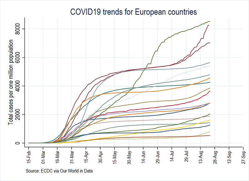
graphregion(fcolor(white))graph export ./graphs/total_cases_pop_4.png, replace wid(1000)
The graph already looks a bit neater since we got rid of the extra elements like multiple background colors, and the unreadable legends:
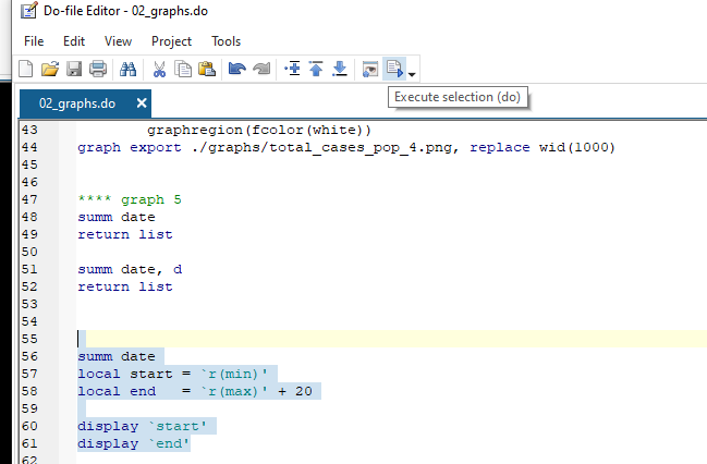
At this stage, I will introduce a first advanced piece of code that will help us with the automation of figures through the use of locals. Locals are pieces of information stored in the memory after the execution of a command. For example, we manually added the date range to the figure above. If we are making a lot of figures and the data is getting updated daily, then this quickly becomes a pain to deal with (and also makes it prone to human error). Since we looked up the date range using the summarize summ command, this information displayed is also stored in the memory in what are called r-class locals. We can recover this information ex-post using the return command:
summ date         // see help summarize
return list       // see help return
summ date, d // here d stands for details
return listWe can now store this information in memory by defining a local variable:
// run all these lines together
summ date
local start = `r(min)'
local end   = `r(max)' + 30
display `start'
display `end'Tip: code lines that deal with locals cannot be run independently. They need to run in the same instance as the previous command otherwise they will show a blank output. To properly display locals, select the code you want to run, and then press the Execute selection button on the top of the dofile editor.
The display window should show the values that we manually added to the date range in the graph above. We can now integrate this information dynamically in the graph syntax:
*** graph 5summ date
local start = `r(min)'
local end = `r(max)' + 30display `start'
display `end'xtline total_cases_pop ///
, overlay ///
ttitle("") ///
tlabel(`start'(15)`end', labsize(small) angle(vertical) grid) ///
title(COVID19 trends for European countries) ///
note(Source: ECDC via Our World in Data) ///
legend(off) ///
graphregion(fcolor(white))
graph export ./graphs/total_cases_pop_5.png, replace wid(1000)which gives us exactly the same graph as above, except the date ranges are now automatically generated.
This means that every time the data set is updated, the date range will be automatically updated as well.
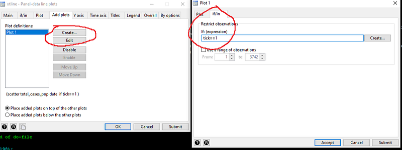
In the next and final step, we add markers to the end of the trend lines with country labels. In order to do so, we need to generate a new variable which marks the end of each line. This is an x-y pair comprising of the last date and its corresponding value on the y-axis. Here we do it with an additional step by generating a variable called “tick” for the last observation (this can be skipped as well by directly using r(max) in the graph syntax but we leave it for now):
summ date
gen tick = 1 if date == `r(max)'Notice the use of locals again; rather than manually defining the last date, we just let Stata pick the observations with the maximum value. Next, in the xtline GUI, we use the addplots tab and add a scatter plot:
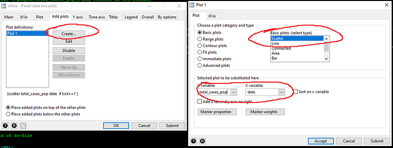
And we limit the scatter plot to where the variable “tick==1” in the if/in tab:
If we press submit, then we get a figure which looks like this:
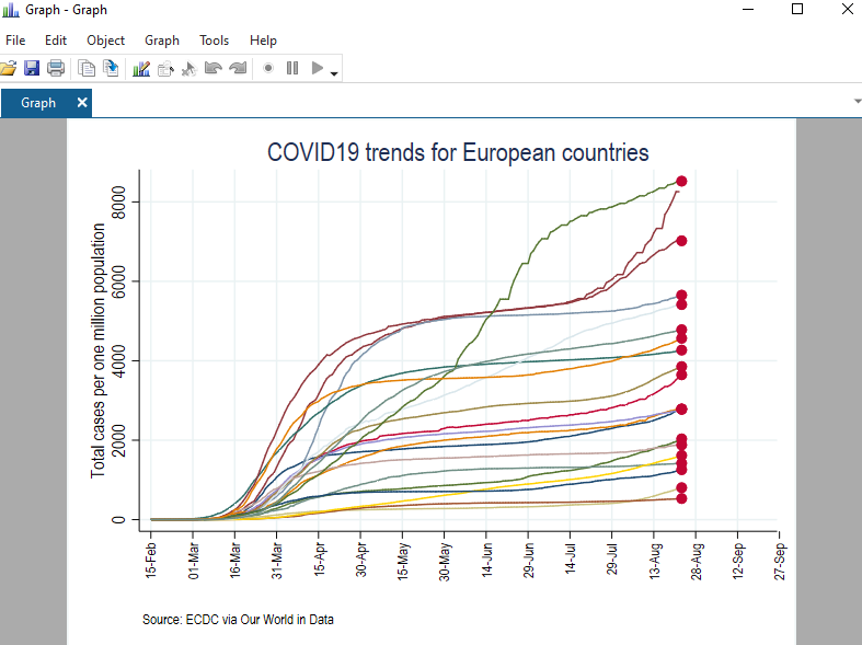
Now have the markers in the correct place, we need to clean them up. This can be achieved from the “Marker properties” button. Here we just select a “Point” symbol with a black color, and enable “Add label to markers”. For markers, we select the “country” variable and adjust its size and color:
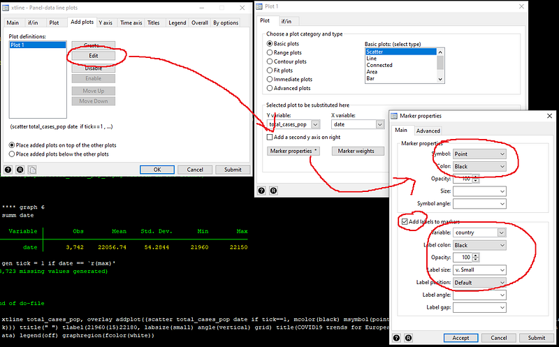
This gives us the final piece of code:
summ date
local start = `r(min)'
local end   = `r(max)' + 30
display `start'
display `end'xtline total_cases_pop ///
, overlay ///
addplot((scatter total_cases_pop date if tick==1, mcolor(black) msymbol(point) mlabel(country) mlabsize(vsmall) mlabcolor(black))) ///
ttitle("") ///
tlabel(`start'(15)`end', labsize(small) angle(vertical) grid) ///
title(COVID19 trends for European countries) ///
note(Source: ECDC via Our World in Data) ///
legend(off) ///
graphregion(fcolor(white))graph export ./graphs/total_cases_pop_6.png, replace wid(1000)which gives us the following line graph:
This figure is much easier to read than the first figure we created. Note that one line has a label missing. This is because the data for this country has not been updated for the last date we are using. The code can be customized to select the marker point for each country independently but this will be covered in subsequent guides. In Part 2 of the guide, we work further on the figure above and discuss custom color schemes.
An exercise
Try and replicate the following three graphs for new cases, new cases with 3-day moving average, and new cases with 7-day moving average, based on the variables we generated above:
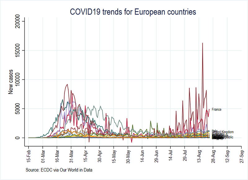
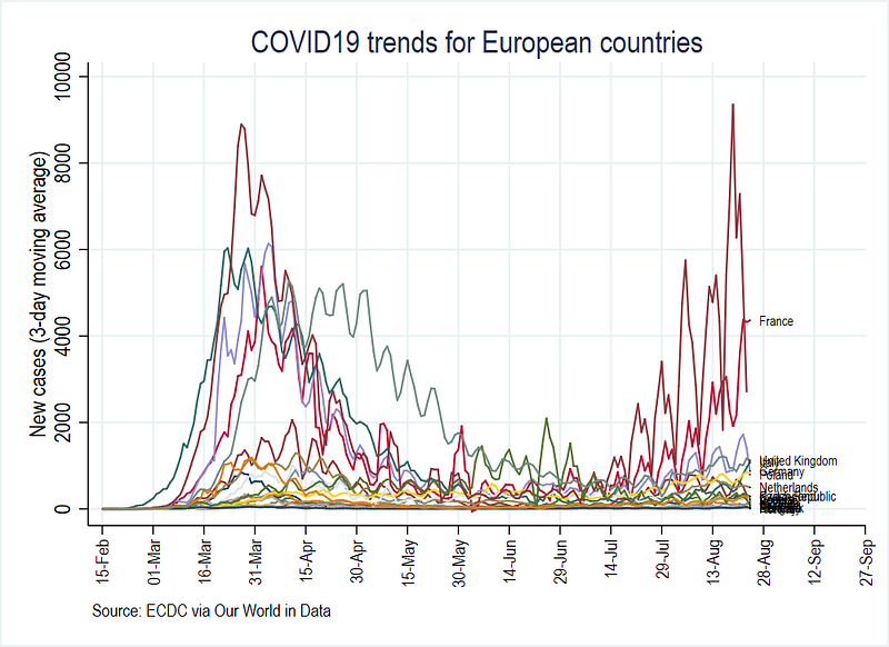
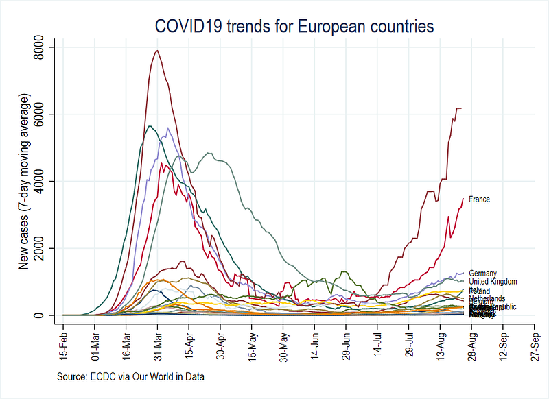
You can also compare these figures with the Our World in Data COVID-19 platform.
Miscellaneous
The files used in this guide can be found on my Github repository https://github.com/asjadnaqvi/COVID19-Stata-Tutorials.
Other Stata guides
Part 1: An introduction to data setup and customized graphs
Part 2: Customizing colors schemes
Part 7: Doubling time graphs I
Part 8: Ridge-line plots (Joy plots)
If you enjoy these guides and find them useful, then please like and follow The Stata Guide. Also, please share your visualizations if you use these guides!
About the author
I am an economist by profession and I have been using Stata since 2003. I am currently based in Vienna, Austria where I work at the Vienna University of Economics and Business (WU) and at the International Institute for Applied Systems Analysis (IIASA). You can find my research work on ResearchGate and Google Scholar, and Stata code repository on GitHub. You can follow my COVID-19 related Stata visualizations on my Twitter. I am also featured on the Stata COVID-19 webpage in the visualization and graphics section.
You can connect with me via Medium, Twitter, LinkedIn or simply via email: [email protected].
My Medium blog for Stata stuff here: The Stata Guide where new awesome content is released regularly. Clap, and/or follow if you like these guides!


