
COVID-19 visualizations with Stata Part 8: Ridgeline plots (Joy plots)
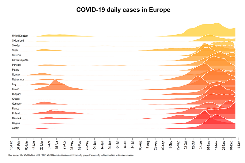
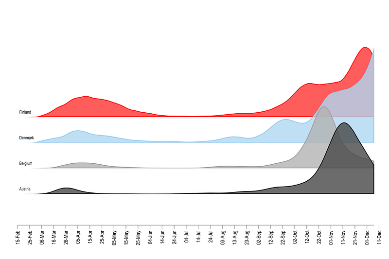
In this guide learn how to make ridgeline plots (also known as joy plots), in Stata using publicly available COVID-19 dataset from Our World in Data. At the end of the guide, we will learn how to make this graph below:
This guide builds on the concepts introduced in previous guides. Here we learn how to use Lowess curves to generate the graph above.
The guide goes step-by-step over the idea behind the construction of the ridgeline plots. If you are an advanced user, the core code is provided at the end of the guide.
Preamble
A basic knowledge of Stata is assumed. If you are using this guide for the first time, and are new to Stata, then Guide 1 and Guide 2 are highly recommended.
Like previous guides, the standard introduction applies here as well, where we start with the following folder structure for the work-flow management:
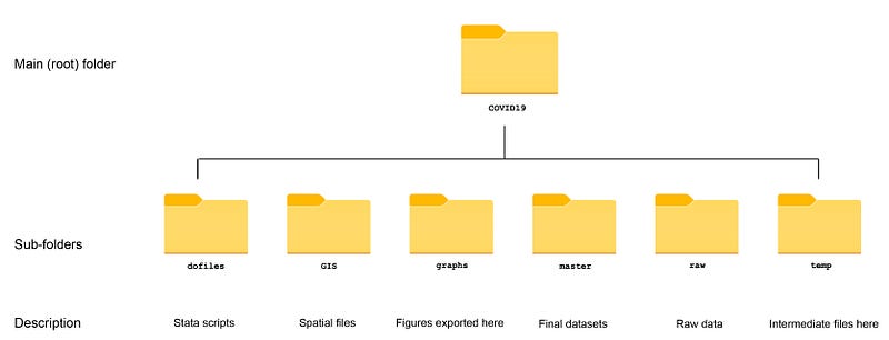
Within the graphs folder, I also create an additional sub-folder called guide8, to store the figures generated here. For details on how to organize your files, please see Guide 1.
In order to make the graphs exactly as they are shown here, several additional item are required:
- Cleanplots theme (Guide 2):
net install cleanplots, from("https://tdmize.github.io/data/cleanplots")set scheme cleanplots, perm- Colorpalette package (Guide 2)
net install palettes, replace from("https://raw.githubusercontent.com/benjann/palettes/master/")
net install colrspace, replace from("https://raw.githubusercontent.com/benjann/colrspace/master/")- Set default graph font to Arial Narrow
graph set window fontface "Arial Narrow"Or the other way is to generate some graph, you can right click on the graph window, click properties, and select the font for graphs. This step is optional and I will cover the use of fonts in Stata in a different guide.
Task 1: Data setup
The details of pulling data from the internet are discussed in Guides 1 and 2. But for the sake of completeness, a minimal code for replication is provided here.
First we set up the data from the Our World in Data COVID-19 repository:
************************
***  COVID 19 data   ***
************************
insheet using "https://covid.ourworldindata.org/data/owid-covid-data.csv", clear
save ./raw/full_data_raw.dta, replacegen date2 = date(date, "YMD")
format date2 %tdDD-Mon-yy
drop date
ren date2 dateren location country
replace country = "Slovak Republic" if country == "Slovakia"drop if date < 21915 // 1st Januarycompress
save "./master/OWID_data.dta", replaceNext we keep a sample of countries and clean up the data a bit. Note that any set of countries can be used here:
use ./master/OWID_data.dta, clearsumm date
drop if date >= `r(max)' - 2 // drop the last two observationsgen group = .replace group = 1 if ///
country == "Austria" | ///
country == "Belgium" | ///
country == "Czech Republic" | ///
country == "Denmark" | ///
country == "Finland" | ///
country == "France" | ///
country == "Germany" | ///
country == "Greece" | ///
country == "Hungary" | ///
country == "Italy" | ///
country == "Ireland" | ///
country == "Netherlands" | ///
country == "Norway" | ///
country == "Poland" | ///
country == "Portugal" | ///
country == "Slovenia" | ///
country == "Slovak Republic" | ///
country == "Spain" | ///
country == "Sweden" | ///
country == "Switzerland" | ///
country == "United Kingdom"keep if group==1keep country date new_cases new_deaths// generate a numerical country var
encode country, gen(country2)
order country country2 date*** fix some data errors
replace new_cases = 0 if new_cases < 0
replace new_deaths = 0 if new_deaths < 0lab var new_cases "New cases"
lab var new_deaths "New deaths"
lab var date "Date"drop if date < 21960 // drop data points before 1st Jan 2020
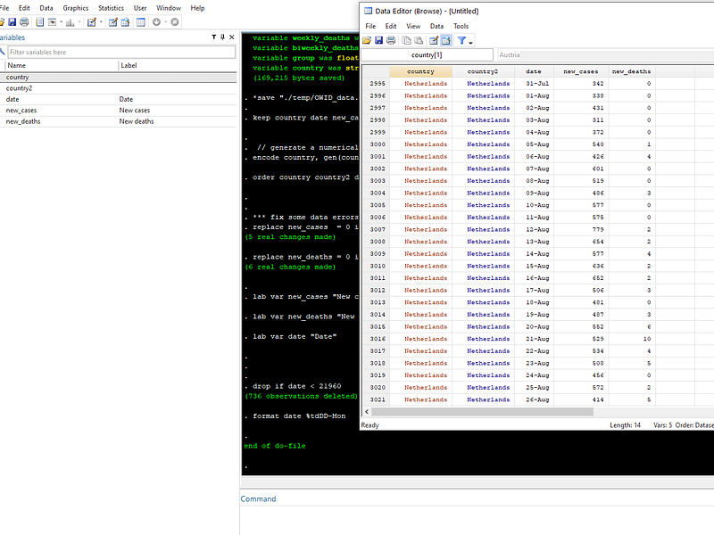
format date %tdDD-MonIn the end we should only have five variables left:
Task 2: Getting the area graphs in order
Here, rather than using a 7-day moving average, as we did in the last guides, we utilize the non-parametric Lowess smoothing function. To give an example, a Lowess fit for country2==1 can be generated as follows:
twoway ///
 (lowess new_cases date if country2==1, bwid(0.1)) ///
 (scatter new_cases date if country2==1, msize(small) mcolor(gs8%30)) ///
 , legend(off)
** the graph export:
graph export ./graphs/guide8/graph0.png, replace wid(5000)Note that I am only showing the graph export command as an example here. If you are not using the above folder structure, then this line will not work and can be removed.
From the code above, we should get the following graph:
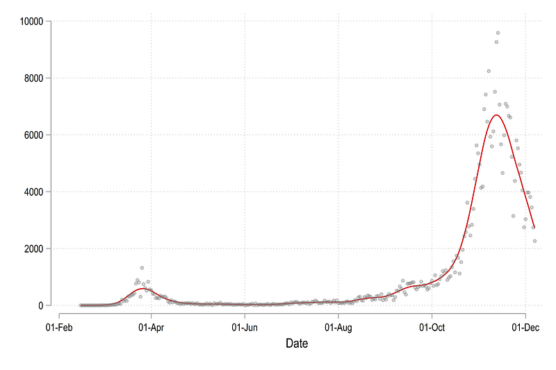
In the code above, bwid(0.1) is short for bandwidth of 0.1 using the default Epanechnikov kernel function. A smaller value will make the fit closer to the actual data, while a larger value will make the line smoother. There is no “right” bandwidth for non-parametric functions so this mostly depends on what kind of information needs to be communicated.
Let’s start by plotting the first four countries defined by the country2 variable:
twoway ///
 (lowess new_cases date if country2==1, bwid(0.1)) ///
 (lowess new_cases date if country2==2, bwid(0.1)) ///
 (lowess new_cases date if country2==3, bwid(0.1)) ///
 (lowess new_cases date if country2==4, bwid(0.1)) ///
 , legend(off)
graph export ./graphs/guide8/graph1.png, replace wid(2000)
The figure shows daily reported cases as smoothed-out line graphs:
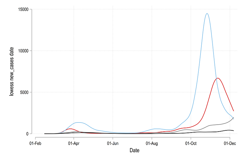
For ridgeline plots, variable are usually normalized (usually between 0 and 1), either by the maximum value for each category (countries in our case) or by the overall maximum value in the data for the variable of interest. The former is easier for comparing changes within a country over time, but the latter is used for comparing changes across all the countries. If the differences are high, then a “global” normalization might hide countries which are smaller in size, as is the case in the graph above, where the black line is a tiny fraction of the blue line. One can use cases per population for a more accurate comparison across countries and regions, but for this guide, we will stick to a “local” country-level normalization. This can be achieved as follows:
***** normalize the cases in a range of 0-1 for each country
gen cases_norm = .
gen deaths_norm = .

levelsof country2, local(levels)
foreach x of local levels {
summ new_cases if country2==`x'
replace cases_norm = new_cases / `r(max)' if country2==`x'summ new_deaths if country2==`x'
replace deaths_norm = new_deaths / `r(max)' if country2==`x'
}Notice the use of levelsof and locals for generate the new variable. Once we have the normalized variables, we can store the lowess fits as separate variables, which allows us to import them later for graphs:
lowess cases_norm date if country2==1, bwid(0.1) gen(ytop1) nograph
lowess cases_norm date if country2==2, bwid(0.1) gen(ytop2) nograph
lowess cases_norm date if country2==3, bwid(0.1) gen(ytop3) nograph
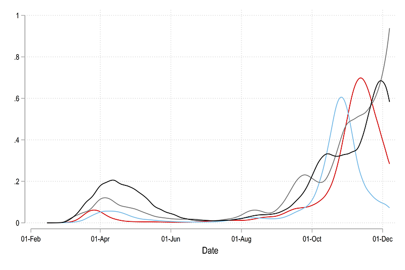
lowess cases_norm date if country2==4, bwid(0.1) gen(ytop4) nographFor each country, we generate a new variable ytopx, which contains the lowess-smoothed fitted valued. We can also check and plot these:
twoway ///
 (line ytop1 date) ///
 (line ytop2 date) ///
 (line ytop3 date) ///
 (line ytop4 date) ///
 , legend(off)
Which gives us th graph below where the values are bounded between 0 and 1 on the y-axis. All country lines have been scaled to fit this data range. On a technical note, if the bandwidth of the smoothing function, currently set at 0.1, is reduced, then the lines will also approach 1 on the y-axis upper bound since neighboring observations will have less weights. This graph highlights variation within each country more clearly:
We can also convert these lines into areas. Here we make use of the Stata twoway area function which requires three inputs, one x-axis value and two y-axis values for the upper and the lower bound. This can be simply generated as:
gen y0 = 0twoway ///
(rarea ytop1 y0 date) ///
(rarea ytop2 y0 date) ///
(rarea ytop3 y0 date) ///
(rarea ytop4 y0 date) ///
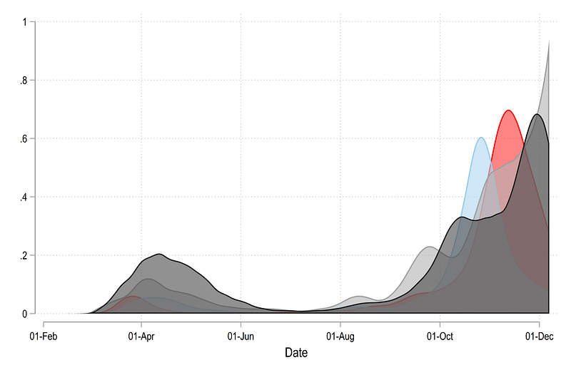
, legend(off)Which gives us this figure:
In order to make it more readable, we can play with the fill intensity (needs Stata 15 or higher):
twoway ///
 (rarea ytop1 y0 date, fcolor(%60)) ///
 (rarea ytop2 y0 date, fcolor(%60)) ///
 (rarea ytop3 y0 date, fcolor(%60)) ///
 (rarea ytop4 y0 date, fcolor(%60)) ///
 , legend(off)
Where we get an area graph that sort of shows all the country trends:
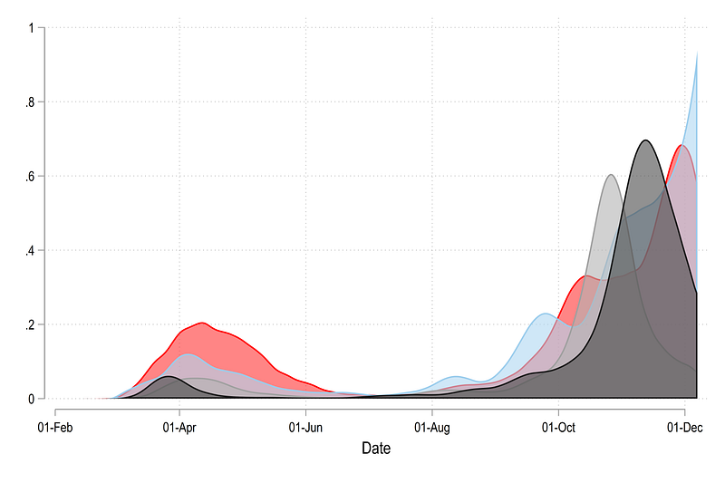
If we reverse the order of the countries:
twoway ///
 (rarea ytop4 y0 date, fcolor(%80)) ///
 (rarea ytop3 y0 date, fcolor(%80)) ///
 (rarea ytop2 y0 date, fcolor(%80)) ///
 (rarea ytop1 y0 date, fcolor(%80)) ///
 , legend(off)
we get this graph:
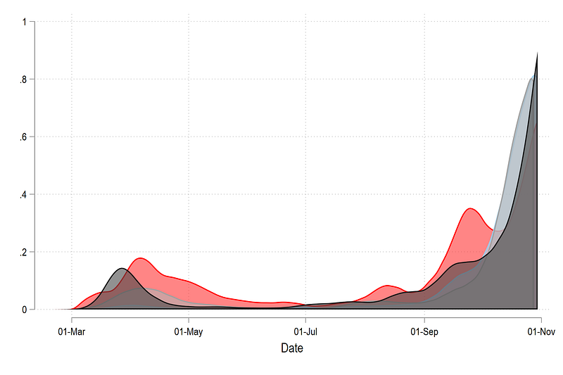
which reverses the order in which layers are drawn. This step is extremely imported for creating ridgeline plots since we need to control the drawing order (draw last, see first principle). This step is also important to control color schemes, which we will discuss later.
In the next step, we add two more control to the graphs. Since each country is normalized between 0 and 1, we just generate the bottom y values as number ranging from 1 to the number of countries (4 in our case for this example). We also shift the top part, which shows the distribution by these values:
gen y1 = 1
gen y2 = 2
gen y3 = 3
gen y4 = 4
gen ytest4 = ytop4 + y4
gen ytest3 = ytop3 + y3
gen ytest2 = ytop2 + y2
gen ytest1 = ytop1 + y1twoway ///
(rarea ytest4 y4 date, fcolor(%80)) ///
(rarea ytest3 y3 date, fcolor(%80)) ///
(rarea ytest2 y2 date, fcolor(%80)) ///
(rarea ytest1 y1 date, fcolor(%80)) ///
, legend(off)From the code above, we get this graph:
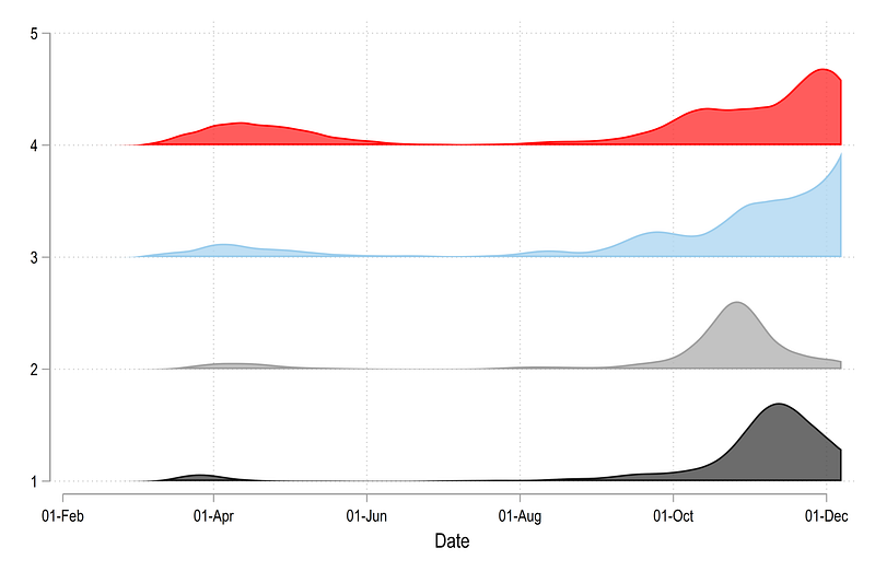
All countries are stacked on top of each other and all are bound between 0 and 1. This is essentially the core figure that we need for generating a ridgeline plots. Now all we need to do is squish the y-axis.
We just generate a variable for each “bottom” part of the area graph, where we reduce the space between the y-axis ticks by a fourth.
**** squish the axis
gen y1_new = 1 / 4
gen y2_new = 2 / 4
gen y3_new = 3 / 4
gen y4_new = 4 / 4
twoway ///
(rarea ytest4 y4_new date, fcolor(%80)) ///
(rarea ytest3 y3_new date, fcolor(%80)) ///
(rarea ytest2 y2_new date, fcolor(%80)) ///
(rarea ytest1 y1_new date, fcolor(%80)) ///
, legend(off)
If we plot this graph and use the old “top” layer, we get something like this:
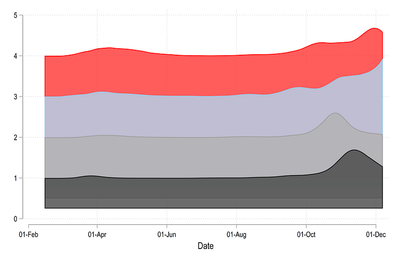
Here we also need to shift the top distribution layer down which is done as follows:
**** and shift the top curves
gen ytest1_new = ytop1 + y1_new
gen ytest2_new = ytop2 + y2_new
gen ytest3_new = ytop3 + y3_new
gen ytest4_new = ytop4 + y4_new
twoway ///
 (rarea ytest4_new y4_new date, fcolor(%80)) ///
 (rarea ytest3_new y3_new date, fcolor(%80)) ///
 (rarea ytest2_new y2_new date, fcolor(%80)) ///
 (rarea ytest1_new y1_new date, fcolor(%80)) ///
 , legend(off)
 graph export ./graphs/guide8/graph8.png, replace wid(2000)
from which we get this plot:
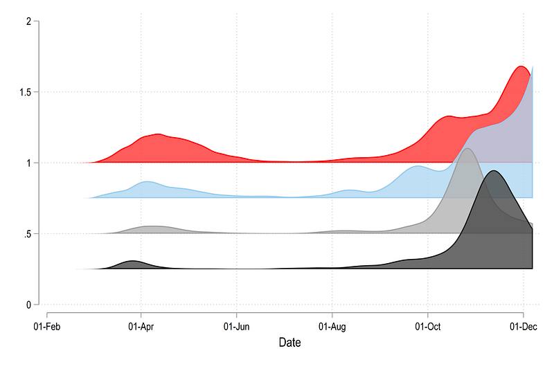
Note that the squishing of the y-axis is done by a factor of 4. This can be played around with to get the optimal result.
The next step generates a scatter point for labeling the countries.
// labels for the country namesegen tag = tag(country)
summ date
gen xpoint = `r(min)' if tag==1gen ypoint = .replace ypoint = (ytest1_new + 1/20) if xpoint!=. & country2==1
replace ypoint = (ytest2_new + 1/20) if xpoint!=. & country2==2
replace ypoint = (ytest3_new + 1/20) if xpoint!=. & country2==3
replace ypoint = (ytest4_new + 1/20) if xpoint!=. & country2==4This step is important since countries are no longer defined by categorical variables on the y-axis (1,2,3,4,…) but rather 0.25, 0.5, 0.75 etc. These steps can also vary based on how much we squeeze the y-axis.
Rather than trying to figure out, which values on the y-axis need to be labeled (which is possible using certain custom packages), we just get rid of the y-axis altogether and use a scatterplot for labeling. Here we mark xpoint, the x-axis value simply as the first date. The ypoint is derived from the y-axis used to generate the area graph. Here we shift the ypoint slightly up to avoid overlaps with lines.
Now we have all the ingredients to generate a fully labeled graph:
summ date
local x1 = `r(min)'
local x2 = `r(max)'
twoway ///
(rarea ytest4_new y4_new date, fcolor(%80)) ///
(rarea ytest3_new y3_new date, fcolor(%80)) ///
(rarea ytest2_new y2_new date, fcolor(%80)) ///
(rarea ytest1_new y1_new date, fcolor(%80)) ///
(scatter ypoint xpoint, mcolor(white) msize(zero) msymbol(point) mlabel(country) mlabsize(*0.6) mlabcolor(black)) ///
, ///
xlabel(`x1'(10)`x2', nogrid labsize(vsmall) angle(vertical)) ///
ylabel(, nolabels noticks nogrid) yscale(noline) ytitle("") xtitle("") ///
legend(off)
graph export ./graphs/guide8/graph9.png, replace wid(2000)Here several things are happening. First we are automating the control of the data range using locals. Next we are adding a scatter, with a hidden marker msize(zero) for the country labels. We also completely hide the y-axis. All grids are also turned off.
From the code above, we get the following graph:
This gives us the blueprint we need to generate a fully customized graph with custom color schemes.
Task 3: Full automation of the graph
In this part, we will make use of several steps, the logic of which also has been discussed in previous guides. Since we make use of several locals, which have to be executed in one go, I am giving the whole code chunk here:
cap drop y* // drop the variables we generated earliergen ypoint=.levelsof country2, local(levels)
local items = `r(r)' + 6foreach x of local levels {summ country2
local newx = `r(max)' + 1 - `x' // reverse the sortinglowess cases_norm date if country2==`newx', bwid(0.05) gen(y`newx') nograph
gen ybot`newx' = `newx'/ 4 // squish the axis
gen ytop`newx' = y`newx' + ybot`newx'colorpalette matplotlib autumn, n(`items') nograph
local mygraph `mygraph' rarea ytop`newx' ybot`newx' date , fc("`r(p`newx')'%75") lc(white) lw(thin) ||
replace ypoint= (ytop`newx' + 1/16) if xpoint!=. & country2==`newx'
}summ date
local x1 = `r(min)'
local x2 = `r(max)'twoway `mygraph' ///
(scatter ypoint xpoint, mcolor(white) msize(zero) msymbol(point) mlabel(country) mlabsize(*0.6) mlabcolor(black)) ///
, ///
xlabel(`x1'(10)`x2', nogrid labsize(vsmall) angle(vertical)) ///
ylabel(, nolabels noticks nogrid) yscale(noline) ytitle("") xtitle("") ///
legend(off) ///
title("{fontface Arial Bold:COVID-19 daily cases in Europe}") ///
note("Data sources: Our World in Data, JHU, ECDC. World Bank classifications used for country groups. Each country plot is normalized by its maximum value.", size(tiny))
graph export ./graphs/guide8/graph10.png, replace wid(2000)Let’s dissect the code above. levelsof country2, local(levels) stores the information of all the unique countries in a local called levels. From this command we can also store the value of how many levels there are local items = `r(r)' + 6 . This information is used to generate the colors in the command colorpalette matplotlib autumn, n(`items') nograph. Here, I add an additional 6 values to stretch the color range to avoid getting a very yellow color which is not so visible especially with a white outline.
The commands summ country2 and local newx = `r(max)' + 1 — `x' , reverses the order of countries so that they are drawn top first and bottom last. There is probably a more elegant way of doing this, but it works! The lowess store the smoothed values of each country level in country-specific variable. This part of the code can also be optimized by making use of temporary variables tempvar but here the idea is to explore what the data looks like after each step.
In the next step we generate the bottom and top y-values to generate the areas. In the code gen ybot`newx' = `newx'/ 4 the value of 4 is the “squish” factor. One can play around with this number to get the optimal landscape which depends on the number of countries, the desired height of the waves, and the desired gap between them. The higher the number in the denominator, the higher the exaggeration of the peaks.
The variable ypoint generates the scatter for the country labels. Sine we have turned off the axis, we just use the x-y values of the dates and area graphs to labels each ridge. The part where we add + 1 /16 is just to move the scatter points a bit up so that they align with the lines. Otherwise the labels end up at the mid point of each line. These can be played around with to get the optimal result as well.
In the title, {fontface Arial Bold:xxx} allows us to customize the font of the header (see the Stata Font Guide for more on this).
And here we get our final figure:
which clearly shows the making of the second wave in the sample European countries.
Exercise
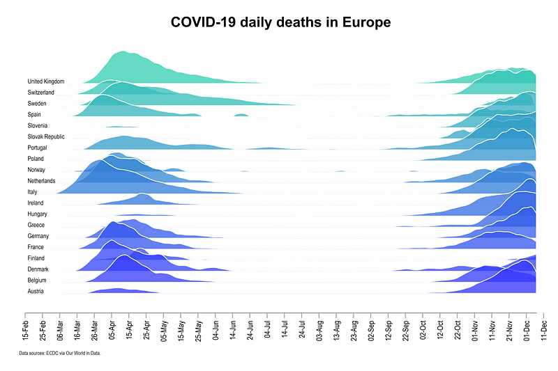
Trying generating a graph for the daily deaths. The color scheme used below is colorpalette matplotlib winter
Also try generating the graph with cases and deaths per population and use a global normalization.
Other Stata guides
Part 1: An introduction to data setup and customized graphs
Part 2: Customizing colors schemes
Part 7: Doubling time graphs I
Part 8: Ridge-line plots (Joy plots)
If you enjoy these guides and find them useful, then please like and follow The Stata Guide. Also, please share your visualizations if you use these guides!
About the author
I am an economist by profession and I have been using Stata since 2003. I am currently based in Vienna, Austria where I work at the Vienna University of Economics and Business (WU) and at the International Institute for Applied Systems Analysis (IIASA). You can find my research work on ResearchGate and Google Scholar, and Stata code repository on GitHub. You can follow my COVID-19 related Stata visualizations on my Twitter. I am also featured on the Stata COVID-19 webpage in the visualization and graphics section.
You can connect with me via Medium, Twitter, LinkedIn or simply via email: [email protected].
My Medium blog for Stata stuff here: The Stata Guide where new awesome content is released regularly. Clap, and/or follow if you like these guides!


