
COVID-19 visualizations with Stata Part 9: Customized bar graphs
In this guide, we will learn how to make the following bar graph in Stata that have custom color schemes, automated legends, and labels:
Two challenges exist with automating bar graphs. First, there is a loss of information that occurs when collapsing or reshaping a dataset. For example, variable and value labels drop, which would typically be used to label graphs. Reshaping of the data is required, in one form or the other, to make bars of different colors. Second, while the graph above looks straightforward to make, individually fixing bars or legends quickly becomes cumbersome. Bar graphs are used to plot summary statistics, usually sum or mean value of different variables. As a result, legend labels need to be manually fixed. This becomes cumbersome especially if bar graphs are generated over a bunch of varying groups, or if the number of groups is large.
In order to deal with these challenges, in this guide we will introduce additional programming elements where we will learn how to store information using locals and pull it in the final stages of the graph creation for coloring and legend labeling. This allows us to generate a fully automated graph where minor tweaking is required once the code structure is in place.
Preamble
Like all previous guides, this guide assumes a basic knowledge of Stata. This guide deals with advanced usage of locals, loops, and code structures that require some experience and familiarity with Stata programming. If you are using this guide for the first time, and are new to Stata, then Guide 1 and Guide 2 are highly recommended and then follow through the subsequent guides to get yourself familiar with the code.
Additionally, this guide uses the following folder structure for the work-flow and file management:
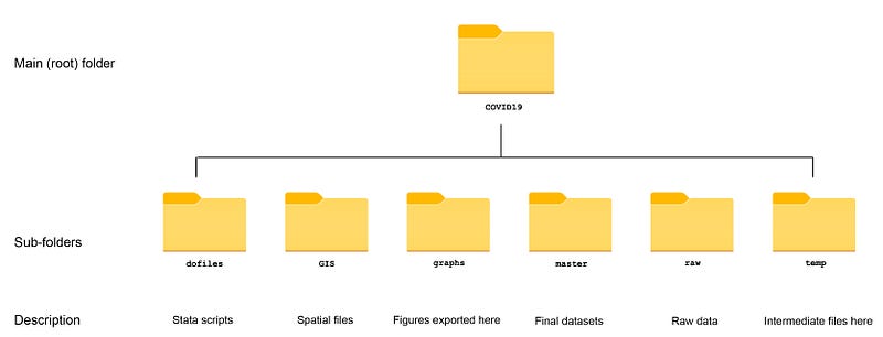
Within the graphs folder, I also create an additional sub-folder called guide9, to store the figures generated here. For details on how to organize your files, please see Guide 1.
In order to make the graphs exactly as they are shown here, several additional item are required:
- Install the cleanplots theme for a clean look for your figures (more on themes in Guide 2):
net install cleanplots, from("https://tdmize.github.io/data/cleanplots")set scheme cleanplots, perm- Install Ben Jann’s colorpalette package (more on colors in Guide 2 and the Color guide)
net install palettes, replace from("https://raw.githubusercontent.com/benjann/palettes/master/")
net install colrspace, replace from("https://raw.githubusercontent.com/benjann/colrspace/master/")- Set default graph font to Arial Narrow (see the Font guide on customizing fonts)
graph set window fontface "Arial Narrow"This guide has been written in version 16.1 but should work with version 14 and onwards. Earlier versions might need some modification for implementing custom colors.
Get the data in order
For the bar graphs we need to get the data in order. Here we pull the raw data from the Our World in Data’s COVID-19 database and clean it up:
************************
***  COVID 19 data   ***
************************
insheet using "https://covid.ourworldindata.org/data/owid-covid-data.csv", clear
save ./raw/full_data_raw.dta, replacegen date2 = date(date, "YMD")
format date2 %tdDD-Mon-yy
drop date
ren date2 dateren location country
replace country = "Slovak Republic" if country == "Slovakia"drop if date < 21915save "./master/OWID_data.dta", replaceI usually keep the setup file separate from the graph files so technically the save and the use (shown below) can be skipped.
In the dataset, generate a variable for the month of the year (see help datetime in Stata for more on this):
use "./master/OWID_data.dta", cleargen month = month(date)Drop the missing observations and also drop Oceania (mainly Australia and New Zealand) since it is a small fraction of total cases. For per capita graphs, it can be added back in:
tab continent, m
drop if continent==""
drop if continent=="Oceania"
In the next step, collapse the data at the continent and month level:
collapse (sum) new_cases new_deaths population, by(continent month)and label the variables and save the data:
**** label the variables for completenesslab var month "Month"
lab var continent "Continent"
lab var new_cases "New cases"
lab var new_deaths "New deaths"
lab var population "Population"which gives us the core data file we need for our bar graphs. Note that the data is now unique at the continent and month combination.
Next generate a numeric variable for the continent:
encode continent, gen(id)
order id
drop continent
Label the month variable and keep observations between March and November 2020.
lab de month 3 "Mar" 4 "Apr" 5 "May" 6 "Jun" 7 "Jul" 8 "Aug" 9 "Sep" 10 "Oct" 11 "Nov"lab val month month
keep if inrange(month,3,11)We do this because there were very few cases before March across the globe and November is the last complete month at the time of writing this guide:
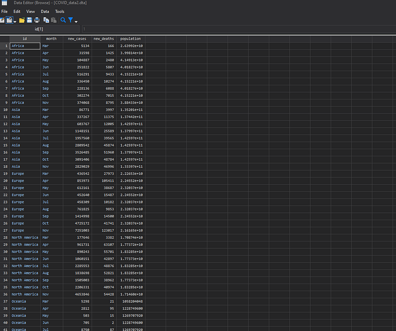
At this point our data should look something like this:
To make bar graphs where each continent is differentiated in terms of color, each continent needs to be a different variable. This can achieved using the reshape command. But once we reshape the data, value labels and variable labels are lost. We usually use this information for labeling graphs.
Do deal with this issue, in the next step, we do the following three things in one go; (a) preserve the labels of the id variable and store them in locals, (b) reshape the data and, (c) apply the id value labels as variable labels once the reshape is done:
*** (a) preserve the labels...levelsof id, local(idlabels) // store the id levels
foreach x of local idlabels {
local idlab_`x' : label id `x'
}
*** (b) and reshape
reshape wide new_cases new_deaths population, i(month) j(id)
*** (c) and attach the labels back again to the variablesforeach x of local idlabels { display "`x'"
lab var new_cases`x' "`idlab_`x''" // label these
lab var new_deaths`x' "`idlab_`x''"
lab var population`x' "`idlab_`x''"
}order month new_cases* new_deaths* population*After running the above code, we should get a wide data structure that looks like this:
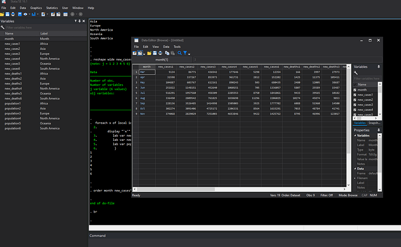
Note that each variable (new_cases, new_deaths, population), is multiplied by the number of continents that are numbered from one to five. Each variable is given its corresponding continent name as the label. This is extremely important for the labeling of bar graphs which will become obvious in the next step.
Let’s generate a plain bar graph:
graph bar (sum) new_cases*, over(month) ///
 ytitle(Cases) ylabel(, format(%12.0fc))
Here it doesn’t matter if we can use sum or mean since we have already generated the data for the bar graphs such that each continent month combination is just one number.
From the code above, we get this bar graph in the default Cleanplots colorscheme:
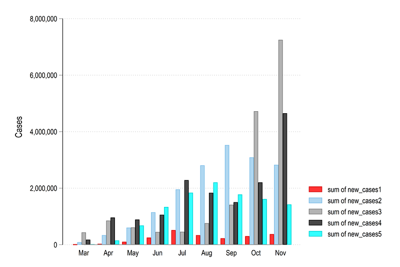
Note how the legend is labeled. It basically says that we are plotting the sum of the new_cases variable. This will always be in this format
We can also generate other types of bar graphs. Here are stacked graphs using the default bars and the horizontal bars (hbars ):
graph bar (sum) new_cases*, over(month) stack ///
  ytitle(Cases) ylabel(, format(%12.0fc))
graph hbar (sum) new_cases*, over(month) stack ///
ytitle(Percentage) ylabel(, format(%12.0fc))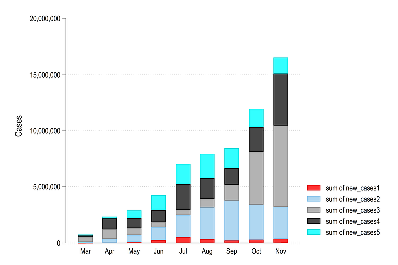
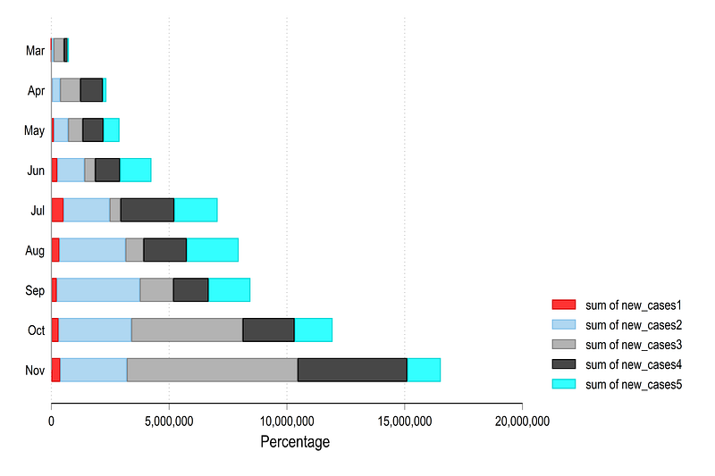
The choice of vertical or horizontal bars is a matter of taste. If space is limited, then horizontal bars give the space to stretch the data across the page width.
One can also generate stacked bar graphs:
graph bar (sum) new_cases*, over(month) percentages stack ///
  ytitle(Percentage) ylabel(, format(%12.0fc))
which gives us this figure:
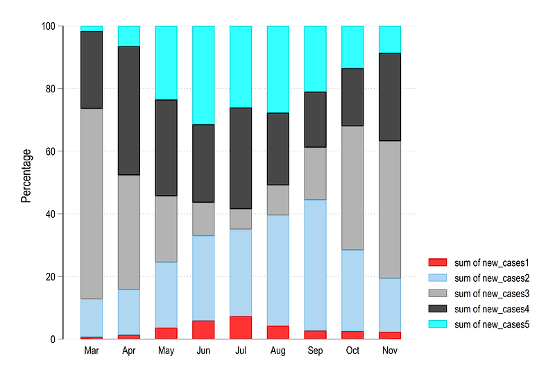
Stacked graphs sum up to 100% and are useful to look at the distribution and the variable shares but don’t say anything about the total.
Next we need to deal with two elements; (a) colors and (b) legend labels.
Let’s deal with the colors first. As shown in the previous guides, the colorpalette package by Ben Jann, opens up endless possibilities to utilize colors. Below we plot the graph using the default Stata s2 color scheme:
colorpalette s2, n(5) nographgraph bar (sum) new_cases*, over(month) stack ///
ytitle(Cases) ylabel(, format(%12.0fc)) ///
bar(1, fcolor("`r(p1)'") lcolor(black) lwidth(vvthin)) ///
bar(2, fcolor("`r(p2)'") lcolor(black) lwidth(vvthin)) ///
bar(3, fcolor("`r(p3)'") lcolor(black) lwidth(vvthin)) ///
bar(4, fcolor("`r(p4)'") lcolor(black) lwidth(vvthin)) ///
bar(5, fcolor("`r(p5)'") lcolor(black) lwidth(vvthin))which gives us this familiar looking figure:
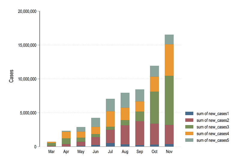
Notice how the colors are passed on to the graph using the locals generated from the colorpalette package. These are discussed in detail in Guide 2 and the Color guide posts.
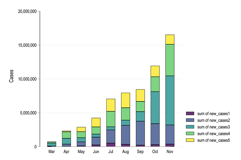
We can also use other color palettes defined by the colorpalette package. For example, here is the matplotlib viridis color scheme:
colorpalette viridis, n(5) nographgraph bar (sum) new_cases*, over(month) stack ///
ytitle(Cases) ylabel(, format(%12.0fc)) ///
bar(1, fcolor("`r(p1)'") lcolor(black) lwidth(vthin)) ///
bar(2, fcolor("`r(p2)'") lcolor(black) lwidth(vthin)) ///
bar(3, fcolor("`r(p3)'") lcolor(black) lwidth(vthin)) ///
bar(4, fcolor("`r(p4)'") lcolor(black) lwidth(vthin)) ///
bar(5, fcolor("`r(p5)'") lcolor(black) lwidth(vthin))which gives us this image:
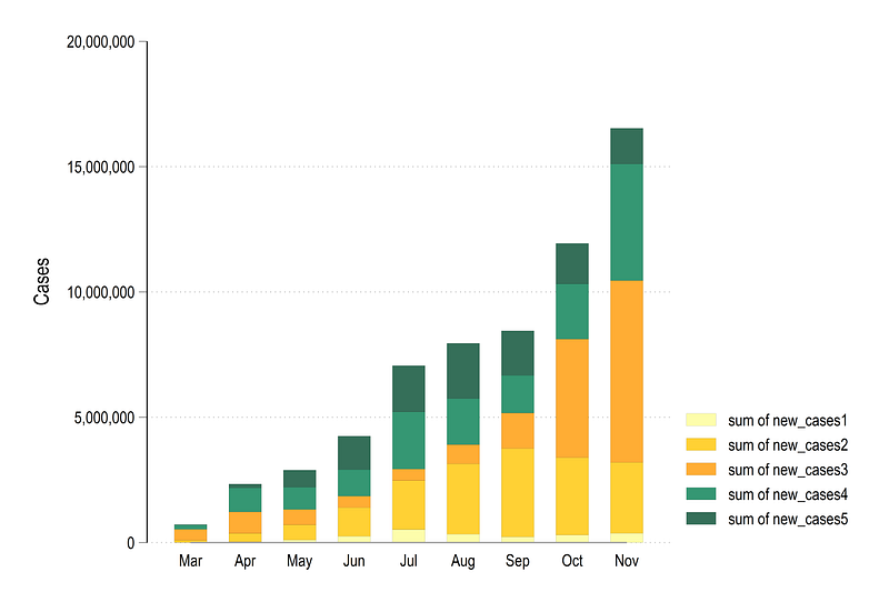
or we go fully custom and define our own color scheme using RGB values. For example, here is a color scheme that we previous used in the Color guide post, where we extracted the color from this page:
colorpalette ///
 "253 253 150" ///
 "255 197   1" ///
 "255 152   1" ///
 "  3 125  80" ///
 "  2  75  48" ///
  , n(5) nograph
graph bar (sum) new_cases*, over(month) stack ///
ytitle(Cases) ylabel(, format(%12.0fc)) ///
bar(1, fcolor("`r(p1)'") lcolor(black) lwidth(vvthin)) ///
bar(2, fcolor("`r(p2)'") lcolor(black) lwidth(vvthin)) ///
bar(3, fcolor("`r(p3)'") lcolor(black) lwidth(vvthin)) ///
bar(4, fcolor("`r(p4)'") lcolor(black) lwidth(vvthin)) ///
bar(5, fcolor("`r(p5)'") lcolor(black) lwidth(vvthin))Here we see a bar graph that also looks a bit more appealing with the graduated colors:
Once we have the colors in place, the next step is to automate the legend labels.
Automate all the elements
This process of generating an automated legend for bar graphs is not trivial. Since these are multiple locals involved, the code block is provided below which has to run in one go, and the explanations are given underneath:
ds new_cases*
local items : word count `r(varlist)'
display `item'
local colors = `items' + 1colorpalette ///
"253 253 150" ///
"255 197 1" ///
"255 152 1" ///
" 3 125 80" ///
" 2 75 48" ///
, n(`colors') nographforeach x of numlist 1/`items' {
*** here the code for bar colors
local barcolor `barcolor' bar(`x', fcolor("`r(p`x')'")
lcolor(black) lwidth(*0.4)) `///'
*** here the code for legend
local mylab : var lab new_cases`x'
local legend `legend' lab(`x' "`mylab'")}
graph bar (sum) new_cases*, ///
over(month, axis(lcolor(none))) percentages stack ///
`barcolor' ///
blabel(bar, size(vsmall) position(center) format(%12.0fc)) ///
legend(`legend' rows(1) size(small) pos(6))The first two line pick the number of variables that have the name new_cases*. The macro local items : word count `r(varlist)' counts the number of variables. In theory we have as many variables as we want. The local items is used to define the number of colors which are just the number of items + 1. This is to avoid very dark shades that occur at the end of the color schemes. This step is not really necessary but is more of a fine-tuning of the graph. The colorpalette command generates the required number of colors using the colors local.
We then iteratively generate the graph elements using a loop. Since we have already the number of variables in the local items, the foreach command is used to loop over the variables. The loop generates two things. First, are the bar colors. Each bar is given a value according to the item position on the colorpalette scheme. Here we also define the line color. To break the line, we use the three forward slashes ///. Since this is a non-standard application of loops and line breaks, the forward slashes are given in quotations to prevent the code from thinking that a line break in the code exists here. This had to be discovered with some code experimentation.
The second part of the code looks complex but this is what it does: it picks the variable label from the variable name, stores it in a macro, and from this generates an entry that looks like this lab(1 "Africa") lab(2 "Asia") and so on. This is an alternative way of defining an appendix label and gives a nice symmetry and order to the legend generation. Note that this step could also have been done manually since we only have five continents but here the aim is to learn how to automate these steps. For example, one can split the continents to generate new categories. For example, North America can be split into USA, and the rest of North America, or Asia can be split into India, China, and the rest of Asia etc. This will be discussed in a subsequent guide.
From the code above, we get this graph below:
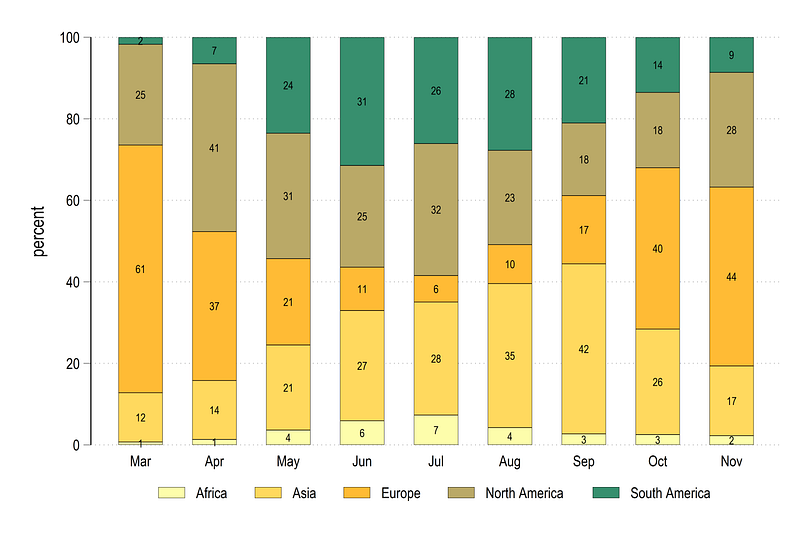
were the percentages are also labeled in the center of the graph. Note that with very small bars, the numbers can get squished a bit but here there is little option to individually customize bars. One can theoretically program the bar graphs completely using the standard twoway graph commands for a full control over all the elements, but this we will leave for another guide.
Below, we repeat the code to generate a horizontal bar graph:
ds new_cases*
local items : word count `r(varlist)'
display `item'
local colors = `items' + 1colorpalette ///
"253 253 150" ///
"255 197 1" ///
"255 152 1" ///
" 3 125 80" ///
" 2 75 48" ///
, n(`colors') nographforeach x of numlist 1/`items' {
*** here the code for bar colors
local barcolor `barcolor' bar(`x', fcolor("`r(p`x')'")
lcolor(black) lwidth(*0.3)) `///'
*** here the code for legend
local mylab : var lab new_cases`x'
local legend `legend' lab(`x' "`mylab'")
}graph hbar (sum) new_cases*, ///
over(month, axis(lcolor(none))) stack ///
`barcolor' ///
ylabel(, format(%12.0fc)) ///
legend(`legend' rows(1) size(small) pos(6))which looks like this:
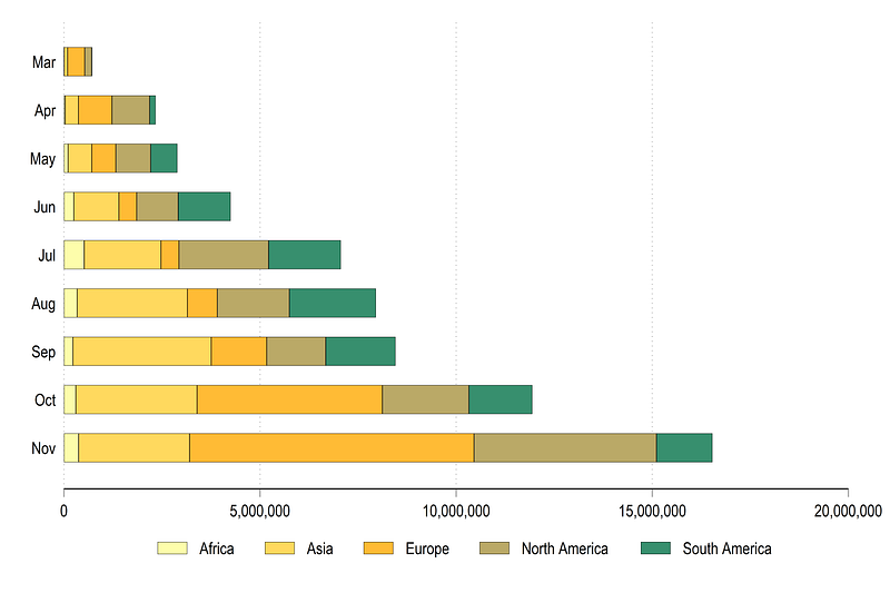
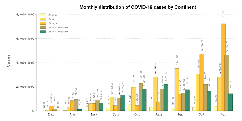
We can also customize the fonts to generate a graph that has a bit more information and looks balanced in terms of fonts and colors. Here we define the final piece of code for our main figure:
graph set window fontface "Courier New"ds new_cases*
local items : word count `r(varlist)'display `item'
local colors = `items' + 1colorpalette ///
"253 253 150" ///
"255 197 1" ///
"255 152 1" ///
" 3 125 80" ///
" 2 75 48" ///
, n(`colors') nographforeach x of numlist 1/`items' {
*** here the code for bar colors
local barcolor `barcolor' bar(`x', fcolor("`r(p`x')'")
lcolor(black) lwidth(*0.1)) `///'
*** here the code for legend
local mylab : var lab new_cases`x'
local legend `legend' lab(`x' "`mylab'")
}*** the final graph we want:graph bar (mean) new_cases*, ///
over(month, label(labsize(small)) axis(lcolor(none))) bargap(-20) ///
`barcolor' ///
ytitle(Cases) ylabel(, format(%12.0fc)) ///
blabel(bar, size(1.7) orientation(vertical) margin(vsmall) format(%12.0fc)) ///
legend(`legend' col(1) size(vsmall) pos(11) ring(0) region(fcolor(none))) ///
title("{fontface Arial Bold: Monthly distribution of COVID-19 cases by Continent}") ///
xsize(2) ysize(1)where we set the font to “Courier New”, which is a monospaced font. In monospaced fonts all the letters have the same width. This classic font also gives an old typewriter feel. The header is also customized and uses Arial Bold, an easy-to-read sans-Serif font. We also label the bars and make them overlap a bit to give it a finishing touch. And from all of the code above, we get this graph below:
Here the patterns each easy to distinguish within and across months, and the color scheme also works reasonably well. From the bar graph we can see that in November, Europe alone reported over 7.2 million cases. North America (mostly led by the USA) also reported over 4.6 million cases.
Exercise
Try generating a bar graph of reported deaths by continent:
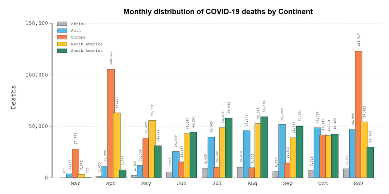
In the graph above the following palette is used:
colorpalette lin brandsTry also generating graphs for cases and deaths per million people. These variables can be generated as follows:
cases_pop = (new_cases / population) * 1000000Also try your own graphs and color schemes.
Hope you found this guide useful!
Other Stata guides
Part 1: An introduction to data setup and customized graphs
Part 2: Customizing colors schemes
Part 7: Doubling time graphs I
Part 8: Ridge-line plots (Joy plots)
If you enjoy these guides and find them useful, then please like and follow The Stata Guide. Also, please share your visualizations if you use these guides!
About the author
I am an economist by profession and I have been using Stata since 2003. I am currently based in Vienna, Austria where I work at the Vienna University of Economics and Business (WU) and at the International Institute for Applied Systems Analysis (IIASA). You can find my research work on ResearchGate and Google Scholar, and Stata code repository on GitHub. You can follow my COVID-19 related Stata visualizations on my Twitter. I am also featured on the Stata COVID-19 webpage in the visualization and graphics section.
You can connect with me via Medium, Twitter, LinkedIn or simply via email: [email protected].
My Medium blog for Stata stuff here: The Stata Guide where new awesome content is released regularly. Clap, and/or follow if you like these guides!


