
COVID-19 visualizations with Stata Part 5: Stacked area graphs
In this guide, we will learn how to make customized stacked area graphs, show below, in Stata using COVID-19 data.
This guide will also teach about automation of scripts, generating and applying custom color schemes, and using dynamic labeling in graphs.
Getting started
As in the previous guides, two points are reiterated here:
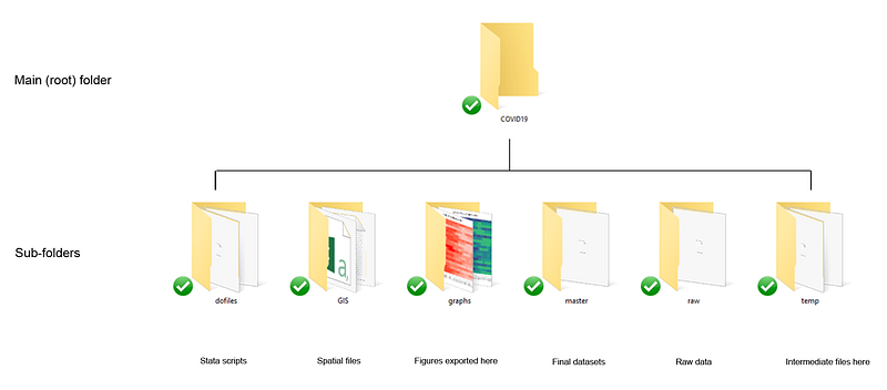
- We use the following folder structure to organize the files:
2. A basic knowledge of Stata is assumed including a familiarity with the Stata interface, scripts, and dofiles.
Task 1: Getting the data in order
We download the data from Our World in Data’s (OWID) COVID-19 page (see Guide 1 on how to get data from online repositories):
clear
cd "D:/Programs/Dropbox/Dropbox/PROJECT COVID - MEDIUM"***********************************
**** our worldindata ECDC dataset
***********************************insheet using "https://covid.ourworldindata.org/data/ecdc/full_data.csv", clear
save ./raw/full_data_raw.dta, replacegen year = substr(date,1,4)
gen month = substr(date,6,2)
gen day = substr(date,9,2)destring year month day, replacedrop date
gen date = mdy(month,day,year)
format date %tdDD-Mon-yyyy
drop year month day
gen date2 = date
order date date2
gen group = .replace group = 1 if ///
location == "Austria" | ///
location == "Belgium" | ///
location == "Czech Republic" | ///
location == "Denmark" | ///
location == "Finland" | ///
location == "France" | ///
location == "Germany" | ///
location == "Greece" | ///
location == "Hungary" | ///
location == "Italy" | ///
location == "Ireland" | ///
location == "Netherlands" | ///
location == "Norway" | ///
location == "Poland" | ///
location == "Portugal" | ///
location == "Slovenia" | ///
location == "Slovak Republic" | ///
location == "Spain" | ///
location == "Sweden" | ///
location == "Switzerland" | ///
location == "United Kingdom"keep if group==1ren location country
tab country
compress
save "./temp/OWID_data.dta", replaceFor this guide we keep a handful of European countries. Note that we keep the same group of countries across the guides. Any set of countries can be used here.
We can also get rid of the extra information and keep only the variables and dates we need:
drop if date < 21975 // drop everything before 1st Marchsumm date
drop if date >= r(max) - 3 // drop the last three daysencode country, gen(country2) // generate a numerical country var
order country country2 date date2keep country country2 date date2 new_casesxtset country2 date
tssmooth ma new_cases_ma7 = new_cases , w(6 1 0)
format date %tdDD-Mon
format new_cases %9.0fc// this is not the best thing to do:
replace new_cases = 0 if new_cases < 0 | new_cases==.lab var new_cases "New cases"
lab var new_cases_ma7 "New cases (7-day moving average)"In the code above, we drop all the observations before 1st March since little was happening before this date in terms of cases. We also drop observations for the last 2 or 3 days since some countries are updated slower than others (e.g. Spain). We also replace missing and negative values with zero. Technically such steps should be avoided without fully understanding what is going on. For now, we treat these as data errors.
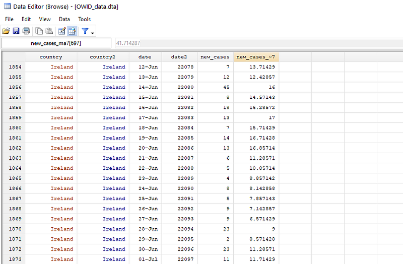
We can explore the data using the br command and it should look something like this:
For graphs, we use the cleanplots scheme (See Guide 2 for a discussion on schemes) for a minimal graph output:
net install cleanplots, from("https://tdmize.github.io/data/cleanplots")
set scheme cleanplots, perm
Since the data has been defined a panel, we can now visualize the data of daily new cases by using the panel graph command xtline:
xtline new_cases, overlay legend(off)
graph export ./graphs/guide5/graph1.png, replace wid(1000)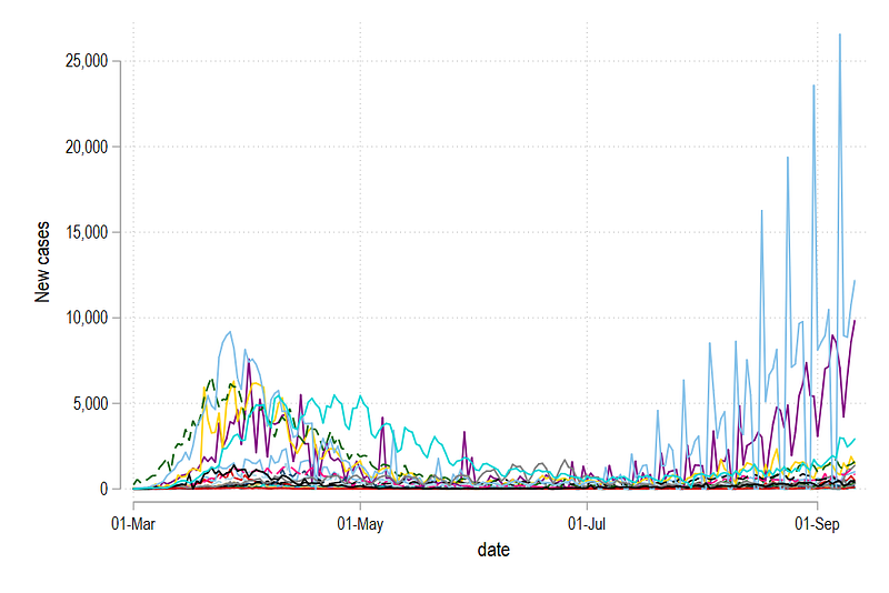
Here we see a lot of spikes resulting from drops in observations over the weekends. Since we generated a 7-day moving average above, we can also plot this variable:
xtline new_cases_ma7, overlay legend(off)
graph export ./graphs/guide5/graph2.png, replace wid(1000)
which gives us:
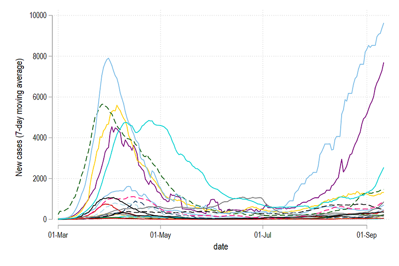
The figure above gives us a much better picture and is also commonly shown on websites to compare trends across countries. For the remaining guide, we will use the 7-day moving average variable (ma7) for graphs, and the raw cases variable for labels.
For each date, we can also generate the percentage share of cases of each country for each day:
*** generate shares here:* original data
bysort date: egen new_cases_total = sum(new_cases)
gen share_cases = (new_cases / new_cases_total) * 100* 7-day moving average
bysort date: egen new_cases_ma7_total = sum(new_cases_ma7)
gen share_cases_ma7 = (new_cases_ma7 / new_cases_ma7_total) * 100* drop the additional variables
drop new_cases_total new_cases_ma7_totalThis is achieved by calculating the total for each date using the bysort date: prefix, and then just simply dividing the actual value with the total value times 100. We do this only for the raw actual data new_cases and the moving average variable new_cases_ma7. We can generate the share graph:
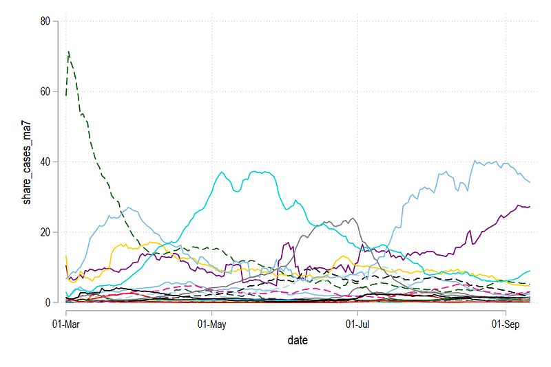
xtline share_cases_ma7, overlay legend(off)
graph export ./graphs/guide5/graph4.png, replace wid(1000)
This graph shows how each country contributed daily to COVID-19 cases in the selection of European countries defined above.
Task 2: Stack the data
In the next step, we generate two variables which stack the data for new cases and shares.
******** Stack the observationsgen stack_cases_ma7 = . // generate empty variables
gen stack_share_cases = .sort date country2 // it is import to sort the data here.levelsof date, local(dates) foreach y of local dates {summ country2* stack moving average cases for a smoother graph// take the first country as it is
replace stack_cases_ma7 = new_cases_ma7 if date==`y' & country2==`r(min)'// iteratively add up the
replace stack_cases_ma7 = new_cases_ma7 + stack_cases_ma7[_n-1] if date==`y' & country2!=`r(min)'
* stack shares replace stack_share_cases = share_cases_ma7 if date==`y' & country2==`r(min)' replace stack_share_cases = share_cases_ma7 + stack_share_cases[_n-1] if date==`y' & country2!=`r(min)'}
Here several things are combined. levelsof allows us to loop over each date. country2 is essential a numerical variable that goes from 1 to the total number of countries. For stacking, the first country with country2=1 is taken as it is. If country2=1 is not available for a particular date, then the next available value is taken. This is ensured by the summ country and then country2==`r(min)' commands. While here this is strictly not necessary, since the dataset is complete, for some regions outside of the EU, missing data is common where different sets of countries have data missing across different days. For the next set of countries, we iteratively add up the values. We also do the same steps for daily case shares.
We can check the data as well. Here we just look at one date:
br if date==22159 // this is 1st SeptemberHere we can see that country2 = 1 is Austria which has 106 new cases. This value is taken as it is in stack_cases variable. The second country is Belgium (country2 = 2) with 633 new cases. These cases added to the previous value of 106 to gives us 819 cases and so on.
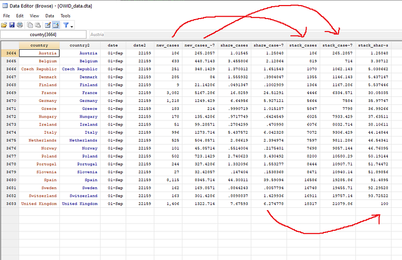
This process is repeated for all countries for all dates. If we look at the stack_share_cases column, then the shares are added up and the last observation will always be 100.
We can also plot the stacked cases graph:
xtline stack_cases_ma7, overlay legend(off)
graph export ./graphs/guide5/graph5.png, replace wid(1000)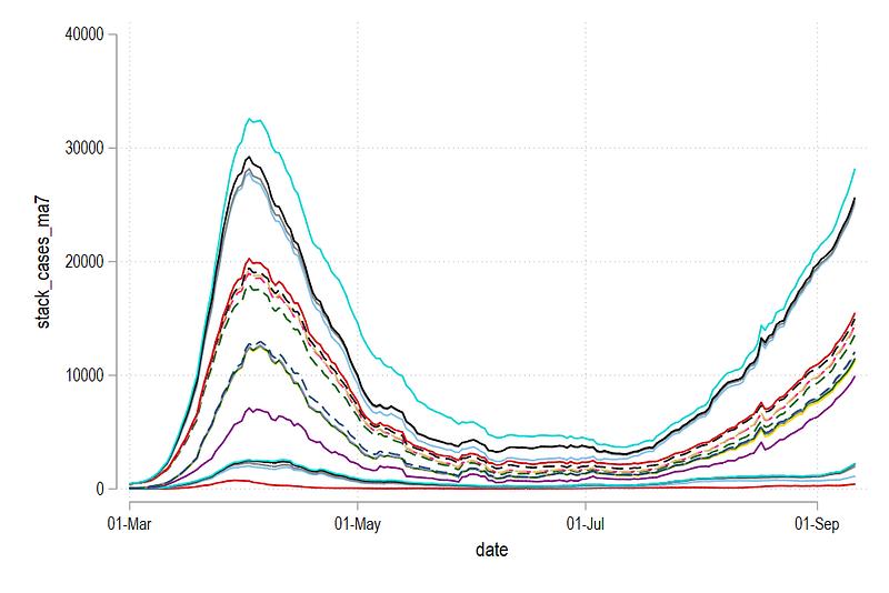
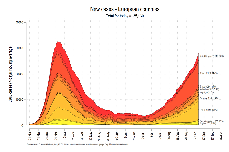
The graph above is already a bit easier to read than the graph showing individual lines. This graph conveys two things. First, the difference between the lines represents the new cases for a country, and second, the last line on the very top shows the total cases for the whole region. What we see above is the making of the second wave.
We can also look at the share graph:
xtline stack_share_cases, overlay legend(off)
graph export ./graphs/guide5/graph6.png, replace wid(1000)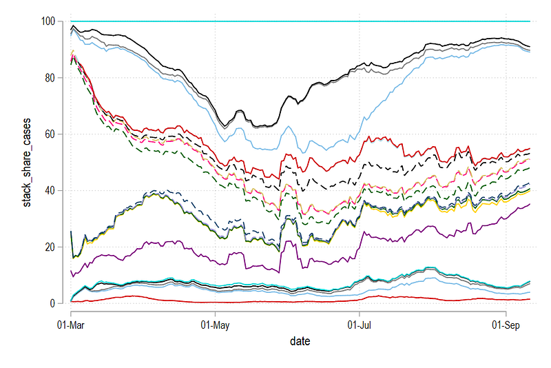
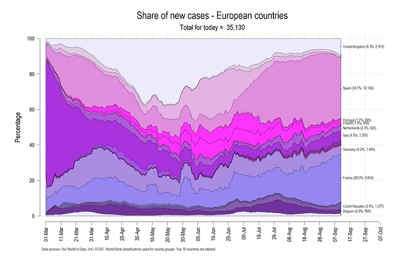
The last country is always 100%. The difference between the lines is the relative share of a country for that particular day. Note that both the level and the share graphs convey two different things. While the former shows how the trend is evolving over time, the latter shows, who is contributing to this trend.
Task 3: Customizing the graphs
In this part, we will move to full customization of the above graphs including adding labels and custom colors. For this, we will make use of the colorpalette and the colrspace packages that we introduced and discussed in Guide 2. We will also make use of the technique of looping over lines to define each line separately. This is done through the use of a combination of locals. For details on what the locals do and how to use them for automation, it is highly recommended to go over the previous guides thoroughly.
The core code structure to custom color the graphs is as follows:
sort date country2

summ country2
gen country3 = `r(max)' + 1 - country2  // reverse the ordering
****** stacked graph with custom colorlevelsof country3, local(levels)
local items = `r(r)'foreach x of local levels {
display "`x'"
colorpalette matplotlib autumn, n(`items') nograph
local stacklines `stacklines' area stack_cases_ma7 date if country3 == `x', fcolor("`r(p`x')'") lcolor(black) lwidth(vthin) ||
}summ date // automate the date ranges
local x1 = `r(min)'
local x2 = `r(max)'graph twoway `stacklines' ///
, ///
legend(off) ///
ytitle("Daily cases (7-days moving average)", size(small)) ///
ylabel(, labsize(vsmall)) ///
xtitle("") ///
xlabel(`x1'(10)`x2', labsize(vsmall) angle(vertical)) ///
title("New cases - European countries") ///
note("Data sources: Our World in Data, JHU, ECDC. World Bank classifications used for country groups.", size(tiny))graph export ./graphs/guide5/graph7.png, replace wid(2000)The country3 variable reverse order the numbers (there are other ways of doing this as well) so that we start with the bottom country and make our way to the top. This is super important for this step since we are essentially layering area figures on top of each other. If UK, the last country, is drawn last, then it will hide all the other countries underneath. While this can be solved partially using transparency introduced in Stata 15, the graph is not very readable.
The local items picks the number of levels in the country3 variable. This is a neat way of pick the total items we are looping over. We also use the local items in the colorpalette command to tell us how many colors we need. From this, we pick the color names stored in the local of colorpalette and assign to the area color of a particular country. We also give it a black outline color and a thin width. The range of the date axis is also automated and plotted in steps of 10. All of the above steps involving locals are mainly for automation of the script.
The code above gives us this graph:
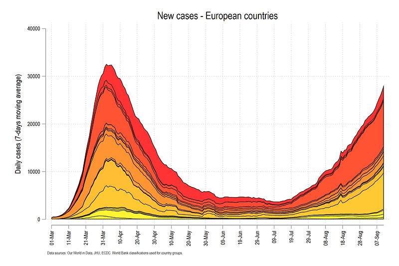
The graph above has a gradient color scheme defined by the matplotlib autumn color scheme. In the last step, we fine tune the above graph by adding country names and dynamic headers.
The labels can be generated using the following code:
**** get the labels in order
summ date
gen tag = 1 if date==`r(max)'
sort date country2
gen labely = .
replace labely = stack_cases_ma7 / 2 if country2==1 & tag==1
replace labely = (stack_cases_ma7 + stack_cases_ma7[_n-1]) / 2 if country2!=1 & tag==1For labels we use the mid points of the gap between the two lines. For the first observation where country2 =1, this can be done directly by dividing the last value (where tag = 1), by 2. For the subsequent values, we need to take the mean of the current and previous observations.
If we are plotting a lot of countries, then labeling all of them might get messy very quickly. Here we can just show the top 10 or top five countries that can reasonably fit on a figure without over burdening the reader.
For this we can generate a rank variable:
egen rank = rank(new_cases) if tag==1 & new_cases > 0 & new_cases!=., fwhich orders the countries based on the number of cases. For details see help egen on various options for the rank command.
Once the rank is defined, we can also generate a label for the countries that we want to show using regular expressions in Stata:
** generate a label:gen labelval = country + " (" + string(new_cases, "%9.0fc") + ", " + string(share_cases, "%9.1f") + "%)" if rank <= 10This command above simply says that the label should have country name, and then cases and share of cases in brackets. If you explore the data, this should look something like this:
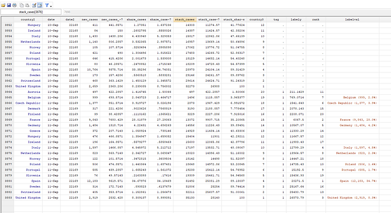
Above, you can see the rank variable and the label variable which highlights the top 10 countries. Note that the date at which this script runs will change the rankings.
We can now redraw the figure:
local stacklines // this clears the locallevelsof country3, local(levels)
local items = `r(r)'
foreach x of local levels {
display "`x'"
colorpalette matplotlib autumn, n(`items') nograph
local stacklines `stacklines' area stack_cases_ma7 date if country3 == `x', fcolor("`r(p`x')'") lcolor(black) lwidth(*0.2) ||
}summ date
local x1 = `r(min)'
local x2 = `r(max)' + 25summ date
summ new_cases if date==`r(max)'
local ctot = `r(sum)'
local ctot : di %7.0fc `ctot'graph twoway `stacklines' ///
(scatter labely date if tag==1, ms(smcircle) msize(0.2) mcolor(black%20) mlabel(labelval) mlabsize(tiny) mlabcolor(black) ) ///
, ///
legend(off) ///
ytitle("Daily cases (7-days moving average)", size(small)) ///
ylabel(, labsize(vsmall)) ///
xtitle("") ///
xlabel(`x1'(10)`x2', labsize(vsmall) angle(vertical)) ///
title("New cases - European countries") ///
subtitle("Total for today = `ctot'", size(small)) ///
note("Data sources: Our World in Data, JHU, ECDC. World Bank classifications used for country groups. Top 10 countries are labeled.", size(tiny))
graph export ./graphs/guide5/graph8.png, replace wid(2000)The scatter line adds the x,y coordinates of the last observations in the center of the stacked area graphs. In the code above, we also add the total number of cases to the header after storing and formatting a local (ctot above).
Which gives us the above final figure.
For the stacked share graphs we do the same process as earlier, but this time, we use the HTML purple color scheme:
************ percentage share graphscap drop labely
cap drop labelval
cap drop ranksort date country2
gen labely = .
replace labely = stack_share_cases / 2 if country2==1 & tag==1
replace labely = (stack_share_cases + stack_share_cases[_n-1]) / 2 if country2!=1 & tag==1egen rank = rank(share_cases) if tag==1 & share_cases > 0 & share_cases!=., f
format share_cases %9.1f
gen labelval = country + " (" + string(share_cases, "%9.1fc") + "%, " + string(new_cases, "%9.0fc") + ")" if rank <= 10levelsof country3, local(levels)
local items = `r(r)'
foreach x of local levels {
display "`x'"colorpalette HTML purple, n(`items') nograph
local stacklines2 `stacklines2' area stack_share_cases date if country3 == `x', fcolor("`r(p`x')'") lcolor(black) lwidth(*0.2) ||
}summ date
local x1 = `r(min)'
local x2 = `r(max)' + 25summ date
summ new_cases if date==`r(max)'
local ctot = `r(sum)'
local ctot : di %7.0fc `ctot'graph twoway `stacklines2' ///
(scatter labely date if tag==1, ms(smcircle) msize(0.2) mcolor(black%20) mlabel(labelval) mlabsize(tiny) mlabcolor(black) ) ///
, ///
legend(off) ///
ytitle("Percentage", size(small)) ///
ylabel(, labsize(vsmall)) ///
xtitle("") ///
xlabel(`x1'(10)`x2', labsize(vsmall) angle(vertical)) ///
title("Share of new cases - European countries") ///
subtitle("Total for today = `ctot'", size(small)) ///
note("Data sources: Our World in Data, JHU, ECDC. World Bank classifications used for country groups. Top 10 countries are labeled.", size(tiny))
graph export ./graphs/guide5/graph9.png, replace wid(2000)Which gives us the following graph.
The graph above shows that Spain and France contributed more than 50% of the cases on the last day shown in the graph. The graph also shows that UK’s share has started increasing again and Italy was the main contributor to the cases in the early days.
Exercise
Try generating the above graph with cases or deaths per one million population. Data for this is discussed in Guide 1. Also try using other color schemes.
Other guides
Part 1: An introduction to data setup and customized graphs
Part 2: Customizing colors schemes
Part 8: Ridge-line plots (Joy plots)
If you enjoy these guides and find them useful, then please like and follow The Stata Guide. Also, please share your visualizations if you use these guides!
About the author
I am an economist by profession and I have been using Stata since 2003. I am currently based in Vienna, Austria where I work at the Vienna University of Economics and Business (WU) and the International Institute for Applied Systems Analysis (IIASA). You can find my research work on ResearchGate and Stata code repository on GitHub. You can follow my COVID-19 related Stata visualizations on my Twitter. I am also featured on the Stata COVID-19 webpage in the visualization and graphics section.
You can connect with me via Medium, Twitter, LinkedIn or simply via email: [email protected].
My Medium blog for Stata stuff here: The Stata Guide where new awesome content is released regularly. Clap, and/or follow if you like these guides!


