
When Art Went Pop! in the USA
Looking back at the resounding collision of Comedy, Culture, and Commerce that became Pop Art…
Pop Art was both revolutionary and reactionary, innovating whilst invoking the past. The movement had no defining manifesto but during the 1950s groups of artists sought to challenge the high-brow elitism of Modern Art by embracing everyday Popular Culture as their main medium. In many ways, a breakthrough, but also returning to more traditional approaches after decades of challenging concepts and abstraction.
Along with Surrealism, Pop was among the first major Post-Modern movements to emerge in the mid-twentieth-century. Although they’re separated by a wide ideological divide, they share quite a bit of overlapping visual vocabulary, including a reliance on the re-presentation of recognisable objects. Familiar items may be removed from their everyday context and isolated from additional narratives. Or, they may be placed within a surprising situation, in relation to other unexpected elements.
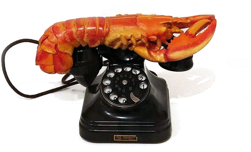
Salvador Dali may be the definitive Surrealist, yet his 1938 Lobster Telephone also ticks the boxes for Pop Art, only way ahead of its time. This satirical readymade sculpture uses recognisable objects to create a visual joke simply by combing them. I’ve stood near this exhibit on several occasions and enjoyed the reactions of many gallery visitors. Toddlers and pensioners alike find it delightfully amusing. They’re drawn to it, passing all the other twentieth-century art surrounding it, and spend time talking, questioning, and smiling. The concepts and context — its Freudian subtext — become irrelevant to their direct engagement with the art. For many, it may be nothing more than a replica crustacean mounted on an antique phone, and that’s enough.
Two popular artists more readily associated with proper Pop Art are Andy Warhol, who imitated fine art with the manufacturing techniques often found in mass media, and Roy Lichtenstein, who imitated the printed medium of comics with his painstakingly precise painterly technique.
Andy Warhol began his career as a graphic designer, catalogue illustrator, and designer of shop window displays. He questioned why some visual artists were denigrated as ‘mere’ crafts-persons when working to a brief, whilst others were lauded as something special when their work was shown in a gallery though valued only by a few critics and collectors. After all, mainstream magazine illustrations, billboard posters, pulp book covers, primetime television shows, and Hollywood movies were by definition reaching and pleasing a wider audience. Weren’t such things more representative of America’s desires and values? Didn’t they say more about the Nation’s cultural identity than framed daubs of paint hanging on the wall of one gallery?
Following this reasoning, Warhol began producing his art using the same technical processes he’d experienced in the commercial sector such as printing and photography — thus rendering the ‘works’ reproducible. This, in turn, placed higher value upon the image rather than the artefact and unleased it from the hand of the artist. He welcomed increasing creative collaboration where the so-called ‘artist’ assumed the role of ‘director’ overseeing a production team or cooperative. In 1962, he founded his famous Factory where numerous artists would work together on Warhol-endorsed projects.
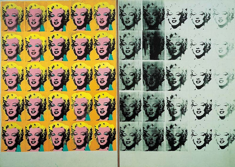
He was obsessed with celebrity, both the famous and infamous, making many prints and paintings that recycled mass media imagery of political leaders, gangsters, and Hollywood stars — notably, his recurring Marilyn series. Warhol expanded into film-making, marketing, distribution, and popular publishing with Interview, the magazine he launched in 1969. He had become a brand. Not unlike Campbell’s Soups, which he helped to immortalise with his 1962 series, (32) Campbell’s Soup Cans.
Whilst this new approach shook-up the art world, and may have seemed rather radical, it was also a rejection of Modernism and a return to the traditional use of recognisable people, places, and objects in art, literally re-presented with a semblance of ‘realism’ that the public could easily relate to.
Much Pop Art deliberately blurred the boundaries of, and merged with, consumer culture, spilling into graphics and product design. So, consumerism threatened to consume the art. By mimicking mass manufacture and commerce, Pop Art ran the risk of becoming indistinguishable from product. Which brings to mind the old adage, “If you’re doing it for the money, then that’s not art. It’s commerce.”
Admittedly, commerce had always been a part of art and some artists, particularly those associated with Pop, reasoned that if art had monetary value, then why not take control of that aspect too, instead of leaving it to the dealers to grow rich on one’s creative labours?
Fair enough. Though this raises the question of what was really of value here. If the artist has to divide their time between making, self-promotion, advertising, maintaining business contacts, distribution, and selling, does that devalue and dilute the core creative process? They become peddlers of products. Some Pop Art practitioners argued that commerce itself is their creative medium and the business aspects were also part of the art. But how could those artists who’d rebelled against elitism and exploitation avoid simply becoming the elite exploiters themselves? …or of themselves?
Despite such dilemmas, one very positive outcome of Pop Art was that commercial artists, illustrators, comic creators, and such, were more readily elevated to the status of ‘artist’. Clearly, the ‘splash page’ of many a graphic novel is superior, on so many levels, when considered side-by-side with most works isolated on the gallery wall. (Not all, of course!)
Which brings us nicely back to Roy Lichtenstein. His approach was varied and included abstract sculpture, architectural murals, and automotive styling, but it was his parodies of panels from comics, often with ironic text, that made him famous. Not without some humour, he would use fine art techniques to document a medium that, at the time, was generally thought of as disposable and lacking artistic merit.
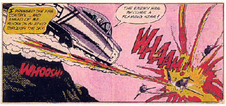
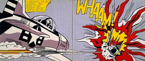
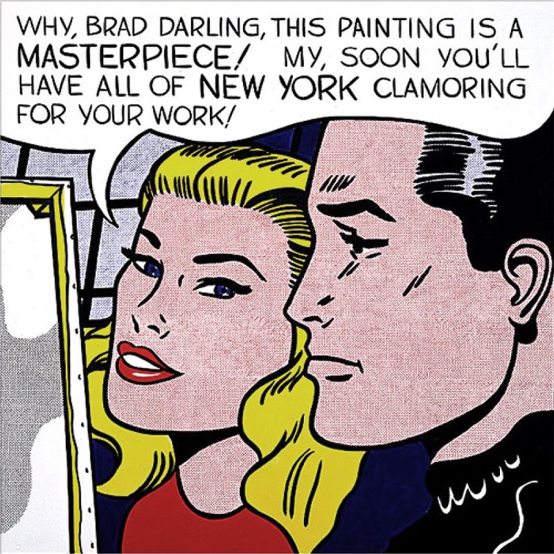
The process of printing comic books utilised tiny spots of pure colour, known as Ben-Day dots, that would blend ‘in the eye’ to create different hues, or even achieve the appearance of ‘flat colour’. Lichtenstein mimicked this technique on an enlarged scale, painting each individual dot by hand, precisely regulating their size with expert control of the brush tip. This harks back to the pioneering Pointillism of Georges-Pierre Seurat but, instead of oils, Lichtenstein often used enamel paints on sheets of steel — materials more often associated with industrial manufacture and household appliances. His best known works offered a commentary on mass media representation of some serious issues, such as military conflict and Cold War propaganda, as in 1963’s Whaam! and the moral duty of art itself in Masterpiece, painted in 1963, which later sold for $165M — the highest price paid for a Lichtenstein to date.
This tendency to appropriate familiar, sometimes ubiquitous, imagery and re-present facsimiles of everyday objects, or even simply the item itself, aligned Pop Art with Nouveau Réalisme — the French answer to Pop Art, which grew out of the Dada ideologies expressed in the work of Marcel Duchamp. Several artists associated with the group would become known as important innovators of Pop Art when they transitioned from Europe to the USA. Among them were Yves Klein, Christo, and Niki de Saint Phalle, who collaborated with the Texan-born artist Robert Rauschenberg several times…
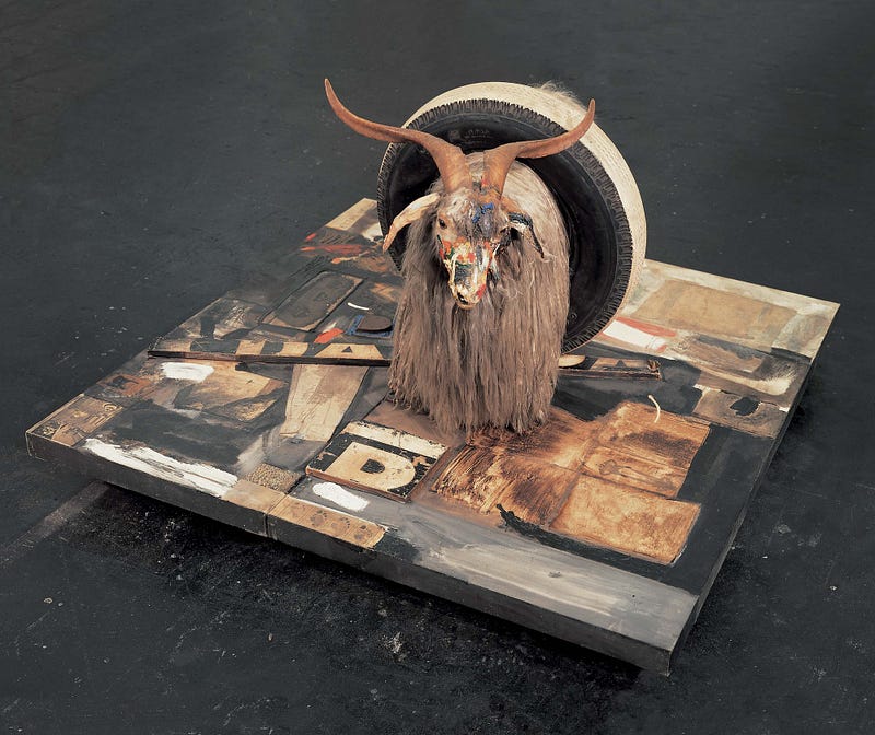
In this third iteration of Monogram by Robert Rauschenberg, a taxidermied angora goat, splashed with colours, wears a car tyre around its midriff and stands atop a Merzbau-Schwittersesque collage of wood, images and text which itself is mounted on casters — like a big square skateboard or small mobile pasture of paint and print.
This is probably the most famous of Rauschenberg’s Combines, in which objects are taken out of their everyday context and placed together in a kind of 3D collage. Rauschenberg built on Duchamp’s concept to create further dialogues between the readymade, found object, organic, inorganic, the natural and artificial, mechanically produced images, printing, intuitive mark-making and broad expressive brushstrokes. He fused sculpture and painting, and incorporated images from art history into collages of utilitarian everyday objects and newspaper images. The collision of these different elements often appeared to create sequences and implied narratives.
The sculptural presence of Monogram has coaxed various interpretations from critics ever since is debut startled art audiences. Generally, it’s thought to represent birth trauma — something we all experience, yet only recall subconsciously in pre-linguistic memories. Also, the ideas of the ‘scapegoat’ and of Biblical sacrifice are insinuated, as if birth leads to a life that constitutes our individual sacrifice to the cosmos, otherwise we act as a scapegoat for the actions of others. Like the aforementioned Lobster Telephone, the viewer need not understand any narrative, context, or art history to have a valid personal response when meeting this artwork.
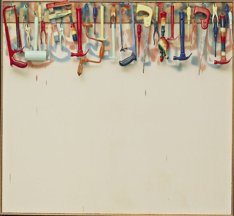
In 1962, with Five Feet of Colorful Tools, Jim Dine also crosses the boundaries between painting, collage and sculpture. We see an almost square canvas, with colourful silhouettes of DIY tools, such as hand saws, hammers, and screwdrivers, stencil-printed onto it along its upper edge. At the top of the canvas is a plank from which the tools hang on hooks. The process is clear, some of the tools were laid in position on the canvas and spray-painted. They were then rearranged as a hanging 3D element with the addition of some unpainted tools.
The use of everyday, recognisable objects and the bright colours places the work in the field of Pop Art and this reflects the majority of works by Dine, which are often very colourful and sometimes use tools as their subject. In this case, the tools seem almost joyous, reflecting the positive action they may play a part in. The potential in the blank canvas speaks of that moment of inspiration when an artist is about to produce a work, rather than the daunt of an empty space. Then, the viewer realises they are looking at the work that was produced — a celebration of process, the journey, the act of creation itself…
This piece represents a general transition from Jim Dine’s early period when he concentrated on Performance Art in the form of ‘Happenings’ that took place within his hurriedly, and often crudely, constructed ‘sets’, to his continual experimentation with techniques and media focused on recognisable items from life and popular culture.
In Colorful Tools we see examples of the instruments that he had often used to make part of his art, but presented here as the art itself. The kit on display is very similar to the kind of tools found in the ‘dens’, sheds and garages of average DIY doers, where they may hang in a similar fashion. Painted in the bright pure colours, these tools look more like toys and this builds links between play, work, and creativity. By using the ‘tools-of-the-trade’ as the subject, Dine is referring to similar art-about-art such as many works by Duchamp, particularly the assemblages and readymades, and also brings to mind George-Pierre Seurat’s politically-charged ‘statement-piece’ of 1888, Models.
The origins of narrative art and comic-books are also discussed by Remy Dean in Signifier
* All images are used with permission or presented here for educational purposes under fair usage policy.


