
Art Can Do
How the Campbell’s soup tin became a Pop icon to rival Marilyn and Elvis…
The humble can of Campbell’s soup was notable even before Andy Warhol made it ‘iconic’ in the 1960s. Over half-a-century earlier, it was one of the earliest examples of deliberate graphic language intended to attract and inform using ‘stealth’ psychology to improve its commercial performance over its competitors — what we now know as ‘packaging design’, a sort of ‘sub-set’ of advertising.
The origins of canned food can be traced back even further, to the Napoleonic Wars in Europe when a very attractive award of 12,000 French Francs was offered for a successful process of preserving food indefinitely. This was to enable the distribution of supplies to the frontlines and keep the soldiers fed. The prize was given to the brewer, Nicolas Appert, in 1809. He devised a way of cooking food in sealed jars which seemed to remain unspoiled until opened — a form of ‘pasteurisation’ decades ahead of Louis Pasteur discovering that microbes caused food to ‘go off’ and that cooking prevented this.
Another Frenchman, Philippe de Girard, was to patent a tin can process just one year later. The innovation of using a metal cannister instead of glass meant that shipping was far more viable for these shiny ‘unbreakable’ capsules. Initially, the biggest demand came from the British armed services and, famously, Sir William Edward Parry, stocked HMS Fury with tinned supplies for his 1824 Arctic exploration mission. This set a trend and tinned food began to be sold to the public, attracted by its novelty and the association with brave explorers.
The use of canned supplies on such military and scientific missions attracted other pioneers and soon caught-on across North America. It’s since become a stereotype that cowboys ate prodigious amounts beans — famously exploited for comedy in the notorious Blazing Saddles (1974) ‘camp-fire’ scene. Indeed, tins of, often pork’n’beans, were a staple of those pushing ‘the frontiers’. A tin was rugged, almost indestructible, and could be placed directly over a fire or in the hot embers to reheat. It was its own pan and serving ‘dish’ in one.
In 1869, Joseph Campbell set-up his food canning factory and began commercial distribution. Some of the first products to come out of the factory were the now famous range of condensed soups. Campbell’s wasn’t the only company offering tinned food via grocery stores and there’s little evidence that his recipe was superior to the competition. Yet Campbell’s soup was to dominate the market and become one of the most recognisable food brands of the twentieth century across the USA. This was down to the innovation in label design.
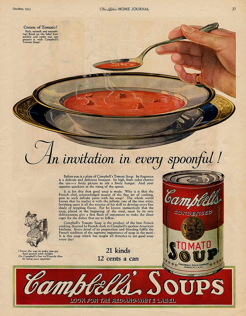
Initial market resistance was mainly due to the notion that a product cooked in vast industrial vats, couldn’t taste anything like homecooked. So, the label featured Mr Campbell’s ‘signature’ in a cursive script. Now, I doubt the public were fooled into thinking each can had been individually signed, but it suggested that a person was proud enough to put his name to the product. A ‘font’ that looked sort of hand-written supported this notion of a homemade ‘personal touch’ and implied superior quality.
Probably, though, the most effective element in the design was the two-tone colour split. Apparently, this was introduced in 1898 after Herberton L. Williams, who would become the company’s assistant general manager, was impressed by how the Cornell football team’s half-and-half, red-and-white strip stood out on the pitch. So, the labels were colour coded likewise.
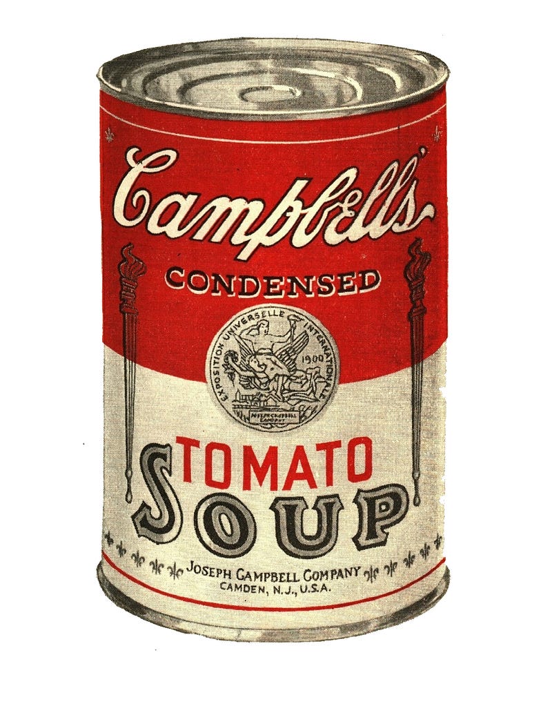
Condensed Tomato soup was the first to be actively marketed and intuitively, a band of ‘flat’ red circled the top half of the can and the lower portion remained white with just a simple red line to balance the composition. The word ‘tomato’ was presented in clean, sans serif typography, implying the ‘modern’ processes used in manufacture, whereas ‘soup’ was in a decorative script typical of contemporary Victoriana signage, representing tradition and reliability.
In 1900, a gold-coloured circular motif that looked like a coat of arms, a medallion, or a coin — all suggestive of endorsement and value — was added to celebrate the gold medal awarded to the Campbell Soup Company at the 1900 Paris Exposition Universelle. The design would be streamlined further in the 1930s as the influence of Art Deco, along with the functional minimalism of Bauhaus graphics, influenced visual culture.
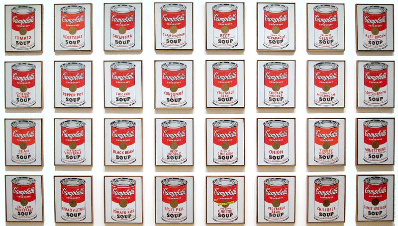
This distinctive design, which set the bar for label graphics, along with the historical associations with cowboys and the founding of the American West, were factors in attracting Andy Warhol’s eye and led to his breakthrough series, (32) Campbell’s Soup Cans, presented in 1962.
Andy Warhol is often heralded as ‘America’s Own’ because he is recognised as an original and a very important artist. From the Renaissance, through Romanticism, to Modernism and Surrealism, most of the earlier ‘ground-breaking’ Western artists had been European. All the major movements had started in Europe. Finally, with Andy Warhol, America had an avant garde artist who was ‘of America’, using familiar visual language from their own culture and not overtly aligned with the usual European precursors of style or technique… though he did owe a great deal to Dada and the Fauves. Unlike his contemporaries at the vanguard of the American Modern, such as Jackson Pollock and Mark Rothko, he veered away from the popular style of abstract expressionism and was stubbornly representational.
Here, he presented a series of paintings that had been executed in a very graphic style that resembled the quality of silk screen prints. Warhol had started his career as an illustrator for advertising and had used a similar clean style to depict a variety of products. His skill as a draughtsman is evident here as these were not printed using the silk screen techniques he would soon turn to, but individually painted by hand. There is some use of stencilling to maintain conformity and the small, repeated fleur de lys is made with a stamper.
In many ways he was picking up on the ideas of Marcel Duchamp, by taking an object from consumer culture and re-presenting it in the context of art. Warhol caused similar controversy, and fuelled this by not being an overtly intellectual theorist. He did not defend his art. He admitted it was shallow. He said there was no hidden meaning. He claimed to be interested only in the surface of things.
This statement has added irony when referring to a thing that functions as a container. Most people would buy a tin of soup for what was inside. The canister is functional and uniform but the surface decoration, the label, also has its function. The outside presents a literal account of what’s inside. So, the ‘portrait’ of a can is far more reliable than the portrait of a person.
What does Warhol’s other iconography, from the same period, featuring the likes of Marilyn Monroe and Elvis Presley tell us about the interior of those individuals? Does the art give any clue to their human ‘ingredients’ — thoughts, memories, emotions, or even how their biology was ticking along?
Perhaps this was the motivation behind producing a variant showing a can with ripped label, effectively disrupting the distinctive individuality of the brand and revealing the bland uniformity beneath…
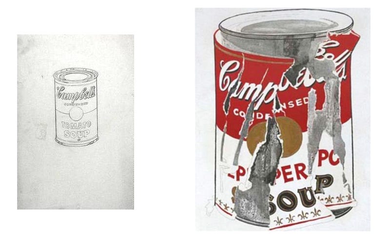
This incongruous painting, Small Torn Campbell’s Soup Can (Pepper Pot) was produced alongside the original series in 1962. Four decades later, in 2006, it reputedly sold for nearly $12 million. Warhol had always been amused that prices paid for his simplified images of everyday things were vastly higher than the cost of buying the authentic ‘original’ items they depicted.
Andy Warhol could be considered the definitive Pop artist. He took objects and iconography from mainstream, popular culture and used them in his visual language. By doing this, Pop artists were combatting the elitist approach to art, using recognisable and familiar symbols that did not alienate the everyday audience.
If Warhol’s art was criticised for being shallow, then this only reflected the depth of mainstream American culture — or lack of. If the accepted everyday visual language of a culture, democratically selected through mass media and capitalist processes cannot say anything deep about the culture that selects it, then that verdict should be accepted. (Andy Warhol would not like that reasoning, because it sounds too cerebral and elitist. Sorry, Andy.)
The British beginnings of Pop Art and the golden age of Pop Art in the USA are also discussed by Remy Dean in Signifier.
* All images used here with license or for educational purposes under fair usage policy.


_1962_Pencil_on_paper.jpg)
,_1962.jpg)