
NVDA Technical Analysis using 75 Simplified FinTA Indicators

- In this project, we’ll implement, simplify and test a technical analysis module integrating standalone Python functions available through the FinTA library [1–4] (read more here).
- Our technical challenge is three-fold:
- Firstly, the proposed technical analysis tool should not require an installation and import of FinTA.
- Secondly, algo-traders should be able to use the above functions to generate 75 popular trading indicators directly without having to match all FinTA dependencies in their projects.
- Thirdly, we’ll strengthen our message by creating powerful, yet simple data visualizations using Pandas, Matplotlib and Plotly libraries. Charts can be a great way to illustrate trends in stocks.
Business Goal:
- We’ll attempt to find patterns in charts of the NVDA stock using a huge array of different technical indicators.
- Our focus on trends in prices and trading volume. It helps traders identify areas where there may be potential opportunities for profit or risk reduction, as well as warning signs to avoid.
Why NVDA:
- The demand for GPUs is indeed massive, which provides NVDA with wide opportunities to continue capitalizing on the demand spike. Recall that NVDA dominates the GPU market with a staggering 82% market share. And NVDA’s H100 GPUs are even called the “gold standard” of generative AI workloads.
- NVDA delivered another staggering quarter on 2/21/2024, topping consensus estimates by a wide margin.
- It seems like the rapid adoption of ChatGPT in recent years opened eyes to corporate leaders on capabilities of AI, and now we are in a big “AI race”.
- It is also important that NVDA is not only a company that sells AI chipsets, but provides an ecosystem with software, tools, and libraries. Providing ecosystem instead of just selling chipsets increases switching costs for customers.
- These points express our optimism about the ability of NVDA to sustain its leadership in the tech sector.
Let’s get down to the nuts & bolts of our methodology illustrated by the in-depth NVDA technical analysis.
Imports & Settings
- Setting the working directory YOURPATH, importing the necessary libraries and ignoring warnings
import os
os.chdir('YOURPATH')    # Set working directory
os. getcwd()

#Import Libraries
import pandas as pd
import numpy as np

import matplotlib.pyplot as plt
import seaborn as sns
sns.set_style('whitegrid')
plt.style.use("fivethirtyeight")
%matplotlib inline

# For reading stock data from yahoo


import yfinance as yf

# For time stamps
from datetime import datetime
from math import sqrt
from math import sqrt
from sklearn.metrics import mean_squared_error
from sklearn.preprocessing import MinMaxScaler

#ignore the warnings
import warnings
warnings.filterwarnings('ignore')
Input Stock Data
- Using yfinance to read the NVDA historical data
symbols = ['NVDA']
start_date = '2023-01-01'

data = yf.download(symbols, start=start_date)
data.tail()

[*********************100%%**********************]  1 of 1 completed
           Open       High       Low        Close     Adj Close   Volume
Date
2024-06-21 127.120003 130.630005 124.300003 126.570000 126.570000 655484700
2024-06-24 123.239998 124.459999 118.040001 118.110001 118.110001 476060900
2024-06-25 121.199997 126.500000 119.320000 126.089996 126.089996 425787500
2024-06-26 126.129997 128.119995 122.599998 126.400002 126.400002 362975900
2024-06-27 124.099998 126.410004 122.919998 123.989998 123.989998 251669500
2024-06-28 124.574997 127.709999 122.889999 124.375000 124.375000 188174904
SMA Indicator
- Moving averages are one of the core indicators in technical analysis.
- Simple Moving Average (SMA) is simply the rolling average price over the specified period.
def SMA(ohlc, period= 41, column="Close"):
        """
        Simple moving average - rolling mean in pandas lingo. Also known as 'MA'.
        The simple moving average (SMA) is the most basic of the moving averages used for trading.
        """

        return pd.Series(
            ohlc[column].rolling(window=period).mean(),
            name="{0} period SMA".format(period),
        )

plt.figure(figsize=(10,6))
data['SMA20']=SMA(data, period=20, column="Close")
data['SMA50']=SMA(data, period=50, column="Close")
data['Close'].plot(label='Close')
data['SMA20'].plot(label='SMA20')
data['SMA50'].plot(label='SMA50')
plt.ylabel('Price USD')
plt.title('NVDA SMA20-50')
plt.legend()
- SMAs are often used to determine trend direction. If the SMA is moving up, the trend is up. If the SMA is moving down, the trend is down. A 200-bar SMA is common proxy for the long term trend. 50-bar SMAs are typically used to gauge the intermediate trend. Shorter period SMAs can be used to determine shorter term trends.
SMM Indicator
- Where a moving average filter takes the arithmetic mean of the input over a moving sample window, a median filter takes a median instead. The median filter is most-useful for removing occasional outliers from an input stream.
- The Simple Moving Median (SMM) of an array A returns an array of local k-point median values, where each median is calculated over a sliding window of length k across neighboring elements of A.
- The SMM is a central tendency which is calculated over a sliding window of price bars or indicator values. The median is the numeric value separating the higher from the lower half of the data set built from the input series over the selected window.
def SMM(ohlc, period= 9, column= "Close"):
        """
        Simple moving median, an alternative to moving average. SMA, when used to estimate the underlying trend in a time series,
        is susceptible to rare events such as rapid shocks or other anomalies. A more robust estimate of the trend is the simple moving median over n time periods.
        """

        return pd.Series(
            ohlc[column].rolling(window=period).median(),
            name="{0} period SMM".format(period),
        )

plt.figure(figsize=(10,6))
data['SMM20']=SMM(data, period=20, column="Close")
data['SMM50']=SMM(data, period=50, column="Close")
data['Close'].plot(label='Close')
data['SMM20'].plot(label='SMM20')
data['SMM50'].plot(label='SMM50')
plt.ylabel('Price USD')
plt.title('NVDA SMM20-50')
plt.legend()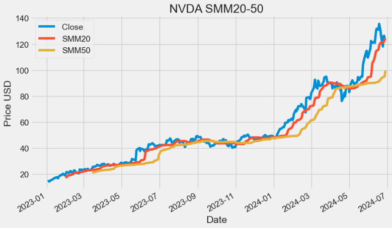
SSMA Indicator
- Smoothed Simple Moving Average (SSMA) and SMA are two popular technical indicators used in technical analysis. The primary difference between the two is that SMA places equal weight on each data point, while SSMA places more emphasis on recent data points.
def SSMA(ohlc,period = 9, column = "Close",adjust = True):
        """
        Smoothed simple moving average.

        :param ohlc: data
        :param period: range
        :param column: open/close/high/low column of the DataFrame
        :return: result Series
        """

        return pd.Series(
            ohlc[column]
            .ewm(ignore_na=False, alpha=1.0 / period, min_periods=0, adjust=adjust)
            .mean(),
            name="{0} period SSMA".format(period),
        )

plt.figure(figsize=(10,6))
data['SSMA20']=SSMA(data, period=20, column="Close",adjust=True)
data['SSMA50']=SSMA(data, period=50, column="Close",adjust=True)
data['Close'].plot(label='Close')
data['SSMA20'].plot(label='SSMA20')
data['SSMA50'].plot(label='SSMA50')
plt.ylabel('Price USD')
plt.title('NVDA SSMA20-50')
plt.legend()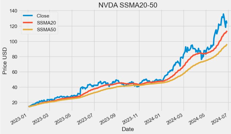
- As we can see from the above plot, the main advantage of SSMA is that it removes short-term fluctuations, and allows us to view the price trends much easier, which is why they are widely used in trending markets.
- Even more than the SMA, the SMMA ensures that temporary fluctuations in price (also known as ‘noise’) are filtered out. In this way, the SMMA succeeds — better than the other MAs — in visualizing the prevailing trend.
EMA Indicator
- An exponential moving average (EMA) is a type of moving average (MA) that places a greater weight and significance on the most recent data points.
- Like all MA, EMA is used to produce buy and sell signals based on crossovers and divergences from the historical average.
- Traders often use several different EMA lengths, such as 20-day, 50-day, and 200-day moving averages.
def EMA(ohlc,period = 9,column = "Close", adjust = True):
        """
        Exponential Weighted Moving Average - Like all moving average indicators, they are much better suited for trending markets.
        When the market is in a strong and sustained uptrend, the EMA indicator line will also show an uptrend and vice-versa for a down trend.
        EMAs are commonly used in conjunction with other indicators to confirm significant market moves and to gauge their validity.
        """

        return pd.Series(
            ohlc[column].ewm(span=period, adjust=adjust).mean(),
            name="{0} period EMA".format(period),
        )

plt.figure(figsize=(10,6))
data['EMA20']=EMA(data, period=20, column="Close",adjust=True)
data['EMA50']=EMA(data, period=50, column="Close",adjust=True)
data['Close'].plot(label='Close')
data['EMA20'].plot(label='EMA20')
data['EMA50'].plot(label='EMA50')
plt.ylabel('Price USD')
plt.title('NVDA EMA20-50')
plt.legend()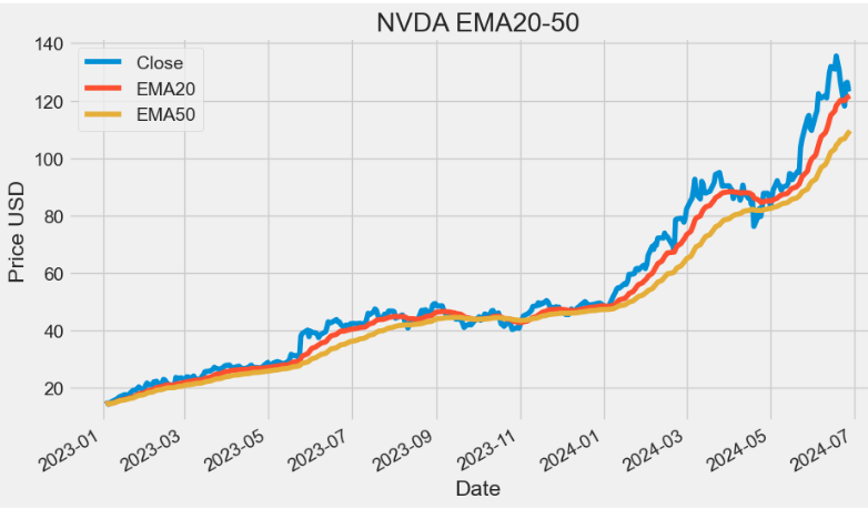
- The aim of EMA is to establish the direction in which the price of a security is moving based on past prices. Therefore, EMA is a lag indicator.
- EMA is not predictive of future prices; it simply highlights the trend that is being followed by the stock price.
- Advantages of Using the EMA:
- Firstly, it provides accurate signal identification by weighing recent price data more heavily than older data, reflecting the current market sentiment more accurately.
- Secondly, it reduces lag time in trend identification, allowing traders to enter and exit positions more quickly.
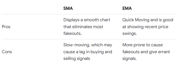
- Simple vs. Exponential Moving Averages:
DEMA Indicator
- The double exponential moving average (DEMA) is a technical indicator devised to reduce the lag in the results produced by a traditional MA. Technical traders use it to lessen the amount of “noise” that can distort the movements on a price chart.
def DEMA(ohlc,period = 9,column = "Close",adjust = True):
        """
        Double Exponential Moving Average - attempts to remove the inherent lag associated to Moving Averages
         by placing more weight on recent values. The name suggests this is achieved by applying a double exponential
        smoothing which is not the case. The name double comes from the fact that the value of an EMA (Exponential Moving Average) is doubled.
        To keep it in line with the actual data and to remove the lag the value 'EMA of EMA' is subtracted from the previously doubled EMA.
        Because EMA(EMA) is used in the calculation, DEMA needs 2 * period -1 samples to start producing values in contrast to the period
        samples needed by a regular EMA
        """

        DEMA = (
            2 * EMA(ohlc, period)
            - EMA(ohlc, period).ewm(span=period, adjust=adjust).mean()
        )

        return pd.Series(DEMA, name="{0} period DEMA".format(period))

plt.figure(figsize=(10,6))
data['DEMA20']=DEMA(data, period=20, column="Close",adjust=True)
data['DEMA50']=DEMA(data, period=50, column="Close",adjust=True)
data['Close'].plot(label='Close')
data['DEMA20'].plot(label='DEMA20')
data['DEMA50'].plot(label='DEMA50')
plt.ylabel('Price USD')
plt.title('NVDA DEMA20-50')
plt.legend()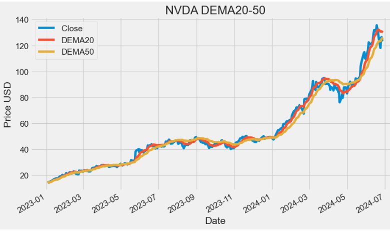
- TradingView: The DEMA was developed by Patrick Mulloy for the purpose of reducing lag and increasing responsiveness. This fast-acting MA allows traders to spot trend reversals quickly, resulting in better entries into newly formed trends. The indicator is obviously based on the EMA but it follows the price more closely.
- Its calculation and usage somewhat resemble the Hull Moving Average (HMA). It helps traders spot the prevailing trend and is often used in combination with other signals and analysis techniques.
TEMA Indicator
- The triple exponential moving average, TEMA, is a trend following indicator used by analysts. It is formulated by creating multiple EMA of the original EMA to reduce some of the lag. It helps to reduce price volatility to make the trend easier to identify.
def TEMA(ohlc, period = 9, adjust = True):
        """
        Triple exponential moving average - attempts to remove the inherent lag associated to Moving Averages by placing more weight on recent values.
        The name suggests this is achieved by applying a triple exponential smoothing which is not the case. The name triple comes from the fact that the
        value of an EMA (Exponential Moving Average) is triple.
        To keep it in line with the actual data and to remove the lag the value 'EMA of EMA' is subtracted 3 times from the previously tripled EMA.
        Finally 'EMA of EMA of EMA' is added.
        Because EMA(EMA(EMA)) is used in the calculation, TEMA needs 3 * period - 2 samples to start producing values in contrast to the period samples
        needed by a regular EMA.
        """

        triple_ema = 3 * EMA(ohlc, period)
        ema_ema_ema = (
            EMA(ohlc, period)
            .ewm(ignore_na=False, span=period, adjust=adjust)
            .mean()
            .ewm(ignore_na=False, span=period, adjust=adjust)
            .mean()
        )

        TEMA = (
            triple_ema
            - 3 * EMA(ohlc, period).ewm(span=period, adjust=adjust).mean()
            + ema_ema_ema
        )

        return pd.Series(TEMA, name="{0} period TEMA".format(period))

plt.figure(figsize=(10,6))
data['TEMA20']=TEMA(data, period=20, adjust=True)
data['TEMA50']=TEMA(data, period=50, adjust=True)
data['Close'].plot(label='Close')
data['TEMA20'].plot(label='TEMA20')
data['TEMA50'].plot(label='TEMA50')
plt.ylabel('Price USD')
plt.title('NVDA TEMA20-50')
plt.legend()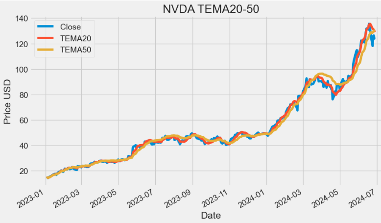
TRIMA Indicator
- The triangular moving average (TMA) is a weighted average of the last n prices (P), whose result is equivalent to a double smoothed simple moving average: SMA = (P1 + P2 + P3 + P4 + … + Pn) / n.
- The TRIMA is simply the SMA of the SMA — a double-smoothed simple moving average . The end effect of the double smoothing is that greater weight is placed on values near the middle of the lookback period. It therefore reacts relatively slowly to price changes compared to most moving averages.
def TRIMA(ohlc, period = 18):
        """
        The Triangular Moving Average (TRIMA) [also known as TMA] represents an average of prices,
        but places weight on the middle prices of the time period.
        The calculations double-smooth the data using a window width that is one-half the length of the series.
        source: https://www.thebalance.com/triangular-moving-average-tma-description-and-uses-1031203
        """

        mysma=SMA(ohlc, period).rolling(window=period).sum()

        return pd.Series(mysma/ period, name="{0} period TRIMA".format(period))

plt.figure(figsize=(10,6))
data['TRIMA20']=TRIMA(data, period=20)
data['TRIMA50']=TRIMA(data, period=50)
data['Close'].plot(label='Close')
data['TRIMA20'].plot(label='TRIMA20')
data['TRIMA50'].plot(label='TRIMA50')
plt.ylabel('Price USD')
plt.title('NVDA TRIMA20-50')
plt.legend()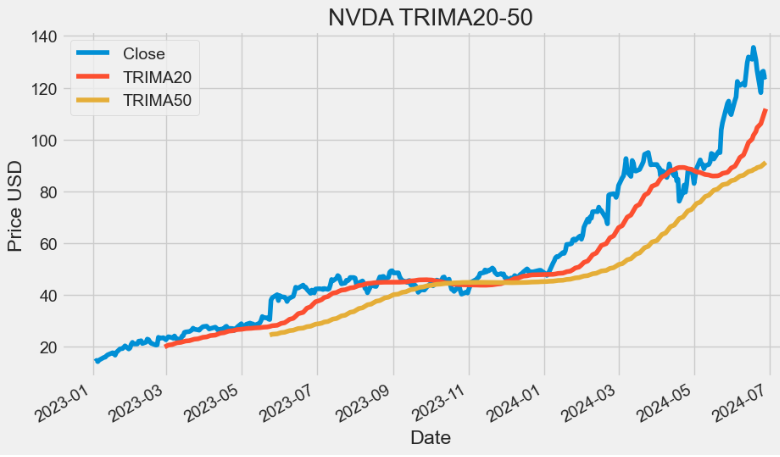
TRIX Indicator
- The triple exponential average (TRIX) is a momentum indicator used by technical traders. It shows the percentage change in a moving average that has been smoothed exponentially three times.
- Two main advantages of TRIX over other trend-following indicators are its excellent filtration of market noise and its tendency to be a leading than lagging indicator. It filters out market noise using the triple exponential average calculation, thus eliminating minor short-term cycles that indicate a change in market direction. It has the ability to lead a market because it measures the difference between each bar’s “smoothed” version of the price information. When interpreted as a leading indicator, TRIX is best used in conjunction with another market-timing indicator — this minimizes false indications.
def TRIX(ohlc,period = 20,column = "Close",adjust = True):
        """
        The TRIX indicator calculates the rate of change of a triple exponential moving average.
        The values oscillate around zero. Buy/sell signals are generated when the TRIX crosses above/below zero.
        A (typically) 9 period exponential moving average of the TRIX can be used as a signal line.
        A buy/sell signals are generated when the TRIX crosses above/below the signal line and is also above/below zero.

        The TRIX was developed by Jack K. Hutson, publisher of Technical Analysis of Stocks & Commodities magazine,
        and was introduced in Volume 1, Number 5 of that magazine.
        """

        data = ohlc[column]

        def _ema(data, period, adjust):
            return pd.Series(data.ewm(span=period, adjust=adjust).mean())

        m = _ema(_ema(_ema(data, period, adjust), period, adjust), period, adjust)

        return pd.Series(100 * (m.diff() / m), name="{0} period TRIX".format(period))

plt.figure(figsize=(10,6))
data['TRIX20']=TRIX(data, period=20,column = "Close")
data['TRIX20'].plot(label='TRIX20')
plt.title('NVDA TRIX20')
plt.legend()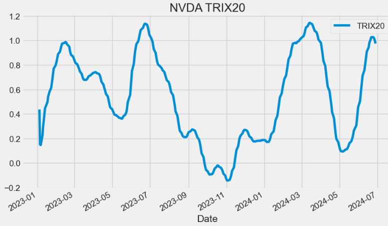
- In fact, TRIX can be used as both a trend following indicator and as an oscillator.
- As a trend following indicator, TRIX>0 values imply that an uptrend is in place whereas TRIX<0 values denote that a downtrend is in place in the market.
- When TRIX values run along the 0 value (centerline), it implies that the market stance is neutral.
- As an oscillator, TRIX is used to watch out for overbought and oversold conditions in the market. Extreme positive values denote overbought conditions, while extreme negative values denote oversold conditions in the market.
VAMA Indicator
- Volume Adjusted Moving Average (VAMA) is a technical indicator that combines price and volume when computing the average.
def VAMA(ohlcv,period = 8, column = "Close",colvol="Volume"):
        """
        Volume Adjusted Moving Average
        """

        vp = ohlcv[colvol] * ohlcv[column]
        volsum = ohlcv[colvol].rolling(window=period).mean()
        volRatio = pd.Series(vp / volsum, name="VAMA")
        cumSum = (volRatio * ohlcv[column]).rolling(window=period).sum()
        cumDiv = volRatio.rolling(window=period).sum()

        return pd.Series(cumSum / cumDiv, name="{0} period VAMA".format(period))

plt.figure(figsize=(10,6))
data['VAMA20']=VAMA(data, period=20,column = "Close",colvol="Volume")
data['VAMA50']=VAMA(data, period=50,column = "Close",colvol="Volume")
data['Close'].plot(label='Close')
data['VAMA20'].plot(label='VAMA20')
data['VAMA50'].plot(label='VAMA50')
plt.ylabel('Price USD')
plt.title('NVDA VAMA20-50')
plt.legend()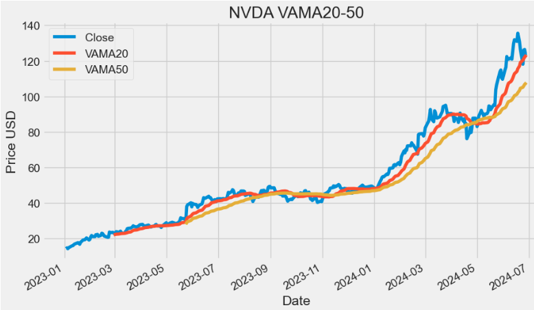
- VAMA utilizes a period length that is based on volume increments rather than time.
- As with any MA, the VAMA can be used to detect turning points on the market. This can be done by identifying crossover points between slow and fast VAMAs for the same stock.
(K)ER Indicator
- The Kaufman Efficiency Ratio (ER) Indicator provides insights to assess trend efficiency and understand the speed of price movements relative to market volatility. It is used to identify bullish trends and filter out erratic entry signals.
def ER(ohlc, period = 10, column = "Close"):
        """The Kaufman Efficiency indicator is an oscillator indicator that oscillates between +100 and -100, where zero is the center point.
         +100 is upward forex trending market and -100 is downwards trending markets."""

        change = ohlc[column].diff(period).abs()
        volatility = ohlc[column].diff().abs().rolling(window=period).sum()

        return pd.Series(change / volatility, name="{0} period ER".format(period))

plt.figure(figsize=(10,6))
data['ER20']=ER(data, period=20,column = "Close")
data['ER20'].plot(label='ER20')
plt.title('NVDA ER20')
plt.legend()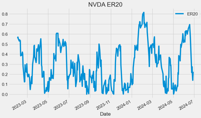
- The center point is 0. +1 indicates a financial instrument with a perfectly efficient upward trend.
- A buy signal is generated after the indicator crosses above +0,6.
KAMA Indicator
- The Kaufman’s Adaptive Moving Average (KAMA) indicator accounts not only for price action but also for market volatility. One of the primary weaknesses of traditional MA is that when used for trading signals, they tend to generate many false signals. The KAMA indicator seeks to lessen this tendency — generate fewer false signals — by not responding to short-term, insignificant price movements.
def KAMA(ohlc,er= 10,ema_fast = 2,ema_slow = 30,period = 20,column = "Close"):
        """Developed by Perry Kaufman, Kaufman's Adaptive Moving Average (KAMA) is a moving average designed to account for market noise or volatility.
        Its main advantage is that it takes into consideration not just the direction, but the market volatility as well."""

        er = ER(ohlc, er)
        fast_alpha = 2 / (ema_fast + 1)
        slow_alpha = 2 / (ema_slow + 1)
        sc = pd.Series(
            (er * (fast_alpha - slow_alpha) + slow_alpha) ** 2,
            name="smoothing_constant",
        )  ## smoothing constant

        sma = pd.Series(
            ohlc[column].rolling(period).mean(), name="SMA"
        )  ## first KAMA is SMA
        kama = []
        # Current KAMA = Prior KAMA + smoothing_constant * (Price - Prior KAMA)
        for s, ma, price in zip(
            sc.items(), sma.shift().items(), ohlc[column].items()
        ):
            try:
                kama.append(kama[-1] + s[1] * (price[1] - kama[-1]))
            except (IndexError, TypeError):
                if pd.notnull(ma[1]):
                    kama.append(ma[1] + s[1] * (price[1] - ma[1]))
                else:
                    kama.append(None)

        sma["KAMA"] = pd.Series(
            kama, index=sma.index, name="{0} period KAMA.".format(period)
        )  ## apply the kama list to existing index
        return sma["KAMA"]

plt.figure(figsize=(10,6))
data['KAMA']=KAMA(data,er= 10,ema_fast = 2,ema_slow = 30,period = 20,column = "Close")
data['Close'].plot(label='Close')
data['KAMA'].plot(label='KAMA')
plt.ylabel('Price USD')
plt.title('NVDA KAMA 10-2-30-20')
plt.legend()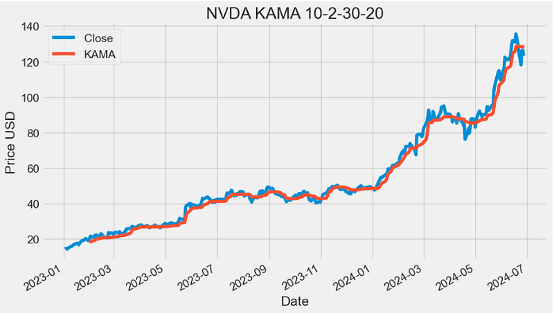
- One of the uses of KAMA is to identify the general trend of current market price action. Basically, when the KAMA indicator line is moving lower, it indicates the existence of a downtrend. On the other hand, when the KAMA line is moving higher, it shows an uptrend. As compared to the SMA, the KAMA indicat\or is less likely to generate false signals that may cause a trader to incur losses.
- Read more about KAMA here.
ZLEMA Indicator
- The Zero Lag Exponential Moving Average (ZLEMA) is a technical analysis indicator that is used to smoothen out price fluctuations and provide traders with a clearer view of market trends.
- Unlike traditional moving averages, the ZLEMA uses a complex formula that minimizes lag and provides traders with real-time market information.
  def ZLEMA(ohlc,period = 26,adjust = True,column = "Close"):
        """ZLEMA is an abbreviation of Zero Lag Exponential Moving Average. It was developed by John Ehlers and Rick Way.
        ZLEMA is a kind of Exponential moving average but its main idea is to eliminate the lag arising from the very nature of the moving averages
        and other trend following indicators. As it follows price closer, it also provides better price averaging and responds better to price swings."""

        lag = (period - 1) / 2

        ema = pd.Series(
            (ohlc[column] + (ohlc[column].diff(lag))),
            name="{0} period ZLEMA.".format(period),
        )

        zlema = pd.Series(
            ema.ewm(span=period, adjust=adjust).mean(),
            name="{0} period ZLEMA".format(period),
        )

        return zlema

plt.figure(figsize=(10,6))
data['ZLEMA20']=ZLEMA(data,period = 20,adjust = True,column = "Close")
data['ZLEMA50']=ZLEMA(data,period = 50,adjust = True,column = "Close")
data['Close'].plot(label='Close')
data['ZLEMA20'].plot(label='ZLEMA20')
data['ZLEMA50'].plot(label='ZLEMA50')
plt.ylabel('Price USD')
plt.title('NVDA ZLEMA20-50')
plt.legend()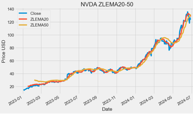
- Read more about ZLEMA here.
WMA Indicator
- Weighted Moving Average (WMA) assigns a heavier weighting to more current data points since they are more relevant than data points from the more remote past. The sum of the weighting should add up to one (or 100%). For SMA, the weightings are equally distributed.
def WMA(ohlc, period = 9, column = "Close"):
        """
        WMA stands for weighted moving average. It helps to smooth the price curve for better trend identification.
        It places even greater importance on recent data than the EMA does.

        :period: Specifies the number of Periods used for WMA calculation
        """

        d = (period * (period + 1)) / 2  # denominator
        weights = np.arange(1, period + 1)

        def linear(w):
            def _compute(x):
                return (w * x).sum() / d

            return _compute

        _close = ohlc[column].rolling(period, min_periods=period)
        wma = _close.apply(linear(weights), raw=True)

        return pd.Series(wma, name="{0} period WMA.".format(period))

plt.figure(figsize=(10,6))
data['WMA20']=WMA(data,period = 20,column = "Close")
data['WMA50']=WMA(data,period = 50,column = "Close")
data['Close'].plot(label='Close')
data['WMA20'].plot(label='WMA20')
data['WMA50'].plot(label='WMA50')
plt.ylabel('Price USD')
plt.title('NVDA WMA20-50')
plt.legend()
- The WMA method is a form of technical analysis that is used by traders to identify trends. Additionally, it can be used as a filter for price action and as an indicator of trend direction. It can also be used as a way to identify support and resistance levels on a chart.
- The WMA can be used in conjunction with other indicators such as the Moving Average Convergence Divergence (MACD) and Relative Strength Index (RSI) to help traders make more informed trading decisions.
HMA Indicator
- The Hull Moving Average (HMA) is a technical analysis tool that measures the average price of an asset over a period of time. In contrast to traditional moving averages (MA), the indicator aims to minimize the noise and smooth price fluctuations.
def HMA(ohlc, period = 16):
        """
        HMA indicator is a common abbreviation of Hull Moving Average.
        The average was developed by Allan Hull and is used mainly to identify the current market trend.
        Unlike SMA (simple moving average) the curve of Hull moving average is considerably smoother.
        Moreover, because its aim is to minimize the lag between HMA and price it does follow the price activity much closer.
        It is used especially for middle-term and long-term trading.
        :period: Specifies the number of Periods used for WMA calculation
        """

        import math

        half_length = int(period / 2)
        sqrt_length = int(math.sqrt(period))

        wmaf = WMA(ohlc, period=half_length)
        wmas = WMA(ohlc, period=period)
        ohlc["deltawma"] = 2 * wmaf - wmas
        hma = WMA(ohlc, column="deltawma", period=sqrt_length)

        return pd.Series(hma, name="{0} period HMA.".format(period))

plt.figure(figsize=(10,6))
data['HMA20']=HMA(data,period = 20)
data['HMA50']=HMA(data,period = 50)
data['Close'].plot(label='Close')
data['HMA20'].plot(label='HMA20')
data['HMA50'].plot(label='HMA50')
plt.ylabel('Price USD')
plt.title('NVDA HMA20-50')
plt.legend()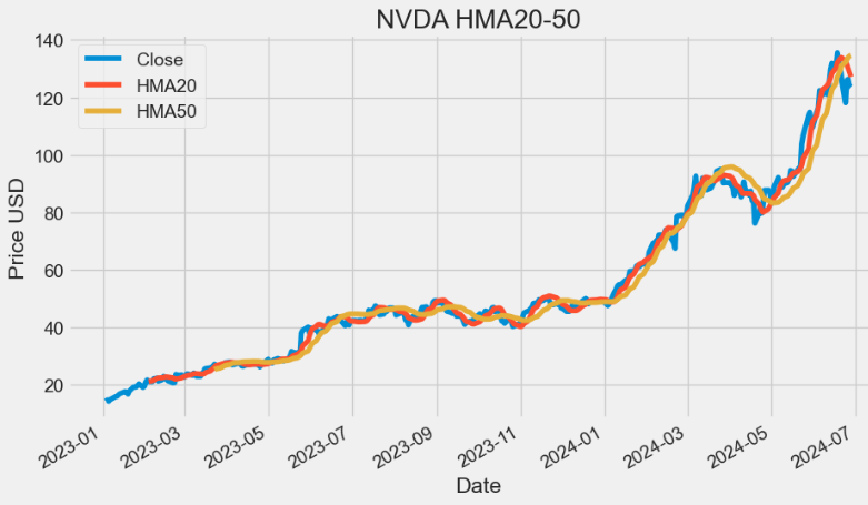
eVWMA Indicator
- Elastic Volume Weighted Moving Average (eVWMA) is a statistical measure using the volume to define the period of the moving average. It incorporates volume information in a natural and logical way. The eVWMA can be looked at as an approximation to the average price paid per share. The ability to “Use Average Volume” as your volume period, makes this indicator both symbol-independent and timeframe independent. This allows the use to switch both timeframe and symbol without having to change the volume period.
def EVWMA(ohlcv, period = 20,column = "Close",colvol="Volume"):
        """
        The eVWMA can be looked at as an approximation to the
        average price paid per share in the last n periods.

        :period: Specifies the number of Periods used for eVWMA calculation
        """

        vol_sum = (
            ohlcv[colvol].rolling(window=period).sum()
        )  # floating shares in last N periods

        x = (vol_sum - ohlcv[colvol]) / vol_sum
        y = (ohlcv[colvol] * ohlcv[column]) / vol_sum

        evwma = [0]


        for x, y in zip(x.fillna(0).items(), y.items()):
            if x[1] == 0 or y[1] == 0:
                evwma.append(0)
            else:
                evwma.append(evwma[-1] * x[1] + y[1])

        return pd.Series(
            evwma[1:], index=ohlcv.index, name="{0} period EVWMA.".format(period),
        )

plt.figure(figsize=(10,6))
data['EVWMA20']=EVWMA(data,period = 20,column = "Close",colvol="Volume")
data['EVWMA50']=EVWMA(data,period = 50,column = "Close",colvol="Volume")
data['Close'].plot(label='Close')
data['EVWMA20'].plot(label='EVWMA20')
data['EVWMA50'].plot(label='EVWMA50')
plt.ylabel('Price USD')
plt.title('NVDA EVWMA20-50')
plt.legend()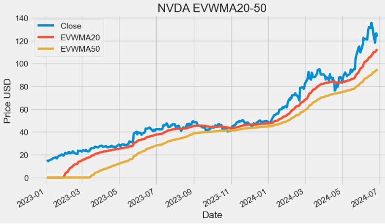
VWAP Indicator
- Volume-Weighted Average Price (VWAP) is the average price of a stock weighted by volume. By monitoring VWAP, a trader might get an idea of a stock’s liquidity and the price buyers and sellers agree is fair at a specific time. The VWAP indicator can be used by day traders to monitor intraday price movement. Institutions and algorithms might use VWAP to figure out the average price of large orders.
def TP(ohlc,open="Open",close="Close",high="High",low="Low"):
        """Typical Price refers to the arithmetic average of the high, low, and closing prices for a given period."""

        return pd.Series((ohlc[high] + ohlc[low] + ohlc[close]) / 3, name="TP")


def VWAP(ohlcv,colvol="Volume"):
        """
        The volume weighted average price (VWAP) is a trading benchmark used especially in pension plans.
        VWAP is calculated by adding up the dollars traded for every transaction (price multiplied by number of shares traded) and then dividing
        by the total shares traded for the day.
        """

        return pd.Series(
            ((ohlcv[colvol] * TP(ohlcv,open="Open",close="Close",high="High",low="Low")).cumsum()) / ohlcv[colvol].cumsum(),
            name="VWAP.",
        )

plt.figure(figsize=(10,6))
data['VWAP']=VWAP(data,colvol="Volume")
data['Close'].plot(label='Close')
data['VWAP'].plot(label='VWAP')
plt.ylabel('Price USD')
plt.title('NVDA VWAP')
plt.legend()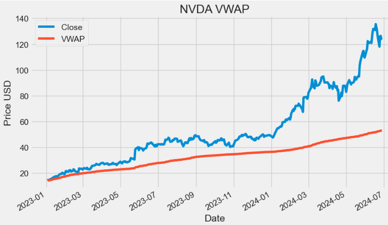
FRAMA Indicator
- Fractal Adaptive Moving Average (FRAMA) is designed to adapt to market conditions, providing traders with a versatile tool for trend identification and smoother price tracking.
 def FRAMA(ohlc, period = 16, batch =10,column = "Close"):
        """Fractal Adaptive Moving Average
        Source: http://www.stockspotter.com/Files/frama.pdf
        Adopted from: https://www.quantopian.com/posts/frama-fractal-adaptive-moving-average-in-python

        :period: Specifies the number of periods used for FRANA calculation
        :batch: Specifies the size of batches used for FRAMA calculation
        """

        assert period % 2 == 0, print("FRAMA period must be even")

        c = ohlc[column].copy()
        window = batch * 2

        hh = c.rolling(batch).max()
        ll = c.rolling(batch).min()

        n1 = (hh - ll) / batch
        n2 = n1.shift(batch)

        hh2 = c.rolling(window).max()
        ll2 = c.rolling(window).min()
        n3 = (hh2 - ll2) / window

        # calculate fractal dimension
        D = (np.log(n1 + n2) - np.log(n3)) / np.log(2)
        alp = np.exp(-4.6 * (D - 1))
        alp = np.clip(alp, .01, 1).values

        filt = c.values
        for i, x in enumerate(alp):
            cl = c.values[i]
            if i < window:
                continue
            filt[i] = cl * x + (1 - x) * filt[i - 1]

        return pd.Series(filt, index=ohlc.index, name="{0} period FRAMA.".format(period))

plt.figure(figsize=(10,6))
data['FRAMA20']=FRAMA(data,period = 20,column = "Close")
data['Close'].plot(label='Close')
data['FRAMA20'].plot(label='FRAMA20')
plt.ylabel('Price USD')
plt.title('NVDA FRAMA20')
plt.legend()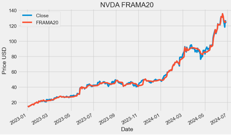
- TradingView:
- The practical application of MAs often involves a tradeoff between the amount of smoothness required and the amount of lag that can be tolerated. MAs have this problem because the price data is not stationary, and may have different bandwidths over different time intervals.
- FRAMA has been developed based on price statistics and the cyclic content of the price data. It rapidly follows significant changes in price but becomes very flat in congestion zones so that bad whipsaw trades can be eliminated.
MACD Indicator
- Moving average convergence/divergence (MACD) is a trend-following momentum indicator that helps investors identify price trends, measure trend momentum, and identify market entry points for buying or selling.
def MACD(ohlc, period_fast = 12, period_slow = 26,signal = 9,column = "Close",adjust = True):
        """
        MACD, MACD Signal and MACD difference.
        The MACD Line oscillates above and below the zero line, which is also known as the centerline.
        These crossovers signal that the 12-day EMA has crossed the 26-day EMA. The direction, of course, depends on the direction of the moving average cross.
        Positive MACD indicates that the 12-day EMA is above the 26-day EMA. Positive values increase as the shorter EMA diverges further from the longer EMA.
        This means upside momentum is increasing. Negative MACD values indicates that the 12-day EMA is below the 26-day EMA.
        Negative values increase as the shorter EMA diverges further below the longer EMA. This means downside momentum is increasing.

        Signal line crossovers are the most common MACD signals. The signal line is a 9-day EMA of the MACD Line.
        As a moving average of the indicator, it trails the MACD and makes it easier to spot MACD turns.
        A bullish crossover occurs when the MACD turns up and crosses above the signal line.
        A bearish crossover occurs when the MACD turns down and crosses below the signal line.
        """

        EMA_fast = pd.Series(
            ohlc[column].ewm(ignore_na=False, span=period_fast, adjust=adjust).mean(),
            name="EMA_fast",
        )
        EMA_slow = pd.Series(
            ohlc[column].ewm(ignore_na=False, span=period_slow, adjust=adjust).mean(),
            name="EMA_slow",
        )
        MACD = pd.Series(EMA_fast - EMA_slow, name="MACD")
        MACD_signal = pd.Series(
            MACD.ewm(ignore_na=False, span=signal, adjust=adjust).mean(), name="SIGNAL"
        )

        return pd.concat([MACD, MACD_signal], axis=1)

plt.figure(figsize=(10,6))
data[["MACD", "MACD_signal"]]=MACD(data, period_fast = 12, period_slow = 26,signal = 9,column = "Close",adjust = True)
data['MACD'].plot(label='MACD')
data['MACD_signal'].plot(label='MACD_signal')
plt.title('NVDA MACD (12-26-9)')
plt.legend()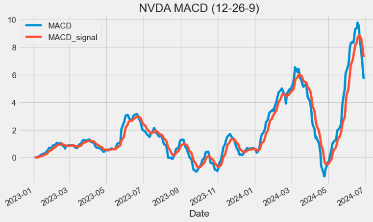
- Let’s calculate and plot the MACD histograms
# Calculate MACD
short_term = 12
long_term = 26
signal_period = 9

# Calculate short-term and long-term EMAs
short_ema = data['Close'].ewm(span=short_term, adjust=False).mean()
long_ema = data['Close'].ewm(span=long_term, adjust=False).mean()

# Calculate MACD Line
macd_line = short_ema - long_ema

# Calculate Signal Line
signal_line = macd_line.ewm(span=signal_period, adjust=False).mean()

# Calculate MACD Histogram
macd_histogram = macd_line - signal_line

# Add MACD components to the DataFrame
data['MACD12269'] = macd_line
data['Signal12269'] = signal_line
data['Histogram12269'] = macd_histogram

import plotly.graph_objects as go

# Create a Plotly figure
fig = go.Figure()

# MACD and Signal lines
fig.add_trace(go.Scatter(x=data.index, y=data['MACD12269'], mode='lines', name='MACD'))
fig.add_trace(go.Scatter(x=data.index, y=data['Signal12269'], mode='lines', name='Signal'))

# Histogram
fig.add_trace(go.Bar(x=data.index, y=data['Histogram12269'], name='Histogram',
                marker_color=['green' if val >= 0 else 'red' for val in data['Histogram12269']]))

# Customize the chart
fig.update_xaxes(rangeslider=dict(visible=False))
fig.update_layout(plot_bgcolor='#efefff', font_family='Monospace', font_color='#000000', font_size=20,width=400)
fig.update_layout(
        title="NVDA MACD (12-26-9)"
 )

fig.update_layout(
    autosize=False,
    width=1100,
    height=500,
    margin=dict(
        l=50,
        r=50,
        b=100,
        t=100,
        pad=4
    ),
    paper_bgcolor="LightSteelBlue",
)

fig.update_layout(
     xaxis=dict(showgrid=True,gridwidth=1, gridcolor='Grey'),
     yaxis=dict(showgrid=True,gridwidth=1, gridcolor='Grey')
)
# Show the chart
fig.show()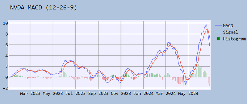
- TradingView: MACD can be used to identify aspects of a security’s overall trend. Most notably these aspects are momentum, as well as trend direction and duration.
- The MACD histogram is used as a good indication of a security’s momentum.
PPO Indicator
- The Percentage Price Oscillator (PPO) is a momentum indicator that gives traders and investors an idea of when the trend may change. It does this by taking the difference between two moving averages and expressing it as a percentage, which makes identifying potential entry points easier.
 def PPO(ohlc,
        period_fast = 12,
        period_slow = 26,
        signal = 9,
        column = "Close",
        adjust = True):
        """
        Percentage Price Oscillator
        PPO, PPO Signal and PPO difference.
        As with MACD, the PPO reflects the convergence and divergence of two moving averages.
        While MACD measures the absolute difference between two moving averages, PPO makes this a relative value by dividing the difference by the slower moving average
        """

        EMA_fast = pd.Series(
            ohlc[column].ewm(ignore_na=False, span=period_fast, adjust=adjust).mean(),
            name="EMA_fast",
        )
        EMA_slow = pd.Series(
            ohlc[column].ewm(ignore_na=False, span=period_slow, adjust=adjust).mean(),
            name="EMA_slow",
        )
        PPO = pd.Series(((EMA_fast - EMA_slow) / EMA_slow) * 100, name="PPO")
        PPO_signal = pd.Series(
            PPO.ewm(ignore_na=False, span=signal, adjust=adjust).mean(), name="SIGNAL"
        )
        PPO_histo = pd.Series(PPO - PPO_signal, name="HISTO")

        return pd.concat([PPO, PPO_signal, PPO_histo], axis=1)

data[["PPO", "PPO_signal","PPO_histo"]]=PPO(data, period_fast = 12, period_slow = 26,signal = 9,column = "Close",adjust = True)- Plotting the NVDA PPO (12–26–9) signal & histogram
import plotly.graph_objects as go

# Create a Plotly figure
fig = go.Figure()

# MACD and Signal lines
fig.add_trace(go.Scatter(x=data.index, y=data['PPO'], mode='lines', name='PPO'))
fig.add_trace(go.Scatter(x=data.index, y=data['PPO_signal'], mode='lines', name='Signal'))

# Histogram
fig.add_trace(go.Bar(x=data.index, y=data['PPO_histo'], name='Histogram',
                marker_color=['green' if val >= 0 else 'red' for val in data['PPO_histo']]))

# Customize the chart
fig.update_xaxes(rangeslider=dict(visible=False))
fig.update_layout(plot_bgcolor='#efefff', font_family='Monospace', font_color='#000000', font_size=20,width=400)
fig.update_layout(
        title="NVDA PPO (12-26-9)"
 )

fig.update_layout(
    autosize=False,
    width=1100,
    height=500,
    margin=dict(
        l=50,
        r=50,
        b=100,
        t=100,
        pad=4
    ),
    paper_bgcolor="LightSteelBlue",
)

fig.update_layout(
     xaxis=dict(showgrid=True,gridwidth=1, gridcolor='Grey'),
     yaxis=dict(showgrid=True,gridwidth=1, gridcolor='Grey')
)
# Show the chart
fig.show()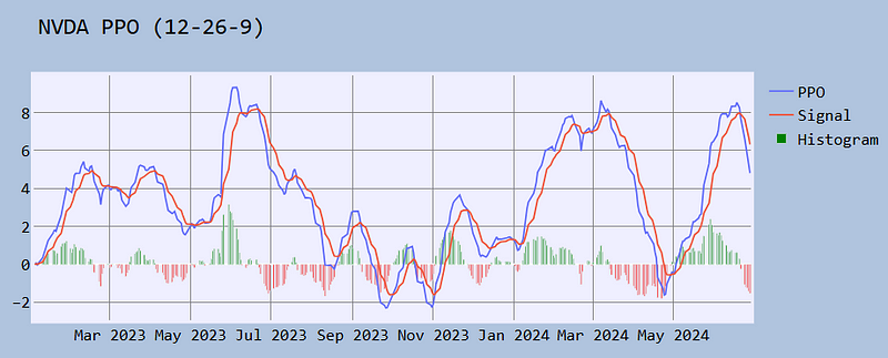
There are two main reasons for using the PPO:
- With the PPO, it is possible to compare Price Oscillator levels from one symbol to the next. A PPO reading of +5% means that the shorter MA is 5% higher than the longer MA.
- The PPO is a better representation of the two MAs relative to each other. The difference between the two MAs is shown in relation to the shorter moving average.
VWMACD Indicator
- The Volume-Weighted MACD (VWMACD) is an amendment to the original Moving Average Convergence Divergence (MACD) indicator discussed above. Instead of calculating the difference between two EMAs this tool uses volume-weighted moving averages.
- VWMACD represents the convergence and divergence of volume weighted average price trends. The use of volume makes this indicator more sensitive and reliable than the traditional MACD v.s.
def VW_MACD(ohlcv,period_fast = 12,period_slow = 26,signal = 9,column = "Close", colvol = "Volume", adjust = True):
        """"Volume-Weighted MACD" is an indicator that shows how a volume-weighted moving average can be used to calculate moving average convergence/divergence (MACD).
        This technique was first used by Buff Dormeier, CMT, and has been written about since at least 2002."""

        vp = ohlcv[colvol] * ohlcv[column]
        _fast = pd.Series(
            (vp.ewm(ignore_na=False, span=period_fast, adjust=adjust).mean())
            / (
                ohlcv[colvol]
                .ewm(ignore_na=False, span=period_fast, adjust=adjust)
                .mean()
            ),
            name="_fast",
        )

        _slow = pd.Series(
            (vp.ewm(ignore_na=False, span=period_slow, adjust=adjust).mean())
            / (
                ohlcv[colvol]
                .ewm(ignore_na=False, span=period_slow, adjust=adjust)
                .mean()
            ),
            name="_slow",
        )

        MACD = pd.Series(_fast - _slow, name="MACD")
        MACD_signal = pd.Series(
            MACD.ewm(ignore_na=False, span=signal, adjust=adjust).mean(), name="SIGNAL"
        )

        return pd.concat([MACD, MACD_signal], axis=1)

plt.figure(figsize=(10,6))
data[["VWMACD", "VWMACD_signal"]]=VW_MACD(data, period_fast = 12, period_slow = 26,signal = 9,column = "Close",colvol = "Volume",adjust = True)
data['VWMACD'].plot(label='VWMACD')
data['VWMACD_signal'].plot(label='VWMACD_signal')
plt.title('NVDA VWMACD (12-26-9)')
plt.legend()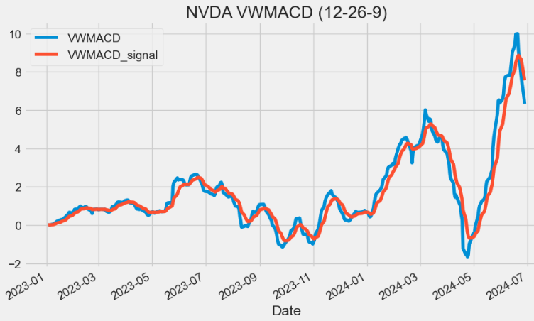
EVWMACD Indicator
- The Elastic Volume Weighted MACD (EVWMACD) is a variation of standard MACD. The Difference is that EVWMACD applies the formula of standard MACD with the eVWMA v.s.
def EV_MACD(ohlcv,period_fast = 20,period_slow = 40,signal = 9,adjust = True ):
        """
        Elastic Volume Weighted MACD is a variation of standard MACD,
        calculated using two EVWMA's.

        :period_slow: Specifies the number of Periods used for the slow EVWMA calculation
        :period_fast: Specifies the number of Periods used for the fast EVWMA calculation
        :signal: Specifies the number of Periods used for the signal calculation
        """

        evwma_slow = EVWMA(ohlcv, period_slow)

        evwma_fast = EVWMA(ohlcv, period_fast)

        MACD = pd.Series(evwma_fast - evwma_slow, name="MACD")
        MACD_signal = pd.Series(
            MACD.ewm(ignore_na=False, span=signal, adjust=adjust).mean(), name="SIGNAL"
        )

        return pd.concat([MACD, MACD_signal], axis=1)

plt.figure(figsize=(10,6))
data[["EVMACD", "EVMACD_signal"]]=EV_MACD(data, period_fast = 12, period_slow = 26,signal = 9,adjust = True)
data['EVMACD'].plot(label='EVWMACD')
data['EVMACD_signal'].plot(label='EVWMACD_signal')
plt.title('NVDA EVWMACD (12-26-9)')
plt.legend()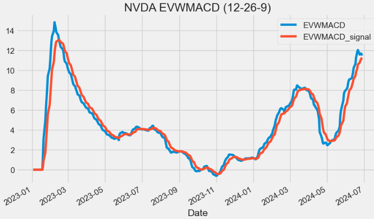
MOM Indicator
- Market Momentum (MOM) can be used as a measure of overall market sentiment that can support buying and selling with and against market trends.
def MOM(ohlc, period = 10, column = "Close"):
        """Market momentum is measured by continually taking price differences for a fixed time interval.
        To construct a 10-day momentum line, simply subtract the closing price 10 days ago from the last closing price.
        This positive or negative value is then plotted around a zero line."""

        return pd.Series(ohlc[column].diff(period), name="MOM".format(period))

plt.figure(figsize=(10,6))
data["MOM20"]=MOM(data, period = 20, column = "Close")
data['MOM20'].plot(label='MOM20')
plt.title('NVDA MOM20')
plt.legend()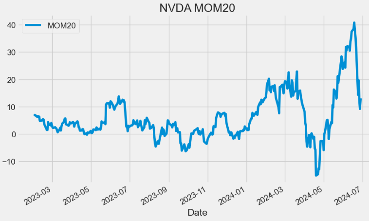
- The MOM signal indicates when an asset’s price has moved too far in one direction and is likely to reverse. For example, the above plot shows that MOM20 generates overbought signals when the reading rises above 20 and signals oversold conditions when the reading falls below 10.
ROC Indicator
- The Price Rate of Change (ROC) is a momentum-based technical indicator that measures the percentage change in price between the current price and the price a certain number of periods ago. The ROC indicator is plotted against zero, with the indicator moving upwards into positive territory if price changes are to the upside, and moving into negative territory if price changes are to the downside.
def ROC(ohlc, period = 12, column = "Close"):
        """The Rate-of-Change (ROC) indicator, which is also referred to as simply Momentum,
        is a pure momentum oscillator that measures the percent change in price from one period to the next.
        The ROC calculation compares the current price with the price “n” periods ago."""

        return pd.Series(
            (ohlc[column].diff(period) / ohlc[column].shift(period)) * 100, name="ROC"
        )

plt.figure(figsize=(10,6))
data["ROC20"]=ROC(data, period = 20, column = "Close")
data['ROC20'].plot(label='ROC20')
plt.title('NVDA ROC20')
plt.legend()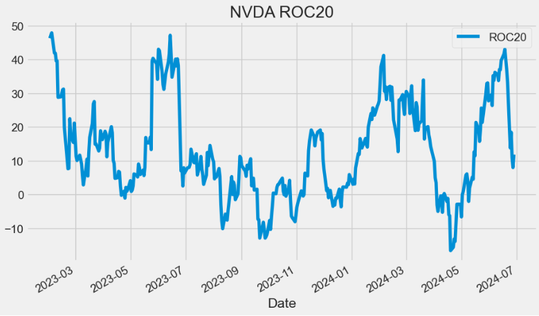
- Reading the ROC Indicator: When indicator values hover around zero, it will denote a consolidating market. A reading above zero will imply a bullish sentiment in the market; whereas a reading below zero will imply a bearish sentiment in the market.
TR Indicator
- True Range (TR) measures the daily range plus any gap from the closing price of the preceding day.
- TR is defined as the largest of the following:
- The distance from today’s high to today’s low.
- The distance from yesterday’s close to today’s high.
- The distance from yesterday’s close to today’s low.
 def TR(ohlc,high="High",low="Low",close="Close"):
        """True Range is the maximum of three price ranges.
        Most recent period's high minus the most recent period's low.
        Absolute value of the most recent period's high minus the previous close.
        Absolute value of the most recent period's low minus the previous close."""

        TR1 = pd.Series(ohlc[high] - ohlc[low]).abs()  # True Range = High less Low

        TR2 = pd.Series(
            ohlc[high] - ohlc[close].shift()
        ).abs()  # True Range = High less Previous Close

        TR3 = pd.Series(
            ohlc[close].shift() - ohlc[low]
        ).abs()  # True Range = Previous Close less Low

        _TR = pd.concat([TR1, TR2, TR3], axis=1)

        _TR["TR"] = _TR.max(axis=1)

        return pd.Series(_TR["TR"], name="TR")

plt.figure(figsize=(10,6))
data['TR']=TR(data,high="High",low="Low",close="Close")
data['TR'].plot(label='TR')
plt.title('NVDA TR')
plt.legend()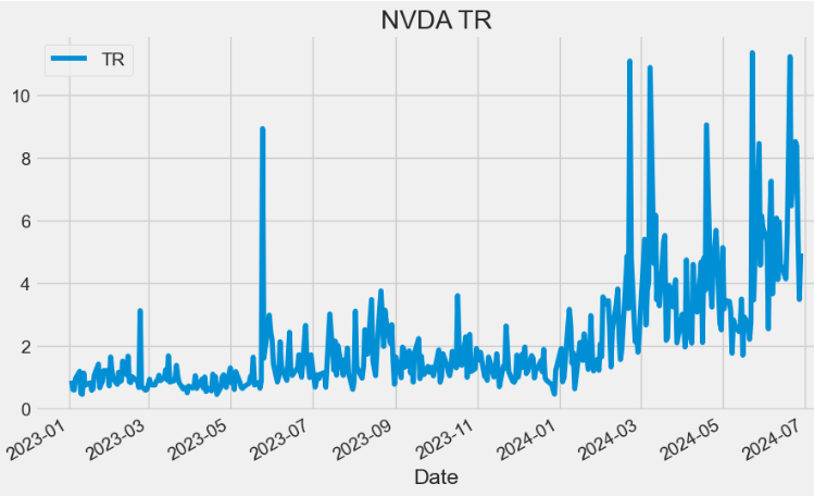
ATR Indicator
- Average True Range (ATR) is the average of TR over the specified period. ATR measures volatility, taking into account any gaps in the price movement.
def ATR(ohlc, period = 14,high="High",low="Low",close="Close"):
        """Average True Range is moving average of True Range."""

        mytr=TR(ohlc,high=high,low=low,close=close)
        return pd.Series(
            mytr.rolling(center=False, window=period).mean(),
            name="{0} period ATR".format(period),
        )
plt.figure(figsize=(10,6))
data['ATR20']=ATR(data, period = 20,high="High",low="Low",close="Close")
data['ATR20'].plot(label='ATR20')
plt.title('NVDA ATR20')
plt.legend(loc='upper left')
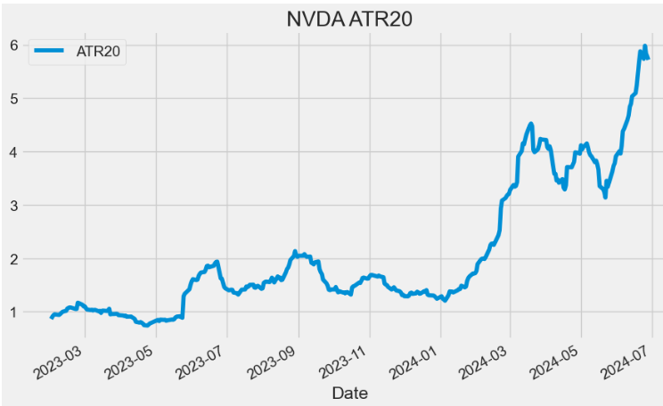
- An expanding ATR indicates increased volatility in the market, with the range of each bar getting larger. A reversal in price with an increase in ATR would indicate strength behind that move. ATR is not directional so an expanding ATR can indicate selling pressure or buying pressure. High ATR values usually result from a sharp advance or decline and are unlikely to be sustained for extended periods.
- A low ATR value indicates a series of periods with small ranges (quiet days). These low ATR values are found during extended sideways price action, thus the lower volatility. A prolonged period of low ATR values may indicate a consolidation area and the possibility of a continuation move or reversal.
VBM Indicator
- The Volatility Based Momentum (VBM) indicator is a variation on the ROC indicator v.s.
- VBM expresses momentum in a normalized, universally applicable ‘multiples of volatility’ (MoV) unit.
def VBM(ohlc,roc_period = 12,atr_period = 26,high="High",low="Low",column = "Close"):
        """The Volatility-Based-Momentum (VBM) indicator, The calculation for a volatility based momentum (VBM)
        indicator is very similar to ROC, but divides by the security’s historical volatility instead.
        The average true range indicator (ATR) is used to compute historical volatility.
        VBM(n,v) = (Close — Close n periods ago) / ATR(v periods)
        """

        return pd.Series(
            (
                (ohlc[column].diff(roc_period) - ohlc[column].shift(roc_period))
                / ATR(ohlc, period = atr_period,high=high,low=low,close=column)
            ),
            name="VBM",
        )

plt.figure(figsize=(10,6))
data["VBM"]=VBM(data,roc_period = 12,atr_period = 26,high="High",low="Low",column = "Close")
data['VBM'].plot(label='VBM')
plt.title('NVDA VBM (12,26)')
plt.legend()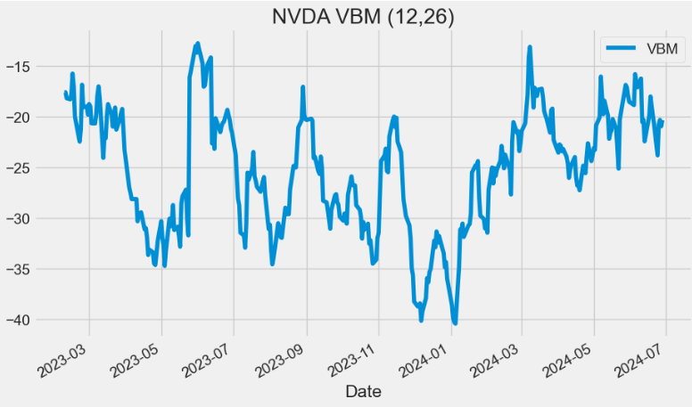
RSI Indicator
- The relative strength index (RSI) is a momentum indicator used in technical analysis. RSI measures the speed and magnitude of a security’s recent price changes to evaluate overvalued or undervalued conditions in the price of that security.
- The RSI is displayed as an oscillator (a line graph below) on a scale of zero to 100. Readings below 30 generally indicate that the stock is oversold, while readings above 70 indicate that it is overbought.
def RSI(ohlc, period = 14, column = "Close", adjust = True):
        """Relative Strength Index (RSI) is a momentum oscillator that measures the speed and change of price movements.
        RSI oscillates between zero and 100. Traditionally, and according to Wilder, RSI is considered overbought when above 70 and oversold when below 30.
        Signals can also be generated by looking for divergences, failure swings and centerline crossovers.
        RSI can also be used to identify the general trend."""

        ## get the price diff
        delta = ohlc[column].diff()

        ## positive gains (up) and negative gains (down) Series
        up, down = delta.copy(), delta.copy()
        up[up < 0] = 0
        down[down > 0] = 0

        # EMAs of ups and downs
        _gain = up.ewm(alpha=1.0 / period, adjust=adjust).mean()
        _loss = down.abs().ewm(alpha=1.0 / period, adjust=adjust).mean()

        RS = _gain / _loss
        return pd.Series(100 - (100 / (1 + RS)), name="{0} period RSI".format(period))

plt.figure(figsize=(10,6))
data["RSI20"]=RSI(data, period = 20, column = "Close", adjust = True)
data['RSI20'].plot(label='RSI20')
plt.title('NVDA RSI20')
plt.legend()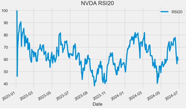
IFT RSI Indicator
- Inverse Fisher Transform with RSI (IFT RSI) is a variation of the Inverse Fisher Transform (IFT) oscillator, where the RSI indicator values are taken as intermediate values.
def IFT_RSI(ohlc,column = "Close",rsi_period = 5,wma_period = 9, adjust=True):
        """Modified Inverse Fisher Transform applied on RSI.
        Suggested method to use any IFT indicator is to buy when the indicator crosses over –0.5 or crosses over +0.5
        if it has not previously crossed over –0.5 and to sell short when the indicators crosses under +0.5 or crosses under –0.5
        if it has not previously crossed under +0.5."""


        v1 = pd.Series(0.1 * (RSI(ohlc, rsi_period,column = column, adjust = adjust) - 50), name="v1")


        d = (wma_period * (wma_period + 1)) / 2  # denominator
        weights = np.arange(1, wma_period + 1)

        def linear(w):
            def _compute(x):
                return (w * x).sum() / d

            return _compute

        _wma = v1.rolling(wma_period, min_periods=wma_period)
        v2 = _wma.apply(linear(weights), raw=True)

        ift = pd.Series(((v2 ** 2 - 1) / (v2 ** 2 + 1)), name="IFT_RSI")

        return ift

plt.figure(figsize=(10,6))
data["IFTRSI"]=IFT_RSI(data,column = "Close",rsi_period = 5,wma_period = 9, adjust=True)
data['IFTRSI'].plot(label='IFT_RSI')
plt.title('NVDA IFT_RSI (5,9)')
plt.legend()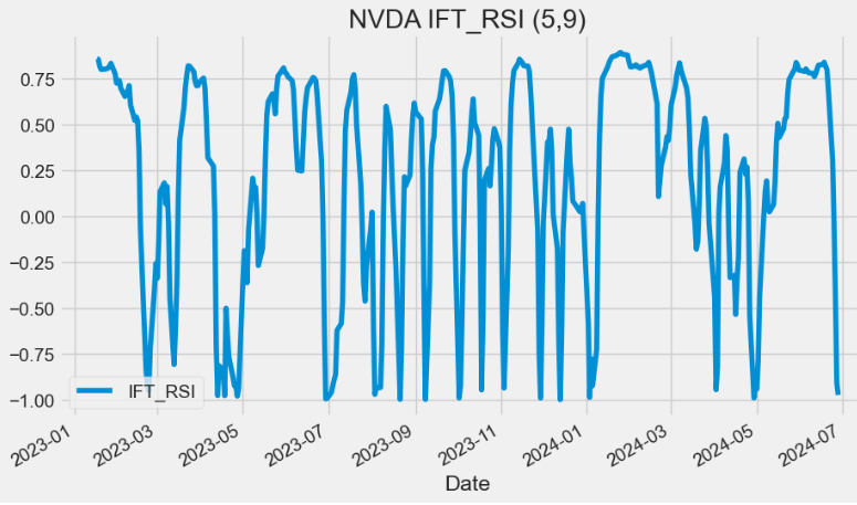
- The IFT RSI gives buy and sell signals (although the sell signals are a little late). This can be used stand alone or with other indicators to add additional confirmation in either direction.
DYMI Indicator
- The dynamic momentum index (DYMI) is an overbought/oversold indicator that uses fewer periods in its calculation when volatility is high, and more periods when volatility is low.
- The indicator oscillates between 0 and 100. When the indicator is below 30 the price of the asset is considered oversold and when its above 70, the price is considered overbought.
   def DYMI(ohlc, column = "Close", adjust = True):
        """
        The Dynamic Momentum Index is a variable term RSI. The RSI term varies from 3 to 30. The variable
        time period makes the RSI more responsive to short-term moves. The more volatile the price is,
        the shorter the time period is. It is interpreted in the same way as the RSI, but provides signals earlier.
        Readings below 30 are considered oversold, and levels over 70 are considered overbought. The indicator
        oscillates between 0 and 100.
        https://www.investopedia.com/terms/d/dynamicmomentumindex.asp
        """

        def _get_time(close):
            # Value available from 14th period
            sd = close.rolling(5).std()
            asd = sd.rolling(10).mean()
            v = sd / asd
            t = 14 / v.round()
            t[t.isna()] = 0
            t = t.map(lambda x: int(min(max(x, 5), 30)))
            return t

        def _dmi(index):
            time = t.iloc[index]
            if (index - time) < 0:
                subset = ohlc.iloc[0:index]
            else:
                subset = ohlc.iloc[(index - time) : index]
            return RSI(subset, period=time, column = column,adjust=adjust).values[-1]

        dates = pd.Series(ohlc.index)
        periods = pd.Series(data=range(14, len(dates)), index=ohlc.index[14:].values)
        t = _get_time(ohlc[column])
        return periods.map(lambda x: _dmi(x))

plt.figure(figsize=(10,6))
data["DYMI"]=DYMI(data, column = "Close", adjust = True)
data['DYMI'].plot(label='DYMI')
plt.title('NVDA DYMI')
plt.legend()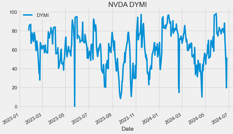
- Read more here.
SAR Indicator
- Stop and Reverse (SAR) is a trailing stop-based trading system; it is often used as an indicator as well.
def SAR(ohlc, af = 0.02, amax = 0.2,high="High",low="Low"):
        """SAR stands for “stop and reverse,” which is the actual indicator used in the system.
        SAR trails price as the trend extends over time. The indicator is below prices when prices are rising and above prices when prices are falling.
        In this regard, the indicator stops and reverses when the price trend reverses and breaks above or below the indicator."""
        high1, low1 = ohlc[high], ohlc[low]

        # Starting values
        sig0, xpt0, af0 = True, high1[0], af
        _sar = [low1[0] - (high1 - low1).std()]

        for i in range(1, len(ohlc)):
            sig1, xpt1, af1 = sig0, xpt0, af0

            lmin = min(low1[i - 1], low1[i])
            lmax = max(high1[i - 1], high1[i])

            if sig1:
                sig0 = low1[i] > _sar[-1]
                xpt0 = max(lmax, xpt1)
            else:
                sig0 = high1[i] >= _sar[-1]
                xpt0 = min(lmin, xpt1)

            if sig0 == sig1:
                sari = _sar[-1] + (xpt1 - _sar[-1]) * af1
                af0 = min(amax, af1 + af)

                if sig0:
                    af0 = af0 if xpt0 > xpt1 else af1
                    sari = min(sari, lmin)
                else:
                    af0 = af0 if xpt0 < xpt1 else af1
                    sari = max(sari, lmax)
            else:
                af0 = af
                sari = xpt0

            _sar.append(sari)

        return pd.Series(_sar, index=ohlc.index)

plt.figure(figsize=(10,6))
data["SAR"]=SAR(data, af = 0.02, amax = 0.2,high="High",low="Low")

data['Close'].plot(label='Close')
data['SAR'].plot(label='SAR')
plt.ylabel('Price USD')
plt.title('NVDA SAR')
plt.legend()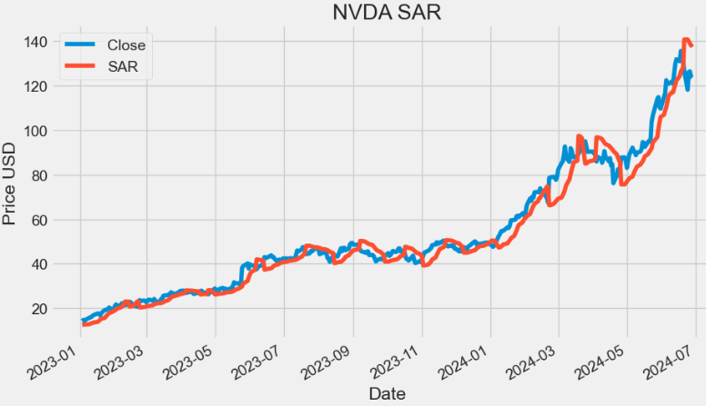
PSAR Indicator
- As a technical indicator, Parabolic SAR (PSAR) is known as a momentum indicator and used to identify potential trend reversals when the price is in a strong uptrend or downtrend.
- Parabolic SAR displays a series of dots v.i. that are placed either above or below the price, depending on the trend.
- If the dot switches its placement, a signal is generated that the current trend is most likely coming to an end, thus giving us a hint to close any open positions.
def PSAR(ohlc, iaf = 0.02, maxaf = 0.2,high="High",low="Low",close="Close"):
        """
        The parabolic SAR indicator, developed by J. Wells Wilder, is used by traders to determine trend direction and potential reversals in price.
        The indicator uses a trailing stop and reverse method called "SAR," or stop and reverse, to identify suitable exit and entry points.
        Traders also refer to the indicator as the parabolic stop and reverse, parabolic SAR, or PSAR.
        https://www.investopedia.com/terms/p/parabolicindicator.asp
        https://virtualizedfrog.wordpress.com/2014/12/09/parabolic-sar-implementation-in-python/
        """

        length = len(ohlc)
        high1, low1, close1 = ohlc[high], ohlc[low], ohlc[close]
        psar = close1[0 : len(close1)]
        psarbull = [None] * length
        psarbear = [None] * length
        bull = True
        af = iaf
        hp = high1[0]
        lp = low1[0]

        for i in range(2, length):
            if bull:
                psar[i] = psar[i - 1] + af * (hp - psar[i - 1])
            else:
                psar[i] = psar[i - 1] + af * (lp - psar[i - 1])

            reverse = False

            if bull:
                if low1[i] < psar[i]:
                    bull = False
                    reverse = True
                    psar[i] = hp
                    lp = low1[i]
                    af = iaf
            else:
                if high1[i] > psar[i]:
                    bull = True
                    reverse = True
                    psar[i] = lp
                    hp = high1[i]
                    af = iaf

            if not reverse:
                if bull:
                    if high1[i] > hp:
                        hp = high1[i]
                        af = min(af + iaf, maxaf)
                    if low1[i - 1] < psar[i]:
                        psar[i] = low1[i - 1]
                    if low1[i - 2] < psar[i]:
                        psar[i] = low1[i - 2]
                else:
                    if low1[i] < lp:
                        lp = low1[i]
                        af = min(af + iaf, maxaf)
                    if high1[i - 1] > psar[i]:
                        psar[i] = high1[i - 1]
                    if high1[i - 2] > psar[i]:
                        psar[i] = high1[i - 2]

            if bull:
                psarbull[i] = psar[i]
            else:
                psarbear[i] = psar[i]

        psar = pd.Series(psar, name="psar", index=ohlc.index)
        psarbear = pd.Series(psarbear, name="psarbear", index=ohlc.index)
        psarbull = pd.Series(psarbull, name="psarbull", index=ohlc.index)

        return pd.concat([psar, psarbull, psarbear], axis=1)

data[["PSAR", "PSARBULL", "PSARBEAR"]]=PSAR(data, iaf = 0.02, maxaf = 0.2,high="High",low="Low",close="Close")- Reading the input stock data
symbols = ['NVDA']
start_date = '2023-01-01'


data0 = yf.download(symbols, start=start_date)
data["Close"]=data0["Close"]
data0.tail()

[*********************100%%**********************]  1 of 1 completed
           Open       High       Low        Close      Adj Close   Volume
Date
2024-06-24 123.239998 124.459999 118.040001 118.110001 118.110001 476060900
2024-06-25 121.199997 126.500000 119.320000 126.089996 126.089996 425787500
2024-06-26 126.129997 128.119995 122.599998 126.400002 126.400002 362975900
2024-06-27 124.099998 126.410004 122.919998 123.989998 123.989998 252571700
2024-06-28 124.580002 127.709999 122.750000 123.540001 123.540001 314945500- Plotting PSAR
plt.figure(figsize=(16,6))
data['Close'].plot(label='Close')
plt.scatter(data0.index,data['PSAR'],c='r',label='PSAR')
plt.ylabel('Price USD')
plt.title('NVDA PSAR')
plt.legend()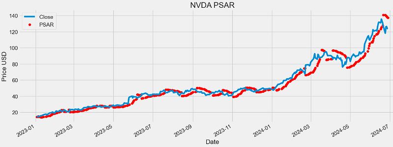
- Plotting PSARBULL
plt.figure(figsize=(16,6))
data['Close'].plot(label='Close')
plt.scatter(data0.index,data['PSARBULL'],c='r',label='PSARBULL')
plt.ylabel('Price USD')
plt.title('NVDA PSARBULL')
plt.legend()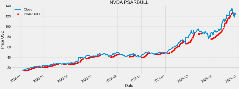
- Plotting PSARBEAR
plt.figure(figsize=(16,6))
data['Close'].plot(label='Close')
plt.scatter(data0.index,data['PSARBEAR'],c='r',label='PSARBEAR')
plt.ylabel('Price USD')
plt.title('NVDA PSARBEAR')
plt.legend()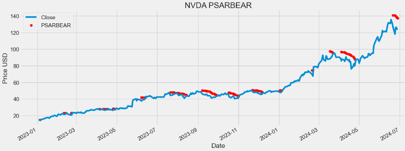
BB Indicator
- Bollinger Bands (BB) is a technical analysis tool used to determine where prices are high and low relative to each other.
- BB are composed of three lines: SMA (the middle band), upper band (UB) and lower band (LB).
- UB and LB are typically two standard deviations (2*SD) above or below SMA20.
- BB widen and narrow as the volatility of the underlying asset changes.
data0['SMA'] = data0['Close'].rolling(window=20).mean()

# Calculate the 20-period Standard Deviation (SD)
data0['SD'] = data0['Close'].rolling(window=20).std()

# Calculate the Upper Bollinger Band (UB) and Lower Bollinger Band (LB)
data0['UB'] = data0['SMA'] + 2 * data0['SD']
data0['LB'] = data0['SMA'] - 2 * data0['SD']import plotly.graph_objs as go
# Create a Plotly figure
fig = go.Figure()
# Add the price chart
fig.add_trace(go.Scatter(x=data0.index, y=data0['Close'], mode='lines', name='Price'))
# Add the Upper Bollinger Band (UB) and shade the area
fig.add_trace(go.Scatter(x=data0.index, y=data0['UB'], mode='lines', name='Upper Bollinger Band', line=dict(color='red')))
fig.add_trace(go.Scatter(x=data0.index, y=data0['LB'], fill='tonexty', mode='lines', name='Lower Bollinger Band', line=dict(color='green')))
# Add the Middle Bollinger Band (MA)
fig.add_trace(go.Scatter(x=data0.index, y=data0['SMA'], mode='lines', name='Middle Bollinger Band', line=dict(color='blue')))
# Customize the chart layout
fig.update_layout(title='NVDA Stock Price with Bollinger Bands',
xaxis_title='Date',
yaxis_title='Price',
showlegend=True)
fig.update_layout(
autosize=False,
width=1000,
height=500,
margin=dict(
l=50,
r=50,
b=100,
t=100,
pad=4
),
paper_bgcolor="LightSteelBlue",
)
# Show the chart
fig.update_layout(
xaxis=dict(showgrid=True,gridwidth=1, gridcolor='Grey'),
yaxis=dict(showgrid=True,gridwidth=1, gridcolor='Grey')
)
fig.show()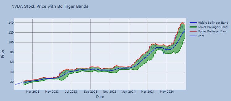
- Examining the stock volatility
data0['SD'].plot(label='SD')
plt.legend()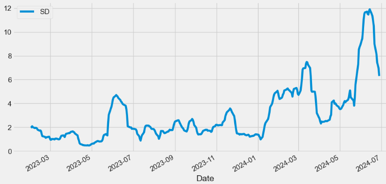
- The Percent B (%B) indicator reflects closing price as a percentage of the lower and upper BB.
percent_b = pd.Series(
            100*(data0['Close'] - data0['LB']) / (data0['UB'] - data0['LB']),
            name="%b"
        )

percent_b.plot(label='%b')
plt.legend()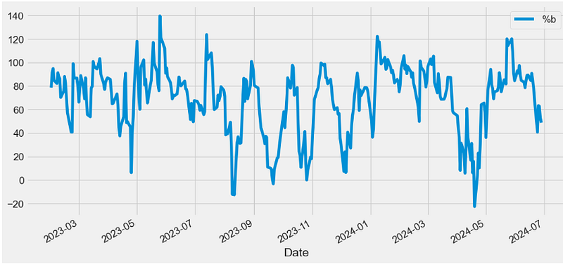
- Close=UB, %b=100
- Close>UB, %b>100
- Close=SMA, %b=50
- Close=LB, %b=0
- Close
KC Indicator
- Keltner Channels (KC) are volatility-based bands that are placed on either side of an asset’s price and can aid in determining the direction of a trend.
def KC(ohlc,period = 20,atr_period = 10,kc_mult = 2,high="High",low="Low",column="Close",adjust=True):
        """Keltner Channels [KC] are volatility-based envelopes set above and below an exponential moving average.
        This indicator is similar to Bollinger Bands, which use the standard deviation to set the bands.
        Instead of using the standard deviation, Keltner Channels use the Average True Range (ATR) to set channel distance.
        The channels are typically set two Average True Range values above and below the 20-day EMA.
        The exponential moving average dictates direction and the Average True Range sets channel width.
        Keltner Channels are a trend following indicator used to identify reversals with channel breakouts and channel direction.
        Channels can also be used to identify overbought and oversold levels when the trend is flat."""

        middle = pd.Series(EMA(ohlc, period=period, column=column,adjust=adjust), name="KC_MIDDLE")

        up = pd.Series(middle + (kc_mult * ATR(ohlc, period = atr_period,high=high,low=low,close=column)), name="KC_UPPER")
        down = pd.Series(
            middle - (kc_mult * ATR(ohlc, period = atr_period,high=high,low=low,close=column)), name="KC_LOWER"
        )

        return pd.concat([middle, up, down], axis=1)

data0[["KC_MIDDLE", "KC_UPPER","KC_LOWER"]]=KC(data0,period = 20,atr_period = 10,kc_mult = 2,high="High",low="Low",column="Close",adjust=True)- Plotting KC
import plotly.graph_objs as go

# Create a Plotly figure
fig = go.Figure()

# Add the price chart
fig.add_trace(go.Scatter(x=data0.index, y=data0['Close'], mode='lines', name='Price'))

# Add the Upper KC and shade the area
fig.add_trace(go.Scatter(x=data0.index, y=data0['KC_UPPER'], mode='lines', name='Upper KC', line=dict(color='red')))
fig.add_trace(go.Scatter(x=data0.index, y=data0['KC_LOWER'], fill='tonexty', mode='lines', name='Lower KC', line=dict(color='green')))

# Add the Middle KC
fig.add_trace(go.Scatter(x=data0.index, y=data0['KC_MIDDLE'], mode='lines', name='Middle KC', line=dict(color='blue')))

# Customize the chart layout
fig.update_layout(title='NVDA KC',
                  xaxis_title='Date',
                  yaxis_title='Price',
                  showlegend=True)

fig.update_layout(
    autosize=False,
    width=1000,
    height=500,
    margin=dict(
        l=50,
        r=50,
        b=100,
        t=100,
        pad=4
    ),
    paper_bgcolor="LightSteelBlue",
)
# Show the chart
fig.update_layout(
     xaxis=dict(showgrid=True,gridwidth=1, gridcolor='Grey'),
     yaxis=dict(showgrid=True,gridwidth=1, gridcolor='Grey')
)
fig.show()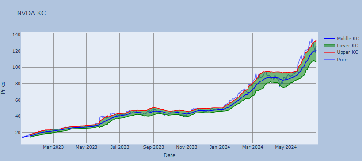
- Price reaching KC_UPPER is bullish while reaching KC_LOWER is bearish.
- The angle of the KC also aids in identifying the trend direction. The price may also oscillate between the upper and lower KC bands, which can be interpreted as resistance and support levels.
DC Indicator
- Donchian Channels (DC) are used in technical analysis to measure a market’s volatility. It is a banded indicator, similar to BB. Besides measuring a market’s volatility, DC are primarily used to identify potential breakouts or overbought/oversold conditions when price reaches either the Upper or Lower Band. These instances would indicate possible trading signals.
   def DC(ohlc, upper_period = 20, lower_period = 5,high="High",low="Low"):
        """Donchian Channel, a moving average indicator developed by Richard Donchian.
        It plots the highest high and lowest low over the last period time intervals."""

        upper = pd.Series(
            ohlc[high].rolling(center=False, window=upper_period).max(), name="UPPER"
        )
        lower = pd.Series(
            ohlc[low].rolling(center=False, window=lower_period).min(), name="LOWER"
        )
        middle = pd.Series((upper + lower) / 2, name="MIDDLE")

        return pd.concat([lower, middle, upper], axis=1)

data0[["DC_L", "DC_M","DC_U"]]=DC(data0, upper_period = 20, lower_period = 5,high="High",low="Low")- Plotting DC
import plotly.graph_objs as go

# Create a Plotly figure
fig = go.Figure()

# Add the price chart
fig.add_trace(go.Scatter(x=data0.index, y=data0['Close'], mode='lines', name='Price'))

# Add the Upper DC and shade the area
fig.add_trace(go.Scatter(x=data0.index, y=data0['DC_U'], mode='lines', name='Upper DC', line=dict(color='red')))
fig.add_trace(go.Scatter(x=data0.index, y=data0['DC_L'], fill='tonexty', mode='lines', name='Lower DC', line=dict(color='green')))

# Add the Middle DC
fig.add_trace(go.Scatter(x=data0.index, y=data0['DC_M'], mode='lines', name='Middle DC', line=dict(color='blue')))

# Customize the chart layout
fig.update_layout(title='NVDA DC',
                  xaxis_title='Date',
                  yaxis_title='Price',
                  showlegend=True)

fig.update_layout(
    autosize=False,
    width=1000,
    height=500,
    margin=dict(
        l=50,
        r=50,
        b=100,
        t=100,
        pad=4
    ),
    paper_bgcolor="LightSteelBlue",
)
# Show the chart
fig.update_layout(
     xaxis=dict(showgrid=True,gridwidth=1, gridcolor='Grey'),
     yaxis=dict(showgrid=True,gridwidth=1, gridcolor='Grey')
)
fig.show()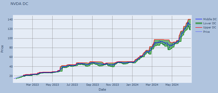
DMI Indicator
- The directional movement index (DMI) measures both the strength and direction of a price movement and is used to reduce false signals.
- The DMI employs two standard indicators, one negative (-DI) and one positive (+DI).
- The larger the spread between the two primary lines, the stronger the price trend.
- If +DI is way above -DI, the price trend is strongly up.
- If -DI is way above +DI, then the price trend is strongly down.
def DMI(ohlc, period = 14, adjust = True,high="High",low="Low",close="Close"):
        """The directional movement indicator (also known as the directional movement index - DMI) is a valuable tool
         for assessing price direction and strength. This indicator was created in 1978 by J. Welles Wilder, who also created the popular
         relative strength index. DMI tells you when to be long or short.
         It is especially useful for trend trading strategies because it differentiates between strong and weak trends,
         allowing the trader to enter only the strongest trends.
        source: https://www.tradingview.com/wiki/Directional_Movement_(DMI)#CALCULATION

        :period: Specifies the number of Periods used for DMI calculation
        """

        ohlc["up_move"] = ohlc[high].diff()
        ohlc["down_move"] = -ohlc[low].diff()

        # positive Dmi
        def _dmp(row):
            if row["up_move"] > row["down_move"] and row["up_move"] > 0:
                return row["up_move"]
            else:
                return 0

        # negative Dmi
        def _dmn(row):
            if row["down_move"] > row["up_move"] and row["down_move"] > 0:
                return row["down_move"]
            else:
                return 0

        ohlc["plus"] = ohlc.apply(_dmp, axis=1)
        ohlc["minus"] = ohlc.apply(_dmn, axis=1)

        diplus = pd.Series(
            100
            * (ohlc["plus"] / ATR(ohlc, period = period,high=high,low=low,close=close))
            .ewm(alpha=1 / period, adjust=adjust)
            .mean(),
            name="DI+",
        )
        diminus = pd.Series(
            100
            * (ohlc["minus"] / ATR(ohlc, period = period,high=high,low=low,close=close))
            .ewm(alpha=1 / period, adjust=adjust)
            .mean(),
            name="DI-",
        )

        return pd.concat([diplus, diminus], axis=1)

data0[["DMI_plus", "DMI_minus"]]=DMI(data0, period = 14, adjust = True,high="High",low="Low",close="Close")

data0['DMI_plus'].plot(label='DMI_plus')
data0['DMI_minus'].plot(label='DMI_minus')

plt.title('NVDA DMI')
plt.legend()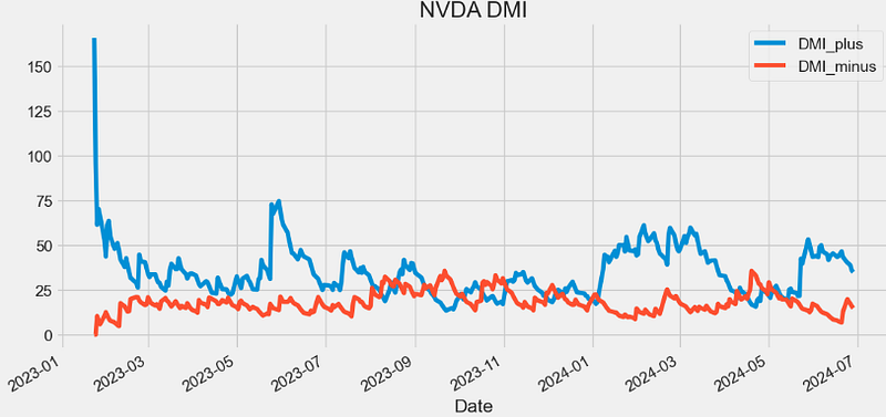
ADX Indicator
- The average directional index (ADX) is a technical indicator used by traders to determine the strength of a price trend for a financial security. Trading in the direction of a strong trend reduces risk and increases profit potential. Many traders consider the ADX to be the ultimate trend indicator because it is so reliable.
   def ADX(ohlc, period = 14, adjust = True,high="High",low="Low",column="Close"):
        """The A.D.X. is 100 * smoothed moving average of absolute value (DMI +/-) divided by (DMI+ + DMI-). ADX does not indicate trend direction or momentum,
        only trend strength. Generally, A.D.X. readings below 20 indicate trend weakness,
        and readings above 40 indicate trend strength. An extremely strong trend is indicated by readings above 50"""

        dmi = DMI(ohlc, period = period, adjust = adjust,high=high,low=low,close=column)
        return pd.Series(
            100
            * (abs(dmi["DI+"] - dmi["DI-"]) / (dmi["DI+"] + dmi["DI-"]))
            .ewm(alpha=1 / period, adjust=adjust)
            .mean(),
            name="{0} period ADX.".format(period),
        )

plt.figure(figsize=(12,6))
data0["ADX"]=ADX(data0, period = 20, adjust = True,high="High",low="Low",column="Close")
data0['ADX'].plot(label='ADX20')
plt.title('NVDA ADX')
plt.legend()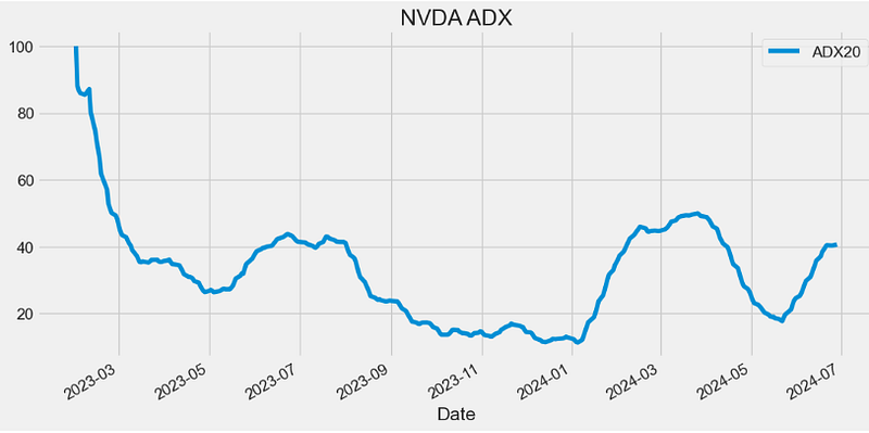
- The ADX identifies a strong trend when the ADX is over 25 and a weak trend when the ADX is below 20.
PIVOT Indicator
- Pivot Point analysis is a technique of determining key levels that price may react to. Pivot points tend to function as support or resistance and can be turning points.
def PIVOT(ohlc,open="Open",close="Close",high="High",low="Low"):
        """
        Pivot Points are significant support and resistance levels that can be used to determine potential trades.
        The pivot points come as a technical analysis indicator calculated using a financial instrument’s high, low, and close value.
        The pivot point’s parameters are usually taken from the previous day’s trading range.
        This means you’ll have to use the previous day’s range for today’s pivot points.
        Or, last week’s range if you want to calculate weekly pivot points or, last month’s range for monthly pivot points and so on.
        """

        df = ohlc.shift()  # pivot is calculated of the previous trading session

        pivot = pd.Series(TP(df,open=open,close=close,high=high,low=low), name="pivot")  # pivot is basically a lagging TP

        s1 = (pivot * 2) - df[high]
        s2 = pivot - (df[high] - df[low])
        s3 = df[low] - (2 * (df[high] - pivot))
        s4 = df[low] - (3 * (df[high] - pivot))

        r1 = (pivot * 2) - df[low]
        r2 = pivot + (df[high] - df[low])
        r3 = df[high] + (2 * (pivot - df[low]))
        r4 = df[high] + (3 * (pivot - df[low]))

        return pd.concat(
            [
                pivot,
                pd.Series(s1, name="s1"),
                pd.Series(s2, name="s2"),
                pd.Series(s3, name="s3"),
                pd.Series(s4, name="s4"),
                pd.Series(r1, name="r1"),
                pd.Series(r2, name="r2"),
                pd.Series(r3, name="r3"),
                pd.Series(r4, name="r4"),
            ],
            axis=1,
        )

datapivot=PIVOT(data0,open="Open",close="Close",high="High",low="Low")

datapivot.tail()

            pivot      s1         s2          s3        s4          r1        r2            r3       r4
Date
2024-06-20 134.200002 132.070002 128.560003 126.430003 124.300003 137.710002 139.840001 143.350001 146.860001
2024-06-21 133.686666 126.613337 122.446676 115.373347 108.300018 137.853327 144.926656 149.093318 153.259979
2024-06-24 127.166669 123.703334 120.836667 117.373332 113.909996 130.033335 133.496671 136.363337 139.230003
2024-06-25 120.203334 115.946668 113.783335 109.526670 105.270004 122.366666 126.623332 128.786664 130.949997
2024-06-26 123.969999 121.439997 116.789998 114.259997 111.729996 128.619998 131.149999 135.799998 140.449997


plt.figure(figsize=(12,6))
data0['Close'].plot(label='Close')
datapivot['pivot'].plot(label='pivot')
datapivot['s1'].plot(label='s1')
datapivot['s2'].plot(label='s2')
datapivot['s3'].plot(label='s3')
datapivot['s4'].plot(label='s4')

datapivot['r1'].plot(label='r1')
datapivot['r2'].plot(label='r2')
datapivot['r3'].plot(label='r3')
datapivot['r4'].plot(label='r4')

plt.ylabel('Price USD')
plt.title('NVDA PIVOT')
plt.legend()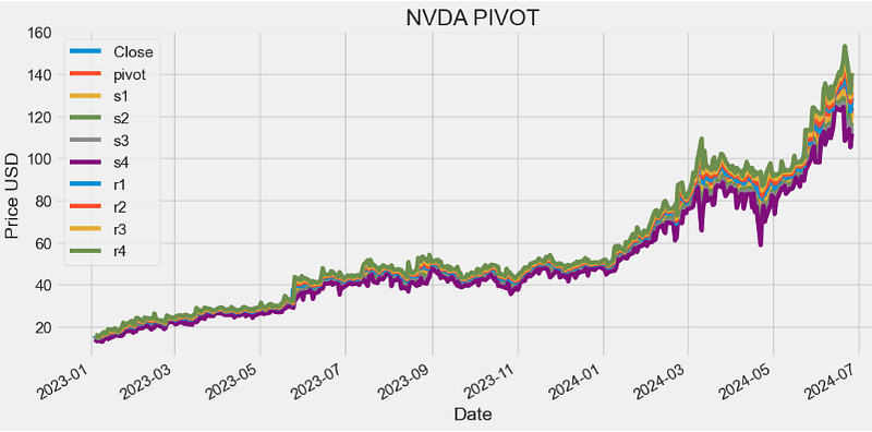
PIVOT FB Indicator
- Fibonacci Pivot Points stand tall as a powerful tool in the trader’s arsenal, offering insights into potential support and resistance levels in financial markets. Derived from the Fibonacci sequence, this indicator aids traders in making informed decisions and navigating market fluctuations with precision.
- Fibonacci Pivot Points are calculated using key levels derived from the Fibonacci sequence — typically the high, low, and close of the previous trading session. The formula involves applying specific ratios (like 0.382, 0.5, and 0.618) from the Fibonacci sequence to determine potential support and resistance levels for the current session.
def PIVOT_FIB(ohlc,open="Open",close="Close",high="High",low="Low"):
        """
        Fibonacci pivot point levels are determined by first calculating the classic pivot point,
        then multiply the previous day’s range with its corresponding Fibonacci level.
        Most traders use the 38.2%, 61.8% and 100% retracements in their calculations.
        """

        df = ohlc.shift()
        pp = pd.Series(TP(df,open=open,close=close,high=high,low=low), name="pivot")  # classic pivot

        r4 = pp + ((df[high] - df[low]) * 1.382)
        r3 = pp + ((df[high] - df[low]) * 1)
        r2 = pp + ((df[high] - df[low]) * 0.618)
        r1 = pp + ((df[high] - df[low]) * 0.382)

        s1 = pp - ((df[high] - df[low]) * 0.382)
        s2 = pp - ((df[high] - df[low]) * 0.618)
        s3 = pp - ((df[high] - df[low]) * 1)
        s4 = pp - ((df[high] - df[low]) * 1.382)

        return pd.concat(
            [
                pp,
                pd.Series(s1, name="s1"),
                pd.Series(s2, name="s2"),
                pd.Series(s3, name="s3"),
                pd.Series(s4, name="s4"),
                pd.Series(r1, name="r1"),
                pd.Series(r2, name="r2"),
                pd.Series(r3, name="r3"),
                pd.Series(r4, name="r4"),
            ],
            axis=1,
        )

datapivotfb=PIVOT_FIB(data0,open="Open",close="Close",high="High",low="Low")

plt.figure(figsize=(12,6))
data0['Close'].plot(label='Close')
datapivotfb['pivot'].plot(label='pivot')
datapivotfb['s1'].plot(label='s1')
datapivotfb['s2'].plot(label='s2')
datapivotfb['s3'].plot(label='s3')
datapivotfb['s4'].plot(label='s4')

datapivotfb['r1'].plot(label='r1')
datapivotfb['r2'].plot(label='r2')
datapivotfb['r3'].plot(label='r3')
datapivotfb['r4'].plot(label='r4')

plt.ylabel('Price USD')
plt.title('NVDA PIVOT_FB')
plt.legend()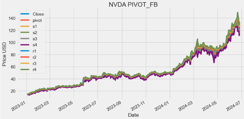
STOCH Indicator
- The stochastic indicator (STOCH) is a popular trading indicator that is useful for predicting trend reversals.
- When the stochastic indicator is at a high level, it means the instrument’s price closed near the top of the 14-period range. When the indicator is at a low level, it signals the price closed near the bottom of the 14-period range.
def STOCH(ohlc, period = 14,close="Close",high="High",low="Low"):
        """Stochastic oscillator %K
         The stochastic oscillator is a momentum indicator comparing the closing price of a security
         to the range of its prices over a certain period of time.
         The sensitivity of the oscillator to market movements is reducible by adjusting that time
         period or by taking a moving average of the result.
        """

        highest_high = ohlc[high].rolling(center=False, window=period).max()
        lowest_low = ohlc[low].rolling(center=False, window=period).min()

        STOCH = pd.Series(
            (ohlc[close] - lowest_low) / (highest_high - lowest_low) * 100,
            name="{0} period STOCH %K".format(period),
        )

        return STOCH

datapivotfb['STOCH14']=STOCH(data0, period = 14,close="Close",high="High",low="Low")

plt.figure(figsize=(10,6))
datapivotfb['STOCH14'].plot(label='STOCH14')
plt.title('NVDA STOCH14')
plt.legend()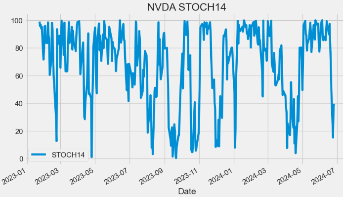
- Stochastic oscillators measure recent prices on a scale of 0 to 100, with measurements above 80 indicating that an asset is overbought and measurements below 20 indicating that it is oversold.
STOCHD Indicator
- In fact, stochastic oscillators display two lines: %K, and %D.
- The %K line compares the lowest low and the highest high of a given period to define a price range, then displays the last closing price as a percentage of this range.
- The %D line (Slow Stochastic) is a 3-period SMA of the %K line.
def STOCHD(ohlc, period = 3, stoch_period = 14,close="Close",high="High",low="Low"):
        """Stochastic oscillator %D
        STOCH%D is a 3 period simple moving average of %K.
        """

        return pd.Series(
            STOCH(data0, period = stoch_period,close=close,high=high,low=low).rolling(center=False, window=period).mean(),
            name="{0} period STOCH %D.".format(period),
        )

datapivotfb['STOCHD']=STOCHD(data0, period = 3, stoch_period = 14,close="Close",high="High",low="Low")

plt.figure(figsize=(10,6))
datapivotfb['STOCHD'].plot(label='STOCHD')
plt.title('NVDA STOCHD')
plt.legend()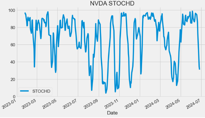
- The Slow Stochastic applies further smoothing to the Stochastic oscillator, to reduce volatility and improve signal accuracy.
- Traditionally, when %D falls below the 20 mark it suggests the market is oversold. Conversely, when the oscillator exceeds the 80 mark, the asset is considered overbought.
- A bullish divergence occurs when price records a lower low, but the stochastic oscillator forms a higher low. This shows less downside momentum and could be foreshadowing a bullish reversal.
- A bearish divergence forms when price records a higher high, but the stochastic oscillator forms a lower high. This shows less upside momentum and could foreshadow a bearish reversal.
STOCH RSI Indicator
- The Stochastic RSI (Stoch RSI) is an indicator used in technical analysis that ranges between 0 and 1 and is created by applying the Stochastic oscillator formula to a set of relative strength index (RSI) v.s. rather than to price data.
def STOCHRSI(ohlc, rsi_period = 14, stoch_period = 14,column = "Close", adjust = True):
        """StochRSI is an oscillator that measures the level of RSI relative to its high-low range over a set time period.
        StochRSI applies the Stochastics formula to RSI values, instead of price values. This makes it an indicator of an indicator.
        The result is an oscillator that fluctuates between 0 and 1."""

        rsi = RSI(ohlc, period = rsi_period, column = column, adjust = adjust)
        return pd.Series(
            ((rsi - rsi.min()) / (rsi.max() - rsi.min()))
            .rolling(window=stoch_period)
            .mean(),
            name="{0} period stochastic RSI.".format(rsi_period),
        )

datapivotfb['STOCHRSI']=STOCHRSI(data0, rsi_period = 14, stoch_period = 14,column = "Close", adjust = True)

plt.figure(figsize=(10,6))
datapivotfb['STOCHRSI'].plot(label='STOCHRSI')
plt.title('NVDA STOCHRSI14')
plt.legend()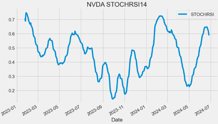
- A Stoch RSI reading above 0.8 is considered overbought, while a reading below 0.2 is considered oversold.
- Overbought doesn’t necessarily mean the price will reverse lower, just like oversold doesn’t mean the price will reverse higher. Rather the overbought and oversold conditions simply alert traders that the RSI is near the extremes of its recent readings.
- A reading of zero means the RSI is at its lowest level in 14 periods (or whatever lookback period is chosen).
Williams %R Indicator
- The Williams %R is a momentum indicator that oscillates between -100% to 0%, with -80% indicating oversold conditions and -20% representing overbought conditions.
def WILLIAMS(ohlc, period = 14,close="Close",high="High",low="Low"):
        """Williams %R, or just %R, is a technical analysis oscillator showing the current closing price in relation to the high and low
         of the past N days (for a given N). It was developed by a publisher and promoter of trading materials, Larry Williams.
         Its purpose is to tell whether a stock or commodity market is trading near the high or the low, or somewhere in between,
         of its recent trading range.
         The oscillator is on a negative scale, from −100 (lowest) up to 0 (highest).
        """

        highest_high = ohlc[high].rolling(center=False, window=period).max()
        lowest_low = ohlc[low].rolling(center=False, window=period).min()

        WR = pd.Series(
            (highest_high - ohlc[close]) / (highest_high - lowest_low),
            name="{0} Williams %R".format(period),
        )

        return WR * -100

datapivotfb['WILLIAMS']=WILLIAMS(data0, period = 14,close="Close",high="High",low="Low")

plt.figure(figsize=(10,6))
datapivotfb['WILLIAMS'].plot(label='WILLIAMS')
plt.title('NVDA WILLIAMS')
plt.legend()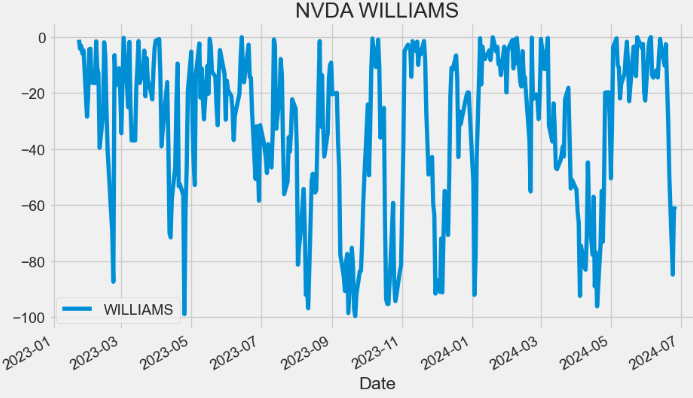
UO Indicator
- The ultimate oscillator (UO) is a momentum indicator designed to measure the price momentum of an asset across multiple timeframes. It uses three different periods (7, 14, and 28) to ascertain the momentum in the short, medium, and long-term market trends and then generates a weighted average of the three.
def UO(ohlc,high="High",low="Low",column="Close"):
        """Ultimate Oscillator is a momentum oscillator designed to capture momentum across three different time frames.
        The multiple time frame objective seeks to avoid the pitfalls of other oscillators.
        Many momentum oscillators surge at the beginning of a strong advance and then form bearish divergence as the advance continues.
        This is because they are stuck with one time frame. The Ultimate Oscillator attempts to correct this fault by incorporating longer
        time frames into the basic formula."""

        k = []  # current low or past close
        for row, _row in zip(ohlc.itertuples(), ohlc.shift(1).itertuples()):
            k.append(min(row, _row))
        bp = ohlc[column] - ohlc[low]  # Buying pressure
        mytr=TR(ohlc,high=high,low=low,close=column)
        Average7 = bp.rolling(window=7).sum() / mytr.rolling(window=7).sum()
        Average14 = bp.rolling(window=14).sum() / mytr.rolling(window=14).sum()
        Average28 = bp.rolling(window=28).sum() / mytr.rolling(window=28).sum()

        return pd.Series(
            (100 * ((4 * Average7) + (2 * Average14) + Average28)) / (4 + 2 + 1)
        )

datapivotfb['UO']=UO(data0,high="High",low="Low",column="Close")

plt.figure(figsize=(10,6))
datapivotfb['UO'].plot(label='UO')
plt.legend()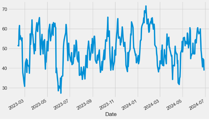
- The Ultimate Oscillator is a range-bound indicator with a value that fluctuates between 0 and 100.
- Similar to the Relative Strength Index (RSI) v.s., levels below 30 are deemed to be oversold, and levels above 70 are deemed to be overbought.
AO Indicator
- The Awesome Oscillator (AO) is an indicator that attempts to gauge whether bearish or bullish forces are currently driving the market. It does this by effectively comparing the recent market momentum, with the general momentum over a wider frame of reference.
def AO(ohlc, slow_period = 34, fast_period = 5,high="High",low="Low"):
        """'EMA',
        Awesome Oscillator is an indicator used to measure market momentum. AO calculates the difference of a 34 Period and 5 Period Simple Moving Averages.
        The Simple Moving Averages that are used are not calculated using closing price but rather each bar's midpoints.
        AO is generally used to affirm trends or to anticipate possible reversals. """

        slow = pd.Series(
            ((ohlc[high] + ohlc[low]) / 2).rolling(window=slow_period).mean(),
            name="slow_AO",
        )
        fast = pd.Series(
            ((ohlc[high] + ohlc[low]) / 2).rolling(window=fast_period).mean(),
            name="fast_AO",
        )

        return pd.Series(fast - slow, name="AO")

datapivotfb['AO']=AO(data0, slow_period = 34, fast_period = 5,high="High",low="Low")

plt.figure(figsize=(10,6))
datapivotfb['AO'].plot(label='AO')
plt.legend()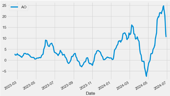
- If the AO is above the zero line, the market is currently bullish but momentum could shift towards being bearish. If the AO is below the zero line, then the market is currently bearish but momentum could shift towards being bullish.
- Plotting the AO histogram vs Close price
plt.figure(figsize=(12,8))
ax1 = plt.subplot2grid((9,1), (0,0), rowspan = 5, colspan = 1)
ax2 = plt.subplot2grid((9,1), (6,0), rowspan = 4, colspan = 1)
ax1.plot(data0['Close'])
ax1.set_title('NVDA')
for i in range(len(datapivotfb)):
    if datapivotfb['AO'][i-1] > datapivotfb['AO'][i]:
        ax2.bar(datapivotfb.index[i], datapivotfb['AO'][i], color = '#f44336')
    else:
        ax2.bar(datapivotfb.index[i], datapivotfb['AO'][i], color = '#26a69a')
ax2.set_title('NVDA AO 5,34')
plt.show()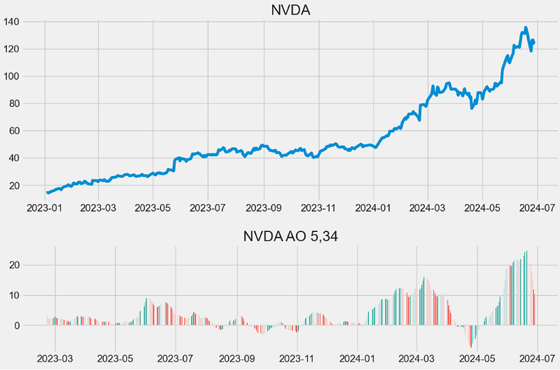
- Read more about AO here.
MI Indicator
- Mass index (MI) is a form of technical analysis that examines the range between high and low stock prices over a period of time.
    def MI(ohlc, period = 9, adjust = True,high="High",low="Low"):
        """Developed by Donald Dorsey, the Mass Index uses the high-low range to identify trend reversals based on range expansions.
        In this sense, the Mass Index is a volatility indicator that does not have a directional bias.
        Instead, the Mass Index identifies range bulges that can foreshadow a reversal of the current trend."""

        _range = pd.Series(ohlc[high] - ohlc[low], name="range")
        EMA9 = _range.ewm(span=period, ignore_na=False, adjust=adjust).mean()
        DEMA9 = EMA9.ewm(span=period, ignore_na=False, adjust=adjust).mean()
        mass = EMA9 / DEMA9

        return pd.Series(mass.rolling(window=25).sum(), name="Mass Index")

datapivotfb['MI']=MI(data0, period = 9, adjust = True,high="High",low="Low")

plt.figure(figsize=(12,8))
datapivotfb['MI'].plot(label='MI')
plt.legend()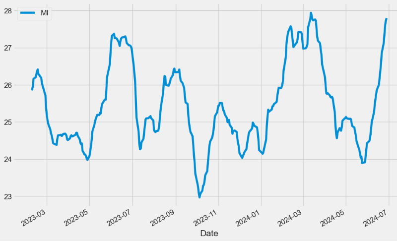
- The indicator typically fluctuates in the mid-20s; readings near the high end of the historical range suggest increasing volatility, which increases the chances for a trend reversal.
BOP Indicator
- Balance of Power (BOP) is a price-based indicator used by technical analysts to evaluate the overall strength of buyers and sellers in the market. BOP oscillates around zero line, where positive values indicate Bull market dominance and negative values indicate Bear market dominance.
def BOP(ohlc,open="Open",column="Close",high="High",low="Low"):
        """Balance Of Power indicator"""

        return pd.Series(
            (ohlc[column] - ohlc[open]) / (ohlc[high] - ohlc[low]), name="BOP"
        )

datapivotfb['BOP']=BOP(data0, open="Open",column="Close",high="High",low="Low")

plt.figure(figsize=(12,8))
datapivotfb['BOP'].plot(label='BOP')
plt.legend()
- BOP Trading: Buyers control the market when the indicator moves above the zero line, and the price is likely to rise. Conversely, sellers dominate the market when the indicator moves below the zero line, and the price is expected to fall.
Vortex Indicator
- The Vortex Indicator (VI) consists of two lines: Vortex Positive (VIP) and Vortex Negative (VIM). These lines are typically colored green and red respectively.
- VI is designed to identify trend direction and measure the strength of a trend.
def VORTEX(ohlc, period = 14,high="High",low="Low",column="Close"):
        """The Vortex indicator plots two oscillating lines, one to identify positive trend movement and the other
         to identify negative price movement.
         Indicator construction revolves around the highs and lows of the last two days or periods.
         The distance from the current high to the prior low designates positive trend movement while the
         distance between the current low and the prior high designates negative trend movement.
         Strongly positive or negative trend movements will show a longer length between the two numbers while
         weaker positive or negative trend movement will show a shorter length."""

        VMP = pd.Series((ohlc[high] - ohlc[low].shift()).abs())
        VMM = pd.Series((ohlc[low] - ohlc[high].shift()).abs())

        VMPx = VMP.rolling(window=period).sum()
        VMMx = VMM.rolling(window=period).sum()
        mytr = TR(ohlc,high=high,low=low,close=column).rolling(window=period).sum()

        VIp = pd.Series(VMPx / mytr, name="VIp").interpolate(method="index")
        VIm = pd.Series(VMMx / mytr, name="VIm").interpolate(method="index")

        return pd.concat([VIm, VIp], axis=1)

datapivotfb[['VIm', 'VIp']]=VORTEX(data0, period = 14,high="High",low="Low",column="Close")

plt.figure(figsize=(12,6))
datapivotfb['VIm'].plot(label='VIm',c='r')
datapivotfb['VIp'].plot(label='VIp',c='g')
plt.legend()
KST Indicator
- The Know Sure Thing (KST) is a momentum oscillator intended to interpret rate-of-change price data. Trading signals are generated when the KST crosses over the signal line, but traders also look for overbought or oversold conditions. Traders also combine the KST with other technical analysis to maximize their odds of a successful trade.
def KST(ohlc, r1 = 10, r2 = 15, r3 = 20, r4 = 30,column = "Close"
    ):
        """Know Sure Thing (KST) is a momentum oscillator based on the smoothed rate-of-change for four different time frames.
        KST measures price momentum for four different price cycles. It can be used just like any momentum oscillator.
        Chartists can look for divergences, overbought/oversold readings, signal line crossovers and centerline crossovers."""

        r1 = ROC(ohlc, period = r1,column = column).rolling(window=10).mean()
        r2 = ROC(ohlc, period = r2,column = column).rolling(window=10).mean()
        r3 = ROC(ohlc, period = r3,column = column).rolling(window=10).mean()
        r4 = ROC(ohlc, period = r4,column = column).rolling(window=15).mean()

        k = pd.Series((r1 * 1) + (r2 * 2) + (r3 * 3) + (r4 * 4), name="KST")

        signal = pd.Series(k.rolling(window=10).mean(), name="signal")

        return pd.concat([k, signal], axis=1)

datapivotfb[['KST_k','KST_signal']]=KST(data0, r1 = 10, r2 = 15, r3 = 20, r4 = 30,column = "Close" )

plt.figure(figsize=(12,6))
datapivotfb['KST_k'].plot(c='b',label='KST_k')
datapivotfb['KST_signal'].plot(c='r',label='KST_signal')
plt.legend()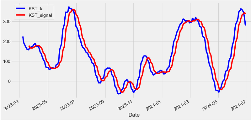
TSI Indicator
- The True Strength Index (TSI) is a momentum oscillator that ranges between limits of -100 and +100 and has a base value of 0.
- Momentum is positive when the oscillator is positive (pointing to a bullish market bias).
- Momentum is negative when the oscillator is negative (pointing to a bearish market bias).
- TSI consists of 2 lines:
- The TSI index line
- An EMA of the TSI, called the TSI signal line
def TSI(ohlc,long = 25,short = 13,signal = 13,column = "Close",adjust = True):
        """True Strength Index (TSI) is a momentum oscillator based on a double smoothing of price changes."""

        ## Double smoother price change
        momentum = pd.Series(ohlc[column].diff())  ## 1 period momentum
        _EMA25 = pd.Series(
            momentum.ewm(span=long, min_periods=long - 1, adjust=adjust).mean(),
            name="_price change EMA25",
        )
        _DEMA13 = pd.Series(
            _EMA25.ewm(span=short, min_periods=short - 1, adjust=adjust).mean(),
            name="_price change double smoothed DEMA13",
        )

        ## Double smoothed absolute price change
        absmomentum = pd.Series(ohlc[column].diff().abs())
        _aEMA25 = pd.Series(
            absmomentum.ewm(span=long, min_periods=long - 1, adjust=adjust).mean(),
            name="_abs_price_change EMA25",
        )
        _aDEMA13 = pd.Series(
            _aEMA25.ewm(span=short, min_periods=short - 1, adjust=adjust).mean(),
            name="_abs_price_change double smoothed DEMA13",
        )

        TSI = pd.Series((_DEMA13 / _aDEMA13) * 100, name="TSI")
        signal = pd.Series(
            TSI.ewm(span=signal, min_periods=signal - 1, adjust=adjust).mean(),
            name="signal",
        )

        return pd.concat([TSI, signal], axis=1)

datapivotfb[['TSI', 'TSI_signal']]=TSI(data0,long = 25,short = 13,signal = 13,column = "Close",adjust = True)

plt.figure(figsize=(12,6))
datapivotfb['TSI'].plot(label='TSI')
datapivotfb['TSI_signal'].plot(c='r',label='TSI_signal')
plt.legend()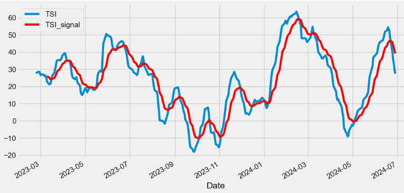
TP Indicator
- The Typical Price (TP) indicator provides a simple, single-line plot of the day’s average price. Some investors use the TP rather than the closing price when creating moving-average penetration systems.
- The TP is a building block of the Money Flow Index (MFI) v.i.
def TP(ohlc,high="High",low="Low",column="Close"):
        """Typical Price refers to the arithmetic average of the high, low, and closing prices for a given period."""

        return pd.Series((ohlc[high] + ohlc[low] + ohlc[column]) / 3, name="TP")
#The Typical Price indicates an average of each day's price.
#The Typical Price indicator provides a simple, single-line plot of the day's average price.
#Some investors use the Typical Price rather than the closing price when creating moving-average penetration systems.

datapivotfb['TP']=TP(data0,high="High",low="Low",column="Close")

plt.figure(figsize=(12,6))
data0['Close'].plot(label='Close')
datapivotfb['TP'].plot(label='TP')
plt.legend(loc='upper left')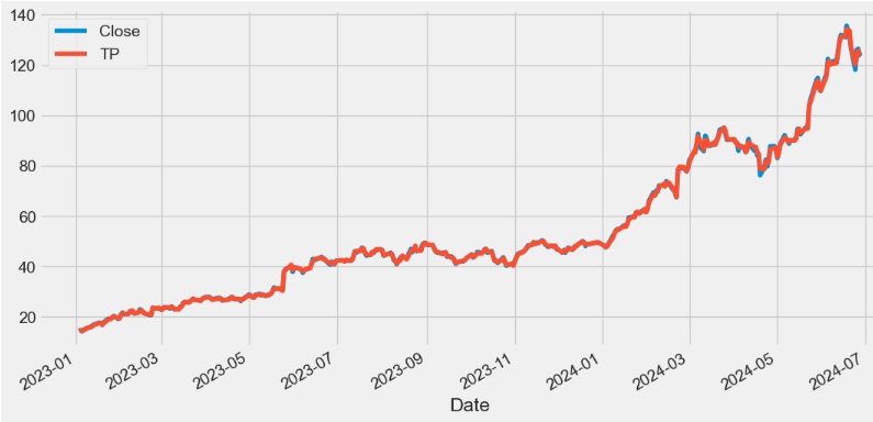
ADL Indicator
- The accumulation/distribution line (ADL) is a cumulative indicator that uses volume and price to assess whether a stock is being accumulated or distributed.
- The ADL measure seeks to identify divergences between the stock price and the volume flow. This provides insight into how strong a trend is.
- If the price is rising but the indicator is falling, then it suggests that buying or accumulation volume may not be enough to support the price rise and a price decline could be forthcoming.
def ADL(ohlcv,colvol="Volume",column="Close",high="High",low="Low"):
        """The accumulation/distribution line was created by Marc Chaikin to determine the flow of money into or out of a security.
        It should not be confused with the advance/decline line. While their initials might be the same, these are entirely different indicators,
        and their uses are different as well. Whereas the advance/decline line can provide insight into market movements,
        the accumulation/distribution line is of use to traders looking to measure buy/sell pressure on a security or confirm the strength of a trend."""

        MFM = pd.Series(
            ((ohlcv[column] - ohlcv[low])
            - (ohlcv[high] - ohlcv[column])) / (ohlcv[high] - ohlcv[low]),
            name="ADL",
        )  # Money flow multiplier
        MFV = pd.Series(MFM * ohlcv[colvol], name="ADL")
        return MFV.cumsum()

datapivotfb['ADL']=ADL(data0,colvol="Volume",column="Close",high="High",low="Low")

plt.figure(figsize=(12,6))
datapivotfb['ADL'].plot(label='ADL')
plt.legend(loc='upper left')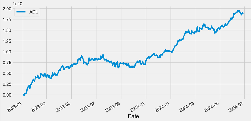
- In general, a rising ADL helps confirm a rising price trend, while a falling ADL helps confirm a price downtrend.
CO Indicator
- The Chaikin Oscillator (CO) can be used to define a general buying or selling bias simply with positive or negative values.
- The Chaikin Oscillator is, at its core, an indicator of an indicator. The Chaikin Oscillator takes ADL v.s. and applies two EMAs of varying length to the line. The CO’s value is then derived by subtracting the longer term EMA of the ADL from the shorter term EMA of the ADL.
def CHAIKIN(ohlcv, colvol="Volume",column="Close",high="High",low="Low",adjust = True):
        """Chaikin Oscillator, named after its creator, Marc Chaikin, the Chaikin oscillator is an oscillator that measures the accumulation/distribution
         line of the moving average convergence divergence (MACD). The Chaikin oscillator is calculated by subtracting a 10-day exponential moving average (EMA)
         of the accumulation/distribution line from a three-day EMA of the accumulation/distribution line, and highlights the momentum implied by the
         accumulation/distribution line."""
        myadl=ADL(ohlcv,colvol=colvol,column=column,high=high,low=low)
        return pd.Series(
            myadl.ewm(span=3, min_periods=2, adjust=adjust).mean()
            - myadl.ewm(span=10, min_periods=9, adjust=adjust).mean()
        )
datapivotfb['CHAIKIN']=CHAIKIN(data0, colvol="Volume",column="Close",high="High",low="Low",adjust = True)


plt.figure(figsize=(12,6))
datapivotfb['CHAIKIN'].plot(label='CO')
plt.legend(loc='lower left')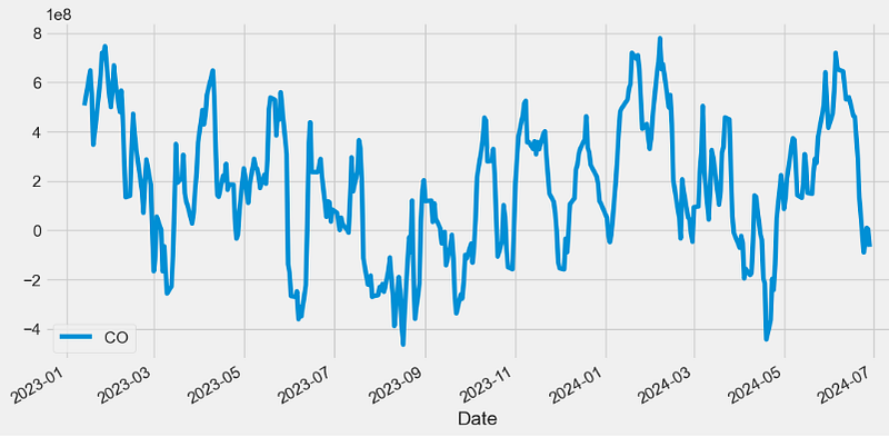
- In the above plot, a Chaikin Oscillator reading above zero indicates net buying pressure, while one below zero registers net selling pressure.
MFI Indicator
- The Money Flow Index (MFI) is a technical oscillator that uses price and volume data for identifying overbought or oversold signals in an asset. It can also be used to spot divergences which warn of a trend change in price. The oscillator moves between 0 and 100.
def MFI(ohlc, period = 14,open="Open",column="Close",high="High",low="Low",colvol="Volume"):
        """The money flow index (MFI) is a momentum indicator that measures
        the inflow and outflow of money into a security over a specific period of time.
        MFI can be understood as RSI adjusted for volume.
        The money flow indicator is one of the more reliable indicators of overbought and oversold conditions, perhaps partly because
        it uses the higher readings of 80 and 20 as compared to the RSI's overbought/oversold readings of 70 and 30"""

        tp = TP(ohlc)
        rmf = pd.Series(tp * ohlc[colvol], name="rmf")  ## Real Money Flow
        _mf = pd.concat([tp, rmf], axis=1)
        _mf["delta"] = _mf["TP"].diff()

        def pos(row):
            if row["delta"] > 0:
                return row["rmf"]
            else:
                return 0

        def neg(row):
            if row["delta"] < 0:
                return row["rmf"]
            else:
                return 0

        _mf["neg"] = _mf.apply(neg, axis=1)
        _mf["pos"] = _mf.apply(pos, axis=1)

        mfratio = pd.Series(
            _mf["pos"].rolling(window=period).sum()
            / _mf["neg"].rolling(window=period).sum()
        )

        return pd.Series(
            100 - (100 / (1 + mfratio)), name="{0} period MFI".format(period)
        )

datapivotfb['MFI']=MFI(data0, period = 14,open="Open",column="Close",high="High",low="Low",colvol="Volume")

plt.figure(figsize=(12,6))
datapivotfb['MFI'].plot(label='MFI')
plt.legend(loc='lower left')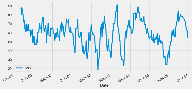
- MFI is a movement indicator used in technical analysis that looks at time and price to measure the trading pressure — buying or selling. It is also called volume-weighted RSI v.s., as it includes volume, unlike RSI, which only incorporates price.
OBV Indicator
- On Balance Volume (OBV) measures buying and selling pressure as a cumulative indicator that adds volume on up days and subtracts volume on down days. When the security closes higher than the previous close, all of the day’s volume is considered up-volume. When the security closes lower than the previous close, all of the day’s volume is considered down-volume.
def OBV(ohlcv, column = "Close",colvol="Volume"):
        """
        On Balance Volume (OBV) measures buying and selling pressure as a cumulative indicator that adds volume on up days and subtracts volume on down days.
        OBV was developed by Joe Granville and introduced in his 1963 book, Granville's New Key to Stock Market Profits.
        It was one of the first indicators to measure positive and negative volume flow.
        Chartists can look for divergences between OBV and price to predict price movements or use OBV to confirm price trends.

        source: https://en.wikipedia.org/wiki/On-balance_volume#The_formula

        :param pd.DataFrame ohlc: 'open, high, low, close' pandas DataFrame
        :return pd.Series: result is pandas.Series
        """

        ohlcv["OBV"] = np.nan

        neg_change = ohlcv[column] < ohlcv[column].shift(1)
        pos_change = ohlcv[column] >= ohlcv[column].shift(1)
        no_change = ohlcv[column] == ohlcv[column].shift(1)

        if pos_change.any():
            ohlcv.loc[pos_change, "OBV"] = ohlcv[colvol]
        if neg_change.any():
            ohlcv.loc[neg_change, "OBV"] = -ohlcv[colvol]
        if no_change.any():
            ohlcv.loc[no_change, "OBV"] = ohlcv["OBV"].shift(1)

        return pd.Series(ohlcv["OBV"].cumsum(), name="OBV")

datapivotfb['OBV']=OBV(data0, column = "Close",colvol="Volume")

plt.figure(figsize=(12,6))
datapivotfb['OBV'].plot(label='OBV')
plt.legend(loc='lower right')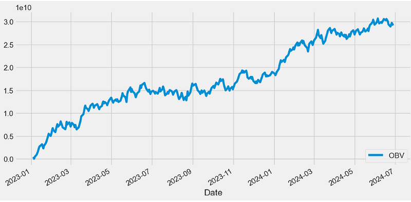
WOBV Indicator
- Weighted OBV (WOBV) can be seen as an OBV indicator that takes the price differences into account.
def WOBV(ohlcv, column = "Close",colvol="Volume"):
        """
        Weighted OBV
        Can also be seen as an OBV indicator that takes the price differences into account.
        In a regular OBV, a high volume bar can make a huge difference,
        even if the price went up only 0.01, and it it goes down 0.01
        instead, that huge volume makes the OBV go down, even though
        hardly anything really happened.
        """

        wobv = pd.Series(ohlcv[colvol] * ohlcv[column].diff(), name="WOBV")
        return wobv.cumsum()

datapivotfb['WOBV']=WOBV(data0, column = "Close",colvol="Volume")

plt.figure(figsize=(12,6))
datapivotfb['WOBV'].plot(label='WOBV')
plt.legend(loc='lower right')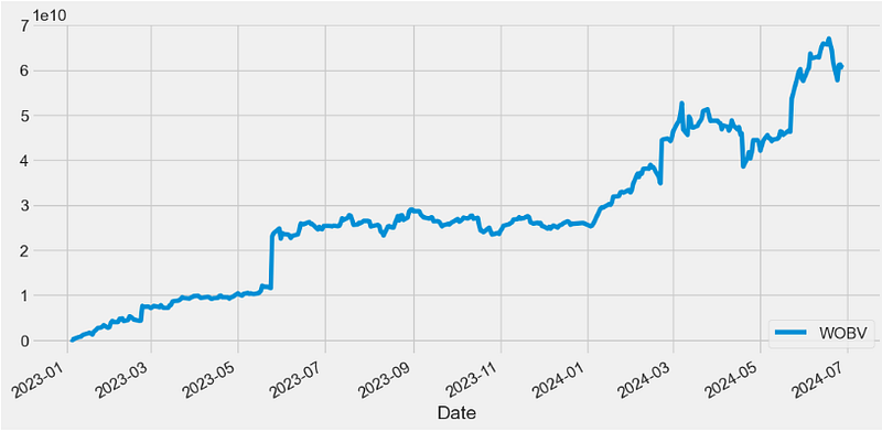
VZO Indicator
- The Volume Zone Oscillator (VZO) is a technical indicator analyzing volume changes in relation to certain levels (zones). Unlike VolumeOsc, the VZO uses price data along with volume.
- VZO Interpretation: The VZO points to a positive trend when it rises above and maintains the 5% level, and a negative trend when it falls below the 5% level and fails to turn higher. Oscillations between the 5% and 40% levels mark a bullish trend zone, while oscillations between -40% and 5% mark a bearish trend zone. Meanwhile, readings above 40% signal an overbought condition, while readings above 60% signal an extremely overbought condition. Alternatively, readings below -40% indicate an oversold condition, which becomes extremely oversold below -60%.
  def VZO(ohlc,period = 14,column = "Close",colvol="Volume",adjust = True):
        """VZO uses price, previous price and moving averages to compute its oscillating value.
        It is a leading indicator that calculates buy and sell signals based on oversold / overbought conditions.
        Oscillations between the 5% and 40% levels mark a bullish trend zone, while oscillations between -40% and 5% mark a bearish trend zone.
        Meanwhile, readings above 40% signal an overbought condition, while readings above 60% signal an extremely overbought condition.
        Alternatively, readings below -40% indicate an oversold condition, which becomes extremely oversold below -60%."""

        sign = lambda a: (a > 0) - (a < 0)
        r = ohlc[column].diff().apply(sign) * ohlc[colvol]
        dvma = r.ewm(span=period, adjust=adjust).mean()
        vma = ohlc[colvol].ewm(span=period, adjust=adjust).mean()

        return pd.Series(100 * (dvma / vma), name="VZO")

datapivotfb['VZO']=VZO(data0,period = 14,column = "Close",colvol="Volume",adjust = True)

plt.figure(figsize=(12,6))
datapivotfb['VZO'].plot(label='VZO')
plt.axhline(y=5, color='g', linestyle='--')
plt.axhline(y=-5, color='r', linestyle='--')
plt.axhline(y=-40, color='y', linestyle='--')
plt.axhline(y=40, color='y', linestyle='--')
plt.legend()
plt.show()
#Oscillations between the 5% and 40% levels mark a bullish trend zone,
#while oscillations between -40% and 5% mark a bearish trend zone. 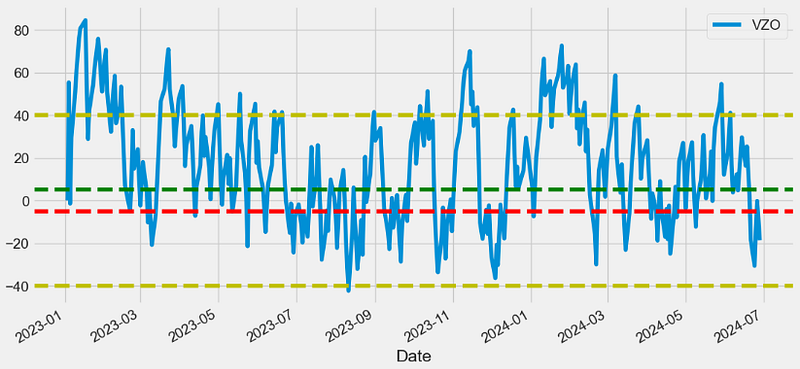
PZO Indicator
- The Price Zone Oscillator (PZO) is a technical indicator that measures the current price versus averaged historical prices.
- The PZO has key levels at 15, 40, 60, -5, -40, and -60.
- These levels represent buy or sell signals depending on which direction the indicator is crossing from, and the overall trend direction in price.
def PZO(ohlc,period = 14,column = "Close",adjust = True):
        """
        The formula for PZO depends on only one condition: if today's closing price is higher than yesterday's closing price,
        then the closing price will have a positive value (bullish); otherwise it will have a negative value (bearish).
        source: http://traders.com/Documentation/FEEDbk_docs/2011/06/Khalil.html

        :period: Specifies the number of Periods used for PZO calculation
        """

        sign = lambda a: (a > 0) - (a < 0)
        r = ohlc[column].diff().apply(sign) * ohlc[column]
        cp = pd.Series(r.ewm(span=period, adjust=adjust).mean())
        tc = EMA(ohlc, period)

        return pd.Series(100 * (cp / tc), name="{} period PZO".format(period))

datapivotfb['PZO']=PZO(data0,period = 14,column = "Close",adjust = True)

plt.figure(figsize=(12,6))
datapivotfb['PZO'].plot(legend='PZO')
plt.axhline(y=60, color='g', linestyle='--')
plt.axhline(y=40, color='y', linestyle='--')
plt.axhline(y=15, color='k', linestyle='--')
plt.axhline(y=-5, color='k', linestyle='--')
plt.axhline(y=-40, color='y', linestyle='--')
plt.axhline(y=-60, color='r', linestyle='--')
plt.legend()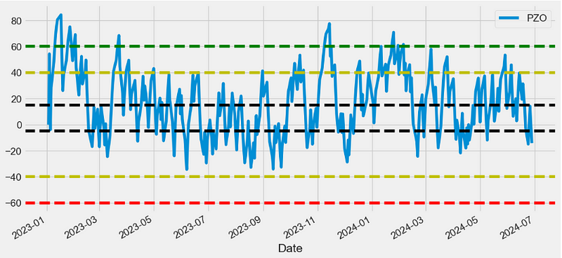
EFI Indicator
- Elder’s Force Index (EFI) is a technical indicator designed to measure a stock’s current buying and selling activity.
- The formula for calculating EFI is as follows:
- EFI = (Current price — Previous price) * Current volume
- Positive EFI values indicate an upward trend, while negative values suggest a downward trend.
def EFI(ohlcv,period = 13,column = "Close",colvol="Volume",adjust = True):
        """Elder's Force Index is an indicator that uses price and volume to assess the power
         behind a move or identify possible turning points."""

        # https://tradingsim.com/blog/elders-force-index/
        fi = pd.Series(ohlcv[column].diff() * ohlcv[colvol])
        return pd.Series(
            fi.ewm(ignore_na=False, span=period, adjust=adjust).mean(),
            name="{0} period Force Index".format(period),
        )
datapivotfb['EFI']=EFI(data0,period = 13,column = "Close",colvol="Volume",adjust = True)
plt.figure(figsize=(12,6))
datapivotfb['EFI'].plot(legend='EFI')
plt.legend(loc='lower left')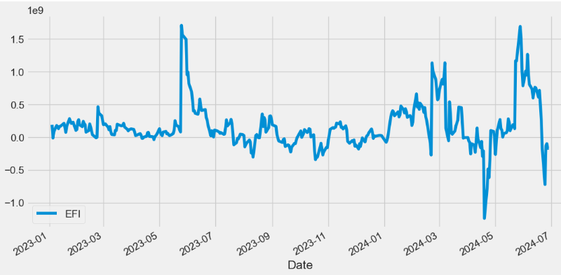
CFI Indicator
- Cumulative Force Index (CFI) = cumulative sum (EFI)
def CFI(ohlcv, column = "Close", colvol="Volume",adjust = True):
        """
        Cumulative Force Index.
        Adopted from  Elder's Force Index.
        """

        fi1 = pd.Series(ohlcv[colvol] * ohlcv[column].diff())
        cfi = pd.Series(
            fi1.ewm(ignore_na=False, min_periods=9, span=10, adjust=adjust).mean(),
            name="CFI",
        )

        return cfi.cumsum()

datapivotfb['CFI']=CFI(data0, column = "Close", colvol="Volume",adjust = True)

plt.figure(figsize=(12,6))
datapivotfb['CFI'].plot(legend='CFI')
plt.legend(loc='upper left')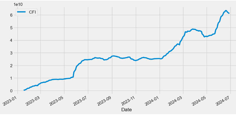
EBBP Indicator
- The Elder’s Bulls/Bears Power (EBBP) indicator is given by
Bulls Power = High — EMA, Bears Power = Low — EMA.
- Positive values in the Bulls Power indicator indicate bullish strength, while negative values in the Bears Power indicator indicate bearish strength.
def EBBP(ohlc,high="High",low="Low"):
        """Bull power and bear power by Dr. Alexander Elder show where today’s high and low lie relative to the a 13-day EMA"""

        bull_power = pd.Series(ohlc[high] - EMA(ohlc, 13), name="Bull.")
        bear_power = pd.Series(ohlc[low] - EMA(ohlc, 13), name="Bear.")

        return pd.concat([bull_power, bear_power], axis=1)

datapivotfb[['bull_power', 'bear_power']]=EBBP(data0,high="High",low="Low")

plt.figure(figsize=(12,6))
datapivotfb['bull_power'].plot(label='bull_power')
datapivotfb['bear_power'].plot(label='bear_power')
plt.legend(loc='upper left')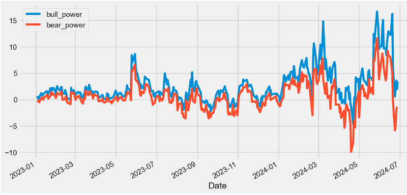
EMV Indicator
- Ease of movement (EMV) is an indicator used in technical analysis to relate an asset’s price change to its volume, and it’s often used to assess the strength of an underlying trend.
- When the indicator creates output values above zero and rising, this suggests that the price is increasing on low volume, while falling negative values suggest that the price is dropping on low volume.
def EMV(ohlcv, period = 14,high="High",low="Low",colvol="Volume"):
        """ is a volume-based oscillator that fluctuates above and below the zero line.
        As its name implies, it is designed to meaEase of Movement (EMV)sure the 'ease' of price movement.
        prices are advancing with relative ease when the oscillator is in positive territory.
        Conversely, prices are declining with relative ease when the oscillator is in negative territory."""

        distance = pd.Series(
            ((ohlcv[high] + ohlcv[low]) / 2)
            - (ohlcv[high].shift() + ohlcv[low].shift()) / 2
        )
        box_ratio = pd.Series(
            (ohlcv[colvol] / 1000000) / (ohlcv[high] - ohlcv[low])
        )

        _emv = pd.Series(distance / box_ratio)

        return pd.Series(
            _emv.rolling(window=period).mean(), name="{0} period EMV.".format(period)
        )

datapivotfb['EMV']=EMV(data0, period = 14,high="High",low="Low",colvol="Volume")

plt.figure(figsize=(12,6))
datapivotfb['EMV'].plot(label='EMV')
plt.legend(loc='upper left')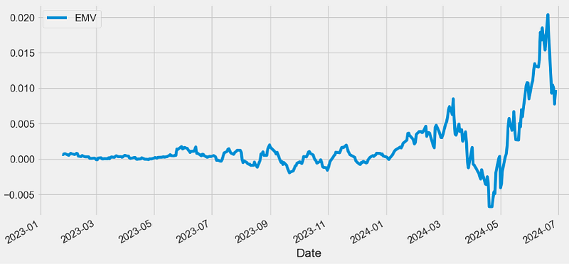
CCI Indicator
- The Commodity Channel Index (CCI) is a technical indicator that measures the difference between the current price and the historical average price.
- When the CCI is above zero, it indicates the price is above the historic average. Conversely, when the CCI is below zero, the price is below the historic average.
- The CCI is an unbounded oscillator, meaning it can go higher or lower indefinitely. For this reason, overbought and oversold levels are typically determined for each individual asset by looking at historical extreme CCI levels where the price reversed from.
def CCI(ohlc, period = 20, constant = 0.015,open="Open",column="Close",high="High",low="Low"):
        """Commodity Channel Index (CCI) is a versatile indicator that can be used to identify a new trend or warn of extreme conditions.
        CCI measures the current price level relative to an average price level over a given period of time.
        The CCI typically oscillates above and below a zero line. Normal oscillations will occur within the range of +100 and −100.
        Readings above +100 imply an overbought condition, while readings below −100 imply an oversold condition.
        As with other overbought/oversold indicators, this means that there is a large probability that the price will correct to more representative levels.

        source: https://stockcharts.com/school/doku.php?id=chart_school:technical_indicators:commodity_channel_index_cci

        :param pd.DataFrame ohlc: 'open, high, low, close' pandas DataFrame
        :period: int - number of periods to take into consideration
        :factor float: the constant at .015 to ensure that approximately 70 to 80 percent of CCI values would fall between -100 and +100.
        :return pd.Series: result is pandas.Series
        """

        tp = TP(ohlc)
        tp_rolling = tp.rolling(window=period, min_periods=0)
        # calculate MAD (Mean Deviation)
        # https://www.khanacademy.org/math/statistics-probability/summarizing-quantitative-data/other-measures-of-spread/a/mean-absolute-deviation-mad-review
        mad = tp_rolling.apply(lambda s: abs(s - s.mean()).mean(), raw=True)
        return pd.Series(
            (tp - tp_rolling.mean()) / (constant * mad),
            name="{0} period CCI".format(period),
        )

datapivotfb['CCI']=CCI(data0, period = 20, constant = 0.015,open="Open",column="Close",high="High",low="Low")
plt.figure(figsize=(12,6))
datapivotfb['CCI'].plot(label='CCI')
plt.legend(loc='upper left')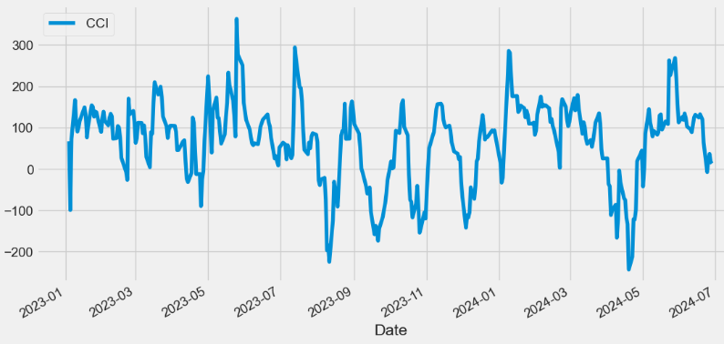
COPP Indicator
- The Coppock Curve (COPP) Indicator is a momentum oscillator that helps identify major turning points in the stock market.
- The COPP is a valuable tool for identifying bearish signals in the stock market.
- One of the most common bearish signals in the Coppock Curve is a divergence between the curve and the price of the market. A divergence occurs when the price of the market continues to rise while the Coppock Curve starts to decline.
- Another bearish signal in the Coppock Curve is a negative crossover. This happens when the curve crosses below the zero line, indicating a change in momentum from positive to negative. This can be a strong indicator that a bear market is imminent.
def COPP(ohlc, adjust = True):
        """The Coppock Curve is a momentum indicator, it signals buying opportunities when the indicator moved from negative territory to positive territory."""

        roc1 = ROC(ohlc, 14)
        roc2 = ROC(ohlc, 11)

        return pd.Series(
            (roc1 + roc2).ewm(span=10, min_periods=9, adjust=adjust).mean(),
            name="Coppock Curve",
        )

datapivotfb['COPP']=COPP(data0, adjust = True)
plt.figure(figsize=(12,6))
datapivotfb['COPP'].plot(label='COPP')
plt.legend(loc='lower left')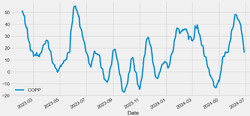
BASP Indicator
- Buying and Selling Pressure (BASP)
- In cryptocurrency trading, understanding BASP is paramount for informed decision-making. These on-chain metrics serve as crucial indicators, shedding light on the market trends and helping traders identify potential buy and sell signals.
- Buying pressure indicates the force behind upward price movements.
- Elevated selling pressure may indicate a bearish trend, with the potential to trigger sell signals.
- Buy/sell pressure metrics play a pivotal role in recognizing a trend reversal. When the balance shifts from buying to selling pressure or vice versa, it can signal an impending shift in market sentiment.
def BASP(ohlc, period = 40, adjust = True,colvol="Volume",high="High",low="Low",close="Close"):
        """BASP indicator serves to identify buying and selling pressure."""

        sp = ohlc[high] - ohlc[close]
        bp = ohlc[close] - ohlc[low]
        spavg = sp.ewm(span=period, adjust=adjust).mean()
        bpavg = bp.ewm(span=period, adjust=adjust).mean()

        nbp = bp / bpavg
        nsp = sp / spavg

        varg = ohlc[colvol].ewm(span=period, adjust=adjust).mean()
        nv = ohlc[colvol] / varg

        nbfraw = pd.Series(nbp * nv, name="Buy.")
        nsfraw = pd.Series(nsp * nv, name="Sell.")

        return pd.concat([nbfraw, nsfraw], axis=1)

datapivotfb[['nbfraw', 'nsfraw']]=BASP(data0, period = 40, adjust = True,colvol="Volume",high="High",low="Low",close="Close")

plt.figure(figsize=(12,6))
datapivotfb['nbfraw'].plot(label='Buy')
datapivotfb['nsfraw'].plot(label='Sell')
plt.legend(loc='upper left')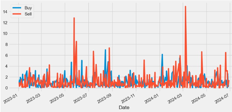
BASPN Indicator
- The Normalized BASP (BASPN) indicator is calculated as follows:
- Normalized Buying Pressure = Buying Pressure / mean(Buying Pressure).ewm(span=period)
- Normalized Selling Pressure = Selling Pressure / mean(Selling Pressure).ewm(span=period)
def BASPN(ohlc, period = 40, adjust = True,colvol="Volume",high="High",low="Low",close="Close"):
        """
        Normalized BASP indicator
        """

        sp = ohlc[high] - ohlc[close]
        bp = ohlc[close] - ohlc[low]
        spavg = sp.ewm(span=period, adjust=adjust).mean()
        bpavg = bp.ewm(span=period, adjust=adjust).mean()

        nbp = bp / bpavg
        nsp = sp / spavg

        varg = ohlc[colvol].ewm(span=period, adjust=adjust).mean()
        nv = ohlc[colvol] / varg

        nbf = pd.Series((nbp * nv).ewm(span=20, adjust=adjust).mean(), name="Buy.")
        nsf = pd.Series((nsp * nv).ewm(span=20, adjust=adjust).mean(), name="Sell.")

        return pd.concat([nbf, nsf], axis=1)

datapivotfb[['nbf', 'nsf']]=BASPN(data0, period = 40, adjust = True,colvol="Volume",high="High",low="Low",close="Close")

plt.figure(figsize=(12,6))
datapivotfb['nbf'].plot(label='Buy')
datapivotfb['nsf'].plot(label='Sell')
plt.legend(loc='upper left')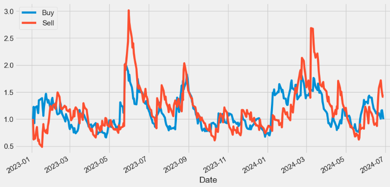
CMO Indicator
- The Chande momentum oscillator (CMO) is a technical indicator that uses momentum to identify relative strength or weakness in a market.
- Traders can use the CMO to spot bullish and bearish price divergence between the indicator and underlying security. A bearish divergence occurs if the underlying security is trending upward and the Chande momentum oscillator is moving downwards. A bullish divergence occurs if the price is declining but the oscillator is rising.
def CMO(ohlc,period = 9, factor = 100,column = "Close",adjust = True):
        """
        Chande Momentum Oscillator (CMO) - technical momentum indicator invented by the technical analyst Tushar Chande.
        It is created by calculating the difference between the sum of all recent gains and the sum of all recent losses and then
        dividing the result by the sum of all price movement over the period.
        This oscillator is similar to other momentum indicators such as the Relative Strength Index and the Stochastic Oscillator
        because it is range bounded (+100 and -100)."""

        # get the price diff
        delta = ohlc[column].diff()

        # positive gains (up) and negative gains (down) Series
        up, down = delta.copy(), delta.copy()
        up[up < 0] = 0
        down[down > 0] = 0

        # EMAs of ups and downs
        _gain = up.ewm(com=period, adjust=adjust).mean()
        _loss = down.ewm(com=period, adjust=adjust).mean().abs()

        return pd.Series(factor * ((_gain - _loss) / (_gain + _loss)), name="CMO")

datapivotfb['CMO']=CMO(data0,period = 9, factor = 100,column = "Close",adjust = True)

plt.figure(figsize=(12,6))
datapivotfb['CMO'].plot(label='CMO')
plt.legend(loc='lower left')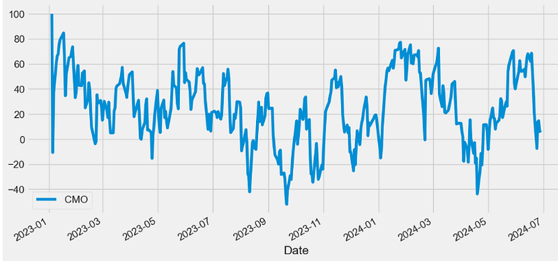
CE Indicator
- Chandelier Exit (CE) is a volatility-based indicator that identifies stop loss exit points for long and short trading positions.
- CE is based on the Average True Range (ATR) indicator v.s.
- It is designed to keep traders in the trend until a defined trend reversal happens. Traders use CE to maximize their returns in a trade and make stop loss exit decisions.
- CE show two lines — the chandelier exit long and the chandelier exit short. The exit long is used to close long positions whereas the exit short is used to close short positions. Therefore, the rule of the indicator is to close long positions when the price goes below the exit long and to close short positions when the price goes above exit short.
def CHANDELIER(ohlc,short_period = 22,long_period = 22,k = 3,high="High",low="Low"):
        """
        Chandelier Exit sets a trailing stop-loss based on the Average True Range (ATR).

        The indicator is designed to keep traders in a trend and prevent an early exit as long as the trend extends.

        Typically, the Chandelier Exit will be above prices during a downtrend and below prices during an uptrend.
        """

        l = pd.Series(
            ohlc[high].rolling(window=long_period).max() - ATR(ohlc, 22) * k,
            name="Long.",
        )
        s = pd.Series(
            ohlc[low].rolling(window=short_period).min() + ATR(ohlc, 22) * k,
            name="Short.",
        )

        return pd.concat([s, l], axis=1)

datapivotfb[['Short', 'Long']]=CHANDELIER(data0,short_period = 22,long_period = 22,k = 3,high="High",low="Low")

plt.figure(figsize=(12,6))
data0['Close'].plot(label='Close')
datapivotfb['Short'].plot(label='Short')
datapivotfb['Long'].plot(label='Long')
plt.legend(loc='upper left')

#Long positions involve owning a security before being sold;
#they profit when there is an increase in price. Short positions involve borrowing a security before being sold,
#to be bought back at a lower price: they profit when the security falls in price.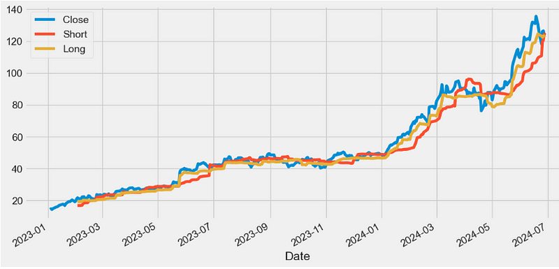
Qstick Indicator
- Qstick is a technical momentum indicator used to identify a stock’s trend by looking at the MA of the difference between a stock’s Close and Open price.
- A Qstick indicator > 0 indicates increasing buying pressure, and a Qstick indicator < 0 indicates increasing selling pressure.
 def QSTICK(ohlc, period = 14,column="Close",open="Open"):
        """
        QStick indicator shows the dominance of black (down) or white (up) candlesticks, which are red and green in Chart,
        as represented by the average open to close change for each of past N days."""

        _close = ohlc[column].tail(period)
        _open = ohlc[open].tail(period)

        return pd.Series(
            (_close - _open) / period, name="{0} period QSTICK.".format(period)
        )

datapivotfb['QSTICK']=QSTICK(data0, period = 14,column="Close",open="Open")

plt.figure(figsize=(12,6))
datapivotfb['QSTICK'].plot(label='QSTICK')
plt.legend(loc='lower left')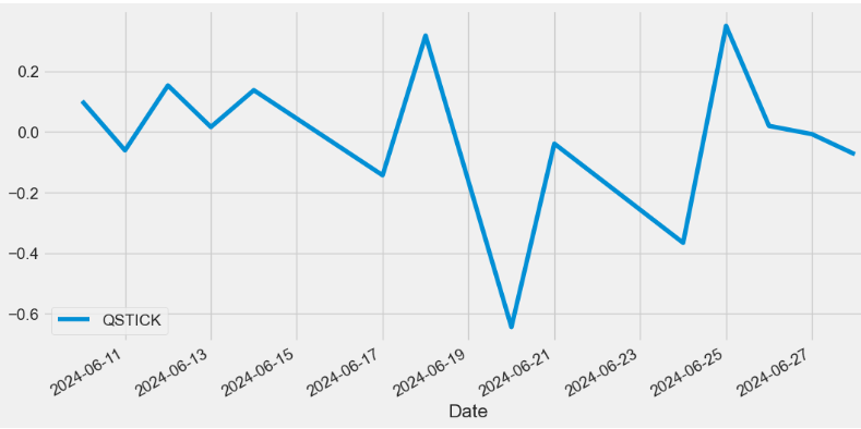
WTO Indicator
- The Wave Trend Oscillator (WTO) is a comprehensive technical indicator merging the ATR and SMA indicators to assist traders in gauging market momentum, predicting potential trend reversals, and determining optimal entry and exit points
- The WTO excels at following swings in a volatile market which is why this particular indicator is very useful when trading cryptocurrency.
def WTO(ohlc,channel_length = 10,average_length = 21,adjust = True):
        """
        Wave Trend Oscillator
        source: http://www.fxcoaching.com/WaveTrend/
        """

        ap = TP(ohlc)
        esa = ap.ewm(span=average_length, adjust=adjust).mean()
        d = pd.Series(
            (ap - esa).abs().ewm(span=channel_length, adjust=adjust).mean(), name="d"
        )
        ci = (ap - esa) / (0.015 * d)

        wt1 = pd.Series(ci.ewm(span=average_length, adjust=adjust).mean(), name="WT1.")
        wt2 = pd.Series(wt1.rolling(window=4).mean(), name="WT2.")

        return pd.concat([wt1, wt2], axis=1)

datapivotfb[['wt1', 'wt2']]=WTO(data0,channel_length = 10,average_length = 21,adjust = True)

plt.figure(figsize=(12,6))
datapivotfb['wt1'].plot(label='wt1')
datapivotfb['wt2'].plot(label='wt2')
plt.legend(loc='lower left')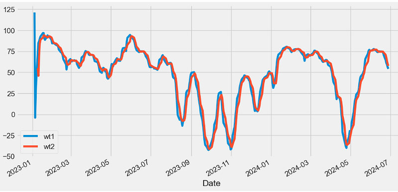
- Read more about WTO here.
FISH Indicator
- The Fisher Transform (FISH) Indicator is a technical indicator that normalizes asset prices, thus making turning points in price clearer.
- An extreme reading indicates the possibility of a reversal. This should be confirmed when the indicator changes direction. For example, an asset price may drop (or has already started dropping) when the indicator heads lower after reaching an extremely high level with a strong price rise in the asset.
def FISH(ohlc, period = 10, adjust = True,high="High",low="Low"):
        """
        Fisher Transform was presented by John Ehlers. It assumes that price distributions behave like square waves.
        """

        from numpy import log, seterr

        seterr(divide="ignore")

        med = (ohlc[high] + ohlc[low]) / 2
        ndaylow = med.rolling(window=period).min()
        ndayhigh = med.rolling(window=period).max()
        raw = (2 * ((med - ndaylow) / (ndayhigh - ndaylow))) - 1
        smooth = raw.ewm(span=5, adjust=adjust).mean()
        _smooth = smooth.fillna(0)

        return pd.Series(
            (log((1 + _smooth) / (1 - _smooth))).ewm(span=3, adjust=adjust).mean(),
            name="{0} period FISH.".format(period),
        )

datapivotfb['FISH']=FISH(data0, period = 10, adjust = True,high="High",low="Low")

plt.figure(figsize=(12,6))
datapivotfb['FISH'].plot(label='FISH')
plt.legend(loc='lower left')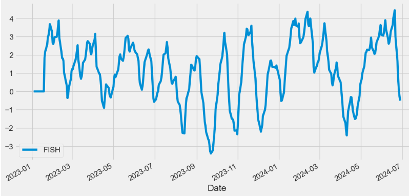
Ichimoku Cloud Indicator
- The Ichimoku Cloud is a collection of technical indicators that show support and resistance levels, as well as momentum and trend direction.
- The following are the five formulas for the lines that comprise the Ichimoku Cloud indicator:
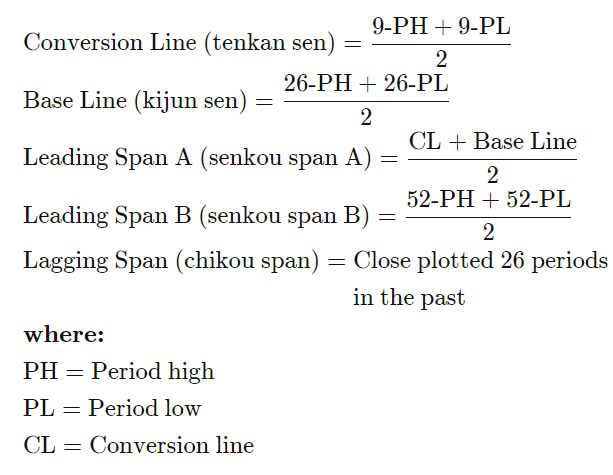
def ICHIMOKU(ohlc,tenkan_period = 9,kijun_period = 26,senkou_period = 52,chikou_period = 26,high="High",low="Low",column="Close"):
        """
        The Ichimoku Cloud, also known as Ichimoku Kinko Hyo, is a versatile indicator that defines support and resistance,
        identifies trend direction, gauges momentum and provides trading signals.

        Ichimoku Kinko Hyo translates into “one look equilibrium chart”.
        """

        tenkan_sen = pd.Series(
            (
                ohlc[high].rolling(window=tenkan_period).max()
                + ohlc[low].rolling(window=tenkan_period).min()
            )
            / 2,
            name="TENKAN",
        )  ## conversion line

        kijun_sen = pd.Series(
            (
                ohlc[high].rolling(window=kijun_period).max()
                + ohlc[low].rolling(window=kijun_period).min()
            )
            / 2,
            name="KIJUN",
        )  ## base line

        senkou_span_a = pd.Series(
            ((tenkan_sen + kijun_sen) / 2), name="senkou_span_a"
        ) .shift(kijun_period) ## Leading span

        senkou_span_b = pd.Series(
            (
                (
                    ohlc[high].rolling(window=senkou_period).max()
                    + ohlc[low].rolling(window=senkou_period).min()
                )
                / 2
            ),
            name="SENKOU",
        ).shift(kijun_period)

        chikou_span = pd.Series(
            ohlc[column].shift(-chikou_period),
            name="CHIKOU",
        )

        return pd.concat(
            [tenkan_sen, kijun_sen, senkou_span_a, senkou_span_b, chikou_span], axis=1
        )

datapivotfb[['tenkan_sen', 'kijun_sen', 'senkou_span_a', 'senkou_span_b', 'chikou_span']]=ICHIMOKU(data0,tenkan_period = 9,kijun_period = 26,senkou_period = 52,chikou_period = 26,high="High",low="Low",column="Close")

plt.figure(figsize=(12,6))
data0['Close'].plot(label="Close")
datapivotfb['tenkan_sen'].plot(label="tenkan_sen")
datapivotfb['kijun_sen'].plot(label="kijun_sen")
datapivotfb['senkou_span_a'].plot(label="senkou_span_a")
datapivotfb['senkou_span_b'].plot(label="senkou_span_b")
datapivotfb['chikou_span'].plot(label="chikou_span")
plt.legend()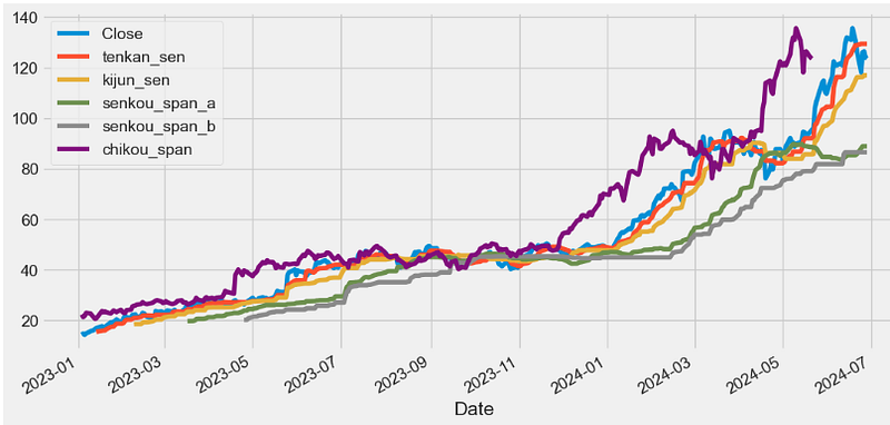
- When the price is above the Tenkan-Sen, it indicates a short-term bullish trend, while the price below the Tenkan-Sen suggests a short-term bearish trend.
- The Kijun-Sen is similar to the Tenkan-Sen but uses a more extended look-back period of 26 periods. It serves as a medium-term trend indicator and is often used as a support or resistance level.
- Senkou Span A represents the average of the Tenkan-Sen and Kijun-Sen, projected 26 periods into the future. It forms one of the boundaries of the Ichimoku Cloud.
- Senkou Span B is the average of the highest high and the lowest low over the past 52 periods, projected 26 periods into the future. It forms the other boundary of the Ichimoku Cloud.
- The Chikou Span is the current closing price, plotted 26 periods in the past. It serves as a momentum indicator and helps traders identify potential trend reversals.
- The space between Senkou Span A and Senkou Span B forms the Ichimoku Cloud. The cloud changes color depending on whether Senkou Span A is above or below Senkou Span B, indicating bullish or bearish market sentiment.
- Read more here.
APZ Indicator
- The adaptive price zone, or APZ, is a volatility-based indicator that appears as a set of bands placed over a price chart. Especially useful in non-trending, choppy markets, the APZ was created to help traders find potential turning points in the markets.
- The APZ calculations form two bands that appear over a price chart. The upper and lower APZ bands are neither uniform nor symmetrical. In contrast, the bands that are formed by the APZ take into consideration volatility, and change in shape and width (distance from each other) as changes in price activity occur.
- In general, the distance between the upper and lower APZ bands will increase with larger price swings and will constrict during periods of decreased price movement. Therefore, wide bands are indicative of increased volatility, and narrow bands represent periods of decreased volatility.
def APZ(ohlc,period = 21,dev_factor = 2,adjust = True,column = "Close",high="High",low="Low"):
        """
        The adaptive price zone (APZ) is a technical indicator developed by Lee Leibfarth.

        The APZ is a volatility based indicator that appears as a set of bands placed over a price chart.

        Especially useful in non-trending, choppy markets,

        the APZ was created to help traders find potential turning points in the markets.
        """

        MA = DEMA(ohlc,period = period,column = column,adjust = adjust)
        price_range = pd.Series(
            (ohlc[high] - ohlc[low]).ewm(span=period, adjust=adjust).mean()
        )
        volatility_value = pd.Series(
            price_range.ewm(span=period, adjust=adjust).mean(), name="vol_val"
        )

        # upper_band = dev_factor * volatility_value + dema
        upper_band = pd.Series((volatility_value * dev_factor) + MA, name="UPPER")
        lower_band = pd.Series(MA - (volatility_value * dev_factor), name="LOWER")

        return pd.concat([upper_band, lower_band], axis=1)

datapivotfb[['apz_upper', 'apz_lower']]=APZ(data0,period = 21,dev_factor = 2,adjust = True,column = "Close",high="High",low="Low")

plt.figure(figsize=(12,6))
data0['Close'].plot(label="Close")
datapivotfb['apz_upper'].plot(label="UPPER")
datapivotfb['apz_lower'].plot(label="LOWER")
plt.legend()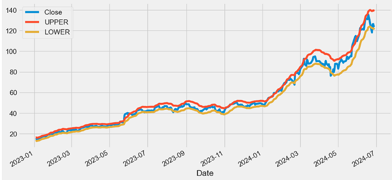
VPT Indicator
- The volume price trend (VPT) indicator is used to determine the balance between a security’s demand and supply. The percentage change in the share price trend shows the relative supply or demand of a particular security, while volume indicates the force behind the trend. The VPT indicator is similar to the on-balance volume (OBV) indicator in that it measures cumulative volume and provides traders with information about a security’s money flow.
def VPT(ohlc,colvol="Volume",column="Close",open="Open",high="High",low="Low"):
        """
        Volume Price Trend
        The Volume Price Trend uses the difference of price and previous price with volume and feedback to arrive at its final form.
        If there appears to be a bullish divergence of price and the VPT (upward slope of the VPT and downward slope of the price) a buy opportunity exists.
        Conversely, a bearish divergence (downward slope of the VPT and upward slope of the price) implies a sell opportunity.
        """

        hilow = (ohlc[high] - ohlc[low]) * 100
        openclose = (ohlc[column] - ohlc[open]) * 100
        vol = ohlc[colvol] / hilow
        spreadvol = (openclose * vol).cumsum()

        vpt = spreadvol + spreadvol

        return pd.Series(vpt, name="VPT")

datapivotfb['VPT']=VPT(data0,colvol="Volume",column="Close",open="Open",high="High",low="Low")

plt.figure(figsize=(12,6))
datapivotfb['VPT'].plot(label='VPT')
plt.legend(loc='lower right')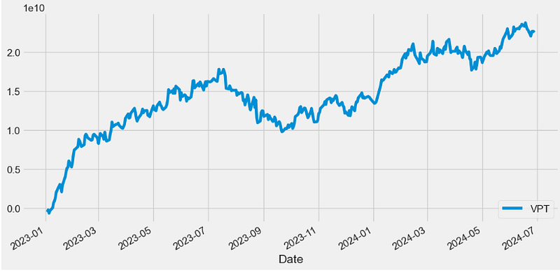
- Traders can use the VPT indicator to spot technical divergence. Divergence occurs when the indicator makes a higher high or a lower low, but the security’s price makes a lower high or a higher low. Traders should place a stop-loss order above the most recent swing high or below the most recent swing low to minimize risk.
FVE Indicator
- The Finite Volume Elements (FVE) Indicator is a money flow indicator but with two important differences from existing money flow indicators:
- It resolves contradictions between intraday money flow indicators (such as Chaikin’s money flow) and interday money flow indicators (like On Balance Volume) by taking into account both intra- and interday price action.
- Unlike other money flow indicators which add or subtract all volume even if the security closed just 1 cent higher than the previous close, FVE uses a volatility threshold to take into account minimal price changes.
def FVE(ohlc, period = 22, factor = 0.3,colvol="Volume",column="Close",open="Open",high="High",low="Low"):
        """
        FVE is a money flow indicator, but it has two important innovations: first, the F VE takes into account both intra and
        interday price action, and second, minimal price changes are taken into account by introducing a price threshold.
        """

        hl2 = (ohlc[high] + ohlc[low]) / 2
        tp = TP(ohlc)
        #open=open,close=column,high=high,low=low)
        smav = ohlc[colvol].rolling(window=period).mean()
        mf = pd.Series((ohlc[column] - hl2 + tp.diff()), name="mf")

        _mf = pd.concat([ohlc[column], ohlc[colvol], mf], axis=1)

        def vol_shift(row):

            if row["mf"] > factor * row[column] / 100:
                return row[colvol]
            elif row["mf"] < -factor * row[column] / 100:
                return -row[colvol]
            else:
                return 0

        _mf["vol_shift"] = _mf.apply(vol_shift, axis=1)
        _sum = _mf["vol_shift"].rolling(window=period).sum()

        return pd.Series((_sum / smav) / period * 100)

datapivotfb['FVE']=FVE(data0, period = 22, factor = 0.3,colvol="Volume",column="Close",open="Open",high="High",low="Low")

plt.figure(figsize=(12,6))
datapivotfb['FVE'].plot(label='FVE')
plt.legend(loc='lower right')
#Sell when the MFI rises above 80 as it indicates an overbought condition
#and buy when the MFI falls below 20 as it indicates an oversold condition.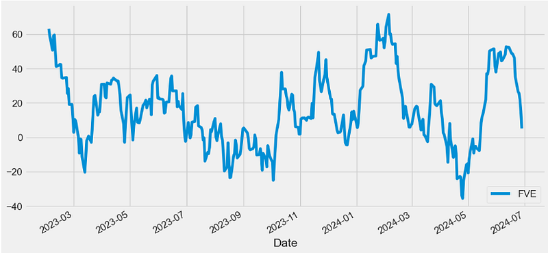
- The FVE provides 3 types of signals:
- The strongest signal is divergence between price and the indicator. Divergence can provide leading signals of breakouts or warnings of impending corrections. The classic method for detecting divergence is for FVE to make lower highs while price makes higher highs (negative divergence).
- The most obvious and coincident signal is the slope of the FVE line. An upward slope indicates that the bulls are in control and the opposite for downward.
- Values above zero are bullish and indicate accumulation while values below zero indicate distribution. FVE crossing the zero line indicates that the short to intermediate balance of power is changing from the bulls to the bears or vice versa.
Conclusions
- The present article describes a complete catalogue/module of technical analysis functions (indicators) obtained through the step-by-step simplification and testing of the FinTA library [1–3] for analyzing financial time series data.
- This module consists of simple standalone Python functions that do not require an installation and import of FinTA.
- Algo-traders can use the modified FinTA functions to generate 75 popular technical indicators directly without having to match all FinTA dependencies in their projects.
- We used a great variety of technical indicators to perform 1Y NVDA technical analysis from 2023–01–03 to 2024–06–28.
- NVDA’s momentum indicators are specifically helpful, as they help traders time the market using mark points where the market can reverse.
- Relevant data visualization is performed using Pandas, Matplotlib and Plotly.
References
- FinTA (Financial Technical Analysis)/ https://github.com/peerchemist/finta
- OHLCV and Technical Indicators
- Finta Package
- Top 4 Python libraries for technical analysis
Explore More
- Backtesting Hull Moving Average (HMA) Algo-Trading: NVDA Price vs Volume Buy/Sell Signals & Expected Returns
- How to Swing Algo-Trade Tech Stocks using the Qullamaggie’s Breakouts — 1. NVIDIA
- Backtesting Algo-Trading Strategies, FinTech Analysis & Portfolio Optimization: NVDA, AMD, INTC, MSI vs S&P 500 Benchmark
- Backtesting Hybrid CI & MACD Trading Strategies for NVIDIA
- A Deeper Look at NVIDIA KST Algo-Trading Signals & Backtesting
- NVIDIA 14–20 RSI-BB Algo-Trading
- Algo-Trading NVIDIA with Donchian Channels
- Algo-Trading NVIDIA with Williams %R & MACD Indicators
- NVIDIA Returns-Drawdowns MVA & RNN Mean Reversal Trading
- NVIDIA Rolling Volatility: GARCH & XGBoost
Contacts
Disclaimer
- The following disclaimer clarifies that the information provided in this article is for educational use only and should not be considered financial or investment advice.
- The information provided does not take into account your individual financial situation, objectives, or risk tolerance.
- Any investment decisions or actions you undertake are solely your responsibility.
- You should independently evaluate the suitability of any investment based on your financial objectives, risk tolerance, and investment timeframe.
- It is recommended to seek advice from a certified financial professional who can provide personalized guidance tailored to your specific needs.
- The tools, data, content, and information offered are impersonal and not customized to meet the investment needs of any individual. As such, the tools, data, content, and information are provided solely for informational and educational purposes only.


