
How to plot Bollinger Bands in Python

Introduction
Bollinger Bands are a popular technical indicator used by traders and investors to analyze price volatility and potential price reversals. In this article, we’ll explore how to calculate Bollinger Bands in Python using AAPL stock data from yfinance with a 1-hour timeframe. We’ll also discuss how to interpret and use Bollinger Bands as a tool for trading and investment decisions.
Step 1: Fetching AAPL Stock Data from yfinance
Let’s use yfinance to fetch AAPL stock data with a 1-hour timeframe. Import the required libraries and fetch the data:
import yfinance as yf

# Fetch AAPL stock data with a 1-hour timeframe
aapl = yf.Ticker("AAPL")
data = aapl.history(period="60d", interval="1h")  # Adjust the period as needed
Step 2: Calculating Bollinger Bands
Bollinger Bands consist of three lines:
- Middle Band (MA): This is the simple moving average (SMA) of the closing prices over a specified period. A common choice is a 20-period SMA.
- Upper Band (UB): This is the sum of the 20-period SMA and two times the 20-period standard deviation (SD) of the closing prices.
- Lower Band (LB): This is the 20-period SMA minus two times the 20-period SD of the closing prices.
Let’s calculate Bollinger Bands in Python:
# Calculate the 20-period Simple Moving Average (SMA)
data['SMA'] = data['Close'].rolling(window=20).mean()

# Calculate the 20-period Standard Deviation (SD)
data['SD'] = data['Close'].rolling(window=20).std()

# Calculate the Upper Bollinger Band (UB) and Lower Bollinger Band (LB)
data['UB'] = data['SMA'] + 2 * data['SD']
data['LB'] = data['SMA'] - 2 * data['SD']
Step 3: Interpreting Bollinger Bands
Bollinger Bands can be interpreted as follows:
- When the price moves close to the upper band (UB), it may indicate overbought conditions, suggesting a potential price reversal to the downside.
- Conversely, when the price approaches the lower band (LB), it may indicate oversold conditions, suggesting a potential price reversal to the upside.
- The middle band (MA) represents the average price over the specified period and can serve as a reference point.
Traders often look for price crossovers of the bands or significant price deviations from the bands as potential trading signals.
Step 4: Visualizing Bollinger Bands with Plotly
To gain better insights from the Bollinger Bands, let’s visualize them alongside the price chart using Plotly. Plotly is a versatile Python library for interactive data visualization. If you haven’t already, install Plotly with:
pip install plotly
Now, let’s create a Plotly chart that displays the price chart along with the Upper Bollinger Band (UB), Lower Bollinger Band (LB), and the Middle Band (MA):
import plotly.graph_objs as go
# Create a Plotly figure
fig = go.Figure()
# Add the price chart
fig.add_trace(go.Scatter(x=data.index, y=data['Close'], mode='lines', name='Price'))
# Add the Upper Bollinger Band (UB) and shade the area
fig.add_trace(go.Scatter(x=data.index, y=data['UB'], mode='lines', name='Upper Bollinger Band', line=dict(color='red')))
fig.add_trace(go.Scatter(x=data.index, y=data['LB'], fill='tonexty', mode='lines', name='Lower Bollinger Band', line=dict(color='green')))
# Add the Middle Bollinger Band (MA)
fig.add_trace(go.Scatter(x=data.index, y=data['SMA'], mode='lines', name='Middle Bollinger Band', line=dict(color='blue')))
# Customize the chart layout
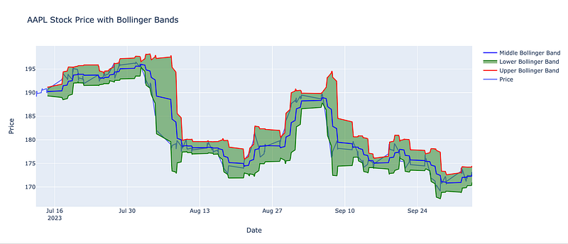
fig.update_layout(title='AAPL Stock Price with Bollinger Bands',
xaxis_title='Date',
yaxis_title='Price',
showlegend=True)
# Show the chart
fig.show()In this code:
- We create a Plotly figure (
fig) and add traces for the price chart, Upper Bollinger Band (UB), Lower Bollinger Band (LB), and Middle Bollinger Band (MA). - We use the
filloption in the Lower Bollinger Band (LB) trace (tonexty) to fill the area between the LB and the x-axis, effectively shading it. - Each trace uses
go.Scatterto create a line chart, with different line colors and names for clarity. - We customize the chart layout, including the title and axis labels.
- Finally, we use
fig.show()to display the interactive Plotly chart.
And this is what it looks like:
Conclusion
In this article, we’ve coded a Bollinger Bands indicator in Python using AAPL stock data with a 1-hour timeframe. We’ve also discussed how to interpret and use Bollinger Bands for trading and investment decisions. Bollinger Bands are a valuable tool for assessing price volatility and identifying potential reversal points in the market.
Feel free to adapt this code for other stocks, timeframes, or additional trading strategies.
Hope you learned something.