
COVID-19 visualizations with Stata Part 3: Heatplots
In this guide, we will learn how to make a heat plot in Stata. A heat plot is a three-dimensional figure which shows the third dimension using colors intensities. In order to make this figure, we will make use of the COVID-19 policy database compiled by the Oxford COVID-19 Government Response Tracker (OxCGRT). This dataset tracks various policy indicators at the country and date level, for example, school closures, work from home policies, travel restrictions, and various other economic and health interventions. These indicators are aggregated in an overall composite index that ranges from 0 (weakest) to 100 (strongest) policy. This provides us with three dimensions we need - date, country, and policy stringency index. From, this information, we will learn how to generate the following heat plot:
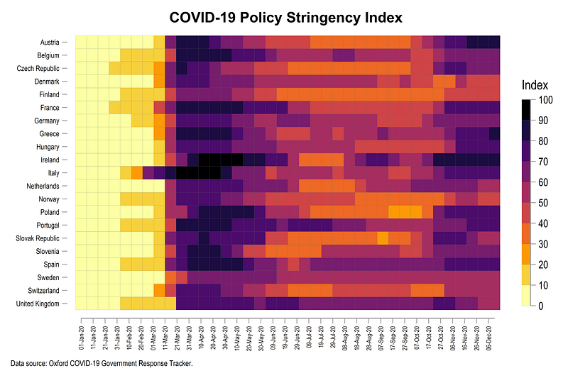
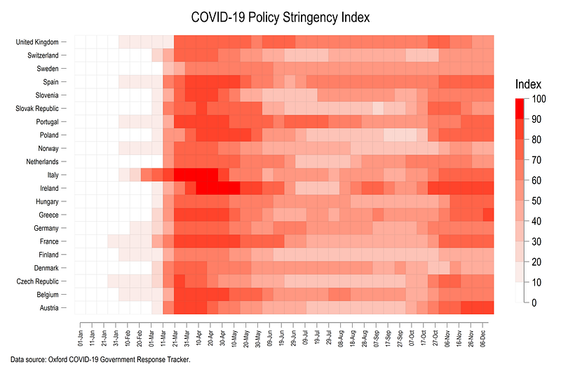
The figure above shows how European countries ramped up their lockdowns after the initial COVID-19 outbreak in Italy around end of February 2020. Italy and Ireland implemented almost a complete shutdown of all activities, which is represented by the dark red color. In June and July several countries started easing their lockdown policies. Sweden also stands out in the graph above since it avoided locking down the economy. Changes in color intensities also show how some countries reintroduced stricter policies around August after an increase in cases which continue till December, the time when this guide was updated.
This third guide, which is part of the Stata COVID-19 data visualization series, aims to use publicly available datasets for learning Stata programming.
Preamble
Like all previous guides, this guide assumes a basic knowledge of Stata. This guide deals with advanced usage of locals, loops, and code structures that require some experience and familiarity with Stata programming. If you are using this guide for the first time, and are new to Stata, then Guide 1 and Guide 2 are highly recommended, followed by the next set of guides which are in increasing order of difficulty.
This guide uses the following folder structure for the work-flow management:
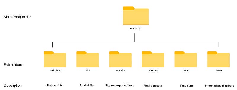
Within the graphs folder, I also create an additional sub-folder called guide3, to store the figures generated here. For details on how to organize your files, please see Guide 1.
In order to make the graphs exactly as they are shown here, several additional item are required:
- Install the cleanplots theme for a clean look for your figures (more on themes in Guide 2):
net install cleanplots, from("https://tdmize.github.io/data/cleanplots")set scheme cleanplots, perm- Install Ben Jann’s colorpalette package (more on colors in Guide 2 and in the Color guide)
net install palettes, replace from("https://raw.githubusercontent.com/benjann/palettes/master/")
net install colrspace, replace from("https://raw.githubusercontent.com/benjann/colrspace/master/")- Set default graph font to Arial Narrow (see the Font guide on customizing fonts)
graph set window fontface "Arial Narrow"This guide has been written in version 16.1 and should work with version 14 and onwards. Earlier versions might need some modification for implementing custom colors.
Task 1: Get the data in order
We start off by setting up the data, which can be pulled directly from the Oxford GitHub repository. In order to get a link to a GitHub dataset, we need to first look up where the data file physically exists. For the policy tracker, the files are hosted on this link:
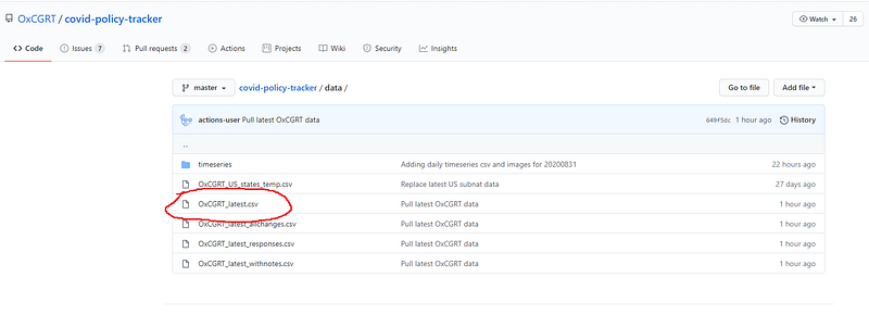
From this link, we need to open the file labeled OxCGRT_latest.csv which will give us this page:
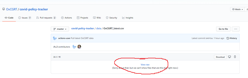
If you click on the “View raw” icon we can see the raw data:
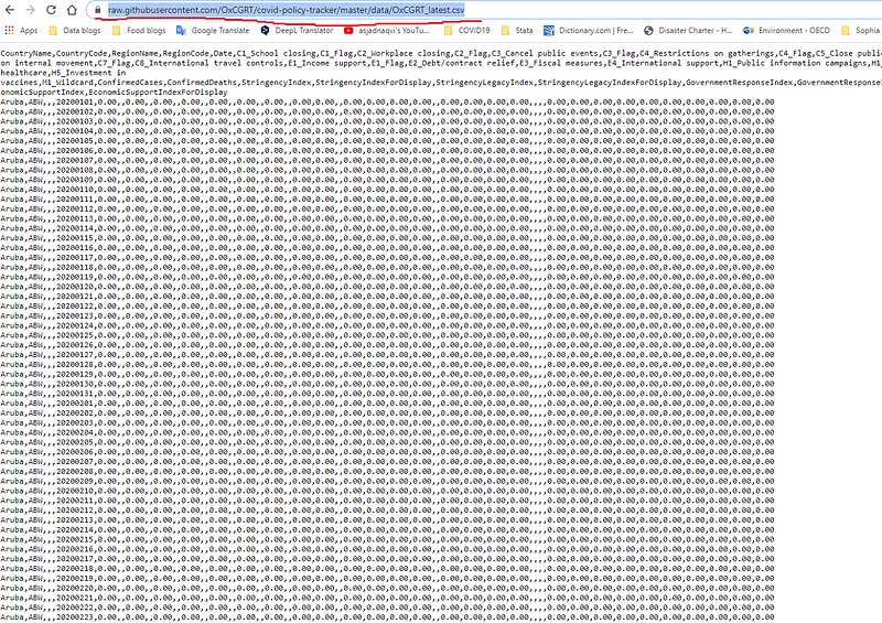
On top of this page, the link to the file can be copied and used directly in Stata to pull the data as follows:
clear
*** change the directory to your root folder here
cd "D:/Programs/Dropbox/Dropbox/PROJECT COVID - MEDIUM"
*** import the data from Github directly:insheet using "https://raw.githubusercontent.com/OxCGRT/covid-policy-tracker/master/data/OxCGRT_latest.csv", clearThe advantage of pulling data from GitHub is that every time we run the script, we automatically get the latest file. The data set once imported, can be viewed using the browse br command.
The dataset contains several variables for different country and date combinations. While we will not use all the variables in this file, the explanations of the various indicators are discussed in the links here. There is significant amounts of information on the type and strength of various policies and this data worth exploring. From the raw indicators on various individual policies, several indices are generated including a composite index of overall policy stringency, which is the variable of interest for our guide.
For now, we also only keep the information we need in Stata, which is country name, date, and the index variable:
*** keep only the variables we need
keep date countryname stringencyindexfordisplay
*** clean up variable names
ren stringencyindexfordisplay Index
ren countryname country *** convert the date to Stata format:tostring date, gen(date2) // string the date variable
drop date
gen date = date(date2,"YMD")
format date %tdDD-Mon-yyyy
drop date2
drop if date < 21915 // 1st Januarydrop month day year
order country date*** save the filecompress
save ./master/COVID_policies.dta, replaceHere we also generate and format the date. We also drop any observations that might exist before 1st January, 2020 as a safety measure. We also save this data in the master datasets folder.
Following the previous guides, we only keep a handful of European countries in our example:
use ./master/COVID_policies.dta, cleargen group = .replace group = 1 if ///
country == "Austria" | ///
country == "Belgium" | ///
country == "Czech Republic" | ///
country == "Denmark" | ///
country == "Finland" | ///
country == "France" | ///
country == "Germany" | ///
country == "Greece" | ///
country == "Hungary" | ///
country == "Italy" | ///
country == "Ireland" | ///
country == "Netherlands" | ///
country == "Norway" | ///
country == "Poland" | ///
country == "Portugal" | ///
country == "Slovenia" | ///
country == "Slovak Republic" | ///
country == "Spain" | ///
country == "Sweden" | ///
country == "Switzerland" | ///
country == "United Kingdom"keep if group==1
drop groupThe multiple steps we follow here to keep the countries we need are strictly not necessary. But this logic allows us to generate different groupings which we will use in loops in order to learn routines for batch processing groupings in later guides.
Task 2: Generating the heatmap
In order to generate a heat plot, we also need to install the following package:
*** install the packagesssc install heatplot, replacehelp heatplot // see for the documentation and examplesheatplot is a custom package written by Ben Jann who has also authored several other useful packages including the colorpalette and colrspace used in this and other guides. An introduction to the heatplot command can be found in a presentation here.
For the heatplot command we need to use several tricks to get the figure right. Since countries are categorical variables, and heatplot is programmed to deal with continuous variables on the x- and y-axes, we need to generate country dummies which will allow us to label the country axis (y-axis) properly.
For this, we just sort on the country variable and generate a numeric variable with country names as labels:
sort country
encode country , gen(country2)
Note that any other sorting can also be used but one would need to apply labels using the labmask command for custom data sorting. encode by default deals with alphabetic sorting.
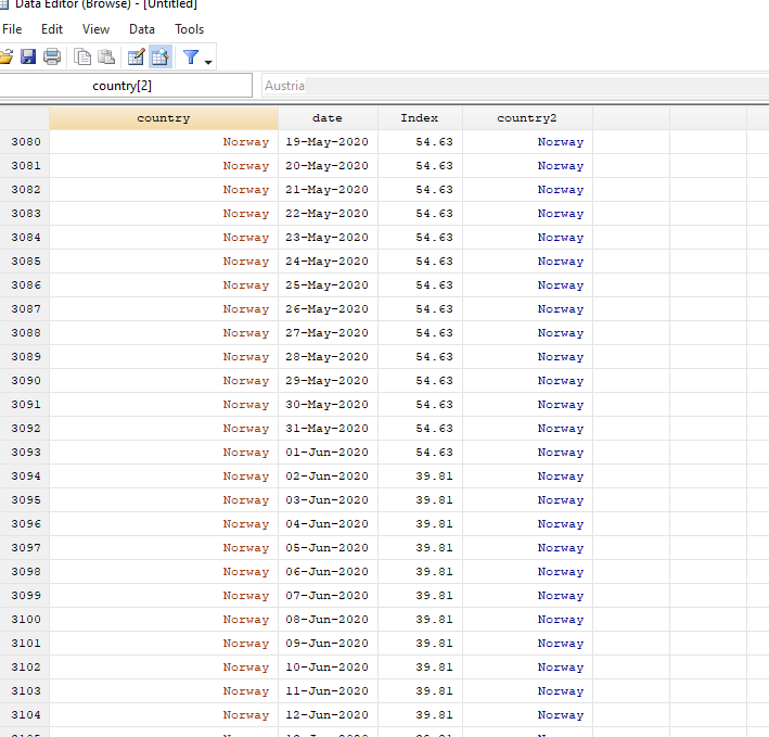
After all the data processing described above, the data should look like this:
Since heatplot is a user-written package, and no graphical user interface (GUI) for this command exists, the code to generate a basic heatmap is given below:
summ date
  local x1 = `r(min)'
  local x2 = `r(max)'
heatplot Index i.country2 date, ///
yscale(noline) ///
ylabel(, nogrid labsize(*0.7)) ///
xlabel(`x1'(10)`x2', labsize(*0.6) angle(vertical) format(%tdDD-Mon) nogrid) ///
color(white red) ///
cuts(0(10)100) ///
ramp(right space(10) label(0(10)100)) ///
p(lcolor(black%10) lwidth(*0.15)) ///
ytitle("") ///
xtitle("", size(vsmall)) ///
title("COVID-19 Policy Stringency Index") ///
note("Data source: Oxford COVID-19 Government Response Tracker.", size(vsmall))
graph export ./graphs/guide3/heatplot.png, replace wid(5000)Here I am showing the graph export command, as an example, which will only work if you are using the above folder structure. Otherwise you can modify or remove it accordingly.
The above code, gives us the following figure:
Note that the heatplot package makes use of several Stata graph commands for labeling the axes, legends, fixing colors, ticks etc. We break the syntax above down step-by-step:
The first line summ date summarizes the date variable, from which we store the information on the minimum and maximum date values in locals. This step also allows us to automatically update the date range in the heatplot whenever the data gets updated.
The first line of the heatplot syntax heatplot Index i.country2 date refers to the z, y, and x axis respectively. The next few lines are standard Stata syntax for graphs. yscale(noline) gets rid of the y-axis line and only shows countries as ticks. ylabel and xlabel format the labels on the axes. nogrid gets rid of the grid lines and labsize(*x) sets the size of the axes ticks. Here we replace the default size options (tiny, small, medium, large) with custom sizes (this is a bit under-documented in Stata but is a very useful command). xlabel also cleans up the display of the dates by changing their angle and the format. Incolor we define a custom color ramp which goes from white to red in intervals of 10 defined in the cuts command. The ramp option shows the legend on the right, where the gradient is broken into intervals of 10 (to also match the cuts), and is stretched slightly using the space command. The new few lines are standard x-axis, y-axis, title, and note descriptions. The p option is used for generating the outline of the boxes. Here we use two customizations; first, we define a black line with 10% transparency black%10, and second, we give it a custom line width using lwidth command. Note: transparency can only be done in Stata 15 or above. For Stata 14 and below, replace black%10 with some light grey color like gs10.
The color command can also take on other predefined color schemes in the colorpalette. For example, we can use the matplotlib viridis color scheme, which we also discussed in Part2 of this guide series. This can be implemented as follows:
summ date
  local x1 = `r(min)'
  local x2 = `r(max)'
heatplot Index i.country2 date, ///
yscale(noline) ///
ylabel(, nogrid labsize(*0.7)) ///
xlabel(`x1'(5)`x2', labsize(*0.6) angle(vertical) format(%tdDD-Mon) nogrid) ///
color(viridis, reverse) ///
cuts(0(10)100) ///
ramp(right space(10) label(0(10)100)) ///
p(lcolor(black%10) lwidth(*0.15)) ///
ytitle("") ///
xtitle("", size(vsmall)) ///
title("COVID-19 Policy Stringency Index") ///
note("Data source: Oxford COVID-19 Government Response Tracker.", size(vsmall)) which gives us this figure:
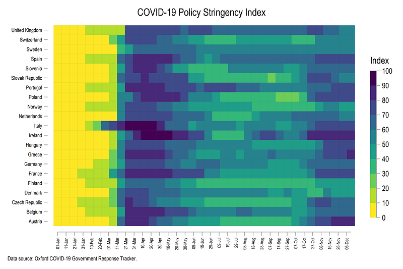
In the last step, we reverse the order of the country names, generate the graph using another matplotlib theme, inferno, and customize the heading of the graph (see the Font guide for more details):
egen country3 = rank(-country2), by(date)
labmask country3, val(country)
summ date
local x1 = `r(min)'
local x2 = `r(max)'heatplot Index i.country3 date, ///
yscale(noline) ///
ylabel(, nogrid labsize(*0.7)) ///
xlabel(`x1'(10)`x2', labsize(*0.6) angle(vertical) format(%tdDD-Mon-yy) nogrid) ///
color(inferno, reverse) ///
cuts(0(10)100) ///
ramp(right space(10) label(0(10)100)) ///
p(lcolor(gs6) lwidth(*0.05)) ///
ytitle("") ///
xtitle("", size(vsmall)) ///
title("{fontface Arial Bold: COVID-19 Policy Stringency Index}") ///
note("Data source: Oxford COVID-19 Government Response Tracker.", size(vsmall))which gives us this final figure with the countries sorted in the correct order:
Note that here we can see the second round of lockdowns that came into effect around October in varying intensities across the European countries.
Exercise
The Oxford COVID-19 data also includes information for USA states over time. Try and generate a heatmap of just American states over time and using another color scheme.
Also try generating heatmaps of other indicators given in the dataset.
Hope you enjoyed the guide! Please see your graphs if you use the code above.
Other Stata guides
Part 1: An introduction to data setup and customized graphs
Part 2: Customizing colors schemes
Part 8: Ridge-line plots (Joy plots)
If you enjoy these guides and find them useful, then please like and follow The Stata Guide. Also, please share your visualizations if you use these guides!
About the author
I am an economist by profession and I have been using Stata since 2003. I am currently based in Vienna, Austria where I work at the Vienna University of Economics and Business (WU) and the International Institute for Applied Systems Analysis (IIASA). You can find my research work on ResearchGate and Stata code repository on GitHub. You can follow my COVID-19 related Stata visualizations on my Twitter. I am also featured on the Stata COVID-19 webpage in the visualization and graphics section.
You can connect with me via Medium, Twitter, LinkedIn or simply via email: [email protected].
My Medium blog for Stata stuff here: The Stata Guide where new awesome content is released regularly. Clap, and/or follow if you like these guides!


