
The Why And How Of Exploratory Data Analysis In Python

Data Analysis is basically where you use statistics and probability to figure out trends in the data set. It helps you to sort out the “ real” trends from the statistical noise. What is “ noise “? A large amount of data that doesn’t seem to mean anything at all. Following are the topics that we are going to discuss as part of Exploratory Data Analysis in Python:
- What is Exploratory Data Analysis In Python?
- Need For Exploratory Data Analysis
- What Are The Steps In Exploratory Data Analysis In Python?
- The Tools Used In EDA
What Is Exploratory Data Analysis In Python?
Exploratory Data Analysis (EDA) in Python is the first step in your data analysis process developed by “ John Tukey” in the 1970s. In statistics, exploratory data analysis is an approach to analyzing data sets to summarize their main characteristics, often with visual methods. By the name itself, we can get to know that it is a step in which we need to explore the data set.
For Example, You are planning to go on a trip to the “ X “ location. Things you do before taking a decision:
- You will explore the location on what all places, waterfalls, trekking, beaches, restaurants that location has in Google, Instagram, Facebook, and other social Websites.
- Calculate whether it is in your budget or not.
- Check for the time to cover all the places.
- Type of Travel method.
Similarly, when you are trying to build a machine learning model you need to be pretty sure whether your data is making sense or not. The main aim of exploratory data analysis is to obtain confidence in your data to an extent where you’re ready to engage a machine learning algorithm.
Need For Exploratory Data Analysis
Exploratory Data Analysis is a crucial step before you jump to machine learning or modeling of your data. By doing this you can get to know whether the selected features are good enough to model, are all the features required, are there any correlations based on which we can either go back to the Data Pre-processing step or move on to modeling.
Once Exploratory Data Analysis is complete and insights are drawn, its feature can be used for supervised and unsupervised machine learning modeling.
In every machine learning workflow, the last step is Reporting or Providing the insights to the Stake Holders and as a Data Scientist you can explain every bit of code but you need to keep in mind the audience. By completing the Exploratory Data Analysis you will have many plots, heat-maps, frequency distribution, graphs, correlation matrix along with the hypothesis by which any individual can understand what your data is all about and what insights you got from exploring your data set.
There is a saying “ A picture is worth a thousand words “.
I want to modify it for data scientist as “ A Plot is worth a thousand rows “
In our Trip Example, we do all the exploration of the selected place based on which we will get the confidence to plan the trip and even share with our friends the insights we got regarding the place so that they can also join.
What Are The Steps In Exploratory Data Analysis In Python?
There are many steps for conducting Exploratory data analysis. I want to discuss regarding the below few steps using the Boston Data Set which can be imported from sklearn.datasets import load_boston
- Description of data
- Handling missing data
- Handling outliers
- Understanding relationships and new insights through plots
a) Description of data:
We need to know the different kinds of data and other statistics of our data before we can move on to the other steps. A good one is to start with the describe() function in python. In Pandas, we can apply describe() on a DataFrame which helps in generating descriptive statistics that summarize the central tendency, dispersion, and shape of a dataset’s distribution, excluding NaN values.
The result’s index will include count, mean, std, min, max as well as lower, 50 and upper percentiles. By default, the lower percentile is 25 and the upper percentile is 75. The 50 percentile is the same as the median.
Loading the Dataset:
import pandas as pd
from sklearn.datasets import load_boston

boston = load_boston()
x = boston.data
y = boston.target
columns = boston.feature_names
# creating dataframes
boston_df = pd.DataFrame(boston.data)
boston_df.columns = columns
boston_df.describe()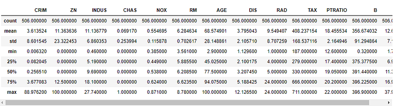
b) Handling missing data:
Data in the real-world are rarely clean and homogeneous. Data can either be missing during data extraction or collection due to several reasons. Missing values need to be handled carefully because they reduce the quality of any of our performance matrix. It can also lead to wrong prediction or classification and can also cause a high bias for any given model being used. There are several options for handling missing values. However, the choice of what should be done is largely dependent on the nature of our data and the missing values. Below are some of the techniques:
- Drop NULL or missing values
- Fill Missing Values
- Predict Missing values with an ML Algorithm
Drop NULL or missing values:
This is the fastest and easiest step to handle missing values. However, it is not generally advised. This method reduces the quality of our model as it reduces sample size because it works by deleting all other observations where any of the variables are missing.
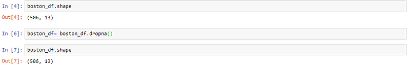
The above code indicates that there are no null values in our data set.
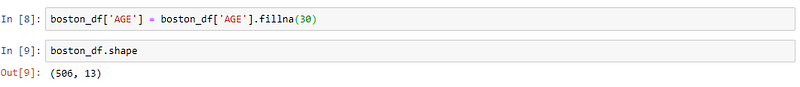
Fill Missing Values:
This is the most common method of handling missing values. This is a process whereby missing values are replaced with a test statistic like mean, median or mode of the particular feature the missing value belongs to. Let’s suppose we have a missing value of age in the Boston data set. Then the below code will fill the missing value with the 30.
Predict Missing values with an ML Algorithm:
This is by far one of the best and most efficient methods for handling missing data. Depending on the class of data that is missing, one can either use a regression or classification model to predict missing data.
c) Handling outliers:
An outlier is something which is separate or different from the crowd. Outliers can be a result of a mistake during data collection or it can be just an indication of variance in your data. Some of the methods for detecting and handling outliers:
- BoxPlot
- Scatterplot
- Z-score
- IQR(Inter-Quartile Range)
BoxPlot:
A box plot is a method for graphically depicting groups of numerical data through their quartiles. The box extends from the Q1 to Q3 quartile values of the data, with a line at the median (Q2). The whiskers extend from the edges of the box to show the range of the data. Outlier points are those past the end of the whiskers. Boxplots show robust measures of location and spread as well as providing information about symmetry and outliers.
import seaborn as sns
sns.boxplot(x=boston_df['DIS'])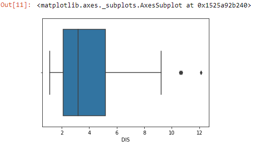
Scatterplot:
A scatter plot is a mathematical diagram using Cartesian coordinates to display values for two variables for a set of data. The data are displayed as a collection of points, each having the value of one variable determining the position on the horizontal axis and the value of the other variable determining the position on the vertical axis. The points that are far from the population can be termed as an outlier.
import matplotlib.pyplot as plt
fig, ax = plt.subplots(figsize=(16,8))
ax.scatter(boston_df['INDUS'] , boston_df['TAX'])
ax.set_xlabel('proportion of non-retail business acre per town')
ax.set_ylabel('full-value property-tax per $10000')
plt.show()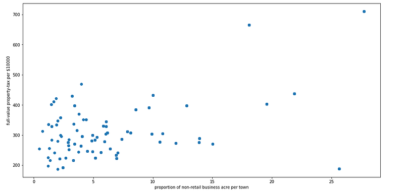
Z-score:
The Z-score is the signed number of standard deviations by which the value of an observation or data point is above the mean value of what is being observed or measured. While calculating the Z-score we re-scale and center the data and look for data points that are too far from zero. These data points which are way too far from zero will be treated as the outliers. In most of the cases a threshold of 3 or -3 is used i.e if the Z-score value is greater than or less than 3 or -3 respectively, that data point will be identified as outliers.
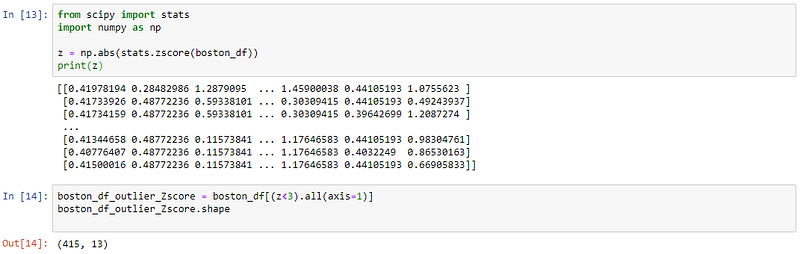
We can see from the above code that the shape changes, which indicates that our dataset has some outliers.
IQR:
The interquartile range (IQR) is a measure of statistical dispersion, being equal to the difference between 75th and 25th percentiles, or between upper and lower quartiles.
IQR = Q3 − Q1
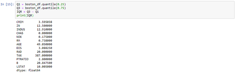
Once we have IQR scores below code will remove all the outliers in our dataset.

Understanding relationships and new insights through plots :
We can get many relations in our data by visualizing our dataset. Let’s go through some techniques in order to see the insights.
- Histogram
- HeatMaps
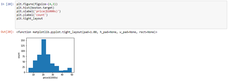
Histogram:
A histogram is a great tool for quickly assessing a probability distribution that is easy for interpretation by almost any audience. Python offers a handful of different options for building and plotting histograms.
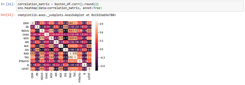
HeatMaps:
The Heat Map procedure shows the distribution of a quantitative variable over all combinations of 2 categorical factors. If one of the 2 factors represents time, then the evolution of the variable can be easily viewed using the map. A gradient color scale is used to represent the values of the quantitative variable. The correlation between two random variables is a number that runs from -1 through 0 to +1 and indicates a strong inverse relationship, no relationship, and a strong direct relationship, respectively.
The Tools Exploratory Data Analysis
There are plenty of open-source tools exist which automate the steps of predictive modeling like data cleaning, data visualization. Some of them are also quite popular like Excel, Tableau, Qlikview, Weka and many more apart from the programming.
In programming, we can accomplish EDA using Python, R, SAS. Some of the important packages in Python are:
- Pandas
- Numpy
- Matplotlib
- Seaborn
- Bokeh
Many Data Scientists will be in a hurry to get to the machine learning stage, some either entirely skip exploratory process or do a very minimal job. This is a mistake with many implications, including generating inaccurate models, generating accurate models but on the wrong data, not creating the right types of variables in data preparation, and using resources inefficiently because of realizing only after generating models that perhaps the data is skewed, or has outliers, or has too many missing values, or finding that some values are inconsistent.
In our Trip example, without a prior exploration of the place you will be facing many problems like directions, cost, travel in the trip which can be reduced by EDA the same applies to the machine learning problem. If you wish to check out more articles on the market’s most trending technologies like Artificial Intelligence, DevOps, Ethical Hacking, then you can refer to Edureka’s official site.
Do look out for other articles in this series which will explain the various other aspects of Python and Data Science.
15. Python vs C++
16. Scrapy Tutorial
17. Python SciPy
20. Python Basics
23. Python Decorator
32. Python 3.8
34. Python Tutorial
Originally published at https://www.edureka.co on July 29, 2019.


