
CS50’s Web Programming with Python and JavaScript 2020— Review CSS, Sass, and RWD
Introduction
CS50’s Web Programming with Python and JavaScript is a solid course for IT or software engineers to review the basic knowledge for web programming which provided by HarvardX. Of course, we still have to take time to clarify the concepts after completing the class.
The content for week 1 is about the Git version control.I have made a topic for Git before. So I will start from the week 2. The content is HTML(includes HTML, CSS, Sass, RWD).
This article includes the following items.
- The basic concepts of CSS (Cascading Style Sheets)
- The basic concepts of RWD (Responsible Web Design)
- The basic concepts of Sass (Syntactically Awesome Stylesheets)
- Project 0: the web resume
About this Series
This series aims to wrap up contents of CS50’s Web Programming with Python and JavaScript.
- Article 1: this article
- Article 2: Review APIs, ORM and SQL
- Article 3: Review JavaScript, SPA, and CSS animation
- Article 4: Learn Django and Selenium
- Article 5: CI/CD, Containerization, Scalability, Caching, and Security
The basic concepts of CSS (Cascading Style Sheets)
This paragraph includes the following items.
- Different ways to use CSS
- CSS Selectors
- CSS Box model
1. Different ways to use CSS
1.Use style attribute: just for styling the specific element in a page
2.Add extra section to the header of the web page
3.Separate CSS styles to different files: across all of the HTML files
- HTML
- CSS
2. CSS Selectors
There are few types of the CSS selectors.
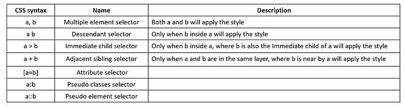
1.Multiple element selector
div, p {
  color: red;
}
2.Descendant selector: select all descendant children
ol li {
  color: red;
}
3.Immediate child selector: only select the immediate children
ol > li {
  color: red;
}
4. Attribute selector
input[type=number] {
    background-color: red;
}<input name="name" type="number">5. Pseudo classes selector: a special state of an HTML element
button:hover {
    background-color:orange;
}
6. Pseudo element selector
a::before{
    content: attr(href);
    color:red;
}a::after{
content: attr(target);
color:green;
}<a href="https://www.google.com" target="_blank">google</a>3. CSS Box model
<Box Model>
We can check the box model from the developer tool -> elements->style. The following model is the box model.
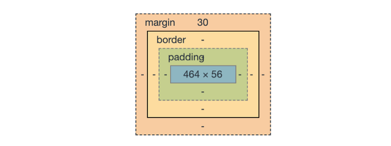
<Elements>
- Content: it can be defined by width, height
- Padding: it generates space around an element’s content, inside of any defined borders.
3. Border: by default it’s invisible. It can be defined by border-color and border-width
4. Margin: used to create space around elements , outside of any defined borders.
<box-sizing>
It’s a way to adjust the size of the content. We can set following values for this attribute.
- content-box: div’s width = content’s width
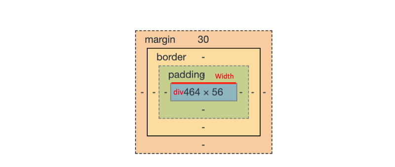
- border-box: div’s width = content’s width + padding + border
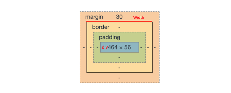
- inherit: inherit the box-sizing from the parent
The basic concepts of RWD (Responsible Web Design)
Introduction
Responsible Web Design is about using HTML and CSS to resize automatically to adapt different kinds of devices.
The first step is to set the viewpoint for the HTML file. We have to add the following code into the .
<meta name="viewport" content="width=device-width, initial-scale=1.0">Then there are different methods for creating a responsive web design.
1. Use media queries
<Advantages>
- Media query is a way for different device like the different screen size.
<Usages>
- We can use it to change things like background-image, font-size, or font-weight, etc according to the device’s screen size.
@media screen and(min-width: 500px) {
    body {
        background-color: red;
    }
}
@media screen and(max-width: 499px) {
body {
background-color: blue;
}
}2. The basic concepts of CSS Flexbox
<Advantages>
- It can avoid to use of floats.
- It can fully support in all modern web browsers.
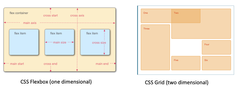
<Elements>
- Flex container, Flex items, main axis, and cross axis
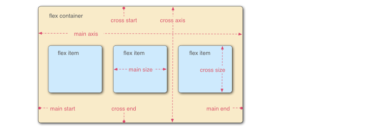
<Flex container>
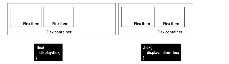
- display: determine how elements display (flex || inline-flex)
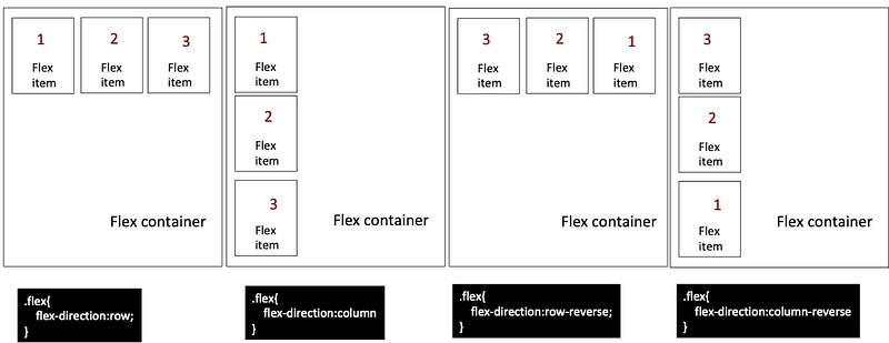
- flex-direction: determine the direction to arrange elements
- flex-wrap: determine do line ending or not (nowrap |wrap)
- flex-flow: determine the way for the line ending (row wrap | row-reverse wrap)
- justify-content: determine the position for the horizontal alignment. (flex-start | flex-end |center | space-between |space-around | space-evenly)
- align-items: determine the position for the vertical alignment.(flex-start |flex-end |center |space-between | space-around |space-evenly)
- align-content
<Flex items>
- order
- align-self: determine the position for the vertical alignment.(flex-start |flex-end |center |space-between | space-around |space-evenly)
- flex-grow: stretch the width of the element (0|number)
- flex-basis: set the initial width (0|number)
- flex-shrink
3. The basic concepts of CSS Grid
<Advantages>
- It can avoid to use of floats.
- More flexibility and control of the layout than ever before
- CSS Flexbox vs CSS Grid: CSS Grid layout gives us the ability to divide web page into rows and columns simultaneously
<Elements>
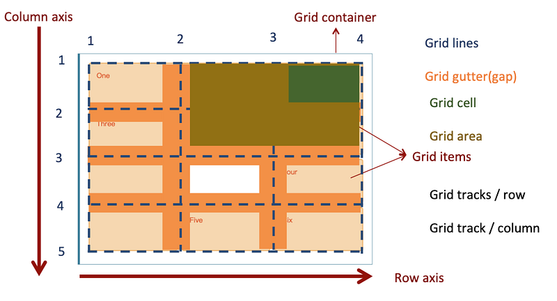
<Usage: Example 1>
- Use explicit grid:grid-template-columns, grid-template-rows
- Use grid-column-start, grid-column-end, grid-row-start, grid-row-end
- Use grid-column-gap, grid-row-gap
- HTML code
<div class="wrapper">
  <div class="one">Target</div>
  <div class="two">Two</div>
  <div class="three">Three</div>
  <div class="four">Four</div>
  <div class="five">Five</div>
  <div class="six">Six</div>
  <div class="six">Seven</div>
  <div class="six">Eight</div>
</div>- CSS code
* {
  box-sizing: border-box;
}.wrapper {
max-width: 940px;
margin: 0 auto;
}.wrapper > div {
border: 2px solid rgb(233,171,88);
border-radius: 5px;
background-color:rgba(233,171,88,.5);
padding: 1em;
color: #d9480f;
}.wrapper {
display: grid;
grid-column-gap: 10px;
grid-row-gap: 15px;
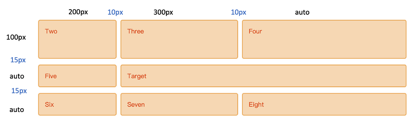
grid-template-columns: 200px 300px auto;
grid-template-rows: 100px auto;
}.one {
grid-column-start: 2;
grid-column-end: 4;
grid-row-start: 2;
grid-row-end: 3;
}- CodePen
<Usage: Example 2>
- Use implicit grid: max-width + grid-auto-rows
- Use grid-column, grid-row
- Use grid-gap
- HTML code
<div class="wrapper">
<div class="one">Target</div>
<div class="two">Two</div>
<div class="three">Three</div>
<div class="four">Four</div>
<div class="five">Five</div>
<div class="six">Six</div>
<div class="six">Seven</div>
<div class="six">Eight</div>
</div>- CSS code
* {box-sizing: border-box;}
.wrapper {
  max-width: 940px;
  margin: 0 auto;
}
.wrapper > div {
border: 2px solid rgb(233,171,88);
border-radius: 5px;
background-color: rgba(233,171,88,.5);
padding: 1em;
color: #d9480f;
}.wrapper {
display: grid;
grid-gap: 10px;
grid-auto-rows: minmax(100px, auto);
}
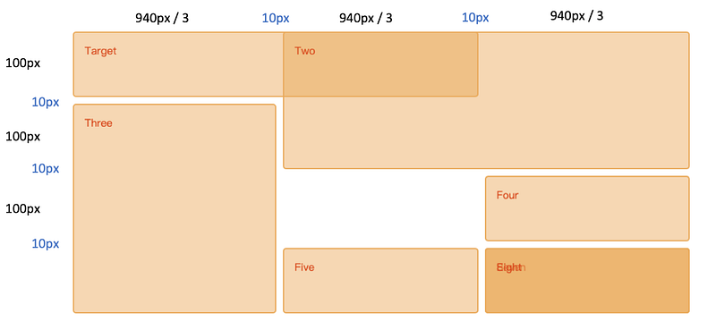
.one {
grid-column: 1 / 3;
grid-row: 1;
}
.two {
grid-column: 2 / 4;
grid-row: 1 / 3;
}
.three {
grid-row: 2 / 5;
grid-column: 1;
}
.four {
grid-column: 3;
grid-row: 3;
}
.five {
grid-column: 2;
grid-row: 4;
}
.six {
grid-column: 3;
grid-row: 4;
}- CodePen
The basic concepts of Sass (Syntactically Awesome Stylesheets)
DRY: Don’t Repeat Yourself!

Introduction
Sass is a kind of CSS extension that can let developers get rid of repeating the CSS code in the stylesheets.
There are more and more developers use Sass to generate stylesheets. It’s easier to maintain the complex and large stylesheets in the project.
This paragraph includes the following items.
- Installation/Setup
- Preprocessing
- Variable
- Nesting
- Extend/Inheritance
- Module
Installation/Setup
- Install Sass from npm
npm install -g sassYou can also read: - Official document of the installation
Preprocessing
- The browser can’t understand the Scss file. Sass can help us to compile .scss files to .css files then we can apply these stylesheets in the HTML.
sass --watch variables.scss:variables.css
sass --watch sass:public/css- Sass would watch all files in the sass folder for changes, and compile CSS to the public/css folder.
Variable
- It’s easier to modify the style in a large stylesheet with Sass variable.
$color:red;ul {
font-size: 14px;
color: $color:
}ol {
font-size: 18px;
color: $color:
}Nesting
Sass provides natural way to write styles. The usage depends on the type of selectors.
- Descendant selector and immediate child selector
//CSS
div, p {
    font-size: 18px;
    color: blue;
}
div > ul{
font-size: 18px;
color: green;
}//Sass
div {
font-size: 18px;
p {
color: blue;
}> ul {
color: green;
}
}- Pseudo classes selector
//CSS
article a {color: blue}
article a:hover {color: red}
//Sass
article a{
color: blue;
&:hover {color: red}
}Extend/Inheritance
We can share a set of CSS properties from on selector to another by using @extend.
%message {
    font-family: sans-serif;
    font-size: 18px;
    font-weight: bold;
    border: 1px solid black;
    padding: 20px;
    margin: 10px;
}
.success {
@extend %message;
background-color: green;
}.warning {
@extend %message;
background-color: orange;
}.error {
@extend %message;
background-color: red;
}Module
We cam import one Sass module to the another one.
- _page.scss
#page {
    padding-left: $page-padding;
    padding-right: $page-padding;
}
- main-page.scss
$page-padding: 10%;
@import 'page';
Project 0: the web resume
Requirements
- 4 HTML pages with at least 1 table, 1 list, and 1 image
2. CSS part : 5 different CSS selector, Media queries
3. SCSS part: variable, nesting, inheritance
4. Use Bootstrap: one component, two columns (grid model)
My idea & Implementation
- Here is my web resume
- Demo video
References
- A Complete Guide to Grid
- CSS3 box-sizing 屬性
- 深入解析 CSS Flexbox
- CS50’s Web Programming with Python and JavaScript
- CSS格線布局
Summary
Thanks for your patient. I am Sean. I work as a software engineer.
This article is my note. Please feel free to give me advice if any mistakes. I am looking forward to your feedback.
Please feel free to clap if this article can help you. Thank you.
You can also subscribe my page on Facebook.
Related topics
How to use the two-way binding in Knout.js and ReactJS?
Learn how to use SignalR to build a chatroom application
My reflection of
IT & Network:
Database:
Software testing:
Debugging:
DevOps:


