
Stata graphs: Reprogramming maps
In this guide we will learn how to reprogram maps in Stata:
Why is this guide necessary given the already amazing spmap package? To be honest, spmap is a great tool for making maps in Stata. It is fairly extensive with a lot of customization options. I also use it very frequently and have covered it in detail in my earlier guides on maps and animations. However, it has a couple of limitations. First, it does not allow multiple layers to be individually customized. One can technically add supplementary polygon, line, or point layers and use the by() option to draw various layers using different colors. But customizing several layers in one map is not currently possible especially, if we want to several choropleth (or heat) layers in one map. For example, think about different building types differentiated by zones. We can plot building area by zone type and color code both of them. And then on top of this, we can also add data on parks, streets, rivers etc. Since, none of these layers overlap with each other, they can be visualized on one map. Here we are thinking of going in the direction of doing what standard GIS softwares like ArcGIS or QGIS can do. Second, the spmap package currently cannot be combined with other twoway graph options. These options can be highly valuable to add annotations and additional information on the map. If you have followed my earlier guides, my whole aim is to make graphs as flexible as possible to allow for full customization of visualizations. This was also the reason to reprogram pie charts in an earlier guide.
This is a foundational guide that will be referenced in future guides. This is a follow up to the first guide on maps. If you are new to making maps in Stata, it is highly recommended to start with the first one and only move to this one if you want to expand your map-making capabilities.
Preamble
Like other guides, a basic knowledge of Stata is assumed. In order to make the graphs exactly as they are shown here, several additional item are required:
- Install the cleanplots theme for a clean look for your figures (more on themes in Guide 2):
net install cleanplots, from("https://tdmize.github.io/data/cleanplots")set scheme cleanplots, perm- Install Ben Jann’s colorpalette package (more on colors in Guide 2 and the Color guide)
ssc install palettes, replace - Set default graph font to Arial Narrow (see the Font guide on customizing fonts)
graph set window fontface "Arial Narrow"- For workflow management, I use the following folder structure to organize the files, and paths refer to subfolders relative to the root folder:
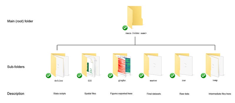
Using folders to organize files is important since files multiply quickly. See Guide 1 for a discussion on this.
- Get the additional packages for maps:
*** install the core packagesssc install spmap, replace // for maps
ssc install shp2dta, replace // shapefiles to dta. For v14 or below
ssc install geo2xy, replace // for fixing the coordinate systemAlways make sure you have the latest versions of the packages. You can always check by typing which <package name>, for example, which geo2xy.
This guide has been written in Stata version 16.1. Earlier versions might need some modifications. If you are using Stata 14 or earlier versions then the built-in Stata command spshape2dta will need to be replaced by shp2dta. I already discuss this in detail in the first map guide so it won’t be repeated here. Please report errors or workarounds if you come across problems with this guide.
Spatial layers
For this guide, we will use Europe’s NUTS layers. NUTS stands for Nomenclature of territorial units for statistics, and are the official regional classification for Europe. A brief background is give here. In short NUTS 0 are countries, NUTS 1 are provinces, NUTS 2 are districts, and NUTS 3 are finer administrative units. This allows different countries to map their own regional classifications on to a homogenized definition at the European level. The reason I am using NUTS regions for this guide is because I am personally using them to track the spread of COVID-19 in Europe. Plus they can be merged with other EU-level regional data from Eurostat. Automating Eurostat in Stata was also discussed in a previous guide.
Since NUTS regions are reclassified every few years, for the purpose of this guide I am using the 2016 definitions available at the 3 meter resolution (1:3 million) that can be downloaded here:
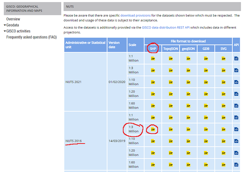
Here we want to download the shapefiles given in the SHP column. Feel free to use the higher resolution 1m files (1:1 million) or the more latest 2021 definitions. A higher resolution file has more data points and hence requires more processing time. A 3m file is decent enough for processing on normal computers and laptops. If you decide to use another regional classification or another resolution, please be mindful of changes in unique identifiers and variable names. They vary across files.
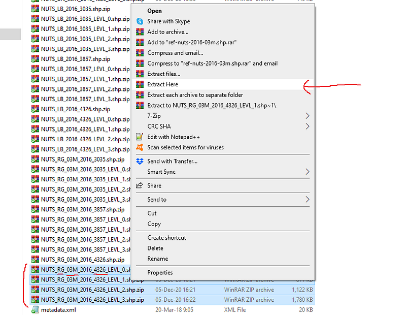
Once you click on the link above, a zipped file will be downloaded. Copy it in your work directory and extract all the files inside some folder. Within the main zip file are dozens of other zipped files. Here you want to extract the files with _RG (for region) and the number 4326 (the map projection for Europe we want to use) as shown in the screenshot below:
Extract these in the same directory. You can use another directory as well but be sure you know the path of where the shapefiles are extracted. I just dumped all the files in the same folder:
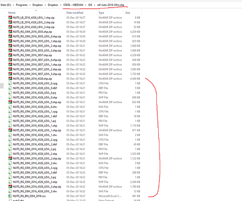
What is important is the path highlighted in the address bar above. The explanation of different shapefiles and projections is given in the first guide on maps.
The basics
For this guide, one needs to set the directory to where the shapefiles are. This is the least painful way to deal with map layers in Stata, otherwise it is a confusing mess of paths etc since multiple files are involved. Since I follow the workflow mentioned in the preamble, my shapefile are in the following directory:
clear
cd "D:/Programs/Dropbox/Dropbox/STATA - MEDIUM/GIS/ref-nuts-2016-03m.shp"
You can set this directory to where ever you have extracted the data. As discussed in the first maps guide, Stata 15 or higher can convert and process shapefiles and save them in a Stata format (for earlier versions you need the shp2dta package).
This is done as follows:
spshape2dta "NUTS_RG_03M_2016_4326_LEVL_0.shp", replace saving(nuts0)spshape2dta "NUTS_RG_03M_2016_4326_LEVL_1.shp", replace saving(nuts1)spshape2dta "NUTS_RG_03M_2016_4326_LEVL_2.shp", replace saving(nuts2)spshape2dta "NUTS_RG_03M_2016_4326_LEVL_3.shp", replace saving(nuts3)The above code processes all the four layers for the European NUTS regions. The saving option gives the name in which the data is stored. For example, for the first shapefile, two Stata datasets are created: nuts0.dta and nuts0_shp.dta. The first file contains the attributes for each shape, country in this case, and the second file contains the outline of the shapes.
Let us load the shape layer:
use nuts0_shp, clearand look at the data:
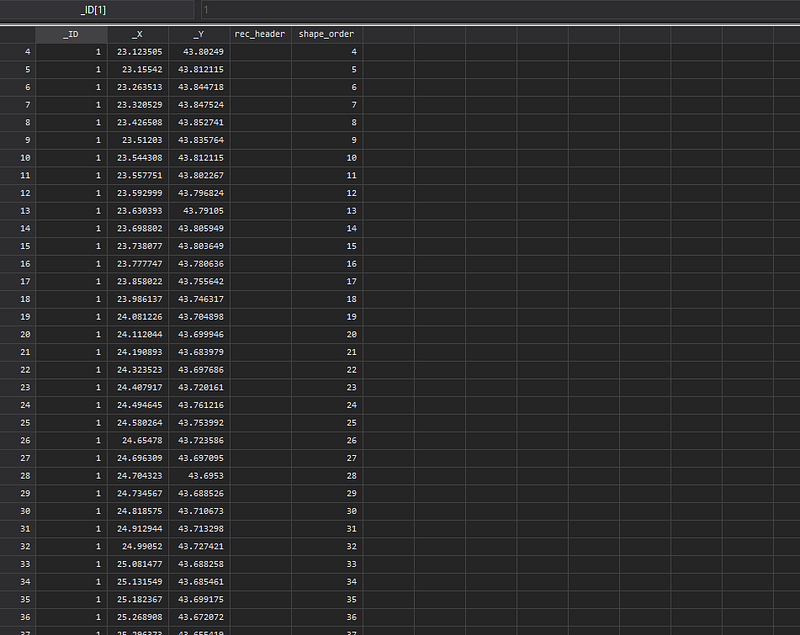
It contains four key variables. _ID is the identifier of each shape or country in this case, _Y, _X are coordinate pairs for the points that define the outline of the _ID, and shape_order is the drawing sequence order. This variable is extremely important. The data always needs to be sorted on the _ID and shape_order combination.
We can also merge this layer with the attributes to find out more information about each _ID:
merge m:1 _ID using nuts0If we look at the data now:
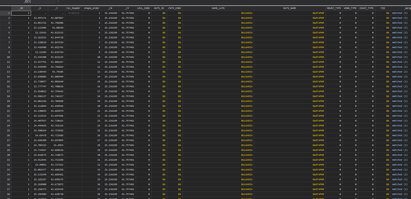
We can now see the country names ID, NUTS codes and other information. Note here that because NUTS0 are countries, the country code and NUTS code are the same for this file. Since the attribute file contains information at the _ID level, it needs a many-to-one (m:1) merge, which multiplies the information from the attribute file for each row with the same _ID.
Here we can also see another set of coordinate pairs _CY, _CX. These are the center points of the shapes which are calculated as geometric means of the outline points for each _ID.
Let’s plot the data:
twoway (scatter _Y _X, msymbol(point) msize(small))
We get a map of Europe including all the territories that are islands, in South America, and in Africa.
We can fix the project to Mercator, and drop the additional territories as well:
geo2xy _Y _X, proj (web_mercator) replace
drop if _X <  120
drop if _Y < -110
If we plot the map now:
twoway (scatter _Y _X, msymbol(point) msize(small)), aspect(1)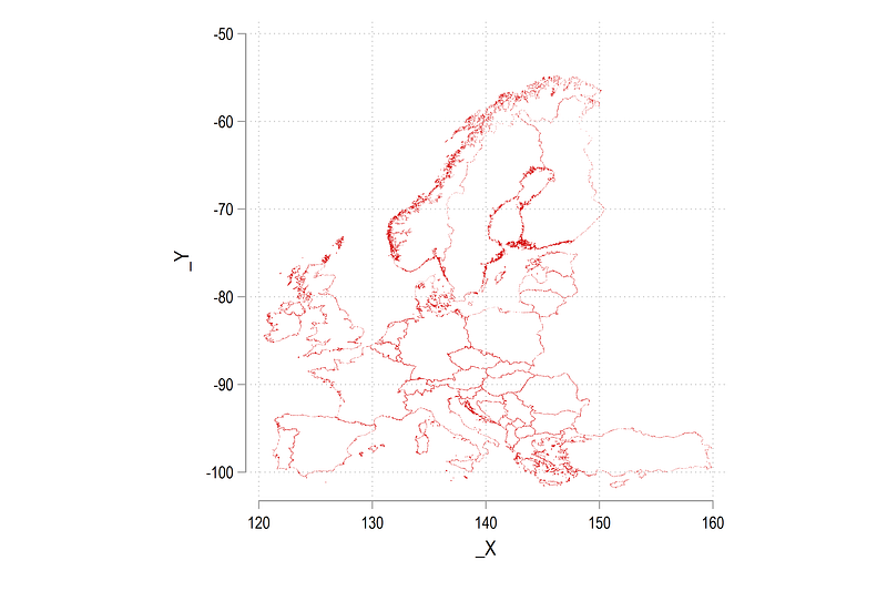
We get a slightly better looking and familiar outlines. We can also add the center points after fixing their projection:
egen tag = tag(_ID)
geo2xy _CY _CX, proj (web_mercator) replace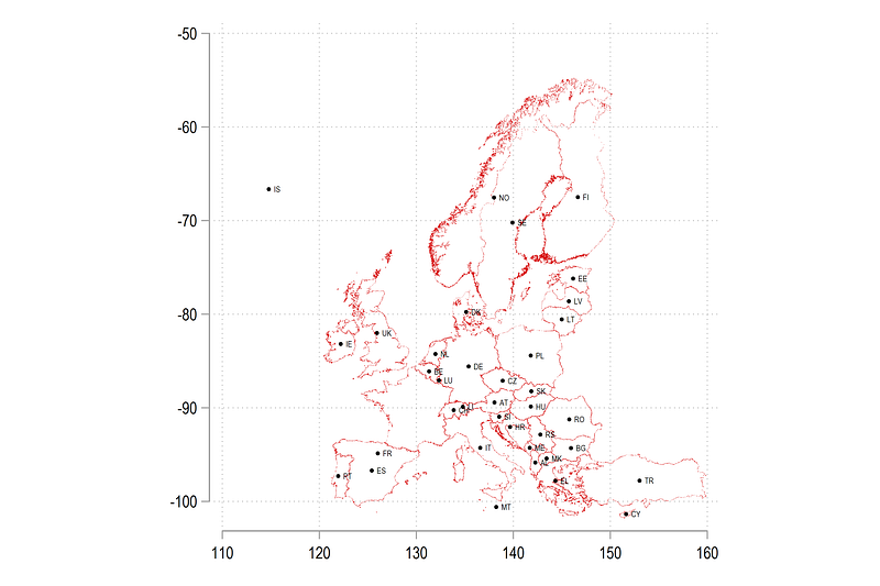
Note that the command tag tags only one observation for each _ID value. Since we know this information is repeated, we only need one observation per group, otherwise we will draw the data points as many times as the number of rows. The graph above has some center points misplaced. Since France has territories somewhere in the south, its center point is pushed down. Similarly convex shaped countries like Norway (NO), Sweden (SE), and Croatia (HR) have their center points a bit off. These can be cleaned up by manually fixing the _CY, _CX values for tag==1. A bit of manual work but it is a one-time investment to correct these errors.
Let’s now start with one country, Germany, to start the mapping. We start with a simple scatter plot:
twoway ///
 (scatter _Y _X if _ID==8, msymbol(circle) msize(vsmall)), aspect(1)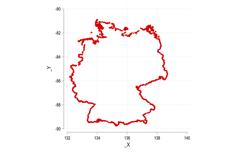
As we have seen in previous guides, if we have the outline scatter, we can use the twoway area command to fill in the color:
twoway ///
 (area _Y _X if _ID==8, fc(red) lc(black) lw(0.06)), aspect(1)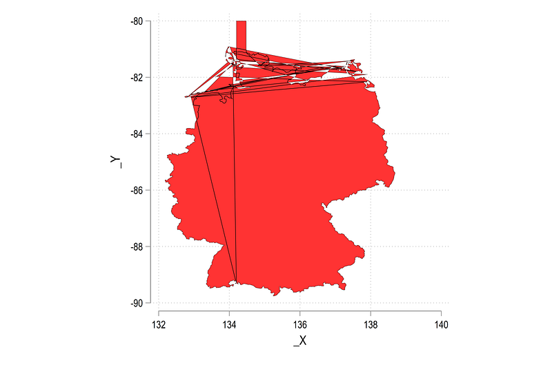
A bit messed up! We need to get rid of the additional points that force a redraw relative to base values (note the square box at -80) and we also need to factor in the missing data points. These can be added to the code as follows:
twoway ///
 (area _Y _X if _ID==8, nodropbase cmissing(no) fc(red) lc(black) lw(0.06)), aspect(1)
Both of these are advance options discussed in the PDF manual. They do not feature in the normal help file.
From the code above we get the map of Germany:
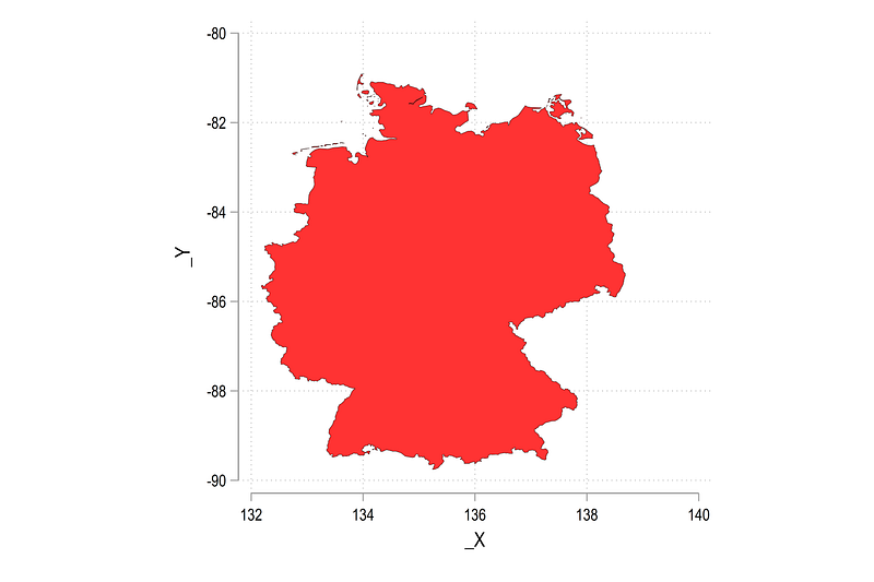
This is basically the core principle of drawing shapefiles. Everything else is layered on top of it. Here note that the X and Y axes can also give us the latitude and longitude values after formatting them for the correct scale. This is another feature missing from spmap. Adding information on the bounding boxes of an area is a fairly common practice in cartography.
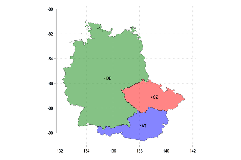
We can add some more countries:
twoway ///
 (area _Y _X if _ID==5, nodropbase cmissing(n) fc(red%60) lc(black) lw(0.06))  ///
 (area _Y _X if _ID==7, nodropbase cmissing(n) fc(blue%60) lc(black) lw(0.06)) ///
 (area _Y _X if _ID==8, nodropbase cmissing(n) fc(green%60) lc(black) lw(0.06)) ///
 (scatter _CY _CX if tag==1 & (_ID==5 | _ID==7 | _ID==8), mc(black) msymbol(circle) msize(tiny) mlabel(NUTS_ID) mlabsize(tiny) mlabc(black)) ///
 , aspect(1) legend(off)
Here we have added Czechia and Austria where we also color them differently:
We can also map the whole of NUTS 0 layer as follows:
sort _ID shape_order

twoway ///
 (area _Y _X, nodropbase cmissing(n) fi(100) fc(red) lc(black) lw(0.06)) ///
 , ///
   legend(off) xtitle("") ytitle("")  ///
   aspect(1.3)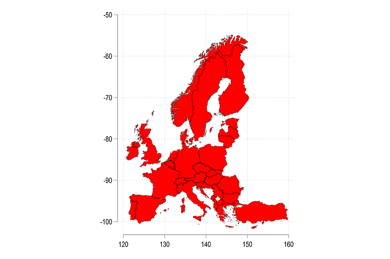
If you use the 1 meter resolution layer, the outlines will be a bit more well defined.
Multiple layers
Using the tools we learned above, we can now start adding multiple layers. First we process all the files in the directory:
clear
forval i = 0/3 {

 use nuts`i', clear
  merge 1:m _ID using nuts`i'_shp


egen tag = tag(_ID)

 geo2xy _Y _X, proj (web_mercator) replace
 geo2xy _CY _CX, proj (web_mercator) replace
drop if _X < 120
drop if _Y < -110gen layer = `i'
order layer
keep layer _ID _Y _X _CY _CX tag shape_order NUTS_ID CNTR_CODE NUTS_NAME
sort _ID shape_ordercompress
save nuts`i'_clean.dta, replace
}Here we combine each of the NUTS 0, 1, 2, 3 shape and attribute layers, generate tags and layer information, clean up the variables, and sort the data on the _ID and sort_order variable.
All the files can be appended on top of each other:
use nuts0_clean, clear
append using nuts1_clean
append using nuts2_clean
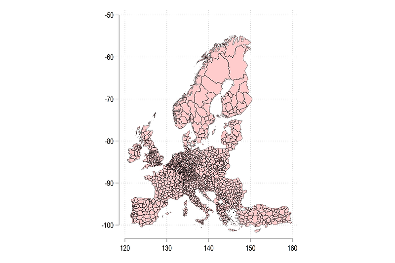
append using nuts3_cleanThis is one massive dataset which contains data for all the layers. Let us draw everything:
twoway ///
 (area _Y _X  , nodropbase cmissing(n) fi(20) fc(red) lc(black) lw(0.06)) ///
  , ///
   legend(off) xtitle("") ytitle("")  ///
   aspect(1.3)
The map below shows every shape in the dataset.
Since the layers perfectly overlap with each other, we can draw some as lines and some as area colors:
twoway ///
 (line _Y _X  if layer==3, nodropbase cmissing(n) lc(red)   lw(0.03)) ///
 (line _Y _X  if layer==2, nodropbase cmissing(n) lc(green)   lw(0.05)) ///
 (line _Y _X  if layer==1, nodropbase cmissing(n) lc(blue)   lw(0.08)) ///
 (area _Y _X  if layer==0, nodropbase cmissing(n) fc(gs10%25) lc(black) lw(0.1)) ///
  , ///
   legend(off) xtitle("") ytitle("")  ///
   aspect(1.3)
which gives us a bit more differentiation across the layers:
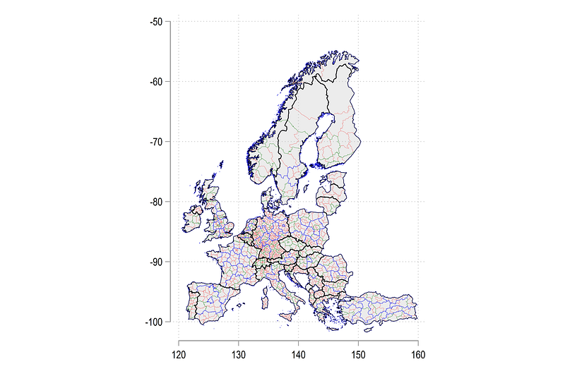
Note that this technique can be used to draw as many layers as we want. Let us zoom in a bit and go back to Germany again:
twoway ///
 (line _Y _X  if layer==3 & CNTR_CODE=="DE", nodropbase cmissing(n) lc(red)   lw(0.03)) ///
 (line _Y _X  if layer==2 & CNTR_CODE=="DE", nodropbase cmissing(n) lc(green)   lw(0.05)) ///
 (line _Y _X  if layer==1 & CNTR_CODE=="DE", nodropbase cmissing(n) lc(blue)   lw(0.08)) ///
 (area _Y _X  if layer==0 & CNTR_CODE=="DE", nodropbase cmissing(n) fc(gs12%25) lc(black) lw(0.1)) ///
  , ///
   legend(off) xtitle("") ytitle("")  ///
   aspect(1.3)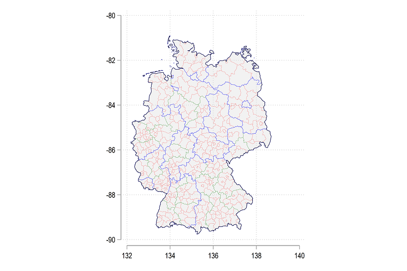
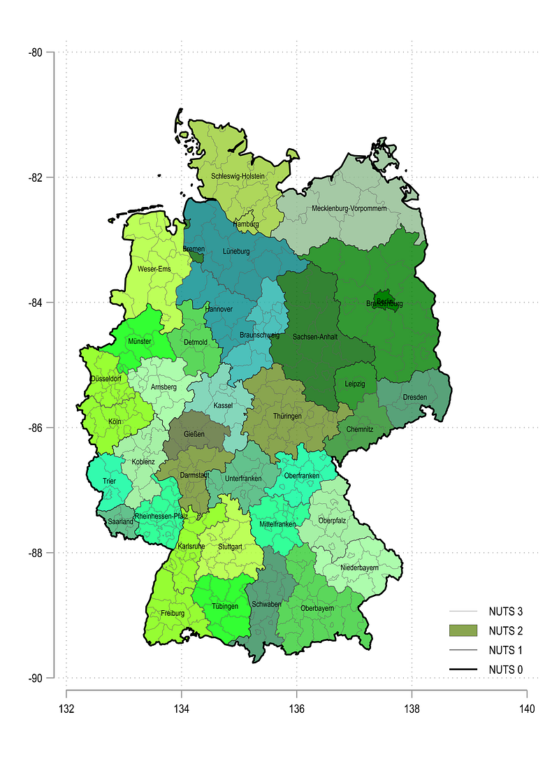
This does the job but now it is time to make it a bit prettier. The next code contains several locals to adjust minor aspects of the code, so it needs to run in one go:
local area2

sum _Y if CNTR_CODE=="DE"
local ymax = `r(max)'
local ymin = `r(min)'
sum _X if CNTR_CODE=="DE"
local xmax = `r(max)'
local xmin = `r(min)'
local aratio = (`ymax' - `ymin') / (`xmax' - `xmin')
display `aratio'local xsize = 10
local ysize = `xsize' * `aratio'levelsof NUTS_ID if layer==2 & CNTR_CODE=="DE", local(lvls)
return list
local shapes = `r(r)'local i = 1foreach x of local lvls { colorpalette HTML green, n(`shapes') nograph
local area2 `area2' (area _Y _X if layer==2 & CNTR_CODE=="DE" & NUTS_ID=="`x'", nodropbase cmissing(n) fi(100) fc("`r(p`i')'%80") lc(gs4) lw(0.06) lp(solid)) ||
local i = `i' + 1
}twoway ///
`area2' ///
(line _Y _X if layer==3 & CNTR_CODE=="DE", nodropbase cmissing(n) lc(gs6) lw(0.05) lp(solid)) ///
(line _Y _X if layer==1 & CNTR_CODE=="DE", nodropbase cmissing(n) lc(gs2) lw(0.1 ) lp(solid)) ///
(line _Y _X if layer==0 & CNTR_CODE=="DE", nodropbase cmissing(n) lc(black) lw(0.3 ) lp(solid)) ///
(scatter _CY _CX if layer==2 & CNTR_CODE=="DE" & tag==1, mc(none) ms(point) mlab(NUTS_NAME) mlabpos(0) mlabc(black) mlabsize(*0.5)) ///
, ///
xlabel(, labsize(vsmall)) ///
ylabel(, labsize(vsmall)) ///
legend(order( 39 "NUTS 3" 38 "NUTS 2" 40 "NUTS 1" 41 "NUTS 0") position(5) ring(0) size(vsmall) region(fcolor(none))) ///
xtitle("") ytitle("") ///
aspect(`aratio') xsize(`xsize') ysize(`ysize')The first part of the code fixes the aspect ratio based on the y and x-dimensions of the graph. The xsize and ysize are also derived from the aspect ratio to get rid of the additional white space in maps. This can also be modified to include for example additional information on the map. Note that this part of the code is derived from the original spmap code. In the original code these elements go through several steps of fine-tuning to give the most accurate map projection. But the aspect ratio adjustment given above is sufficient enough to draw the shape that is close to the Mercator projection. We are in any case not using this map for deriving distances or areas which are very heavily projection dependent. For this sort of work, either needs to know the exact projection transformation.
In the code above, we are also drawing each NUTS 2 region as a different color. The final map below features all the layers and the labels.
For the legend, one can also hack the original spmap command to generate a gradient legend to show the gradation in colors. For now, the original twoway legend option is used. Here we start the legend numbering with the last area drawn, which has a value of 38 since there are 38 NUTS 2 regions in Germany. Remember in Stata what is drawn last is shown first and this principle also determines the legend order. Since the 38th legend entry is the last area fill of some NUTS 2 region, the remaining entries that are drawn afterwards range from 39 to 41 representing NUTS 3, NUTS 1 and NUTS 0 lines respectively. Also note how the legend order can be used to reorganize how the entries are shown. This trick can be used for any graph if you want to order the legend differently.
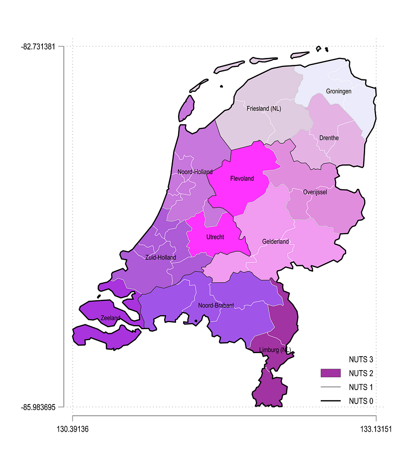
Let us go one step further and automate some more. Here we take Netherlands as the case example:
local area2

sum _Y if CNTR_CODE=="NL"
local ymax = `r(max)'
local ymin = `r(min)'
sum _X if CNTR_CODE=="NL"
local xmax = `r(max)'
local xmin = `r(min)'
local aratio = (`ymax' - `ymin') / (`xmax' - `xmin')
display `aratio'local xsize = 10
local ysize = `xsize' * `aratio'levelsof NUTS_ID if layer==2 & CNTR_CODE=="NL", local(lvls)
return list
local shapes = `r(r)'local i = 1foreach x of local lvls {colorpalette HTML purple, n(`shapes') nograph
local area2 `area2' (area _Y _X if layer==2 & CNTR_CODE=="NL" & NUTS_ID=="`x'", nodropbase cmissing(n) fi(100) fc("`r(p`i')'%80") lc(gs4) lw(0.06) lp(solid)) ||
local i = `i' + 1
}local leg2 = `shapes'
local leg3 = `shapes' + 1
local leg1 = `shapes' + 2
local leg0 = `shapes' + 3twoway ///
`area2' ///
(line _Y _X if layer==3 & CNTR_CODE=="NL", nodropbase cmissing(n) lc(white) lw(0.08) lp(solid)) ///
(line _Y _X if layer==1 & CNTR_CODE=="NL", nodropbase cmissing(n) lc(gs2) lw(0.1 ) lp(solid)) ///
(line _Y _X if layer==0 & CNTR_CODE=="NL", nodropbase cmissing(n) lc(black) lw(0.3 ) lp(solid)) ///
(scatter _CY _CX if layer==2 & CNTR_CODE=="NL" & tag==1, mc(none) ms(point) mlab(NUTS_NAME) mlabpos(0) mlabc(black) mlabsize(*0.5)) ///
, ///
xlabel(minmax, labsize(vsmall)) ///
ylabel(minmax, labsize(vsmall)) ///
legend(order( `leg3' "NUTS 3" `leg2' "NUTS 2" `leg1' "NUTS 1" `leg0' "NUTS 0") position(5) ring(0) size(vsmall) region(fcolor(none))) ///
xtitle("") ytitle("") ///
aspect(`aratio') xsize(`xsize') ysize(`ysize')Note that here we define the legend keys based on the last observation of the area graph that we pull from the shapes local. Additionally for the x and y-axes, we use the minmax option to get rid of the extra white space on top and below the map. This is basically the bounding box for the map. Stata by default comes up with some reasonable values that generate a neat grid. The minmax can also be replace to custom generate the values. From the code above we get:
Since we are at it, two more countries, UK and Turkey, selected for their dimension, are showcased below:
local area2

sum _Y if CNTR_CODE=="UK"
local ymax = `r(max)'
local ymin = `r(min)'
sum _X if CNTR_CODE=="UK"
local xmax = `r(max)'
local xmin = `r(min)'
local aratio = (`ymax' - `ymin') / (`xmax' - `xmin')
display `aratio'local xsize = 20
local ysize = `xsize' * `aratio'levelsof NUTS_ID if layer==2 & CNTR_CODE=="UK", local(lvls)
return list
local shapes = `r(r)'local i = 1foreach x of local lvls {colorpalette HTML cyan, n(`shapes') nograph local area2 `area2' (area _Y _X if layer==2 & CNTR_CODE=="UK" & NUTS_ID=="`x'", nodropbase cmissing(n) fi(100) fc("`r(p`i')'%80") lc(gs4) lw(0.06) lp(solid)) ||
local i = `i' + 1
}local leg2 = `shapes'
local leg3 = `shapes' + 1
local leg1 = `shapes' + 2
local leg0 = `shapes' + 3twoway ///
`area2' ///
(line _Y _X if layer==3 & CNTR_CODE=="UK", nodropbase cmissing(n) lc(gs6) lw(0.05) lp(solid)) ///
(line _Y _X if layer==1 & CNTR_CODE=="UK", nodropbase cmissing(n) lc(gs2) lw(0.1 ) lp(solid)) ///
(line _Y _X if layer==0 & CNTR_CODE=="UK", nodropbase cmissing(n) lc(black) lw(0.3 ) lp(solid)) ///
(scatter _CY _CX if layer==2 & CNTR_CODE=="UK" & tag==1, mc(none) ms(point) mlab(NUTS_NAME) mlabpos(0) mlabc(black) mlabsize(*0.4)) ///
, ///
xlabel(minmax, labsize(vsmall)) ///
ylabel(minmax, labsize(vsmall)) ///
legend(order( `leg3' "NUTS 3" `leg2' "NUTS 2" `leg1' "NUTS 1" `leg0' "NUTS 0") position(11) ring(0) size(vsmall) region(fcolor(none))) ///
xtitle("") ytitle("") ///
aspect(`aratio') xsize(`xsize') ysize(`ysize')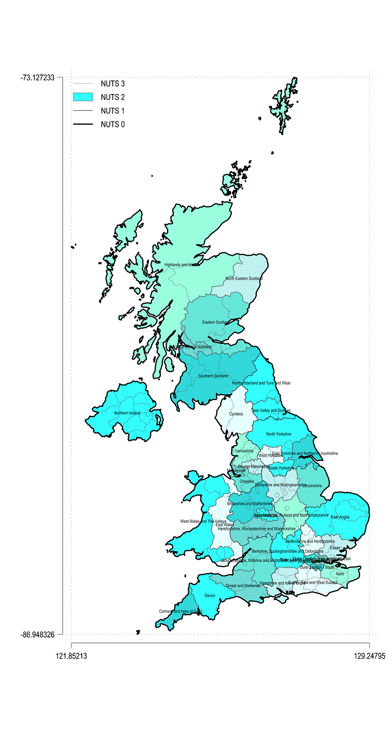
For UK the xsize and ysize values are not optimal and need some more customization. Also note that the names for NUTS 2 regions are fairly long. Here I would go one step ahead and split them across two rows by using the scatter option with clock positions. But this type of fine-tuning is very much dependent on what we want to achieve at the end of the day.
Let us plot Turkey:
local area2

sum _Y if CNTR_CODE=="TR"
local ymax = `r(max)'
local ymin = `r(min)'
sum _X if CNTR_CODE=="TR"
local xmax = `r(max)'
local xmin = `r(min)'
local aratio = (`ymax' - `ymin') / (`xmax' - `xmin')
display `aratio'local xsize = 10
local ysize = `xsize' * `aratio'levelsof NUTS_ID if layer==2 & CNTR_CODE=="TR", local(lvls)
return list
local shapes = `r(r)'local i = 1foreach x of local lvls {colorpalette HTML red, n(`shapes') nograph
local area2 `area2' (area _Y _X if layer==2 & CNTR_CODE=="TR" & NUTS_ID=="`x'", nodropbase cmissing(n) fi(100) fc("`r(p`i')'%80") lc(gs4) lw(0.06) lp(solid)) ||
local i = `i' + 1
}local leg2 = `shapes'
local leg3 = `shapes' + 1
local leg1 = `shapes' + 2
local leg0 = `shapes' + 3twoway ///
`area2' ///
(line _Y _X if layer==3 & CNTR_CODE=="TR", nodropbase cmissing(n) lc(white) lw(0.08) lp(solid)) ///
(line _Y _X if layer==1 & CNTR_CODE=="TR", nodropbase cmissing(n) lc(gs2) lw(0.1 ) lp(solid)) ///
(line _Y _X if layer==0 & CNTR_CODE=="TR", nodropbase cmissing(n) lc(black) lw(0.3 ) lp(solid)) ///
(scatter _CY _CX if layer==2 & CNTR_CODE=="TR" & tag==1, mc(none) ms(point) mlab(NUTS_NAME) mlabpos(0) mlabc(black) mlabsize(*0.6)) ///
, ///
xlabel(minmax, labsize(vsmall)) ///
ylabel(minmax, labsize(vsmall)) ///
legend(order( `leg3' "NUTS 3" `leg2' "NUTS 2" `leg1' "NUTS 1" `leg0' "NUTS 0") position(7) ring(0) size(1.5) region(fcolor(none))) ///
xtitle("") ytitle("") ///
aspect(`aratio') xsize(`xsize') ysize(`ysize')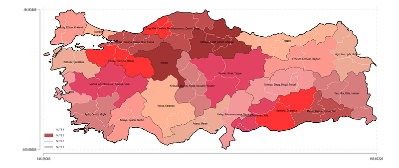
In general the code above holds fairly well to varying shapes and sizes. One can also combine all of the maps in one large colorful map, but this is very processing intensive. Each step used to generate a new color for a subset of shapes slows down the processing time considerably but it can be done!
Hope you like this guide! Please use it to play around with shapefiles, multiple polygons, lines, data points etc. For example one can also add a layer or rivers and roads to the above maps and color them accordingly. I will be calling on this guide for several future guides and is one of several planned for dealing with maps. Stay tuned!
About the author
I am an economist by profession and I have been using Stata since 2003. I am currently based in Vienna, Austria where I work at the Vienna University of Economics and Business (WU) and at the International Institute for Applied Systems Analysis (IIASA). You can find my research work on ResearchGate and Google Scholar, and Stata code repository on GitHub. You can follow my COVID-19 related Stata visualizations on Twitter. I am also featured on the Stata COVID-19 webpage in the visualization and graphics section.
You can connect with me via Medium, Twitter, LinkedIn or simply via email: [email protected].
The Stata Guide, releases awesome new content regularly. Clap, and/or follow if you like these guides!