
Stata graphs: Programming pie charts from scratch
In this guide learn to program pie charts from scratch in Stata:
This is a fairly long guide. But it lays the foundation for dealing pies and arcs and their area fills in Stata. This allows for creating and customizing a whole range of visualizations, for example, donut charts, sunburst graphs, pies with different radii, or even half pies. These are all topics for subsequent guides. This guide is fairly advanced and discusses several programming elements. These include cartesian to polar coordinate transformation, matrix rotations, using nested if-else conditions, reshape sorting variables, and customizing color schemes.
Why is this necessary? Pie charts are one of the oldest features of Stata and unlike other graphs, they are not incorporated in the twoway menu. This limits the options to add more information on figures. For example custom labeling or combining multiple pie charts in one graph. Additionally, individual pie slices cannot be customized beyond fill colors which is severely limiting.
A bit of a background on why pie charts are not used so much: Pie charts are a controversial visualization tool since they distort the data and make it hard to interpret the data. Note that in a pie chart, the division of the circle is based on the angles and not on the area and hence it is not easy to identify the differences if the values are fairly close to each other. This article provides some good examples:
For years visualization experts have been suggesting to substitute pie charts with bar graphs or line charts where axes are readable and scalable. But having said this, pie charts are not fully out of the game, and are sort of making a comeback but in different forms.
Preamble
Like other guides, a basic knowledge of Stata is assumed. This guide deals with advanced usage of locals, loops, and code structures that require some experience and familiarity with Stata programming. If you are using this guide for the first time, and are new to Stata, then Guide 1 and Guide 2 are highly recommended, followed by the next set of guides which are in increasing order of difficulty.
In order to make the graphs exactly as they are shown here, several additional item are required:
- Install the cleanplots theme for a clean look for your figures (more on themes in Guide 2):
net install cleanplots, from("https://tdmize.github.io/data/cleanplots")set scheme cleanplots, perm- Install Ben Jann’s colorpalette package (more on colors in Guide 2 and in the Color guide)
net install palettes, replace from("https://raw.githubusercontent.com/benjann/palettes/master/")
net install colrspace, replace from("https://raw.githubusercontent.com/benjann/colrspace/master/")- Set default graph font to Arial Narrow (see the Font guide on customizing fonts)
graph set window fontface "Arial Narrow"This guide has been written in Stata version 16.1. Earlier versions might need some modifications.
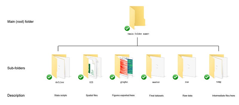
Paths might be defined in parts of the code. For workflow management, I use the following folder structure to organize the files, and paths refer to subfolders relative to the root folder:
Please modify these accordingly.
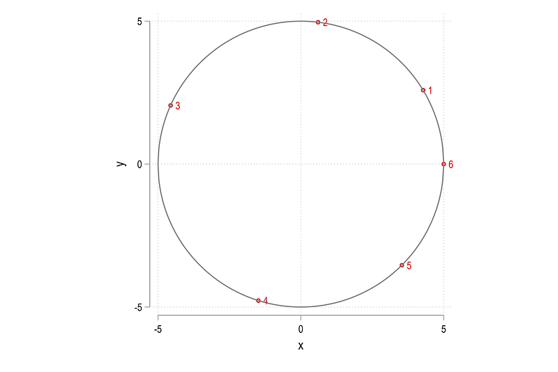
For circles and arcs and pies we need to deal with angles and radians and sin and cos and theta, so keep this figure as a reference:
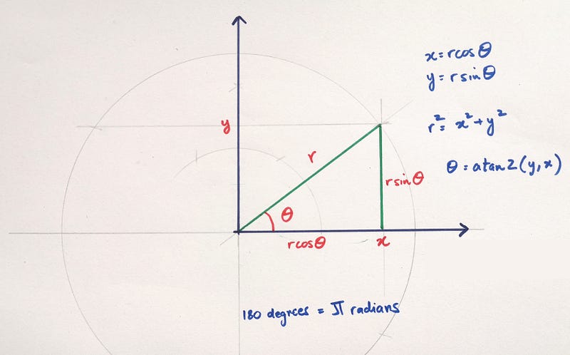
On a side note, I made this figure with the help of my daughter. She is 5.5 years old and was interested in learning how to bisect angles using a compass :)
The basics
This section covers several aspects of dealing with pies. This includes creating pies, filling in the colors, and rotations.
The first quadrant (x and y are positive)
Let’s start with one pie slice that we manually generate:
clear
set obs 3
// arc 1
gen x1 = .
gen y1 = .replace x1 = 0 in 1
replace y1 = 0 in 1replace x1 = 3 in 2
replace y1 = 4 in 2replace x1 = 4 in 3
replace y1 = 3 in 3Since circles have been covered in previous guides on Polar plots and Spider plots, here we will just jump right into it:
twoway ///
 (area y1 x1, nodropbase fc(%20) lc(black) lw(thin))   ///
   (function   sqrt(5^2 - (x)^2), lp(solid) lw(vthin) lc(red) range(-5 5)) ||  ///
   (function  -sqrt(5^2 - (x)^2), lp(solid) lw(vthin) lc(blue) range(-5 5))    ///
 ,  ///
 xlabel(-5(1)5)   ///
 ylabel(-5(1)5)  ///
   xline(0) yline(0) ///
   aspect(1) legend(off)
which gives us this figure:
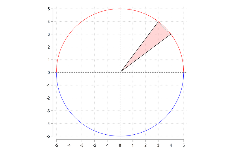
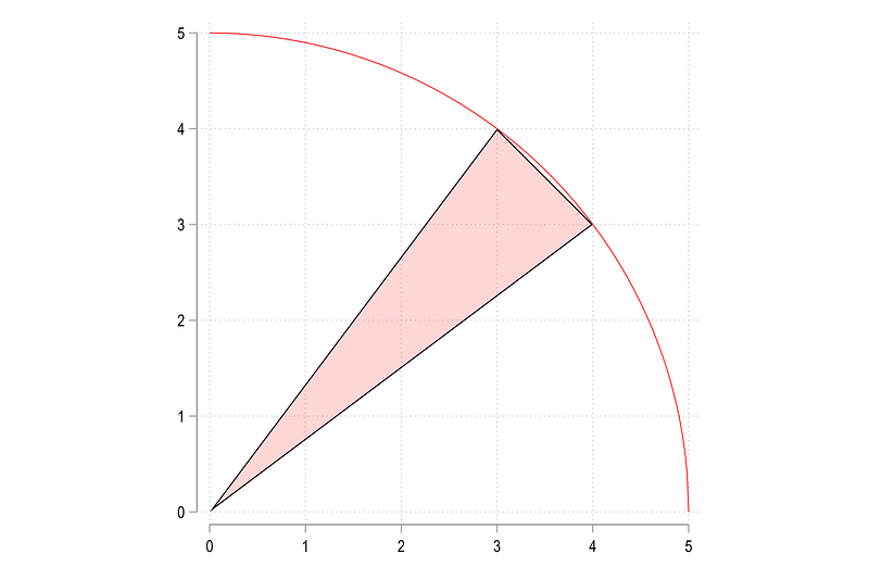
The pie that we have drawn, lies in the first quadrant. Here we use a circle of radius 5, thus allowing us to make use of the famous {3,4,5} Pythagoras ratios. So we can fit triangles in the circle without having to deal with obscure coordinates.
We can zoom in the first quadrant as well:
twoway ///
 (area y1 x1, nodropbase fc(%20) lc(black) lw(thin))   ///
   (function   sqrt(5^2 - (x)^2), lp(solid) lw(vthin) lc(red) range(0 5)) ||  ///
 ,  ///
 xlabel(0(1)5)   ///
 ylabel(0(1)5)  ///
   aspect(1) legend(off)
and we get this figure:
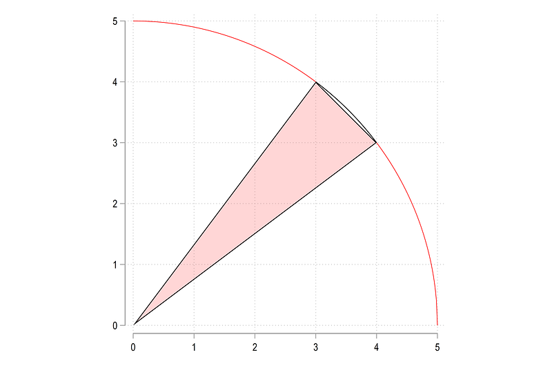
Here lies the first challenge. We need to add the arc to the triangle and fill in the color. We can simply draw the arc using the functions option:
twoway (area y1 x1, nodropbase fc(%20) lc(black) lw(thin))   ///
  (function sqrt(25 - (x)^2), lp(solid) lw(vthin) lc(red) range(0 5))  ///
  (function sqrt(25 - (x)^2), lp(solid) lw(thin) lc(black) range(3 4)),   ///
 xlabel(0(1)5)   ///
 ylabel(0(1)5)  ///
  aspect(1) legend(off)
which gives us the outline
Here comes the next challenge. Since one cannot combine functions with twoway plots to draw a pie slice, we can just generate points manually and append them to our variables. So we increase the observations to 100. The higher this number, the higher the number of points and smoother the curve. For this arc, 100 points are sufficient:
set obs 100summ x1 if x1!=0
gen temp_x1 = runiform(`r(min)', `r(max)')summ y1 if y1!=0
gen temp_y1 = sqrt(5^2 - temp_x1^2)replace x1 = temp_x1 if x1==.
replace y1 = temp_y1 if y1==.Here we generate a uniform distribution of the minimum and maximum points on the x-axis. Since we know that the radius if the circle is 5, the y-values can be calculated using the formula above. We replace the missing data points of the original variables with the new values that have generated.
Here we can now sort on the x1 variable and draw the pie slice:
sort x1twoway (area y1 x1, nodropbase fc(%20) lc(black) lw(thin)) ///
(function sqrt(25 - (x)^2), lp(solid) lw(vthin) lc(red) range(0 5)) ///
, ///
xlabel(0(1)5) ///
ylabel(0(1)5) ///
aspect(1) legend(off)which gives us this figure:

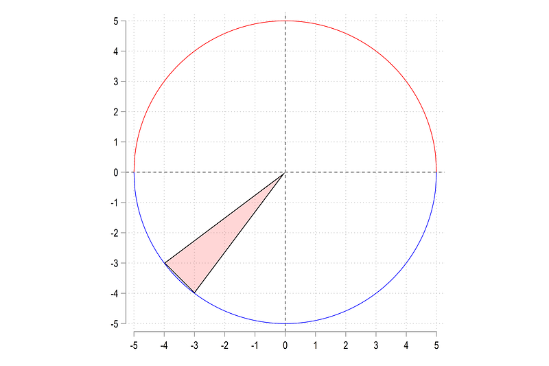
The third quadrant (x and y are negative)
Just to get the basics right, let’s do the the 3-rd quadrant where both x and y are negative:
gen x2 = .
gen y2 = .
replace x2 = 0 in 1
replace y2 = 0 in 1replace x2 = -4 in 2
replace y2 = -3 in 2replace x2 = -3 in 3
replace y2 = -4 in 3Like in the earlier example, we can plot this triangle:
twoway ///
 (area y2 x2, nodropbase fc(%20) lc(black) lw(thin))   ///
   (function   sqrt(5^2 - (x)^2), lp(solid) lw(vthin) lc(red) range(-5 5)) ||  ///
   (function  -sqrt(5^2 - (x)^2), lp(solid) lw(vthin) lc(blue) range(-5 5))    ///
 ,  ///
 xlabel(-5(1)5)   ///
 ylabel(-5(1)5)  ///
   xline(0) yline(0) ///
   aspect(1) legend(off)
and get:
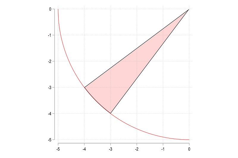
Here we also generate a uniform distribution over the minimum and maximum values of x2:
summ x2 if x2!=0
gen temp_x2 = runiform(`r(min)',`r(max)')
summ y2 if y2!=0
gen temp_y2 = -sqrt(5^2 - temp_x2^2)replace x2 = temp_x2 if x2==.
replace y2 = temp_y2 if y2==.The key difference here is that in order to generate y2, we add a negative sign to the formula. In fact, the positive and negative signs are determined by the blue and red semi-circles shown in the figure above. For the top half, where y is positive, the sign is also positive, and negative for the bottom half.
After replacing the empty values we can draw the circle as follows:
sort x2twoway (area y2 x2, nodropbase fc(%20) lc(black) lw(thin)) ///
(function -sqrt(25 - (x)^2), lp(solid) lw(vthin) lc(red) range(-5 0)), ///
xlabel(-5(1)0) ///
ylabel(-5(1)0) ///
aspect(1) legend(off)Note here that the sort is very important. If we use another sort, then the pie will not be drawn correctly. From the code above we get:
Negative to positive on the y-axis
Now comes the next challenge. How do we deal with pies that cross the x=0 axis? As we discussed above, the formula changes depending on whether we are on the top half or the bottom half.
Let’s start by increasing the observations to 200 and generate a triangle manually:
cap drop *x3* *y3*
set obs 200
gen x3 = .
gen y3 = .replace x3 = 0 in 1
replace y3 = 0 in 1replace x3 = -3 in 2
replace y3 = 4 in 2replace x3 = -4 in 3
replace y3 = -3 in 3We can plot this as:
twoway (area y3 x3, nodropbase fc(%20) lc(black) lw(thin))         ///
   (function   sqrt(5^2 - (x)^2), lp(solid) lw(vthin) lc(red) range(-5 5))    ///
   (function  -sqrt(5^2 - (x)^2), lp(solid) lw(vthin) lc(blue) range(-5 5))    ///
  ,  ///
 xlabel(-5(1)5)   ///
 ylabel(-5(1)5)  ///
  xline(0) yline(0) ///
  aspect(1) legend(off)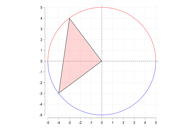
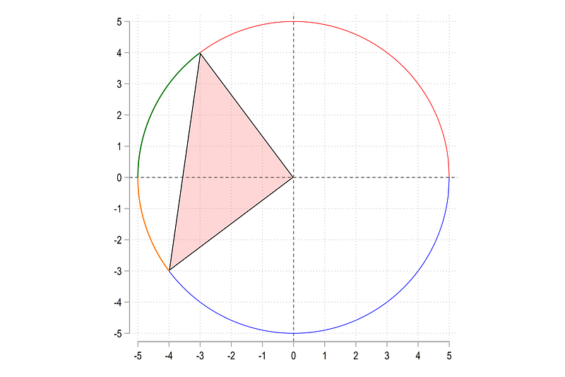
Using the logic above, what we can do is calculate two arc for the negative and positive regions:
twoway ///
 (area y3 x3, nodropbase fc(%20) lc(black) lw(thin))     ///
   (function   sqrt(5^2 - (x)^2), lp(solid) lw(vthin) lc(red) range(-5 5)) ||  ///
   (function  -sqrt(5^2 - (x)^2), lp(solid) lw(vthin) lc(blue) range(-5 5))    ///
    (function  sqrt(25 - (x)^2), lc(black) lw(medium) range(-5 -3))     ///
    (function -sqrt(25 - (x)^2), lc(gs10)  lw(medium) range(-5 -4))     ///
 ,  ///
 xlabel(-5(1)5)   ///
 ylabel(-5(1)5)  ///
   xline(0) yline(0) ///
   aspect(1) legend(off)
Here we manually define the ranges which give us these green and orange arcs:
We can also use this logic to generate the points for the top half and the bottom half separately. For the top half, this is done as follows:
**** top half

 summ x3 if x3!=0 & y3 >= 0
 gen temp_x3_1 = runiform(-5,`r(max)')
summ y3 if y3!=0 & y3 >= 0
gen temp_y3_1 = sqrt(25 - (temp_x3_1)^2)and for the bottom half as follows:
**** bottom halfsumm x3 if x3!=0 & y3 < 0
gen temp_x3_2 = runiform(-5,`r(min)')summ y3 if y3!=0 & y3 < 0
gen temp_y3_2 = -sqrt(25 - (temp_x3_2)^2)Note the controls on the summation of the x3 values for the top and bottom parts. These give us different starting and ending points for the x-ranges. For y values, the formula changes according to the region being evaluated.
We can plot the points as follows:
twoway ///
 (area y3 x3, nodropbase fc(%20) lc(black) lw(thin))     ///
 (scatter temp_y3_1 temp_x3_1, msymbol(circle_hollow) msize(vsmall) mcolor(green) ) ///
 (scatter temp_y3_2 temp_x3_2, msymbol(circle_hollow) msize(vsmall) mcolor(orange)) ///
   (function   sqrt(5^2 - (x)^2), lp(solid) lw(vthin) lc(red) range(-5 5)) ||  ///
   (function  -sqrt(5^2 - (x)^2), lp(solid) lw(vthin) lc(blue) range(-5 5))    ///
 ,  ///
 xlabel(-5(1)5)   ///
 ylabel(-5(1)5)  ///
   xline(0) yline(0) ///
   aspect(1) legen(off)
which gives us this figure:
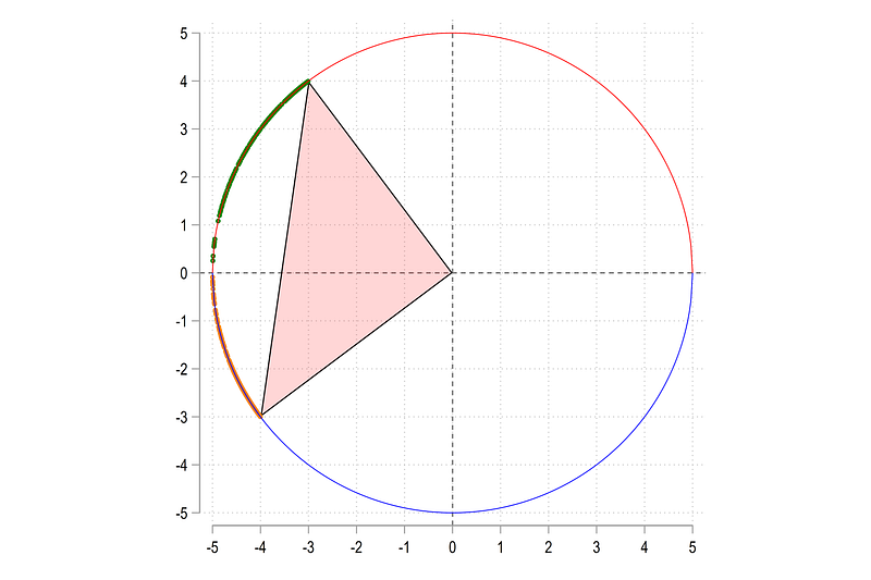
Since x values are random there might be gaps in the points and these can also vary every time we run the code. One can increase the points to reduce these gaps.
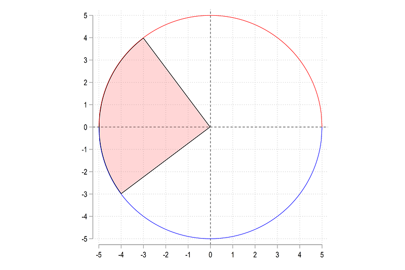
In the next step, we manually replace values for the top and bottom halves. Since we have 200 rows, the top half goes till the 100th row while the second half goes from 101–200th row (I am sure there is a better way of doing this):
replace x3 = temp_x3_1 in 4 / 100
replace y3 = temp_y3_1 in 4 / 100
replace x3 = temp_x3_2 in 101 / 200
replace y3 = temp_y3_2 in 101 / 200Next step is extremely important:
gen marker = 1 if x3==0
Here we mark the (0,0) intercept part of the pie and make sure it is not sorted with the remaining y values. After sorting on y3, we can now generate the arc:
sort marker y3twoway ///
(area y3 x3, nodropbase fc(%20) lc(black) lw(thin)) ///
(function sqrt(5^2 - (x)^2), lp(solid) lw(vthin) lc(red) range(-5 5)) || ///
(function -sqrt(5^2 - (x)^2), lp(solid) lw(vthin) lc(blue) range(-5 5)) ///
, ///
xlabel(-5(1)5) ///
ylabel(-5(1)5) ///
xline(0) yline(0) ///
aspect(1) legend(off)which gives us exactly what we need:
Negative to positive on the x-axis
Here is the last challenge where we learn how to deal with arcs that go from positive to negative on the x-axis (or the arc crosses y=0 line). Let’s start by generating a pie:
gen x4 = .
gen y4 = .
replace x4 = 0 in 1
replace y4 = 0 in 1replace x4 = -3 in 2
replace y4 = -4 in 2replace x4 = 4 in 3
replace y4 = -3 in 3and plot it:
twoway (area y4 x4, nodropbase fc(%20) lc(black) lw(thin))         ///
   (function   sqrt(5^2 - (x)^2), lp(solid) lw(vthin) lc(red) range(-5 5))    ///
   (function  -sqrt(5^2 - (x)^2), lp(solid) lw(vthin) lc(blue) range(-5 5))    ///
  ,  ///
 xlabel(-5(1)5)   ///
 ylabel(-5(1)5)  ///
  xline(0) yline(0) ///
  aspect(1) legend(off)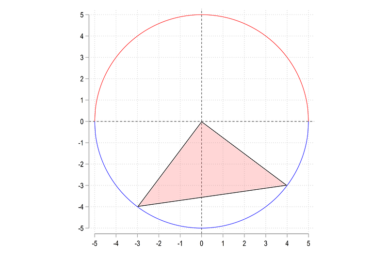
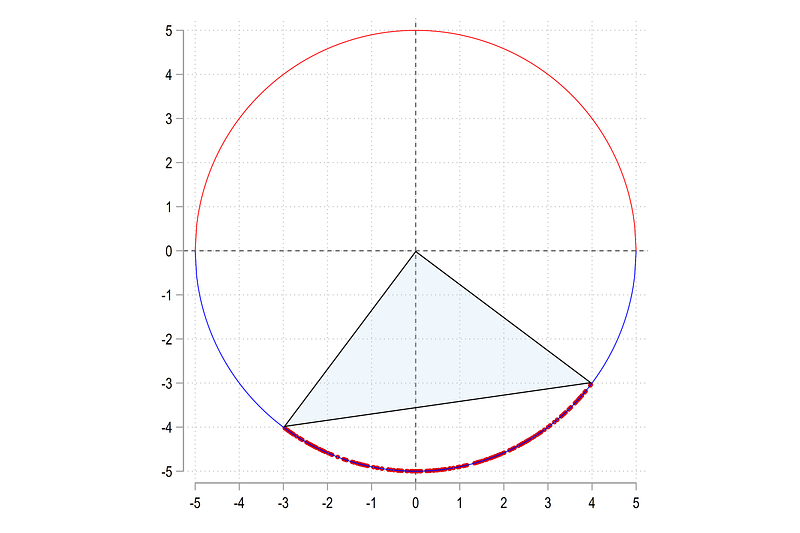
Since the pie lies in the bottom half, we just need to generate the distribution of x-axis points and y-points for this region only:
**** bottom halfsumm x4 if x4!=0 & y4 < 0
cap gen temp_x4_2 = runiform(`r(min)',`r(max)')summ y4 if y4!=0 & y4 < 0
cap gen temp_y4_2 = -sqrt(25 - (temp_x4_2)^2)And if we plot this:
sort x4twoway ///
(scatter temp_y4_2 temp_x4_2, msymbol(circle_hollow) msize(vsmall) ) ///
(area y4 x4, nodropbase fc(%20) lc(black) lw(thin)) ///
(function sqrt(5^2 - (x)^2), lp(solid) lw(vthin) lc(red) range(-5 5)) || ///
(function -sqrt(5^2 - (x)^2), lp(solid) lw(vthin) lc(blue) range(-5 5)) ///
, ///
xlabel(-5(1)5) ///
ylabel(-5(1)5) ///
xline(0) yline(0) ///
aspect(1) legend(off)If we plot this, we get the following set of points:
We can replace the missing x and y values with the points we generated:
cap replace x4 = temp_x4_2 if x4==.
cap replace y4 = temp_y4_2 if x4==.
And now we move on to the important part. If we sort the data on y4 and plot it:
sort marker y4

twoway ///
 (area y4 x4, nodropbase fc(%20) lc(black) lw(thin))     ///
   (function   sqrt(5^2 - (x)^2), lp(solid) lw(vthin) lc(red) range(-5 5)) ||  ///
   (function  -sqrt(5^2 - (x)^2), lp(solid) lw(vthin) lc(blue) range(-5 5))    ///
 ,  ///
 xlabel(-5(1)5)   ///
 ylabel(-5(1)5)  ///
   xline(0) yline(0) ///
   aspect(1) legen(off)
We get the following figure:
This is not surprising since y is oscillating between the negative and positive x-axis range. The solution here is to sort on the x-axis:
sort marker x4

twoway ///
 (area y4 x4, nodropbase fc(%20) lc(black) lw(thin))     ///
   (function   sqrt(5^2 - (x)^2), lp(solid) lw(vthin) lc(red) range(-5 5)) ||  ///
   (function  -sqrt(5^2 - (x)^2), lp(solid) lw(vthin) lc(blue) range(-5 5))    ///
 ,  ///
 xlabel(-5(1)5)   ///
 ylabel(-5(1)5)  ///
   xline(0) yline(0) ///
   aspect(1) legen(off)
which gives us the correct figure we need:

Whether to sort on the y or the x values is extremely important in order to draw the shaded areas correctly. Since we can have any combination of pies, we need to keep this point in mind for later.
A pie chart
So here we start by generating complete pie chart. We start with six pies and manually assign them values. This is just to keep control over the drawing. Please feel free to modify them or increase the pies as you see fit:
clear
set obs 6

gen order = _n // this defined the draw order

gen val = .   // some variable which has the pie values
replace val = 9 in 1
replace val = 15 in 2
replace val = 21 in 3
replace val = 28 in 4
replace val = 18 in 5
replace val = 13 in 6The variable val contains the values that we want to graph. The variable order defines the draw order and this can be modified in case one needs to move the pie slices around.
Since pie charts are dealing with shares, we can generate the shares as follows:
gen share = .
sum val
replace share = val / `r(sum)'
summ share // should add up to 1Once the shares are calculated, we can split the angle of a circle theta by the ratio of the shares:
gen theta = share * 2 * _piwhere 2 pi represents 360 degrees or a full circle. To complete the circle, the angles are cumulatively added up based on the order variable:
// generate cumulative sum anglegen theta2 = .sum order
forval i = 1/`r(max)' {
replace theta2 = sum(theta) if order <= `i'
}Next step, we define a radius. Here I stick to the value of 5. One can use whatever value since the pie is radius-neutral. Only the angles matter. According to the formulas shown in the intro figure, if we know the angle and the radius, we can generate the x and y polar coordinates as follows:
global r = 5 // define a radius (can be any number)// generate the end points of the pie in polar coordinatesgen x = $r * cos(theta2)
gen y = $r * sin(theta2)And if we plot these:
twoway ///
(scatter y x, mlabel(order)) ///
(function sqrt($r^2 - (x)^2), lc(gs8) range(-$r $r)) || ///
(function -sqrt($r^2 - (x)^2), lc(gs8) range(-$r $r)), ///
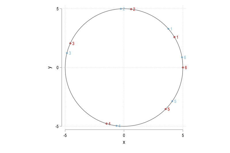
aspect(1) legend(off)We get this figure:
Note that it starts with 1 in a counter-clockwise direction and ends at 6 exactly on the x = 0 point. As we have specified above, the last point completes the 360 degree angle:
Here, I would like to introduce another element which is matrix rotations. The code below defines the matrix rotation for a 10 degree angle:
// rotation on the 180 degree axiscap drop xhat yhatlocal ro = 10 * _pi / 180 // rotate by 10 degrees// rotation matrix
gen xhat = x * cos(`ro') - y * sin(`ro')
gen yhat = x * sin(`ro') + y * cos(`ro')The formula is fairly intuitive, we increase the value of y by the rotation amount and decrease the value of x. I will be discussing matrix rotations a lot more in subsequent guides so more on this later.
Let’s compare the rotated values with the original ones:
// compare the rotated values with the original ones
    twoway ///
   (scatter y    x   , mlabel(order))  ///
   (scatter yhat xhat, mlabel(order))  ///
   (function   sqrt($r^2 - (x)^2), lc(gs8) range(-$r $r)) ||  ///
   (function  -sqrt($r^2 - (x)^2), lc(gs8) range(-$r $r)),    ///
    aspect(1) legend(off)
and we get:
Here I will keep the rotated values since we get all the possible cases of arc crossing the x=0 and y=0 axes. Let’s just drop the original and rename the rotated values:
**** lets take the rotated values
drop x y
ren xhat x
ren yhat y
replace theta2 = theta2 + (10 * _pi / 180) // also rotate theta2Here we also rotate the angles for consistency. These will be used later to calculate the points for labels.
Now comes the challenging part. Since we have six pies, we need to end the last pie with the starting value of the first pie. So we need to duplicate the first observation:
We do it as follows using a combination of expand and replace:
// duplicate the first value because it is the ending point of the last valuelocal obs = _N + 1
display `obs'expand 2 if order==1
replace order = `obs' in `obs' // repeat the first value and assign it a serialThe expanded values are always appended to the data at the end and we manually replace the order variable for this row only. Note that the above procedure is a very risky piece of code since it specifically replaces one value on one row. So avoid sorting etc. to make sure you have the correct row fixed.
Next, drop the additional variables and generate a dummy id. Since each pie needs to be its own set of coordinates, arc points, and sorting, we reshape the data:
drop val thetagen id = 1
reshape wide x y share theta2, i(id) j(order)Here if you browse the data, it will be just one row with the x, y, share, theta2 values for each variable.
Expand the rows two more times and replace the first observation with the (0,0) coordinates to mark the starting point of the pie:
expand 3 // this adds duplicate two rowsforval i = 1/6 {
// add the intercept dummy for the pie
replace x`i' = 0 in 1
replace y`i' = 0 in 1
// pick the ending point from the next arc
local j = `i' + 1
replace x`i' = x`j' in 3
replace y`i' = y`j' in 3
}The last step above is very important. Here we pick the starting coordinates of the next arc as the last coordinates of the current arc. Since we added the 7th arc as a dummy, the 6–7th arc is actually the first pie because it starts from the 6th pie, and ends at the 1st pie.
Let’s draw what we got:
twoway ///
  (area y7 x7, nodropbase fc(%20) lc(black) lw(thin))  ///
  (area y1 x1, nodropbase fc(%20) lc(black) lw(thin))  ///
  (area y2 x2, nodropbase fc(%20) lc(black) lw(thin))  ///
  (area y3 x3, nodropbase fc(%20) lc(black) lw(thin))  ///
  (area y4 x4, nodropbase fc(%20) lc(black) lw(thin))  ///
  (area y5 x5, nodropbase fc(%20) lc(black) lw(thin))  ///
  (area y6 x6, nodropbase fc(%20) lc(black) lw(thin))  ///
   (function   sqrt($r^2 - (x)^2), lp(solid) lw(thin) lc(red) range(-$r $r)) ||  ///
   (function  -sqrt($r^2 - (x)^2), lp(solid) lw(thin) lc(blue) range(-$r $r))    ///
   , aspect(1) legend(off)  ///
    xlabel(-5(1)5) ///
    ylabel(-5(1)5) ///
    xline(0) yline(0)
And here we get the skeleton for the pie chart:
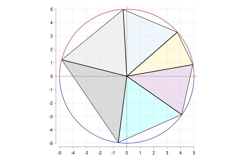
This was the easy part. Next challenge is drawing the arcs correctly.
Generate the a dummy for the origin just for controlling the sorting and increase the observations to 200:
****** get the arc rightgen marker0 = 0 in 1 // identify the origin
set obs 200 // points for the arcNext up, mark half the values, and run a huge loop with a lot of if-else conditions where the conditions are highlighted in bold and explained below:
local half = _N / 2
display `half'
forval i = 1/6 {cap drop x`i'_temp
cap drop y`i'_tempgen x`i'_temp = .
gen y`i'_temp = .summ y`i' if y`i' != 0 // this defines the conditions// positive half top if `r(min)' >= 0 & `r(max)' >= 0 {
sum x`i' if x`i' != 0
replace x`i'_temp = runiform(`r(min)' , `r(max)')
replace y`i'_temp = sqrt(25 - (x`i'_temp)^2)
replace x`i' = x`i'_temp if x`i'==.
replace y`i' = y`i'_temp if y`i'==.
}// negative half bottom
else if `r(min)' < 0 & `r(max)' < 0 {
sum x`i' if x`i' != 0
replace x`i'_temp = runiform(`r(min)' , `r(max)')
replace y`i'_temp = -sqrt(25 - (x`i'_temp)^2)
replace x`i' = x`i'_temp if x`i'==.
replace y`i' = y`i'_temp if y`i'==.
}// positive to negative else if `r(min)' < 0 & `r(max)' >= 0 {
sum x`i' if x`i' != 0 & y`i' >= 0
if `r(min)' < 0 {
replace x`i'_temp = runiform(-5, `r(min)') in 1/`half'
}
else {
replace x`i'_temp = runiform(`r(min)', 5) in 1/`half'
}
replace y`i'_temp = sqrt(25 - (x`i'_temp)^2) in 1/`half'sum x`i' if x`i' != 0 & y`i' < 0
if `r(min)' < 0 {
replace x`i'_temp = runiform(-5, `r(min)') in `half'/200
}
else {
replace x`i'_temp = runiform(`r(min)', 5) in `half'/200
}
replace y`i'_temp = -sqrt(25 - (x`i'_temp)^2) in `half'/200
replace x`i' = x`i'_temp if x`i'==.
replace y`i' = y`i'_temp if y`i'==.
}
}The first two if and else conditions determine whether the y values are fully in the positive or in the negative half. This is fairly straightforward. The tricky part is when y values cross the x=0 axis and on top of this we need to make a distinction between whether this crossing is taking place where x is negative (2nd and 3rd quadrants) or positive (1st and 4th quadrants). Which is why we have nested if-else conditions above to cover all the possible iterations. For each arc one can draw the scatter values and check the code.
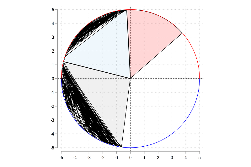
Here we come to the last hurdle. Sorting the variables. As mentioned earlier sorting depends on where the arc is located in the circle. Let’s test it out by trying three sorts:
sort marker0 x1 // first arc

    twoway ///
  (area y1 x1, nodropbase fc(%20) lc(black) lw(thin))  ///
  (area y2 x2, nodropbase fc(%20) lc(black) lw(thin))  ///
  (area y3 x3, nodropbase fc(%20) lc(black) lw(thin))  ///
  (function   sqrt($r^2 - (x)^2), lp(solid) lw(thin) lc(red) range(-$r $r)) ||  ///
   (function  -sqrt($r^2 - (x)^2), lp(solid) lw(thin) lc(blue) range(-$r $r))    ///
   , aspect(1) legend(off)  ///
    xlabel(-5(1)5) ///
    ylabel(-5(1)5) ///
    xline(0) yline(0)
If we sort on x1, the pie (x1, y1) is fine but the rest are messed up:
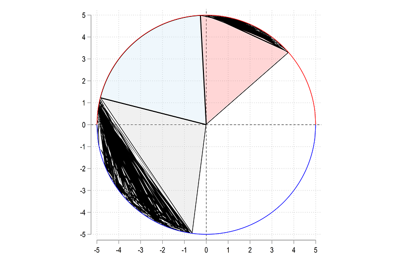
If we sort on y2:
sort marker0 y2 // second arctwoway ///
(area y1 x1, nodropbase fc(%20) lc(black) lw(thin)) ///
(area y2 x2, nodropbase fc(%20) lc(black) lw(thin)) ///
(area y3 x3, nodropbase fc(%20) lc(black) lw(thin)) ///
(function sqrt($r^2 - (x)^2), lp(solid) lw(thin) lc(red) range(-$r $r)) || ///
(function -sqrt($r^2 - (x)^2), lp(solid) lw(thin) lc(blue) range(-$r $r)) ///
, aspect(1) legend(off) ///
xlabel(-5(1)5) ///
ylabel(-5(1)5) ///
xline(0) yline(0)The other two are messed up:
and lastly, if we sort on y3:
sort marker0 y3 // third arc
twoway ///
  (area y1 x1, nodropbase fc(%20) lc(black) lw(thin))  ///
  (area y2 x2, nodropbase fc(%20) lc(black) lw(thin))  ///
  (area y3 x3, nodropbase fc(%20) lc(black) lw(thin))  ///
  (function   sqrt($r^2 - (x)^2), lp(solid) lw(thin) lc(red) range(-$r $r)) ||  ///
   (function  -sqrt($r^2 - (x)^2), lp(solid) lw(thin) lc(blue) range(-$r $r))    ///
   , aspect(1) legend(off)  ///
    xlabel(-5(1)5) ///
    ylabel(-5(1)5) ///
    xline(0) yline(0)
The last pie is fine while the first two are drawn wrong:
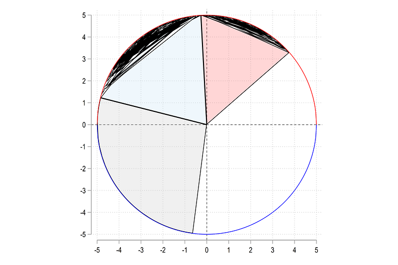
Also note that the first pie is sorted on x while the last two are sorted on y values.
Let’s fix this problem using the following logic: (a) all pie slices need to be sorted in ascending order either on x or y values, (b) the sorting has to depend on whether the pie cuts across y=0 axis (this where y values oscillate)
BUT, if you sort on one variable, the other variable will get messed up. This is because Stata preserves the row correspondence across the variables. The trick here is to transpose the data using reshape, sort all the variables, and reshape it back.
Let’s start with reshaping:
drop id
drop marker0
gen id = _n

reshape long x y share theta2, i(id) j(arc)  // here we create j var

gen marker0 = 1 if x==0
drop id
sort arc marker0
For reshape long, we define the arc variable, and also generate the marker to control the intercept. Next we define a sort variable sortme:
gen sortme = .// sorting based on the ruleslevelsof arc, local(lvls)foreach x of local lvls {
summ x if arc==`x'if `r(max)'> 0 & `r(min)' < 0 {
replace sortme = x if arc==`x'
}
else {
replace sortme = y if arc==`x'
}
}For each arc, we determine the condition for sorting. If x crosses the positive and negative, then use x for sorting (this is where y oscillates), otherwise y is fine.
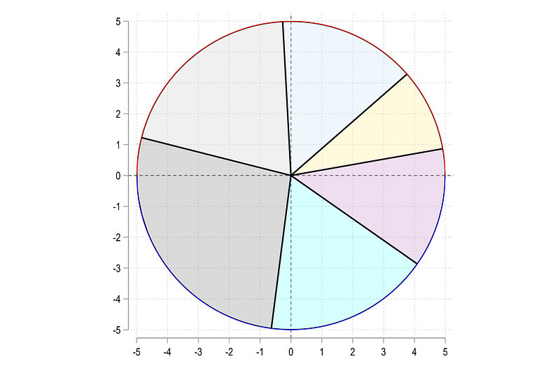
Next step, sort the data on the sortme which will have either values from the x or the y column depending on the position of the arc. Generate a new id variable determined by the sort and reshape the the data back to a wide format:
sort arc marker0 sortme
drop marker0

by arc: gen id = _n  // dont use bysort here

reshape wide x y sortme share theta2, i(id) j(arc)
Here if you look at the data, all the pie values will be sorted in ascending order. Reshape sorting is currently the ONLY way to deal with this issue.
Now we can draw the figure again:
twoway ///
  (area y7 x7, nodropbase fc(%20) lc(black) lw(thin))  ///
  (area y1 x1, nodropbase fc(%20) lc(black) lw(thin))  ///
  (area y2 x2, nodropbase fc(%20) lc(black) lw(thin))  ///
  (area y3 x3, nodropbase fc(%20) lc(black) lw(thin))  ///
  (area y4 x4, nodropbase fc(%20) lc(black) lw(thin))  ///
  (area y5 x5, nodropbase fc(%20) lc(black) lw(thin))  ///
  (area y6 x6, nodropbase fc(%20) lc(black) lw(thin))  ///
   (function   sqrt($r^2 - (x)^2), lp(solid) lw(thin) lc(red) range(-$r $r)) ||  ///
   (function  -sqrt($r^2 - (x)^2), lp(solid) lw(thin) lc(blue) range(-$r $r))    ///
   , aspect(1) legend(off)  ///
    xlabel(-5(1)5) ///
    ylabel(-5(1)5) ///
    xline(0) yline(0)
And here it is the pie chart as we want it:
Here I would like to point out that since each pie has its own set of variable columns, one can transform pies individually as well. For example one can explode one or two pie slices to highlight them. Various transformations can be applied here. This is a topic I will cover in another guide.
Pie labels
Next part is to deal with pie labels. Labels can be added anywhere since we are in an (x,y) polar space. Let’s add the labels outside the pies. Since we know the radius, we need add a small number to push the labels outside the circle.
If we want the labels to be aligned exactly with the center point of the arcs, we divide the theta2 angles. Since theta2 defines the end point of a pie from the origin, we need to average the angle from the current pie and the value of the next pie. This is operationalized as follows:
// add pie labelscap drop xlab* ylab*local labrad = $r + 0.5forval x = 1/6 {
local y = `x' + 1
gen xlab`x' = `labrad' * cos((theta2`x' + theta2`y')/2) in 1
gen ylab`x' = `labrad' * sin((theta2`x' + theta2`y')/2) in 1
}// the last pie
replace ylab6 = ylab6 * -1
replace xlab6 = xlab6 * -1Since the last pie is special, I manually adjust it here to place it correctly (might still figure out an automated way to fixing this). If one chooses a value of the labrad local that is less than the radius, then the labels will end up inside the pie.
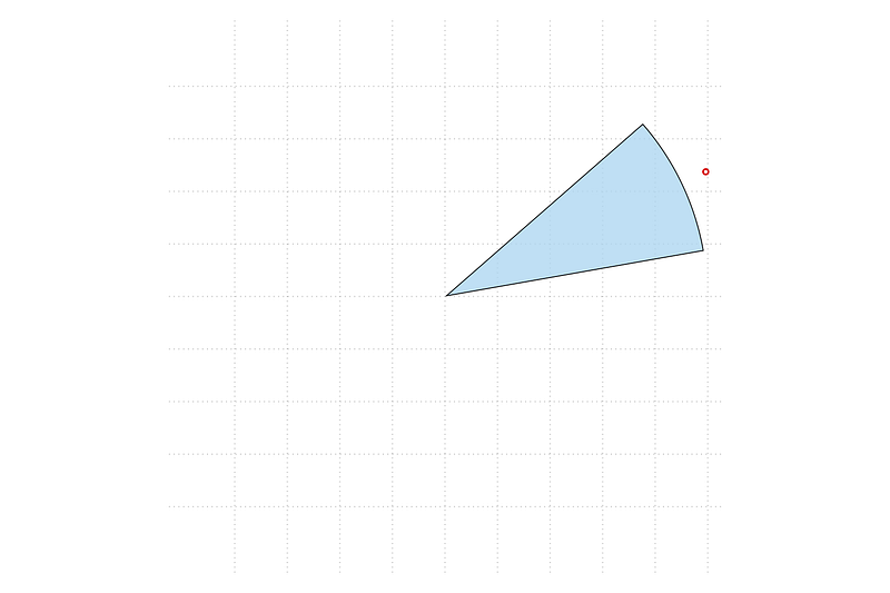
We can test one pie:
**** test here
    twoway ///
  (scatter ylab6 xlab6) ///
  (area y6 x6, nodropbase fc("`r(p1)'%80") lc(black) lw(vthin))  ///
      , aspect(1) legend(off)  ///
       xlabel(-5(1)5) ///
       ylabel(-5(1)5) ///
      xscale(off) yscale(off)
And here we get the correct position:
We can also do it for the whole pie chart:
**** pie with labels
    twoway ///
  (area y7 x7, nodropbase fc("`r(p1)'%80") lc(black) lw(vthin))  ///
  (area y1 x1, nodropbase fc("`r(p2)'%80") lc(black) lw(vthin))  ///
  (area y2 x2, nodropbase fc("`r(p3)'%80") lc(black) lw(vthin))  ///
  (area y3 x3, nodropbase fc("`r(p4)'%80") lc(black) lw(vthin))  ///
  (area y4 x4, nodropbase fc("`r(p5)'%80") lc(black) lw(vthin))  ///
  (area y5 x5, nodropbase fc("`r(p6)'%80") lc(black) lw(vthin))  ///
  (area y6 x6, nodropbase fc("`r(p7)'%80") lc(black) lw(vthin))  ///
   (scatter ylab1 xlab1) ///
   (scatter ylab2 xlab2) ///
   (scatter ylab3 xlab3) ///
   (scatter ylab4 xlab4) ///
   (scatter ylab5 xlab5) ///
   (scatter ylab6 xlab6) ///
    , aspect(1) legend(off)  ///
      xlabel(, nogrid) ylabel(, nogrid) ///
      xscale(off) yscale(off) ///
      title("{fontface Arial Bold: My first custom pie chart}")
and we get the next blueprint that we need:
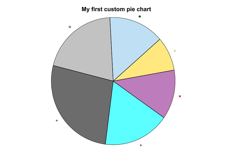
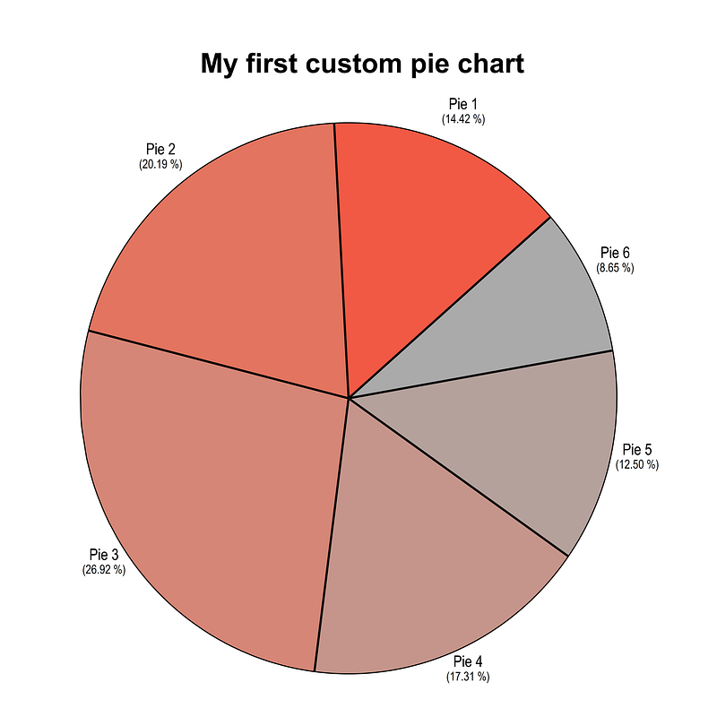
Let us now automate the whole process with labels and colors:
cap drop label*forval i = 1/6 {
local j = `i' + 1
gen label`i'_top = "Pie `i'" in 1
gen label`i'_bot = "(" + string(share`j' * 100, "%9.2f") + " %)" in 1
}local labsforval i = 1/6 {
local labs `labs' (scatter ylab`i' xlab`i', mcolor(none) mlabel(label`i'_top) mlabposition(12) mlabcolor(black) mlabsize(2.2)) || (scatter ylab`i' xlab`i', mlab(share`i') mcolor(none) mlabel(label`i'_bot) mlabposition(0) mlabcolor(black) mlabsize(1.7)) ||
colorpalette red gs10, n(7) nographtwoway ///
(area y7 x7, nodropbase fc("`r(p1)'") fi(90) lc(black) lw(vthin)) ///
(area y1 x1, nodropbase fc("`r(p2)'") fi(90) lc(black) lw(vthin)) ///
(area y2 x2, nodropbase fc("`r(p3)'") fi(90) lc(black) lw(vthin)) ///
(area y3 x3, nodropbase fc("`r(p4)'") fi(90) lc(black) lw(vthin)) ///
(area y4 x4, nodropbase fc("`r(p5)'") fi(90) lc(black) lw(vthin)) ///
(area y5 x5, nodropbase fc("`r(p6)'") fi(90) lc(black) lw(vthin)) ///
(area y6 x6, nodropbase fc("`r(p7)'") fi(90) lc(black) lw(vthin)) ///
`labs' ///
, aspect(1) legend(off) ///
xlabel(, nogrid) ylabel(, nogrid) ///
xscale(off) yscale(off) ///
xsize(1) ysize(1) ///
title("{fontface Arial Bold: My first custom pie chart}", margin(medium))Note that the first pie share needs to come from the next pie for it to be labeled correctly. Here we get rid of the scatter points and add two labels at the 12 and 6'o clock positions. This is just a small hack if you want to do multi-row labels. The color palette basically goes from red to gray. The fill intensity fi option is different from color opacity in Stata (e.g. red%80). This is not properly documented in Stata, but the fill intensity is not at 100% by default. Therefore, if one makes fill areas, they sometimes the legends look darker than the areas.
And here we get the final figure:
And that is it for this guide! A lot more will be built on the principles introduced here. Try and generating the pie chart with other data points and play around with colors and labels.
Please report errors and bugs if you find any. Also please share your visualizations!
About the author
I am an economist by profession and I have been using Stata since 2003. I am currently based in Vienna, Austria where I work at the Vienna University of Economics and Business (WU) and at the International Institute for Applied Systems Analysis (IIASA). You can find my research work on ResearchGate and Google Scholar, and Stata code repository on GitHub. You can follow my COVID-19 related Stata visualizations on Twitter. I am also featured on the Stata COVID-19 webpage in the visualization and graphics section.
You can connect with me via Medium, Twitter, LinkedIn or simply via email: [email protected].
My Medium blog, The Stata Guide, releases awesome new content regularly. Clap, and/or follow if you like these guides!


