
Stata graphs: Polar (Radial) Plots
In this guide, learn how to make polar plots from scratch in Stata. The polar plot script is also applied to the Eurostat’s weekly deaths dataset to generate excess deaths figures shown below:
The above visualization was inspired by this Reddit post where weekly deaths are animated in a wheel. This visualization makes a lot of sense, especially when exploring seasonal indicators that continue from one year to the next. For example, deaths go up in winter starting around November and this wave continues till February. The standard way of graphing this information it to plot different lines for each year (see graph above). Even though this also work, the continuity of seasonal patterns is broken.
This guide is slightly more advanced than previous guides since the visualization is programmed from scratch. It also involves a basic knowledge of trigonometry, transformation of cartesian to polar coordinates, and knowledge of programming in Stata. These are discussed where necessary.
Preamble
Like other guides, a basic knowledge of Stata is assumed. This guide deals with advanced usage of locals, loops, and code structures that require some experience and familiarity with Stata programming. If you are using this guide for the first time, and are new to Stata, then Guide 1 and Guide 2 are highly recommended, followed by the next set of guides which are in increasing order of difficulty.
In order to make the graphs exactly as they are shown here, several additional item are required:
- In order to make the graphs exactly as they are shown here, install the schemepack suite (more info in the Scheme guide and on GitHub):
ssc install schemepack, replaceand set the scheme to White Tableau:
set scheme white_tableau- Install Ben Jann’s colorpalette package (more on colors in Guide 2 and in the Color guide)
ssc install palettes, replace- Set default graph font to Arial Narrow (see the Font guide on customizing fonts)
graph set window fontface "Arial Narrow"This guide has been written in Stata version 16.1. Earlier versions might need some modifications.
Additionally, keep this figure as a reference point for formulas used below:
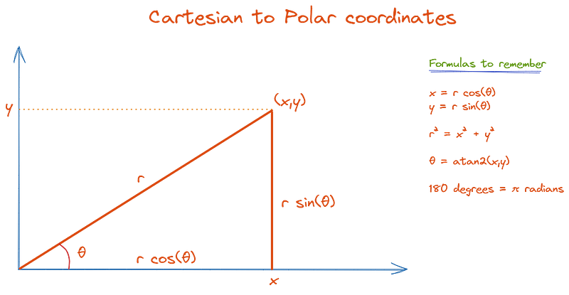
This figure was introduced in a previous guide where we learned how to add arrows to line graphs which also involved calculating the correct angle of the arrows.
Part I: Functions in Stata
An under-explored, yet an extremely powerful feature of Stata is the ability to plot functions. In fact, I have hardly seen it being used or discussed except by Stata programmers. The functions feature can be combined with any other twoway graph option to generate a range of exciting visualizations.
The Stata GUI to access the Functions option is given in Graphics>Twoway graphs>Create>Advanced plots>Functions. A screenshot is shown below:
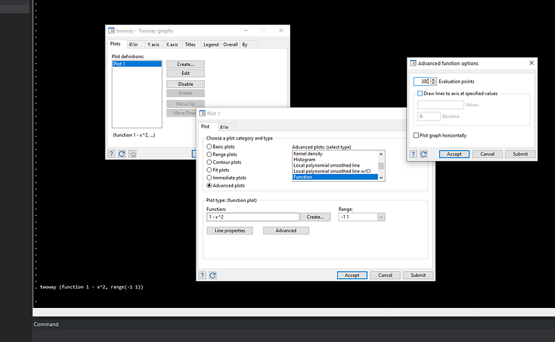
Essentially here we need to define a function in the form of y=f(x) , where the f(x) is plotted for the range (-n n). The y-values, or the domain, is calculated from the function. Stata, by default uses 300 points for evaluating a function. This is sufficient, but this can be increased or decreased from the advanced menu in case one needs a very high resolution image or not enough processing power is available to evaluate multiple functions. This 2004 Stata Journal article by the prolific Nick Cox is a good introduction to plotting functions.
Circles
The formula for a circle centered at (0,0) is x^2 - y^2 = r^2 where r is the radius. Thus for Stata, we need to make y the subject. This is simply derived as: y = +/- sqrt(r^2 — x^2), where the positive and negative domains need to be evaluated to since a square root is involved. In Stata, a basic circle can be drawn as follows:
twoway (function   sqrt(1 - (x)^2), lc(black) range(-1 1)) ||  ///
       (function  -sqrt(1 - (x)^2), lc(gs12)  range(-1 1)),    ///
     legend(off)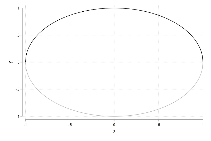
Here we essentially draw two semi-circles of radius 1. The black line shows the positive domain, while the gray line shows the negative domain. We can modify the code as follows to make it also round:
twoway (function   sqrt(1 - (x)^2), lc(gs8) range(-1 1)) ||  ///
       (function  -sqrt(1 - (x)^2), lc(gs8) range(-1 1)),    ///
          aspect(1) legend(off)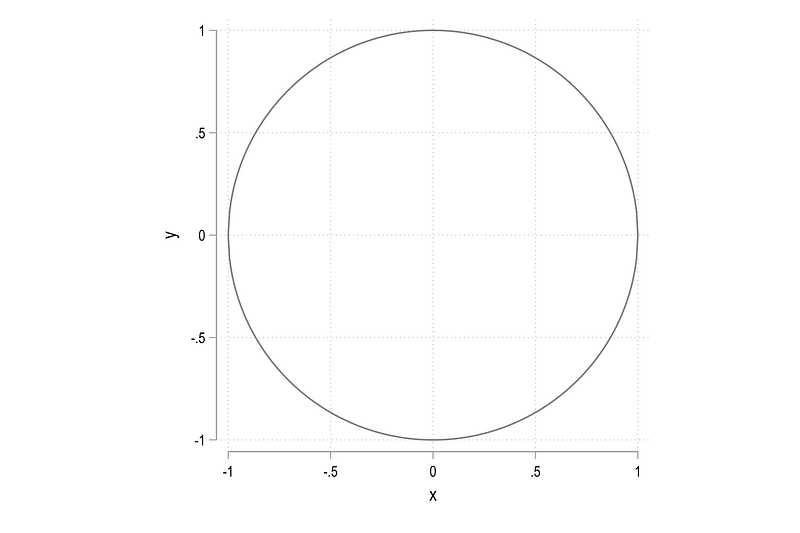
where aspect(x) defines the aspect of y-axis to x-axis. Note this does not change the dimensions of the graph which is controlled by xsize() and ysize(). This will be discussed later in this guide.
We can also draw a circle of any radius. For example, the code below shows a circle with a radius of 4:
twoway (function   sqrt(4 - (x)^2), lc(gs8) range(-2 2)) ||  ///
       (function  -sqrt(4 - (x)^2), lc(gs8) range(-2 2)),    ///
         aspect(1) legend(off) xscale(off) yscale(off)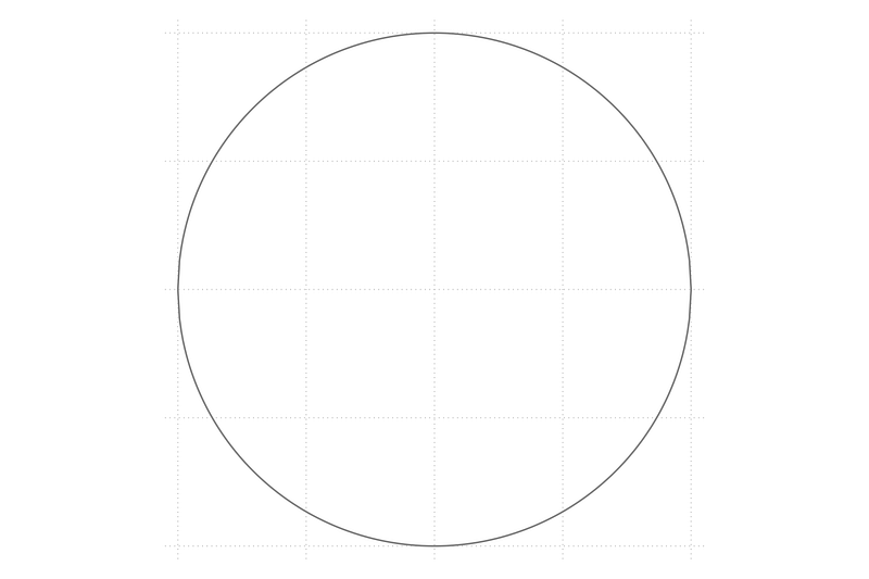
Since the logic is fairly simple, several circles can be drawn using a combination of loops and locals:
forval x = 1/5 {local circle `circle' (function sqrt(`x'^2 - x^2), lc(gs12) lw(thin) lp(solid) range(-`x' `x')) || (function -sqrt(`x'^2 - x^2), lc(gs12) lw(thin) lp(solid) range(-`x' `x')) ||
}twoway ///
`circle' ///
, ///
aspect(1) legend(off) ///
xlabel(-5(1)5) ylabel(-5(1)5)which gives us circles from radius 1 to 5 in steps of 1.
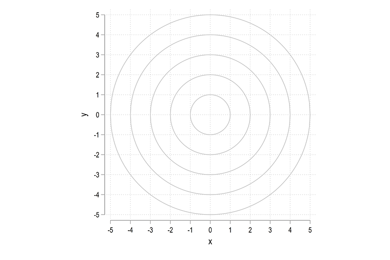
The above formulation provides a neat way of generate any number of circles. For details on this type of coding, see Guide 2 or subsequent guides for a step-by-step introduction.
Spikes
The next thing we need to draw are spikes that split the circle in even intervals. Here we need to make use of a couple of trigonometry formulas shown in the illustration above.
Let’s say we want to create 20 spikes. We can calculate half of them and extend the range in which they are evaluated. Therefore we only need to deal with a semi-circle, which is represented by 180 degrees or pi radians. If we to draw 10 spikes in a semi-circle then this is simply pi/10. The angle of each spike x is theta = x * pi/10. Once the angle is known, the line extends from +/- radius * cos(theta) on the x-axis and +/- radius * sin(theta) on the y-axis. Again see the the illustration above for the formulas.
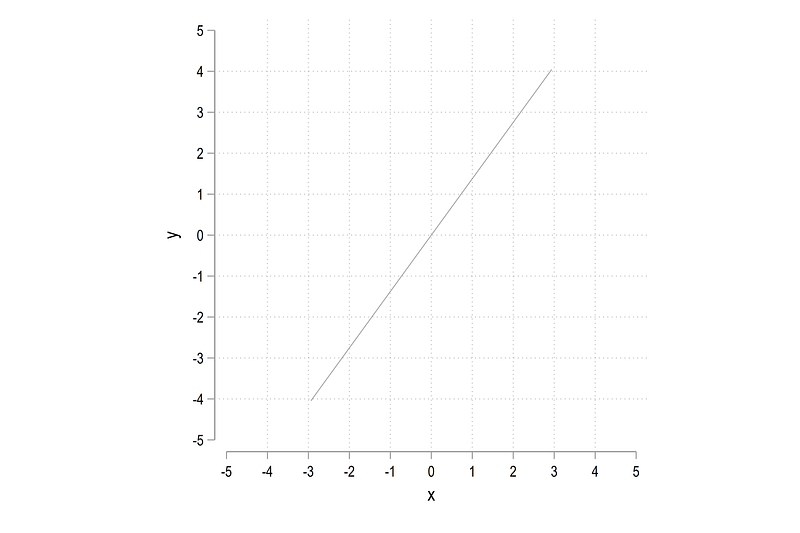
For example, if we want to plot the third spike, this can be operationalized as follows:
local theta = 3 * _pi / 10               // 3rd of 10 segments
local liner = abs(5 * cos(`theta'))      // 5 is the radius
twoway ///
(function (tan(`theta'))*x, n(2) range(-`liner' `liner') lw(vthin) lc(gs10) lp(solid)) ///
, ///
aspect(1) legend(off) ///
xlabel(-5(1)5) ylabel(-5(1)5)where we make use of the identity sin theta = tan theta * cos theta for the y-axis values. This allows us to define the line radius local liner only once and we can then use it both to define the length of the lines, and calculate the y values. Note that since this is a straight line, we can also just evaluate it using two points using the n(2) option. From the above script, we get a plot of the 3rd segment of the spike:
The 3 in the above formula can be replaced to generate other segments as well. Or we can just loop over all the segments and generate them in a local spike:
forval x = 1/10 {
 local theta = (`x') * _pi / 10
 local liner = abs(5 * cos(`theta'))

 local spike `spike' (function (tan(`theta'))*x, n(2) range(-`liner' `liner') lw(vthin) lc(gs10) lp(solid)) ||

 }
twoway ///
`spike' ///
, ///
aspect(1) legend(off) ///
xlabel(-5(1)5) ylabel(-5(1)5)which gives us this star burst figure with 20 spikes:
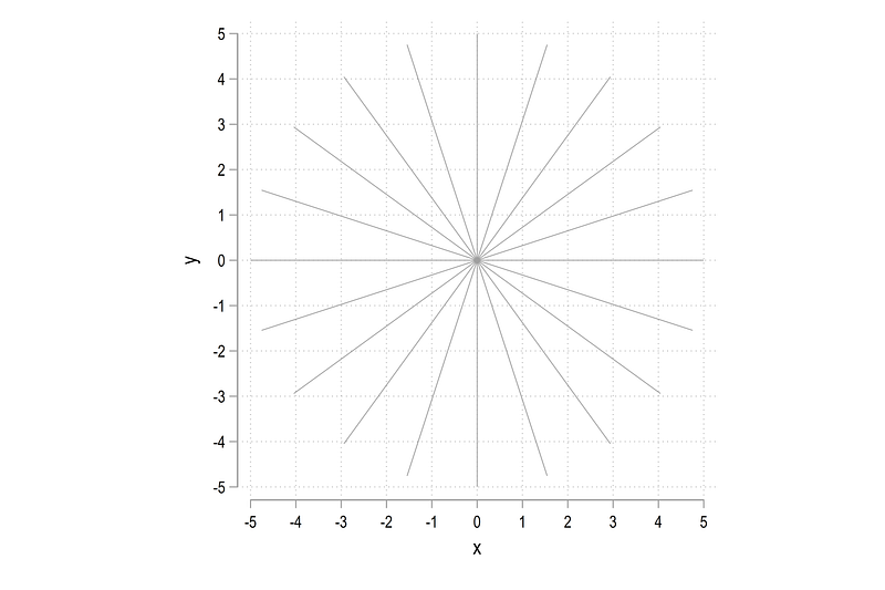
Note that the code above automates the process of generating the spikes. By modifying the value of the number of segments and the length of the segment, any type of spikes can be generated.
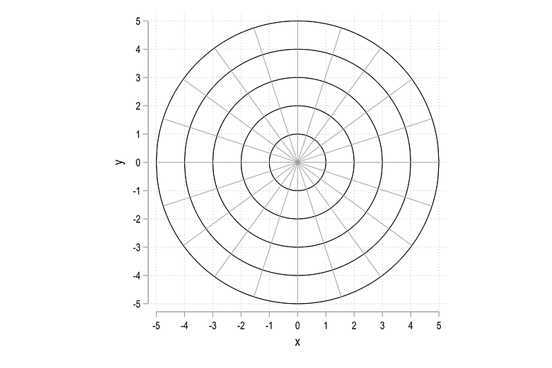
Circles and spikes
Here we combine the circles and the spikes:
local circle  // reset the locals
local spike
forval x = 1/5 {
local circle `circle' (function sqrt(`x'^2 - x^2), lc(black) lw(thin) lp(solid) range(-`x' `x')) || (function -sqrt(`x'^2 - x^2), lc(black) lw(thin) lp(solid) range(-`x' `x')) ||
}forval x = 1/10 {
local theta = (`x') * _pi / 10
local liner = abs(5 * cos(`theta'))
local spike `spike' (function (tan(`theta'))*x, n(2) range(-`liner' `liner') lw(vthin) lc(gs10) lp(solid)) ||
}twoway ///
`circle' ///
`spike' ///
, ///
aspect(1) legend(off) ///
xlabel(-5(1)5) ylabel(-5(1)5)to get the baseline frame of a polar plot:
Part II: Labels and fine tuning
The next challenge is to add labels to the wheels and the spikes. Let’s start by generating a set of observations which equal the number of spikes divided by two:
clear
set obs 10
gen obs = _n
Here we need to generate the labels for the positive and the negative values of the circle. For this, we also need some maths! The angle for each spike is calculated as spike number times pi divided by number of spikes / 2:
** calculate the angle
gen double theta = - obs * _pi / 10** generate the x values
gen double px1 = abs((5 + 0.5) * cos(theta))
gen double px2 = -abs((5 + 0.5) * cos(theta))** generate the y values
gen double py1 = tan(theta)*px1
gen double py2 = tan(theta)*px2** generate the marker labels
gen marker1 = obs
gen marker2 = obsThe x values are calculated for the negative and the positive ranges. The values are also extended by a small number to move them away from the edge of the circle. In the above example, we adjust the markers by 0.5. Similarly, the y values are calculated using the sin theta = tan theta * cos theta formula. Markers are labeled by the number of observations in the last step.
Why do we use double when generating variables? This is to ensure precision is maintained while calculating the values. Check out the Power of Precision guide for more information and why it really matters for your calculations.
We can plot the markers as follows:
twoway ///
 (scatter py1 px1, mc(none) ms(point) mlab(marker1) mlabpos(0)) ///
 (scatter py2 px2, mc(none) ms(point) mlab(marker2) mlabpos(0))
to get this circle of numbers:
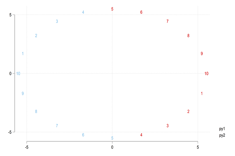
Note the pattern here. The values 1–10 repeat themselves twice. Since the polar plot starts from the value of 1 give in red and goes clockwise, we need to change the values after the blue 10. Here we just add 10 to the markers that need to be modified and adjust for a small threshold to make sure all value are covered:
replace marker1 = marker1 + 10 if py1 > -3e-06
replace marker2 = marker2 + 10 if py2 >  3e-06
This might need slight modification if the radius and number of spikes increase. We can plot the values again:
twoway ///
 (scatter py1 px1, mc(none) ms(point) mlab(marker1) mlabpos(0)) ///
 (scatter py2 px2, mc(none) ms(point) mlab(marker2) mlabpos(0))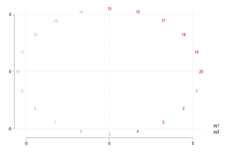
and we get the correct numbers around the wheel. The option mlabpos(0) centers the label directly on top of the scatter points.
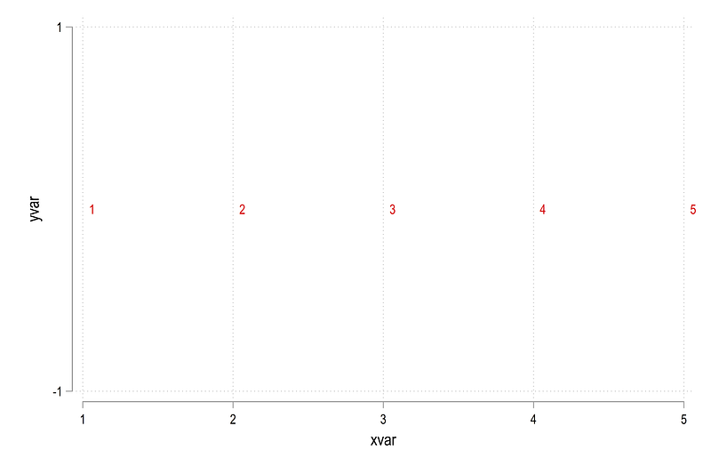
The spike labels are easier. We pick an axis on which to plot the values, keep it constant, and label the other axis by the number of circles which cut the spikes. In the code below, we freeze the y-axis at 0 and generate x-axis values as simply 1 to 5 for the circles we drew earlier:
gen xvar = .
gen yvar = .
forval x = 1/5 {
replace xvar = `x' in `x'
replace yvar = 0 in `x'
}twoway ///
(scatter yvar xvar, mc(none) ms(point) mlab(xvar) mlabpos(3))which gives us this simple scatter:
Now let’s put everything together, the circles, the spikes, and their corresponding labels:
local circle  // reset the locals
local spike
colorpalette gs6 gs14, n(5) reverse nograph
forval x = 1/5 {
 local width = `x' * 0.1
 local circle `circle' (function sqrt(`x'^2 - x^2), lc("`r(p`x')'%80") lw(`width') lp(solid) range(-`x' `x')) || (function -sqrt(`x'^2 - x^2), lc("`r(p`x')'%80") lw(`width') lp(solid) range(-`x' `x')) ||
}
forval x = 1/10 {
local theta = (`x') * _pi / 10
local liner = abs((5 + 0.2) * cos(`theta'))
local spike `spike' (function (tan(`theta'))*x, n(2) range(-`liner' `liner') lw(vthin) lc(gs12) lp(solid)) ||
}
twoway ///
`circle' ///
`spike' ///
(scatter py1 px1, mc(none) ms(point) mlab(marker1) mlabpos(0) mlabc(black) mlabsize(vsmall)) ///
(scatter py2 px2, mc(none) ms(point) mlab(marker2) mlabpos(0) mlabc(black) mlabsize(vsmall)) ///
(scatter yvar xvar, mc(none) ms(point) mlab(xvar) mlabpos(10) mlabc(black) mlabsize(tiny)) ///
, ///
aspect(1) legend(off) ///
xscale(off) yscale(off) ///
xlabel(, nogrid) ylabel(, nogrid)Three additional elements are added here. The color and the width of circles are now controlled via locals, and the circle labels are positioned at 10'o clock. These options give the graph a clean look with larger circles being more prominent and thicker than the inner circles:
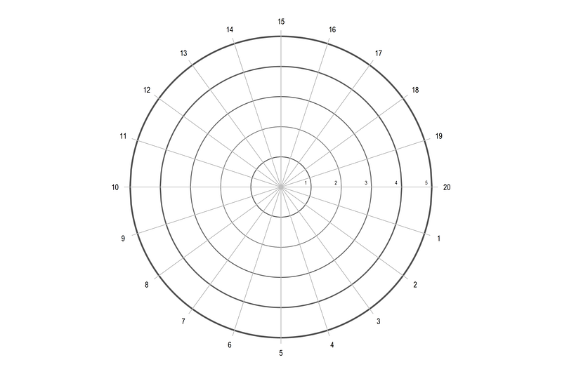
So here we get the underlying blueprint for polar plots.
Part III: Testing with random data
Now let’s just generate random data. Since we are plotting weekly deaths, we just generate 52 random observations for the number of weeks:
clear
set obs 52
gen obs = _n
gen double y = runiform(2, 4)Note that any number of observations can be used. If there are 52 segments, then observations higher than 52 will just continue on the wheel (that is also the beauty of trigonometry and circles). Here we limit observations to 52 just for clarity in how the plotted data looks like.
The next part is fairly straightforward, where we generate the angle of each observation on the wheel:
gen double angle = obs * 2 * _pi / 52Note that the angle is independent of the actual data. It is determined by the full circle or 360 degrees = 2 pi divided by the number of spikes. Once the angle is calculated, the polar coordinates of the actual data we want to plot can be generated as follows:
gen double obsx = y * cos(angle)
gen double obsy = y * sin(angle)
where the data value y plays the role of the radius and the angle determines the position on the circle (see reference figure above for formulas).
We can now apply what we learned above and plot the values as follows:
local circle  // reset the locals
local spike
*** circlescolorpalette gs6 gs14, n(5) reverse nographforval x = 1/5 {
local width = `x' * 0.05
local circle `circle' (function sqrt(`x'^2 - x^2), lc("`r(p`x')'%80") lw(`width') lp(solid) range(-`x' `x')) || (function -sqrt(`x'^2 - x^2), lc("`r(p`x')'%80") lw(`width') lp(solid) range(-`x' `x')) ||
}*** spikesforval x = 1/26 {
local theta = (`x') * _pi / 26
local liner = abs((5 + 0.2) * cos(`theta'))
local spike `spike' (function (tan(`theta'))*x, n(2) range(-`liner' `liner') lw(*0.2) lc(gs13) lp(solid)) ||
}*** figure twoway ///
(connected obsy obsx, lc(red)) ///
`circle' ///
`spike' ///
, ///
aspect(1) legend(off) ///
xscale(off) yscale(off) ///
xlabel(, nogrid) ylabel(, nogrid)which gives us this figure:
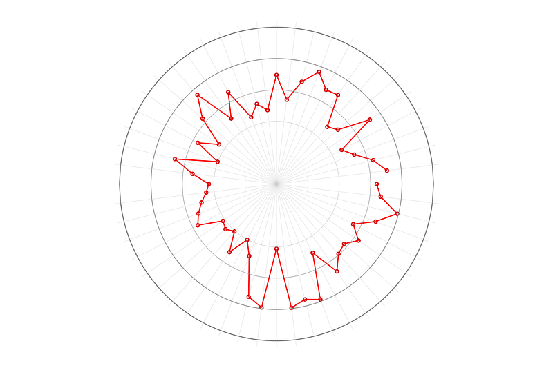
Notice also how the locals are modified based on the number of spikes. Additionally since the data is random, the red line will look different every time one runs the script, but it should start and end on the same spikes. Also note that the individual points align perfectly with each spike. This means that the angles are calculated correctly.
We can now go ahead and add the other styling elements including labels:
*** add circle markersgen xvar = .
gen yvar = .forval x = 1/5 {
replace xvar = `x' in `x'
replace yvar = 0 in `x'
}*** add spike markersgen spikes = _n in 1/26
gen double theta = - spikes * _pi / 26gen double px1 = abs((5 + 0.2) * cos(theta))
gen double px2 = -abs((5 + 0.2) * cos(theta))gen double py1 = tan(theta)*px1
gen double py2 = tan(theta)*px2gen marker1 = obs
gen marker2 = obsreplace marker1 = marker1 + 26 if py1 > -3e-06
replace marker2 = marker2 + 26 if py2 > 3e-06local circle // reset the locals
local spike*** generate the circlescolorpalette gs10 gs14, n(5) reverse nograph
return listforval x = 1/5 {
local width = `x' * 0.05
local circle `circle' (function sqrt(`x'^2 - x^2), lc("`r(p`x')'%80") lw(`width') lp(solid) range(-`x' `x')) || (function -sqrt(`x'^2 - x^2), lc("`r(p`x')'%80") lw(`width') lp(solid) range(-`x' `x')) ||
}*** generate the spikesforval x = 1/26 {
local theta = (`x') * _pi / 26
local liner = abs((5 + 0.2) * cos(`theta'))
local spike `spike' (function (tan(`theta'))*x, n(2) range(-`liner' `liner') lw(*0.2) lc(gs13) lp(solid)) ||
}*** plot the figuretwoway ///
(line obsy obsx, lc(red)) ///
`circle' ///
`spike' ///
(scatter py1 px1, mc(none) ms(point) mlab(marker1) mlabpos(0) mlabc(black) mlabsize(tiny)) ///
(scatter py2 px2, mc(none) ms(point) mlab(marker2) mlabpos(0) mlabc(black) mlabsize(tiny)) ///
(scatter yvar xvar, mc(none) ms(point) mlab(xvar) mlabpos(10) mlabc(gs8) mlabsize(tiny)) ///
, ///
aspect(1) legend(off) ///
xlabel(-5(1)5) ylabel(-5(1)5) ///
xscale(off) yscale(off) ///
xsize(1) ysize(1) ///
xlabel(, nogrid) ylabel(, nogrid)and this gives us:
Here we add xsize and ysize to get rid of the white space on the sides of the circle. This makes the image a square and therefore makes the polar plot stand out more. You can click on this figure and the earlier figure to see the difference. This example also illustrates how aspect controls the plot dimensions and xsize and ysize control the overall figure dimensions. Both elements can be modified depending on the purpose of the figure.
Part IV: Excess death polar plot
In this part, we will learn how to graph actual data on a polar plot. For this, we will make use of the weekly deaths dataset available from Eurostat in the file demo_r_mweek3. The dataset is very extensive, providing information up to NUTS-3 level (the lowest homogenous administrative sub-division for the EU), for all year and week combinations starting from the year 2000. It also provides breakdown by gender and age groups. This file is also the key dataset used for producing excess death figures for Europe.
Here, I initially had the idea to also introduce the script that processes the raw data based on the Eurostat guide I posted earlier. But the dataset is simply too large and needs a detailed guide on its own. For example, for year 2015 and onwards, there are more than 26 million data points, and the Stata file, which is very efficient in storing information, is almost one giga byte (1 GB) in size. This can be challenging if the processing power is not there, and also distracts from the radial plots we want to build in this guide.
Instead, I have posted a reduced form of the dataset on the Stata Guide GitHub, which was processed at the time of writing this guide. The file has information at the country (NUTS 0) level. It can be stored in your working directory using the following command:
use "https://github.com/asjadnaqvi/The-Stata-Guide/blob/master/data/demo_r_mweek3_medium.dta?raw=true", clearNote, it is always good practice to set directories and paths at the beginning of the dofiles. See Guide 1 here on an introduction to workflow management.
For the tutorial, I will use Austria as the case example. Other countries can be generated using the procedures defined below or the whole script can be looped over all the countries as well.
Basic cleaning is done as follows:
keep if geo=="AT"
drop unit
split year, p(W) destring // extract year and weeks
drop year
ren year1 year
ren year2 weekdrop if year>2020 // in case the data is updated to include 2021gen date = yw(year,week) // not needed but given as date example
format date %tworder geo date age
sort geo date age*** keep the main age brackets
keep if age == "Y_LT5" | ///
age == "Y5-9" | ///
age == "Y10-14" | ///
age == "Y15-19" | ///
age == "Y20-24" | ///
age == "Y25-29" | ///
age == "Y30-34" | ///
age == "Y35-39" | ///
age == "Y40-44" | ///
age == "Y45-49" | ///
age == "Y50-54" | ///
age == "Y55-59" | ///
age == "Y60-64" | ///
age == "Y65-69" | ///
age == "Y70-74" | ///
age == "Y75-79" | ///
age == "Y80-84" | ///
age == "Y85-89" | ///
age == "Y_GE90" | ///
age == "TOTAL"*** keep information for total population
keep if sex=="T"
drop sex*** replace hyphens with underscores
replace age = subinstr(age, "-", "_", .) We basically reduce the information in the file and clean up the variables. Next step, we reshape the data and clean it some more so we have the information in the shape we need:
ren y tot_
reshape wide tot_, i(geo date year week) j(age) string
sort geo dateren tot_* *recode Y* (.=0)
drop if date==.encode geo, gen(geo2)
order geo2 datedrop TOTAL*** clean up names
ren Y5_9 Y05_09
ren Y_LT5 Y00_04
ren Y_GE90 Y90_100order Y*, alpha last // notice the order options here*** aggregate the data
egen Y00_64 = rowtotal(Y00_04 - Y60_64)
egen Y65_99 = rowtotal(Y65_69 - Y90_100)drop Y00_04 - Y90_100
order geo geo2 date year weekIn the end, the data should look like this:
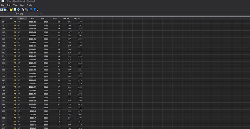
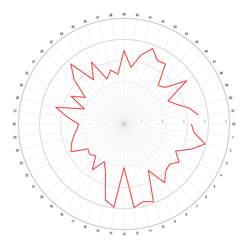
Next start with generating the angles and the polar coordinates of the data:
// fix the angles of data pointssort year weeklevelsof year, local(lvls)
foreach x of local lvls {
gen obs_`x' = _n if year==`x'
local year1 = `x' - 1
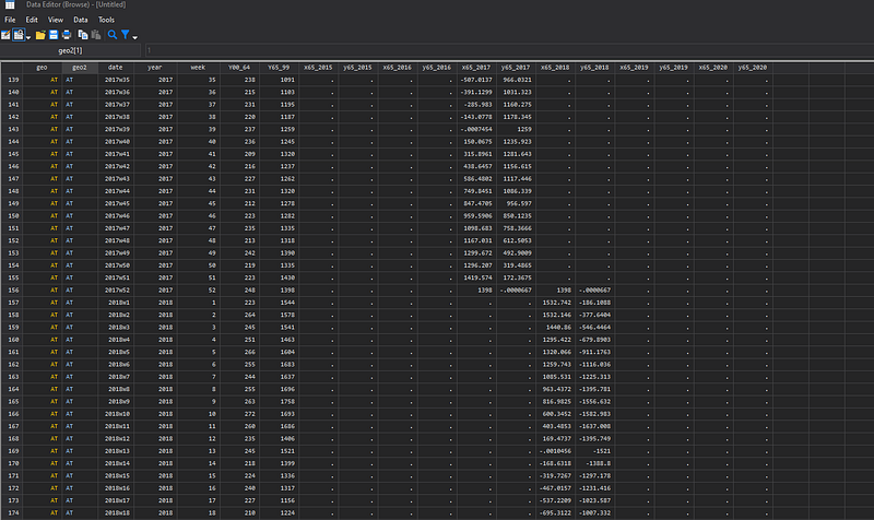
cap replace obs_`x' = _n if year==`year1' & week==52gen double angle_`x' = obs_`x' * -2 * _pi / 52
gen double x65_`x' = Y65_99 * cos(angle_`x')
gen double y65_`x' = Y65_99 * sin(angle_`x')
}drop obs* angle*What this piece of code is doing is taking the value of age 65 plus from the Y65_99 variable and converting them in polar coordinates. Each year also has its own data column where the last entry of a year is padded on to the next year as the starting value. These steps, are done to generate colored lines for each year, and the padding ensures that the new year starts from the last point of the previous year and ensures continuity. The screen shot of the data is as follows:
Next we automate the spike markers using the min/max of the key variable Y65_99:
****** spike markers heregen double obs = _n in 1/26
gen double theta = -obs * _pi / 26summ Y65_99
local cmin = max(0, round(`r(min)', 20) - 50)
local cmax = round(`r(max)', 20) + 50display `cmin'
display `cmax'local diff = round((`cmax' - `cmin') / 6) // divisionsgen px1 = abs((`cmax' * 1.05) * cos(theta))
gen px2 = -abs((`cmax' * 1.05) * cos(theta))gen py1 = tan(theta)*px1
gen py2 = tan(theta)*px2gen marker1 = obs
gen marker2 = obsreplace marker1 = marker1 + 26 if py1 > -1e-02
replace marker2 = marker2 + 26 if py2 > 1e-02A buffer of 50 is added to the minimum and maximum values and the number of divisions of circles is set to 6. These are control variables that can be modified as well. Markers are pushed out by a factor of 5% (`cmax' * 1.05), which also ensures that labels are scaled according to the maximum circle value. Label markers are corrected in the last step.
In the next step, circle markers are generated as follows:
****** spike markers heresumm Y65_99
local cmin = max(0, round(`r(min)', 20) - 50)
local cmax = round(`r(max)', 20) + 50local diff = round((`cmax' - `cmin') / 6)cap gen xvar = .
cap gen yvar = .local i = 1forval x = `cmin'(`diff')`cmax' {
replace xvar = `x' in `i'
replace yvar = 0 in `i'
local i = `i' + 1
}Here I am using the cmin, cmax, diff locals again for the sake of completion. If the script is executing in one go, these locals just need to be defined once.
Once the labels are sorted out, the next piece of code generates the final graph we need:
local circle // reset the localsumm Y65_99
local cmin = max(0, round(`r(min)', 20) - 100)
local cmax = round(`r(max)', 20) + 100local diff = round((`cmax' - `cmin') / 6)*** circlescolorpalette gs12 gs14, n(12) reverse nographlocal i = 1forval x = `cmin'(`diff')`cmax' { local width = `i' * 0.05
local circle `circle' (function sqrt(`x'^2 - x^2), lc("`r(p`i')'%70") lw(`width') lp(solid) range(-`x' `x')) || (function -sqrt(`x'^2 - x^2), lc("`r(p`i')'%70") lw(`width') lp(solid) range(-`x' `x')) ||
local i = `i' + 1
}*** spikeslocal spikeforval x = 1/26 {
local theta = (`x') * _pi / 26
local liner = abs((`cmax' + 40) * cos(`theta'))
local spike `spike' (function (tan(`theta'))*x, n(2) range(-`liner' `liner') lw(vvthin) lc(gs8) lp(solid)) ||
}***** final graph herecolorpalette inferno, n(15) reverse nographtwoway ///
`circle' ///
`spike' ///
(scatter py1 px1, mc(none) ms(point) mlab(marker1) mlabpos(0) mlabc(gs6) mlabsize(*0.5)) ///
(scatter py2 px2, mc(none) ms(point) mlab(marker2) mlabpos(0) mlabc(gs6) mlabsize(*0.5)) ///
(scatter yvar xvar, mc(none) ms(point) mlab(xvar) mlabpos(9) mlabc(gs6) mlabangle(vertical) mlabsize(*0.4)) ///
(line y65_2015 x65_2015, lc("`r(p3)'") lp(solid) lw(vthin)) ///
(line y65_2016 x65_2016, lc("`r(p4)'") lp(solid) lw(vthin)) ///
(line y65_2017 x65_2017, lc("`r(p5)'") lp(solid) lw(vthin)) ///
(line y65_2018 x65_2018, lc("`r(p6)'") lp(solid) lw(vthin)) ///
(line y65_2019 x65_2019, lc("`r(p7)'") lp(solid) lw(vthin)) ///
(line y65_2020 x65_2020, lc("`r(p15)'") lp(solid) lw(thin)) ///
, ///
aspect(1) legend(off) ///
xscale(off) yscale(off) ///
xsize(1) ysize(1) ///
xlabel(, nogrid) ylabel(, nogrid) ///
title("{fontface Arial Bold: Excess deaths in Austria}") ///
subtitle("65 years and older", size(small)) ///
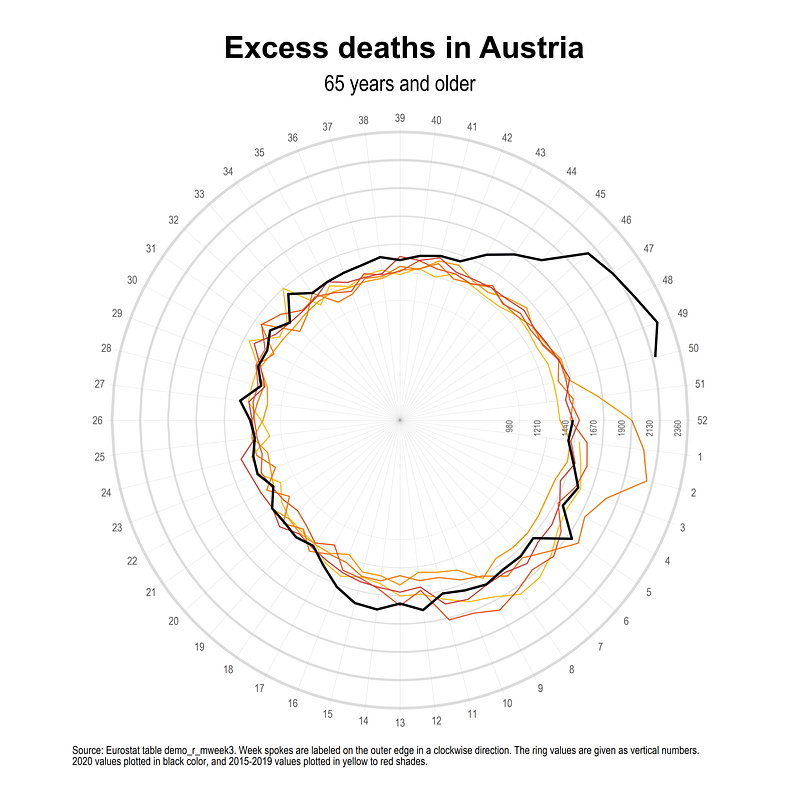
note("Source: Eurostat table demo_r_mweek3. Week spokes are labeled on the outer edge in a clockwise direction. The ring values, given as vertical numbers," "show the number of deaths. 2020 values plotted in bold red color, and 2015-2019 values plotted in light grey-red shades.", size(tiny))The code above does a lot of fine tuning to minor elements to gives us this clean-looking polar plot:
Since the data is only available till week 50, at the time of writing this guide, we can see that there have been excess deaths compared to the previous five years after week 43 for age groups 65 and over. In week 49 there were almost a 1000 extra deaths. One previous year also shows extra deaths mostly due to the combination of flu and cold (see official Statistik Austria explanations here). Excess deaths can also be observed in other weeks especially around the first wave in weeks 14–16 but these could also be wrongly associated with COVID-19 (Type I error). There is also a possibility that the measures put in place to prevent COVID-19 also reduce other types of mortalities such that one sees a zero net impact of the virus. This of course, is a deeper look at the data and subject to debate as well.
Exercise
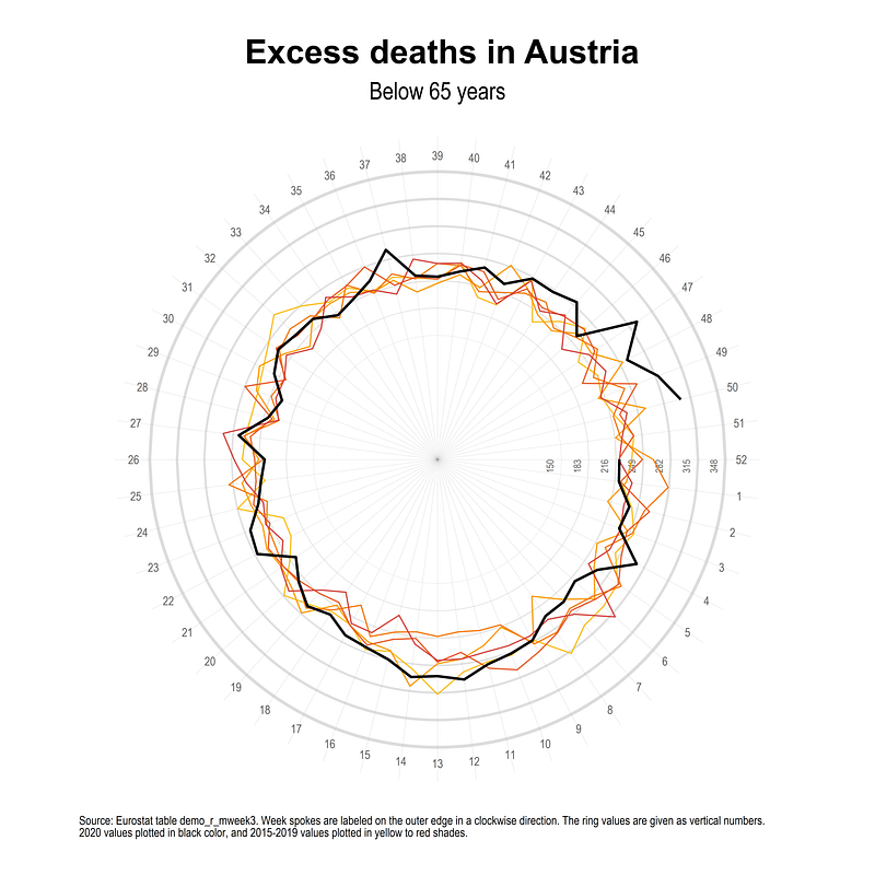
Try and replicating the graph for ages below 65 years, which also shows excess deaths in the last weeks of 2020:
Also try and generate polar plots for other countries. For example, see Spain and France below which show very different patterns of weekly deaths.
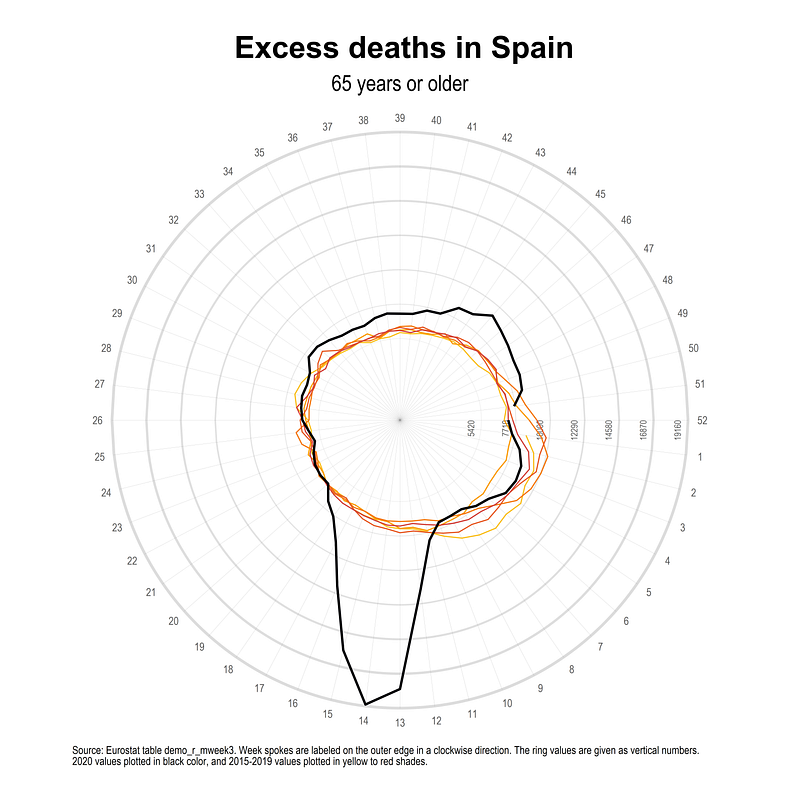
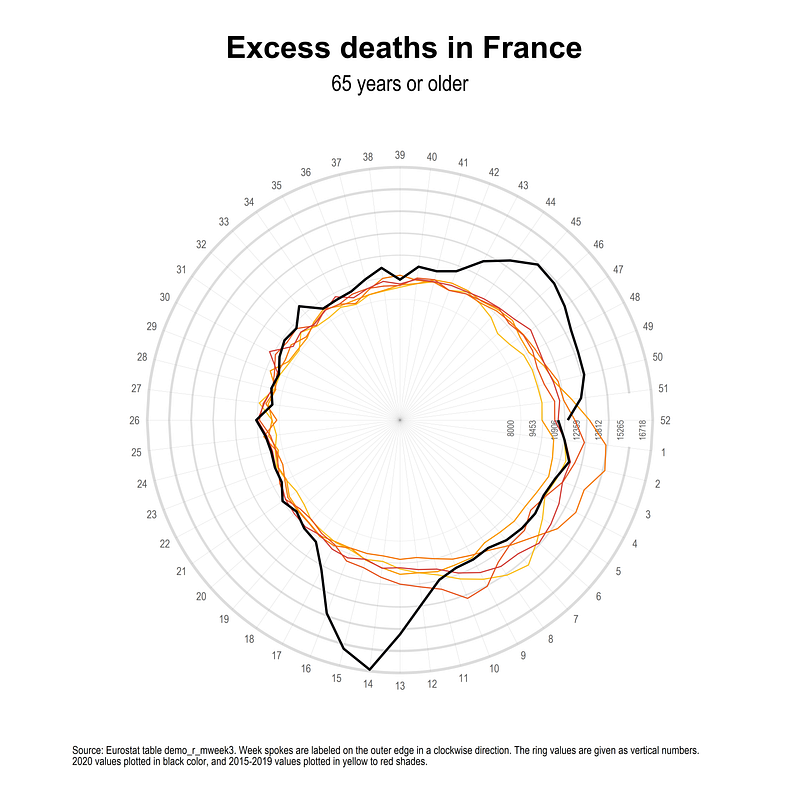
Note that the scale of excess deaths in these countries is in 7,000–10,000 range in some weeks, so the cumulative impact is very high.
Hope you found this guide useful! Please share your visualizations, errors, bugs, suggestions, comments etc. For more polar plot guides, check out the Polar section on the Stata guide.
About the author
I am an economist by profession and I have been using Stata since 2003. I am currently based in Vienna, Austria. You can see my profile, research, and projects on GitHub or my website. You can connect with me via Medium, Twitter, LinkedIn, or simply via email: [email protected]. If you have questions regarding the Guide or Stata in general post them on The Code Block Discord server.
The Stata Guide releases awesome new content regularly. Subscribe, Clap, and/or Follow the guide if you like the content!