
Stata graphs: How to add arrows to your line graphs
In this guide, learn how to add arrows to lines graphs in Stata as shown in the figure below:
While the idea of an arrow at the end of a line seems a banal one, it does pose an interesting challenge, since it involves calculating angles in Stata. The core principles behind calculating angles for adding arrows can be used for a lot of interesting visualizations, that will be covered in subsequent guides.
The guide is split in to two parts. Part I covers the fundamentals of angles in Stata, while Part II applies the fundamentals to actual COVID-19 data that has been covered in previous guides as well.
NOTE: This guide only works with Stata 15 and onwards. The ability to add angles to symbols was added in v15.
Preamble
Like other guides, a basic knowledge of Stata is assumed. This guide deals with advanced usage of locals, loops, and code structures that require some experience and familiarity with Stata programming. If you are using this guide for the first time, and are new to Stata, then Guide 1 and Guide 2 are highly recommended, followed by the next set of guides which are in increasing order of difficulty.
In order to make the graphs exactly as they are shown here, several additional item are required:
- Install the cleanplots theme for a clean look for your figures (more on themes in Guide 2):
net install cleanplots, from("https://tdmize.github.io/data/cleanplots")set scheme cleanplots, perm- Install Ben Jann’s colorpalette package (more on colors in Guide 2 and in the Color guide)
net install palettes, replace from("https://raw.githubusercontent.com/benjann/palettes/master/")
net install colrspace, replace from("https://raw.githubusercontent.com/benjann/colrspace/master/")- Set default graph font to Arial Narrow (see the Font guide on customizing fonts)
graph set window fontface "Arial Narrow"This guide has been written in version 16.1. Earlier versions might need some modifications which are highlighted where necessary.
Part I: The principles
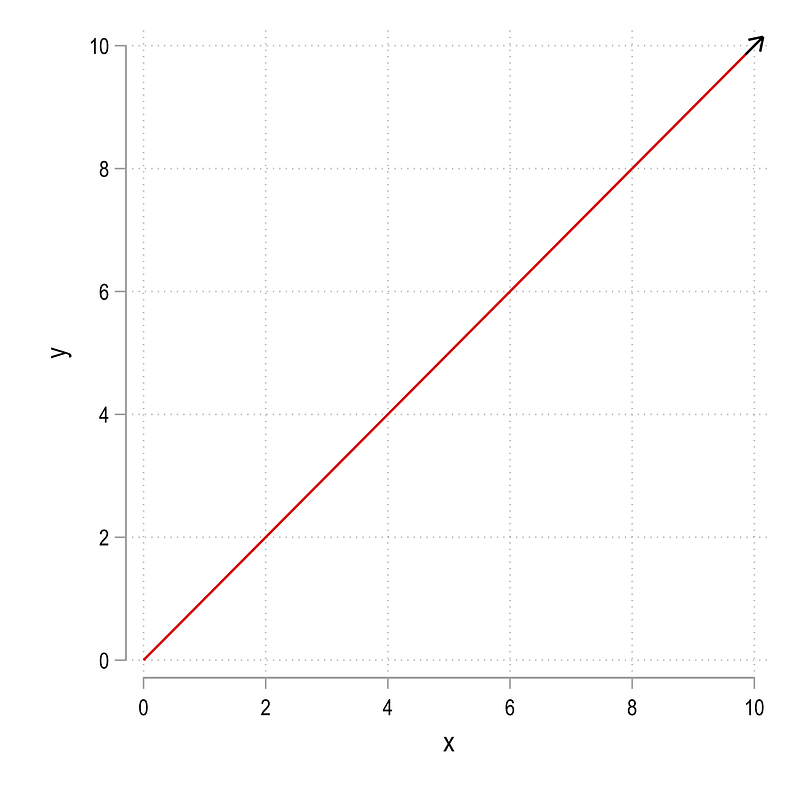
Let’s start with generating two data points:
clear
set obs 2
gen x = .
gen y = .
replace x = 0 in 1
replace x = 10 in 2replace y = 0 in 1
replace y = 10 in 2twoway (line y x)which gives us this line graph:
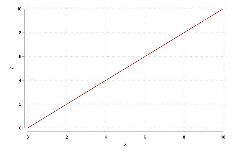
Nothing spectacular. In the next step, mark the last data point and add a marker:
summ x
gen dot = 1 if x==`r(max)'
twoway ///
(line y x) ///
(scatter y x if dot==1, mcolor(black)), ///
legend(off)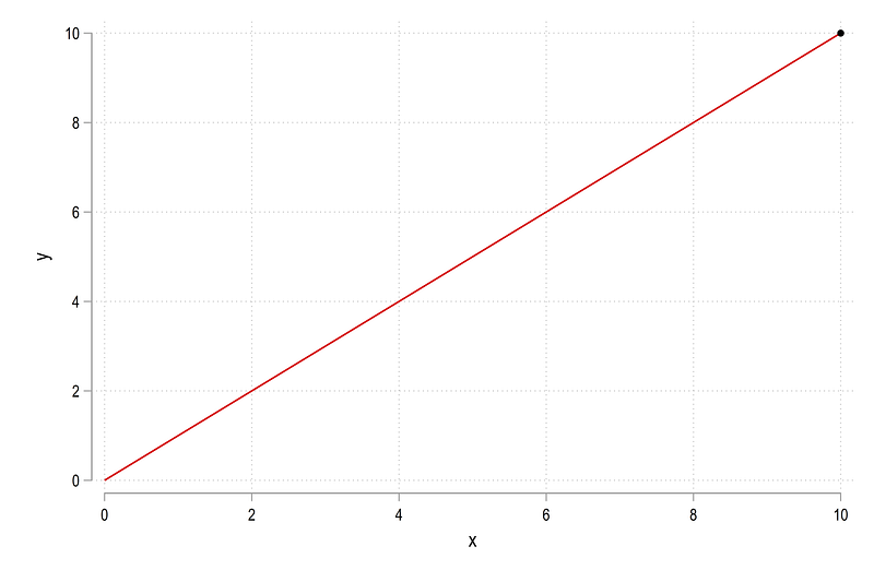
This marker can also be replaced with the marker symbol already provided in Stata:
twoway ///
 (line y x) ///
 (scatter y x if dot==1, mcolor(black) msize(vlarge) msymbol(arrow)), ///
 legend(off)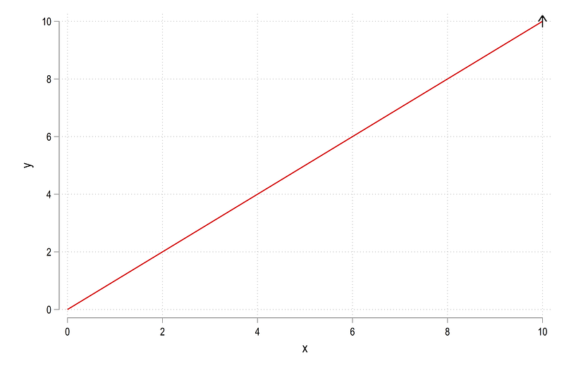
We can see that the angle of the arrow needs to be changed so it aligns with the line. Here we need to introduce some core concepts of how angles work as shown in the figure below:
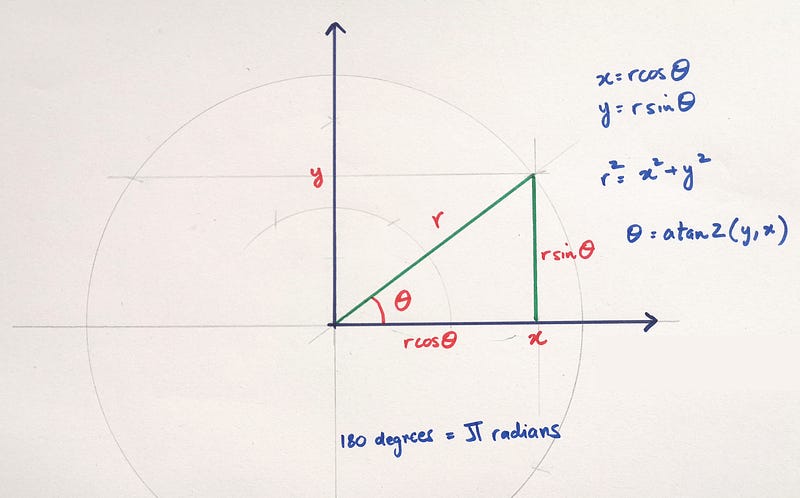
The figure shows the relationship between cartesian coordinates defined by the x,y pairs to polar coordinates, defined by r,theta. While all of the formulas shown in the figure above are not used in this guide, they provide conversion factors of cartesian to polar coordinates. The first main formula shows how the angle theta is calculated, which uses the atan2 function. Without going too much into the mathematics, the atan2 function takes a pair of Cartesian coordinates and returns the angle in radians.
In the figure that we drew earlier, the line is represented by two coordinates (x1,y1)=(0,0) and (x2,y2)=(10,10)
so the angle is defined as:
atan2(y2 — y1, x2 — x1) = atan2(10,10) = 0.7854
The angle is recovered in radians but Stata needs the angle in degrees. Here we utilize the second formula in the figure above, which states that 180 degree = pi radians or 1 radian = 180 / pi. So the formula for the angle can be modified as follows:
atan2(y2 — y1, x2 — x1) * 180 / pi = atan2(10,10) * 180 / pi = 45 degrees
Which is exactly what the angle should be since both x and y start from the origin and end at the (10,10) coordinate.
Let’s implement the above logic in Stata:
gen diffx = x - x[_n-1]
gen diffy = y - y[_n-1]
*** for Stata 16:
gen angle = atan2(diffx, diffy) * -180 / _pi if dot==1*** for Stata 15 or earlier
gen angle = atan2(diffx, diffy) * 180 / _pi if dot==1NOTE: The direction is which the angle is calculated (clockwise, or counter-clockwise) in Stata has switched from Stata 15 or Stata 16. I personally think that this is a bug or some unintentional outcome of programming, since there is no change in documentation in the core functions. In Stata 16, the angle starts from the 0 degree line and goes clockwise, while in Stata 15 or earlier, it is measured as counter-clockwise, the more standard way of representing angles. Therefore, 45 degrees in Stata 16 is actually written as -45 degrees.
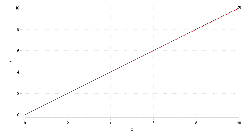
We can now plot the figure with the new angle we calculated:
summ angle
local angle = `r(mean)'
twoway ///
(line y x) ///
(scatter y x if dot==1, mcolor(black) msize(vlarge) msangle(`angle') msymbol(arrow)), ///
legend(off)Note that Stata does not read variables for angle values (as opposed to marker labels), so it has to be converted into a local. From the code above we get:

Notice that the arrow is a bit off. This is not an error. Angles don’t adjust for height and width dimensions. We can control this as follows:
summ angle
local angle = `r(mean)'twoway ///
(line y x) ///
(scatter y x if dot==1, mcolor(black) msize(vlarge) msangle(`angle') msymbol(arrow)), ///
legend(off) xsize(1) ysize(1)where we using the twoway xsize and ysize options. And we get the figure where the arrow is correctly aligned:
While this solves this specific problem, not all graphs can be made into squares. So to accommodate the height and width of the figures, we can modify the angles accordingly as well. Here I would like to emphasize that for angles, full control over the dimensions is needed. Let’s start with a standard 4:3 dimension typically used for graphs and presentations. We start by generating a new angle variable which modified the diffy by the height/width ratio, which we also specify in the twoway graph code:
gen angle2 = atan2(diffx, diffy * 3/4) * -180 / _pi if dot==1 summ angle2
local angle = `r(mean)'twoway ///
(line y x) ///
(scatter y x if dot==1, mcolor(black) msize(vlarge) msangle(`angle') msymbol(arrow)), legend(off) ///
xsize(4) ysize(3)and we get this figure:

The arrow is now correctly aligned. We can even change the dimensions to whatever we want as long as the height and width values are controlled. For example, let’s do the 16:9 ratio used for wide-screen formats:
gen angle2_2 = atan2(diffx, diffy * 9/16) * -180 / _pi if dot==1 // ysize/xsize * x-axisrange/y-axisrangesumm angle2_2
local angle = `r(mean)'twoway ///
(line y x) ///
(scatter y x if dot==1, mcolor(black) msize(vlarge) msangle(`angle') msymbol(arrow)), legend(off) ///
xsize(16) ysize(9)which again gives us the correctly aligned arrow:
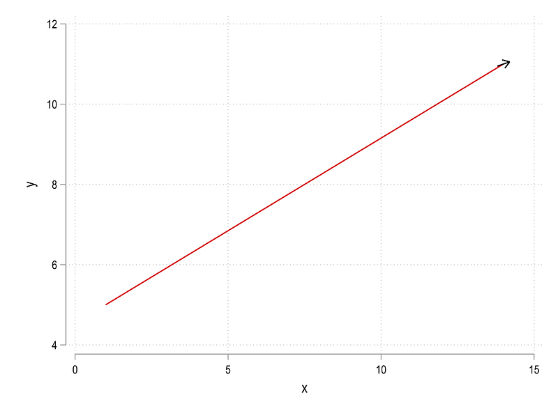
Now let’s clear Stata and start with a slightly different example where the line does not start at the origin:
clear
set obs 2
gen x = .
gen y = . replace x = 1 in 1
replace x = 14 in 2replace y = 5 in 1
replace y = 11 in 2summ x
gen dot = 1 if x==`r(max)'gen diffx = x - x[_n-1]
gen diffy = y - y[_n-1]gen angle = atan2(diffx, diffy) * -180 / _pi if dot==1summ angle
local angle = `r(mean)'twoway ///
(line y x) ///
(scatter y x if dot==1, mcolor(black) msize(vlarge) msangle(`angle') msymbol(arrow)), ///
legend(off)which gives us this figure:
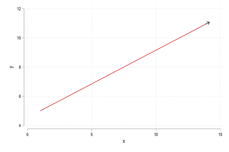
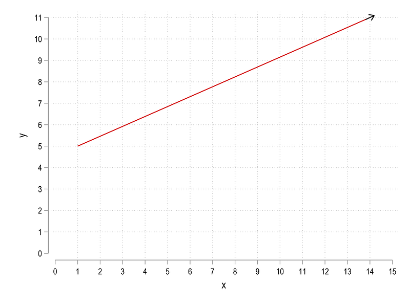
The arrow is very slightly off, which we can correct by controlling the dimensions as specified earlier:
gen angle2 = atan2(diffx, diffy * 3/4) * -180 / _pi if dot==1 // ysize/xsize * x-axisrange/y-axisrangesumm angle2
local angle = `r(mean)'twoway ///
(line y x) ///
(scatter y x if dot==1, mcolor(black) msize(vlarge) msangle(`angle') msymbol(arrow)), legend(off) ///
xsize(4) ysize(3)and this gives us:
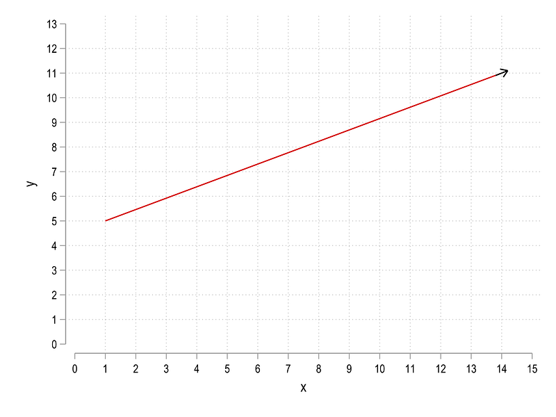
Here we can see that once we control for figure dimensions, the angle is even more off. So a second element needs to be controlled for, the x-axis and y-axis ticks since they also contribute to the figure dimensions. This can be achieved as follows:
gen angle3 = atan2(diffx, diffy * 3/4 * 15/11) * -180 / _pi if dot==1 // ysize/xsize * x-axisrange/y-axisrangesumm angle3
local angle = `r(mean)'
twoway ///
 (line y x) ///
 (scatter y x if dot==1, mcolor(black) msize(vlarge) msangle(`angle') msymbol(arrow)), ///
legend(off) ///
xlabel(0(1)15) ylabel(0(1)11) xsize(4) ysize(3)where 15 is the highest tick we want on the x-axis and 11 on the y-axis. The code gives us this figure:
which again has the correct angle. This process can also be automated to adjust for axes ticks:
cap drop angle4summ x
local xmax = `r(max)' + 1
summ y
local ymax = `r(max)' + 2gen angle4 = atan2(diffx, diffy * 3/4 * `xmax'/`ymax') * -180 / _pi if dot==1 summ angle4
local angle = `r(mean)'twoway ///
(line y x) ///
(scatter y x if dot==1, mcolor(black) msize(vlarge) msangle(`angle') msymbol(arrow)), ///
legend(off) ///
xlabel(0(1)`xmax') ylabel(0(1)`ymax') xsize(4) ysize(3)and we get:
The formula above can be adapted to applied to any graph as long as both the ticks and the dimensions are fully controlled.
Part II: Application
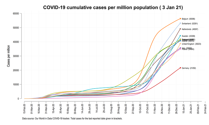
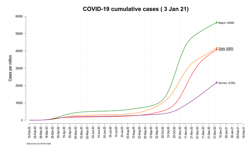
In this part, we will deal with actual COVID-19 data and learn to add arrows to lines, as shown in the figure below:
The lines are not straight and each country has its own trajectory. Therefore what we need to do is apply the principles we learned above, and adapt them to actual data through automation.
Here I will not go so much in the details of COVID-19 since several guides cover this already. So we jump right in by pulling the data:
*** pull the dataclear
insheet using "https://covid.ourworldindata.org/data/owid-covid-data.csv", cleargen date2 = date(date, "YMD")
format date2 %tdDD-Mon-yy
drop date
ren date2 dateren location country
drop if date < 21960 compressNext keep the information we need:
summ date
drop if date >= `r(max)' - 2  // drop the last two observations
gen group = .replace group = 1 if ///
country == "Austria" | ///
country == "Belgium" | ///
country == "France" | ///
country == "Germany" | ///
country == "Italy" | ///
country == "Netherlands" | ///
country == "Poland" | ///
country == "Portugal" | ///
country == "Spain" | ///
country == "Sweden" | ///
country == "Switzerland" | ///
country == "United Kingdom"keep if group==1keep country date total_cases total_deaths population// generate a numerical country var
encode country, gen(country2)
order country country2 dateNote that I drop the last two observations since sometimes not all data is updated on the last available date. You can modify this as necessary. Similarly the choice is countries is arbitrary. I have previously used a larger set of European countries for the COVID-19 guides since the impact of the virus has been the highest in this continent. Any set of countries available in the database can be used here.
Generate the variables we need:
gen cases_pop  = (total_cases  / population) * 1000000
gen deaths_pop = (total_deaths / population) * 1000000
format date %tdDD-Mon-yyxtset country2 dateHere we use cases per million, cases_pop as the variable of choice for analysis . Deaths per million is for the exercise at the end of the guide :) Here we declare the panel using the xtset command. Let’s see what cases_pop looks like:
xtline cases_pop, overlay legend(off)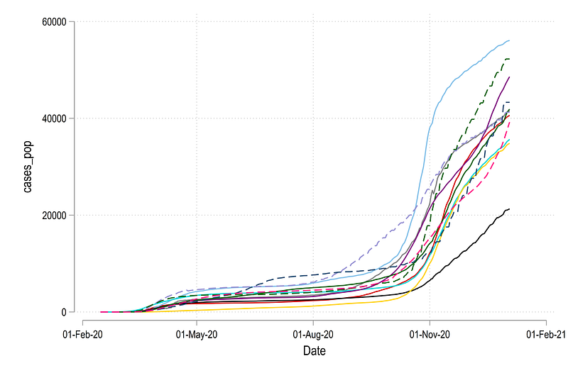
Here we can see that some countries have spikes in the data. We can deal with it by smoothing out the series:
sort country date
gen cases_pop_smooth =.
gen deaths_pop_smooth =.
levelsof country2, local(lvls)
foreach x of local lvls {*** smooth cases
lowess cases_pop date if country2==`x', bwid(0.15) gen(temp`x') nograph
replace cases_pop_smooth =temp`x' if country2==`x'
drop temp`x'*** smooth deaths
lowess deaths_pop date if country2==`x', bwid(0.15) gen(temp`x') nograph
replace deaths_pop_smooth =temp`x' if country2==`x'
drop temp`x'
}xtline cases_pop_smooth, overlay legend(off)where bwid(0.15) is the smoothing parameter. You can modify this accordingly. The new variable gives a slightly smoother looking graph that also helps with calculating angles:
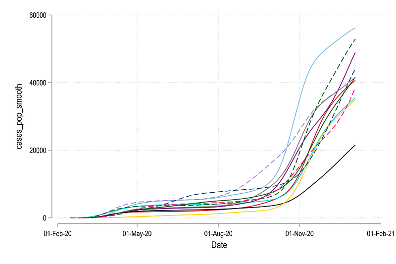
In the next step, we generate the variables for the angles:
summ date
local x1 = `r(min)'
local x2 = `r(max)' + 45
local today = `r(max)'
local dist = `x2' - `x1'sort country2 date
bysort country2: gen diff = cases_pop_smooth - cases_pop_smooth[_n-1] if date==`today'gen angle = atan2(1, diff * 3/5 * `dist' / 60000) * (-180 / _pi)Here we use the date range to control the ticks. For the last date an additional 45 ticks are added to allow labels for lines. On the y-axis the cases extend till 60,000 cases per million so we fix this upper limit as well. As new data comes in, these values can be adapted. The dimensions of the graph are also fixed at 5:3 ratio.
We can generate the label for the lines as well:
summ date
gen label = country + "  (" + string(cases_pop, "%9.0f") + ")" if date==`r(max)'
Here we use the actual cases per million population values rather than the smoothed ones. Using the information we generated above, we can generate the follow graph manually for the first four observations:
summ date
local x1 = `r(min)'
local x2 = `r(max)' + 45
local date: display %tdd_m_y `r(max)'
display "`date'"twoway ///
(line cases_pop_smooth date if country2==1, lc(red) lw(thin)) ///
(line cases_pop_smooth date if country2==2, lc(green) lw(thin)) ///
(line cases_pop_smooth date if country2==3, lc(orange) lw(thin)) ///
(line cases_pop_smooth date if country2==4, lc(purple) lw(thin)) ///
(scatter cases_pop_smooth date if country2==1 & date==`r(max)', msangle(-55.33) mcolor(red) msymbol(arrow) msize(medium) mlabel(label) mlabcolor(black) mlabsize(*0.6)) ///
(scatter cases_pop_smooth date if country2==2 & date==`r(max)', msangle(-61.94) mcolor(green) msymbol(arrow) msize(medium) mlabel(label) mlabcolor(black) mlabsize(*0.6)) ///
(scatter cases_pop_smooth date if country2==3 & date==`r(max)', msangle(-56.48) mcolor(orange) msymbol(arrow) msize(medium) mlabel(label) mlabcolor(black) mlabsize(*0.6)) ///
(scatter cases_pop_smooth date if country2==4 & date==`r(max)', msangle(-50.96) mcolor(purple) msymbol(arrow) msize(medium) mlabel(label) mlabcolor(black) mlabsize(*0.6)) ///
, ///
xtitle("") ///
ytitle("New cases (3-day moving average)" , size(small)) ///
xlabel(`x1'(10)`x2', labsize(vsmall) angle(vertical) glwidth(vvthin) glpattern(solid)) ///
ylabel(0(10000)60000, labsize(vsmall) glwidth(vvthin) glpattern(solid)) ///
title("{fontface Arial Bold:COVID-19 cumulative cases (`date')}") ///
note("Data source: Our World in Data", size(tiny)) ///
legend(off) xsize(5) ysize(3)Note here that I am copying the angles from the data browser (br) just to illustrate the usage. Note also that these values will change depending on when the graph is replicated, for which countries, and whether Stata 16 or Stata 15 or earlier versions are used.
The code above gives us this graph:
Here we see that the arrows are aligned to the lines at the correct angles, and the labels are also correctly defined.
In the next step, we automate this process whole process using a combination of locals and loops. We start with a simple loop get a feel on how to generate a set of lines and define their colors:
levelsof country2, local(lvls)
local i = 1
foreach x of local lvls {
colorpalette tableau, n(12) nographlocal lines `lines' (line cases_pop_smooth date if country2==`x', lc("`r(p`i')'") lp(solid)) ||local i = `i' + 1
}twoway ///
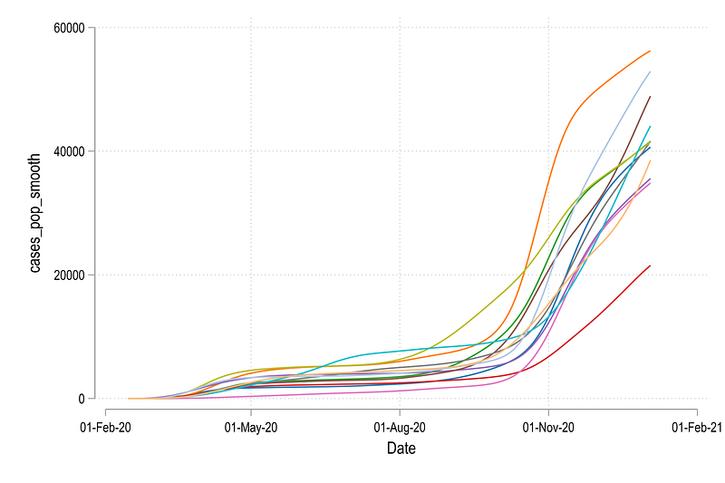
`lines', legend(off)If you are not familiar with the above type of programming, I would suggest having a look at Guide 2 which explains the above code in detail. From the code above, we get all the lines using the Tableau color scheme defined by the colorpalette:
We can expand the code above to include all the elements that we need to draw. The next code set needs to run in one go since there are several locals being used to generate the final graph:
levelsof country2, local(lvls)
local i = 1  // counter for colors
summ date
local today = `r(max)'foreach x of local lvls {qui summ angle if country2 == `x' & date == `today'
local angle`x' = `r(mean)'colorpalette tableau, n(12) nographlocal lines `lines' (line cases_pop_smooth date if country2==`x', lc("`r(p`i')'") lp(solid)) || (scatter cases_pop_smooth date if country2==`x' & date==`today', msangle(`angle`x'') mcolor("`r(p`i')'") msymbol(arrow) msize(medium) mlabel(label) mlabcolor(black) mlabsize(*0.6)) ||local i = `i' + 1
}summ datelocal date: display %tdd_m_y `r(max)'
display "`date'"local x1 = `r(min)'
local x2 = `r(max)' + 45twoway ///
`lines', ///
xtitle("") ///
ytitle("Cases per million" , size(small)) ///
xlabel(`x1'(15)`x2', labsize(vsmall) angle(vertical) glwidth(vvthin) glpattern(solid)) ///
ylabel(0(10000)60000, labsize(vsmall) glwidth(vvthin) glpattern(solid)) ///
title("{fontface Arial Bold:COVID-19 cumulative cases per million population (`date')}") ///
note("Data source: Our World in Data COVID-19 tracker. Total cases for the last reported date given in brackets.", size(vsmall)) ///
legend(off) xsize(5) ysize(3)The local i is the counter for colors. It increments in values by 1. Strictly not necessary here since the country2 variable also increases incrementally but it helps in case a subset of a large set of countries is used. The rest is a combination of locals and loops to generate the lines and the arrows stored in the `lines' local. The rest of the code is for styling the figure. Since a lot of locals are used, the whole code block needs to run in one go.
And we get the final figure here:
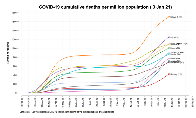
Exercise
Try and generate the following graph for cumulative deaths per million population
And that is it! Hope you found this guide useful. Please share your work if you use the guide. Also please send comments, feedback, errors if you find any.
About the author
I am an economist by profession and I have been using Stata since 2003. I am currently based in Vienna, Austria where I work at the Vienna University of Economics and Business (WU) and at the International Institute for Applied Systems Analysis (IIASA). You can find my research work on ResearchGate and Google Scholar, and Stata code repository on GitHub. You can follow my COVID-19 related Stata visualizations on my Twitter. I am also featured on the Stata COVID-19 webpage in the visualization and graphics section.
You can connect with me via Medium, Twitter, LinkedIn or simply via email: [email protected].
My Medium blog for Stata stuff here: The Stata Guide where new awesome content is released regularly. Clap, and/or follow if you like these guides!


