
Stata graphs: Spider plots
In this guide, learn to make spider plots in Stata. We will use the Oxford COVID-19 policy tracker to generate the following graphs:
This visualization builds on the previous Radial plots guide.
Preamble
Like other guides, a basic knowledge of Stata is assumed. This guide deals with advanced usage of locals, loops, and code structures that require some experience and familiarity with Stata programming. If you are using this guide for the first time, and are new to Stata, then Guide 1 and Guide 2 are highly recommended, followed by the next set of guides which are in increasing order of difficulty.
In order to make the graphs exactly as they are shown here, several additional item are required:
- In order to make the graphs exactly as they are shown here, install the schemepack suite (more info in the Scheme guide and on GitHub):
ssc install schemepack, replaceand set the scheme to White Tableau:
set scheme white_tableau- Install Ben Jann’s colorpalette package (more on colors in Guide 2 and in the Color guide)
ssc install palettes, replace
ssc install colrspace, replace- Set default graph font to Arial Narrow (see the Font guide on customizing fonts)
graph set window fontface "Arial Narrow"This guide has been written in Stata version 16.1. Earlier versions might need some modifications.
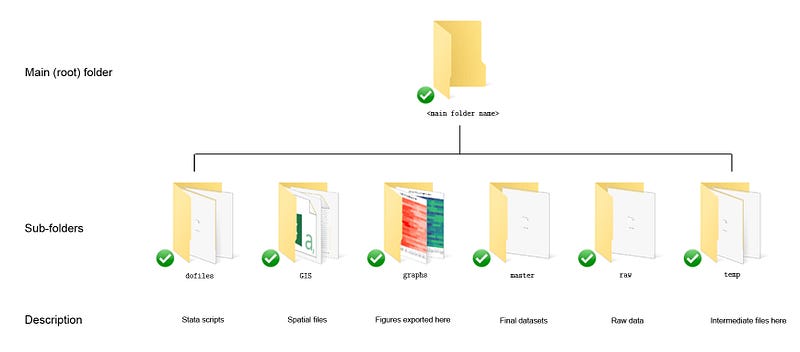
In parts of the code, paths are also defined. For workflow management, I use the following folder structure to organize the files, and paths refer to subfolders relative to the root folder:
Additionally, keep this figure as a reference point for formulas used below:
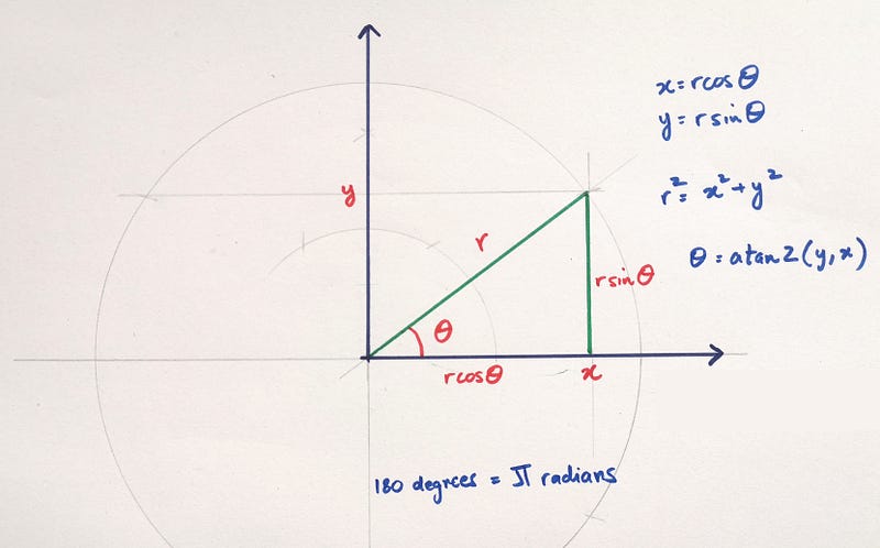
This figure was introduced in a previous guide where we learned how to add arrows to line graphs which involved calculating angles.
The base code
Here we start with generating three random variables with seven observations each.
clear
set obs 7
gen y1 = runiform(2, 5)
gen y2 = runiform(1, 3)
gen y3 = runiform(2, 4)Since seven is an odd number, the method introduced in the previous guide where we used half the observations to generate spikes, no longer works here. This twist is introduced on purpose to allow for a more flexible coding of spikes and points around the wheel.
For the previous guide, we also know that the angle of each spike can be calculated as follows:
gen angle = _n * 2 * -_pi / 7Where pi or -pi is for counter-clockwise and clockwise plotting respectively. 2pi represents the full circle and _n is the observation number. From the angle variable, we can generate the polar coordinates of the three variables:
gen obsx1 = y1 * cos(angle)
gen obsy1 = y1 * sin(angle)
gen obsx2 = y2 * cos(angle)
gen obsy2 = y2 * sin(angle)gen obsx3 = y3 * cos(angle)
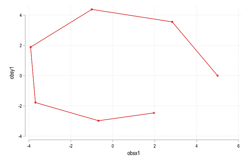
gen obsy3 = y3 * sin(angle)Let’s just plot the first pair:
twoway (connected obsy1 obsx1)which gives us this figure:
Since spider plots are dealing with areas, we can also use the twoway area command:
twoway (area obsy1 obsx1, fcolor(red%20))which gives us this figure:
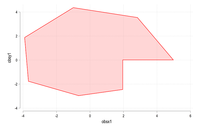
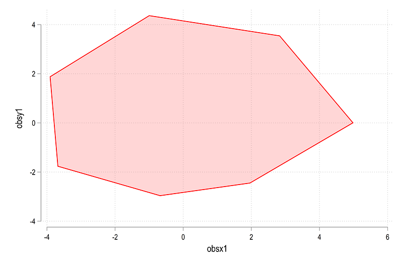
Here we can see that the end points are not connected but an additional point is generated to combine these two. There is an advanced programmers feature in Stata nodropbase which allows us to fix this issue:
twoway (area obsy1 obsx1, nodropbase fcolor(red%20))which gives us the figure we need:
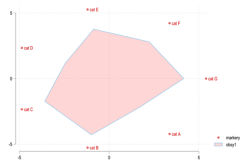
Next, we need to generate the circles and the spikes for the background. Since the data ranges from 0 to 5, we generate the markers at some distance away from 5. Here we chose the value of 5.4 (after some testing):
gen markerx   = 5.4 * cos(angle)
gen markery   = 5.4 * sin(angle)
gen markerlab = ""
replace markerlab = "cat A" if _n==1
replace markerlab = "cat B" if _n==2
replace markerlab = "cat C" if _n==3
replace markerlab = "cat D" if _n==4
replace markerlab = "cat E" if _n==5
replace markerlab = "cat F" if _n==6
replace markerlab = "cat G" if _n==7Each marker is also given some qualitative value. This can be adapted to the graph requirements. We plot the makers with the area graph:
twoway (scatter markery markerx, mlab(markerlab)) ///
  (area obsy1 obsx1, nodropbase fcolor(red%20))
and this gives us a rough sketch of a spider plot:
The labels for the circles can be generated as follows:
// labels for the circles
gen xvar = .
gen yvar = .
forval x = 1/5 {
replace xvar = `x' in `x'
replace yvar = 0 in `x'
}Following the previous guide, we generate the circles and the spikes dynamically. Since a lot of locals are involved, the following code needs to run in one go:
local circle
local spike
*** circlescolorpalette gs12 gs14, n(5) reverse nographforval x = 1/5 {
local width = `x' * 0.02
local circle `circle' (function sqrt(`x'^2 - x^2), lc("`r(p`x')'%50") lw(`width') lp(solid) range(-`x' `x')) || (function -sqrt(`x'^2 - x^2), lc("`r(p`x')'%50") lw(`width') lp(solid) range(-`x' `x')) ||
}*** spikes
forval x = 1/7 {
local theta = (`x') * 2 * -_pi / 7
local liner = (5 + 0.05) * cos(`theta')
local spike `spike' (function (tan(`theta'))*x, n(2) range(0 `liner') lw(*0.8) lc(gs6) lp(solid)) ||
}twoway ///
(area obsy1 obsx1, nodropbase fcolor(red%20) lc(red) lw(vthin)) ///
(area obsy2 obsx2, nodropbase fcolor(blue%20) lc(blue) lw(vthin)) ///
(area obsy3 obsx3, nodropbase fcolor(green%20) lc(green) lw(vthin)) ///
`circle' ///
`spike' ///
(scatter markery markerx, mc(none) ms(point) mlab(markerlab) mlabpos(0) mlabc(black) mlabsize(*0.7)) ///
(scatter yvar xvar, mc(none) ms(point) mlab(xvar) mlabpos(10) mlabc(black) mlabsize(*0.6)) ///
, ///
aspect(1) legend(off) ///
xlabel(-5(1)5) ylabel(-5(1)5) ///
xscale(off) yscale(off) ///
xsize(1) ysize(1) ///
xlabel(, nogrid) ylabel(, nogrid)The key difference here between this guide and the previous guide is that the all spikes are generated individually starting from the origin till the end point, defined as 5.05, to make it protrude a bit from the outermost circle. From this code above, we get this figure:
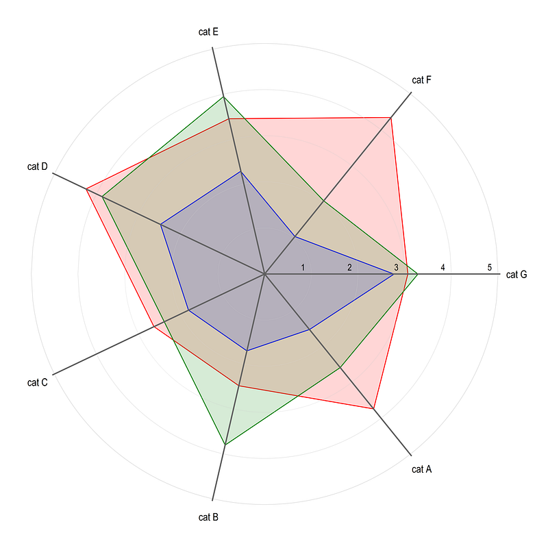
Note that since the data is random, the figure will look different every time the figure is drawn. Here we get the build blocks of generating spider plots in Stata.
Application to COVID-19 Policy Stringency Index
In this part, we apply the guide to the Oxford COVID-19 Government Response Tracker that was used in a previous guide on heatplots as well.
Data
Since we split the countries by different regions, the following Stata .dta file can be downloaded from my GitHub repository. This file processes World Bank 2020 country classifications:
copy "https://github.com/asjadnaqvi/COVID19-Stata-Tutorials/blob/master/master/country_codes.dta?raw=true" "./master/country_codes.dta", replaceThe Oxford COVID-19 policy data can be pulled directly from their GitHub page as follows:
**** actual data
insheet using "https://raw.githubusercontent.com/OxCGRT/covid-policy-tracker/master/data/OxCGRT_latest.csv", clear
Note that the Oxford GitHub also provides documentation of the various indicators used in the dataset. For this guide, we keep five indicators (just to keep the number of spikes odd):
drop if regionname!=""
keep countryname date h6_facialcoverings stringencyindexfordisplay governmentresponseindexfordispla containmenthealthindexfordisplay economicsupportindexfordisplay
ren h6_facialcoverings index_masks
ren stringencyindexfordisplay index_strin
ren governmentresponseindexfordispla index_gov
ren containmenthealthindexfordisplay index_cont
ren economicsupportindexfordisplay index_econWe clean up the data a bit more and save the file we need:
ren countryname countrytostring date, gen(date2) // string the date variable
drop date
gen date = date(date2,"YMD")
format date %tdDD-Mon-yy
drop date2
drop if date < 21915 // 1st January 2020order country date
sort country datesumm date
drop if date > `r(max)' - 5 // just to avoid missing obscompress
save ./master/COVID_policies2.dta, replaceWe save the file after cleaning it so that we do not have to import it every time we run the script. Once the file is in place, this part of the code can be marked out as well.
Here I name the final file COVID_policies2.dta since COVID_policies.dta is already used for the Heatplots guide. The code above also drops the last five dates just to make sure all data points are complete. This can be modified based on when the file is loaded.
Plot 1: Policy stringency by regions
The randomly selected h6_facialcoverings variable, which basically cover masks, ranges from 0 to 4, representing weak to strong policies respectively. The remaining variables are composite indices ranging from 0–100. We normalize h6_facialcoverings from 0–100 to make it consistent with the other indicators as follows:
use ./master/COVID_policies2.dta, clearsum index_masks
replace index_masks = ((index_masks - `r(min)') / (`r(max)'-`r(min)')) * 100Here we make use of the formula index = ((var — min)/(max — min)) * 100.
Next we clean up a couple of country observations and merge it with the region file we downloaded earlier:
replace country="Cabo Verde"         if country=="Cape Verde"
replace country="West Bank and Gaza" if country=="Palestine"


merge m:1 country using "./master/country_codes.dta"
 drop if _m!=3
 drop _m
The merge is fairly good except for small islands and territories (they are usually problematic to merge). From this file we group the data based on regions. Here I just use a single variable id to generate region identifiers:
gen id = .
 replace id = 1 if group10==1  // European Union (EU)
 replace id = 2 if group35==1  // South Asia (SA)
 replace id = 3 if group37==1  // Sub-saharan Africa (SSA)
 replace id = 4 if group20==1  // Latin America & Carribean (LAC)
 replace id = 5 if group29==1  // North America (NA) (for exercise)
drop group*
drop if id==.Since these regions are mutually exclusive, this is fairly straightforward. If there are overlaps in regions (e.g. Europe and EU), this needs a bit of extra coding.
Next we collapse the data at the id and date combination and calculate the average values of the indicators:
collapse (mean) index*, by(id date)
order id date
Next we transpose the data (swap rows and columns) by reshaping it twice:
reshape long index_, i(id date) j(policy) string
ren index_ index
reshape wide index, i(policy date) j(id)In the end, all policies are stored in one column variable while regions are now different variables. This data transpose can also be done using custom written commands but practicing and mastering the reshape command goes a long long way!
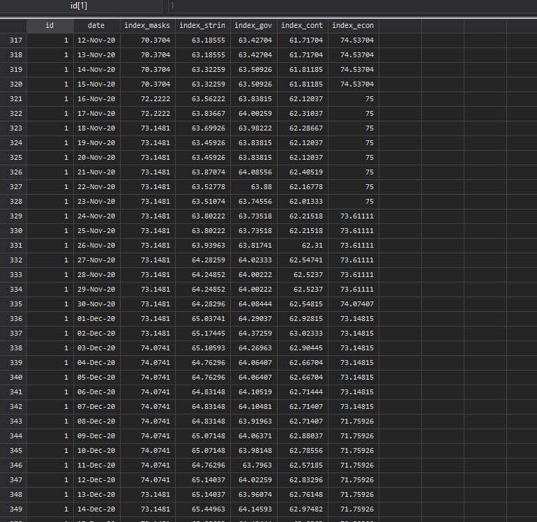
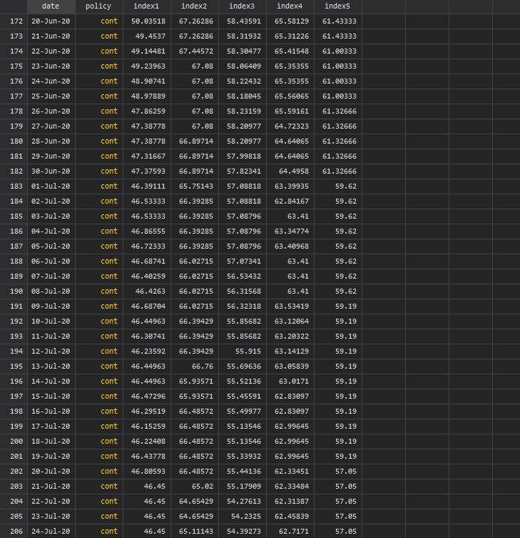
Screen shots of the data, pre and post transpose, are given below:
Next we clean up the policy and region variables:
replace policy = "Containment"    if policy=="cont"
replace policy = "Govt. support"  if policy=="gov"
replace policy = "Overall"        if policy=="strin"
replace policy = "Masks"          if policy=="masks"
replace policy = "Econ. support"  if policy=="econ"
ren index1 index_EU
ren index2 index_SA
ren index3 index_SSA
ren index4 index_LAC
ren index5 index_NAThe next part follows from the guide above where the code is made dynamic based on the number of policies in the data by utilizing levelsof:
levelsof policy
gen angle = _n * 2 * _pi / `r(r)'
foreach x of varlist index_* {
gen x_`x' = `x' * cos(angle)
gen y_`x' = `x' * sin(angle)
}gen markerx = 115 * cos(angle)
gen markery = 115 * sin(angle)****gen xvar = .
gen yvar = .local i = 1forval x = 20(20)100 {
replace xvar = `x' in `i'
replace yvar = 0 in `i'
local i = `i' + 1
}
*** here we generate spikeslevelsof policy
gen spikes = _n in 1/`r(r)'local circle // reset the locals
local spikeforval x = 0(20)100 {
local circle `circle' (function sqrt(`x'^2 - x^2), lc(gs14%80) lw(thin) lp(solid) range(-`x' `x')) || (function -sqrt(`x'^2 - x^2), lc(gs14%80) lw(thin) lp(solid) range(-`x' `x')) ||}
levelsof policyforval x = 1/`r(r)' {
local theta = `x' * 2 * _pi / `r(r)'
local liner = (105) * cos(`theta')
local spike `spike' (function (tan(`theta'))*x, n(2) range(0 `liner') lw(*0.8) lc(gs6) lp(solid)) ||
}summ date
local last = `r(max)'local date: display %tdd_m_y `last'
display "`date'"colorpalette tableau, n(5) nographtwoway ///
`circle' ///
`spike' ///
(area y_index_EU x_index_EU if date==`last', nodropbase fcolor("`r(p1)'%15") lc("`r(p1)'") lw(vthin)) ///
(area y_index_SA x_index_SA if date==`last', nodropbase fcolor("`r(p2)'%15") lc("`r(p2)'") lw(vthin)) ///
(area y_index_SSA x_index_SSA if date==`last', nodropbase fcolor("`r(p3)'%15") lc("`r(p3)'") lw(vthin)) ///
(area y_index_LAC x_index_LAC if date==`last', nodropbase fcolor("`r(p4)'%15") lc("`r(p4)'") lw(vthin)) ///
(scatter markery markerx if date==`last', mc(none) ms(point) mlab(policy) mlabpos(0) mlabc(black) mlabsize(*0.55)) ///
(scatter yvar xvar, mc(none) ms(point) mlab(xvar) mlabpos(10) mlabc(black) mlabsize(*0.4)) ///
, ///
aspect(1) ///
xlabel(-5(1)5) ylabel(-5(1)5) ///
xscale(off) yscale(off) ///
xsize(1) ysize(1) ///
xlabel(, nogrid) ylabel(, nogrid) ///
title("{fontface Arial Bold: COVID-19 Policy stringency (`date')}") ///
note("Data source: Oxford COVID-19 Government Response Tracker.", size(tiny)) ///
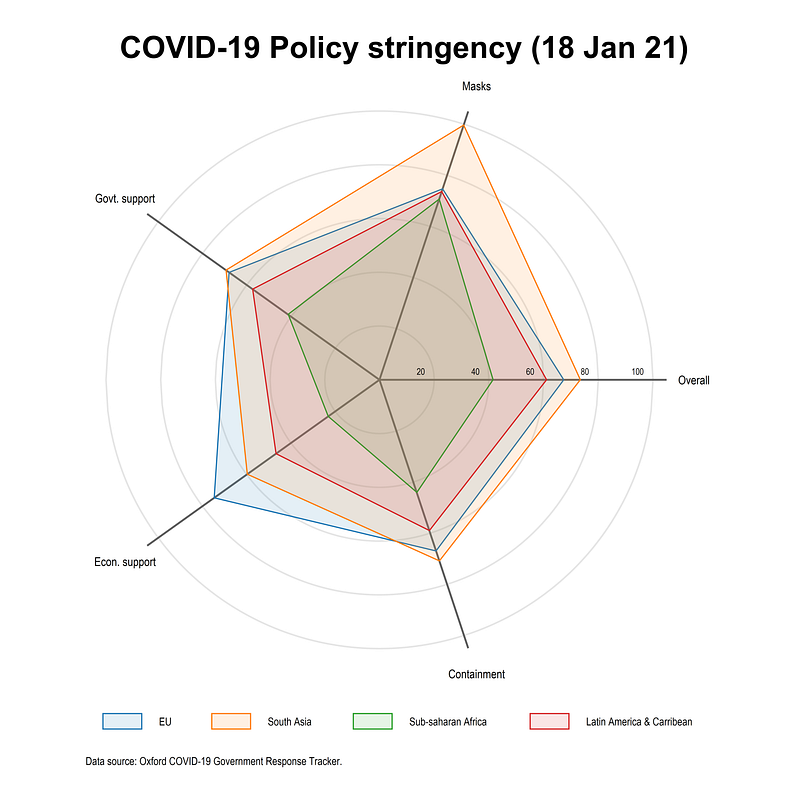
legend(order(18 "EU" 19 "South Asia" 20 "Sub-Saharan Africa" 21 "Latin America & Caribbean") size(*0.5) pos(6) rows(1))The code above needs to run in one go to patch together all the locals to give us this graph:

Here we use the combination of colorpalette and color transparency to allow various layers to be shown. Notice also how the legend is defined. It starts from 18. This is because we have 6x2=12 semi-circles plus the five spikes (see the Polar plot guide for a step-by-step intro). The area plots are drawn after circles and spikes hence the legend starts from 18 to label the regions. This ordering can be changed as well but the key principle to keep in mind is that what is drawn last, is shown on top, and legend remembers the drawing order.
What does this plot show us? On 18 Jan 2021, EU had a much higher economic support program than other regions. South Asia had a very stringent mask requirement and a higher containment and overall stringency index. Sub-Saharan Africa had the weakest policies out of all the regions followed by Latin America and the Caribbean.
Please note that these numbers are also sometimes back-corrected and revised. The indicators can also fluctuate a lot on a day-to-day basis. For policy advise and/or academic research please check the documentation and interpret the numbers carefully.
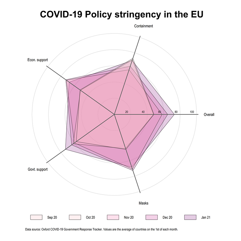
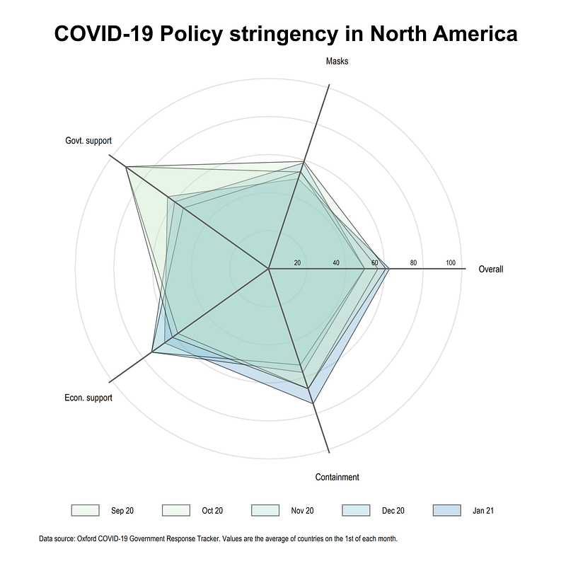
Plot 2: Policy stringency over time
An extension of the above code is to show how policies evolve for a region over time. Here we take the EU as an example and plot average policies from Sept 2020 to Jan 2021 evaluated on the 1st of each month. Here we generate a numerical date2 variable to manually pick the values of the first of each month (this can be automated as well but for five observations it is ok to do some stuff manually):
gen date2 = date  // gen a numeric date var for picking date values
order date date
local circle // reset the locals
local spikeforval x = 0(20)100 {
local circle `circle' (function sqrt(`x'^2 - x^2), lc(gs14%80) lw(thin) lp(solid) range(-`x' `x')) || (function -sqrt(`x'^2 - x^2), lc(gs14%80) lw(thin) lp(solid) range(-`x' `x')) ||}
levelsof policyforval x = 1/`r(r)' {
local theta = `x' * 2 * _pi / `r(r)'
local liner = (102) * cos(`theta')
local spike `spike' (function (tan(`theta'))*x, n(2) range(0 `liner') lw(*0.8) lc(gs6) lp(solid)) ||
}summ date
local last = `r(max)'
local date: display %tdd_m_y `last'
colorpalette RdPu, n(5) nographtwoway ///
`circle' ///
(area y_index_EU x_index_EU if date==22281, nodropbase fcolor("`r(p5)'%25") lc("black%50") lw(vthin)) ///
(area y_index_EU x_index_EU if date==22250, nodropbase fcolor("`r(p4)'%25") lc("black%50") lw(vthin)) ///
(area y_index_EU x_index_EU if date==22220, nodropbase fcolor("`r(p3)'%25") lc("black%50") lw(vthin)) ///
(area y_index_EU x_index_EU if date==22189, nodropbase fcolor("`r(p2)'%25") lc("black%50") lw(vthin)) ///
(area y_index_EU x_index_EU if date==22159, nodropbase fcolor("`r(p2)'%25") lc("black%50") lw(vthin)) ///
`spike' ///
(scatter markery markerx if date==`last', mc(none) ms(point) mlab(policy) mlabpos(0) mlabc(black) mlabsize(*0.60)) ///
(scatter yvar xvar, mc(none) ms(point) mlab(xvar) mlabpos(10) mlabc(black) mlabsize(*0.45)) ///
, ///
aspect(1) ///
xlabel(-5(1)5) ylabel(-5(1)5) ///
xscale(off) yscale(off) ///
xsize(1) ysize(1) ///
xlabel(, nogrid) ylabel(, nogrid) ///
title("{fontface Arial Bold: COVID-19 Policy stringency in the EU}") ///
note("Data source: Oxford COVID-19 Government Response Tracker. Values are the average of countries on the 1st of each month.", size(tiny)) ///
legend(order(17 "Sep 20" 16 "Oct 20" 15 "Nov 20" 14 "Dec 20" 13 "Jan 21") size(*0.55) pos(6) rows(1))And we get this graph from the above code:
Note how the policies changed after September 2020 around the start of the second lockdown phase. Mask requirements went up considerably, while government and economic support also increased across the EU. Overall on 1st of January, the policies were the most stringent compared to previous months but considerable heterogeneity exists at the individual policy level.
Exercise
Try and replicate the graph for North America. This following figure uses the colorpalette GnBu color scheme.
Also try with other indicators, dimensions, and color schemes. Unlike other visualizations, I have not explored this one in detail. But here one has to be selective with the number of layers to plot. The dimensions can be easily increased by increasing the number of spikes.
Hope you found this guide useful! Please share your visualizations, questions, feedback, comments etc. if you have any.
About the author
I am an economist by profession and I have been using Stata since 2003. I am currently based in Vienna, Austria. You can see my profile, research, and projects on GitHub or my website. You can connect with me via Medium, Twitter, LinkedIn, or simply via email: [email protected]. If you have questions regarding the Guide or Stata in general post them on The Code Block Discord server.
The Stata Guide releases awesome new content regularly. Subscribe, Clap, and/or Follow the guide if you like the content!


