
Constructing D3 Charts in React
Implement and customize D3 line and bar charts
In a previous article, “Easier D3.js — Render C3 Charts With React Functional Components,” we noted that C3 allows us to build charts quickly without knowing all of the complexity of D3. Using C3 to create a chart is just a few lines of code.
In another article, “5 Steps to Render D3.js With React Functional Components,” we mentioned that D3 provides rich features to construct graphical representations. Take charts as an example — D3 can customize every detail of axes, shapes, tool tips, texts, colors, and animation.
In this article, we’re going to dive into D3 line and bar charts to get firsthand experience with the complexity and capability of D3.
C3 Charts
In our previous example, we showed how it takes a few lines to implement a C3 line chart.
It shows up in a Create React App environment:
To make a bar chart, all we need to do is change the type to bar at line 13.
Then the C3 line chart changes to a C3 bar chart.
D3 Charts
We’ve created the react-components repository for advanced React input fields and tabs. D3 charts will be added to this repository.
git clone https://github.com/JenniferFuBook/react-components.gitInstall the d3 package into your dependencies, along with the existing recoil package:
"dependencies": {
    "@testing-library/jest-dom": "^5.11.6",
    "@testing-library/react": "^11.1.2",
    "@testing-library/user-event": "^12.2.2",
    "d3": "^6.3.1",
    "react": "^17.0.1",
    "react-dom": "^17.0.1",
    "react-scripts": "^4.0.1",
    "recoil": "^0.1.2",
    "styled-components": "^5.2.1",
    "web-vitals": "^0.2.4"
  }
In src/components, the Charts folder is created to hold chart-related files.
A chart has three types of settings:
- SVG (Scalable Vector Graphics) layout for width, height, and margins
- Chart data series and types
- Chart-derived information about data series names, x-axis settings, and y-axis settings
Recoil is used for SVG-layout state management. Other information is stored as props and passed down to child components.
We define the D3 chart interface similarly to C3 charts:
Line 2 specifies width.
Line 3 specifies height.
data.columns are data-series values, except that each array’s first item is the series name (line 6 and line 7).
Line 9 specifies the chart type.
We’re going to implement charts part by part, using the two data series defined at line 6 and line 7.
1. Chart State Management
2. X-axis
3. Y-axis
4. Line Chart
5. Legend
6. Bar Chart
7. Animation
8. General Chart
9. Storybook
Chart State Management
Recoil uses atoms to hold states. Atoms for SVG layouts are created in src/components/Charts/chartStates.js.
Lines 6-11 define a margin object.
Lines 16-19 define widthAtom, whose default value is the sum of margin.left and margin.right.
Lines 24-27 define heightAtom, whose default value is the sum of margin.top and margin.bottom.
Lines 32-35 define marginAtom, whose default value is set to the default margin object.
These atoms are available to all of the chart’s code.
X-axis
The x-axis is the principal or horizontal axis of a system of coordinates. Points along the x-axis have a value of zero for all other coordinates. In D3, the x-axis can be conveniently defined by the function, scaleLinear.
scaleLinear constructs a function for continuous scaling, with domain defaulting to [0, 1] and range defaulting to [0, 1]. It’s likely that we’ll need to specify the domain and range.
scaleLinear is commonly chained with domain, which sets the scale’s boundary. For the data series of [30, 200, 100, 400, 150, 250], 30 is for the x value of 0, 200 is for x value of 1, and so on. Therefore, we set domain to be [0, 5].
scaleLinear.domain is commonly chained with range, which sets the scale’s mapped boundary. For example, the SVG width is 120px, and the left and right margins are 10px. The chart’s x position will be in the range of [10, 110].
If we define x = scaleLinear().domain([0, 5]).range([10, 110]), the following code snippet shows how the function x works:
The range values can be non-numbers. The following is an example of colors in the range between red and blue.
Both domain and range could have more than two values to define a particular scale.
The following is the XAxis component defined in src/components/Charts/XAxis.js:
Line 7 gets width from Recoil’s widthAtom.
Line 8 gets height from Recoil’s heightAtom.
Line 9 gets left, right, and bottom from Recoil’s marginAtom.
Line 10 creates a ref to reference the uncontrolled component at line 22.
Lines 12-20 use useLayoutEffect to call the D3 code that mutates the DOM.
Lines 13-15 create a linear scale for the x-axis.
Line 16 uses axisBottom, which creates a bottom horizontal axis. It’s possible to create multiple bottom horizontal axes, and it’s also possible that these axes are at the top, using axisTop.
Line 17 sets the ticks number to be the data series count and tickSizeOuter to be 0. In fact, a lot of customization can be done regarding where to show ticks, the tick label formats, and an axis’s ending position.
Line 19 instantiates the x-axis to the uncontrolled component.
Line 22 defines an SVG group for the x-axis. It positions the x-axis at the bottom of the SVG, excluding the margin bottom.
XAxis.js displays the following x-axis :
Y-axis
The y-axis is the secondary or vertical axis of a system of coordinates. Points along it have a value of zero for all other coordinates.
The following is the YAxis component defined in src/components/Charts/YAxis.js:
The above code is very similar to src/components/Charts/XAxis.js. The two differences are:
rangeis calculated differently at line 14.transformuses a different dimension at line 21.
With both the x-axis and y-axis created, we see the following coordinates:
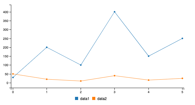
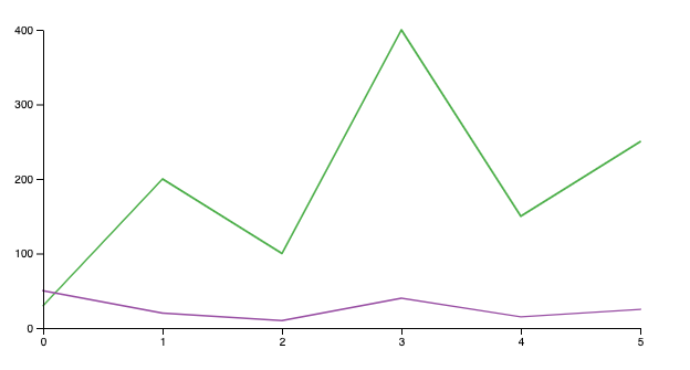
Line Chart
Line charts display how y numbers vary over x numbers. They’re ideal for showing a changing time series as well as trends and developments over time.
We’ve used scaleLinear to draw straight lines for the x-axis and the y-axis. A line series is a path that connects each point. The function line is used to connect these points. line is typically chained with x and y functions produced by the scaleLinear function.
const lineFn = line()
      .x((_, i) => x(i))
      .y((d) => y(d));
For each data series i, a path is appended to the SVG group. The path takes the data.columns[i] value, excluding the series name. It configures a nonfilled path, with specific stroke settings and then calls the lineFn function to connect the points.
select(containerRef.current)
  .append('path')
  .datum(values)
  .attr('fill', 'none')
  .attr('stroke', () => 'blue')
  .attr('stroke-width', 1.5)
  .attr('stroke-linejoin', 'round')
  .attr('stroke-linecap', 'round')
  .attr('d', lineFn);
In the above code, blue is used as the line color. But with more than one path, we need to have different colors to differentiate paths. scaleOrdinal can be used to set up colors. scaleOrdinal constructs a function for ordinal scale, which arranges values in a specific order, beyond just naming them.
schemeSet1 is an array of nine categorical colors represented as RGB hexadecimal strings. If we define color = scaleOrdinal().range(schemeSet1), the following code snippet shows how the function color works:
Lines 2-10 output nine categorical colors.
Afterward, the nine colors are reused. color(0) is the same as color(9), color(1) is the same as color(10), and so on.
The above scaleOrdinal is directly chained to range. domain, which is an array of color names. It can be chained in the middle, too. The following example defines the first two color names as data1 and data2.
Lines 2-10 output nine categorical colors.
Afterward, the same colors are reused again. color('data1') is the same as color(7), color('data2') is the same as color(8), and so on.
We define color as a common function in src/components/Charts/constants.js:
At line 3, we remove the first two colors from schemeSet1. So in our charts, there are a total of seven categorical colors. This is simply because we prefer the third and fourth colors for the two data series.
The following is the LineChart component defined in src/components/Charts/LineChart.js:
Line 8 gets width from Recoil’s widthAtom.
Line 9 gets height from Recoil’s heightAtom.
Line 10 gets left, right, top, and bottom from Recoil’s marginAtom.
Line 11 creates a ref to reference the uncontrolled component at line 40.
Lines 13-38 use useLayoutEffect to call the D3 code that mutates the DOM.
Line 14 removes the previous paths that line 29 may have appended.
Lines 16-18 create a linear scale for the x direction.
Lines 19-21 create a linear scale for the y direction.
Lines 23-25 create a line function to connect points for each data series.
Lines 27-37 customize and draw each data series.
The LineChart component renders the following image:
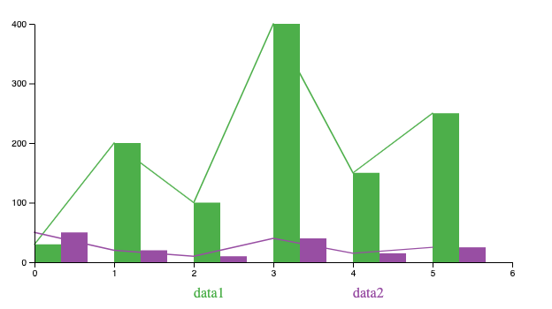
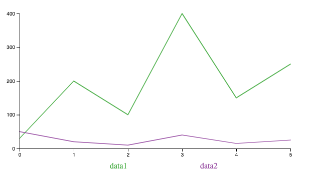
Legend
We’ve drawn a line chart. However, without a legend, there’s no way to tell which line is aligned with which data series.
The C3 legend shows colored squares and data-series names. We simplify it to show colored data-series names. Based on the number of data series, scaleLinear is used to position series’ names, which are displayed with text tags.
The following is the Legend component defined in src/components/Charts/Legend.js:
Line 8 gets width from Recoil’s widthAtom.
Line 9 gets height from Recoil’s heightAtom.
Line 10 gets left and right from Recoil’s marginAtom.
Line 11 creates a ref to reference the uncontrolled component at line 27.
Lines 13-25 use useLayoutEffect to call the D3 code that mutates the DOM.
Lines 14-16 create a linear scale for the x direction.
Lines 18-24 are D3 code. keys is an array of series’ names. The code creates text elements and customizes them for the x position (line 22), color (line 23), and text (line 24).
Line 27 defines the legend group, which is positioned 20px below the x-axis.
The following is a line chart with a legend.
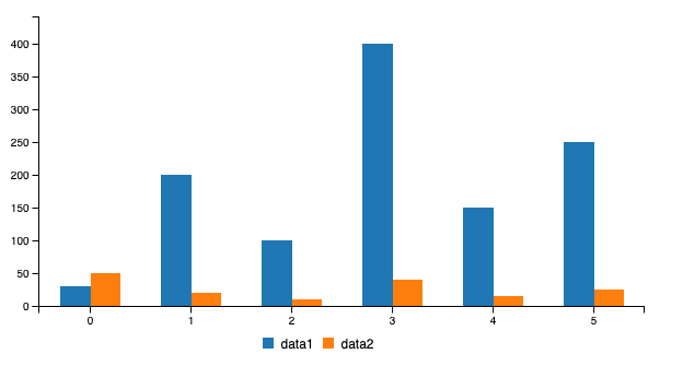
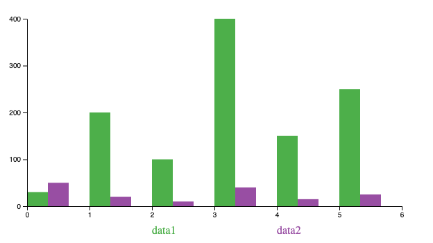
Bar Chart
Bar charts are used for comparing categorical data using rectangular bars that have heights or lengths proportional to values.
While a bar chart uses scaleLinear to calculate the y value, its x value is calculated by scaleBand, which constructs a function for an ordinal or categorical dimension, with domain defaulting to [] and range defaulting to [0, 1]. scaleBand is commonly chained with domain and then range.
scaleBand doesn’t create a continuous scale. Instead, its scale is discrete. It also has a function to generate the band width.
If we define x = scaleBand().domain([0, 5]).range([10, 110]), the following code snippet shows how the function x works:
In the above code, only values in the domain array [0, 5] return values (line 2 and line 7). Since there are two values in the domain array, the range [10, 110] is split into two bands. Each band’s width is 50 (line 9). Considering the starting range is 10, the first value becomes 10 (line 2), and the second value becomes 60 (line 7).
range(stop) is a function that generates a numeric sequence from 0 to stop — 1.
We use range(6) to generate values in the range, which is [0, 1, 2, 3, 4, 5]. By creating domain with the return value from the range function, we get the x value for each item in domain.
The following is the BarChart component defined in src/components/Charts/BarChart.js:
The above code is very similar to src/components/Charts/LineChart.js, except the following differences:
- Lines 16-18 use
scaleBand. barWidthis derived from the band width (line 22).- Lines 24-35 customize and draw each data series. Each
rect(rectangle) element is positioned at x (line 31) and y (line 32), with proper fill color (line 30), width (line 33), and height (line 34). In SVG,y(0)is larger thany(d).
The following is a bar chart with a legend.
Animation
We’ve written quite a lot of code to build line charts and bar charts. Compared to C3 charts, D3 axes and legends are primitive, and the data-series plots end up missing out on tool tips, selection, responsiveness, and much more.
Is it worth the effort to build D3 charts?
Yes, indeed. D3 provides rich features to construct graphical representations. It opens a door for many advanced features. With the above foundational work, animation can be added with a few lines of code.
transition is a selection-like interface for animating changes to the DOM. Instead of applying changes instantaneously, transition interpolates changes in the DOM from its current state to the desired target state over a given duration.
The following code transits the background color to red.
select(element)
  .transition()
  .style(‘background-color’, ‘red’)
transition is commonly chained with duration and then ease. duration sets the transition duration to the specified value in milliseconds. ease specifies the transition easing function, such as easeLinear, the linear easing.
select(element)
  .transition()
  .duration(1000)
  .ease(easeLinear)
  .style('background-color', 'red');
In addition, the transition can be delayed by a number in milliseconds.
select(element)
  .transition()
  .duration(1000)
  .ease(easeLinear)
  .delay(2000)
  .style('background-color', 'red');
attrTween assigns an attribute with a function, which is evaluated for each selected element. The stroke-dasharray property controls the pattern of dashes and gaps used to form the shape of a path’s stroke. By interpolating the stroke-dasharray property, we can animate a stroke starting from length 0, and going all the way to the full length.
const reveal = (path) =>
  path
    .transition()
    .duration(5000)
    .ease(easeLinear)
    .attrTween('stroke-dasharray', function () {
      const length = this.getTotalLength();
      return interpolate(`0, ${length}`, `${length}, ${length}`);
  });
The following is src/components/Charts/LineChart.js with animation code:
Two changes are made in the above code:
- Lines 27-36 define the animation function,
reveal. - Line 48 calls
reveal.
This video clip shows how the line chart is animated.
We design the bar chart animation a little differently. All bars start with a height of 0 and grow to the full height.
The following is src/components/Charts/BarChart.js with the animation code:
Two changes are made in the above code:
- The original
rectdimension has been modified. Line 32 sets the y value to bey(0)instead ofy(d). Line 34 sets the height to be0, instead ofy(0) — y(d). - Lines 37-45 execute the animation. The
rect’s target y value isy(d)(line 42), and it’s target height isy(0) — y(d)(line 43). The transition’s duration is1000ms(line 41), and it’s delayed by an additional1000msfor each bar (line 44).
This video clip shows how the bar chart is animated.
General Chart
Now that we have LineChart and BarChart components, we need to create a general Chart component to hold them. This component takes width, height, margin, and data as props. Based on the chart type, it shows a line chart or a bar chart, along with the proper x-axis, y-axis, and legend.
The following is the Chart component defined in src/components/Charts/Chart.js:
Lines 3-8 import all of the related code.
Lines 15-21 set the SVG layout in the Recoil states. width and height are required, and margin is optional.
It calculates the longest data column, longestColumn (line 25), builds up keys for the data series’ names (line 26), and saves the largest y value (line 27). We’ve assumed the minimal y value is 0.
The tick count for a bar chart is longestColumn — 1, while the tick count for a line chart is longestColumn — 2 (lines 30–33).
Line 34 composes the xDomain, while line 35 composes the yDomain.
Lines 38-48 assemble the whole chart into an SVG element. viewBox is an attribute that defines the SVG’s dimensions. There are the separate attributes of width and height to make the chart dimension fixed. If they’re removed, the chart will be autozoomed.
Storybook
We use Storybook to show the line chart and the bar chart. The two stories are written in src/components/Charts/Charts.stories.js:
Lines 6-9 set up stories for Charts and put them inside RecoilRoot.
Lines 13-17 compose the line-chart story.
Lines 29-42 compose the bar-chart story.
Chart is imported at line 4 from an index file. This file is src/components/Charts/index.js, which is created for external use:
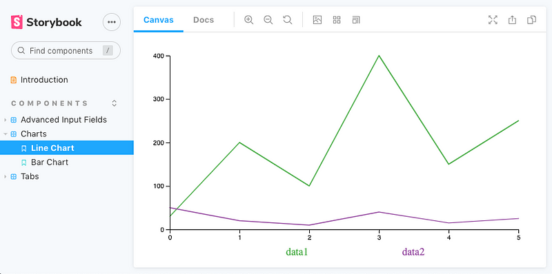
Here’s the line chart on Storybook:
Here’s the bar chart on Storybook:

Conclusion
D3 stands for data-driven documents. Instead of the full components, it provides data-driven helper functions that can be used to create those components. It may take longer to build up a D3 library, such as React Charts. But as soon as things are built up, it opens many possibilities for data visualization.
For charts, you have a choice: C3 or D3.
Thanks for reading. I hope this was helpful. You can see my other Medium publications here.


