
Build React Tabs Using Recoil, Styled Components, and Storybook.js
A development guide to building React components with the latest technologies

In a previous article, we introduced Recoil, the state management library that’s been available since May 2020. For managing states, Recoil is simpler and more effective than Context API and Redux. We have been using it for our projects ever since.
In another article, we introduced styled components, a JavaScript library that allows us to write CSS inside a JavaScript file. As a result, components can run independently, without relying on any external CSS files.
Storybook is a tool for UI development. It makes development faster and easier by isolating components. This allows us to work on one component at a time.
We use tabs as an example to illustrate the power of Recoil, styled components, and storybook.
As we are writing an interview series, creating tabs components is also a frequently asked interview question. This article prepares you for both development work and interview challenges.
Tabs Components
Tabs are one of the frequently used components of UI. They allow alternating between views within the same context, without navigating to different areas. Each tab has a head label and a detailed content panel. There is one, and only one, active tab at any time. A visual indication is needed to show which tab is active. The active tab’s content is displayed and others are hidden.
The following is an example of tabs:
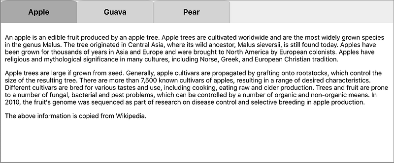
There are three tabs in total and Apple is the active tab. A user can click on a tab and make it active.
We’re going to build Tabs components, which allow a developer to declaratively write tabs:
<Tabs activeIndex={2}>
  <Tab label="Apple">
    <any JSX content>
  </Tab>
  <Tab label="Guava">
    <any JSX content>
  </Tab>
  <Tab label="Pear">
    <any JSX content>
  </Tab>
</Tabs>
Tabs are composed of a number of Tab components. Each Tab component has a label to be displayed as a tab name. Its content is any JSX content. Tabs has an optional property: activeIndex. If it is a valid number, the associated tab will be pre-selected to be active. Otherwise, the first tab will be pre-selected to be active.
These can be summarized by the following type definitions:
export interface TabsProps {
  activeIndex?: number;
  children: JSX.Element[] | JSX.Element;
}
export interface TabProps {
label: string;
children: JSX.Element[] | JSX.Element | string;
}Set Up Working Environment
As always, we use Create React App to set up the React coding environment:
npx create-react-app my-app
cd my-app
npm start
In this React environment, we set up Recoil and Styled Components for dependencies in package.json:
npm i recoil
npm i styled-components
In order to use Recoil, components must be wrapped with <RecoilRoot>. In the following src/index.js, add RecoilRoot on lines 3, 10, and 12:
Then we install storybook:
npx sb initWe are ready to build Tabs. The following files in src/components/Tabs need to be created to accomplish the task:
$ ls
Tab.js          Tabs.js         Tabs.stories.js index.js        tabStates.js
Implement tabStates.js
useState is a Hook to track React states in function components. However, this kind of state is only available inside the function component. In order to create states shared between Tabs and Tab, external states are needed.
We use Recoil to track tab states. It is composed of two original states:
- Active index
- All labels
There is also a derived state. Based on the active index and all labels, we can compute the active label.
The original states are kept in atoms, which are shared and writable. The derived states are from selectors, which use pure functions to calculate derived values. Selectors avoid redundant states, usually obviating the need for reducers to keep states in sync and valid.
Components subscribing to related atoms or selectors will be re-rendered when these atoms or selectors’ states change.
In the following src/components/Tabs/tabStates.js, activeIndexAtom (lines 6 - 9) and labelArrayAtom (line 14 - 17) are atoms. activeLabelSelector (lines 23 - 30) is a selector.
Implement Tab.js
A tab has a head label and a detailed content panel. Whether the content panel is displayed is controlled by Tabs. The Tab component renders its tab label.
The following is src/components/Tabs/Tab.js:
Lines 6-18 define the CSS of the tab label, which is a styled component (TabName) based on h3. In an interview prep article, we explained the basics of how to lay out and style components. It has the pointer cursor and grid layout. When it is on hover, the background color varies.
Line 25 reads the activeLabelSelector value. Based on this value, the tab background is set to darkgrey (active) or lightgrey (inactive). The tab color updates accordingly.
Implement Tabs.js
Tabs are composed of a number of Tab components. The tab names and the active tab's content are displayed.
The following is src/components/Tabs/Tabs.js:
Lines 6-9 define CSS of the tab names, which is a styled component (TabNames) based on div.
Lines 11-13 define CSS of the tab content panel, which is a styled component (TabContent) based on div.
Line 20 reads and sets the activeIndexAtom value. The active index is used to show the active content (lines 45-48). Lines 31-33 set the initial active index if it is valid. Otherwise, the default value 0 will be used. When a tab is clicked, the active index is updated accordingly (line 40).
Line 21 gets the setLabelArray method, which is used to initialize all labels to labelArrayAtom (line 30).
Line 23-26 converts the children to an array if it is not one.
Implement index.js
index.js is not necessary, but using one file to re-export makes the usage easy. For common components, it’s recommended to create the index file.
The following is src/components/Tabs/index.js:
With all components of Tabs, we can run a demo using modified src/App.js:
At line 2, the import statement is cleaner by using index.js. Otherwise, we have to import Tab and Tabs from two different files.
Implement Tabs.stories.js
We have built the tab components and showed a demo. It works.
But what if we initialize with a specific active index? What if there’s only one tab?
For all the variations, storybook provides an excellent playground to try. We can make a story for each “what if.”
The following is src/components/Tabs/Tabs.stories.js, which is composed of three stories:
Line 8 wraps stories inside <RecoilRoot>.
A story name is parsed strings of the camel case name of a component (lines 13, 68, and 123).
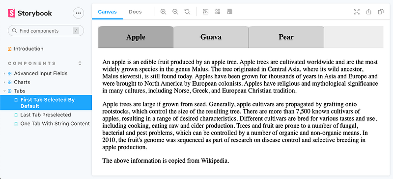
Lines 13-66 define the first story. It is similar to our demo in src/App.js, where the first tab is selected by default.
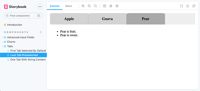
Lines 68-121 define the second story, where the second tab (0-based) is selected by initialization (line 70).
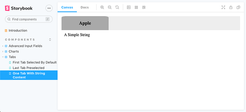
Lines 123-129 define the third story, where there’s only one tab.
It’s easy to add more use cases.
Storybook is launched with the command: npm run storybook.
Conclusion
We have created Tabs components using Recoil, styled-components, and storybook. These are three powerful ingredients to build common components.
This example is located on GitHub. You can view and play with the storybook examples online. Our next article describes how to set up a GitHub Pages site for a repository.
Thanks for reading. I hope this was helpful. You can see my other Medium publications here.


