
Styled Components: A CSS-in-JS Approach
How to adopt styled components in Create React App

With tagged template literals and the power of CSS, styled components let us write CSS code to style components.
It’s a CSS-in-JS approach — a JavaScript library that bundles each JavaScript component with all its belonging CSS rules and dependencies. As a result, components can run independently, without relying on any external CSS files.
Here’s is a quote from Max Stoiber, the co-creator of styled components, in February 2019:
For three years, I have styled my web apps without any
.cssfiles. Instead, I have written all the CSS in JavaScript.
Styled components are compatible with both React (for web) and React Native. We are going to use the Create React App to show how to use styled components.
Create React App With No Styles
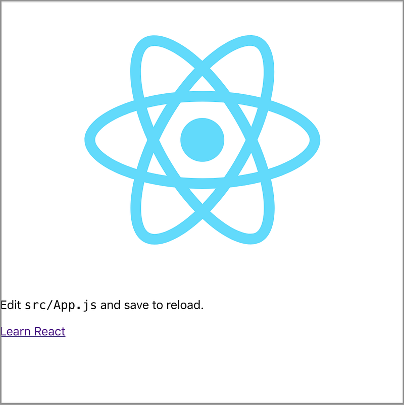
This is what you see from Create React App — a pinning logo and some texts:
Here’s the src/App.css file, which styles the application:
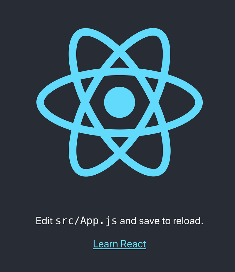
What do we see if we comment out line three in the following src/App.js?:
We see Create React App without styles:
Create a Styled Component
We’re going to use Styled Components to rebuild Create React App. The first step is to install with the command npm i styled-components. styled-components becomes part of dependencies in package.json.
In src/App.css, the App-header class is styled as follows:
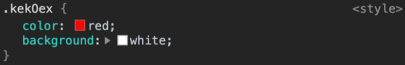
.App-header {
  background-color: #282c34;
  min-height: 100vh;
  display: flex;
  flex-direction: column;
  align-items: center;
  justify-content: center;
  font-size: calc(10px + 2vmin);
  color: white;
}
How is it written in styled-components?
We need to import styled from styled-components (line three). styled is a low-level factory to create the styled.tagname helper methods. Here, a template literal is used to create a component that will render a DOM element with some styles. In this case, we create a component named AppHeader at line five. It is defined by styled, followed by a period and the element’s name, header. The detailed styles are quoted by backticks at lines 5-14.
The header tag at line 19 is replaced by the AppHeader component that we’ve just created. Make sure that styled components are capitalized so that React can recognize them as custom components.
Since AppHeader is styled by a styled component, the className is no longer needed at line 19.
We get partial styles back:

Everything is horizontally centered, the background color is set, and the text message is white.
Build More Styled Components
We continue building styled components for div and a tags:
AppDiv is created at line five, with styles at lines 5-7. AppDiv replaces div with className at line 26.
AppLink is created at line 20, with styles at lines 20-22. AppLink replaces a with className at line 32.
More things are styled:
Although the text alignment for AppDiv isn’t obvious, the blue link puts us a step closer to the original Create React App.
We’ve used styled.tagname helper methods. Can the tagname be a component name?
No. If we want to build upon a tagged template literal, styled should be used as a constructor like styled(Component). The new component inherits the styling of Component.
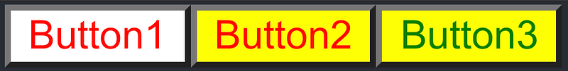
In the following code, Button1 is styled with the red text with white background. Button2 inherits the red text, and has the yellow background. Button3 inherits the yellow background, and is styled with the green text.
const Button1 = styled.button`
  color: red;
  background: white;
`;
const Button2 = styled(Button1)`
background: yellow;
`;const Button3 = styled(Button2)`
color: green;
`;Put them together:
<Button1>Button1</Button1>
<Button2>Button2</Button2>
<Button3>Button3</Button3>
It looks like this:
If the styled target is a simple element (styled.tagName), styled components passes through any known HTML attribute to the DOM. If it’s a custom React component (styled(Component)), styled components pass through all props.
The above button example can be accomplished by passed props used in interpolations:
const Button = styled.button`
  color: ${(props) => props.clr || "red"};
  background: ${(props) => props.bg || "white"};;
`;
Here’s the usage:
<Button>Button1</Button>
<Button bg="yellow">Button2</Button>
<Button clr="green" bg="yellow">Button3</Button>
It’s important to define styled components outside the render method, otherwise, they are recreated on every single render pass.
For the three generated buttons, each has two classes connected to it:
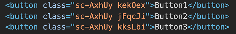
The first is the static class, which does not have any style attached to it. It’s used to quickly identify which styled component a DOM object belongs to.
The second one is the dynamic class, which is different for every element. It’s used to style the component:
Construct Animation Styled Components
In src/App.css, the App-logo class is styled as follows:
.App-logo {
  height: 40vmin;
  pointer-events: none;
}
@media (prefers-reduced-motion: no-preference) {
.App-logo {
animation: App-logo-spin infinite 20s linear;
}
}@keyframes App-logo-spin {
from {
transform: rotate(0deg);
}
to {
transform: rotate(360deg);
}
}The @keyframes CSS at-rule controls the intermediate steps in a CSS animation sequence by defining styles for keyframes along the animation sequence.
How do we configure it to get the spinning icon back? Styled components provide a helper method to create keyframes for animations:
keyframes is imported from styled-components (line three). It’s used to define appLogoSpin at line 20. appLogoSpin is interpolated into AppLogo at line 33. Now the logo spins again!
You may wonder whether we can define media separately, similar to src/App.css. Yes, we can, with a little helper:
This little helper is css, which is imported from styled-components (line 3). It’s a helper function to generate CSS from a template literal with interpolations. media created at line 29 is interpolated into AppLogo at line 38.
Are you wondering what the media query about prefers-reduced-motion is? It’s used to detect if the user has requested the system to minimize the amount of non-essential motion. There are two accessibility choices:
no-preferenceindicates that the user has made no preference.reduceindicates that the user prefers removing animation that triggers discomfort for those with vestibular motion disorders.
The following video shows that the spinning icon stops animation when Reduce motion is selected.
Styled Components Tooling
After you’ve installed styled-components, babel-plugin-styled-components and babel-plugin-macros come with it in package-lock.json.
babel-plugin-styled-components adds support for server-side rendering, minification of styles, and a nicer debugging experience. It can be configured by .babelrc. Without explicitly setting flags to be true, default values are false.
{
  "plugins": [
    [
      "babel-plugin-styled-components",
      {
        "ssr": false, // enable server-side rendering
        "displayName": false, // display component name
        "fileName": false // display file name
        "minify": false, //  remove all whitespace and comments
        "transpileTemplateLiterals": false, // keep valuable bytes out
        "pure": true // remove dead code
      }
    ]
  ]
}
Somehow, the configuration of babel-plugin-styled-components is not stable enough to function properly.
babel-plugin-macros is quickly gaining steam as a full-featured option to allow advanced code transpilation for zero-config projects, such as the Create React App. All you need to do is to import items from the macro directory:
import styled, { css, keyframes } from 'styled-components/macro';Although babel-plugin-macros sets default values to be true, it’s always a good idea to explicitly set them up in babel-plugin-macros.config.js:
module.exports = {
  styledComponents: {
    displayName: true,
    fileName: true,
    pure: true,
  },
}
With both fileName and displayName set to be true, the class names in the following code are more readable, making the debug process easier:
Conclusion
Styled Components provides an improved experience for developers to write CSS in JavaScript.
If you build a library, it’s recommended that you not to bundle and ship styled-components module with a library. Make styled-components a peer dependency and mark it as external in bundler (rollup or webpack).
Thanks for reading.
If you are interested, check out other styled components articles.


