
10 Steps to Building Web Applications With Accessibility (a11y)
A detailed guide to making your web accessible to all

Accessibility (a11y) is the practice of making web applications that are usable for people whose abilities are limited in some way, such as vision (using a screen reader) and mobility (using the keyboard only). In addition, the limitation could come from the device’s capability, such as mobile devices.
The followings are the rationales of accessibility:
- It provides equal access to everyone, including people with disabilities.
- It improves usability for a more intuitive user experience.
- It meets federal, state, and international laws to make electronic and web content accessible to people with disabilities. Violating these laws can result in loss of funds or contracts.
It takes time and effort to build up usability, and it would be important that usability is baked into the framework of web applications. In this article, we will provide ten steps on how to build web applications with accessibility.
- Step 1: Choose semantic HTML
- Step 2: Use built-in keyboard access
- Step 3: Avoid positive tabindex for setting navigation flow
- Step 4: Reach full keyboard access
- Step 5: Make focus and hover equal / Use
mouseoverover mouseenter/Use mouseout over mouseleave - Step 6: Ensure web pages are functional without CSS
- Step 7: Fill accessibility gap with WAI-ARIA
- Step 8: Offer text alternatives and more for media content
- Step 9: Make text size and color distinguishable
- Step 10: Pass audit tool tests
Step 1: Choose Semantic HTML
Semantic HTML introduces meaning to web pages rather than just presentation. Sometimes, it is called Plain Old Semantic HTML (POSH).
The following is the semantic definition of a heading:
<h1>This is heading text</div>Visually, it would look the same with the specified style:
<div style="font-size:32px;font-weight:600;">This is heading text</div>However, div is not a correct way to implement a heading. Although it looks the same on the desktop, it will be translated incorrectly by a screen reader.
Historically, there are two common pitfalls in web development:
- Emphasize a text using
<b>instead of<strong>. - Lay out elements using
<table>instead of CSS.
HTML5 provides us with all the semantic elements to write the markup in a meaningful way, such as <article>, <details>, <figure>, <nav>, <section>, and <summary>. Search Engine Optimization (SEO) gives more importance to the content inside these tags and makes the underlining web page more searchable.
It is recommended to use Semantic HTML, and it is also important that a web page’s HTML is semantically correct.
W3C has a website to validate the markup validity of web documents in HTML, XHTML, SMIL, MathML, etc. We can use it to make sure HTML syntaxes are used correctly.
Here is the result of validating https://www.amazon.com/:
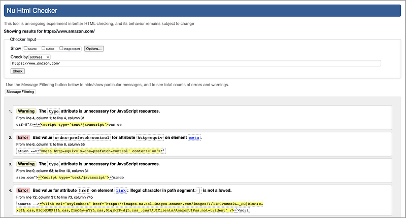
Even a commercially successful website has room to improve.
Step 2: Use Built-In Keyboard Access
Keyboard access is essential to accessibility. A keyboard user typically uses the Tab, Shift Tab , or arrow keys to navigate through interactive elements on a web page, such as buttons, input fields, selections, links, etc. When an item gets focused, it can be activated or manipulated with a keyboard. An action can be performed by clicking the Enter or Spacebar key.
WebAIM provides keyboard testing rules for autocomplete, dialog, slider, menu bar, tab panel, tree menu, etc.
The following are the focusable rules:
<input>,<select>,<textarea>,<button>, and<object>are focusable if they are not disabled.- Anchors are focusable if they have an
hrefortabindexattribute. <area>is focusable if it is inside a named<map>, has anhrefattribute, or there is a visible image using<map>.- All other elements are focusable based solely on their
tabindexattribute and visibility.
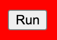
Based on these rules, <button> is focusable. If you need a button, use <button>Run</button> or <input type=”button” value=”Run”>.
It is discouraged to use <div>Run</div> with CSS and tabindex. This div element may provide a similar style or behavior, but the built-in accessibility will likely be lost.
Using built-in keyboard access conforms with the rule of using semantic HTML. Since you do not need to implement additional plumbing, it is likely that semantic elements will end up with a smaller bundle size than non-semantic code.
Step 3: Avoid Positive Tabindex for Setting Navigation Flow
The navigation order in which interactive items receive keyboard focus is important. The default order should be logical and intuitive. The general flow is from left to right and from top to bottom. The navigation order should come from the document’s source order. Avoid positive tabindex for setting navigation flow.
tabindex is a global attribute that indicates that its element can be focused and can be part of navigation flow if the value is not negative.
tabindex="-1"(or any negative number) means that the element is not in navigation flow, but it can be focused with JavaScript or by clicking.tabindex="0"means that the element is in navigation flow. The order is after elements with positivetabindexvalues. Among elements withtabindex=“0”, the order is defined by a document's source order.tabindex="1"(or another positive number) means that the element is in navigation flow. The element with a smallertabindexvalue is ordered first.
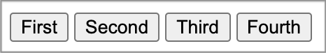
Can you guess the following Tab order?
<div tabindex="0">Third</div>
<div tabindex="-1">Not Reachable</div>
<div tabindex="0">Fourth</div>
<div tabindex="2">Second</div>
<div tabindex="1">First</div>
It is First, Second, Third, and Fourth.
What is the screen reader order?
It is Third, Not Reachable, Fourth, Second, and First.
Do you see the inconsistency?
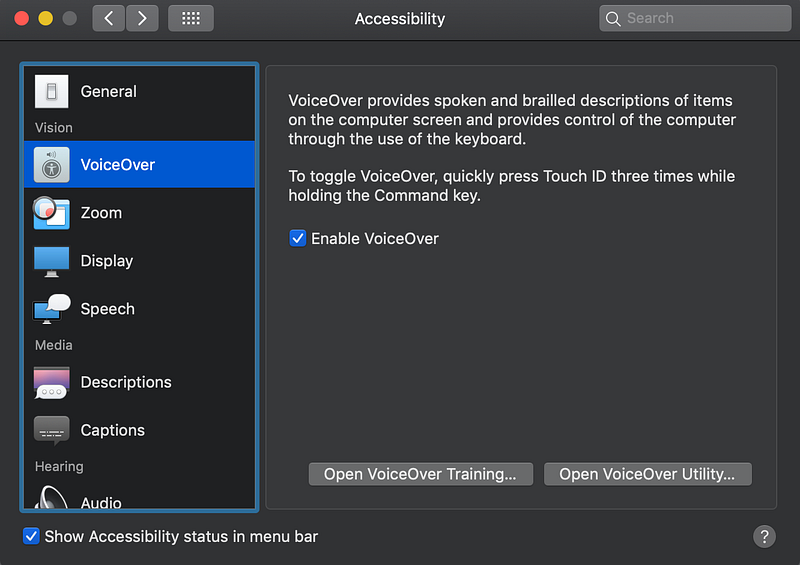
It is a good practice to use a screen reader to test web pages during development.
MacBooks have excellent built-in accessibility. You can turn on VoiceOver for screen reading.
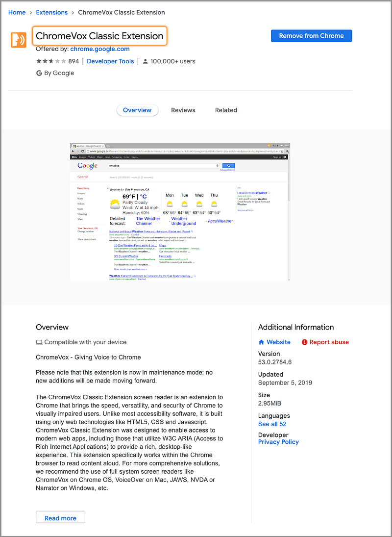
You can also use the ChromeVox Classic Extension, which is a screen reader on Chrome for visually impaired users.
Step 4: Reach Full Keyboard Access
The Web Content Accessibility Guidelines (WCAG 2) explain how to make web content more accessible to people with disabilities. It provides four categories of guidance:
“1. Perceivable: Information and user interface components must be presentable to users in ways they can perceive.
2. Operable: User interface components and navigation must be operable.
3. Understandable: Information and the operation of user interface must be understandable.
4. Robust: Content must be robust enough that it can be interpreted reliably by a wide variety of user agents, including assistive technologies.”
For each guideline, there are testable success criteria with three levels: A, AA, and AAA. The minimal level is A and the target level is AAA.
Keyboard access is all about operability. When implementing web pages, we should first use built-in keyboard access. If it is not available for a complex user interface, tabindex can be implemented to fill in the gap. The goal is to reach full keyboard access.
Step 5: Make Focus and Hover Equal / Use Mouseover Over Mouseenter / Use Mouseout Over Mouseleave
Focus indicates that the component is currently selected. In order to satisfy WCAG 2’s Perceivable and Operable rules, when the cursor moves around an application, the focused item should be visible. The visual indication should be large enough to cover the component area, and the bounding area should have sufficient color contrast and thickness.
Focus is true if the cursor is in that element and the element has the :focus pseudo-state. Hover is true when the mouse pointer is over an element and the element has the :focus pseudo-state.
Most of the time, focus and hover act in concert. It is possible for focus to be true while hover is false. If a user clicks a form element and moves the mouse away, focus is true and hover is false. If a user tabs to a form element, it also triggers a case where focus is true and hover is false.
Typically, a focused item has an outline bounding it. This outline can be hidden by applying CSS of outline:0 or outline:none, though it is against the guidance.
In addition, CSS can be used to make the focused item more visually prominent (contrast or thickness) or styled to match the whole website design.
When styling focused items, we can use the :focus pseudo-class. It is a good idea to double up focus and hover styles. Therefore, users get the same visual indication that a control is ready to perform an action, whether it is hovered by a mouse or focused by a keyboard.
The following is an example to show a red outline when elements are hovered or focused:
When detecting a mouse event to show a focused or hovered item, use mouseover over mouseenter and use mouseout over mouseleave.
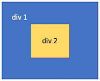
Here are differences if the event listener is added to div 1:
mouseover: When the mouse goes from outside todiv 2, it triggers an event fordiv 1and another event for the childdiv 2.mouseenter: When the mouse goes from outside todiv 2, it triggers an event fordiv 1.mouseout: When the mouse goes fromdiv 2to outside, it triggers an event for the childdiv 2and another event fordiv 1.mouseleave: When the mouse goes fromdiv 2to outside, it triggers an event fordiv 1.
Step 6: Ensure Web Pages Are Functional Without CSS
The navigation order should come from the document’s source order. CSS is used to control the visual presentation. A well-designed web page should be functional without CSS.
CSS is a short form of Cascading Style Sheets. It is used to define layout, colors, fonts, and dynamic behaviors. CSS is designed to enable the separation of presentation and content. This makes it feasible to present the same markup page in different styles for different rendering systems, such as desktop browsers, mobile devices, in print, by voice, and on Braille-based tactile devices. It improves the content’s accessibility.
Given the following HTML source code:
It renders a row of buttons:
With the following CSS selector:
p {
  display: flex;
  flex-direction: row-reverse;
}
It renders a row of buttons in the reverse order:
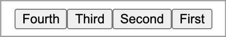
Although it looks reversed, the keyboard navigation and the screen reader still go from First, Second, Third, to Fourth.
The CSS flexbox has the order property that controls the flex items’ order in the flex container. Similarly to tabindex, this order property must only be used when the visual order needs to be out of sync with the screen reader order and navigation order. Otherwise, the underlying document source should be reordered instead.
It is important to test a web page rendering without CSS.
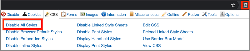
Most browsers, except Chrome, have a menu choice to view pages without CSS. On Chrome, the Web Developer Extension can achieve the same thing.
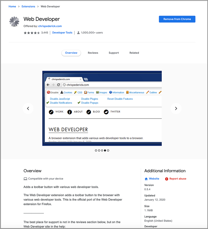
This extension adds an icon to Chrome’s toolbar with various web developer tools. Upon clicking the icon, we are presented with a menu. In this menu, choose the CSS tab and then click on Disable All Styles to disable CSS.
Now we can view https://www.amazon.com/ without CSS:
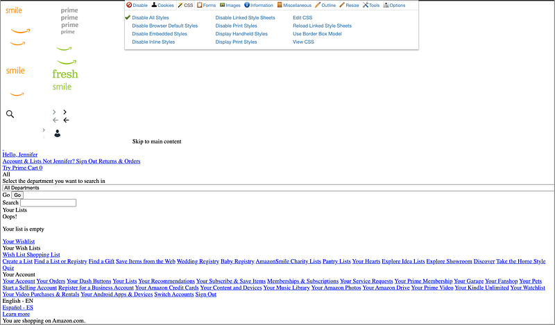
We can see that this document without CSS is in a reasonable order that can be functional. The buttons and input fields have default styling. Using Tab and Shift Tab can navigate around. On links, selection menus, and buttons, the enter key is able to trigger an action. This is a well-designed web page that can work without CSS.
Step 7: Fill Accessibility Gap With WAI-ARIA
HTML5 was initially published in October 2014. It includes many landmark- and section-related elements, such as main, nav, header, footer, section, and aside. These areas can be jumped by screen readers and other assistive technologies.
WAI-ARIA (Web Accessibility Initiative — Accessible Rich Internet Applications) was initially published in March 2014. According to the documentation, it defines “a set of additional HTML attributes that can be applied to elements to provide additional semantics and improve accessibility wherever it is lacking.” ARIA is not a version of HTML.
HTML5 is for static web content and ARIA is mostly for dynamic web content. However, the new HTML 5 elements overlap some of the ARIA roles. The general recommendation is to use semantic HTML first and consider WAI-ARIA for more advanced cases. The most robust method is to use both at the same time in the same element.
An ARIA role is added via a role="<ROLE TYPE>" attribute and does not change for an element once set. There are six categories of ARIA roles.
- Landmark roles, such as
banner,navigation, andsearch, identify large content areas and are used by screen readers for navigation. - Document structure roles, such as
table,row, androwgroup, provide a structural description for a section and are typically non-interactive. - Widget roles, such as
button,radio, andtab, describe user interface objects with which the user can interact. - Window roles, such as
alertdialoganddialog, act as windows within the browser or application. - Live region roles, such as
alert,status, andtimer, describe perceivable regions of a web page that are typically updated as a result of an external event when user focus may be elsewhere. - Abstract roles, such as
command,widget, andwindow, are used for the ontology. Web developers must not use abstract roles in content.
ARIA also supports states and properties. They are both treated as aria-prefixed markup attributes.
A state is a dynamic property that may change in response to user actions or automated processes (e.g. aria-busy, aria-disabled, and aria-hidden).
A property is essential to the nature of a given object. It is used to supply extra meaning or semantics (e.g. aria-controls, aria-details, and aria-label).
This is an example of a search box with ARIA attributes:
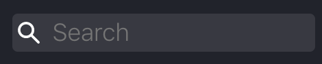
<input id="algolia-doc-search" type="search" role="combobox" placeholder="Search" aria-label="Search docs" aria-autocomplete="list" aria-expanded="false" aria-labelledby="label-for-search" aria-owns="autocomplete-listbox-0">Roles, states, and properties are part of the robustness in WCAG 2.
Step 8: Offer Text Alternatives and More for Media Content
It is always a good idea to offer text alternatives for media content in case it cannot be viewed due to a slow connection, wrong link, or via a screen reader.
The alt attribute provides a text alternative for an image. According to W3Schools, here is the guidance for the alt text:
- The text should describe the image if the image contains information.
- The text should explain where the link goes if the image is inside an
<a>element. - Use
alt=””if the image is only for decoration.
The title attribute is another way to provide the text alternative, though it will display a tooltip.
ARIA can be used to calculate text alternatives for elements/objects, including media content:
aria-label: Defines a string value that labels the current element. It is not visible on the screen. A label should be concise.aria-labelledby: Identifies the element or elements that label the object. It could be visible on the screen.aria-describedby: Identifies the element or elements that describe the object. It is more verbose thanaria-labelledby.aria-details: Identifies the element that provides a detailed and extended description for the object. The content of an element referenced byaria-detailsis not flattened to a string when presented by assistive technology. This avoids the possible loss of information.
This is an example on YouTube:
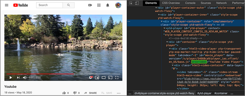
Text alternatives are part of the Perceivable category in WCAG 2. It requires all non-text items to have a text alternative.
- Proper labels and descriptions are at Level A, along with prerecorded captions.
- Live captions and prerecorded audio descriptions are at Level AA.
- Sign languages and live audio descriptions reach Level AAA.
Step 9: Make Text Size and Color Distinguishable
WCAG 2’s Perceivable category has a section about making text’s size and color distinguishable for people with weak vision.
This is the text size guidance:
- Text can be enlarged without loss of content or functionality.
- Text should have sufficient line spacing, paragraph spacing, letter spacing, and word spacing.
According to Wikipedia, the color contrast ratio is “a property of a display system defined as the ratio of the luminance of the brightest color (white) to that of the darkest color (black) that the system is capable of producing.” A high contrast ratio is a desired aspect for viewing the content.
This is the text color guidance:
- The visual presentation of text and images of text has a contrast ratio of at least 7:1 (except large-scale text and decorative text).
How do you measure the color contrast?
Go to WebAIM’s contrast check page where you can compare the contrast of two colors:
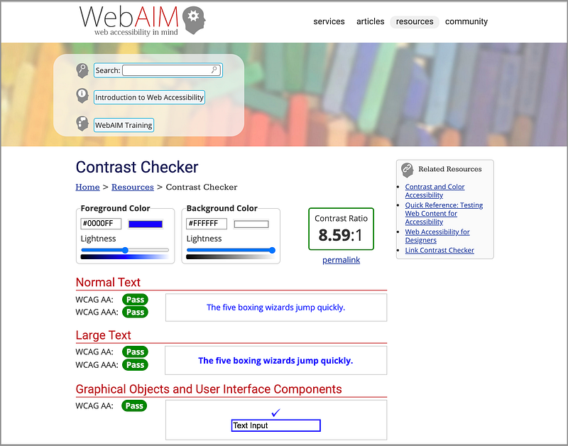
It tells us the contrast between blue and white is 8.59. It also shows that the contrast of these two colors passes WCAG’s criteria of Level AA and AAA. Isn’t that cool?
Step 10: Pass Audit Tool Tests
Despite following all the rules for accessibility, you may still miss things here and there. It is a good practice to use audit tools to verify the accessibility of web pages.
Here are a few useful tools:
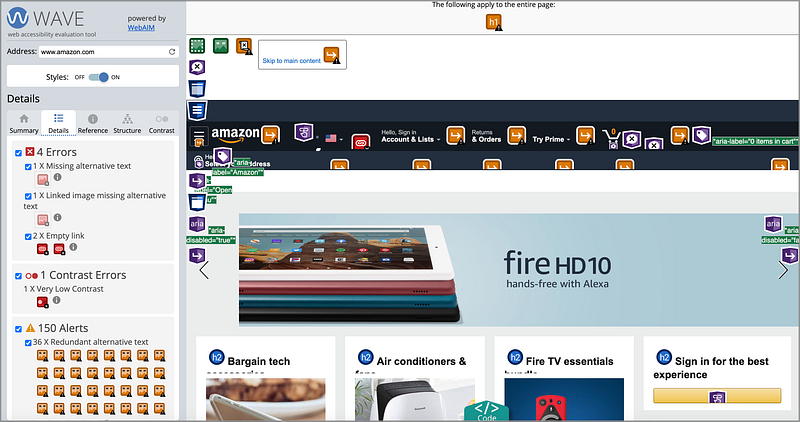
- Wave: An online accessibility testing tool that accepts a web address. It displays an annotated view of that page. All accessibility problems are highlighted.
This is the testing result for https://www.amazon.com/. It shows there are four accessibility errors and where they are.
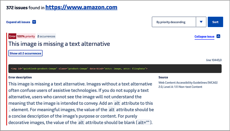
- Tenon: An online tool that accepts a web address or source code. It displays accessibility issues based on WCAG 2 and Section 508.
This is the testing result for https://www.amazon.com/. It shows there are 372 accessibility issues and what they are.
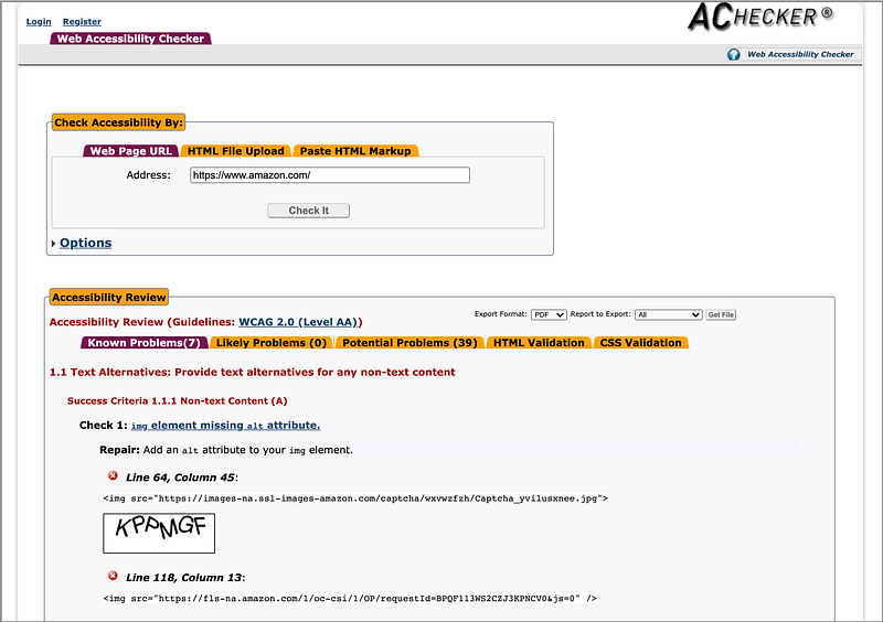
- AChecker: An online tool that accepts a web address, source code, or an uploaded file. It displays accessibility issues based on HTML Validator, WCAG 2, Section 508, etc.
This is the testing result for https://www.amazon.com/. It shows there are seven known problems and lists which rules they fail to pass.
Conclusion
We have described ten steps to building web applications with accessibility. Let us review them.
- Choose semantic HTML.
- Use built-in keyboard access.
- Avoid positive tabindex for setting navigation flow.
- Reach full keyboard access.
- Make focus and hover equal / use
mouseoverovermouseenter/ Usemouseoutovermouseleave. - Ensure web pages are functional without CSS.
- Fill accessibility gap with WAI-ARIA.
- Offer text alternatives and more for media content.
- Make text size and color distinguishable.
- Pass audit tool tests.
This is a long list, but it is worth the effort to improve the accessibility of your web applications.
Next, we are going to provide a guide on how to fill in Voluntary Product Accessibility Template (VPAT®).
Thanks for reading. I hope this was helpful. You can see my other Medium publications here.
Note: Yashwanth Pinneka and Mary Chen contributed to mouseover/mouseout rules.


