
Interview Prep: Build Web Application Using HTML, CSS, and JavaScript
A hands-on guide on how to build a Web application using HTML, CSS, and JavaScript

Web development has advanced to framework era. However, interview is a time limited experience. Frequently, a frontend job interview requests building a simplified Web application, with restricted resource of HTML, CSS, and JavaScript, and possibly, without internet access to check syntax.
In this article, we use limited resource to build a Web application.
VSCode Preparation
We use VSCode to set up the working environment for HTML, CSS, and JavaScript.
- Create a directory, named as
js. - Create two empty files in the directory:
index.htmlandstyle.css.
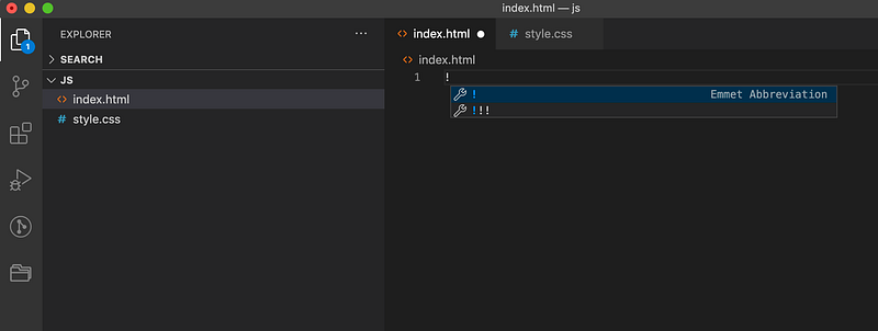
Open the empty index.html, and type !. Select the first choice in the above image, and HTML scaffolding is generated:
We add to the above template.
At line 7, a link to style.css is added into the head section. In case you do not remember the link syntax, type link and enter. VSCode will generate the link element. This method works for all HTML tags.
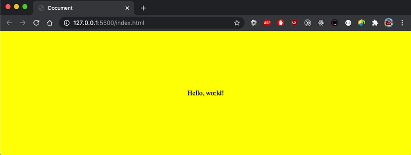
At line 10, a div of Hello, world! is added inside the body section.
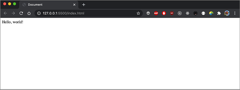
That’s it. We have built our Hello, world! Web application!
Then, how can we view the Web application?
The VSCode extension, Live Server, can help.
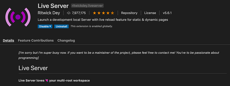
Download Live Server which is a local development server with live reload feature for static and dynamic pages.
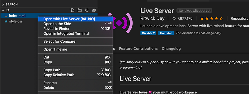
Right-click index.html, and choose the option, Open with Live Server. Expectedly, we see a browser session being launched with the Web application:
CSS Layouts
We had Hello, world! on the browser. Using CSS to style the page layout is likely the next step of the interview process.
First question: how do you let Hello, world! fill the whole screen?
This can be accomplished with style.css:
At lines 3 - 4, we set width and height to make the body element fill the screen.
At line 5, margin: 0 overrides browser’s default margin.
It is usually a good idea to set box-sizing: border-box (line 10) for including border and padding in element width and height.
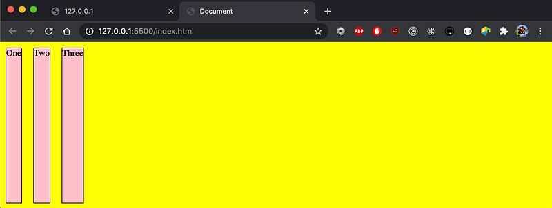
For the div element, it is a common practice to set width: 100% and height: 100vh to take over the whole viewport (lines 14 and 15). Try to change it to height: 100%. What will you see? The div element becomes a thin strip. Setting background: yellow (line 16) makes the effect obvious.
At lines 17 and 18, setting display: grid and place-items: center centers the text.
We have answered the first question. Now we do a little more.
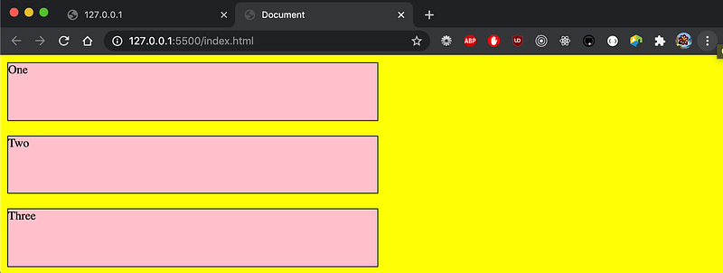
A container (lines 5 - 9) is added to the body section, and it contains three items.
The rulesets are adjusted accordingly in style.css:
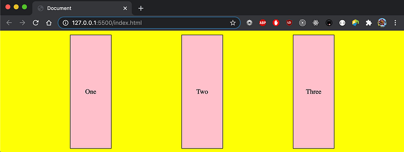
The container id uses the flex layout (line 17).
The item class sets width: 100px (line 23).
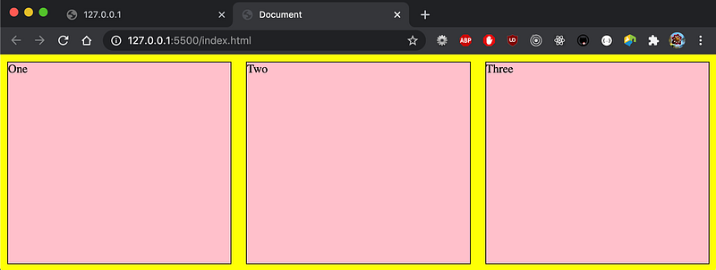
The items are evenly distributed on the screen by the declaration at line 19:
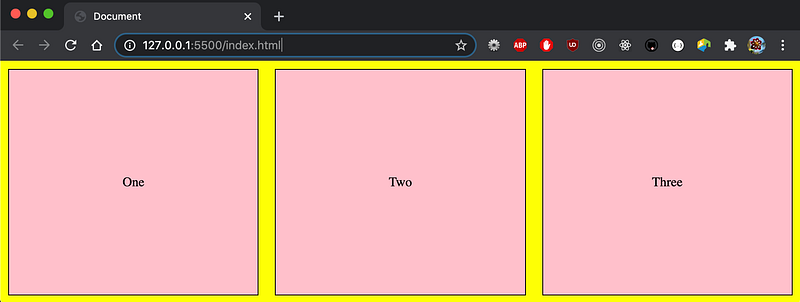
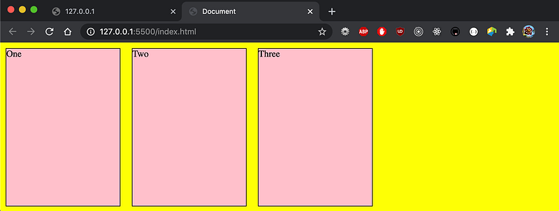
Instead of hardcoding width, we can make the item width responsive to the container’s width:
At line 2, flex-grow is set to 1.
So far, we have used grid to center the text. The flex display can accomplish the same effect:
With one extra line, lines 6 - 8 also center the text.
Let’s take a look at the flex property at line 2. Its syntax is defined as follows:
none | [ <’flex-grow’> <’flex-shrink’>? || <’flex-basis’> ]<’flex-grow’>: Defines theflex-growof the flex item. Negative values are considered invalid. Defaults to 1 when omitted.<’flex-shrink’>: Defines theflex-shrinkof the flex item. Negative values are considered invalid. Defaults to 1 when omitted.<’flex-basis’>: Defines theflex-basisof the flex item. A preferred size of 0 must have a unit to avoid being interpreted as a flexibility. Defaults to 0 when omitted.
We have seen that setting flex to 1 will grow the items. That is the flex-grow value.
The following are potential interview questions:
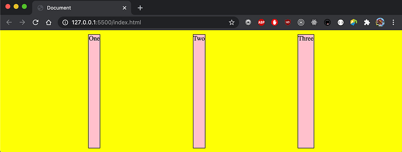
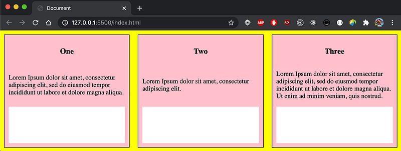
What happens if
flexis not set, and neither iswidth?
Then the width is set to the content width. Consequently, the item Three is wider than the item One.
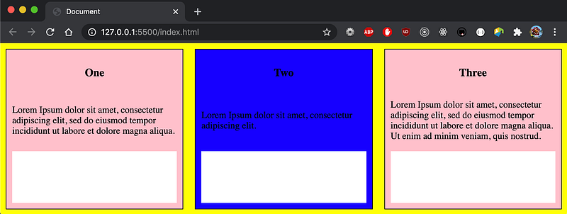
What happens if we remove
justify-contentfromcontainer(line 6) in the below code?
The extra width is no longer distributed.
What happens if we set
flex: 0 1 200px(line 2) in the below code?
With this setting, flex-grow is 0, flex-shrink is 1, and flex-basis is 200px. Each item’s width is fixed at 200px without growing.
What happens if we set
flex: 1 1 200px(line 2) in the below code?
With this setting, flex-grow is 1, flex-shrink is 1, and flex-basis is 200px. The items take the full width.
What if
flex-basisis500px(line 2 in the below code), where 3 items are wider than the viewport?
With the container set to flex-wrap: wrap, the extra items flow to next rows. In this case, all items stack up.
What if we turn off flex-grow at line 2?
Then, the stacked items do not grow.
We have used flex to explore various layouts. It should be sufficient to build a simple Web application. We can also use the grid layout to accomplish the same task. The traditional relative or absolute positions can work as well too. Simply pick up a way that you are most comfortable with.
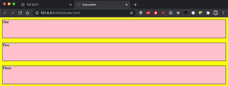
As part of practice, can you create a Web application with the following layout?
It is easy, right?
Here is index.html:
Here is style.css:
JavaScript Actions
JavaScript is used to program the behavior of web pages. A Web application interview usually is composed of some interactive aspects.
For the previous Web application, we are going to add the interactive part. When each item is clicked upon, its background color will be changed to blue. After 1 second, the color will be reverted back to pink.
There are 4 steps to add the interactive part:
- Create the
scripttag. - Access the elements inside the script tag.
- Implement event handlers.
- Add visual indications.
Create the script tag
A script tag can be added to the head section or the body section. Where should we put it?
Put the script tag in the head section if it is executed when it is called, or when an event is triggered. Otherwise, put it in the body. When it is in the body section, put it at the bottom of the body section in order not to delay the HTML content loading.
Generally speaking, it is recommended to put all scripts in the head section for easier management.
Access the elements inside the script tag
A target element can be retrieved from the event handler parameter. Or it can be retrieved from a number of APIs:
document.getElementById()document.getElementsByClassName()document.getElementsByName()document.getElementsByTagName()
The document.getElementById() method returns the element that has the id attribute with the specified value. Other APIs returns a collection of all elements in the document with the specified feature. The collection is an array like object. It needs to be converted to an array for accessing array APIs.
The element or elements can also be retrieved by CSS selector(s):
document.querySelector()document.querySelectorAll()
After JavaScript retrieves the element, x, it can be accessed to change attributes, such as x.innerHTML = ‘New Value’ , x.style.color = ‘blue’, and etc.
Implement event handlers
There are three ways to handle events:
- In an HTML element, it can be handled by the
on<event>attribute. For example,<div class=”item” onclick=”myHandler(this)”>and<div class=”item” onclick=”myHandler(event.currentTarget)”>. - In JavaScript, it can be created as an
on<event>function for the specified element. Take the element x as an example, the event handler can be written asx.onclick = event => {}. - In JavaScript, the
addEventListener()method attaches an event handler to the specified element. Take the element x as an example, the event handler can be written asx.addEventListener(‘click’, event => {}, useCapture).
Add visual indications
It is always a good idea to provide visual indications to users. For this exercise, when the mouse enters an item, changing it to a pointer reminds users that the item is clickable. In the below code, line 11 achieves this effect.
We have explained the 4 steps to to add the interactive part to the Web application. Are you ready to try it out?
Solution 1: Use HTML element's onclick attribute
The event handler, myHandler, is implemented in the head section (lines 9 - 14).
At lines 19, 28, and 33, the onclick attribute is added to the div element. “this” is passed in as the current element. Alternatively, event.currentTarget works the same way (line 20).
Solution 2: Use JavaScript’s addEventListener() method
In this solution, the element’s onclick attribute is replaced by the code at lines 43 - 46 in the body section.
If you move JavaScript from the body section to the head section, it will complain that items are not defined since DOM has not been loaded.
However, it is hard to maintain when JavaScript code is split in both head and body sections. Is there a way to resolve the issue?
Solution 3: Use JavaScript’s window.onload method
At lines 15 - 20, JavaScript initialization code is wrapped inside window.onload, which is fired when the entire page loads.
Now, all JavaScript code is neatly listed in the head section.
Conclusion
We have set up a Web application using HTML, CSS, and JavaScript. There will be more questions, such as:
- What is the difference between
window.onloadanddocument.onload? - How to prevent event bubbling if there are multiple event handlers?
- How to implement event delegation?
This is a starting point for a typical 1-hour-long interview. Practice makes perfect. Enjoy the coding.
Thanks for reading. I hope this was helpful. You can see my other Medium publications here.


