
Build Advanced React Input Fields Using Styled Components and Storybook.js
A development guide to building React components with the latest technologies

In a previous article, we built React tabs using Recoil, Styled Components, and Storybook.js. Here we’ll walk through advanced input fields: ClearableInput and MultiValueClearableInput. The development process can be applied to daily coding work. It’s also a frequently asked interview question, fitting easily within the one-hour interview time frame.
Since an input field is self-contained, useState is well-suited for state management. We don’t need to use Recoil for external state management in this case.
Create React App is used to set up the React coding environment:
npx create-react-app my-app
cd my-app
npm start
Set up Styled Components for dependencies in your package.json:
npm i styled-componentsInstall Storybook for the project:
npx sb initCreate src/components/AdvancedInputs with the following files:
$ ls
AdvancedInputs.stories.js   MultiValueClearableInput.js index.js
ClearableInput.js           clear.svg
Input Field
The HTML <input> tag specifies an input field, in which a user can enter data. It can be a text field, a checkbox, a radio button, a file input, or something else.
The default input is a text field:
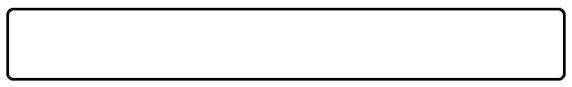
It looks good.
Type some text into it.
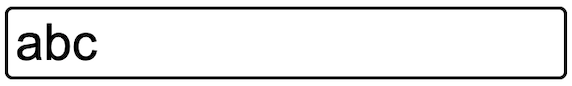
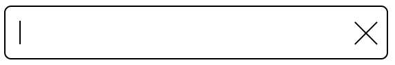
Typing Backspace can delete the content, character by character, from back to front. Will an x to clear all of the text work better?
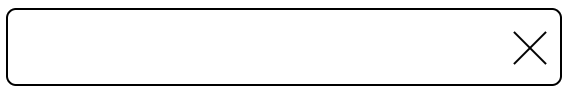
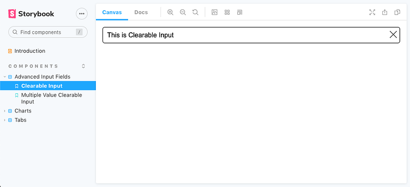
The Clearable Input
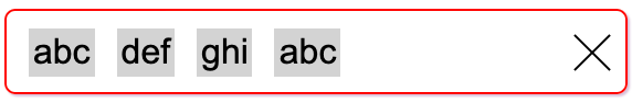
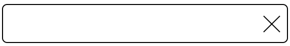
The HTML input element doesn’t include the clear icon (the x mark), let alone the clear functionality. We need to build a React component to achieve the ClearableInput field. It’s a container that’s composed by two elements: an input field and a clear icon. We call it a combo input.
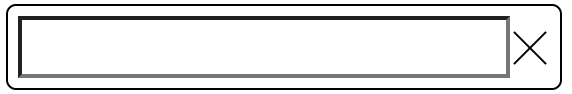
The inner input field has a black border. When it’s focused, it has a blue outline:
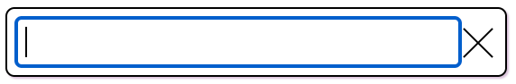
We need to hide the inner input field’s border and outline to make the combo input feel like one component:
border: 0;
&:focus {
  outline: none;
}
Here’s src/components/AdvancedInputs/ClearableInput.js, implemented with Styled Components:
Lines 40-45 specify the input field. When the value is changed, the input value state is updated (lines 42-44).
Lines 46-55 specify the clear icon. The icon size (lines 48-49) and stroke color (line 50) are specified. When the icon is clicked, the input field is cleared (lines 51-53).
The input field and the clear icon are displayed as flex items in the container. The icon size is fixed, and the input field will take the remaining width.
The clear icon is written with SVG. The following is the SVG code and the image:
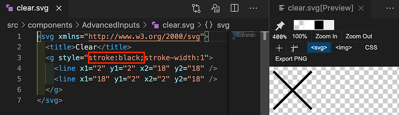
The above SVG is composed by two diagonal lines. The icon size and stroke color are specified by each usage. However, we add stroke:black here for previewing the x mark. The actual SVG file in src/components/AdvancedInputs/clear.svg doesn’t include the stroke color.
<svg xmlns="http://www.w3.org/2000/svg">
<title>Clear</title>
<g style="stroke-width:1">
<line x1="2" y1="2" x2="18" y2="18" />
<line x1="18" y1="2" x2="2" y2="18" />
</g>
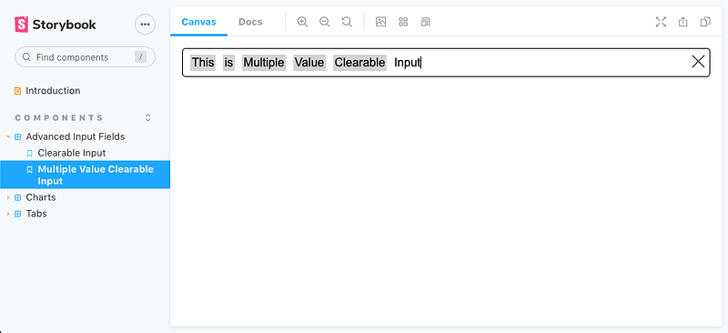
</svg>The Multiple-Value Clearable Input
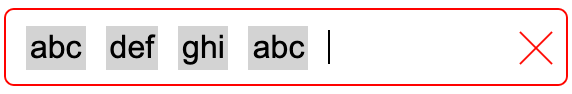
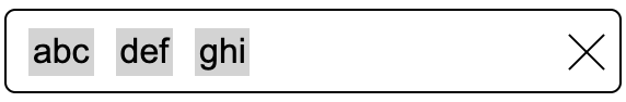
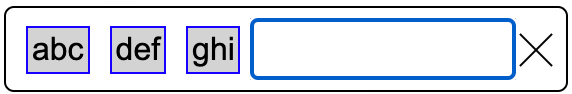
In addition to the clear icon, we’ll try to make the combo input more interesting. Whenever a user hits the Enter key, the existing none-empty value will be extracted out of the input field to be an item, displayed with a gray background.
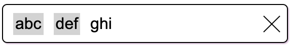
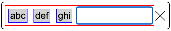
Duplicated item values indicates an error. The combo input will be bordered by red lines.
In addition, we can change the clear icon to red color too.
This MultiValueClearableInput can wrap around to the following lines if the size exceeds the width.
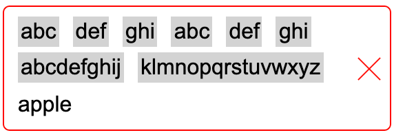
Entering Backspace will delete the text in the input field and then items, one by one, from back to front.
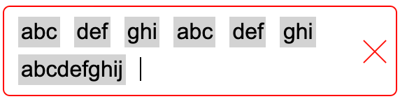
When there are no duplicated-item values, the combo input border will turn back to black.
Clicking the clear icon will clear all of the items, along with the current value in the input field.
This MultiValueClearableInput can be built with a container composed by three things: a list of divs, an input field, and a clear icon.
In addition, the list of divs and the input field are grouped by an input container.
We copy the ClearableInput code and expand it to accomplish the MultiValueClearableInput.
Here’s src/components/AdvancedInputs/MultiValueClearableInput.js:
Line 13 defines the container’s border color, which is based on whether there’s an error. isError is passed to the props at line 77.
Line 53 adds a state to track item values.
Lines 55-57 calculate the state and whether there’s an error (duplicated item values).
Lines 79-81 specify a list of items, in addition to the input field and the clear icon.
Line 84 handles the KeyDown event. The event handler is defined at lines 59-74. Why do we use KeyDown instead of KeyPress? It’s because the KeyPress event is invoked only for printable character keys, and the KeyDown event is raised for all characters, including nonprintable characters, such as Control, Shift, Alt, Backspace, etc. The Enter key is a printable character.
Line 94 sets the SVG color based on whether there’s an error.
Line 97 clears item values along with clearing the input field (line 96).
This file adds code to the ClearableInput. Instead of having two files, we could add a parameter for it to handle both cases. Do you want to take it as an exercise?
In addition, we’re following the best practice to create src/components/AdvancedInputs/index.js for reexport. This makes the usage easy.
Storybook
Storybook is a tool for UI development. It makes development faster and easier by isolating components. This allows us to work on one component at a time.
This is src/components/AdvancedInputs/AdvancedInputs.stories.js:
Lines 10-12 define the first story. It’s the ClearableInput.
Lines 14-16 define the second story. It’s the MultiValueClearableInput.
Storybook is launched with the command npm run storybook.
This example is located on GitHub. You can view and play with the Storybook examples online.
You may wonder how this example page is set up. Let’s walk through the process.
At the root directory, run the command npm run build-storybook. It runs a script, build-storybook -o docs -s public, which puts built files into the docs directory. Commit and push the changes to GitHub.
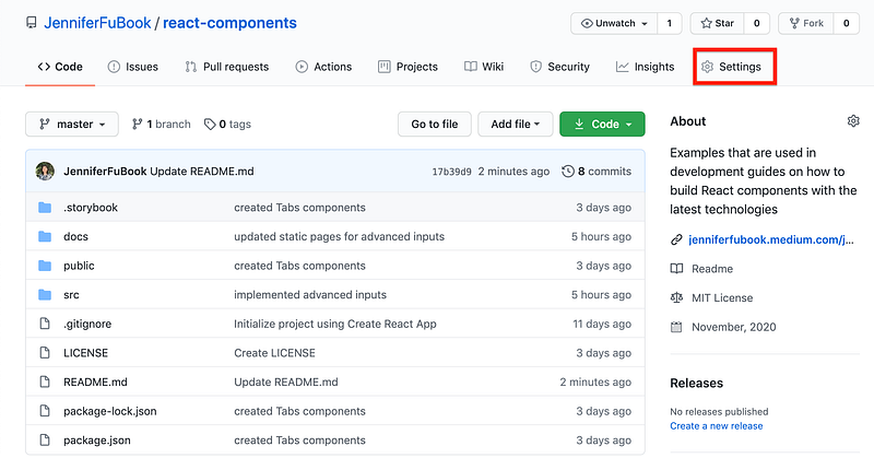
From the GitHub page, select Settings.
On the Settings page, scroll down to the GitHub Pages section.
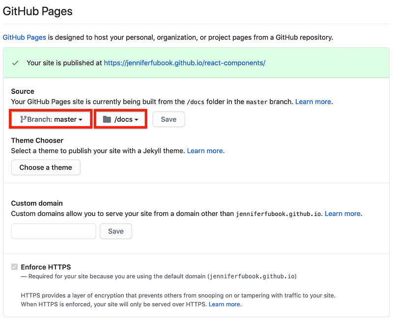
Choose the branch and directory for the GitHub Pages site, and save the changes. The storybook examples can be accessed here.
Conclusion
We’ve created advanced input components using Styled Components and Storybook. These components are published at the GitHub Pages site for viewing and playing.
Do you want to give it a try?
Thanks for reading. I hope this was helpful. You can see my other Medium publications here.


