
Easier D3.js — Render C3 Charts With React Functional Components
Better charts with C3
What is D3?
D3 stands for Data-Driven Documents. It is a JavaScript library for manipulating documents based on data. D3 is a dynamic, interactive, online data visualizations framework used in a large number of websites. The visualized data are called charts. Commonly, there are line charts, bar charts, pie charts, etc.
What is C3?
C3 stands for Comfortable, Customizable, and Controllable. C3 is a JavaScript library that builds on top of D3. C3 allows us to build charts quickly without knowing all the complexity of D3. C3 provides a variety of APIs and callbacks to access the state of the chart.
In this article, we are going to show how to build C3 charts using React functional components.
Static C3 Charts
We will use the Create React App as a starting point. Since C3 is a wrapper of D3, both
npm i c3
npm i d3
Then the following packages become part of dependencies in package.json.
"dependencies": {
  "c3": "^0.7.20",
  "d3": "^5.16.0",
}
Change src/index.css to this for minimal styling:
C3 generates a chart by calling generate() with a config object. The chart will be inserted into the element specified by the bindto selector in the config object.
We create src/Chart.js where the official C3 example is rendered by a React component:
In the above code, the functional component, Chart, generates an element, <div id=”chart” /> (line 18).
The config object for the generate API is defined in lines 6-15. Line 7 instructs to insert the chart into the element whose id is chart. Lines 9-12 hardcode two data series: data1 and data2. Line 13 defines the chart type to be line. Lines 5-16 generate the C3 chart in useEffect. This chart will not be updated since the dependency list is an empty array (line 16).
In src/App.js, we invoke this chart component in line 5:
Run npm start, and we see the following chart:
What happened? This chart has no styles. The C3 styles need to be included in src/Chart.js or src/App.js (line 3).
With styles, the chart looks the same as it does in the official C3 document.
You can hover over the lines to view data in detail. Each line can be showed or hidden by hovering or clicking the data series name on the x-axis.
Dynamic C3 Charts
The previous chart is static. How can we draw a dynamic chart? Usually, chart data are fetched by promises. To simplify the code, we create getData in src/getData.js to generate dynamic data.
This getData function takes an array of plotconfig (line 9) and then uses a reduce function (lines 11-18) to transform the config to chart data that can be rendered by C3.
We modify src/Chart.js to call getData.
Here, data is a state (line 6), The useEffect (line 22-30) will regenerate the chart if the data object is changed. Another useEffect (line 7-20) is called to set new data every second. The config (lines 10-16) creates five dynamically updating data series in the following video:
Alternatively, we create src/DataSource.js to make fetching data a component.
At line 12, we return null. For the cases not to render anything intentionally, returning null is a good practice.
In src/Chart.js, the DataSource component is used, as a replacement of the useEffect fetch block.
Does the above componentized code look neater?
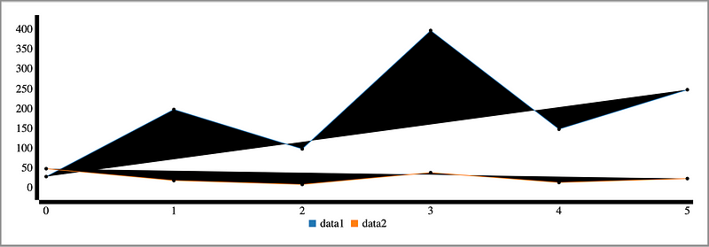
For C3 charts, different data series can have different numbers of points. We modify plotConfig (lines 22-28) to make data of various lengths in src/Chart.js:
The following is a chart with different length data series:
Various Chart Types
C3 charts support many types. In the previous examples, the type has been set to line.
Line charts
Display how numbers have changed over time. They are ideal to show changing time series as well as trends and developments over time.
We will explore more chart types, using the same code but setting to different types.
Step charts
Line charts that do not use the shortest distance to connect two data points. Instead, they use vertical and horizontal lines to connect the data points in a plot forming a step-like progression. The vertical parts of a step chart denote changes in the data and their magnitude. The horizontal parts of a step chart denote the constancy of the data. For step charts, the type is set to step.
The following is a step chart:
Spline charts
Line charts that do not use a straight line to connect two data points. Instead, they draw a curved line between the points in a data series. For spline charts, the type is set to spline.
This is a spline chart:
Bar charts
Used for comparing size. They present categorical data using rectangular bars with heights or lengths proportional to the values that they represent. For bar charts, the type is set to bar.
The following is a bar chart:
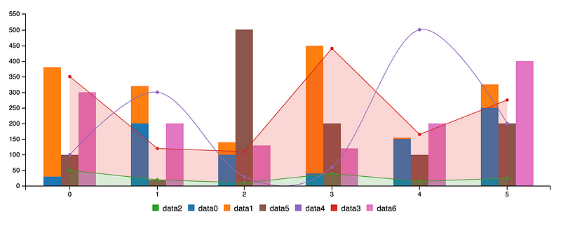
In addition, different bars can be grouped together to make stacked bar charts. In the following config, all five groups of data are stacked into one bar.
data: {
  columns: data,
  type: "bar",
  groups: [
    ["data0", "data1", "data2", "data3", "data4"],
  ],
}
This is a stacked bar chart:
Area charts
Line charts with the areas between the line and the x-axis filled. For area charts, the type is set to area.
The following is an area chart:
In addition, different areas can be grouped together to make stacked area charts. In the following config, all five groups of data are stacked to one group.
data: {
  columns: data,
  type: "area",
  groups: [
    ["data0", "data1", "data2", "data3", "data4"],
  ],
}
This is a stacked area chart:
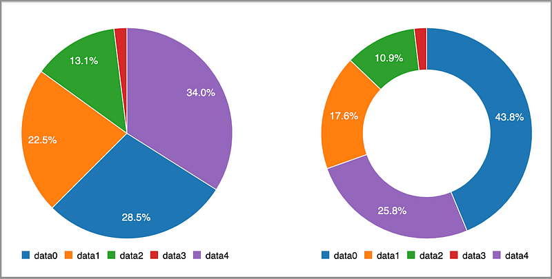
Pie charts
Display a circular chart divided into sectors which are proportional to the quantity it represents. For pie charts, the type is set to pie.
Donut charts
Essentially pie charts, with an area of the center cut out. For donut charts, the type is set to donut.
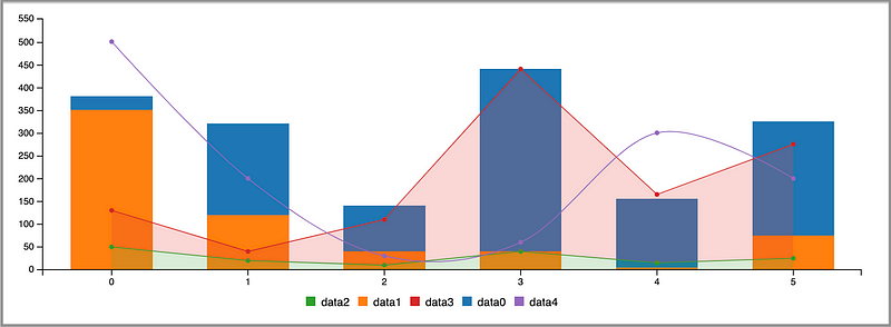
Multiple charts can be put into one component:
We can also put different data series into one chart:
At line 16, it specifies that the default type is bar. Lines 18-20 specify each individual data series type. Line 23 makes two groups: data0&data1 and data2&data3.
We have the following combined chart:
Conclusion
C3 charts bring charting power with an easy learning curve. Let’s reiterate its advantages:
- Comfortable: C3 makes it easy to generate D3-based charts by wrapping the code required to construct the entire chart. We do not need to write D3 code any more.
- Customizable: C3 gives some classes to each element when generating, so we can define a custom style by the class and it is possible to extend the structure directly by D3.
- Controllable: C3 provides a variety of APIs and callbacks to access the state of the chart. By using them, we can update the chart even after it is rendered.
Thanks for reading. I hope this was helpful. You can see my other Medium publications here.


