
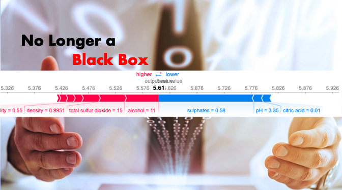
An Explanation for eXplainable AI

Artificial intelligence (AI) has been integrated into every part of our lives. A chatbot, enabled by advanced Natural language processing (NLP), pops up to assist you while you surf a webpage. A voice recognition system can authenticate you to unlock your account. A drone or driverless car can service operations or humanly impossible access areas. Machine learning (ML) predictions are utilized in all kinds of decision-making. A broad range of industries such as manufacturing, healthcare, finance, law enforcement, and education rely more and more on AI-enabled systems.
However, how AI systems make decisions is not known to most people. Many of the algorithms, though achieving a high level of precision, are not easily understandable for how a recommendation is made. This is especially the case in a deep learning model. As humans, we must be able to fully understand how decisions are being made so that we can trust the decisions of AI systems. We need ML models to function as expected, to produce transparent explanations, and to be visible in how they work. Explainable AI (XAI) is important research and has been guiding the development of AI. It enables humans to understand the models to manage effectively the benefits that AI systems provide while maintaining a high level of prediction accuracy.
Explainable AI answers the following questions to build the trust of users for the AI systems:

- Why does the model predict that result?
- What are the reasons for a prediction?
- What is the prediction interval?
- How does the model work?
In this article, I am going to walk you through the advancements that address the above questions.
Two emerging trends in AI are “Explainable AI” and “Differential Privacy”. Differential Privacy is an important research branch in AI. It has brought a fundamental change to AI and continues to morph AI development. On Explainable AI, you are recommended to read the model explainability series. On Differentiated Privacy, Dataman published “You Can Be Identified by Your Netflix Watching History” and “What Is Differential Privacy?” and more to come in the future.
(A) Explainable AI with SHAP
To provide model transparency, the SHAP (SHapley Additive exPlanations) was invented by Lundberg and Lee (2016). The article “Explain Your Model with the SHAP Values” has the following analogy:
Is your highly-trained model easy to understand? If you ask me to swallow a black pill without telling me what’s in it, I certainly don’t want to swallow it. The interpretability of a model is like a label on a drug bottle. We need to make our effective pill transparent for easy adoption.
The SHAP provides three salient propositions:
- The first one is global interpretability — the collective SHAP values can show how much each predictor contributes, either positively or negatively, to the target variable. This is like the variable importance plot but it can show the positive or negative relationship for each variable with the target (see the SHAP value plot below).
- The second one is local interpretability — each observation gets its own set of SHAP values (see the individual SHAP value plot below). This greatly increases its transparency. We can explain why a case receives its prediction and the contributions of the predictors. Traditional variable importance algorithms only show the results across the entire population but not in each case. The local interpretability enables us to pinpoint and contrast the impacts of the factors.
- Third, the SHAP values can be calculated for any tree-based model, while other methods use linear regression or logistic regression models as surrogate models.
Global interpretability— A SHAP value plot can show positive or negative relationships between the predictors with the target variable. Figure 1 is made of all the dots in the train data.
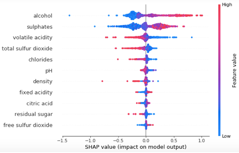
This SHAP value plot presents us:
- Feature importance: Variables are ranked in descending order.
- Impact: The horizontal location shows whether the effect of that value is associated with a higher or lower prediction.
- Original value: Color shows whether that variable is high (in red) or low (in blue) for that observation.
- Correlation: A high level of “alcohol” content has a high and positive impact on the quality rating. The “high” comes from the red color, and the “positive” impact is shown on the X-axis. Similarly, we will say the “volatile acidity” is negatively correlated with the target variable.
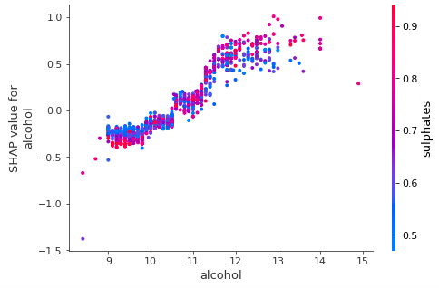
Global interpretability — How about showing the marginal effect one or two features have on the predicted outcome? J. H. Friedman (2001), the instrumental contributor of machine learning techniques, calls such plot a partial dependence plot. It tells whether the relationship between the target and a feature is linear, monotonic, or more complex. Figure (II) plot shows there is an approximately linear and positive trend between “alcohol” and the target variable, and “alcohol” interacts with “sulphates” frequently.
Local interpretability — the ability to explain each prediction, is a very important promise in an explainable AI. We need to explain what the reasons are for a prediction. This is delivered by a force plot. Each prediction will have a force plot to explain the reasons.
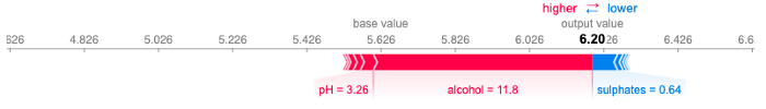
The force plot in Figure III shows that the prediction settled at 6.20. This is because the red features (Alcohol and pH) push the prediction to the right (higher), and the blue features (Sulphates) push the predictions to the left (lower).
If you want to implement the code and understand more details, please click “Explain Your Model with the SHAP Values” and “Explain Any Models with the SHAP Values — Use the KernelExplainer”, in which I walk you through how to create these explainable results. The SHAP builds on ML algorithms. If you want to get deeper into the Machine Learning algorithms, you can check my post “My Lecture Notes on Random Forest, Gradient Boosting, Regularization, and H2O.ai”.
(B) Explainable AI with LIME
To make AI explainable, two types of confidence are required: the first one is confidence in our model, and the second one is confidence in our prediction. In the seminar work “Why Should I Trust You?” Explaining the Predictions of Any Classifier (KDD2016), the authors explained we need to build two types of trusts.
- Trusting the overall model: the user gains enough trust that the model will behave in reasonable ways when deployed. Although in the modeling stage accuracy metrics (such as AUC — Area under the curve) is used on multiple validation datasets to mimic the real-world data, there often exist significant differences in the real-world data. Besides using the accuracy metrics, we need to test the individual prediction explanations.
- Trusting an individual prediction: a user will trust an individual prediction to act upon. No user wants to accept a model prediction on blind faith, especially if the consequences can be catastrophic.
They proposed a novel technique called the Local Interpretable Model-Agnostic Explanations (LIME) that can explain the predictions of any classifier in “an interpretable and faithful manner, by learning an interpretable model locally around the prediction”. Their approach is to gain the trust of users for individual predictions and then to trust the model as a whole.
This reminds me of a friend of mine who once walked me through his new house. He excitingly showed me the outlook of the house, each room, and every device in the closets. He saw the great value in the house and had great confidence. We the data science enthusiasts also hope our AI systems can be trusted likewise.

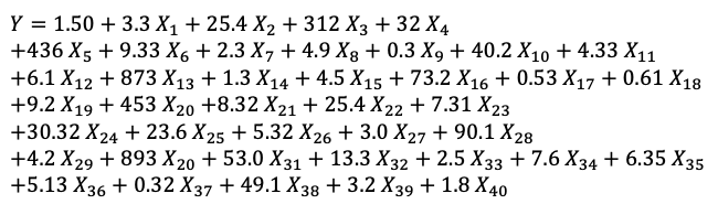
A model should be easily interpretable. Often we have this impression that a linear model is more interpretable than an ML model. Is it true? Look at this linear model with forty variables. Is it easy to explain? Not really.
Although this model has forty variables, for an individual prediction there may be only a few variables influencing its predicted value. The interpretation should make sense from an individual prediction’s view. The authors of LIME call this local fidelity. Globally important features may not be important in the local context, and vice versa. Because of this, it could be the case that only a handful of variables directly relate to a local (individual) prediction, even if a model has hundreds of variables globally.
Figure IV presents how LIME explains an individual prediction. The reasons that the prediction is 5.770 are due to the positive and negative driving forces.
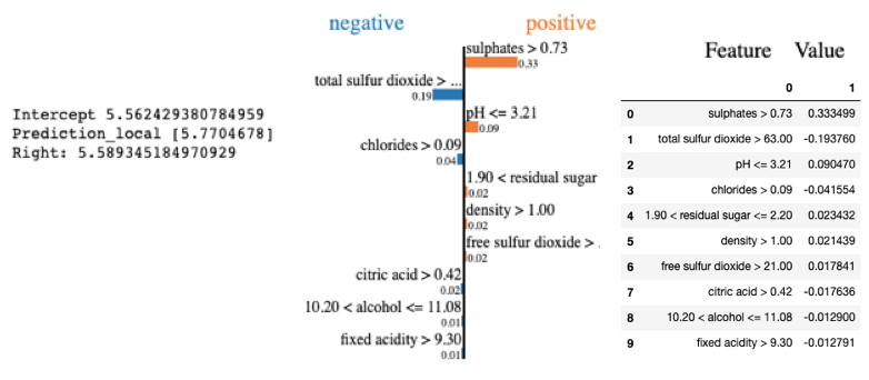
This data point has sulphates>0.73, the strongest influencer driving the prediction to the right (higher). The next influencer is total sulfur dioxide which pushes the prediction to the left (lower). We can explain each influencer in the same way.
How is LIME different from SHAP? The Shapley value is the average of the marginal contributions across all permutations. The Shapley values consider all possible permutations, thus SHAP is a united approach that provides global and local consistency and interpretability. However, its cost is time — it has to compute all permutations to give the results. In contrast, LIME (Local Interpretable Model-agnostic Explanations) builds sparse linear models around an individual prediction in its local vicinity. So LIME is a subset of SHAP, as documented in Lundberg and Lee (2016).
If you want to conduct your LIME and get the step-by-step tutorial, you can click the post “Explain Your Model with LIME”.
(C) Explainable AI with Microsoft’s InterpretML
The InterpretML module, developed by a team at Microsoft Inc., offers prediction accuracy and model interpretability in an integrated API. If you use scikit-learn as your main modeling tool, you will find the InterpretML API offers a unified framework API like scikit-learn. It leverages many libraries like Plotly, LIME, SHAP, and SALib so is already compatible with other modules. Its Explainable Boosting Machine (EBM) is a very accessible algorithm that is based on Generalized Additive Models (GAMs). The terms in a GAM are additive like those of a linear model, but they do not need to be linear with the target variable. You can find more tutorials on GAM in “Explain Your Model with Microsoft’s InterpretML” and “Business Forecasting with Facebook’s Prophet”.
Explainable AI means you can easily explain each variable like exploratory data analysis. The InterpretML offers the interface in Figure V to show the histogram for each variable.
Figure VI shows present the Pearson Correlation with the target variable.
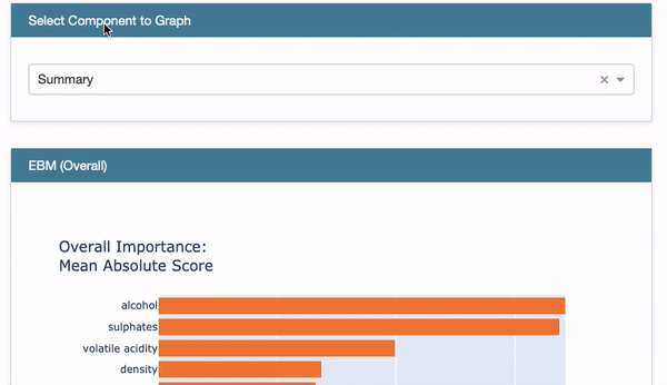
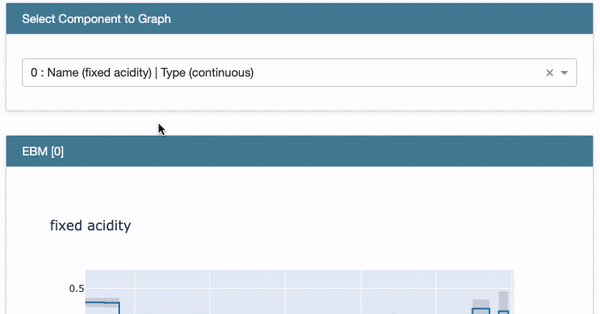
Global Interpretability: Once a model is built, you can demonstrate the overall variable importance in Figure VII. You also can show the Partial Dependent Plot (PDP) in Figure VIII for each variable.
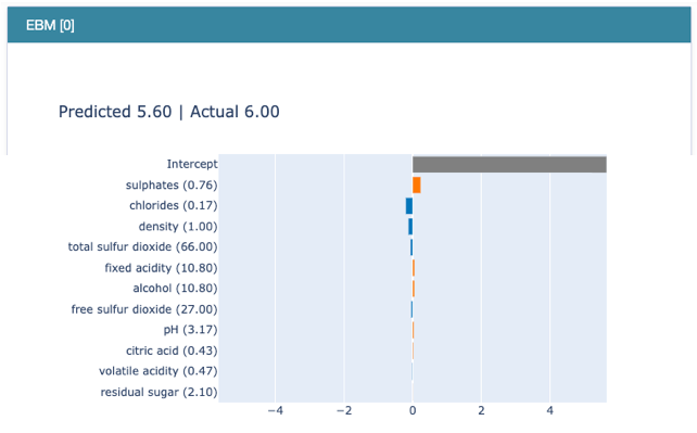
Local interpretability: The interpretation for each prediction is important in Explainable AI. InterpretML lets you explain each prediction like Figure IX. It says the reason that the predicted variable is 5.60 is due to those influencers in descending order.
All of the above can be put together in an elegant dashboard. I think this is the best and is irresistible!
If you want to implement the code and understand the detail, click this article “Explain Your Model with Microsoft’s InterpretML” which provides a gentle mathematical background and then shows you how to conduct the modeling.
(D) Explainable AI Can Include Prediction Intervals
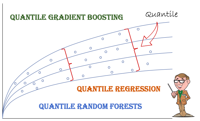
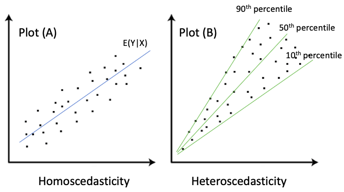
I believe one important piece of information in the development of Explainable AI is prediction intervals. Most applied machine learning techniques typically deliver the mean prediction. Prediction Intervals are not incorporated into machine learning techniques until recent years. Important advancement has been made to Quantile Gradient Boosting and Quantile Random Forests. Why do we need prediction intervals beside the mean predictions? Prediction intervals provide the range of the predicted values. In financial risk management, the prediction intervals for the high range can help risk managers to mitigate risks. In science, a predicted life of a battery between 100 to 110 hours can inform users when to take action. Figure XI shows the intervals become wider for large values. It will be helpful to model a range of percentiles of the target variable.
In “A Tutorial on Quantile Regression, Quantile Random Forests, and Quantile GBM”, I show Quantile GBM can build several models for a range of percentiles of the target variable like Figure XII. The variable importance charts vary in different models. This quantile GBM provides much more insight into global interpretability than the standard GBM that aims at only the conditional mean.
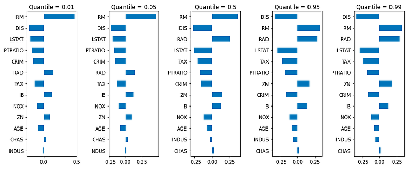
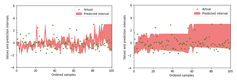
Figure XIII shows how prediction intervals are achieved.
If you are interested in producing quantile measures for Random Forests or GBM, the article “A Tutorial on Quantile Regression, Quantile Random Forests, and Quantile GBM” gives you much detail.
Model Interpretability Does Not Mean Causality
It is important to point out that the model interpretability does not imply causality. To prove causality, you need different techniques. In the “identify causality” series of articles, I demonstrate econometric techniques that identify causality. Those articles cover the following techniques: Regression Discontinuity (see “Identify Causality by Regression Discontinuity”), Difference in differences (DiD)(see “Identify Causality by Difference in Differences”), Fixed-effects Models (See “Identify Causality by Fixed-Effects Models”), and Randomized Controlled Trial with Factorial Design (see “Design of Experiments for Your Change Management”).
The Model Explainability Article Series
For those of you who are interested in model explainability, the following sequence will be helpful:
Part I: Explain Your Model with the SHAP Values
Part II: The SHAP with More Elegant Charts
Part III: How Is the Partial Dependent Plot Calculated?
Part VI: An Explanation for eXplainable AI
Part V: Explain Any Models with the SHAP Values — Use the KernelExplainer
Part VI: The SHAP Values with H2O Models
Part VII: Explain Your Model with LIME
Part VIII: Explain Your Model with Microsoft’s InterpretML
In a modeling project, you explore the data, train the models, compare the model performance, then examine the predictions globally and locally — you get it all in the InterpretML module. It is a one-stop shop and easy to use. However, I want to remind you no machine can replace the creativity of feature engineering. Check “A Data Scientist’s Toolkit to Encode Categorical Variables to Numeric”, “Avoid These Deadly Modeling Mistakes that May Cost You a Career”, and “Feature Engineering for Healthcare Fraud Detection”, and “Feature Engineering for Credit Card Fraud Detection”. Or you can bookmark “Dataman Learning Paths — Build Your Skills, Drive Your Career“ for all articles.
Join Medium with my referral link — Chris Kuo/Dr. Dataman
Readers are recommended to purchase books by Chris Kuo:

- The explainable AI: https://a.co/d/cNL8Hu4
- Transfer learning for image classification: https://a.co/d/hLdCkMH
- Modern time series anomaly detection: https://a.co/d/ieIbAxM
- Handbook of Anomaly Detection: https://a.co/d/5sKS8bI


