
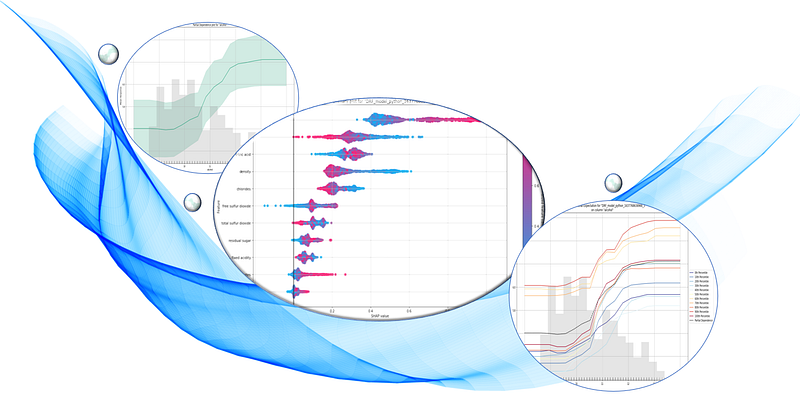
The SHAP Values with H2O Models
Many machine learning algorithms are complicated and not easy to understand, even though they have rendered an impressive level of accuracy. As humans, we must be able to fully understand how decisions are being made so that we can trust the decisions of AI systems. We need ML models to function as expected, to produce transparent explanations, and to be visible in how they work. Explainable AI (XAI) is important research and has been guiding the development of AI.
Since many data scientists have used the H2O open-source module, why shouldn’t we cover advances in H2O for model explainability? The good news is that H2O has released its model explainability capacity in this H2O document. So in this article, I will demonstrate how to do that with H2O.
This article is a sister article to the following articles. If you have not read any of these articles, I strongly recommend that you reference at least Part I to Part III.
Part I: Explain Your Model with the SHAP Values
Part II: The SHAP with More Elegant Charts
Part III: How Is the Partial Dependent Plot Calculated?
Part VI: An Explanation for eXplainable AI
Part V: Explain Any Models with the SHAP Values — Use the KernelExplainer
Part VI: The SHAP Values with H2O Models
Part VII: Explain Your Model with LIME
Part VIII: Explain Your Model with Microsoft’s InterpretML
Benefits of the SHAP (SHapley Additive exPlanations)
The article “Explain Your Model with the SHAP Values” explains the power of SHAP extensively. Here let’s summarize its merits. The SHAP (SHapley Additive exPlanations) deserves its own space rather than an extension of the Shapley value. Inspired by several methods (1,2,3,4,5,6,7) on model interpretability, Lundberg and Lee (2016) proposed the SHAP value as a united approach to explaining the output of any machine learning model. Three benefits worth mentioning here.
- The first one is global interpretability — the collective SHAP values can show how much each predictor contributes, either positively or negatively, to the target variable. This is like the variable importance plot but it can show the positive or negative relationship for each variable with the target (see the SHAP value plot below).
- The second benefit is local interpretability — each observation gets its own set of SHAP values (see the individual SHAP value plot below). This greatly increases its transparency. We can explain why a case receives its prediction and the contributions of the predictors. Traditional variable importance algorithms only show the results across the entire population but not in each case. The local interpretability enables us to pinpoint and contrast the impacts of the factors.
- Third, the SHAP values can be calculated for any tree-based model, while other methods use linear regression or logistic regression models as surrogate models.
To let you compare and contrast the differences, this article uses the same dataset, model algorithm, and the same observation for local interpretation.
You can install the H2O open source module conda install -c h2oai h2o. The code and notebook in this article can be downloaded via this link.
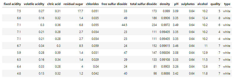
In this post, I build a random forest regression model with H2O. The dataset is the red wine quality data in Kaggle.com. The target value of this dataset is the quality rating from low to high (0–10). The input variables are the content of each wine sample including fixed acidity, volatile acidity, citric acid, residual sugar, chlorides, free sulfur dioxide, total sulfur dioxide, density, pH, sulphates, and alcohol. Notice the specific H2O syntax to do the train-test split.
(A) H2O’s One-Line Code Makes It Easy
H2O builds the entire process in a pipeline. With only one line of code, you are going to see five exhibits:
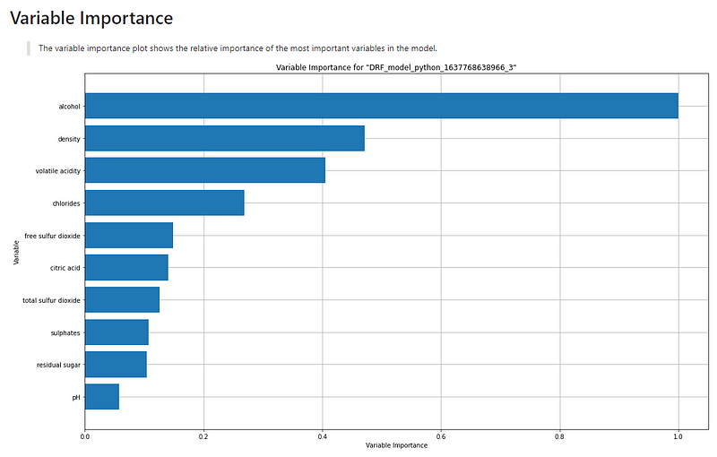
- (A.1) the overall model variable importance,
- (A.2) the SHAP summary plot,
- (A.3) the partial dependence plot,
- (A.4) the individual conditional expectation plot, and
- (A.5) the residual plot.
(A.1) The Overall Model Variable Importance
The variable importance plot shows the relative importance of the most important variables in the model.
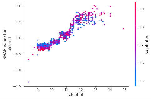
(A.2) The SHAP Summary Plot
The SHAP summary plot shows the positive and negative relationships of the predictors with the target variable. The description above the graph says:
“SHAP summary plot shows the contribution of the features for each instance (row of data). The sum of the feature contributions and the bias term is equal to the raw prediction of the model, i.e., prediction before applying the inverse link function.
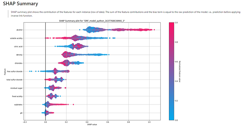
It demonstrates the following information:
- Feature importance: Variables are ranked in descending order.
- Impact: The horizontal location shows whether the effect of that value is associated with a higher or lower prediction.
- Original value: Color shows whether that variable is high (in red) or low (in blue) for that observation.
- Correlation: A high level of “alcohol” content has a high and positive impact on the quality rating. The “high” comes from the red color, and the “positive” impact is shown on the X-axis. Similarly, we will say the “volatile acidity” is negatively correlated with the target variable.
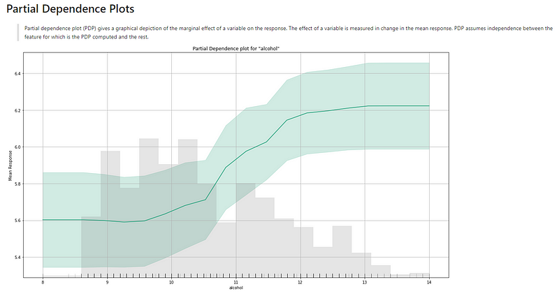
(A.3) The Partial Dependence Plot
Figure (A.3.1) is the partial dependence plot (PDP) by H2O. It may look different from the PDP in Chapter 1, which I reprint in Figure (A.3.2) for comparison. Figure (A.3.1) delivers the same information. The X-axis in Figure (A.3.1) is “alcohol” and the Y-axis is “Mean Response”. The gray bars are the histogram of the variable “alcohol”. The description above the graph says:
“Partial dependence plot (PDP) gives a graphical depiction of the marginal effect of a variable on the response. The effect of a variable is measured by the change in the mean response. PDP assumes independence between the feature for which is the PDP computed and the rest.”
The green line, as well as its confidence interval, shows there is an approximately linear and positive trend between “alcohol” and the target variable “quality”.
Below The following plot shows, that there is an approximately linear and negative trend between “density” and the target variable.
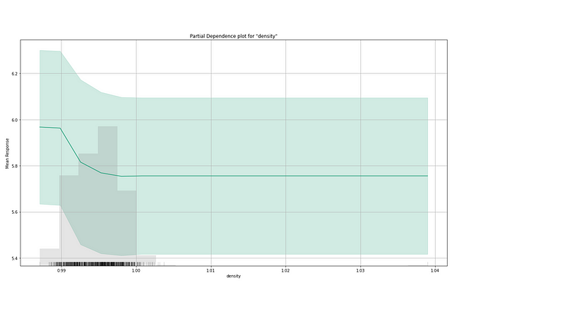
The partial dependence plot for the average effect of a feature is a global method. It does not focus on a specific data point (or record/instance). Section (A.4) introduces another method called the individual conditional expectation.
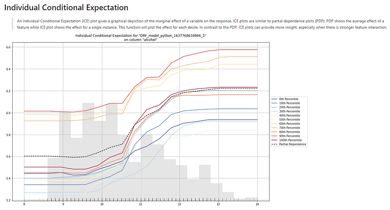
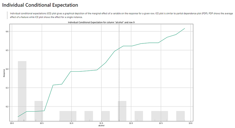
(A.4) The Individual Conditional Expectation Plot
An equivalent plot to a PDP for individual data instances is called the individual conditional expectation (ICE) plot by Goldstein et al. 2017. An ICE plot visualizes the dependence of the prediction on a feature for each instance separately, resulting in one line per instance. If you take the average of the lines of an ICE plot, it becomes a PDP.
How are the values in an ICE plot generated? The idea is similar to the generation of a PDP. It keeps all other features the same and creates small variants of the chosen instance. These new data points are fed to the model to produce their respective predictions.
Figure (A.4) is the ICE plot for “alcohol” and the target. The description above the graph says:
“An Individual Conditional Expectation (ICE) plot gives a graphical depiction of the marginal effect of a variable on the response. ICE plots are similar to partial dependence plots (PDP); PDP shows the average effect of a feature while ICE plot shows the effect for a single instance. This function will plot the effect for each decile. In contrast to the PDP, ICE plots can provide more insight, especially when there is stronger feature interaction.”
First, we notice there are gray bars. They are the histogram of the variable “alcohol”. Second, there are ten lines representing every 10th percentile. In the middle of the ten lines lies a dashed line (you may not be able to see it due to the small image). That dashed line, labeled “Partial Dependence Plot” in the graph, is the PDP line. These lines show the positive correlation between “alcohol” and “quality” — as the value of alcohol increases, the target value of “quality” also increases.
(A.5) The Residual Plot
Residuals are the differences between the actual values and the predicted values. If a model captures the patterns in the data well, there should not be any residual patterns left in the residual plot. Patterns can indicate potential problems that a model does not capture, such as heteroscedasticity, autocorrelation, and so on. We can plot the residuals against each input variable.
If we use a scatter plot to show the residuals on the Y-axis and the predicted values on the X-axis, we should see the residuals randomly dispersed around the horizontal axis. Figure (A.5.1) shows the ideal residual plot in the middle (marked by the green check). The other two graphs tell us there are still patterns uncaptured.
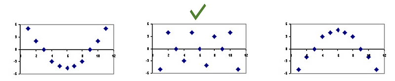
Figure (A.5.2) is the residual plot for the random forest model. You may feel strange why there are “striped” lines of residuals. This is because the target variable Y is an integer-valued variable.
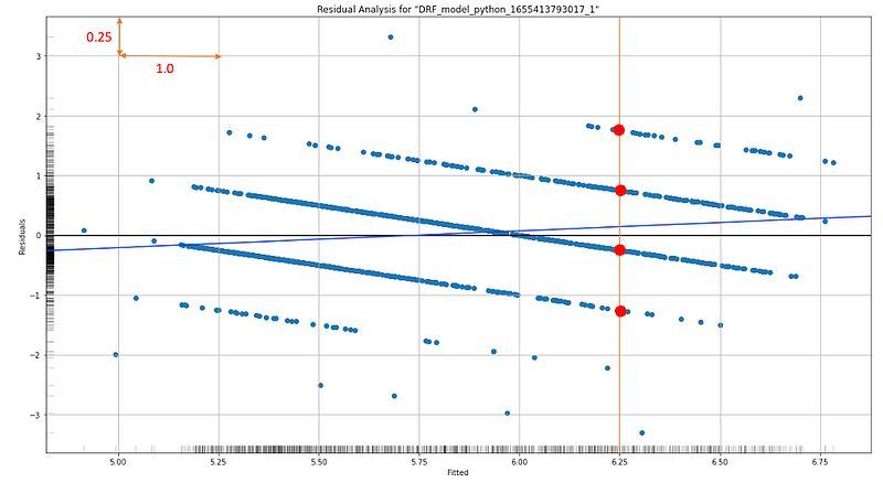
Let me explain further. Residuals are the difference between an observed Y and its predicted value. Because Y values are integers, the residuals for each integer value will line up along the integer values, and the residuals will have a slope of -1.0 on a residual plot. For any given X value (like 6.25), there are corresponding points (the red dots) on these lines. The average of those corresponding points tends to be zero. Notice the scale is 1.0 vs. 0.25 so visually the slope may not look like -1.0, but it is -1.0.
Figure (A.5.2) also shows residuals are parallel and roughly randomly distributed (along the integers). This is plausible. If these “error lines” are not parallel but dispersed with different slopes, the issue of heteroscedasticity may exist.
(B) Explaining More Observations
In the analysis below I identify the same observation that was used in Explain Your Model with the SHAP Values. The 10th row is the exact one that was used. Do you notice that I also include a few other records? While generating the small variants for the 10th row, ICE needs a few other rows to generate such small variants. If I do not include other rows, ICE cannot generate the small variants for the ICE plot.
(B.1) Explaining an Observation
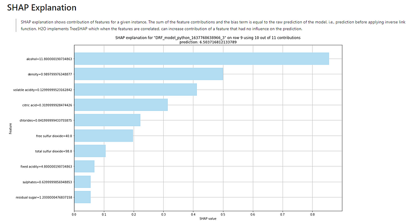
The explanation for this observation is shown in Figure (B.1). The description above the graph says:
“SHAP explanation shows the contribution of features for a given instance. The sum of the feature contributions and the bias term is equal to the raw prediction of the model, i.e., prediction before applying the inverse link function. H2O implements TreeSHAP which when the features are correlated, can increase the contribution of a feature that did not influence the prediction.”
Remember the base value is the value that would be predicted if we did not know any features for the current output. In other words, it is the mean prediction, or mean(yhat).
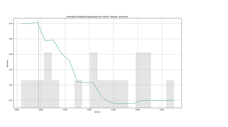
(B.2) Individual Conditional Expectation
The interpretation for the ICE plots is the same as (A.4). Below I only include two ICE plots.
Readers are recommended to purchase books by Chris Kuo:

- The explainable AI: https://a.co/d/cNL8Hu4
- Transfer learning for image classification: https://a.co/d/hLdCkMH
- Modern time series anomaly detection: https://a.co/d/ieIbAxM
- Handbook of Anomaly Detection: https://a.co/d/5sKS8bI


