
2Y Big Techs Portfolio Diversification, Risk-Return Tradeoff and LSTM Price Prediction: AAPL, NVDA, META & AMZN
- This article explores the innovative application of stock correlation + risk-return tradeoff + LSTM price prediction technology in investing decision-making, highlighting its potential to revolutionize traditional portfolio management methodologies.
- LTSMs are a type of Recurrent Neural Network for learning long-term dependencies. It is commonly used for processing and predicting time-series data.
- Our case study will focus on performance, correlations and trends of the following 4 Big Techs: AAPL, NVDA, META, and AMZN.
Business Case
- The dominance of Big Techs has continued so far, driven by a strong rally in AI. The big question is whether these stocks will be able to sustain their impressive gains in the near future.
- Diversification remains essential: investors will likely be well aware by now that the US stock market is top-heavy. The S&P 500 Index is more heavily concentrated than it was at the peak of the dot-com era.
Project Objectives
- Comprehensive Exploratory Data Analysis (EDA), including descriptive analytics and correlations.
- Comparison of Moving Average (MA) lines for most commonly-used periods of 20, 50, and 100 days.
- Comparison of returns and volatility for individual stocks.
- Predicting AAPL prices using LSTM regression.
- Read more here.
Project Technical Highlights:
- Joint analysis of yearly stock returns vs volatility
- Analysis of kurtosis and skewness to describe histograms of daily returns.
- Stock Correlation Analysis using various pairplots and correlation matrix of close prices and daily returns.
- Comparing expected returns vs risks of tech stocks
- Alpha & Beta Performance Analysis
- Standard Error of the Mean Close Price
- Z-Score of Stock Close Prices
- Stock Technical analysis: Close price, SMA and EMA indicators, Volume, Bollinger Bands, Beta, Covariance, Daily/Cumulative Returns, and the Volume Weighted Average Price (VWAP)
- Comprehensive Statistical Testing prior to ML: ADF, KPSS, KW, HP and MK for both close prices and daily returns.
- Class Performance heatmap by Calendar Year: Tech Stocks, Proposed Portfolio & SPY benchmark.
- Accurate LSTM Keras Price Prediction.
Let’s delve into the specifics of our approach!
Input Stock Data
- Setting the working directory, importing libraries and fetching 2Y historical stock data from Yahoo Finance
import os
os.chdir('YOURPATH')    # Set working directory
os. getcwd()

import pandas as pd
import numpy as np

import matplotlib.pyplot as plt
import seaborn as sns
sns.set_style('whitegrid')
plt.style.use("fivethirtyeight")
%matplotlib inline

# For reading stock data from yahoo
from pandas_datareader.data import DataReader
import yfinance as yf
from pandas_datareader import data as pdr

yf.pdr_override()

# For time stamps
from datetime import datetime

# The tech stocks we'll use for this analysis
assets = ['AAPL', 'NVDA', 'META', 'AMZN']

end = datetime.now()
start = datetime(end.year - 2, end.month, end.day)

#create a dataframe to store the adjusted close proce of the stocks
df = pd.DataFrame()

#Store the adjusted close price of the stock into the df
for stock in assets:
    df[stock] = pdr.get_data_yahoo(stock, start =start, end=end)["Adj Close"]

df.tail()
           AAPL       NVDA       META        AMZN
Date
2024-05-08 182.492477 904.119995 472.600006 188.000000
2024-05-09 184.320007 887.469971 475.420013 189.500000
2024-05-10 183.050003 898.780029 476.200012 187.479996
2024-05-13 186.279999 903.989990 468.010010 186.570007
2024-05-14 187.429993 913.559998 471.850006 187.070007- Obtaining a concise summary of the DataFrame's structure and information
df.shape
(502, 4)

df.info()
<class 'pandas.core.frame.DataFrame'>
DatetimeIndex: 502 entries, 2022-05-16 to 2024-05-14
Data columns (total 4 columns):
 #   Column  Non-Null Count  Dtype
---  ------  --------------  -----
 0   AAPL    502 non-null    float64
 1   NVDA    502 non-null    float64
 2   META    502 non-null    float64
 3   AMZN    502 non-null    float64
dtypes: float64(4)
memory usage: 35.8 KB

df.describe().T
Yearly Stock Returns
- Calculating the mean yearly returns for individual companies
ind_er = df.resample('Y').last().pct_change().mean()
ind_er
AAPL    0.231659
NVDA    1.611267
META    1.133273
AMZN    0.515567
dtype: float64- Plotting the mean yearly returns for individual companies in matplotlib
import numpy as np
import matplotlib.pyplot as plt

# creating the dataset
data = {'AAPL':ind_er[0], 'NVDA':ind_er[1], 'META':ind_er[2],
        'AMZN':ind_er[3]}
courses = list(data.keys())
values = list(data.values())

fig = plt.figure(figsize = (10, 5))

# creating the bar plot
plt.bar(courses, values, color ='maroon',
        width = 0.4)

plt.xlabel("Stocks")
plt.ylabel("Returns")
plt.title("Yearly Returns for Individual Companies")
plt.show()
Yearly Stock Volatility
- Volatility is the rate at which the price of a stock increases or decreases over a particular period.
- Let’s calculate volatility based on the annual std
# Volatility is given by the annual standard deviation. We multiply by 250 because there are 250 trading days/year.
ann_sd = df.pct_change().apply(lambda x: np.log(1+x)).std().apply(lambda x: x*np.sqrt(250))
ann_sd
AAPL    0.269251
NVDA    0.519329
META    0.486647
AMZN    0.372133
dtype: float64- Plotting the yearly volatility
# creating the dataset
data = {'AAPL':ann_sd[0], 'NVDA':ann_sd[1], 'META':ann_sd[2],
        'AMZN':ann_sd[3]}
courses = list(data.keys())
values = list(data.values())

fig = plt.figure(figsize = (10, 5))

# creating the bar plot
plt.bar(courses, values, color ='maroon',
        width = 0.4)

plt.xlabel("Stocks")
plt.ylabel("Volatility")
plt.title("Yearly Volatility for Individual Companies")
plt.show()
- Creating a table for visualizing returns and volatility of assets
assets = pd.concat([ind_er, ann_sd], axis=1)
assets.columns = ['Returns', 'Volatility']
assets

     Returns Volatility
AAPL 0.233078 0.269251
NVDA 1.617507 0.519329
META 1.137904 0.486647
AMZN 0.520010 0.372133
Exploratory Data Analysis (EDA)
- Comparing the Adj Close price of assets
assets = ['AAPL', 'NVDA', 'META', 'AMZN']
plt.figure(figsize=(15, 10))
plt.subplots_adjust(top=1.25, bottom=1.2)

for i, company in enumerate(assets, 1):
    plt.subplot(2, 2, i)
    df[assets[i - 1]].plot()
    plt.ylabel('Adj Close')
    plt.xlabel(None)
    plt.title(f"{assets[i - 1]}")

plt.tight_layout()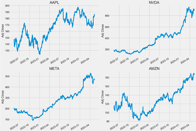
- Comparing the number of shares being traded every trading day
plt.figure(figsize=(15, 10))
plt.subplots_adjust(top=1.25, bottom=1.2)

for i, company in enumerate(assets, 1):
    plt.subplot(2, 2, i)
    dfv[assets[i - 1]].plot()
    plt.ylabel('Volume')
    plt.xlabel(None)
    plt.title(f"{assets[i - 1]}")

plt.tight_layout()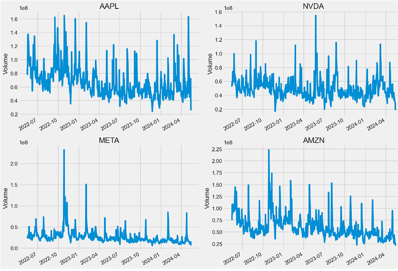
Stock Data Preparation
- Modifying the stock data structure for further steps to follow
tech_list = ['AAPL', 'NVDA', 'META', 'AMZN']


end = datetime.now()
start = datetime(end.year - 2, end.month, end.day)

for stock in tech_list:
    globals()[stock] = yf.download(stock, start, end)

company_list = [AAPL, NVDA, META, AMZN]
company_name = ["APPLE", "NVIDIA", "META", "AMAZON"]

for company, com_name in zip(company_list, company_name):
    company["company_name"] = com_name

df = pd.concat(company_list, axis=0)
df.tail(10)

           Open       High       Low        Close      Adj Close   Volume company_name
Date
2024-05-01 181.639999 185.149994 176.559998 179.000000 179.000000 94645100 AMAZON
2024-05-02 180.850006 185.100006 179.910004 184.720001 184.720001 54303500 AMAZON
2024-05-03 186.990005 187.869995 185.419998 186.210007 186.210007 39172000 AMAZON
2024-05-06 186.279999 188.750000 184.800003 188.699997 188.699997 34725300 AMAZON
2024-05-07 188.919998 189.940002 187.309998 188.759995 188.759995 34048900 AMAZON
2024-05-08 187.440002 188.429993 186.389999 188.000000 188.000000 26136400 AMAZON
2024-05-09 188.880005 191.699997 187.440002 189.500000 189.500000 43368400 AMAZON
2024-05-10 189.160004 189.889999 186.929993 187.479996 187.479996 34141800 AMAZON
2024-05-13 188.000000 188.309998 185.360001 186.570007 186.570007 24878100 AMAZON
2024-05-14 183.692001 186.119904 183.500000 186.119904 186.119904 21151019 AMAZON

df.head(10)
           Open       High       Low        Close     Adj Close    Volume company_name
Date
2022-05-16 145.550003 147.520004 144.179993 145.539993 143.911819 86643800 APPLE
2022-05-17 148.860001 149.770004 146.679993 149.240005 147.570450 78336300 APPLE
2022-05-18 146.850006 147.360001 139.899994 140.820007 139.244629 109742900 APPLE
2022-05-19 139.880005 141.660004 136.600006 137.350006 135.813477 136095600 APPLE
2022-05-20 139.089996 140.699997 132.610001 137.589996 136.050766 137426100 APPLE
2022-05-23 137.789993 143.259995 137.649994 143.110001 141.509003 117726300 APPLE
2022-05-24 140.809998 141.970001 137.330002 140.360001 138.789780 104132700 APPLE
2022-05-25 138.429993 141.789993 138.339996 140.520004 138.947983 92482700 APPLE
2022-05-26 137.389999 144.339996 137.139999 143.779999 142.171494 90601500 APPLE
2022-05-27 145.389999 149.679993 145.259995 149.639999 147.965942 90978500 APPLE
Moving Averages (MA)
- Computing and plotting MA-20, MA-50, and MA-100
ma_day = [20, 50, 100]

for ma in ma_day:
    for company in company_list:
        column_name = f"MA-{ma}"
        company[column_name] = company['Adj Close'].rolling(ma).mean()

fig, axes = plt.subplots(nrows=2, ncols=2)
fig.set_figheight(10)
fig.set_figwidth(15)

AAPL[['Adj Close', 'MA-20', 'MA-50', 'MA-100']].plot(ax=axes[0,0])
axes[0,0].set_title('APPLE')

NVDA[['Adj Close', 'MA-20', 'MA-50', 'MA-100']].plot(ax=axes[0,1])
axes[0,1].set_title('NVIDIA')

META[['Adj Close', 'MA-20', 'MA-50', 'MA-100']].plot(ax=axes[1,0])
axes[1,0].set_title('META')

AMZN[['Adj Close', 'MA-20', 'MA-50', 'MA-100']].plot(ax=axes[1,1])
axes[1,1].set_title('AMAZON')

fig.tight_layout()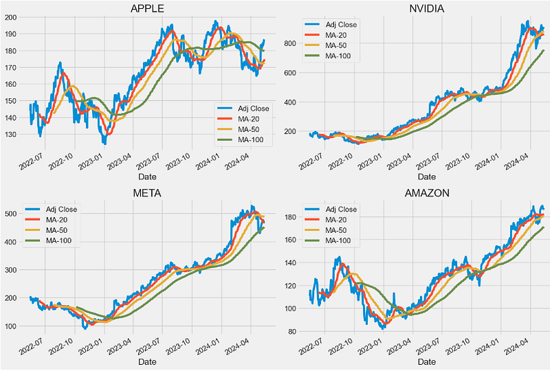
Statistical Analysis of Daily Returns
- One of the best ways to evaluate how well your stocks are performing is to calculate their daily return. Basically, it tells you how much a stock’s value changed over a day. Using this information, you can determine whether you want to invest more in a company or try investing elsewhere.
- Calculating and plotting the stock daily return with pct_change()
# We'll use pct_change to find the percent change for each day
for company in company_list:
    company['Daily Return'] = company['Adj Close'].pct_change()

# Then we'll plot the daily return percentage
fig, axes = plt.subplots(nrows=2, ncols=2)
fig.set_figheight(10)
fig.set_figwidth(15)

AAPL['Daily Return'].plot(ax=axes[0,0], legend=True, linestyle='--', marker='o')
axes[0,0].set_title('APPLE')

NVDA['Daily Return'].plot(ax=axes[0,1], legend=True, linestyle='--', marker='o')
axes[0,1].set_title('NVDA')

META['Daily Return'].plot(ax=axes[1,0], legend=True, linestyle='--', marker='o')
axes[1,0].set_title('META')

AMZN['Daily Return'].plot(ax=axes[1,1], legend=True, linestyle='--', marker='o')
axes[1,1].set_title('AMAZON')

fig.tight_layout()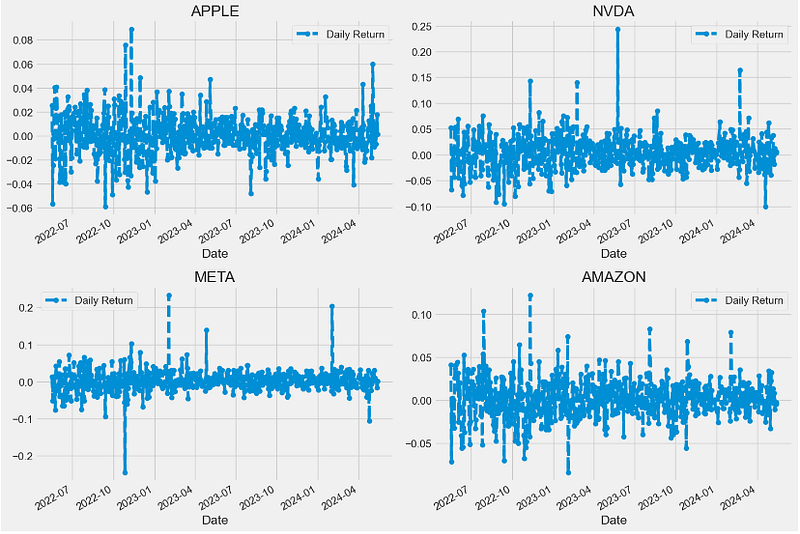
- Plotting histograms of daily returns
plt.figure(figsize=(12, 9))

for i, company in enumerate(company_list, 1):
    plt.subplot(2, 2, i)
    company['Daily Return'].hist(bins=50)
    plt.xlabel('Daily Return')
    plt.ylabel('Counts')
    plt.title(f'{company_name[i - 1]}')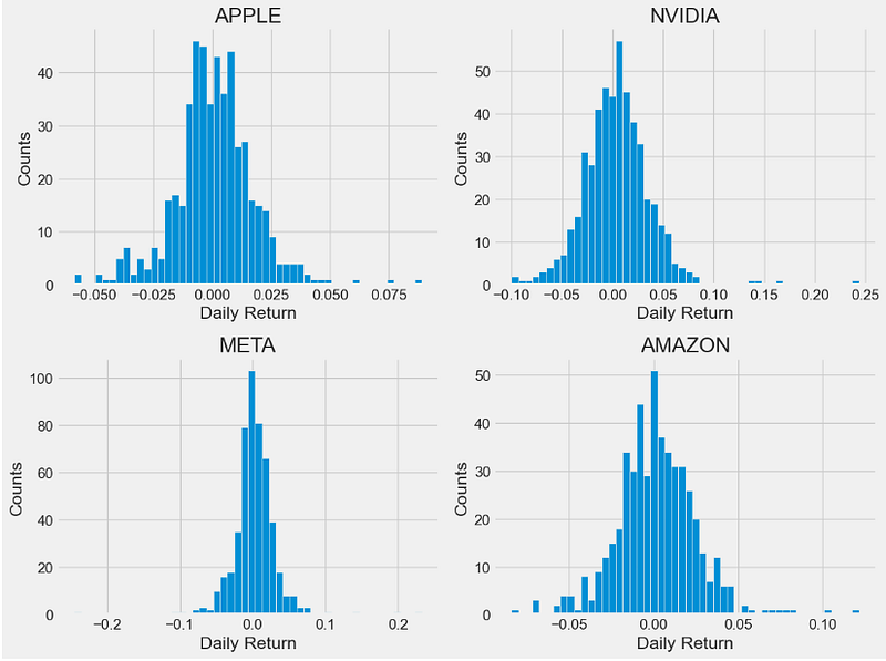
- Let’s look at several statistics which are useful to describe and analyze these histograms:
- Skewness is the measure of the asymmetry of a histogram. A normal distribution will have a skewness of 0. The direction of skewness is “to the tail.” The larger the number, the longer the tail. If skewness is positive, the tail on the right side of the distribution will be longer. If skewness is negative, the tail on the left side will be longer.
- Kurtosis is a measure of the combined weight of the tails in relation to the rest of the distribution. As the tails of a distribution become heavier, the kurtosis value will increase. As the tails become lighter the kurtosis value will decrease. A histogram with a normal distribution has a kurtosis of 0. If the distribution is peaked (tall and skinny), it will have a kurtosis greater than 0 and is said to be leptokurtic. If the distribution is flat, it will have a kurtosis value less than zero and is said to be platykurtic.
- Computing the skewness of daily returns
AAPL['Daily Return'].skew()
0.23567795434841374
NVDA['Daily Return'].skew()
1.0329677183379424
META['Daily Return'].skew()
0.40413996576600136
AMZN['Daily Return'].skew()
0.3378178222049288- Plotting the skewness of daily returns
# creating the dataset
data = {'AAPL':AAPL['Daily Return'].skew(), 'NVDA':NVDA['Daily Return'].skew(), 'META':META['Daily Return'].skew(),
        'AMZN':AMZN['Daily Return'].skew()}
courses = list(data.keys())
values = list(data.values())

fig = plt.figure(figsize = (10, 5))

# creating the bar plot
plt.bar(courses, values, color ='maroon',
        width = 0.4)

plt.xlabel("Stocks")
plt.ylabel("Skewness")
plt.title("Skewness of Daily Returns")
plt.show()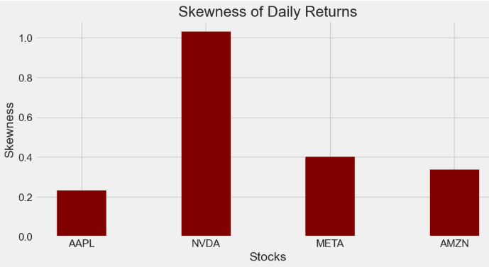
- Computing the kurtosis of daily returns
AAPL['Daily Return'].kurt()
2.700403012617905
NVDA['Daily Return'].kurt()
6.768547282816801
META['Daily Return'].kurt()
18.450763930249277
AMZN['Daily Return'].kurt()
2.5631333999761465- Plotting the kurtosis of daily returns
# creating the dataset
data = {'AAPL':AAPL['Daily Return'].kurt(), 'NVDA':NVDA['Daily Return'].kurt(), 'META':META['Daily Return'].kurt(),
        'AMZN':AMZN['Daily Return'].kurt()}
courses = list(data.keys())
values = list(data.values())

fig = plt.figure(figsize = (10, 5))

# creating the bar plot
plt.bar(courses, values, color ='maroon',
        width = 0.4)

plt.xlabel("Stocks")
plt.ylabel("Kurtosis")
plt.title("Kurtosis of Daily Returns")
plt.show()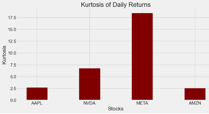
Stock Correlation Analysis
- Correlation is the degree to which the prices of different assets move together. If the prices move in a similar proportion and in the same direction, they have a high correlation. If they move in opposite directions, they have a high negative correlation. If the prices of different assets move in a way generally unrelated to each other, they have a low correlation.
- Preparing the stock daily return data
closing_df = pdr.get_data_yahoo(tech_list, start=start, end=end)['Adj Close']

# Make a new tech returns DataFrame
tech_rets = closing_df.pct_change()
tech_rets.tail()

Ticker AAPL AMZN META NVDA
Date
2024-05-08 0.001864 -0.004026 0.009311 -0.001568
2024-05-09 0.010014 0.007979 0.005967 -0.018416
2024-05-10 -0.006890 -0.010660 0.001641 0.012744
2024-05-13 0.017645 -0.004854 -0.017199 0.005797
2024-05-14 0.001288 -0.000697 0.000523 0.004812- Let’s invoke the sns.jointplot method to plot pairwise relationships in our dataset: using pairwise correlation allows us to detect highly correlated features which bring no new information to the dataset.
- Using the sns.jointplot to compare the daily returns of META and NVDA
sns.jointplot(x='NVDA', y='META', data=tech_rets, kind='scatter')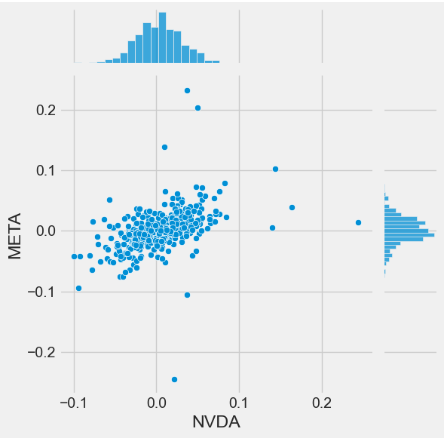
- Using the sns.jointplot to compare the daily returns of META and AMZN
sns.jointplot(x='AMZN', y='META', data=tech_rets, kind='scatter')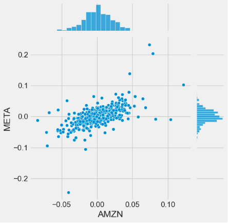
- Using the sns.jointplot to compare the daily returns of AAPL and AMZN
sns.jointplot(x='AMZN', y='AAPL', data=tech_rets, kind='scatter')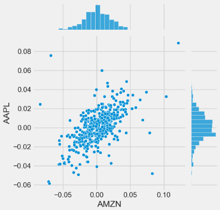
- Invoking the sns.pairplot method to visualize a matrix of relationships between each variable in stock daily returns for an instant (albeit qualitative) examination of highly correlated features
sns.pairplot(tech_rets, kind='reg')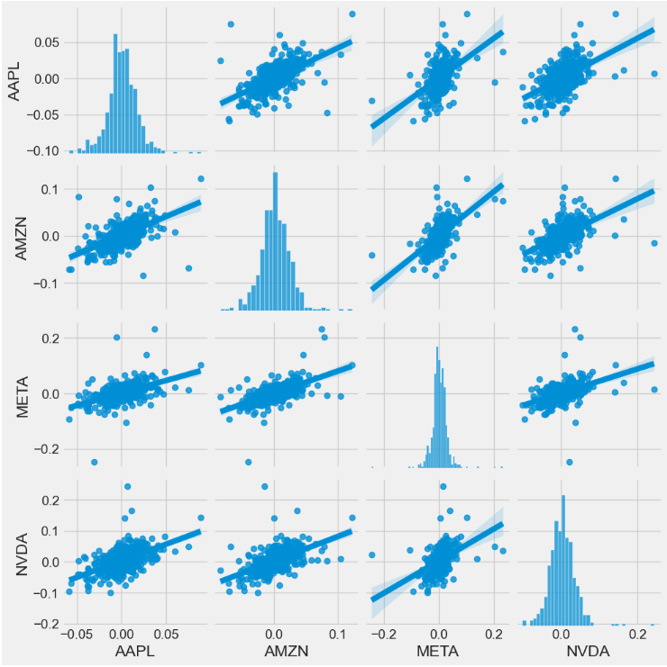
- The PairGrid method leverages the Seaborn library to create a visually appealing matrix pair plot of daily returns with scatter plots (upper triangle), kernel density estimate (KDE) plots (lower triangle), and histograms (diagonal)
return_fig = sns.PairGrid(tech_rets.dropna())
return_fig.map_upper(plt.scatter, color='purple')
return_fig.map_lower(sns.kdeplot, cmap='cool_d')
return_fig.map_diag(plt.hist, bins=30)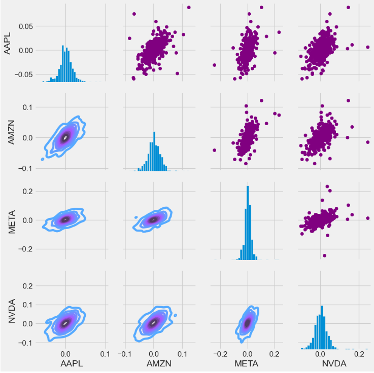
- Invoking the sns.PairGrid method to create a matrix pair plot of stock close prices with scatter plots (upper triangle), KDE plots (lower triangle), and histograms (diagonal)
returns_fig = sns.PairGrid(closing_df)
returns_fig.map_upper(plt.scatter,color='purple')
returns_fig.map_lower(sns.kdeplot,cmap='cool_d')
returns_fig.map_diag(plt.hist,bins=30)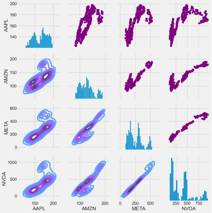
- Let’s look at correlation coefficients. A correlation matrix is a table showing correlation coefficients between variables. Each cell in the table shows the correlation between two variables.
- Creating the correlation matrices of tech stock returns and closing prices
plt.figure(figsize=(12, 10))

plt.subplot(2, 2, 1)
sns.heatmap(tech_rets.corr(), annot=True, cmap='summer')
plt.title('Correlation of stock return')

plt.subplot(2, 2, 2)
sns.heatmap(closing_df.corr(), annot=True, cmap='summer')
plt.title('Correlation of stock closing price')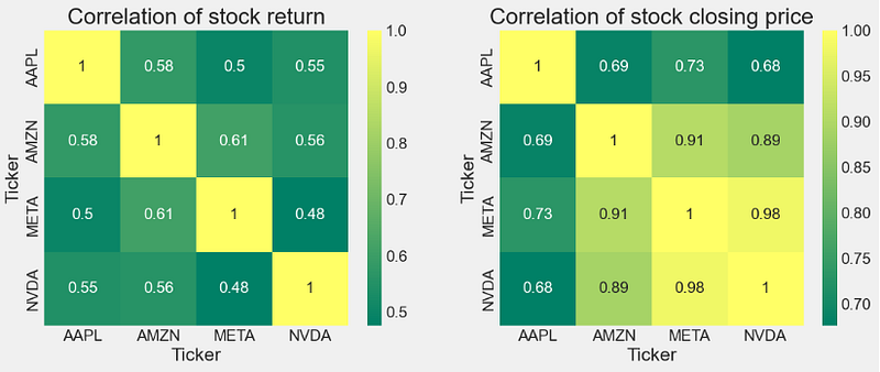
Risk-Return Tradeoff
- Comparing expected returns vs risks of tech stocks
#How much value do we put at risk by investing in a particular stock?
rets = tech_rets.dropna()

area = np.pi * 20

plt.figure(figsize=(10, 8))
plt.scatter(rets.mean(), rets.std(), s=area)
plt.xlabel('Expected return')
plt.ylabel('Risk')

for label, x, y in zip(rets.columns, rets.mean(), rets.std()):
    plt.annotate(label, xy=(x, y), xytext=(50, 50), textcoords='offset points', ha='right', va='bottom',
                 arrowprops=dict(arrowstyle='-', color='blue', connectionstyle='arc3,rad=-0.3'))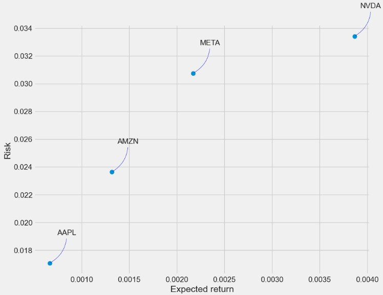
- This plot shows the relationship between the amount of return gained on an asset and the amount of risk undertaken in that asset. The more return sought, the more risk that must be undertaken.
- We can see the following levels of the Risk-Return tradeoff:
- Level 1:NVDA max Risk & Return (aggressive investors)
- Level 2: AMZN Lower Risk & Return (medium-risk, moderate-return investments)
- Level 3: META Higher Risk & Return (moderate-risk, higher returns investors)
- Level 4: AAPL min Risk & Return (defensive investors)
Alpha & Beta Performance Analysis
- Alpha & Beta play a crucial role for maximizing the (Return/Risk) Ratio.
- Let’s begin with fetching the market index data
market = '^GSPC'
dfm = pdr.get_data_yahoo(market, start =start, end=end)- Calculating Alpha & Beta for tech stocks
symbol='AAPL'
new_df = pd.DataFrame({symbol: df['AAPL'], market: dfm['Adj Close']}, index=df.index)

# compute returns
new_df[['stock_returns','market_returns']] = new_df[[symbol,market]] / new_df[[symbol,market]].shift(1) -1
new_df = new_df.dropna()
covmat = np.cov(new_df["stock_returns"],new_df["market_returns"])

# calculate measures now
beta = covmat[0,1]/covmat[1,1]
alpha= np.mean(new_df["stock_returns"])-beta*np.mean(new_df["market_returns"])

print('Stock:', symbol)
print('Beta:', beta)
print('Alpha:', alpha)
Stock: AAPL
Beta: 1.2397948035626773
Alpha: -6.81737838616166e-05

symbol='NVDA'
new_df = pd.DataFrame({symbol: df[symbol], market: dfm['Adj Close']}, index=df.index)

# compute returns
new_df[['stock_returns','market_returns']] = new_df[[symbol,market]] / new_df[[symbol,market]].shift(1) -1
new_df = new_df.dropna()
covmat = np.cov(new_df["stock_returns"],new_df["market_returns"])

# calculate measures now
beta = covmat[0,1]/covmat[1,1]
alpha= np.mean(new_df["stock_returns"])-beta*np.mean(new_df["market_returns"])

print('Stock:', symbol)
print('Beta:', beta)
print('Alpha:', alpha)
Stock: NVDA
Beta: 2.1194428540605177
Alpha: 0.0026122751782576776

symbol='META'
new_df = pd.DataFrame({symbol: df[symbol], market: dfm['Adj Close']}, index=df.index)

# compute returns
new_df[['stock_returns','market_returns']] = new_df[[symbol,market]] / new_df[[symbol,market]].shift(1) -1
new_df = new_df.dropna()
covmat = np.cov(new_df["stock_returns"],new_df["market_returns"])

# calculate measures now
beta = covmat[0,1]/covmat[1,1]
alpha= np.mean(new_df["stock_returns"])-beta*np.mean(new_df["market_returns"])

print('Stock:', symbol)
print('Beta:', beta)
print('Alpha:', alpha)
Stock: META
Beta: 1.678510080329791
Alpha: 0.0011854123639807263

symbol='AMZN'
new_df = pd.DataFrame({symbol: df[symbol], market: dfm['Adj Close']}, index=df.index)

# compute returns
new_df[['stock_returns','market_returns']] = new_df[[symbol,market]] / new_df[[symbol,market]].shift(1) -1
new_df = new_df.dropna()
covmat = np.cov(new_df["stock_returns"],new_df["market_returns"])

# calculate measures now
beta = covmat[0,1]/covmat[1,1]
alpha= np.mean(new_df["stock_returns"])-beta*np.mean(new_df["market_returns"])

print('Stock:', symbol)
print('Beta:', beta)
print('Alpha:', alpha)

Stock: AMZN
Beta: 1.5768388511973255
Alpha: 0.00038106007858145104
- Plotting Beta for tech stocks
import matplotlib.pyplot as plt
ann_sd = [1.2397948035626773,2.1194428540605177,1.678510080329791,1.5768388511973255]

# creating the dataset
data = {'AAPL':ann_sd[0], 'NVDA':ann_sd[1], 'META':ann_sd[2],
        'AMZN':ann_sd[3]}
courses = list(data.keys())
values = list(data.values())

fig = plt.figure(figsize = (10, 5))

plt.rcParams.update({'font.size': 14})

# creating the bar plot
plt.bar(courses, values, color ='green',
        width = 0.4)

plt.xlabel("Stocks")
plt.ylabel("Beta")
plt.title("Beta for Individual Companies")
plt.show()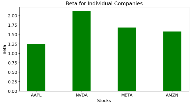
- An alpha of zero suggests that an asset has earned a return commensurate with the risk. Alpha of greater than zero means an investment outperformed, after adjusting for volatility.
- Beta indicates how volatile a stock’s price is in comparison to the ^GSPC benchmark.
- A beta greater than 1 indicates a stock’s price swings more wildly (i.e., more volatile) than the overall market.
- A beta of ~1 indicates the stock moves identically to the overall market.
Standard Error of the Mean Close Price
- Let’s look at the Standard Error (SE) of the mean close price. SE measures how far the sample mean (average) of the close price is likely to be from the true population mean. The SE is always smaller than the std discussed above.
- Calculating the SE of the mean using stats.sem
import numpy as np
import pandas as pd
import matplotlib.pyplot as plt
from scipy import stats


symbol='AAPL'
close=df[symbol]
standard_error = stats.sem(close)
standard_error
0.8475438529774014

symbol='NVDA'
close=df[symbol]
standard_error = stats.sem(close)
standard_error
10.382152476729946

symbol='META'
close=df[symbol]
standard_error = stats.sem(close)
standard_error
5.287668221931584

symbol='AMZN'
close=df[symbol]
standard_error = stats.sem(close)
standard_error
1.2227950351497463


#Plotting the SE of the mean

ann_sd = [0.8475438529774014,10.382152476729946,5.287668221931584,1.2227950351497463]

# creating the dataset
data = {'AAPL':ann_sd[0], 'NVDA':ann_sd[1], 'META':ann_sd[2],
        'AMZN':ann_sd[3]}
courses = list(data.keys())
values = list(data.values())

fig = plt.figure(figsize = (10, 5))


# creating the bar plot
plt.bar(courses, values, color ='green',
        width = 0.4)

plt.tick_params(axis='both', which='major', labelsize=16)

plt.xlabel("Stocks",fontsize=22)
plt.ylabel("SE",fontsize=22)
plt.title("Standard Error (SE) for Individual Companies",fontsize=22)
plt.show()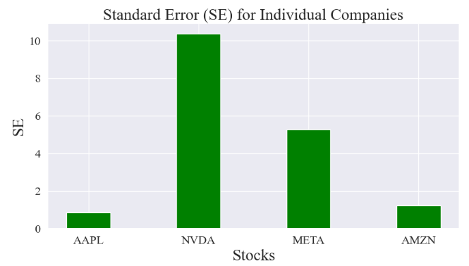
Z-Score of Stock Close Prices
- Z-Score measures how many standard deviations an element is from the mean.
- Z-Score is a general measure of corporate financial health.
- Z-Score is a statistical measure that indicates the robustness of a company. It measures how much of an outlier a data point is.
- Traders can use this score to determine the level of volatility within a given stock.
- Let’s examine the Z-score of tech stocks (close price) using stats.zscore.
- Calculating and plotting the Z-score for APPL
symbol='AAPL'
close=df[symbol]
z = np.abs(stats.zscore(close))
print(z)
Date
2022-05-16    1.115891
2022-05-17    0.923165
2022-05-18    1.361744
2022-05-19    1.542489
2022-05-20    1.529988
                ...
2024-05-09    1.012696
2024-05-10    0.945796
2024-05-13    1.115943
2024-05-14    1.176521
2024-05-15    1.297152
Name: AAPL, Length: 503, dtype: float64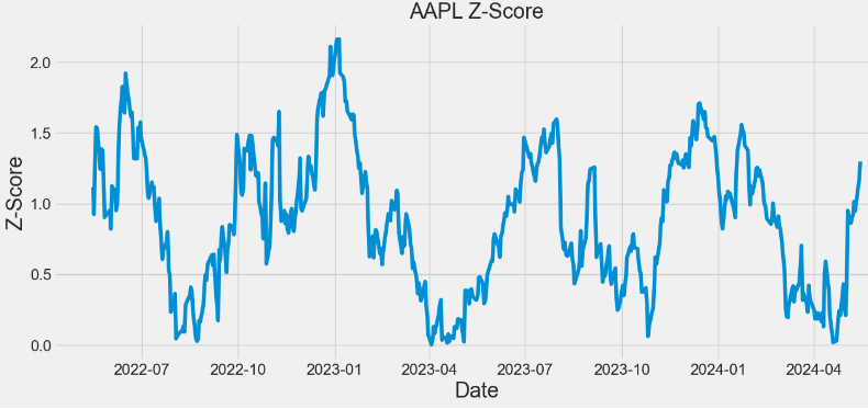
- Calculating and plotting the Z-score for NVDA
symbol='NVDA'
close=df[symbol]
z = np.abs(stats.zscore(close))
print(z)
plt.figure(figsize=(14,6))
plt.plot(z)
plt.xlabel('Date',fontsize=22)
plt.ylabel('Z-Score',fontsize=22)
plt.title('NVDA Z-Score',fontsize=22)
plt.tick_params(axis='both', which='major', labelsize=16)
Date
2022-05-16    0.871880
2022-05-17    0.832835
2022-05-18    0.885821
2022-05-19    0.877867
2022-05-20    0.896256
                ...
2024-05-09    2.189842
2024-05-10    2.238270
2024-05-13    2.260578
2024-05-14    2.301556
2024-05-15    2.441743
Name: NVDA, Length: 503, dtype: float64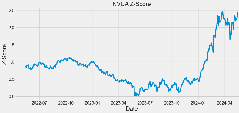
- Calculating and plotting the Z-score for META
symbol='META'
close=df[symbol]
z = np.abs(stats.zscore(close))
print(z)
plt.figure(figsize=(14,6))
plt.plot(z)
plt.xlabel('Date',fontsize=22)
plt.ylabel('Z-Score',fontsize=22)
plt.title('META Z-Score',fontsize=22)
plt.tick_params(axis='both', which='major', labelsize=16)
Date
2022-05-16    0.526391
2022-05-17    0.504668
2022-05-18    0.592066
2022-05-19    0.600065
2022-05-20    0.581120
                ...
2024-05-09    1.796523
2024-05-10    1.803098
2024-05-13    1.734066
2024-05-14    1.766433
2024-05-15    1.848108
Name: META, Length: 503, dtype: float64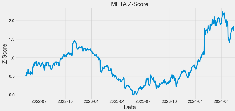
- Calculating and plotting the Z-score for AMZN
symbol='AMZN'
close=df[symbol]
z = np.abs(stats.zscore(close))
print(z)
plt.figure(figsize=(14,6))
plt.plot(z)
plt.xlabel('Date',fontsize=22)
plt.ylabel('Z-Score',fontsize=22)
plt.title('AMZN Z-Score',fontsize=22)
plt.tick_params(axis='both', which='major', labelsize=16)

Date
2022-05-16    0.631334
2022-05-17    0.465373
2022-05-18    0.765982
2022-05-19    0.758463
2022-05-20    0.748559
                ...
2024-05-09    2.233829
2024-05-10    2.160278
2024-05-13    2.127145
2024-05-14    2.145350
2024-05-15    2.106026
Name: AMZN, Length: 503, dtype: float64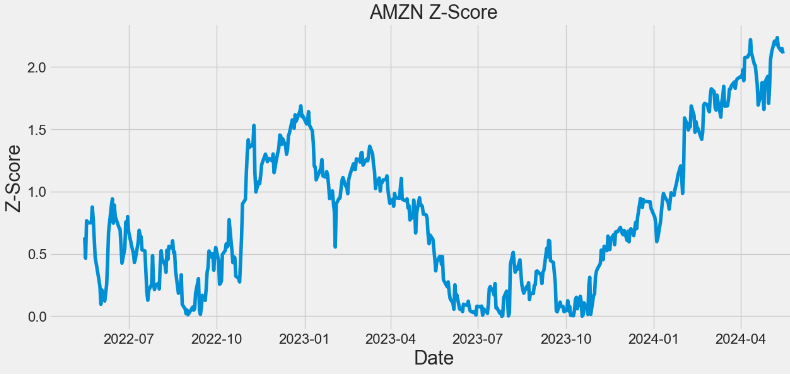
- In the above plots, observing a higher Z-score gives you a higher chance of having enough stock to meet the demand. A lower Z-score means you’ll run a bit more risk of running out.
AAPL Technical Analysis
- Let’s compare the basic indicators of technical analysis (including Beta and VWAP) which are required to confirm the position of AAPL
#AAPL
import yfinance as yf

apple = yf.Ticker("AAPL")
hist = apple.history(period="2y") #2Y period

hist['SMA'] = hist['Close'].rolling(window=20).mean()
hist['EMA'] = hist['Close'].ewm(span=20, adjust=False).mean()
hist['UpperBB'] = hist['SMA'] + (hist['Close'].rolling(20).std() * 2)
hist['LowerBB'] = hist['SMA'] - (hist['Close'].rolling(20).std() * 2)
hist['Daily_Return'] = hist['Close'].pct_change()
hist['Cumulative_Return'] = (1 + hist['Daily_Return']).cumprod()
spy = yf.Ticker("SPY").history(period="2y")
spy['Daily_Return'] = spy['Close'].pct_change()

hist['Covariance'] = hist['Daily_Return'].rolling(window=60).cov(spy['Daily_Return'])
hist['Beta'] = hist['Covariance'] / spy['Daily_Return'].rolling(window=60).var()
hist['VWAP'] = (((hist['High'] + hist['Low'] + hist['Close']) / 3) * hist['Volume']).cumsum() / hist['Volume'].cumsum()- Plotting AAPL Close price, SMA and EMA indicators
import matplotlib.pyplot as plt

hist[['Close', 'SMA', 'EMA']].plot(figsize=(10,5),title="AAPL Close Price, SMA & EMA")
plt.show()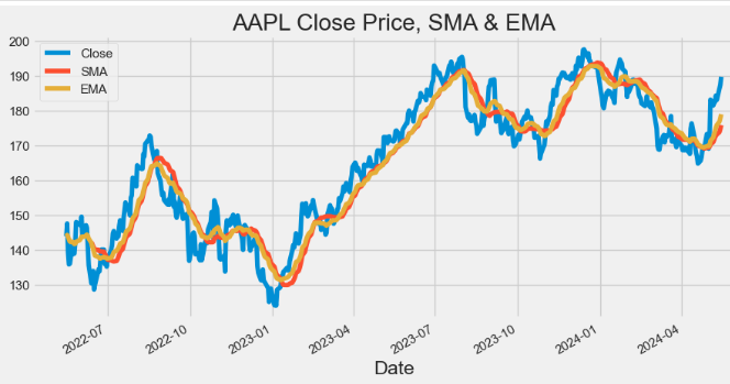
- Plotting AAPL Volume
hist['Volume'].plot(figsize=(10,5),title="AAPL Volume")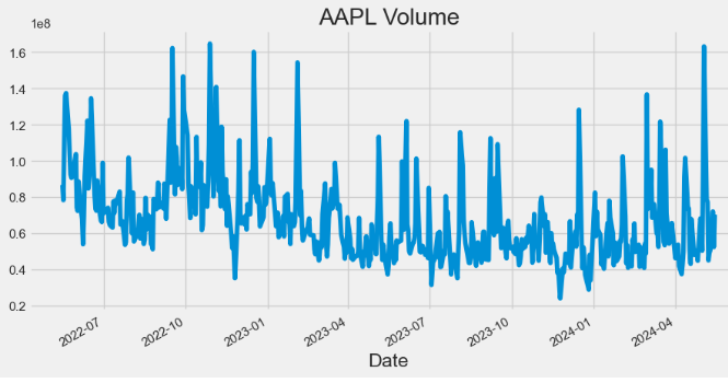
- Plotting AAPL Bollinger Bands (BB)
hist[['Close', 'UpperBB', 'LowerBB']].plot(figsize=(10,5),title="AAPL BB")
plt.show()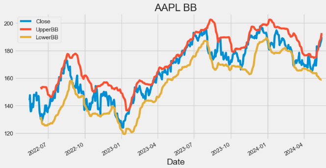
- Plotting AAPL Beta
hist['Beta'].plot(figsize=(10,5),title="AAPL Beta")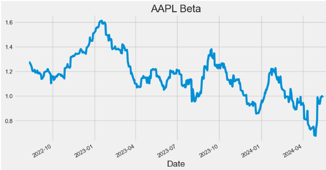
- Plotting AAPL Covariance
hist['Covariance'].plot(figsize=(10,5),title="AAPL Covariance")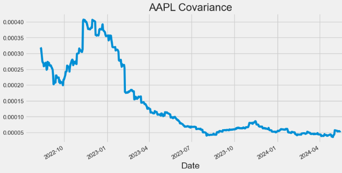
- Plotting AAPL Daily Return
hist['Daily_Return'].plot(figsize=(10,5),title="AAPL Daily Return")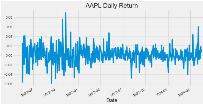
- Plotting AAPL Cumulative Return
hist['Cumulative_Return'].plot(figsize=(10,5),title="AAPL Cumulative Return")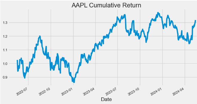
- Plotting AAPL VWAP
import matplotlib.pyplot as plt
hist[['Close', 'VWAP']].plot(figsize=(10,5),title="AAPL VWAP")
plt.grid()
plt.show()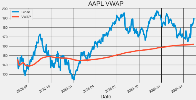
- Here, the Volume Weighted Average Price (VWAP) is a popular trading indicator used by traders and investors to assess the average price of a security based on both its price and trading volume.
- Traders use VWAP to identify potential support and resistance levels for a stock.
- Prices above VWAP indicate an uptrend and if below it shows a downtrend. VWAP also acts as a support or resistance level. Prices decline to VWAP act as a support. And if prices rally up to VWAP, it could act as resistance. VWAP above the closing price indicates buying pressure and bullish sentiment.
- A VWAP below the closing price shows selling pressure and bearish sentiment., It could signal a reversal from a downtrend to uptrend If the price crosses above VWAP. And Price crossing below VWAP indicates a reversal from an uptrend to downtrend. VWAP is also used to set stop-loss or take-profit levels. Traders choose to exit long positions below VWAP or exit short positions above VWAP.
NVDA Technical Analysis
- Extending the proposed technical analysis to NVDA
#NVDA
nvda = yf.Ticker("NVDA")
hist = nvda.history(period="2y")
hist['SMA'] = hist['Close'].rolling(window=20).mean()
hist['EMA'] = hist['Close'].ewm(span=20, adjust=False).mean()

hist['UpperBB'] = hist['SMA'] + (hist['Close'].rolling(20).std() * 2)
hist['LowerBB'] = hist['SMA'] - (hist['Close'].rolling(20).std() * 2)

hist['Daily_Return'] = hist['Close'].pct_change()
hist['Cumulative_Return'] = (1 + hist['Daily_Return']).cumprod()

spy = yf.Ticker("SPY").history(period="2y")
spy['Daily_Return'] = spy['Close'].pct_change()

hist['Covariance'] = hist['Daily_Return'].rolling(window=60).cov(spy['Daily_Return'])
hist['Beta'] = hist['Covariance'] / spy['Daily_Return'].rolling(window=60).var()

# Calculate VWAP
hist['VWAP'] = (((hist['High'] + hist['Low'] + hist['Close']) / 3) * hist['Volume']).cumsum() / hist['Volume'].cumsum()
- Plotting NVDA Close price, SMA and EMA indicators
hist[['Close', 'SMA', 'EMA']].plot(figsize=(10,5),title="NVDA Close Price, SMA & EMA")
plt.show()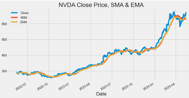
- Plotting NVDA Volume
hist['Volume'].plot(figsize=(10,5),title="NVDA Volume")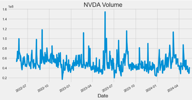
- Plotting NVDA Bollinger Bands (BB)
hist[['Close', 'UpperBB', 'LowerBB']].plot(figsize=(10,5), title="NVDA BB")
plt.show()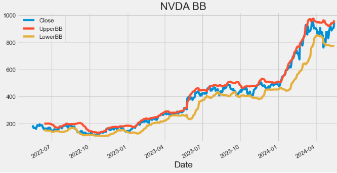
- Plotting NVDA Beta
hist['Beta'].plot(figsize=(10,5),title="NVDA Beta")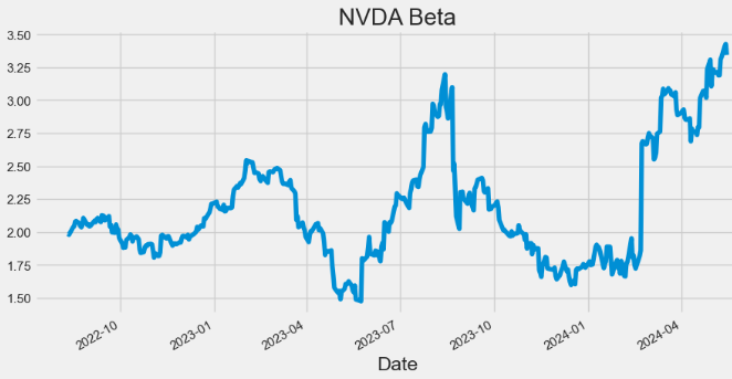
- Plotting NVDA Covariance
hist['Covariance'].plot(figsize=(10,5),title="NVDA Covariance")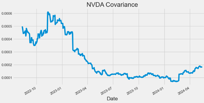
- Plotting NVDA Daily Return
hist['Daily_Return'].plot(figsize=(10,5),title="NVDA Daily Return")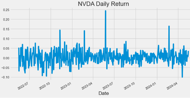
- Plotting NVDA Cumulative Return
hist['Cumulative_Return'].plot(figsize=(10,5),title="NVDA Cumulative Return")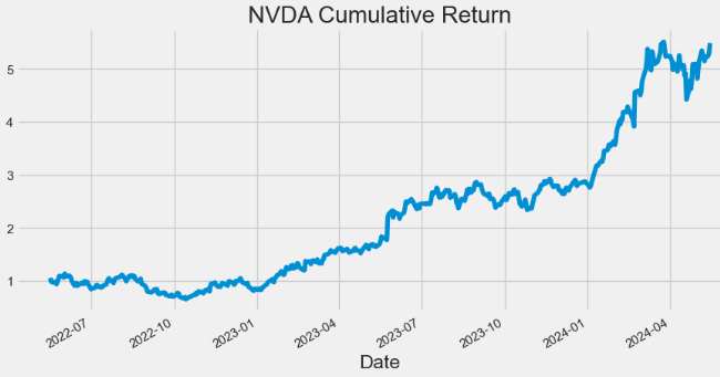
- Plotting NVDA VWAP
import matplotlib.pyplot as plt
hist[['Close', 'VWAP']].plot(figsize=(10,5),title="NVDA VWAP")
plt.grid()
plt.show()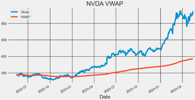
META Technical Analysis
- Extending the proposed technical analysis to META
#META
meta = yf.Ticker("META")
hist = meta.history(period="2y")
hist['SMA'] = hist['Close'].rolling(window=20).mean()
hist['EMA'] = hist['Close'].ewm(span=20, adjust=False).mean()

hist['UpperBB'] = hist['SMA'] + (hist['Close'].rolling(20).std() * 2)
hist['LowerBB'] = hist['SMA'] - (hist['Close'].rolling(20).std() * 2)

hist['Daily_Return'] = hist['Close'].pct_change()
hist['Cumulative_Return'] = (1 + hist['Daily_Return']).cumprod()

spy = yf.Ticker("SPY").history(period="2y")
spy['Daily_Return'] = spy['Close'].pct_change()

hist['Covariance'] = hist['Daily_Return'].rolling(window=60).cov(spy['Daily_Return'])
hist['Beta'] = hist['Covariance'] / spy['Daily_Return'].rolling(window=60).var()- Plotting META Close price, SMA and EMA indicators
hist[['Close', 'SMA', 'EMA']].plot(figsize=(10,5),title="META Close Price, SMA & EMA")
plt.show()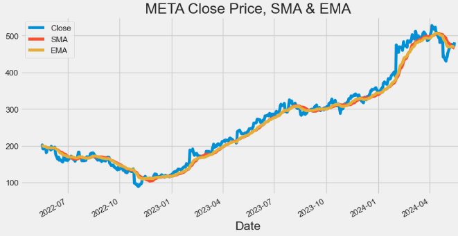
- Plotting META Volume
hist['Volume'].plot(figsize=(10,5),title="META Volume")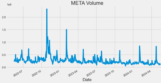
- Plotting META Bollinger Bands (BB)
hist[['Close', 'UpperBB', 'LowerBB']].plot(figsize=(10,5),title="META BB")
plt.show()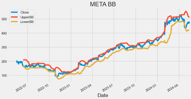
- Plotting META Beta
hist['Beta'].plot(figsize=(10,5),title="META Beta")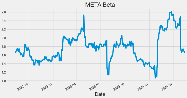
- Plotting META Covariance
hist['Covariance'].plot(figsize=(10,5),title="META Covariance")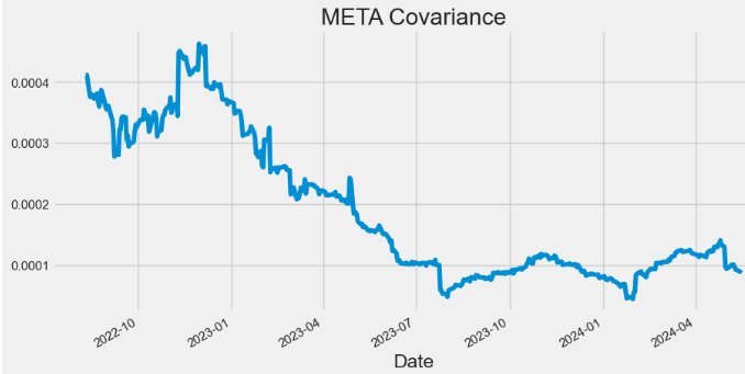
- Plotting META Daily Return
hist['Daily_Return'].plot(figsize=(10,5),title="META Daily Return")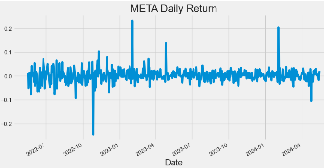
- Plotting META Cumulative Return
hist['Cumulative_Return'].plot(figsize=(10,5),title="META Cumulative Return")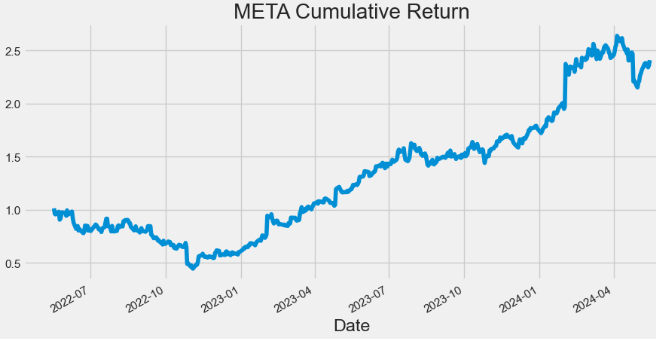
- Plotting META VWAP
import matplotlib.pyplot as plt
hist[['Close', 'VWAP']].plot(figsize=(10,5),title="META VWAP")
plt.grid()
plt.show()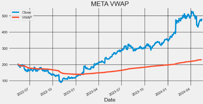
AMZN Technical Analysis
- Extending the proposed technical analysis to AMZN
#AMZN
amzn = yf.Ticker("AMZN")
hist = amzn.history(period="2y")
hist['SMA'] = hist['Close'].rolling(window=20).mean()
hist['EMA'] = hist['Close'].ewm(span=20, adjust=False).mean()

hist['UpperBB'] = hist['SMA'] + (hist['Close'].rolling(20).std() * 2)
hist['LowerBB'] = hist['SMA'] - (hist['Close'].rolling(20).std() * 2)

hist['Daily_Return'] = hist['Close'].pct_change()
hist['Cumulative_Return'] = (1 + hist['Daily_Return']).cumprod()

spy = yf.Ticker("SPY").history(period="2y")
spy['Daily_Return'] = spy['Close'].pct_change()

hist['Covariance'] = hist['Daily_Return'].rolling(window=60).cov(spy['Daily_Return'])
hist['Beta'] = hist['Covariance'] / spy['Daily_Return'].rolling(window=60).var()
# Calculate VWAP
hist['VWAP'] = (((hist['High'] + hist['Low'] + hist['Close']) / 3) * hist['Volume']).cumsum() / hist['Volume'].cumsum()- Plotting AMZN Close price, SMA and EMA indicators
hist[['Close', 'SMA', 'EMA']].plot(figsize=(10,5),title="AMZN Close Price, SMA & EMA")
plt.show()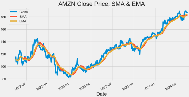
- Plotting AMZN Volume
hist['Volume'].plot(figsize=(10,5),title="AMZN Volume")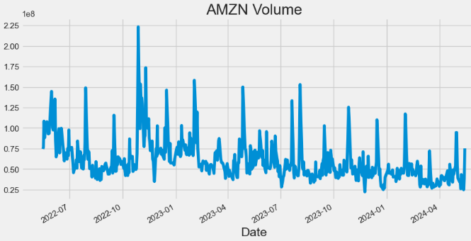
- Plotting AMZN Bollinger Bands (BB)
hist[['Close', 'UpperBB', 'LowerBB']].plot(figsize=(10,5),title="AMZN BB")
plt.show()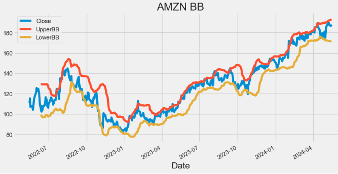
- Plotting AMZN Beta
hist['Beta'].plot(figsize=(10,5),title="AMZN Beta")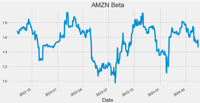
- Plotting AMZN Covariance
hist['Covariance'].plot(figsize=(10,5),title="AMZN Covariance")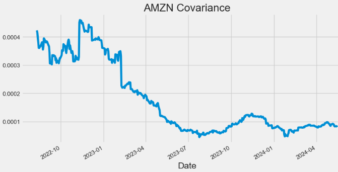
- Plotting AMZN Daily Return
hist['Daily_Return'].plot(figsize=(10,5),title="AMZN Daily Return")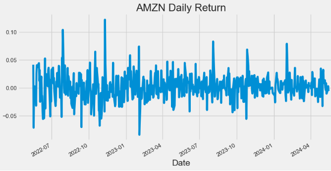
- Plotting AMZN Cumulative Return
hist['Cumulative_Return'].plot(figsize=(10,5),title="AMZN Cumulative Return")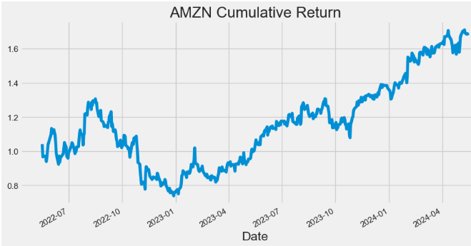
- Plotting AMZN VWAP
import matplotlib.pyplot as plt
hist[['Close', 'VWAP']].plot(figsize=(10,5),title="AMZN VWAP")
plt.grid()
plt.show()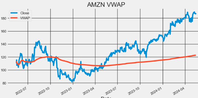
AAPL Statistical Testing
- In addition to the visual inspection of stock trading indicators discussed above, statistical tests provide more objective methods for detecting multiple trends and seasonality.
- Let’s examine at the 2Y AAPL stock
#AAPL
import yfinance as yf

apple = yf.Ticker("AAPL")
hist = apple.history(period="2y")- Augmented Dickey-Fuller (ADF) Test: The ADF test is a hypothesis test used to determine whether a unit root is present in a time series dataset. If the test statistic is less than the critical value and the p-value is less than 0.05, the null hypothesis is rejected, indicating that the series is stationary.
- Kwiatkowski-Phillips-Schmidt-Shin (KPSS) Test: Unlike the ADF test, which assumes a stochastic trend, the KPSS test assumes a deterministic trend.
- Kruskal-Wallis Test: The Kruskal-Wallis test provides evidence of seasonality if the p-value associated with the test statistic is below a chosen significance level (e.g., 0.05).
- Hodrick-Prescott Filter: The Hodrick-Prescott (HP) filter refers to a data-smoothing technique. The HP filter acts as a data smoothing technique, removing high-frequency fluctuations (short-term ups and downs) associated with business cycles. In practical applications, this filter is used to achieve two main goals: smoothing the data by removing short-term noise and detrending the data by extracting the long-term trend component. So basically Hodrick-Prescott filter is indeed a tool used in time series analysis to separate the data into two main components: trend and cycle. Read more here.
- Mann-Kendall Test: The Mann-Kendall (MK) test is a powerful tool for detecting trends in time series data. Although the main concept of MK test is designed for non-seasonal trends, there are ways like the Seasonal Mann-Kendall test that can specifically detect seasonal trends. These variations account for the cyclical nature of the data and identify trends within each season.
- AAPL daily returns
from statsmodels.tsa.stattools import adfuller
def ADF_test (series):
    adf = adfuller(series)
    print('ADF Test Result')
    print("Test statistic: {}".format (adf[0]))
    print("p-value: {}".format (adf[1]))
    print ("Critical values : ")
    for key, value in adf[4].items():
        print("{} : {}".format(key, value))
    if (adf[1] <= 0.05):
        print('Reject the null hypothesis')
        print('Series is Stationary')
    else:
        print('Failed to reject the null hypothesis')
        print('Series is Non-Stationary')
ADF_test (hist['Daily_Return'].dropna())

ADF Test Result
Test statistic: -12.224927565524572
p-value: 1.0859653057592361e-22
Critical values :
1% : -3.4435761493506294
5% : -2.867372960189225
10% : -2.5698767442886696
Reject the null hypothesis
Series is Stationary

from statsmodels.tsa.stattools import kpss
def KPSS_test (series):
    print ("KPSS Test Result")
    kpss_test = kpss(series, regression='ct')
    print("Test statistic: {}".format (kpss_test[0]))
    print("p-value: {}".format (kpss_test[1]))
    print ("Critical values :")
    for key, value in kpss_test[3].items():
        print("{} : {}".format(key, value))
    if(kpss_test[1] < 0.05):
        print('Series is Non-Stationary')
    else:
        print('Series is Stationary')
KPSS_test (hist['Daily_Return'].dropna())

KPSS Test Result
Test statistic: 0.04179682296338587
p-value: 0.1
Critical values :
10% : 0.119
5% : 0.146
2.5% : 0.176
1% : 0.216
Series is Stationary

import numpy as np
from scipy.stats import kruskal
def seasonality_test(series):
    seasonal = 0
    idx = np.arange(len(series.index)) % 12
    H_statistic, p_value = kruskal(series, idx)
    if p_value <= 0.05:
        seasonal = 1
        return {"RESPONSE": "success",
                "data": (seasonal, "The series has seasonality")
                }
    return {"RESPONSE": "success",
            "data": (seasonal, "No seasonality found in the series")
            }
seasonality_test (hist['Daily_Return'].dropna())

{'RESPONSE': 'success', 'data': (1, 'The series has seasonality')}

!pip install pymannkendall

import pymannkendall as mk
def MK_Test(series, seasonal):
    if seasonal == False:
        data_mk = mk.original_test(series)
        trend = data_mk[0]
        p_value = data_mk[2]
    else:
        data_mk_seasonal_test = mk.seasonal_test(series, period= 12)
        trend = data_mk_seasonal_test[0]
        p_value = data_mk_seasonal_test[2]

    if trend == "decreasing" or trend == "increasing":
        trend = "Present"
        return p_value, trend
    return p_value, trend
MK_Test(hist['Daily_Return'].dropna(), True)

(0.5959874579658933, 'no trend')
- AAPL close price
import numpy as np
from scipy.stats import kruskal
def seasonality_test(series):
    seasonal = 0
    idx = np.arange(len(series.index)) % 12
    H_statistic, p_value = kruskal(series, idx)
    if p_value <= 0.05:
        seasonal = 1
        return {"RESPONSE": "success",
                "data": (seasonal, "The series has seasonality")
                }
    return {"RESPONSE": "success",
            "data": (seasonal, "No seasonality found in the series")
            }
seasonality_test (hist['Daily_Return'].dropna())
{'RESPONSE': 'success', 'data': (1, 'The series has seasonality')}

from statsmodels.tsa.filters.hp_filter import hpfilter
def hodrick_prescott(series, lamb):
    df = series.to_frame()
    cycle, trend = hpfilter(series, lamb= lamb)
    df['cycle'], df['trend'] = cycle, trend
    return df
#monthly
hist1=hodrick_prescott(hist['Close'].dropna(), 129600)
#quarterly 1600
#hist1=hodrick_prescott(hist['Close'].dropna(), 1600)
import matplotlib.pyplot as plt
hist1[['Close','cycle', 'trend']].plot(figsize=(10,5),title="AAPL  HP Cycle & Trend")

plt.grid()
plt.show()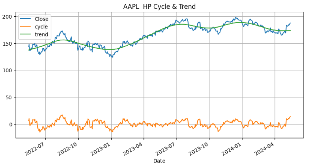
MK_Test(hist['Close'].dropna(), True)
(0.0, 'Present')Class Performance by Calendar Year
- Let’s discuss the diversification of our 2Y investment plan by running the following algorithm
import pandas as pd
import numpy as np
import matplotlib.pyplot as plt
import seaborn as sns
import yfinance
from matplotlib.patches import Rectangle

sns.set()

# declare the tickers
# Create a list with the tickers to use.
tickers = ['AAPL', 'NVDA', 'META', 'AMZN','SPY']

# select the start and end dates
start_date = '2021-12-31'
end_date = '2023-12-31'

# retrieve the prices, resample to yearly
df_prices = yfinance.download(tickers, start_date, end_date)['Adj Close']
df_prices.index = pd.to_datetime(df_prices.index)
df_prices = df_prices.resample('Y').last()

# convert to returns
df_returns = df_prices.pct_change().dropna()

# create a diversified portfolio
portfolio = (df_returns['SPY'].mul(0.4))+(df_returns['AAPL'].mul(0.1))+(df_returns['NVDA'].mul(0.3))+(df_returns['AMZN'].mul(0.1))+(df_returns['META'].mul(0.1))
portfolio.name = 'Portfolio'

# inspect the results
print(portfolio)

# add the balanced portfolio returns to the dataframe
# multiply all decimal format returns by 100 and round to 2 decimals
df_returns_final = pd.concat([df_returns, portfolio], axis=1).mul(100).round(2)

# inspect the final returns dataframe
print(df_returns_final)

# function for plotting
def calendar_year_heatmap(df_returns):
    """
    Creates a heatmap showing the annual performance of various asset classes,
    with each column representing a year and each cell showing the performance
    of an asset class in that year.
    """
    fig, ax = plt.subplots(figsize=(6, 6))

    # Extract just the year part from the DateTimeIndex to identify unique years
    unique_years = df_returns.index.year.unique()
    num_years = len(unique_years)

    # Assign a unique color to each ticker for identification across the heatmap
    tickers = df_returns.columns
    color_map = {ticker: plt.cm.Pastel2(i % len(plt.cm.Pastel2.colors)) for i, ticker in enumerate(tickers)}

    # Iterate through each year, creating a column in the heatmap for each
    for i, year in enumerate(unique_years):
        # Filter the DataFrame for the current year and transpose for easier sorting
        df_year = df_returns[df_returns.index.year == year].T
        # Sort the transposed DataFrame to have the highest returns at the top
        df_year_sorted = df_year.sort_values(by=df_year.columns[0], ascending=False)

        # Plot each ticker's return for the year, using the assigned color and adding a black border
        for j, (ticker, row) in enumerate(df_year_sorted.iterrows()):
            return_value = row.iloc[0]
            rect = Rectangle((i, j), 1, 1, facecolor=color_map[ticker], edgecolor='black')
            ax.add_patch(rect)

            ax.text(i + 0.5, j + 0.5, f'{ticker}\n{return_value:.2f}%',
                    va='center', ha='center', fontsize=8)

    # Set up the axes, labels, and title
    ax.set_xlim(0, num_years)
    ax.set_ylim(0, len(tickers))
    ax.set_xticks([i + 0.5 for i in range(num_years)])
    ax.set_xticklabels(unique_years)
    ax.set_xlabel('Years')
    ax.set_yticks([])  # Remove y-axis tick marks
    ax.set_yticklabels([])  # Clear y-axis tick labels
    ax.set_title('Class Performance by Calendar Year')

    plt.gca().invert_yaxis()
    plt.show()


calendar_year_heatmap(df_returns_final)
Date
2022-12-31 -0.363737
2023-12-31 1.145777
Freq: YE-DEC, Name: Portfolio, dtype: float64
AAPL AMZN META NVDA SPY Portfolio
Date
2022-12-31 -26.40 -49.62 -64.22 -50.26 -18.18 -36.37
2023-12-31 49.01 80.88 194.13 239.02 26.18 114.58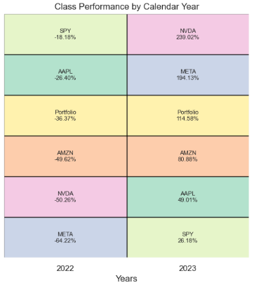
- The point of this heat map is to show you that you never know which asset class will be the best performer in 2022 and 2023, and that by diversifying with securities, you can create a profitable long-term investment portfolio.
LSTM AAPL Price Prediction
- Here, we will use a Long Short Term Memory Network (LSTM) for building our model to predict the stock prices of AAPL (the same considerations apply to other tech stocks).
#Predicting the closing price stock price of APPLE inc
# Get the stock quote
df = pdr.get_data_yahoo('AAPL', start='2022-01-03', end=datetime.now())
# Show the data
df
Open High Low Close Adj Close Volume
Date
2022-01-03 177.830002 182.880005 177.710007 182.009995 179.481125 104487900
2022-01-04 182.630005 182.940002 179.119995 179.699997 177.203201 99310400
2022-01-05 179.610001 180.169998 174.639999 174.919998 172.489639 94537600
2022-01-06 172.699997 175.300003 171.639999 172.000000 169.610214 96904000
2022-01-07 172.889999 174.139999 171.029999 172.169998 169.777817 86709100
... ... ... ... ... ... ...
2024-05-08 182.850006 183.070007 181.449997 182.740005 182.492477 45057100
2024-05-09 182.559998 184.660004 182.110001 184.570007 184.320007 48983000
2024-05-10 184.899994 185.089996 182.130005 183.050003 183.050003 50759500
2024-05-13 185.440002 187.100006 184.619995 186.279999 186.279999 71998100
2024-05-14 187.649994 188.300003 186.289993 186.505005 186.505005 26513269
594 rows × 6 columns- Plotting the APPL Close Price USD
plt.figure(figsize=(16,6))
plt.title('Close Price History')
plt.plot(df['Close'])
plt.xlabel('Date', fontsize=18)
plt.ylabel('Close Price USD ($)', fontsize=18)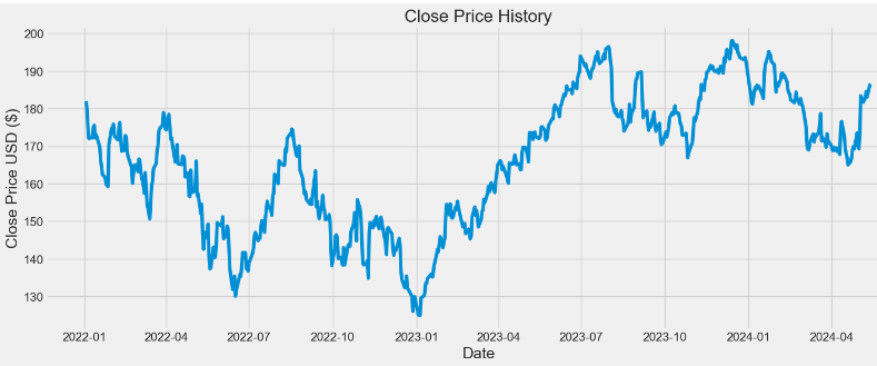
- Preparation of scaled training data for LSTM
data = df.filter(['Close'])
# Convert the dataframe to a numpy array
dataset = data.values
# Get the number of rows to train the model on
training_data_len = int(np.ceil( len(dataset) * .75 ))
training_data_len
446
# Scale the data
from sklearn.preprocessing import MinMaxScaler

scaler = MinMaxScaler(feature_range=(0,1))
scaled_data = scaler.fit_transform(dataset)
# Create the scaled training data set
train_data = scaled_data[0:int(training_data_len), :]
# Split the data into x_train and y_train data sets
x_train = []
y_train = []

for i in range(160, len(train_data)):
    x_train.append(train_data[i-160:i, 0])
    y_train.append(train_data[i, 0])
    if i<= 161:
        print(x_train)
        print(y_train)
        print()

# Convert the x_train and y_train to numpy arrays
x_train, y_train = np.array(x_train), np.array(y_train)

# Reshape the data
x_train = np.reshape(x_train, (x_train.shape[0], x_train.shape[1], 1))
- Building, compiling and training the LSTM model
from keras.models import Sequential
from keras.layers import Dense, LSTM

# Build the LSTM model
model = Sequential()
model.add(LSTM(128, return_sequences=True, input_shape= (x_train.shape[1], 1)))
model.add(LSTM(64, return_sequences=False))
model.add(Dense(25))
model.add(Dense(1))

# Compile the model
model.compile(optimizer='adam', loss='mean_squared_error')

# Train the model
model.fit(x_train, y_train, batch_size=3, epochs=25)

96/96 ━━━━━━━━━━━━━━━━━━━━ 5s 34ms/step - loss: 0.0557
Epoch 2/25
.............
Epoch 25/25
96/96 ━━━━━━━━━━━━━━━━━━━━ 3s 35ms/step - loss: 0.0013

history = model.history.history
print(history)
{'loss': [0.019420769065618515, 0.006535911466926336, 0.005416379310190678, 0.004373038653284311, 0.004472897853702307, 0.0032500692177563906, 0.0028320709243416786, 0.003481486579403281, 0.002727014711126685, 0.00239037093706429, 0.0024072499945759773, 0.003011598950251937, 0.0031069517135620117, 0.0021879596170037985, 0.002042291685938835, 0.0019177179783582687, 0.0019132895395159721, 0.0018414040096104145, 0.0018015303649008274, 0.0018658292246982455, 0.0017496697837486863, 0.001861790893599391, 0.001941954717040062, 0.0018037032568827271, 0.0018449840135872364]}- Plotting the LSTM History Loss
import math
from matplotlib import pyplot as plt
epoch = np.arange(len(history['loss'])) + 1
new_list = range(math.floor(min(epoch)), math.ceil(max(epoch))+1)
plt.xticks(new_list)
histloss=history['loss']
plt.plot(epoch,histloss)
plt.xlabel("Epoch")
plt.ylabel("Loss")

plt.title("LSTM History Loss")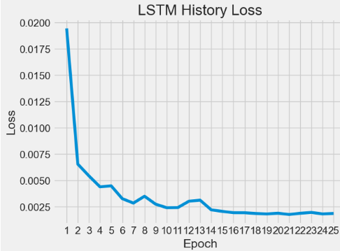
- Preparation of scaled test data for LSTM predictions
test_data = scaled_data[training_data_len - 160: , :]
x_test = []
y_test = dataset[training_data_len:, :]
for i in range(160, len(test_data)):
    x_test.append(test_data[i-160:i, 0])

# Convert the data to a numpy array
x_test = np.array(x_test)

# Reshape the data
x_test = np.reshape(x_test, (x_test.shape[0], x_test.shape[1], 1 ))- Running LSTM predictions of test data, inverse transformation and calculating the rmse error
# Get the models predicted price values
predictions = model.predict(x_test)
predictions = scaler.inverse_transform(predictions)

# Get the root mean squared error (RMSE)
rmse = np.sqrt(np.mean(((predictions - y_test) ** 2)))
rmse
2.4162689580224344- Plotting the training, test data and LSTM predictions
# Plot the data
train = data[:training_data_len]
valid = data[training_data_len:]
valid['Predictions'] = predictions
# Visualize the data
plt.figure(figsize=(16,6))
plt.title('Model')
plt.xlabel('Date', fontsize=18)
plt.ylabel('Close Price USD ($)', fontsize=18)
plt.plot(train['Close'])
plt.plot(valid[['Close', 'Predictions']])
plt.legend(['Train', 'Val', 'Predictions'], loc='lower right')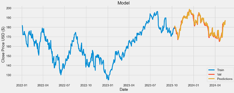
- Comparing validation data vs predictions
valid

           Close      Predictions
Date
2023-10-12 180.710007 180.401230
2023-10-13 178.850006 181.122864
2023-10-16 178.720001 178.818512
2023-10-17 177.149994 179.306335
2023-10-18 175.839996 177.478622
... ... ...
2024-05-08 182.740005 182.394180
2024-05-09 184.570007 182.762009
2024-05-10 183.050003 185.020279
2024-05-13 186.279999 182.731461
2024-05-14 186.505005 187.271286
148 rows × 2 columns- The scatter X-plot Close vs Predictions
x=valid["Close"]
y=valid["Predictions"]
coef = np.polyfit(x,y,1)
poly1d_fn = np.poly1d(coef)
plt.plot(x,y, 'yo', x, poly1d_fn(x), 'r',lw=1)
plt.xlabel('Close')
plt.ylabel('Predictions')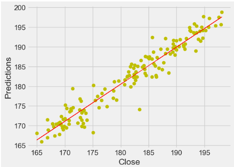
- This X-plot shows quite strong correlation between the model’s predictions and its actual results.
Conclusions
- We have studied 4 Big Techs (AAPL, NVDA, META, and AMZN) by fetching 2Y historical stock data from Yahoo Finance.
- Our EDA techniques include calculating summary statistics, visualizing data distributions, identifying trends, exploring relationships between stocks, and performing hypothesis testing.
- We have compared annualized returns and volatility of these stocks.
- We have investigated at several statistics (i.e. kurtosis & skewness) which are useful to describe and analyze histograms of daily returns.
- In addition to the direct mapping of expected returns vs risks for individual tech stocks, we have calculated their Alpha & Beta that play a crucial role for maximizing the (Return/Risk) Ratio.
- We have conducted a comprehensive Stock Correlation Analysis by creating joint/pair/PairGrid plots and the Pearson’s correlation matrix of both close prices and daily returns.
- We have employed an in-depth stock technical analysis to evaluate investments and identify trading opportunities in price trends and patterns seen on 2Y charts for individual assets.
- Our time-series analysis includes the following metrics: Close price, SMA (20, 50, and 100), EMA, VWAP, Volume, BB, Beta, Covariance, Z-Score, SE, and Daily/Cumulative Returns.
- In addition to the visual inspection of stock trading indicators discussed in this article, our AAPL stock analysis has shown that statistical tests (ADF, KPSS, KW, MK, and HP) provide alternative methods for detecting multiple trends and seasonality.
- We have addressed the diversification of our 2Y investment plan in the context of product heatmap “Class Performance by Calendar Year”.
- We have used a Long Short Term Memory Network (LSTM) for building our model to predict the stock prices of AAPL as a use-case example.
- It appears that the trained LSTM model performs a satisfying prediction of the testing set with rmse=2.41.
- The proposed LSTM model can be easily customized to apply in other broad market indexes where the data exhibits a similar behavior. Interested stakeholders can use the proposed model to better inform the market situation before making their investment decisions.
References
- Stock Market Analysis + Prediction using LSTM
- Machine Learning to Predict Stock Prices
- Stock Market Predictions with LSTM in Python
- Stock Price Analysis With Python
- Exploratory data analysis of stock prices
- Exploratory Data Analysis on Stock Market Data
- How to Create the Investment Diversification Heat Map in Python
- Statistical Test on a Time Series
Explore More
- Building an Optimal Risky Markowitz Portfolio with 4 Major Tech Stocks: min Volatility vs max Sharpe Ratio
- Uncovering Hidden Gems with Multi-Objective Portfolio Optimization: MPT, CAPM, Beta, Vol, Sharpe, PyPortfolioOpt & SciPy
- Backtesting Algo-Trading Strategies, FinTech Analysis & Portfolio Optimization: NVDA, AMD, INTC, MSI vs S&P 500 Benchmark
- Multiple-Criteria Technical Analysis of Blue Chips in Python
- JPM Breakouts: Auto ARIMA, FFT, LSTM & Stock Indicators
- LSTM Price Predictions of 4 Tech Stocks
- Inflation-Resistant Stocks to Buy
- Short-Term Stock Market Price Prediction using Deep Learning Models
- Basic Stock Price Analysis in Python
- A Market-Neutral Strategy
- IQR-Based Log Price Volatility Ranking of Top 19 Blue Chips


