
Data Exploration and Visualization with Seaborn Pair Plots
More often than we’d like, as data scientists, we’re presented new sets of data with little context. Whether we’re beginning a project in a new industry, or you’re a student at Flatiron school and your instructors are continuously using sports-related datasets and you have no idea what they’re talking about.
Regardless of the situation, if it’s your job to analyze it, it’s a great idea to research every variable to get a good idea of the kind of data you’re dealing with. Numerical or categorical? Continuous or discrete? That kinda thing. After you’ve done your research, it’s time to begin the Exploratory Data Analysis (EDA) process. A great place to start is making Pair Plots in Seaborn.
Pair Plots are a really simple (one-line-of-code simple!) way to visualize relationships between each variable. It produces a matrix of relationships between each variable in your data for an instant examination of our data. It can also be a great jumping off point for determining types of regression analysis to use. Check it out:
import seaborn as sns
df = pd.read_csv('nba.csv')
#get a snippet of our data to look at data formats and size
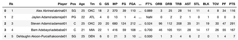
df.head()
#make pairplots
sns.pairplot(df, vars = ["Age", "MP", "PTS", "TRB", "TOV"], dropna = True)In this case, I’ll use that foreign basketball dataset. I found stats for each player playing in the NBA’s 2018–2019 season. It includes their name, age, and…and whole lot of acronyms I’m super unfamiliar with. I chose a few at random.
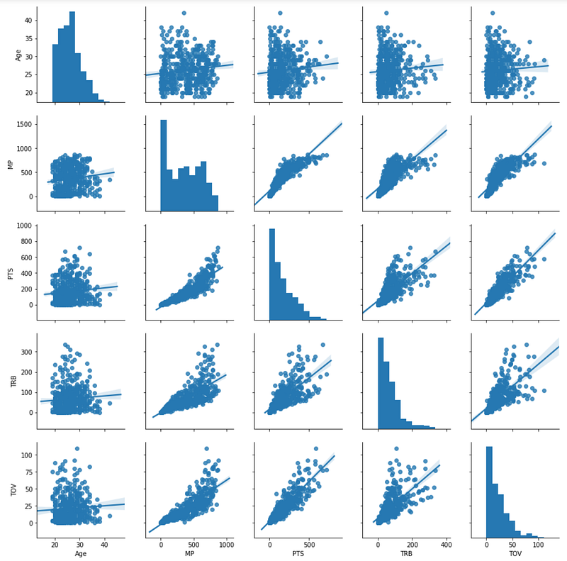
It’s that simple! Again, these are still acronyms I know very little about, but now I have an idea of how everything is related. Here’s a key for those acronyms:
Age = Age of the player MP = Minutes Played PTS = Points Scored TRB = Total Rebounds TOV = Turnovers
The bottom left triangle portion of the matrix is actually the same and the top right portion of the matrix, with the axes flipped. The diagonal row is simply a histogram of each variable and number of occurrences.
I still know very little about basketball, but it’s already incredibly telling to me that there’s a positive correlation between Points and Turnovers, and Rebounds and Minutes Played.
Here is where it’s really important to do your research — After quickly googling what a Turnover was, I was still unsure if I turnover is a good or bad thing. Is the player doing the turning over and stealing the ball? Or are they getting turned over and losing their chance at the shot? Since Turnovers are positively correlated with points, I went with the assumption that the player doing the turning over has the ability to score more points, therefore it is a positive event. However, when double-checking with a classmate (shoutout to Zach Noble), I found out that turnovers are actually a bad thing.
So while Pair Plots are an incredible resource for starting your EDA process, do your research before creating your hypotheses.
What else can we discover? Let’s color code our results by position and see.
sns.pairplot(df, vars = ["Age", "MP", "PTS", "TRB", "TOV"], dropna = True, hue = 'Pos')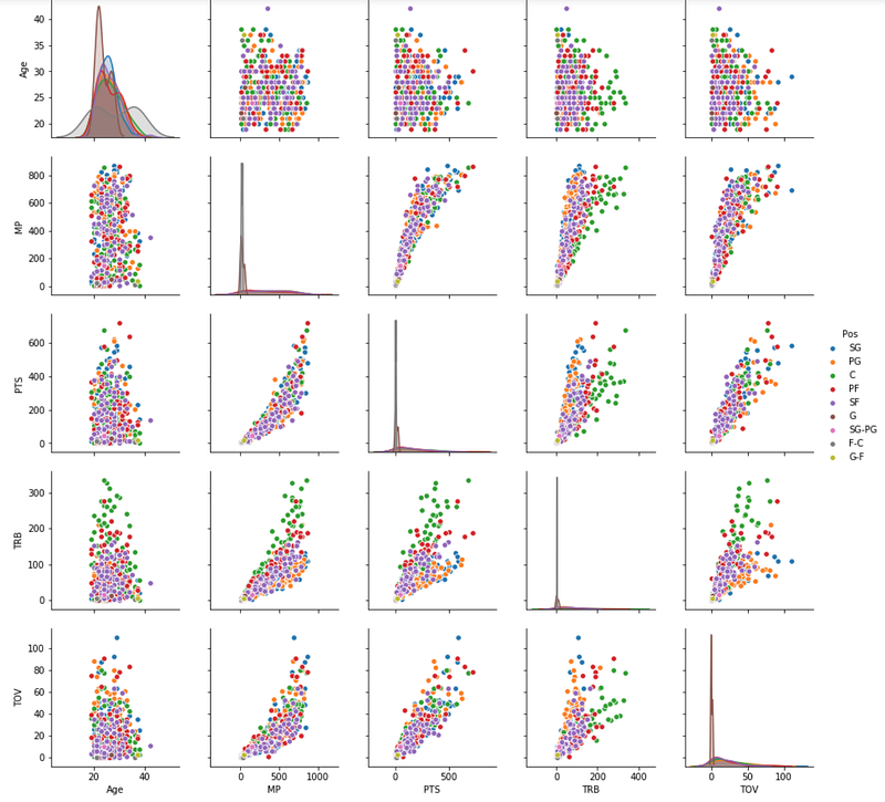
Again, I know nothing about basketball positions and to be honest, it is shocking to me that there are nine positions (I’m not sure why). But at first glance, my first inspection is that “C” (Center!) positions do a lot of rebounding. I might also guess that “SG”s (Shooting Guards) get turned over a lot.
Using PairGrid
Seaborn comes with a PairGrid() class, where you can do further customization. You have to create a class instance and then map specific functions to different parts of the grid. For example, you could write a function to calculate the Correlation Coefficient between each variable and draw in on the graph.
Here is a more intense example that maps a density plot on the lower left triangle, summary statistics on the diagonal, and correlation co-efficient on the upper right triangle:
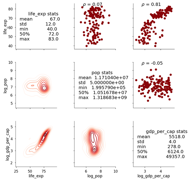
It’s incredible how much information we can glean from this simple matrix! Now we have an idea of which variables we should be investigating further.
The One Without The Pair Plots
Alright, so I did a very good-for-you thing and dove into a category that I’m uncomfortable with (basketball) and wanted to reward myself by creating Pair Plots on other kinds of relationships. And what’s the best type of relationship?
F.R.I.E.N.D.Ship, of course.
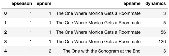
I found a really awesome FRIENDS dataset from someone who so passionately recorded every main storyline and their respective characters in every episode of all ten seasons of Friends. I wanted to plot character dynamics over time, making each axis of the Pair Plots a Friends character, and for each individual pair plot, a bar graph of the Season as the x-axis and number of storylines together as the y-axis.
After a bit of data wrangling I started with:
and ended up with:
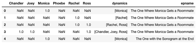
Where each value under each character’s column is the season number. This should have worked….but I got:
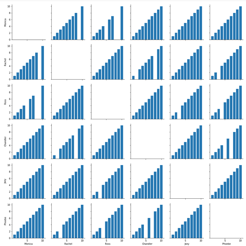
After hours of frustration and reading a lot of fine print, I later found out that Pair Plots only plots numerical variables, but you can color-code with categorical. Sometimes you just have to learn the hard way.
Google Fusion Tables
But since I was so obsessed with the character relationships and being able to quantify Rachel and Ross’s love for one another over time, I turned over to another super simple data analysis tool, this time from Google Fusion Tables. Fusion tables are a great tool for gathering and visualizing data tables. Think of it as a Google Drive product, with it’s ability to store data and tables and then share it with any internet users to view or download.
I had to do a bit more data wrangling and conversion to an excel table, then ended up with a network of relationships between all six characters:
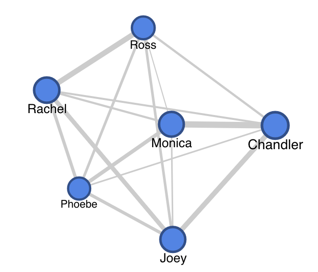
Over the course of ten seasons, you can gather that Monica and Chandler had a strong relationship, as well as Rachel and Ross. Joey had a consistent relationship with Rachel and Chandler, who were both roommates of his at different times.
Whether it’s a dataset you’re seeing for the first time, a dataset where relationships aren’t quite obvious or clear to you, or a dataset you’re comfortable with and just quickly need to visualize for a side-by-side analysis, Seaborn’s Pair Plots are an invaluable tool for exploratory analysis and visualization.


