
How to Create the Investment Diversification Heat Map in Python

Cordell Tanny has over 24 years of experience in financial services, specializing in quantitative finance. Cordell has previously worked as a quantitative analyst and portfolio manager for a leading Canadian institution, overseeing a $2 billion multi-asset retail investment program.
Cordell is currently the President and co-founder of Trend Prophets, a quantitative finance and AI solutions firm. He is also the Managing Director of DigitalHub Insights, an educational resource dedicated to introducing AI into investment management.
Cordell received his B. Sc. in Biology from McGill University. He is a CFA Charterholder, a certified Financial Risk Manager, and holds the Financial Data Professional charter.
Visit trendprophets.com to learn more.
This article is part of my series sharing tools and tips used by professional investment strategists. The Python code can be found at the end of the article.
How to Create the Investment Diversification Heat Map in Python
Investment diversification is a must in any portfolio. While this is incredibly true, it has also become an investment lingo cliché. And whenever markets hit a crisis, the pros will always preach that diversification helps prevent extreme losses that can (and will) result by putting all your eggs in one basket.
And I fully subscribe to this!
Diversification is a pillar of a long-term investment plan. And here is the visual everyone will use to prove it. I’m sure you’ve seen it.
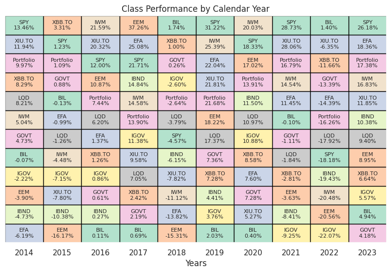
The point of this heat map is to show you that you never know which asset class will be the best performer in any given year, and that by diversifying with stocks and bonds, you can create a smoother ride. The pink cell in the graph above is a balanced portfolio of 60% SPY and 40% AGG. We can see that it is never at the top, and more importantly never at the bottom.
It’s a very powerful visual and you can put anything you want into this. Your favourite stocks, ETFs, crypto currencies, etc.
And here is the code so you can do this yourself! Enjoy.
Note: I love sharing the many things that I have learned over the course of my career as a quant. Not everything you see on Medium needs to be a deep learning model that has no application in the real world. I want to give you some of the small things that will make you a better investor, a better quant, and innovate! If you like free code like this, subscribe to the Digital Hub newsletter at dh-insights.com
And if you want to really see what I can do, subscribe to Trend Prophets!
Cheers.
import pandas as pd
import numpy as np
import matplotlib.pyplot as plt
import seaborn as sns
import yfinance
from matplotlib.patches import Rectangle

sns.set()

# declare the tickers
# Create a list with the tickers to use.
tickers = ['SPY', 'IWM', 'GOVT', 'LQD', 'EFA', 'EEM', 'IGOV', 'IBND', 'XIU.TO',
           'XBB.TO', 'BIL']

# select the start and end dates
start_date = '2013-12-31'
end_date = '2023-12-31'

# retrieve the prices, resample to yearly
df_prices = yfinance.download(tickers, start_date, end_date)['Adj Close']
df_prices.index = pd.to_datetime(df_prices.index)
df_prices = df_prices.resample('Y').last()

# convert to returns
df_returns = df_prices.pct_change().dropna()

# create a diversified portfolio
portfolio = (df_returns['SPY'].mul(0.6)) + (df_returns['GOVT'].mul(0.4))
portfolio.name = 'Portfolio'

# inspect the results
print(portfolio)

# add the balanced portfolio returns to the dataframe
# multiply all decimal format returns by 100 and round to 2 decimals
df_returns_final = pd.concat([df_returns, portfolio], axis=1).mul(100).round(2)

# inspect the final returns dataframe
print(df_returns_final)

# function for plotting
def calendar_year_heatmap(df_returns):
    """
    Creates a heatmap showing the annual performance of various asset classes,
    with each column representing a year and each cell showing the performance
    of an asset class in that year. Asset classes are sorted by performance within
    each column, with the highest returns at the top.

    Parameters:
    - df_returns: A pandas DataFrame with a DateTimeIndex representing dates and columns
                  representing different asset classes. The values are the annual returns
                  of the asset classes.

    The function plots a heatmap where each cell's color is associated with its asset class,
    and the cell is annotated with the asset class ticker and its annual return. Black borders
    separate the cells.
    """
    fig, ax = plt.subplots(figsize=(10, 6))

    # Extract just the year part from the DateTimeIndex to identify unique years
    unique_years = df_returns.index.year.unique()
    num_years = len(unique_years)

    # Assign a unique color to each ticker for identification across the heatmap
    tickers = df_returns.columns
    color_map = {ticker: plt.cm.Pastel2(i % len(plt.cm.Pastel2.colors)) for i, ticker in enumerate(tickers)}

    # Iterate through each year, creating a column in the heatmap for each
    for i, year in enumerate(unique_years):
        # Filter the DataFrame for the current year and transpose for easier sorting
        df_year = df_returns[df_returns.index.year == year].T
        # Sort the transposed DataFrame to have the highest returns at the top
        df_year_sorted = df_year.sort_values(by=df_year.columns[0], ascending=False)

        # Plot each ticker's return for the year, using the assigned color and adding a black border
        for j, (ticker, row) in enumerate(df_year_sorted.iterrows()):
            return_value = row.iloc[0]  # Extract the return value from the row
            # Create a rectangle representing the asset class's annual return for a given year.
            # The rectangle's position and size are determined by (i, j) for the bottom-left corner
            # and width & height set to 1, ensuring each cell in the heatmap is uniform.
            # 'facecolor=color_map[ticker]' assigns a unique color to each asset class based on the ticker,
            # making it easy to identify across different years. 'edgecolor='black'' adds a distinct black border
            # around each cell, enhancing the visual separation between different asset classes' returns.
            rect = Rectangle((i, j), 1, 1, facecolor=color_map[ticker], edgecolor='black')
            ax.add_patch(rect)
            # Annotate the rectangle with the ticker and its return value
            ax.text(i + 0.5, j + 0.5, f'{ticker}\n{return_value:.2f}%',
                    va='center', ha='center', fontsize=8)

    # Set up the axes, labels, and title
    ax.set_xlim(0, num_years)
    ax.set_ylim(0, len(tickers))
    ax.set_xticks([i + 0.5 for i in range(num_years)])
    ax.set_xticklabels(unique_years)
    ax.set_xlabel('Years')
    ax.set_yticks([])  # Remove y-axis tick marks
    ax.set_yticklabels([])  # Clear y-axis tick labels
    ax.set_title('Class Performance by Calendar Year')

    plt.gca().invert_yaxis()  # Invert the y-axis to have the best returns at the top
    plt.show()


calendar_year_heatmap(df_returns_final)

# note: the color palett I chose doesn't accomodate 11 tickers. You are
# better off creating your own!


