
Power BI: Filtering using Slicers

The Power BI slicer visual allows you to dynamically filter and analyze data in your Power BI report. This tutorial will show you how to add slicers into a report and the different slicers settings available.
We’ll be using the sample report we created in our previous tutorial for this.
So lets get right to it!
STEP 1: Add the “slicer” visual from the Visualizations panel

2. Let’s add a date filter to our report. Select the slicer visual in the canvas and click on the Date field in the Fields panel
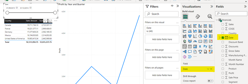
Since we selected a field containing data of the date type, it selected the “between” slicer by default. Using this slicer, you can specify a date range and the visuals in the report page will be filtered accordingly.
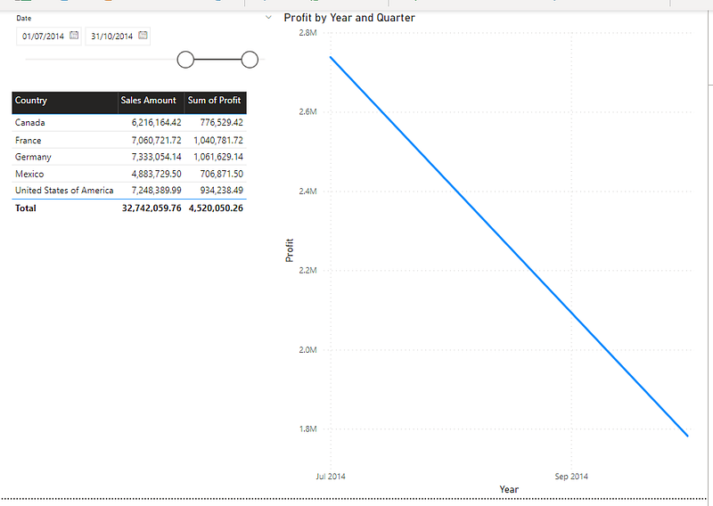
For instance, if I set the from date to 01/07/2014 and the to date to 31/10/2014, the table and the line chart will show values in that date range.
Step 2: Change “slicer” settings as required
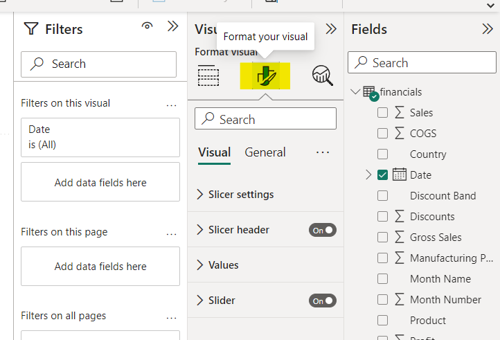
You can change the slicer type, selection and other settings by going to the “Format your visual” tab in the Visualizations panel.
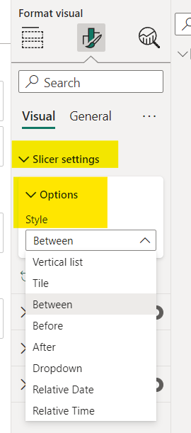
- Changing slicer type
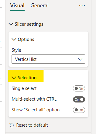
- Expand “Slicer settings”, “Options” and select the required slicer type from the “Style” dropdown. The dropdown options will differ according to the data type of the field you have selected as the filter.
- If you select a slicer type such as “Vertical list”, “Tile” etc. you will see an option called “Selection”. Here you can enable different options pertaining to the selection functionality in the filter.
Single Select — Will only allow the selection of one value from the filter.
Multi-select with CTRL — Will allow the selection of multiple values from the filter when selected with the “ctrl” key pressed.
Show “Select all” option — Will display a new option called “Select all” in the filter. By clicking this, all the values in the filter will be selected.
There are many other options in the “Format your visual” tab in the Visualizations panel. Go ahead and experiment with the options to customize your filter further!
This brings us to the end of this tutorial.
I will be publishing two tutorials on Power BI each week. Subscribe to get notified when a new tutorial is published! Feel free to leave a comment on any areas in Power BI that you might need a tutorial in!
Thanks for reading!
More articles on Power BI (full list here),
- How to create a Power BI report in 15 mins : For absolute beginners
- Creating a pop up window in Power BI
- How to Show/Hide fields dynamically in Power BI
- Sending emails using Power Automate for Power BI — ZERO CODING
If you are interested in Machine Learning, check out this list.
Subscribe to DDIntel Here.
Visit our website here: https://www.datadriveninvestor.com
Join our network here: https://datadriveninvestor.com/collaborate


