
How to create a Power BI report in 15 mins : For absolute beginners

Power BI, simply put, is a reporting tool which allows data visualization and analysis. If you are an absolute beginner who is just getting started with Power BI, this article is for you. Here, I will provide you with a step-by-step guide on how to create and publish a simple Power BI report using an Excel dataset. Let’s get right to it!
You can find the dataset used here.
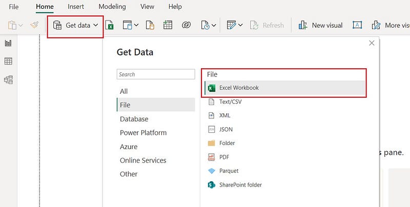
1. Open Power BI Desktop, select Excel Workbook and select the dataset (Financial Sample.xlsx)
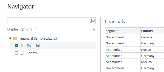
After selecting the file, you will be presented with a preview window which shows a preview of the data in the excel that we selected. Under display options, you will notice that there are 2 options called financials and Sheet1, although in the excel file we only have Sheet1. This is because Power BI automatically identified the existence of a table “financials” from Sheet1.
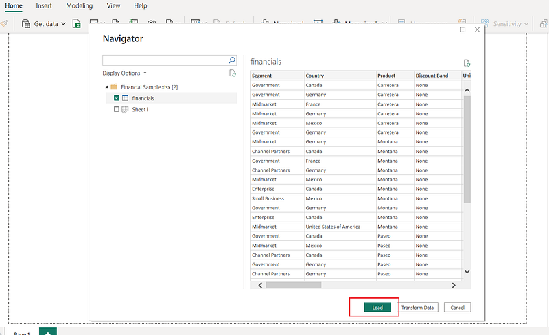
2. Select financials and click on Load to load the dataset to Power BI
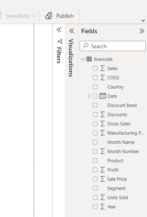
You will now be able to see the dataset and the fields in the dataset by expanding the Fields panel.
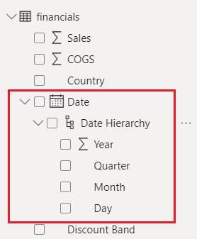
If you expand the Date field in the dataset, you will see something called a Date Hierarchy. This is something created by Power BI to help you with data analysis. Using this hierarchy, you can drill-down and analyze data at different levels. For example, you can look at Profits by Year, Quarter, Month and day.
Note: If you need to apply any transformations to the data, you can do so by clicking on the Transform Data button, which will open the Power Query Editor. But since this is an introductory tutorial for absolute beginners we will not be covering that here.
3. Select Fields to be visualized
I will show you how to visualize the data using 2 visuals for the purpose of this tutorial. You can add many more and experiment with the data.
VISUAL 1: Lets start with visualizing Sales by Country using a Table,
- Click on the Table visual in the Visualizations panel
- Drag and drop the fields from Fields panel to Columns in the Visualizations panel as below
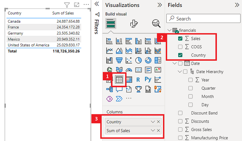
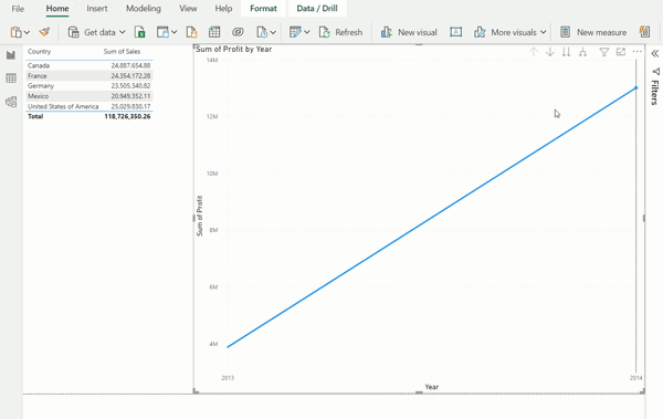
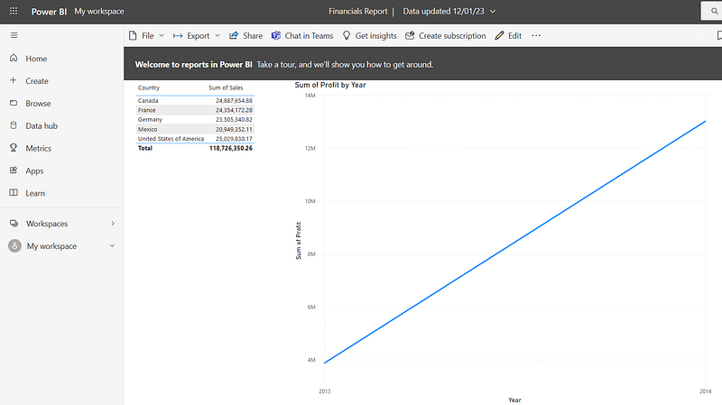
You will now see a table with the Country and the Sales value for each country in a Table.
VISUAL 2: Now lets add a Line Chart to visualize Profits by each Year, Quarter and Month.
- Click on the Line Chart visual in the Visualizations panel
- Drag and drop the fields from Fields panel to Columns in the Visualizations panel as below. Since we need to visualize Profits by each Year, Quarter and Month, remove/deselect the Day field from the visualization. This can be done by clicking on the small “x” icon next to Day in the X-axis of the visual.
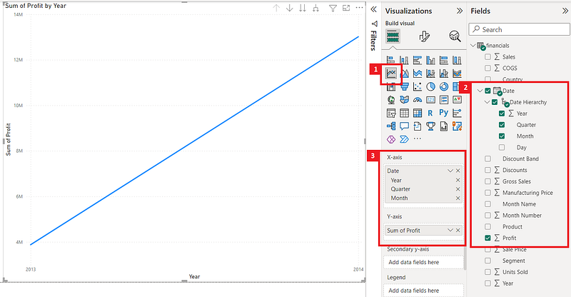
You will now see a table with the Profits by each Year, Quarter and Month in a Line chart.
The cool thing here is that you can drill-down to the Year, Quarter and Month levels and visualize Profits using the Drill-Down option in the visual.
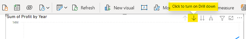
Once you turn on the Drill down, you can simply click on the data points to drill down to the next levels.
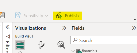
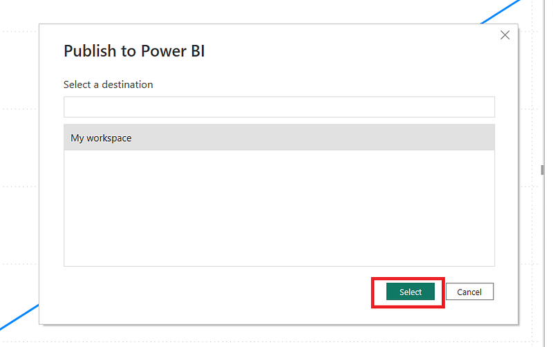
4. Publish report to Workspace using the Publish button
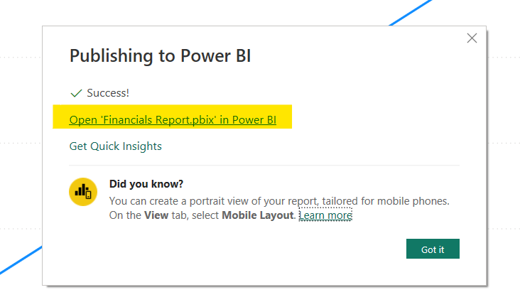
4. View report in workspace by clicking on the displayed link
This brings us to the end of our tutorial. Power BI is a powerful reporting tool which has many advanced features. In this tutorial we covered how to create and publish a simple Power BI report using an Excel dataset.
Thanks for reading and do leave a clap if you found this useful!
More articles on Power BI (full list here),
- Power BI: Filtering using Slicers
- Creating a pop up window in Power BI
- How to Show/Hide fields dynamically in Power BI
- Sending emails using Power Automate for Power BI — ZERO CODING
If you are interested in Machine Learning, check out this list.
Subscribe to DDIntel Here.
Visit our website here: https://www.datadriveninvestor.com
Join our network here: https://datadriveninvestor.com/collaborate