
Day 29 : 60 days of Data Science and Machine Learning Series
ML clustering Project 2 ( Part 2)..
Welcome back peeps. In this post we would be implementing part 2 of the project covering clustering in ML. Project part 1 can be found here :
Some of the other best Series —
100 days : Your Data Science and Machine Learning Degree Series with projects
Complete Data Visualization and Pre-processing Series with projects
Projects Videos —
All the projects, data structures, SQL, algorithms, system design, Data Science and ML , Data Analytics, Data Engineering, , Implemented Data Science and ML projects, Implemented Data Engineering Projects, Implemented Deep Learning Projects, Implemented Machine Learning Ops Projects, Implemented Time Series Analysis and Forecasting Projects, Implemented Applied Machine Learning Projects, Implemented Tensorflow and Keras Projects, Implemented PyTorch Projects, Implemented Scikit Learn Projects, Implemented Big Data Projects, Implemented Cloud Machine Learning Projects, Implemented Neural Networks Projects, Implemented OpenCV Projects,Complete ML Research Papers Summarized, Implemented Data Analytics projects, Implemented Data Visualization Projects, Implemented Data Mining Projects, Implemented Natural Leaning Processing Projects, MLOps and Deep Learning, Applied Machine Learning with Projects Series, PyTorch with Projects Series, Tensorflow and Keras with Projects Series, Scikit Learn Series with Projects, Time Series Analysis and Forecasting with Projects Series, ML System Design Case Studies Series videos will be published on our youtube channel ( just launched).
Subscribe today!
Tech Newsletter —
If you are interested, you can join my newsletter through which I send tech interview tips, techniques, patterns, hacks — Software Development, ML, Data Science, Startups and Technology projects to more than 30K readers. You can subscribe to Tech Brew :
The data for this project can be found in the link below —
Lets dive in —
import datetime as dt
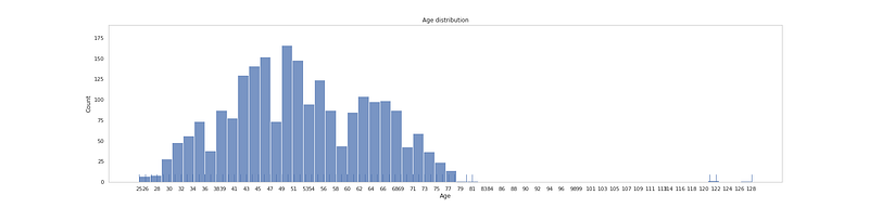
df['Age'] = 2021 - df.Year_Birth# Age Levelplt.figure(figsize=(25, 6))
plt.title('Age distribution')
ax = sns.histplot(df['Age'].sort_values(), bins=56)
sns.rugplot(data=df['Age'], height=.05)
plt.xticks(np.linspace(df['Age'].min(), df['Age'].max(), 56, dtype=int, endpoint = True))
plt.grid(False)plt.show()Output —
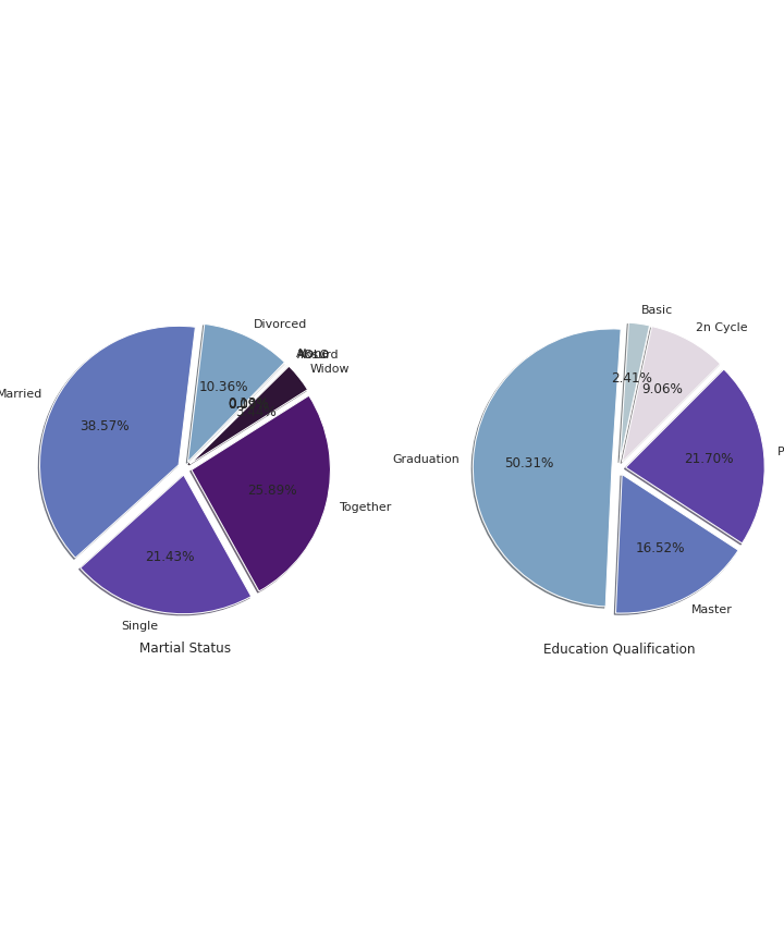
# Education and Marital Statuscc=df.groupby("Marital_Status").count()['Age']
label=df.groupby('Marital_Status').count()['Age'].index
fig, ax = plt.subplots(1, 2, figsize = (10, 12))
ax[0].pie(cc, labels=label, shadow=True, autopct='%1.2f%%',explode=[0.1 for i in cc.index],radius=2,colors=colors1,startangle=45)
ax[0].set_title('Martial Status', y=-0.6)cc1 = df.groupby("Education").count()['Age']
label = df.groupby('Education').count()['Age'].index
ax[1].pie(cc1, labels=label, shadow=True, autopct='%1.2f%%',explode=[0.1 for i in cc1.index],radius=2,colors=colors1,startangle=45)
ax[1].set_title('Education Qualification', y=-0.6)
plt.subplots_adjust(wspace = 1.5, hspace =0)plt.show()Output —
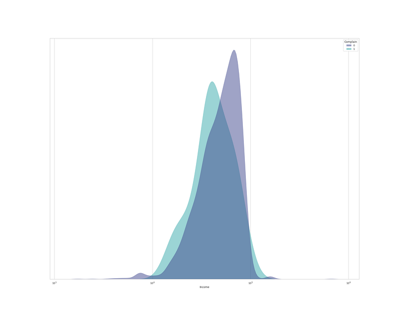
plt.figure(figsize=(25,20))
sns.kdeplot(
   data=df, x="Income", hue="Complain", log_scale= True,
   fill=True, common_norm=False,palette='mako',
   alpha=.5, linewidth=0,
)
plt.gca().axes.get_yaxis().set_visible(False) # Set y invisible
plt.xlabel('Income')

plt.show()
Output —
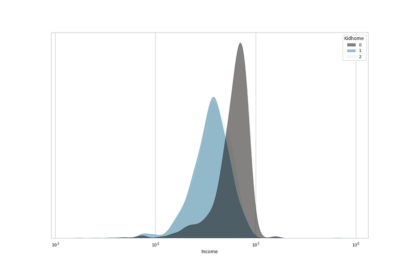
# No of Kids home vs Incomeplt.figure(figsize=(15,10))sns.kdeplot(
data=df, x="Income", hue="Kidhome", log_scale= True,
fill=True, common_norm=False,palette='mako',
alpha=.5, linewidth=0,
)
plt.gca().axes.get_yaxis().set_visible(False)
plt.xlabel('Income')

plt.show()
Output —
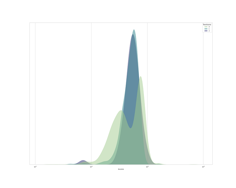
plt.figure(figsize=(15,10))sns.kdeplot(
data=df, x="Income", hue="Teenhome", log_scale= True,
fill=True, common_norm=False,palette='crest',
alpha=.5, linewidth=0,
)
plt.gca().axes.get_yaxis().set_visible(False) # Set y invisible
plt.xlabel('Income')
plt.show()Output —
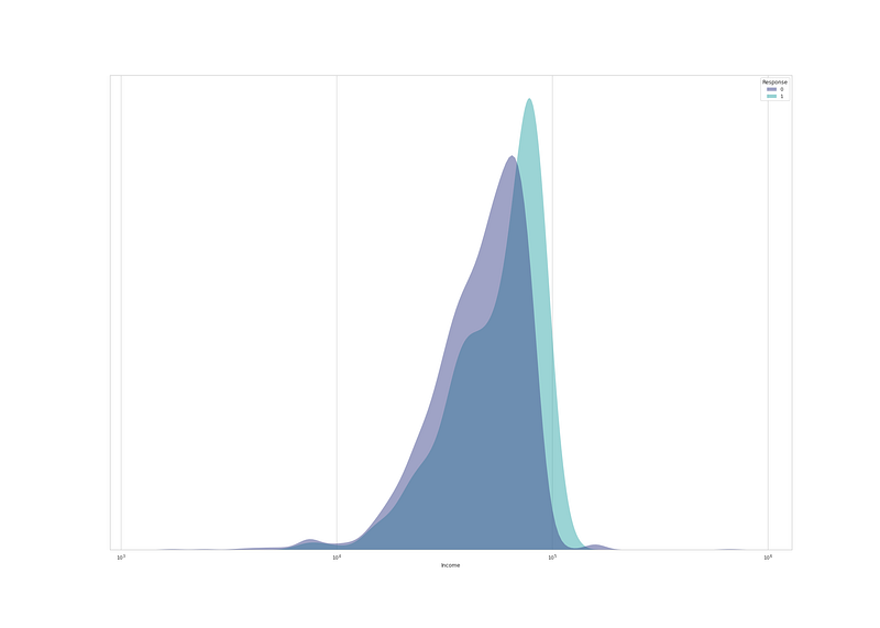
# Income and Responseplt.figure(figsize=(28,20))sns.kdeplot(
data=df, x="Income", hue="Response", log_scale= True,
fill=True, common_norm=False,palette='mako',
alpha=.5, linewidth=0,
)plt.gca().axes.get_yaxis().set_visible(False)
plt.xlabel('Income')
plt.show()Output —
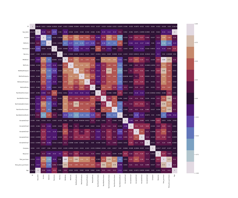
Z_Revenue & Z_CostContact have Constant value, which don’t provide any information so we should drop them.
df.drop(['Z_CostContact', 'Z_Revenue'], axis=1, inplace=True)# Heatmap
plt.figure(figsize = (30,25))
df_cor = df.corr()
sns.heatmap(df_cor, annot = True, cmap = colors1)
plt.show()Output —
Part 3 of this project : Coming soon
Follow and Stay tuned.
For other projects, tune to —
Build Machine Learning Pipelines( With Code)
Recurrent Neural Network with Keras
Clustering Geolocation Data in Python using DBSCAN and K-Means
Facial Expression Recognition using Keras
Hyperparameter Tuning with Keras Tuner
Custom Layers in Keras
That’s it fellas. Peace out and keep coding :)
Stay Tuned and of-course let me end this post with a quote by Vincent Gogh
“The beginning is perhaps more difficult than anything else, but keep heart, it will turn out all right.”


