
Day 28 : 60 days of Data Science and Machine Learning Series
ML Clustering Project 2 ( Part 1)..
Welcome back peeps. Last few weeks have been crazy busy on the work front. Anyways, In this post we will cover ML Clustering in detail with a project 2( Part 1).
Some of the other best Series —
100 days : Your Data Science and Machine Learning Degree Series with projects
Complete Data Visualization and Pre-processing Series with projects
Projects Videos —
All the projects, data structures, SQL, algorithms, system design, Data Science and ML , Data Analytics, Data Engineering, , Implemented Data Science and ML projects, Implemented Data Engineering Projects, Implemented Deep Learning Projects, Implemented Machine Learning Ops Projects, Implemented Time Series Analysis and Forecasting Projects, Implemented Applied Machine Learning Projects, Implemented Tensorflow and Keras Projects, Implemented PyTorch Projects, Implemented Scikit Learn Projects, Implemented Big Data Projects, Implemented Cloud Machine Learning Projects, Implemented Neural Networks Projects, Implemented OpenCV Projects,Complete ML Research Papers Summarized, Implemented Data Analytics projects, Implemented Data Visualization Projects, Implemented Data Mining Projects, Implemented Natural Leaning Processing Projects, MLOps and Deep Learning, Applied Machine Learning with Projects Series, PyTorch with Projects Series, Tensorflow and Keras with Projects Series, Scikit Learn Series with Projects, Time Series Analysis and Forecasting with Projects Series, ML System Design Case Studies Series videos will be published on our youtube channel ( just launched).
Subscribe today!
Tech Newsletter —
If you are interested, you can join my newsletter through which I send tech interview tips, techniques, patterns, hacks — Software Development, ML, Data Science, Startups and Technology projects to more than 30K readers. You can subscribe to Tech Brew :
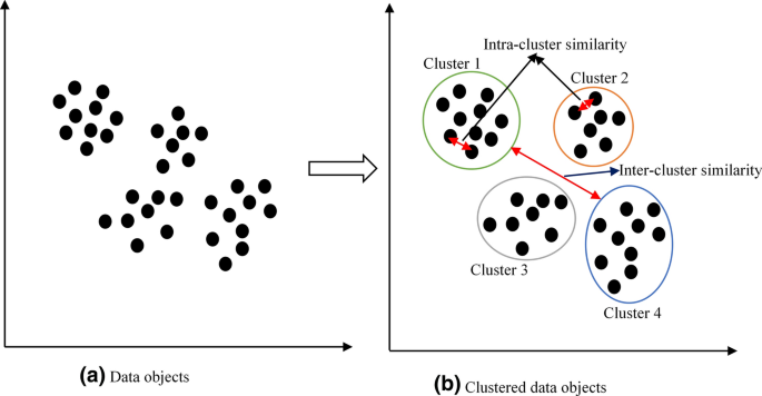
Clustering is a technique of dividing the population or data points, grouping them into different clusters on the basis of similarity and dissimilarity between them. It helps in determining the intrinsic group among the unlabeled data points.
Applications of Clustering —
- Market Segmentation — helps in grouping people who have same purchasing behaviour, discover new customer segments for marketing etc
- News — To group related news together
- Search Engines — To group similar results
- Social Network Analysis
- Image Segmentation
- Anomaly detection
- Insurance fraud cases etc
In this post we are going to build a project ( part 1 ) in ML.The data for this project can be found in the link below —
Lets dive in —
Import Necessary Libraries
import seaborn as sns
from matplotlib import pyplot as plt
import numpy as np
import pandas as pd
from matplotlib.colors import rgb2hex
import matplotlib.cm as cm
import plotly.express as px
import plotly.graph_objects as go
import squarify
from plotly.offline import init_notebook_mode,iplot
from wordcloud import WordCloud
import numpy as np
from scipy import stats
from PIL import Image
from sklearn.preprocessing import StandardScaler
from sklearn.preprocessing import MultiLabelBinarizer
from sklearn.cluster import KMeans
from sklearn.preprocessing import LabelEncoder
import matplotlib.colors
from collections import Counter
cmap2 = cm.get_cmap('twilight',13)
colors1= []
for i in range(cmap2.N):
    rgb= cmap2(i)[:4]
    colors1.append(rgb2hex(rgb))
    #print(rgb2hex(rgb))
# Set style
sns.set(style='whitegrid')
Load the data
df = pd.read_csv('/path to file/marketing_campaign.csv',low_memory = False, sep='\t')# Get to know your datadf.info()Output —
<class 'pandas.core.frame.DataFrame'>
RangeIndex: 2240 entries, 0 to 2239
Data columns (total 29 columns):
 #   Column               Non-Null Count  Dtype
---  ------               --------------  -----
 0   ID                   2240 non-null   int64
 1   Year_Birth           2240 non-null   int64
 2   Education            2240 non-null   object
 3   Marital_Status       2240 non-null   object
 4   Income               2216 non-null   float64
 5   Kidhome              2240 non-null   int64
 6   Teenhome             2240 non-null   int64
 7   Dt_Customer          2240 non-null   object
 8   Recency              2240 non-null   int64
 9   MntWines             2240 non-null   int64
 10  MntFruits            2240 non-null   int64
 11  MntMeatProducts      2240 non-null   int64
 12  MntFishProducts      2240 non-null   int64
 13  MntSweetProducts     2240 non-null   int64
 14  MntGoldProds         2240 non-null   int64
 15  NumDealsPurchases    2240 non-null   int64
 16  NumWebPurchases      2240 non-null   int64
 17  NumCatalogPurchases  2240 non-null   int64
 18  NumStorePurchases    2240 non-null   int64
 19  NumWebVisitsMonth    2240 non-null   int64
 20  AcceptedCmp3         2240 non-null   int64
 21  AcceptedCmp4         2240 non-null   int64
 22  AcceptedCmp5         2240 non-null   int64
 23  AcceptedCmp1         2240 non-null   int64
 24  AcceptedCmp2         2240 non-null   int64
 25  Complain             2240 non-null   int64
 26  Z_CostContact        2240 non-null   int64
 27  Z_Revenue            2240 non-null   int64
 28  Response             2240 non-null   int64
dtypes: float64(1), int64(25), object(3)
memory usage: 507.6+ KB
# Find missing Valuesdf.isna().sum()Output —
ID                      0
Year_Birth              0
Education               0
Marital_Status          0
Income                 24
Kidhome                 0
Teenhome                0
Dt_Customer             0
Recency                 0
MntWines                0
MntFruits               0
MntMeatProducts         0
MntFishProducts         0
MntSweetProducts        0
MntGoldProds            0
NumDealsPurchases       0
NumWebPurchases         0
NumCatalogPurchases     0
NumStorePurchases       0
NumWebVisitsMonth       0
AcceptedCmp3            0
AcceptedCmp4            0
AcceptedCmp5            0
AcceptedCmp1            0
AcceptedCmp2            0
Complain                0
Z_CostContact           0
Z_Revenue               0
Response                0
dtype: int64
# Statistical Analysis of your datadf.describe()# Fill missing data in the income column with meandf['Income'].fillna((df['Income'].mean()),inplace=True)# Again Check for missing valuesdf.isna().sum()Output —
ID                     0
Year_Birth             0
Education              0
Marital_Status         0
Income                 0
Kidhome                0
Teenhome               0
Dt_Customer            0
Recency                0
MntWines               0
MntFruits              0
MntMeatProducts        0
MntFishProducts        0
MntSweetProducts       0
MntGoldProds           0
NumDealsPurchases      0
NumWebPurchases        0
NumCatalogPurchases    0
NumStorePurchases      0
NumWebVisitsMonth      0
AcceptedCmp3           0
AcceptedCmp4           0
AcceptedCmp5           0
AcceptedCmp1           0
AcceptedCmp2           0
Complain               0
Z_CostContact          0
Z_Revenue              0
Response               0
dtype: int64
# Get unique values of Education Column
df.Education.unique()Output —
array(['Graduation', 'PhD', 'Master', 'Basic', '2n Cycle'], dtype=object)# Get unique values of Marital Status
df['Marital_Status'].unique()Output —
array(['Single', 'Together', 'Married', 'Divorced', 'Widow', 'Alone','Absurd', 'YOLO'], dtype=object)#Get the response column unique values
#Response: 1 if customer accepted the offer in the last campaign, 0 otherwisedf.Response.unique()Output —
array([1, 0])Data Visualization —
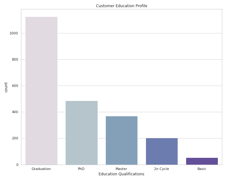
# Visualize Customer Education Profileplt.figure(figsize = (10,8))sns.countplot(x='Education',data=df,palette=colors1, order = df['Education'].value_counts().index)
plt.xlabel('Education Qualifications')
plt.title("Customer Education Profile")
plt.tight_layout()plt.show()Output —
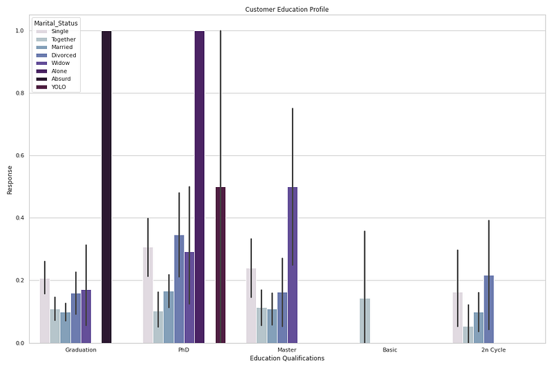
# Customer's Education profile and Response rateplt.figure(figsize = (15,10))sns.barplot(x='Education',y='Response', data=df,palette=colors1, hue='Marital_Status')
plt.xlabel('Education Qualifications')
plt.title("Customer Education Profile")
plt.tight_layout()plt.show()Output —
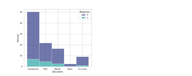
# Education & Response
plt.figure(figsize=(15,6))
plt.subplot(121)
sns.histplot(x="Education", hue="Response", data=df, multiple="stack", stat="percent",palette='mako')

plt.grid(False)
Output —
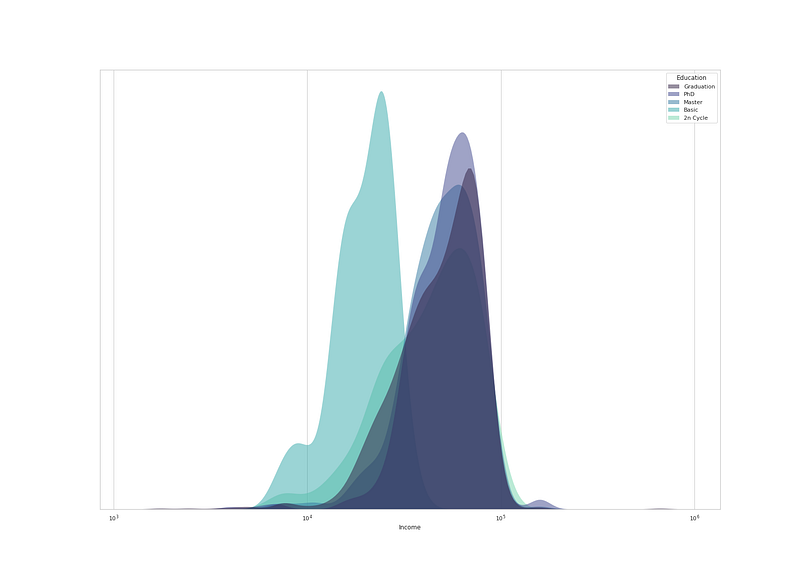
# Education and Income
plt.figure(figsize=(12,10))
sns.kdeplot(
   data=df, x="Income", hue="Education", log_scale= True,
   fill=True, common_norm=False, palette='mako',
   alpha=.5, linewidth=0,
)
plt.gca().axes.get_yaxis().set_visible(False)

plt.show()
Output —
# Analyze Marital Status and Purchases
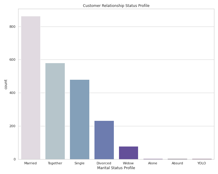
df['Marital_Status'].value_counts()
Output —
Married     864
Together    580
Single      480
Divorced    232
Widow        77
Alone         3
Absurd        2
YOLO          2
Name: Marital_Status, dtype: int64
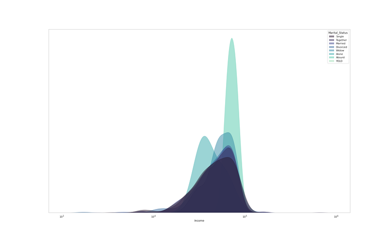
# Marital Status vs Incomeplt.figure(figsize=(12,10))
sns.kdeplot(
data=df, x="Income", hue="Marital_Status", log_scale= True,
fill=True, common_norm=False, palette='mako',
alpha=.5, linewidth=0,
)
plt.gca().axes.get_yaxis().set_visible(False)
plt.grid(False)
plt.show()Output —
# Customer Relationship Status Profileplt.figure(figsize = (10,8))sns.countplot(x='Marital_Status',data=df,palette=colors1,order = df['Marital_Status'].value_counts().index)plt.xlabel('Marital Status Profile')
plt.title("Customer Relationship Status Profile")
plt.tight_layout()plt.show()Output —
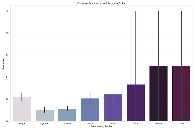
# Customer's Relationship profile and Response rateplt.figure(figsize = (15,10))sns.barplot(x='Marital_Status',y='Response', data=df,palette=colors1)
plt.xlabel('Relationship Profile')
plt.title("Customer Relationship and Response Profile")
plt.tight_layout()plt.show()Output —
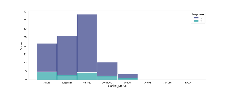
# Marital Status Vs Response Rate
plt.figure(figsize=(15,6))
sns.histplot( x="Marital_Status", data=df, hue="Response",stat="percent", multiple="stack",palette='mako')
plt.grid(False)

plt.show()
Output —
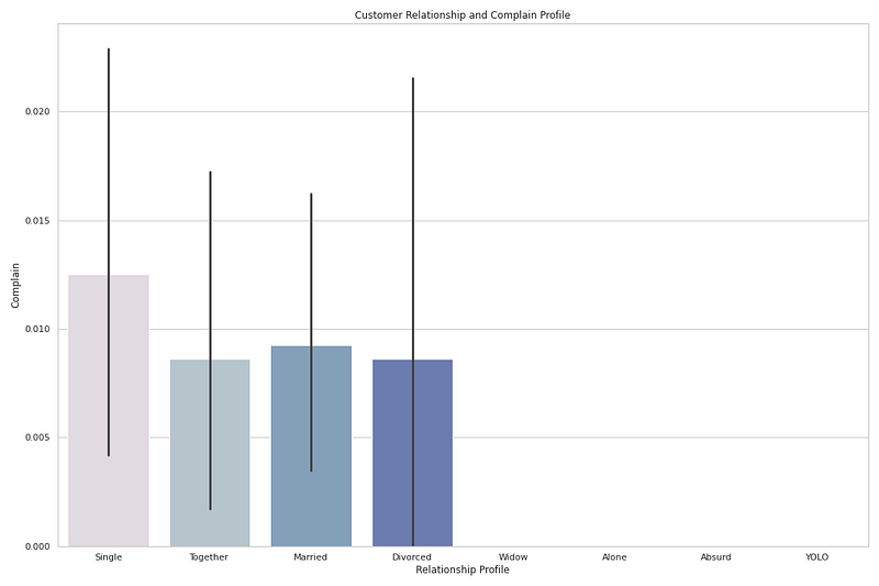
# Customer's Relationship profile and Complainplt.figure(figsize = (15,10))sns.barplot(x='Marital_Status',y='Complain', data=df,palette=colors1)
plt.xlabel('Relationship Profile')
plt.title("Customer Relationship and Complain Profile")
plt.tight_layout()plt.show()Output —
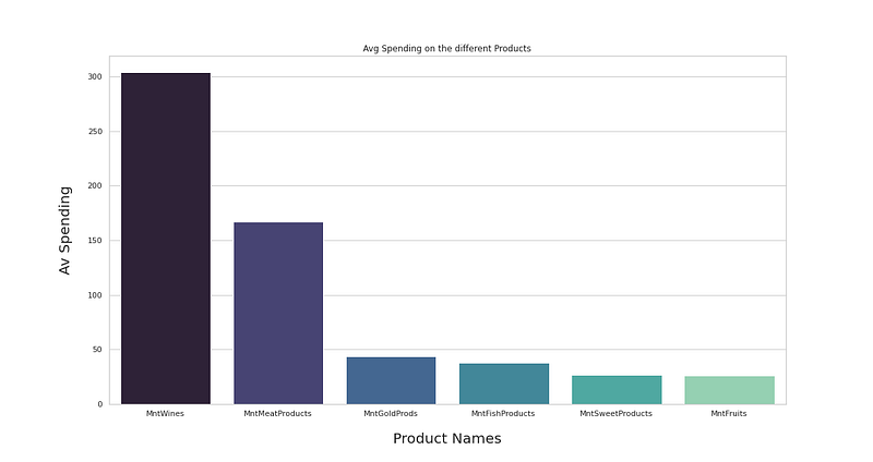
# Most bought productspr = df[['MntWines', 'MntFruits', 'MntMeatProducts', 'MntFishProducts', 'MntSweetProducts', 'MntGoldProds']]
pr_means = pr.mean(axis=0).sort_values(ascending=False)
pr_means_df = pd.DataFrame(list(pr_means.items()), columns=['Product', 'Avg Spending'])plt.figure(figsize=(17,9))
plt.title('Avg Spending on the different Products')
sns.barplot(data=pr_means_df, x='Product', y='Avg Spending',palette='mako');
plt.xlabel('Product Names', fontsize=20, labelpad=20)
plt.ylabel('Av Spending', fontsize=20, labelpad=20)
plt.show()Output —
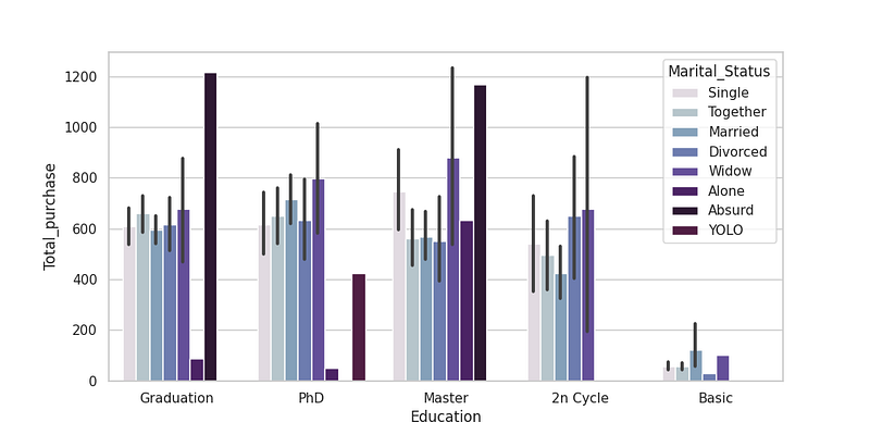
# Customer Age and Amount Spent on Product Purchases [ Who spent how much]plt.figure(figsize=(10, 5),dpi=100)df['Total_purchase'] = df['MntWines'] + df['MntFruits'] + df['MntMeatProducts'] + df['MntFishProducts']+df['MntSweetProducts']+df['MntGoldProds']
#plt.subplot(1, 1, 1)
sns.barplot(x='Education',y='Total_purchase',data=df,palette=colors1,order=df['Education'].value_counts().index,hue='Marital_Status')
plt.show()Output —
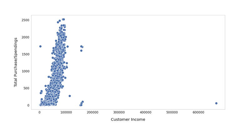
# Total Purchase/Spendings on diferent products by Income
plt.figure(figsize=(18,9))sns.scatterplot(x=df['Income'], y=df['Total_purchase'], s=150,palette='mako');plt.xticks( fontsize=16)
plt.yticks( fontsize=16)
plt.grid(False)
plt.xlabel('Customer Income', fontsize=20, labelpad=20)
plt.ylabel('Total Purchase/Spendings', fontsize=20, labelpad=20)
plt.show()Output —
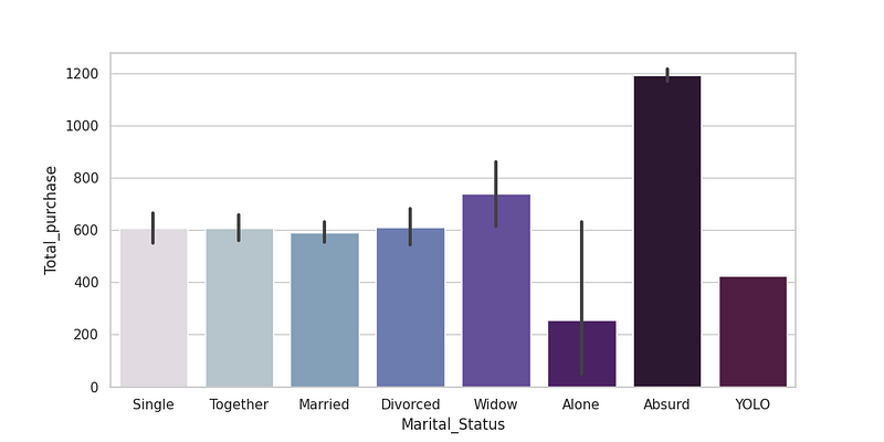
# Total Purchase by Marital Statusplt.figure(figsize=(10, 5),dpi=100)
sns.barplot(x='Marital_Status',y='Total_purchase',data=df,palette=colors1)
plt.show()Output —
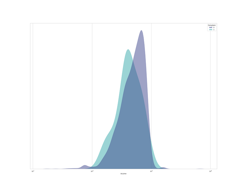
# Total places from where purchases have been madedf['Total_place_purchases'] = df['NumWebPurchases']+df['NumCatalogPurchases']+df['NumStorePurchases'] + df['NumWebVisitsMonth']# Complaint Plotplt.figure(figsize=(15,10))
sns.kdeplot(
data=df, x="Income", hue="Complain", log_scale= True,
fill=True, common_norm=False,palette='mako',
alpha=.5, linewidth=0,
)
plt.gca().axes.get_yaxis().set_visible(False)
plt.xlabel('Income')
plt.show()Output —
Part 2 of this project : Coming soon
Follow and Stay tuned.
For other projects, tune to —
Build Machine Learning Pipelines( With Code)
Recurrent Neural Network with Keras
Clustering Geolocation Data in Python using DBSCAN and K-Means
Facial Expression Recognition using Keras
Hyperparameter Tuning with Keras Tuner
Custom Layers in Keras
That’s it fellas. Peace out and keep coding :)
Stay Tuned and of-course let me end this post with a quote by Vincent Gogh
“The beginning is perhaps more difficult than anything else, but keep heart, it will turn out all right.”


