
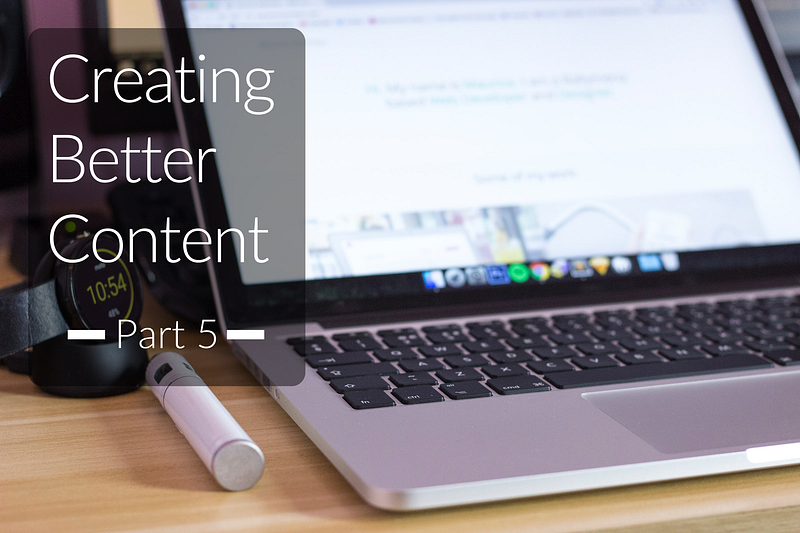
CREATING BETTER CONTENT: SEVEN-PART SERIES
Part 5. Creating Better Content: Page Structure and Styling, Main Headings and Subheadings, and Using images
A seven-part series that explains why it’s important to create your best content, not just any content
In parts one, two, three and four of this series we’ve covered Beginning your journey, The challenges editors face, Why You’re writing, Self-publishing vs publications, The challenge of good writing, plus Language, spelling, punctuation and capitalization, Understanding grammar, Using the right words, Online tools to aid your writing, and Creating your content.
In this, part five, we’ll look at Page structure and styling.

Why should you worry about the layout of your article?
The base template of a Medium article page is purposefully clean and uncomplicated. It displays consistently on most, if not all, screen-based devices and in a ‘responsive’ way (meaning the content adapts dynamically to the device it’s being viewed on).
The layout won’t win any design awards. Still, Medium is all about the content, ensuring the delivery mechanism is transparent. Our articles are readable by a wider audience.
To ensure we, the writers, don’t mess this up, the text styling tools are also simple — there are only five attributes you can apply. It’s in everyone’s interest that you learn how the attributes can be applied to your text, rather than simply typing in paragraph after paragraph of plain text.
That doesn’t mean it’s ok to dump your text into a Medium page and hit the publish button. That would be wrong on so many levels, not least of which is that you owe it to your readers to make your article easy on the eye.
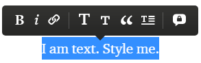
The options are simple: Bold, Italic, web-link (covered in part 6), Page title or main header, Subtitle or kicker or sub-header, blockquote, drop cap. The icon on the far right is not for styling; it’s for sending the author a private message.
Highlight some text and apply the various styles to see how they affect your text. Don’t be tempted to overuse or over-mix the styling. Styling is good — but less is more.
How important is taking care to improve the layout?
I asked Zulie Rane, a prolific and successful author who writes with great clarity and readability across a wide range of subjects, whether she thought volume (number of articles) or style (page structure and layout) had influenced her success on Medium.
This was Zulie’s reply:
“For me, style is the driving factor. My earnings actually drastically increased (~$1000/month to ~$2500/month) when I slowed down from 30 pieces a month to 10–15, but improved the style.”
A bit of styling here and there will not transform you from zero to hero, but it’s obvious that a nicer-looking page layout will probably have some influence over the number of people who read your article — especially if you’re writing long articles.
Page titles
There’s plenty of content available on Medium and elsewhere that explains how important an attention-grabbing title is in any content, not only on Medium. You can pay people to write wonderful page titles for you, and there are even online tools that will churn out a selection for you to choose from.
If the title is boring, maybe nobody will read your article, maybe they will. But it’s this desperation for reads that spawned thousands of click-bait, get-rich-quite articles, such as “How I made $10,000 in my first month on medium.”
They’re enticing because we want to believe what we’re reading and that it will work for us too. These are smart people. They know only too well that if the title promises a quick win, you’re going to want to know about it.
Medium is swamped with these articles. You click and read. They earn. You learn very little of any value. Just don’t do it.
Read the following from Lindy as it explains it in more detail: Why You Should Never Use Clickbait Titles
How the page title works:
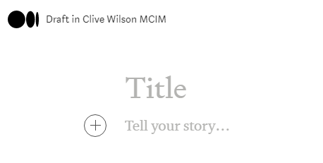
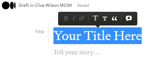
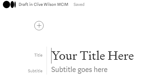
To create your page title, simply start a new draft. The top of the page will look like this:
Place your cursor at the beginning of the grey word ‘Title’ and type your text:
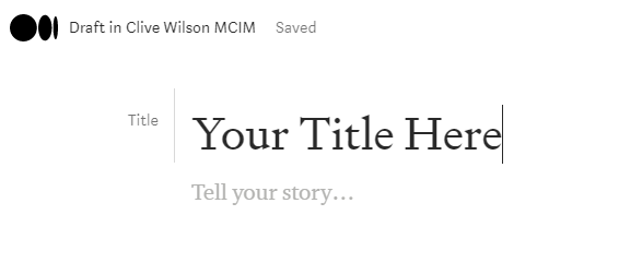
You can see your text automatically has the title designation and will be styled for you in the correct format. You’ll still have to write the title in the title case’ though, as it won’t do that for you.
Read Dominic Warren’s Sentence case or title case for more information.
What if you change your mind?
If you’ve been chopping and changing your mind, copying and pasting text into the title, you can quite easily mess up the automatic formatting of the whole title section.
If that happens, simply highlight the title text and select the big ‘T’ from the pop-up toolbar to set it right again:
The subtitle is important
Overlooked by some, the subtitle is a very important part of the title section. For many publications, the subtitle is a prerequisite.
It’s there to give you a second shot at grabbing your readers’ attention to further explain what your article is about. It qualifies and contextualizes the title, so think carefully about how to make the most of it.
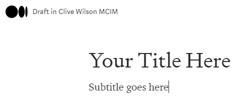
You can see in the above examples that it’s not immediately obvious how the subtitle is created. When you enter the title text, it displays “tell your story…” below it. You can begin typing the body of your content here if you’d like. Don’t. Add the subtitle instead.
There are two simple stages for creating the subtitle:
- Press enter after typing your title text and then type your subtitle. It will look like this:
2. Highlight the subtitle text and select the small ‘T’ from the pop-up toolbar:
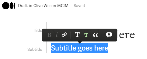
This will create your correctly formatted subtitle.
Subtitle caveat:
The subtitle is a very important element to include but it doesn’t display in the mobile view until you click into the individual article. This means people scrolling through their feed will only see the main page title, not the subtitle.
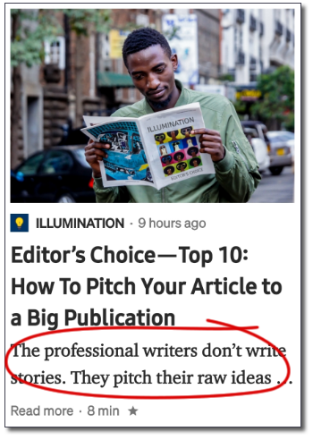
The example here shows the main page title and a few lines from the first paragraph of body text. The text circled in red is NOT the subtitle.
This also means that if your main page title is weak (because you haven’t tried to make it attention-grabbing enough) you shouldn’t try using the subtitle to make up for it, because many people won’t see the subtitle until they click to read the article itself.
The Kicker
The what-er? The kicker. It’s a little known and rarely used addition to the title section that creates a visual placeholder to ‘position’ the article. It’s not meant to be a description. It’s more like the category or section the article slots into. It could be as simple as ‘Business’, or ‘Life Lessons’, or ‘Psychology’ or ‘Investments’, and so on.
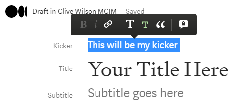
Working out how to create the kicker is a little tricky, not least because most people are unaware of its existence, and it’s less than obvious, so here’s how:
Once you have your title and subtitle in place, put your cursor at the beginning of the title text and press enter:
You’ll see the title and subtitle have moved down, and a space for new content above them has been created.
Enter your kicker text to the right of the circled cross, highlight the text and select the small ‘T’ from the pop-up toolbar:
This will create your kicker and move the title and subtitle up to join it to complete your three-part title section.
You don’t have to use the kicker, and it also doesn’t show in the mobile view, but it does no harm to include as it adds weight to the quality of your content and it’s also visually appealing.
Main headings and subheadings
It’s essential to break-up your page visually, especially if the article is long, as this one is. Main headings and subheadings provide visual anchor points for readers, and they serve two purposes. First, they allow a reader to scan down the page to determine what it’s about. Second, it allows the reader to lock-on to points they might want to jump straight into reading.
Yes, yes, I know you want people to read your article from top to bottom. We all do. However, you cannot control what your readers read or the order in which they read it. Most will start from the top and work down, whilst others will jump around picking out the juicy bits. Don’t fight this; just make sure you include main headings and subheadings to cater to all reading styles.
Creating main or section headings and subheadings
Think of the main heading like the title of a chapter, and the subheading as a way of breaking the chapter into smaller, easier-to-read chunks.
The main heading is physically larger than subheadings but smaller than the page title. This is a standard visual hierarchy. The heading is also tagged in the page code (HTML) to allow search engines to understand this hierarchy.
The main headings are simple. Just enter the text on a new line, highlight the text and select the big ‘T’ pop-up toolbar. It will look like this:
Main/section heading
Body text
Subheadings: the wrong way and the right way
The wrong way: Many people insert a subheading by creating a new line, typing the subheading text, and making the text bold. It serves a purpose, but it’s not the best way to do it for two reasons.
Firstly, you will miss out on the benefit of title hierarchy for search engines.
Secondly, the space between the subhead and the body text below it is too wide, so it looks awkward.
Here’s how the two options look:
Bold heading (text size is the same as body text)
Body text (notice the gap above)
The right way: To create a subheading, enter the text on a new line, highlight the text and select the small ‘T’ from the pop-up toolbar.
Subheading
Body text
Blockquotes and Drop Caps
There are two additional formatting options that will add visual interest.
Blockquotes
Use this to pull-out and highlight a piece of text that you want to be separate from the main body. Typically, ‘blockquotes’ are used to emphasise a quote, something somebody said or wrote, that you want to draw to the reader’s attention.
There are two styling options for the blockquote. The first is more subtle and keeps the text to the left, highlighted with a solid line outside the margin. Whilst the second option places the text in the centre of the page in a large, more spaced-out font.
Highlight your text and click the blockquote icon one for the subtle option, and again for the more obvious option.
For example, I may say: In 1969, the entire human race was enthralled when Neil Armstrong spoke the now-famous words:
First style option:
“That’s one small step for man, one giant leap for mankind.”
Second style option:
“That’s one small step for man, one giant leap for mankind.”
Note that whilst both options are automatically italicized, in the first option the text can have bold and italic styling turned on and off. In the second option, you cannot alter the text style.
Drop Caps
These, and illustrated caps, have been in use for close to 2000 years, as are typically used to mark the start of an important piece of text, such as the beginning of a new chapter. Drop caps, in particular, add little value to the reader, and some would say they are a distraction.
The toolbar provides only one option: a drop cap, where the first one or two characters of the first word will be styled as capital letters that are increased in size and weight across two lines.
Here are some examples using text from elsewhere on this page. They show a single character, the first character of a word, and both characters of a two-letter word:
A bit of styling here and there will not transform you from zero to hero, but it’s obvious that a nicer-looking page layout will probably have some influence over the number of people who read your article — especially if you’re writing long articles.
There are two styling options for the blockquote. The first is more subtle and keeps the text to the left, highlighted with a solid line outside the margin. Whilst the second option places the text in the centre of the page in a large, more spaced-out font.
If you’ve been chopping and changing your mind, copying and pasting text into the title, you can quite easily mess up the automatic formatting of the whole title section.
For fiction writing, drop caps may add a little something extra visually, but in most other forms, they’re not really appropriate. Use with caution.
Bullets point and number lists
Creating bullet point or numbered lists is crucial for presenting multiple options or for creating listicles, but it’s not obvious how to create them (note that listicles are generally frowned upon as they’re seen as ‘empty’ content. Read George J. Ziogas’s Why Listicles Are Killing the Credibility of Blogging).
Bullet point lists.
Start your first new line with a dash (-) or an asterisk (*), press the spacebar, and it will insert a bullet point. Then simply type your text after the bullet. For subsequent bullets, press the enter key at the end of the first line.
- bullet one
- bullet two
If you want to continue on with the normal body text, press enter twice at the end of the last line.
Numbered lists.
Type the first number at the beginning of a new line, press the spacebar, and you have the beginnings of a numbered list. Pressing enter at the end of the line will start the new line with an incremented number. Press enter again to return to standard paragraph text.
- number one
- number two
Note that you can’t indent bullet or numbered lists as you would in a Word document. Again, this is to ensure cross-platform and cross-device compatibility.
TIP: If you want to add new paragraphs within bullet points or numbered lists, but without adding a new bullet point or number, simply press shift-enter at the end of the line. This is known as a ‘soft return’ or line break, exactly as happens in normal paragraphs of text as they wrap to the next line.
- number one text for number one
- number two text for number two
You can also style any of the text to make it clearer, such as using bold:
- number one text for number one
- number two text for number two
TIP: The soft return trick is true for many applications that use bullet points and numbered lists. It also works where pressing the enter key sends the message you’re typing (e.g. this is the default setting in LinkedIn messaging). Just keep using shift-enter in your text to add new lines and paragraph spacing, only pressing the enter key to send your message.
Section dividers.
Another way to break-up your content visually, especially if it’s text-heavy and doesn’t contain lists or graphics, is to use the double-dash divider.
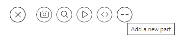
To insert the divider, when you press enter to create a new paragraph, click the circled cross to pop-up the toolbar, and click the double-dash icon on the far right (Medium calls it ‘a new part’).
It will insert a nifty page separator like the one below that gives your readers’ eyes temporary respite.
Personally, I don’t find these particularly visually appealing; hence I created my own version.
If you have some graphics know-how, you can create your own divider icon, as I have with the five circle separators used throughout this article. Instead of using the toolbar's new part’ icon, you will need to insert your bespoke separator as an image. If you do this, just remember the image file needs to be very small, both the physical dimensions and the file size or it will create too big a gap above and below the text.
TIP: Deleting the default page separator is a little tricky. You have to click-drag your cursor from the end of the text above to the beginning of the text below, and press delete. You won’t see it highlight the separator, but when you press delete it will remove it.
Using images
Inserting an image file into the body of your article is another way to break up the page to help it be both informative and visually appealing.
Once again, controls are simple and limited to positioning only. The images you select will be automatically downsized (or re-sampled) to fit the available space and position available.
For example, the original size of the above image of the guy reading Illumination magazine is 972 pixels x 1280 pixels. Once I inserted it into the page, it was automatically resized and reduced to 350 pixels x 492 pixels. This re-sampling is performed to reduce the overhead of large images, especially on mobile devices.
What can you place, where?
If you’ve played with placing images, you may have noticed the toolbar shows different position options. This is because the toolbar is very smart and will show you only the options available according to the size of the image you want to place.
Think about it logically; if you want to place an image across the full width of the page, but the image is the size of a postage stamp, it will look terrible. The toolbar will save you this embarrassment.
Those clever Medium developers created the image selection tool to detect the dimensions of the image you’ve chosen and show you only the positioning options available for it.
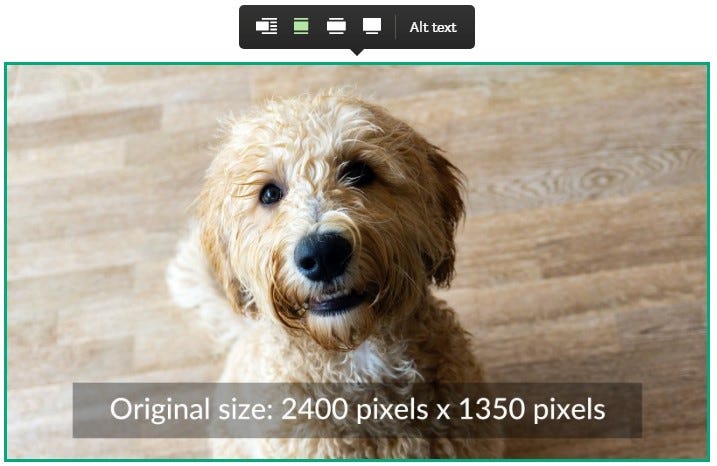
In the above example, the original image size is sufficiently large to allow the image to be positioned in any of the four available.
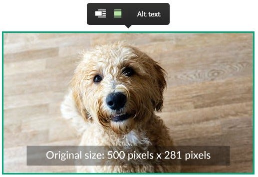
In this example, the original image size is smaller, so only two positioning options are available.
The four image position and file size options are:
- Screen-width images: min 2500 pixels wide
- Out-set images (wider than column): min 2040 pixels
- Full column-width images: min 1400 px wide
- Left-aligned images: all sizes
Notes:
The image size in no 2. will also go to full screen-width but is not recommended for quality reasons.
Only left-align (which wraps the text to the right) is available. There is no right-align option. It’s a shame, but it comes back to layout consistency again.
When you’re downloading photos from your chosen photo libraries, remember to look for the file size options before you download them. You don’t need to choose the largest or original file size, as this can sometimes be 4000–6000 pixels wide, and it’s just not necessary. Just choose a width that’s around 2000–3000 pixels wide, ESPECIALLY FOR YOUR MAIN BANNER PHOTO, and you’ll have all four image positioning options available.
My recommendation is simply to play with the images on a draft page so you become familiar with how the image sizes affect positioning options.
Summary — part five
This section has covered most of what you need to know to help you consistently and repeatedly create good-looking, nicely formatted and easier-to-read and pages.
Once you’ve played with adding structure to your pages a few times, it will become second nature, and you’ll always know what to do.
The Medium help files are a mine of information, but individual writers’ articles tend to put things in easier-to-understand terms, so don't be afraid to search for answers. There is nothing you will come across that hasn’t been asked and answered before.
Coming up in part six:
Part six of this series will look at Photos, graphics, and Weblinks.

Series links:
Part 1. Your ‘Why’ Journey, Editors’ Challenges, and Why Are You Writing?
Part 4. Outline and Structure, Clichés and Jargon, Audience, Editing and Reading Aloud
Part 5. Page Structure and Styling, Main Headings and Subheadings, and Using images
About the author: Clive Wilson