
Inspiration | Colour Choice | Relationships
Why Colour Choice Can Be A Powerful Emotional Tool
In decorating, clothing, entertaining, business, and more
“Mere color, unspoiled by meaning, and unallied with definite form, can speak to the soul in a thousand different ways.”
— Oscar Wilde
My dear readers and writers,
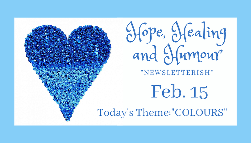
No doubt you’ve noticed that today, I’ve used a different image with blue being the predominant colour instead of purple.
I do love that purple image you’re used to seeing here every week…sigh…
The above blue one might change (and perhaps not. It’s my Pisces prerogative to be indecisive! 🤪 🤦🏻♀️). Let’s call this one a placeholder for the moment, although blue will be the main colour in whatever might follow.
Why the change?
The longish story made short is that I hadn’t taken the mental and emotional impact of colour into consideration when I created the previous one.
Having been a practicing witch for nearly 30 years, I’ve used colours a lot in spell-casting. You’d think I’d have paid attention to them in this, too.
Purple is kind of my “go-to” colour. I love it — perhaps a subconscious nod to my birthstone, amethyst — or because purple is traditionally thought to enhance and/or be related to psychic ability and spirituality — both of which are significant parts of who I am. I use it a lot in spellwork and anything to do with my psychic and spiritual work.
And as an artist, I love lots of colours with many shades of purple being high on my list of favourites — along with deep reds, vibrant blues and many others.
Whatever factors were at play when I spotted the photo in Canva with its pretty bunch of lavender, as well as lavender candle etc. it “felt” light and lovely. I used Witchy’s darker purple to accent (I asked her first) and voilà! An image I thought had lovely, vibrant energy and would be perfect.
I liked it so much, I adapted the image for my website and used the dark purple accent for all the product pics in the shop.
And then…
…You know how sometimes something hits your awareness but it doesn’t exactly register in your brain? As much as I enjoyed producing pictures that all matched and thinking how nice that looked, something felt “off” but it didn’t fully land in my consciousness.
Until…
…my recent internet travels, when something caught my eye. Something that reminded me about the mental and emotional impact of colour.
Aside from learning about colours as they pertain to spellwork, over the years I’ve learned other bits and pieces of information. For example, red seems to mean “no.” Think red lights and stop signs. It represents danger. It means “hot.”
It can also represent dominance. A Dartmouth College study showed that athletes who wear red win more often than those who wear blue, especially in hand-to-hand sports, like wrestling.
A study done in a colony of free-ranging monkeys in Puerto Rico revealed startling results. These Rhesus macaques are sensitive to blue, red, and green. Experimenters dressed in hats and shirts in each of these three colours and offered apples to the monkeys.
The animals took fruit from the humans wearing blue or green, paying them little or no attention, but “…in the significant majority of cases, they steered clear of the red-clad humans and stole the food from the other tray.”
The study of colours and their impact on us is not new. In fact, it’s hundreds of years old. One of the most relevant works today is The Theory of Colours, published by Johann Wolfgang von Goethe in 1810. He published one of the first colour wheels along with information on the psychological impact of colour.
In recent decades, more information has sprung up about the use of colour in professional offices, such as for dentists or therapists. We’ve been hearing more about its use in hospitals, prisons, and especially in advertising.
“Color is a power which directly influences the soul.”
— Wassily Kandinsky
I’m aware of all of this and have been for years but for some reason, did not stop to consider it when producing my newsletterish or overhauling the appearance of my website.
Oops.
Think of the implications of this. What you wear could mean the difference between a meeting going well — or not. For example, you’re meeting with your soon-to-be-ex-partner and his/her lawyer. Or you’re attending mediation and you want to appear to be open and communicative instead of angry and power-hungry.
What you wear will send a quiet, subconscious but powerful message to all who see it.
Or you’re decorating your office as a healer. A soothing light green would be better than dark blue.
Your decor at home and at work will set a tone for all who enter. When planning, take time to consider this: what do you want yours to be?
On seeing mention of colours and emotions, instantly I remembered that blue inspires feelings of trust, calm, and safety. Of all the bits of information I’ve gathered about colours over the years, I don’t know why “blue” was the one the popped up.
But my subconscious was being clever and threw out something else: the “off” feeling that I hadn’t fully “noticed” when I looked at all that dark purple in my shop.
It occurred to me that I’d better check out its emotional impact.
Oh, dear. I got quite a surprise. Sure, lighter shades of purple are great. The darker ones, not so much.
It’s true, they are often associated with royalty and wealth. This goes back many centuries and it is because there isn’t a lot of anything in nature that’s purple and can be used as dye. Therefore, cloth or anything dyed purple was expensive.
Depending on the shade, purple can be used to represent imagination and mystery. It is also associated with bravery and courage — as with the Purple Heart — a US military medal with its origins in the American Revolution.
In August of 1782, George Washington directed the Badge of Military Merit be “the figure of a heart in purple cloth, or silk, edged with narrow lace or binding.” Only three soldiers received it but 150 years later in 1932, General Douglas MacArthur announced the reinstatement of “the Purple Heart.”
So with such a lot of positivity around the colour purple, why the “off” feeling?
Turns out that although lighter purples can elicit positive emotions, dark shades can leave people feeling sad, frustrated, depressed, and gloomy.
Yikes!
That couldn’t be more wrong in terms of everything about who I am, what I stand for, and the work I do. I’m all about being positive, increasing your vibration, “change your thoughts, change your life” and that sort of thing. I accept only positive, inspiring, and uplifting or entertaining submissions for my pubs.
Depressed and gloomy?? Nope. I have no room for these in my life.
Blue makes much more sense (plus I love it and use it a lot in my art!). As mentioned above, it promotes feelings of trust, calm, relaxation and safety — all essential as I’m often dealing with people who feel vulnerable or who share personal information.
Blue can also evoke feelings of peace, serenity and tranquility. Light blue represents freedom (think: the expansiveness of the sky).
It’s also true that not everyone feels the way the “experts” suggest they should on seeing certain colours. So if, by some chance, you feel fabulously uplifted by dark purple, yay! Good for you! You’re in the minority. And no, there’s nothing wrong with you.
I’m like that about yellow. It’s supposed to be uplifting and make people feel cheerful. It reminds them of the sun (supposedly) and all things “sunny.” I detest most yellows and find it to be irritating beyond description.
But then, come to think of it…I’m not a huge fan of the sun either. In fact, I am allergic to it (so said a doctor, based on what happens to me when exposed to it). Hmm. Perhaps there’s a connection there and this is why I don’t like the colour…🧐
Anyway, this is why I’m switching to blue, although I haven’t had an opportunity to dig into it and fine-tune.
I suppose you’ve figured out the theme for this week…
Colour!!
I’d love to know what you think of the image above, please?
And I’d love to hear your stories and poems about colour, how you feel about certain ones. How do they make you feel? Do some of them energise you? Ire or inspire you? Light you up or bring you down?
What are your favourites? Your least favourites?
Let’s get colourful this week, shall we?
Oooo, I can’t wait!
And…while I’m here…is this weird? Whenever I see lots of colours that I love, I want to eat them. Seriously, I always have that thought — or is it a feeling? I’m not sure. If I open a huge box of watercolour pencils or see a display of paint chips (be still, my heart!) or hundreds of tiny bottles of coloured craft paints, that’s the first thing I want to do.
No, I don’t mean I want to eat the pencils or the paints or whatever it is that’s colourful. It’s not the object I want to eat. It’s the actual colours.
Does anyone else feel this way? (she asks nervously, praying someone offers a resounding “Yes” so she doesn’t get carted off in a “hug-yourself” jacket! Either that or she’ll have company in that special room with quilted wallpaper)
🎼Ce-e-e-lebrate good times, come on! 🎼 🎹
If this song doesn’t get you up and moving, you must be unconscious!!! Come on, hit “play” and crank the volume!
It’s time to come together It’s up to you, what’s your pleasure
Everyone around the world Come on!
Woohoo! We are celebrating Shorties But Goodies having 152 followers!
And Hope, Healing and Humour is up to 98!
Witchy has gained a few new fans and is up to 36 beloved followers. She is dancing through the woods like a little kid!
Thank you so much to those of you who are following one or more of these pubs! You are deeply appreciated.
Last week’s invitation was to write about intuition. We had a couple of lovely submissions on that topic, as well as loads of other goodies that I know you’ll enjoy reading.
Take a peek!
Kris Bedenian shares an insightful story and example of a distressing event in which her intuition guided her through.
Trista Signe Ainsworth’s intuition is allowing her to answer a new calling…
Kris Bedenian offers a sweet story about the sky…
…And a really cool one about moonbows!!
She’s also got some fascinating information about clouds! I was so shocked!!
And here’s another from Kris about love language and gifts:
Loren Lieberthal shares a sweet, inspiring, and just plain wonderful story of unrequited love — sort of. The plot twist at the end of this true story was as perfect as it was unexpected!
Jessica Rabel has written an insightful story that every parent will appreciate…and it has a message for non-parents, too…
Sahil Patel offers a wonderful story about hope and healing — and all of us need both at some point…
Eko BP has written a beautiful, inspiring piece about a morning prayer — such a powerful message!
Mary Vraa offers an unusual and fascinating way to cope with stress and chaos!
Susie Kearley wants to send Medium to the naughty corner. Okay, my words, not hers. But check out this story and see if you feel the same way:
Are Medium’s Notifications this Bad for Everyone?
Sorry if there was something important!
medium.com
Rhea Anglesey shares a lovely story about water…as a fellow “Pisces fish” I can relate!
Christina shares a lovely story about quality vs quantity — and with another beautiful story inside…
Carrie Kolar has written a brilliantly fun and interesting piece about her spiritual journey. No doubt, many others will relate to it…I certainly could in many ways!
Isabel Young has some cool thoughts on wake up calls! Not the gentle-polite-good-morning-hotel kind — the slap-you-upside-the-head kind!
Vidya Sury, Collecting Smiles has a thing or two to say about kissin’!!!
My story about a lesson well learned — and a tool that can help you in your daily life:
And…I shared a channelled message about judgement. It’s a punch-you-in-the-face heavy-hitter but raises some powerful points:
If you missed last week’s “newsletterish,” here it is:
Witchy loves providing your smiles for the day
Mega-Thanks!!! to all the beautiful souls who choose to share their magical and inspiring words on Hope, Healing and Humour, and Shorties But Goodies! I am deeply grateful to you for your contributions and ongoing support of our Pub Family!
Here is our current list of Pub Family Members:
Dr Andrea Polzer Kris Bedenian Rodney Brazier Patti Murray Voncannon Carrie Kolar Croix Sather Deb Fiore Dina Alexander DL Nemeril Donnette Anglin, Loren Lieberthal Jimmy Misner Jr. Judy Millar Julie Gaeta Pene Hodge Karen Schwartz James Knight Laura Izquierdo pockett dessert Dr. Preeti Singh Radhika Iyer Sam Branstner Sharon Sayler, Author Umme Salma Susie Kearley Tamil T Mann Vidya Sury, Collecting Smiles Lion~ Wendy S. Bradfield Yana Bostongirl Jo An Fox-Wright Maddox Suma Narayan Penny Walsh Shameem Anwar Irene Fassler Sandy Peckinpah Trista Signe Ainsworth Slow train A.H. Mehr Alex Frederickson Ashley Nicole B.R. Shenoy Carolyn Hastings Christina Christine Vann, MSc. Ellie Jacobson ✍🏻 The Soulful Scribbler Isabel Young Kaz Rochford Nia Simone McLeod Nicole Hilbig Patricia Wright Pam Winter Rachella Angel Page Jodian Marie Thomas, MS, Bsc, Asc L Burton Muhammad Abdullah Kate Aries Danielle Hestand Sahil Patel Jessica Rabel Sharing Words Malky McEwan Belinda Castle Barbara Cook Tyra Jaide Megan Llorente Eko BP Drashti Shroff Evergreen Eden Bernie Pullen Hamsalekha Rhea Anglesey CARMEN F MICSA Robin Oakman Mary Vraa Libby Shively McAvoy


%22%3E)